
last updated: 27 May 2010
JavaFX Cascading Style Sheets (CSS) is based on the W3C CSS version 2.1 [1] with some additions from current work on version 3 [2]. JavaFX CSS also has some extensions to CSS in support of specific JavaFX features. The goal for JavaFX CSS is to allow web developers already familiar with CSS for HTML to use CSS to customize and develop themes for JavaFX controls and scene graph objects in a natural way. The JavaFX CSS support and extensions have been designed to allow JavaFX CSS style sheets to be parsed cleanly by any compliant CSS parser, even though it might not support JavaFX extensions. This enables the mixing of CSS styles for JavaFX and for other purposes (such as for HTML pages) into a single style sheet. To this end, all JavaFX property names have been prefixed with a vendor extension of "-fx-". Even properties that might seem to be compatible with standard HTML CSS have been prefixed, because JavaFX has somewhat different semantics for their values.
JavaFX CSS does not support CSS layout properties such as float, position, overflow, and width. However, the CSS padding and margins properties are supported on some JavaFX scene graph objects. All other aspects of layout are handled programmatically in JavaFX Script code. In addition, CSS support for HTML-specific elements such as Tables are not supported since there is no equivalent construct in JavaFX.
JavaFX has a rich set of extensions to CSS in support of features such as color derivation, property lookup, and multiple background colors and borders for a single node. These features add significant new power for developers and designers and are described in detail in this document.
The structure of this document is as follows. First, there is a description of all value types for JavaFX CSS properties.Where appropriate, this includes a grammar for the syntax of values of that type. Then, for each scene graph node that supports CSS styles, a table is given that lists the properties that are supported, along with type and semantic information. The pseudo-classes for each class are also given. The description of CSS properties continues for the controls. For each control, the substructure of that control's skin is given, along with the style class names for the Region objects that implement that substructure.
CSS styles are applied to nodes in the JavaFX scene graph in a way similar to the way CSS styles are applied to elements in the HTML DOM.
CSS styles are loaded from several sources. There is a default style sheet built into the system. Style sheets are also loaded from the URLs specified in the styleSheets variable of the Scene object. Rules loaded from a Scene's style sheets take precedence over rules from the built-in style sheet. Finally, each node has a style variable that can contain style declarations. (This is analogous to the style="..." attribute that can appear on HTML elements.) Declarations specifed here take precedence over rules originating elsewhere. The precedence order of style rules can be modified using "!important" in a style declaration.
Each node in the scene graph has a styleClass variable, a string. This is analogous to the class="..." attribute that can appear on HTML elements. Supplying a string for a node's styleClass variable causes style properties for that style class to applied to this node. Styles for style classes can be specified using the ".styleclass" selector syntax in a style sheet.
Each node in the scene graph has an id variable, a string. This is analogous to the id="..." attribute that can appear HTML elements. Supplying a string for a node's id variable causes style properties for this node to be looked up using that id. Styles for specific ids can be specified using the "#nodeid" selector syntax in a style sheet.
Each node honors a set of properties that depends on the node's JavaFX class (as distinct from its styleClass). The properties honored by each node class are shown in detail in tables later in this document. The property value that is actually applied depends on the precedence of the origin of the rule, as described above, as well as the specificity of the rule's selector as described in CSS 2. Ultimately, a property value string is converted into a JavaFX value of the appropriate type and is then assigned to an instance variable of the JavaFX object.
CSS styles are applied asynchronously. That is, CSS styles are loaded and values are converted and assigned some time after a scene graph object has been created and added to the scene graph, but before the scene graph is first laid out and painted. In addition, if the styles that apply to an object have changed (for example, because its pseudo-class has changed), values from the newly applied styles will not be applied immediately. Instead, they will be applied sometime after the object's state has changed but before the scene is next painted.
The application of CSS styles affects the values of JavaFX objects' variables. In many cases, JavaFX Script programs can write to these variables if they are public. This raises the possibility that CSS might overwrite values that had been initialized or assigned by a JavaFX Script program. Since CSS styles are applied asynchronously, it's possible that values might be assigned by a program and used for some time before being overwritten by CSS at an arbitrary time later. To avoid problems like this, the CSS implementation applies the following policy to some of the more common variables that are set by CSS style properties. The policy is: if at any point a JavaFX Script program ever writes to a variable of an object, that variable is henceforth never written by CSS, even if it had been set by CSS in the past. This allows JavaFX Script programmers to initialize variables in object literals, and to assign to objects' variables, without fear of those values being overwritten by CSS. However, it's probably best to avoid setting variables both programatically code and from CSS. With controls and charts, setting values from CSS is preferable.
This policy applies to the following JavaFX variables:
Naming conventions have been established for deriving CSS style class names from JavaFX class names, and for deriving CSS property names from JavaFX variable names. Note that this is only a naming convention; there is no automatic name conversion. Most JavaFX names use "camel case," that is, mixed case names formed from compound words, where the initial letter of each sub-word is capitalized. Most CSS names in the HTML world are all lower case, with compound words separated by hyphens. The convention is therefore to take JavaFX class names and form their corresponding CSS style class name by separating the compound words with hyphens and convering the letters to all lower case. For example, the JavaFX ToggleButton class would have a style class of "toggle-button". The convention for mapping JavaFX variable names to CSS property names is similar, with the addition of the "-fx-" prefix. For example, the blendMode variable would have a corresponding CSS property name of "-fx-blend-mode".
Using a class selector as a descendant selector (using whitespace as the combinator) does not work. Instead, insert a * prior to the class selector. For example, instead of ".a .b { ... }" use ".a *.b { ... }".
The ":first-child" and ":lang" pseudo-classes are not supported. The ":first-line", ":first-letter", ":after", and ":before" pseudo-elements are not supported.
The ":active" and ":focus" dynamic pseudo-classes are not supported. However, Nodes do support the ":pressed" and ":focused" pseudo-classes, which are similar.
The ":link" and ":visited" pseudo-classes are not supported in general. However, Hyperlink objects can be styled, and they support the ":visited" pseudo-class.
It is possible to specify only one style class for a node. This is in contrast to CSS for HTML, where an HTML element can have more than one style class. This is significant for the following reason. Each control has a default style class values which matches a set of rules in the default style sheet. This is how the default visual style is achieved. If you change the style class of a control, the default styles won't be applied. This is an advantage if you want to have a completely different style for the control, but it's a disadvantage if you want to use the default style and only change one or two properties. If you want to do the latter, a workaround would be to set an id value on the control and to write some style rules that apply to nodes with that id (using the "#nodeid" selector syntax).
JavaFX CSS does not support comma-separated series of font family names in the -fx-font-family property. The optional line height parameter when specifying fonts is not supported. There is no equivalent for the font-variant property.
JavaFX CSS uses the HSB color model instead of the HSL color model.
A <uri> is not supported as a value for the -fx-cursor property.
It is possible to use the JavaFX class name as a type selector, however, such use is not recommended. For example, it is possible to specify styles for a ToggleButton using the syntax "ToggleButton { ... }". Such usage is not recommended because the name used to match the type selector is the actual concrete class name used in the JavaFX program. This class name can change in the case of subclassing. If the application were to subclass the ToggleButton class, these styles would no longer apply. In addition, if a variable or function is overridden in a ToggleButton object literal, or if a variable is initialized using bind in an object literal, the current JavaFX Script compiler implementation silently creates an anonymous subclass of ToggleButton. The ToggleButton styles would no longer apply to this object. For this reason, style class names have been provided for all JavaFX scene graph classes, and use of the style class names in style sheets is preferred.
At this time most of the UI controls in the JavaFX runtime are built using Regions, which are internal implementation objects that provide CSS support for a rich set of CSS style properties. These style properties are described below. However, the actual Region objects and thus their state variables are considered internal to the system and are not directly accessible to applications.
At this time, the programming interfaces necessary for a class to declare support for CSS properties, to convert and load these values from CSS style sheets into object variables, and to declare and notify changes to an object's pseudo-classes, are considered internal interfaces and are not accessible directly to applications.
CSS also provides for certain properties to be inherited by default, or to be inherited if the property value is 'inherit'. If a value is inherited, it is inherited from the computed value of the element's parent in the document tree. In JavaFX, inheritance is similar, except that instead of elements in the document tree, inheritance occurs from parent nodes in the scene graph.
There is also a hierarchy of JavaFX classes: for example, Rectangle is a subclass of Shape, which in turn is a subclass of Node. A different sort of inheritance occurs here. A JavaFX subclass will "inherit" CSS properties from its JavaFX superclass, similar to the way variables and functions are inherited. That is, a subclass will generally respond to the same set of properties as its ancestor classes, and possibly to additional properties it defines itself. Note that the properties supported are what is inherited, but not the actual property values. So, a Shape supports all the properties of Node plus several more, and Rectangle supports all the properties of Shape plus a couple more. However, providing style declarations for a Shape will not cause a Rectangle to use those values.
Consider the following simple JavaFX Script application:
Scene { width: 200 height: 200 stylesheets: [ "{__DIR__}test.css" ] content: Rectangle { x: 50 y: 50 width: 100 height: 100 styleClass: "my-rect" } }
Without any styles, this will display a plain black rectangle. If test.css contains the following:
.my-rect { -fx-fill: red; }
the rectangle will be red instead of black:
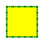
If test.css contains the following:
.my-rect { -fx-fill: yellow; -fx-stroke: green; -fx-stroke-width: 5; -fx-stroke-dash-array: 12 2 4 2; -fx-stroke-dash-offset: 6; -fx-stroke-line-cap: butt; }
the result will be a yellow rectangle with a nicely dashed green border:
Each property has a type, which determines what kind of value and the syntax for specifing those values. In addition, each property may have a specified value of 'inherit', which means that, for a given node, the property takes the same computed value as the property for the node's parent. The 'inherit' value can be used on properties that are not normally inherited.
If the 'inherit' value is set on the root element, the property is assigned its initial value.
Boolean values can either have the string value of "true" or "false", the values are case insensitive as all CSS is case insensitive.
Some value types may have integer values (denoted by <integer>) or real number values (denoted by <number>). Real numbers and integers are specified in decimal notation only. An <integer> consists of one or more digits "0" to "9". A <number> can either be an <integer>, or it can be zero or more digits followed by a dot (.) followed by one or more digits. Both integers and real numbers may be preceded by a "-" or "+" to indicate the sign. -0 is equivalent to 0 and is not a negative number.
Note that many properties that allow an integer or real number as a value actually restrict the value to some range, often to a non-negative value.
Strings can either be written with double quotes or with single quotes. Double quotes cannot occur inside double quotes, unless escaped (e.g., as '\"' or as '\22'). Analogously for single quotes (e.g., "\'" or "\27").
"this is a 'string'" "this is a \"string\"" 'this is a "string"' 'this is a \'string\''
A string cannot directly contain a newline. To include a newline in a string, use an escape representing the line feed character in ISO-10646 (U+000A), such as "\A" or "\00000a". This character represents the generic notion of "newline" in CSS. See the 'content' property for an example.
It is possible to break strings over several lines, for aesthetic or other reasons, but in such a case the newline itself has to be escaped with a backslash (\). For instance, the following two selectors are exactly the same:
a[title="a not s\ o very long title"] { /*...*/ } a[title="a not so very long title"] { /*...*/ }
<number> [ % | px | mm | cm | in | pt | pc | em | ex ]?
No whitespace is allowed between the number and units if provided.
Sizes can either be a percentage or a length with units. If units are not specified then specified the 'px' is assumed. Some units are relative and others absolute.
Relative
Absolute
Percentages
These are a percentage of some length, they are context sensitive so what they are relative to depends on where they are specified. Each property that supports a percentage should specify if percentage is supported and if it is what it is relative to.
url ( [\"\']? <address> [\"\']? )
<address> can be an absolute URI, for example:
url(http://example.com) url('http://example.com') url("http://example.com")
or it can be relative to the location of the CSS file.
JavaFX CSS currently supports the DropShadow and InnerShadow effects from the JavaFX platform. See the class documentation in javafx.scene.effect for further details about the semantics of the various effect parameters.
A high-level effect that renders a shadow of the given content behind the content.
dropshadow( <blur-type> , <color> , <number> , <number> , <number> , <number> )
<blur-type> = [ gaussian | one-pass-box | three-pass-box | two-pass-box ]
<color> The shadow Color.
<number> The radius of the shadow blur kernel. In the range [0.0 ... 127.0], typical value 10.
<number> The spread of the shadow. The spread is the portion of the radius where the contribution of the source material will be 100%. The remaining portion of the radius will have a contribution controlled by the blur kernel. A spread of 0.0 will result in a distribution of the shadow determined entirely by the blur algorithm. A spread of 1.0 will result in a solid growth outward of the source material opacity to the limit of the radius with a very sharp cutoff to transparency at the radius. Values should be in the range [0.0 ... 1.0].
<number> The shadow offset in the x direction, in pixels.
<number> The shadow offset in the y direction, in pixels.
A high-level effect that renders a shadow inside the edges of the given content.
innershadow( <blur-type> , <color> , <number> , <number> , <number> , <number> )
<blur-type> = [ gaussian | one-pass-box | three-pass-box | two-pass-box ]
<color> The shadow Color.
<number> The radius of the shadow blur kernel. In the range [0.0 ... 127.0], typical value 10.
<number> The choke of the shadow. The choke is the portion of the radius where the contribution of the source material will be 100%. The remaining portion of the radius will have a contribution controlled by the blur kernel. A choke of 0.0 will result in a distribution of the shadow determined entirely by the blur algorithm. A choke of 1.0 will result in a solid growth inward of the shadow from the edges to the limit of the radius with a very sharp cutoff to transparency inside the radius. Values should be in the range [0.0 ... 1.0].
<number> The shadow offset in the x direction, in pixels.
<number> The shadow offset in the y direction, in pixels.
JavaFX CSS supports the ability to specify fonts using separate family, size, style, and weight properties, as well as the ability to specify a font using a single shorthand property. There are four value types related to fonts plus a shorthand property that encompasses all four properties. The font-related types are as follows.
<font-family>The string name of the font family. An actual font family name available on the system can be used, or one of the following generic family names can be used:
<font-size> The size of the font, using the <size> syntax.
<font-style> The font's style, using the following syntax:
[ normal | italic | oblique ]
<font-weight> The font's weight, using the following syntax:
[ normal | bold | bolder | lighter | 100 | 200 | 300 | 400 | 500 | 600 | 700 | 800 | 900 ]
<font> This font shorthand property can be used in place of the above properties. It uses the following syntax:
[[ <font-style> || <font-weight> ]? <font-size> <font-family> ]
Most classes that use text will support the following font properties. In some cases a similar set of properties will be supported but with a different prefix instead of "-fx-font".
| CSS Property | Values | Default | Comments |
|---|---|---|---|
| -fx-font | <font> | inherit | shorthand property for font-size, font-family, font-weight and font-style |
| -fx-font-family | <font-family> | inherit | |
| -fx-font-size | <font-size> | inherit | |
| -fx-font-style | <font-style> | inherit | |
| -fx-font-weight | <font-weight> | inherit |
Paint values can either be a solid color specified in one of the color syntaxes or they can be a linear or radial gradient.
<color> | <lineargradient> | <radialgradient>
linear ( <size> , <size> ) to ( <size> , <size> ) stops [ ( <number> , <color> ) ]+ [ repeat | reflect ]?
Linear gradient creates a gradient going though all the stop colors along the line between the two points specified by the first and second (<size>,<size>). If the sizes are percentages then they are relative to the size of the area being filled. Percentage and length sizes can not be mixed in a single gradient definition. This example will create a gradient from top left to bottom right of the filled area with red at the top left corner and black at the bottom right.
linear (0%,0%) to (100%,100%) stops (0.0,red) (1.0,black)
This more complex example will create a 50px high bar at the top with a 3 color gradient with white underneath for the rest of the filled area.
linear (0,0) to (0,50px) stops (0.0,gray) (0.50,darkgray) (0.99,dimgray) (1.0,white)
radial [ ( <size> , <size> ) , ]? <size> [ focus ( <size> , <size> ) ] ? stops [ ( <number> , <color> ) ]+ [ repeat | reflect ]?
The first point (size,size) is the center of the gradient, if not specified this is assumed to be the center. The next <size> is the radius which is followed by a optional focus point. Here are a simple and more complex examples:
radial 100% stops (0.0,red) (0.50,darkgray) (1.0,black)
radial (25%,25%) , 50% focus (20%,20%) stops (0.0,gray) (0.50,darkgray) (1.0,dimgray) reflect
<named-color> | <looked-up-color> | <rgb-color> | <hsb-color> | <color-function>
CSS supports a bunch of named constant colors. Named colors can be specified with just their unquoted name for example:
.button { -fx-background-color: red; }
The named colors that are available in CSS are:
| aliceblue = #f0f8ff | antiquewhite = #faebd7 | aqua = #00ffff | aquamarine = #7fffd4 | ||||
| azure = #f0ffff | beige = #f5f5dc | bisque = #ffe4c4 | black = #000000 | ||||
| blanchedalmond = #ffebcd | blue = #0000ff | blueviolet = #8a2be2 | brown = #a52a2a | ||||
| burlywood = #deb887 | cadetblue = #5f9ea0 | chartreuse = #7fff00 | chocolate = #d2691e | ||||
| coral = #ff7f50 | cornflowerblue = #6495ed | cornsilk = #fff8dc | crimson = #dc143c | ||||
| cyan = #00ffff | darkblue = #00008b | darkcyan = #008b8b | darkgoldenrod = #b8860b | ||||
| darkgray = #a9a9a9 | darkgreen = #006400 | darkgrey = #a9a9a9 | darkkhaki = #bdb76b | ||||
| darkmagenta = #8b008b | darkolivegreen = #556b2f | darkorange = #ff8c00 | darkorchid = #9932cc | ||||
| darkred = #8b0000 | darksalmon = #e9967a | darkseagreen = #8fbc8f | darkslateblue = #483d8b | ||||
| darkslategray = #2f4f4f | darkslategrey = #2f4f4f | darkturquoise = #00ced1 | darkviolet = #9400d3 | ||||
| deeppink = #ff1493 | deepskyblue = #00bfff | dimgray = #696969 | dimgrey = #696969 | ||||
| dodgerblue = #1e90ff | firebrick = #b22222 | floralwhite = #fffaf0 | forestgreen = #228b22 | ||||
| fuchsia = #ff00ff | gainsboro = #dcdcdc | ghostwhite = #f8f8ff | gold = #ffd700 | ||||
| goldenrod = #daa520 | gray = #808080 | green = #008000 | greenyellow = #adff2f | ||||
| grey = #808080 | honeydew = #f0fff0 | hotpink = #ff69b4 | indianred = #cd5c5c | ||||
| indigo = #4b0082 | ivory = #fffff0 | khaki = #f0e68c | lavender = #e6e6fa | ||||
| lavenderblush = #fff0f5 | lawngreen = #7cfc00 | lemonchiffon = #fffacd | lightblue = #add8e6 | ||||
| lightcoral = #f08080 | lightcyan = #e0ffff | lightgoldenrodyellow = #fafad2 | lightgray = #d3d3d3 | ||||
| lightgreen = #90ee90 | lightgrey = #d3d3d3 | lightpink = #ffb6c1 | lightsalmon = #ffa07a | ||||
| lightseagreen = #20b2aa | lightskyblue = #87cefa | lightslategray = #778899 | lightslategrey = #778899 | ||||
| lightsteelblue = #b0c4de | lightyellow = #ffffe0 | lime = #00ff00 | limegreen = #32cd32 | ||||
| linen = #faf0e6 | magenta = #ff00ff | maroon = #800000 | mediumaquamarine = #66cdaa | ||||
| mediumblue = #0000cd | mediumorchid = #ba55d3 | mediumpurple = #9370db | mediumseagreen = #3cb371 | ||||
| mediumslateblue = #7b68ee | mediumspringgreen = #00fa9a | mediumturquoise = #48d1cc | mediumvioletred = #c71585 | ||||
| midnightblue = #191970 | mintcream = #f5fffa | mistyrose = #ffe4e1 | moccasin = #ffe4b5 | ||||
| navajowhite = #ffdead | navy = #000080 | oldlace = #fdf5e6 | olive = #808000 | ||||
| olivedrab = #6b8e23 | orange = #ffa500 | orangered = #ff4500 | orchid = #da70d6 | ||||
| palegoldenrod = #eee8aa | palegreen = #98fb98 | paleturquoise = #afeeee | palevioletred = #db7093 | ||||
| papayawhip = #ffefd5 | peachpuff = #ffdab9 | peru = #cd853f | pink = #ffc0cb | ||||
| plum = #dda0dd | powderblue = #b0e0e6 | purple = #800080 | red = #ff0000 | ||||
| rosybrown = #bc8f8f | royalblue = #4169e1 | saddlebrown = #8b4513 | salmon = #fa8072 | ||||
| sandybrown = #f4a460 | seagreen = #2e8b57 | seashell = #fff5ee | sienna = #a0522d | ||||
| silver = #c0c0c0 | skyblue = #87ceeb | slateblue = #6a5acd | slategray = #708090 | ||||
| slategrey = #708090 | snow = #fffafa | springgreen = #00ff7f | steelblue = #4682b4 | ||||
| tan = #d2b48c | teal = #008080 | thistle = #d8bfd8 | tomato = #ff6347 | ||||
| turquoise = #40e0d0 | violet = #ee82ee | wheat = #f5deb3 | white = #ffffff | ||||
| whitesmoke = #f5f5f5 | yellow = #ffff00 | yellowgreen = #9acd32 | transparent = rgba(0,0,0,0) |
With looked-up colors you can refer to any other color property that is set on the current node or any of its parents. This is a very powerful feature, as it allows a generic palette of colors to be specified on the scene then used thoughout the application. If you want tochange one of those palette colors you can do so at any level in the scene tree and it will affect that node and all its decendents. Looked-up colors are not looked up until they are applied, so they are live and react to any style changes that might occur, such as replacing a palette color at runtime with the "style" property on a node.
In the following example, all background color of all buttons uses the looked up color "abc".
.scene { abc: #f00 } .button { -fx-background-color: abc }
The RGB color model is used in numerical color specifications. It has a number of different supported forms.
#<digit><digit><digit> | #<digit><digit><digit><digit><digit><digit> | rgb( <integer> , <integer> , <integer> ) | rgb( <integer> %, <integer>% , <integer>% ) | rgba( <integer> , <integer> , <integer> , <number> ) | rgba( <integer>% , <integer>% , <integer> %, <number> )
These examples all specify the same color:
em { color: #f00 } /* #rgb */ em { color: #ff0000 } /* #rrggbb */ em { color: rgb(255,0,0) } em { color: rgb(100%, 0%, 0%) } em { color: rgba(255,0,0,1) }
RGB Hex: The format of an RGB value in hexadecimal notation is a ‘#’ immediately followed by either three or six hexadecimal characters. The three-digit RGB notation (#rgb) is converted into six-digit form (#rrggbb) by replicating digits, not by adding zeros. For example, #fb0 expands to #ffbb00. This ensures that white (#ffffff) can be specified with the short notation (#fff) and removes any dependencies on the color depth of the display.
RGB Decimal or Percent: The format of an RGB value in the functional notation is ‘rgb(’ followed by a comma-separated list of three numerical values (either three decimal integer values or three percentage values) followed by ‘)’. The integer value 255 corresponds to 100%, and to F or FF in the hexadecimal notation: rgb(255,255,255) = rgb(100%,100%,100%) = #FFF. White space characters are allowed around the numerical values.
RGB + Alpha: This is an extension of the RGB color model to include an ‘alpha’ value that specifies the opacity of a color. This is accomplished via a functional syntax of the form rgba(...) form that takes a fourth parameter which is the alpha value. The alpha value must be a number in the range 0.0 (representing completely transparent) and 1.0 (completely opaque). As with the rgb() function, the red, green, and blue values may be decimal integers or percentages. The following examples all specify the same color:
em { color: rgb(255,0,0) } /* integer range 0 - 255 */ em { color: rgba(255,0,0,1) /* the same, with explicit opacity of 1 */ em { color: rgb(100%,0%,0%) } /* float range 0.0% - 100.0% */ em { color: rgba(100%,0%,0%,1) } /* the same, with explicit opacity of 1 */
Colors can be specified using the HSB (sometimes called HSV) color model, as follows:
hsb( <number> , <number>% , <number>% ) | hsba( <number> , <number>% , <number>% , <number> )
The first number is hue, a number in the range 0 to 360 degrees. The second number is saturation, a percentage in the range 0% to 100%. The third number is brightness, also a percentage in the range 0% to 100%. The hsba(...) form takes a fourth parameter at the end which is a alpha value in the range 0.0 to 1.0, specifying completely transparent and completely opaque, respectively.
JavaFX supports some color computation functions. These compute new colors from input colors at the time the color style is applied. This enables a color theme to be specified using a single base color and to have variant colors computed from that base color. There are two color functions: derive() and ladder().
<derive> | <ladder>
Derive <derive>
The derive function takes a color and computes a brighter or darker version of that color. The second parameter is the brightness offset, ranging from -100% to 100%. Positive percentages indicate brighter colors and negative percentages indicate darker colors. A value of -100% means completely black, 0% means no change in brightness, and 100% means completely white.
Ladder <ladder>
ladder(<color>) stops [ ( <number> , <color> ) ]+
The ladder function interpolates between colors. The effect is as if a gradient is created using the stops provided, and then the brightness of the provided <color> is used to look up a color value within that gradient. At 0% brightness the color at the 0.0 end of the gradient is used; at 100% brightness the color at the 1.0 end of the gradient is used; and at 50% brightness the color at 0.5, the midway point of the gradient, is used. Note that no gradient is actually rendered. This is merely an interpolation function that results in a single color.
For example, you could use the following if you want the text color to be black or white depending upon the brightness of the background.
background: white; -fx-text-fill: ladder background stops (0.49, white) (0.5, black);
The resulting -fx-text-fill value will be black, because the background (white) has a brightness of 100%, and the color at 1.0 on the gradient is black. If we were to change the background color to black or dark grey, the brightness would be less than 50%, giving an -fx-text-fill value of white.
| javafx.scene |
| CSS Property | Values | Default | Range | Comments |
|---|---|---|---|---|
| -fx-cursor | [ null | crosshair | default | hand | move | e-resize | h-resize | ne-resize | nw-resize | n-resize | se-resize | sw-resize | s-resize | w-resize | v-resize | text | wait ] | null | Note that <uri> is not currently supported. |
|
| -fx-effect | <effect> | null | ||
| -fx-focus-traversable | <boolean> | false | ||
| -fx-opacity | <number> | 1 | [0.0 ... 1.0] | Opacity can be thought of conceptually as a postprocessing operation. Conceptually, after the node (including its descendants) is rendered into an RGBA offscreen image, the opacity setting specifies how to blend the offscreen rendering into the current composite rendering. |
| -fx-rotate | <number> | 0 | This is the angle of the rotation in degrees. Zero degrees is at 3 o'clock (directly to the right). Angle values are positive clockwise. Rotation is about the center. | |
| -fx-scale-x | <number> | 1 | scale about the center | |
| -fx-scale-y | <number> | 1 | scale about the center | |
| -fx-scale-z | <number> | 1 | scale about the center | |
| -fx-translate-x | <number> | 0 | ||
| -fx-translate-y | <number> | 0 | ||
| -fx-translate-z | <number> | 0 |
| CSS Pseudo-class | Comments |
|---|---|
| disabled | applies when the disabled variable is true |
| focused | applies when the focused variable is true |
| hover | applies when the hover variable is true |
| pressed | applies when the pressed variable is true |
| CSS Property | Values | Default | Comments |
|---|---|---|---|
| -fx-blend-mode | [ add | blue | color-burn | color-dodge | darken | difference | exclusion | green | hard-light | lighten | multiply | overlay | red | screen | soft-light | src-atop | src-in | src-out | src-over ] | null | |
| Also has all properties of Node | |||
Style class: scene
The Scene object has no settable CSS properties, nor does it have any pseudo-classes. However, it does have a style class. This is useful because a Scene is the root container for all active scene graph nodes. Thus, it can serve as a container for properties that are inherited or looked up, even though it doesn't have any settable properties of its own.
| javafx.scene.image |
| CSS Property | Values | Default | Comments |
|---|---|---|---|
| -fx-image | <uri> | null | |
| Also has all properties of Node | |||
| javafx.scene.layout |
| CSS Property | Values | Default | Comments |
|---|---|---|---|
| -fx-pannable | <boolean> | true | |
| Also has all properties of Node | |||
| CSS Property | Values | Default | Comments |
|---|---|---|---|
| -fx-snap-to-pixel | <boolean> | false | |
| Also has all properties of Node | |||
| CSS Property | Values | Default | Comments |
|---|---|---|---|
| -fx-hgap | <size> | 0 | |
| -fx-hpos | [ left | center | right | leading | trailing ] | left | |
| -fx-node-hpos | [ left | center | right | leading | trailing ] | center | |
| -fx-node-vpos | [ top | center | baseline | bottom | page-end | page-start ] | center | |
| -fx-vertical | <boolean> | false | |
| -fx-vgap | <number> | 0 | |
| -fx-vpos | [ top | center | baseline | bottom | page-end | page-start ] | top | |
| Also has all properties of Container & Node | |||
| CSS Property | Values | Default | Comments |
|---|---|---|---|
| -fx-hpos | [ left | center | right | leading | trailing ] | left | |
| -fx-node-vpos | [ top | center | baseline | bottom | page-end | page-start ] | center | |
| -fx-spacing | <size> | 0 | |
| -fx-vpos | [ top | center | baseline | bottom | page-end | page-start ] | top | |
| Also has all properties of Container & Node | |||
| CSS Property | Values | Default | Comments |
|---|---|---|---|
| -fx-node-hpos | [ left | center | right | leading | trailing ] | center | |
| -fx-node-vpos | [ top | center | baseline | bottom | page-end | page-start ] | center | |
| -fx-padding | <size> | <size> <size> <size> <size> | 0 | The spacing between the side of the stack and its content "children" |
| Also has all properties of Container & Node | |||
| CSS Property | Values | Default | Range | Comments |
|---|---|---|---|---|
| -fx-columns | <integer> | 5 | > 0 | |
| -fx-hgap | <size> | 0 | ||
| -fx-hpos | [ left | center | right | leading | trailing ] | left | ||
| -fx-node-hpos | [ left | center | right | leading | trailing ] | center | ||
| -fx-node-vpos | [ top | center | baseline | bottom | page-end | page-start ] | center | ||
| -fx-rows | <integer> | 5 | > 0 | |
| -fx-tile-height | <number> | 0 | > 0 | |
| -fx-tile-width | <number> | 0 | > 0 | |
| -fx-vertical | <boolean> | false | ||
| -fx-vgap | <size> | 0 | ||
| -fx-vpos | [ top | center | baseline | bottom | page-end | page-start ] | top | ||
| Also has all properties of Container & Node | ||||
| CSS Property | Values | Default | Comments |
|---|---|---|---|
| -fx-hpos | [ left | center | right | leading | trailing ] | left | |
| -fx-node-hpos | [ left | center | right | leading | trailing ] | center | |
| -fx-spacing | <size> | 0 | |
| -fx-vpos | [ top | center | baseline | bottom | page-end | page-start ] | top | |
| Also has all properties of Container & Node | |||
| javafx.scene.shape |
| CSS Property | Values | Default | Comments |
|---|---|---|---|
| -fx-fill | <paint> | BLACK | |
| -fx-smooth | <boolean> | true | |
| -fx-stroke | <paint> | null | |
| -fx-stroke-dash-array | <size>( <size>)+ | null | |
| -fx-stroke-dash-offset | <number> | 0 | |
| -fx-stroke-line-cap | [ square | butt | round ] | square | |
| -fx-stroke-line-join | [ miter | bevel | round ] | miter | |
| -fx-stroke-miter-limit | <number> | 10 | |
| -fx-stroke-width | <size> | 1 | |
| Also has all properties of Node | |||
The Arc node has all the properties of Shape and Node.
The Circle node has all the properties of Shape and Node.
The CubicCurve node has all the properties of Shape and Node.
The Ellipse node has all the properties of Shape and Node.
The Line node has all the properties of Shape and Node.
The Path node has all the properties of Shape and Node.
The Polygon node has all the properties of Shape and Node.
The QuadCurve node has all the properties of Shape and Node.
| CSS Property | Values | Default | Comments |
|---|---|---|---|
| -fx-arc-height | <size> | 0 | |
| -fx-arc-width | <size> | 0 | |
| Also has all properties of Shape & Node | |||
The ShapeIntersect node has all the properties of Shape and Node.
The ShapeSubtract node has all the properties of Shape and Node.
The SVGPath node has all the properties of Shape and Node.
| javafx.scene.text |
| CSS Property | Values | Default | Comments |
|---|---|---|---|
| -fx-strikethrough | <boolean> | false | |
| -fx-text-alignment | [ left | center | right | justify ] | left | |
| -fx-text-origin | [ baseline | top | bottom ] | baseline | |
| -fx-underline | <boolean> | false | |
| Also has font properties and all properties of Shape & Node | |||
| javafx.scene.control |
In JavaFX 1.3 the default skins for all controls support styling from CSS. This is accomplished by building the skins from internal implementation objects called Regions. Most of the style properties for a control actually are provided by the Region objects that comprise the control's skin. Each Region object of the skin's substructure has its own style class so that it can be styled specifically. The control itself will sometimes provide CSS properties in addition to those provided by its Regions. Finally, controls may also define pseudo-classes such as "vertical" and "horizontal" in addition to those defined by Node.
A Region is a Container that has backgrounds and borders that are styleable via CSS. Regions can contain other Region objects (sub-regions) or they can contain sub-controls. A Region is typically a rounded rectangle, though this can be modified through CSS to be an arbitrary shape. All Regions have the same set of CSS properties as described below.
Each Region consists of several layers, painted from bottom to top, in this order:
The background and border mechanisms are patterned after the CSS 3 draft backgrounds and borders module. See [4] for a detailed description.
Background fills are specified with the properties -fx-background-color, -fx-background-radius and -fx-background-insets. The -fx-background-color property is a series of one or more comma-separated <paint> values. The number of values in the series determines the number of background rectangles that are painted. Background rectangles are painted in the order specified using the given <paint> value. Each background rectangle can have different radii and insets. The -fx-background-radius and -fx-background-insets properties are series of comma-separated values (or sets of values). The radius and insets values used for a particular background are the found in the corresponding position in the -fx-background-radius and -fx-background-insets series. For example, suppose a series of three values is given for the -fx-background-color property. A series of three values should also be specified for the -fx-background-radius and -fx-background-insets properties. The first background will be painted using the first radius value and first insets value, the second background will be painted with the second radius value and second insets value, and so forth.
Note also that properties such as -fx-background-radius and -fx-background-insets can contain a series of values or sets of four values. A set of values is separated by whitespace, whereas the values or sets-of-values in a series are separated by commas. For -fx-background-radius, a single value indicates that the value should be used for the radius of all four corners of the background rectangle. A set of four values indicates that different radius values are to be used for the top-left, top-right, bottom-right, and bottom-left corners, in that order. Similarly, the -fx-background-insets property can also contain a series of values or sets of values. A set of four values for -fx-background-insets indicates that different insets are to be used for the top, right, bottom, and left edges of the rectangle, in that order.
Background images are specified with the properties -fx-background-image, -fx-background-image-repeat, -fx-background-image-position and -fx-background-image-size. The number of images in the series of -fx-background-image values determines the number of background images that are painted. The -fx-background-image-repeat, -fx-background-image-position, and -fx-background-image-size properties each can contain a series of values. For each item in the -fx-background-image series, the corresponding items in the -fx-background-image-repeat, -fx-background-image-position, and -fx-background-image-size properties are applied to that background image.
Stroked borders are specified with the properties -fx-border-color, -fx-border-style, -fx-border-width, -fx-border-radius and -fx-border-insets. Each property contains a series of items. The number of items in the-fx- border-color property determines the number of borders that are painted. Each border in the series is painted using information from the corresponding series item of the -fx-border-style, -fx-border-width, -fx-border-radius, and -fx-border-insets properties.
Image borders are specified with the properties -fx-border-image, -fx-border-image-repeat, -fx-border-image-slice, -fx-border-image-width and -fx-border-image-insets. Each property contains a series of items. The number of items in the -fx-border-image property determines the number of images that are painted. Each image in the series is painted using information from the corresponding series items of the -fx-border-image-repeat, -fx-border-image-slice, -fx-border-image-width, and -fx-border-image-insets properties.
The region's contents are a sequence of nodes, like any other container. The contents are set programmatically and cannot be set via CSS.
| CSS Property | Values | Default | Comments | |
|---|---|---|---|---|
| BACKGROUND FILLS | ||||
| -fx-background-color | <paint> [ , <paint> ]* | null | A series of paint values separated by commas. | |
| -fx-background-insets | <size> | <size> <size> <size> <size> [ , [ <size> | <size> <size> <size> <size>] ]* | null | A series of size values or sets of four size values, separated by commas. A single size value means all insets are the same. Otherwise, the four values for each inset are given in the order top, right, bottom, left. Each comma-separated value or set of values in the series applies to the corresponding background color. |
|
| -fx-background-radius | <size> | <size> <size> <size> <size> [ , [ <size> | <size> <size> <size> <size>] ]* | null | A series of radius values or sets of four radius values, separated by commas. A single radius value means the radius of all four corners is the same. Otherwise, the four values in the set determine the radii of the top-left, top-right, bottom-right, and bottom-left corners, in that order. Each comma-separated value or set of values in the series applies to the corresponding background color. |
|
| BACKGROUND IMAGES | ||||
| -fx-background-image | <uri> [ , <uri> ]* | null | A series of image URIs separated by commas. | |
| -fx-background-image-position | <bg-position> [ , <bg-position> ]* |
null | A series of <bg-position> values separated by commas. Each bg-position item in the series applies to the corresponding image in the background-image series. |
|
| -fx-background-image-repeat | <repeat-style> [ , <repeat-style> ]* where <repeat-style> = repeat-x | repeat-y | [repeat | space | round | no-repeat]{1,2} |
null | A series of <repeat-style> values separated by commas. Each repeat-style item in the series applies to the corresponding image in the background-image series. |
|
| -fx-background-image-size | <bg-size> [ , <bg-size> ]* <bg-size> = [ <size> | auto ]{1,2} | cover | contain |
null | A series of <bg-size> values separated by commas. Each bg-size item in the series applies to the corresponding image in the background-image series. |
|
| STROKED BORDERS | ||||
| -fx-border-color | <paint> | <paint> <paint> <paint> <paint> [ , [<paint> | <paint> <paint> <paint> <paint>] ]* | null | A series of paint values or sets of four paint values, separated by commas. For each item in the series, if a single paint value is specified, then that paint is used as the border for all sides of the region; and if a set of four paints is specified, they are used for the top, right, bottom, and left borders of the region, in that order. If the border is not rectangular, only the first paint value in the set is used. |
|
| -fx-border-insets | <size> | <size> <size> <size> <size> [ , [ <size> | <size> <size> <size> <size>] ]* | null | A series of inset or sets of four inset values, separated by commas. For each item in the series, a single inset value means that all insets are the same; and if a set of four inset values is specified, they are used for the top, right, bottom, and left edges of the region, in that order. Each item in the series of insets applies to the corresponding item in the series of border colors. |
|
| -fx-border-radius | <size> | <size> <size> <size> <size> [ , [ <size> | <size> <size> <size> <size>] ]* | null | A series of radius or sets of four radius values, separated by commas. For each item in the series, a single radius value means that all corner radii are the same; and if a set of four radius values is specified, they are used as the radii of the top-left, top-right, bottom-right, and bottom-left corners, in that order. Each item in the series of radii applies to the corresponding item in the series of border colors. |
|
| -fx-border-style | <border-style> [ , <border-style> ]* |
null | A series of border style values, separated by commas. Each item in the series applies to the corresponding item in the series of border colors. |
|
| -fx-border-width | <size> | <size> <size> <size> <size> [ , [ <size> | <size> <size> <size> <size>] ]* | null | A series of width or sets of four width values, separated by commas. For each item in the series, a single width value means that all border widths are the same; and if a set of four width values is specified, they are used for the top, right, bottom, and left border widths, in that order. If the border is not rectangular, only the first width value is used. Each item in the series of widths applies to the corresponding item in the series of border colors. |
|
| IMAGE BORDERS | ||||
| -fx-border-image | <uri> [ , <uri> ]* | null | A series of image URIs, separated by commas. |
|
| -fx-border-image-insets | <size> | <size> <size> <size> <size> [ , [ <size> | <size> <size> <size> <size>] ]* | null | A series of inset or sets of four inset values, separated by commas. For each item in the series, a single inset value means that all insets are the same; and if a set of four inset values is specified, they are used for the top, right, bottom, and left edges of the region, in that order. Each item in the series of insets applies to the corresponding image in the series of border images. |
|
| -fx-border-image-repeat | <repeat-style> [ , <repeat-style> ]* where <repeat-style> = repeat-x | repeat-y | [repeat | space | round | no-repeat]{1,2} |
null | A series of repeat-style values, separated by commas. Each item in the series applies to the corresponding image in the series of border images. |
|
| -fx-border-image-slice | [<size> | <size> <size> <size> <size> ] fill? [ , [ <size> | <size> <size> <size> <size> ] fill? ]* |
null | A series of image slice values or sets of four values, separated by commas. Each item in the series applies to the corresponding image in the series of border images. For each item in the series, if four values are given, they specify the size of the top, right, bottom, and left slices. This effectively divides the image into nine regions: an upper left corner, a top edge, an upper right corner, a right edge, a lower right corner, a bottom edge, a lower left corner, a left edge and a middle. If one value is specified, this value is used for the slice values for all four edges. If 'fill' is present, the middle slice is preserved, otherwise it is discarded. Percentage values may be used here, in which case the values are considered proportional to the source image. |
|
| -fx-border-image-width | <size> | <size> <size> <size> <size> [ , [ <size> | <size> <size> <size> <size>] ]* | null | A series of width or sets of four width values, separated by commas. For each item in the series, a single width value means that all border widths are the same; and if a set of four width values is specified, they are used for the top, right, bottom, and left border widths, in that order. If the border is not rectangular, only the first width value is used. Each item in the series of widths applies to the corresponding item in the series of border images. Percentage values may be used here, in which case the values are considered proportional to the border image area. |
|
| OTHER | ||||
| -fx-position-shape | <boolean> | true | If true means the shape centered within the region's width and height, otherwise the shape is positioned at its source position. Has no effect if a shape string is not specified. | |
| -fx-scale-shape | <boolean> | true | If true means the shape is scaled to fit the size of the region, otherwise the shape is at its source size, and its position depends on the value of the position-shape property. Has no effect if a shape string is not specified. | |
| -fx-shape | "<string>" | null | An SVG path string. By specifying a shape here the region takes on that shape instead of a rectangle or rounded rectangle. The syntax of this path string is specified in [3]. | |
| Also has all properties of Stack, Container, and Node | ||||
Style class: button
The Button control has all the properties of Region, Labeled and Node.
| CSS Pseudo-class | Comments |
|---|---|
| strong | applies when the strong variable is true |
| Also has all pseudo-classes of ButtonBase and Node | |
The ButtonBase control has all the properties of Region and Node.
| CSS Pseudo-class | Comments |
|---|---|
| armed | applies when the armed variable is true |
| Also has all pseudo-classes of Node | |
Style class: cell
The Cell control has no CSS-settable properties.
| CSS Pseudo-class | Comments |
|---|---|
| empty | applies when the empty variable is true |
| filled | applies when the empty variable is false |
| Also has all pseudo-classes of Node | |
Style class: check-box
The CheckBox control has all the properties of Region, Labeled and Node.
| CSS Pseudo-class | Comments |
|---|---|
| defined | applies when the defined variable is true |
| selected | applies when the selected variable is true |
| undefined | applies when the defined variable is false |
| Also has all pseudo-classes of Node | |
Style class: choice-box
The ChoiceBox control has all the properties of Region, Labeled and Node.
| CSS Pseudo-class | Comments |
|---|---|
| showing | applies when the showing variable is true |
| Also has all pseudo-classes of Node | |
Style class: hyperlink
The Hyperlink control has all the properties of Region, Labeled and Node.
| CSS Pseudo-class | Comments |
|---|---|
| visited | applies when the visited variable is true |
| Also has all pseudo-classes of Node | |
Style class: indexed-cell
The IndexedCell control has no CSS-settable properties.
| CSS Pseudo-class | Comments |
|---|---|
| even | applies if this cell's index is even |
| odd | applies if this cell's index is odd |
| Also has all pseudo-classes of Node | |
Style class: label
| CSS Property | Values | Default | Comments |
|---|---|---|---|
| -fx-text-fill | <paint> | inherit | |
| Also has all properties of Region, Labeled & Node | |||
| CSS Property | Values | Default | Comments |
|---|---|---|---|
| -fx-graphic | <uri> | null | |
| -fx-graphic-hpos | [ left | center | right | leading | trailing ] | left | |
| -fx-graphic-text-gap | <size> | 4 | |
| -fx-graphic-vpos | [ top | center | baseline | bottom | page-end | page-start ] | baseline | |
| -fx-hpos | [ left | center | right | leading | trailing ] | left | |
| -fx-text | <string> | "" | |
| -fx-text-alignment | [ left | center | right | justify ] | left | text-align from CSS spec maps to textAlignment in JavaFX |
| -fx-text-overrun | [ center-ellipses | center-word-ellipses | clip | ellipses | leading-ellipses | leading-word-ellipses | word-ellipses ] | ellipses | |
| -fx-text-wrap | <boolean> | false | |
| -fx-vpos | [ top | center | baseline | bottom | page-end | page-start ] | baseline | |
| Also has font properties | |||
Style class: list-cell
The ListCell control has no CSS-settable properties.
| CSS Pseudo-class | Comments |
|---|---|
| selected | applies if this ListCell is selected |
| Also has all pseudo-classes of IndexedCell & Node | |
Style class: list-view
| CSS Property | Values | Default | Comments |
|---|---|---|---|
| -fx-pannable | <boolean> | true | |
| -fx-vertical | <boolean> | true | |
| Also has all properties of Region, Node | |||
| CSS Pseudo-class | Comments |
|---|---|
| horizontal | applies if this ListView is horizontal |
| vertical | applies if this ListView is vertical |
| Also has all pseudo-classes of Node | |
Style class: password-box
| CSS Property | Values | Default | Comments |
|---|---|---|---|
| -fx-echo-char | <string> | "*" | |
| Also has all properties of Region, TextInputControl & Node | |||
Style class: progress-bar
The ProgressBar control has all the properties of Region and Node.
The ProgressBar control has all the pseudo-classes of ProgressIndicator and Node.
Style class: progress-indicator
The ProgressBar control has all the properties of Region and Node.
| CSS Pseudo-class | Comments |
|---|---|
| determinate | applies if the indeterminate variable is false |
| indetermindate | applies if the indeterminate variable is true |
| Also has all pseudo-classes of Node | |
Style class: radio-button
The RadioButton control has all the properties of Region, Labeled and Node.
Style class: scroll-bar
| CSS Property | Values | Default | Comments |
|---|---|---|---|
| -fx-block-increment | <number> | 10 | |
-fx-click-to-position |
<boolean> | false | |
| -fx-unit-increment | <number> | 1 | |
| Also has all properties of Region and Node | |||
| CSS Pseudo-class | Comments |
|---|---|
| horizontal | applies if this ScrollBar is horizontal |
| vertical | applies if this ScrollBar is vertical |
| Also has all pseudo-classes of Node | |
Style class: scroll-view
| CSS Property | Values | Default | Comments |
|---|---|---|---|
| -fx-fit-to-height | <boolean> | false | |
-fx-fit-to-width |
<boolean> | false | |
| -fx-hbar-policy | [ never | always | as_needed ] | as_needed | |
| -fx-pannable | <boolean> | false | |
| -fx-vbar-policy | [ never | always | as_needed ] | as_needed | |
| Also has all properties of Region and Node | |||
| CSS Pseudo-class | Comments |
|---|---|
| pannable | applies if this ScrollView is pannable |
| Also has all pseudo-classes of Node | |
Style class: separator
| CSS Property | Values | Default | Comments |
|---|---|---|---|
| -fx-hpos | [ left | center | right | leading | trailing ] | center | |
| -fx-vpos | [ top | center | baseline | bottom | page-end | page-start ] | center | |
| Also has all properties of Region and Node | |||
| CSS Pseudo-class | Comments |
|---|---|
| horizontal | applies if this Separator is horizontal |
| vertical | applies if this Separator is vertical |
| Also has all pseudo-classes of Node | |
The Skin class has all the properties of Node.
Style class: slider
| CSS Property | Values | Default | Comments |
|---|---|---|---|
| -fx-block-increment | <number> | 10 | |
| -fx-click-to-position | <boolean> | false | |
| -fx-major-tick-unit | <number> | 25 | |
| -fx-minor-tick-count | <integer> | 3 | |
| -fx-show-tick-labels | <boolean> | false | |
| -fx-show-tick-marks | <boolean> | false | |
| -fx-snap-to-ticks | <boolean> | false | |
| -fx-vertical | <boolean> | false | |
| Also has all properties of Region and Node | |||
| CSS Pseudo-class | Comments |
|---|---|
| horizontal | applies if this Slider is horizontal |
| vertical | applies if this Slider is vertical |
| Also has all pseudo-classes of Node | |
Style class: text-box
| CSS Property | Values | Default | Comments |
|---|---|---|---|
| -fx-lines | <integer> | 5 | |
| Also has Font Properties and all properties of Region, TextInputControl and Node | |||
| CSS Pseudo-class | Comments |
|---|---|
| multiline | applies if the multiline variable is true |
| Also has all pseudo-classes of Node | |
| CSS Property | Values | Default | Comments |
|---|---|---|---|
| -fx-columns | <integer> | 10 | |
| -fx-editable | <boolean> | true | |
| -fx-select-on-focus | <boolean> | true | |
| Also has Font Properties and all properties of Node | |||
| CSS Pseudo-class | Comments |
|---|---|
| editable | applies if this TextInputControl is editable |
| readonly | applies if this TextInputControl is not editable |
| Also has all pseudo-classes of Node | |
Style class: toggle-button
The ToggleButton control has all the properties of Region, Labeled and Node.
| CSS Pseudo-class | Comments |
|---|---|
| selected | applies if this ToggleButton is selected |
| Also has all pseudo-classes of Node | |
Style class: tooltip
The Tooltip control has all the properties of Labeled and Node.
| CSS Pseudo-class | Comments |
|---|---|
| showing | applies if this Tooltip is showing |
| Also has all pseudo-classes of Node | |
| javafx.scene.chart |
| CSS Property | Values | Default | Range | Comments |
|---|---|---|---|---|
| -fx-data-opacity | <number> | 0.5 | [0.0 ... 1.0] | |
| Also has all properties of XYChart, Chart & Node | ||||
| CSS Property | Values | Default | Range | Comments |
|---|---|---|---|---|
| -fx-bar-gap | <size> | 4 | ||
| -fx-bar-fill | <paint> | null | ||
| -fx-bar-stroke | <paint> | rgb(0,0,0,0.2) | ||
| -fx-category-gap | <size> | 10 | ||
| Also has all properties of XYChart, Chart, ValueAxis, CategoryAxis & Node | ||||
| CSS Property | Values | Default | Range | Comments |
|---|---|---|---|---|
| -fx-bottom-shelf-fill | <paint> | rgb(210,210,210) | ||
| -fx-bottom-shelf-stroke | <paint> | rgb(190,190,190) | ||
| -fx-offset-x | <size> | 8 | ||
| -fx-offset-y | <size> | 8 | ||
| -fx-side-shelf-fill | <paint> | rgb(230,230,230) | ||
| -fx-side-shelf-stroke | <paint> | rgb(210,210,210) | ||
| -fx-zero-shelf-fill | <paint> | rgb(160,160,160,0.7) | ||
| -fx-zero-shelf-stroke | <paint> | rgb(100,100,100,0.7) | ||
| Also has all properties of BarChart, XYChart, Chart, ValueAxis, CategoryAxis & Node | ||||
| CSS Property | Values | Default | Range | Comments |
|---|---|---|---|---|
| -fx-radius-scale | <number> | 1 | > 0 | |
| -fx-scale-bubble-radius-using-axis | <boolean> | true | ||
| Also has all properties of XYChart, Chart, ValueAxis & Node | ||||
| CSS Property | Values | Default | Range | Comments |
|---|---|---|---|---|
| -fx-chart-background-fill | <paint> | null | ||
| -fx-chart-background-stroke | <paint> | null | ||
| -fx-chart-background-stroke-width | <size> | 1 | > 0 | |
| -fx-hover-stroke | <paint> | dodgerblue | ||
| -fx-hover-stroke-width | <size> | 1.4 | > 0 | |
| -fx-insets | <number> | [ <number> <number> <number> <number> ] | 10 10 10 10 | ||
| -fx-legend-gap | <size> | 10 | ||
| -fx-legend-side | [ top | bottom | left | right ] | bottom | ||
| -fx-legend-visible | <boolean> | true | ||
| -fx-title-fill | <paint> | #444444 | ||
| -fx-title-font | <font> | inherit | ||
| -fx-title-gap | <size> | 10 | ||
| -fx-title-side | [ top | bottom | left | right ] | top | ||
| Also has all properties of Node | ||||
| CSS Property | Values | Default | Range | Comments |
|---|---|---|---|---|
| -fx-data-opacity | <number> | 1.0 | ||
| -fx-show-symbols | <boolean> | true | ||
| Also has all properties of XYChart, Chart, ValueAxis & Node | ||||
| CSS Property | Values | Default | Range | Comments |
|---|---|---|---|---|
| -fx-clockwise | <boolean> | true | ||
| -fx-pie-label-fill | <paint> | rgb(80,80,80) | ||
| -fx-pie-label-font | <font> | inherit | ||
| -fx-pie-label-visible | <boolean> | true | ||
| -fx-pie-stroke | <paint> | WHITE | ||
| -fx-pie-stroke-width | <size> | 2 | ||
| -fx-pie-to-label-line-curved | <boolean> | false | ||
| -fx-pie-to-label-line-one-length | <number> | 15 | ||
| -fx-pie-to-label-line-stroke | <paint> | rgb(80,80,80) | ||
| -fx-pie-to-label-line-stroke-width | <number> | 1 | ||
| -fx-pie-to-label-line-two-length | <number> | 25 | ||
| -fx-pie-value-label-fill | <paint> | WHITE | ||
| -fx-pie-value-label-font | <font> | inherit | ||
| -fx-pie-value-visible | <boolean> | true | ||
| -fx-start-angle | <number> | 0 | ||
| Also has all properties of Chart & Node | ||||
| CSS Property | Values | Default | Range | Comments |
|---|---|---|---|---|
| -fx-pie-thickness | <size> | 35 | > 0 | |
| Also has all properties of PieChart, Chart & Node | ||||
| CSS Property | Values | Default | Range | Comments |
|---|---|---|---|---|
| -fx-data-opacity | <number> | 1.0 | [0.0 ... 1.0] | |
| Also has all properties of XYChart, Chart, ValueAxis & Node | ||||
| CSS Property | Values | Default | Range | Comments |
|---|---|---|---|---|
| -fx-horizontal-alternate-row-fill | <paint> | rgb(0,0,0,0.03) | ||
| -fx-horizontal-grid-line-stroke | <paint> | rgb(0,0,0,0.1) | ||
| -fx-horizontal-grid-line-stroke-dash-array | <number> <number>+ | 3 3 | ||
| -fx-horizontal-grid-line-stroke-width | <size> | 1 | ||
| -fx-horizontal-grid-line-visible | <boolean> | true | ||
| -fx-horizontal-zero-line-visible | <boolean> | true | ||
| -fx-plot-background-fill | <paint> | linear gradient #FFFFFF to #EEEEEE | ||
| -fx-plot-background-stroke | <paint> | #dddddd | ||
| -fx-plot-background-stroke-width | <size> | 1 | ||
| -fx-vertical-alternate-row-fill | <paint> | null | ||
| -fx-vertical-grid-line-stroke | <paint> | rgb(0,0,0,0.1) | ||
| -fx-vertical-grid-line-stroke-dash-array | <number> <number>+ | 3 3 | ||
| -fx-vertical-grid-line-stroke-width | <size> | 1 | ||
| -fx-vertical-grid-line-visible | <boolean> | true | ||
| -fx-vertical-zero-line-visible | <boolean> | true | ||
| Also has all properties of Chart & Node | ||||
| javafx.scene.chart.part |
Style class: axis
| CSS Property | Values | Default | Range | Comments |
|---|---|---|---|---|
| -fx-axis-stroke | <paint> | #aaaaaa | ||
| -fx-axis-stroke-width | <size> | 1 | > 0 | |
| -fx-label-fill | <paint> | #333333 | ||
| -fx-label-font | <font> | Verdana 12 | shorthand for corresponding font properties | |
| -fx-label-font-family | <font-family> | |||
| -fx-label-font-size | <font-size> | |||
| -fx-label-font-style | <font-style> | |||
| -fx-label-font-weight | <font-weight> | |||
| -fx-label-tick-gap | <size> | 5 | ||
| -fx-side | [ top | bottom | left | right ] | null | ||
| -fx-tick-label-fill | <paint> | #444444 | ||
| -fx-tick-label-font | <font> | Verdana 9 | shorthand for corrresponding font properties | |
| -fx-tick-label-font-family | <font-family> | |||
-fx-tick-label-font-size |
<font-size> | |||
| -fx-tick-label-font-style | <font-style> | |||
| -fx-tick-label-font-weight | <font-weight> | |||
| -fx-tick-label-tick-gap | <size> | 3 | ||
| -fx-tick-labels-visible | <boolean> | true | ||
| -fx-tick-mark-length | <size> | 8 | >= 0 | |
| -fx-tick-mark-stroke | <paint> | #cccccc | ||
| -fx-tick-mark-stroke-width | <size> | 1 | > 0 | |
| -fx-tick-mark-visible | <boolean> | true | ||
| Also has all properties of Node | ||||
| CSS Property | Values | Default | Range | Comments |
|---|---|---|---|---|
| -fx-end-margin | <size> | 5 | >= 0 | |
| -fx-gap-start-and-end | <boolean> | true | ||
| -fx-start-margin | <size> | 5 | >= 0 | |
| Also has all properties of Axis & Node | ||||
| CSS Property | Values | Default | Range | Comments |
|---|---|---|---|---|
| -fx-background-insets | <number> | [ <number> <number> <number> <number> ] | 5 5 5 5 | ||
| -fx-fill | <paint> | rgb(245,245,245) | ||
| -fx-stroke | <paint> | rgb(200,200,200) | ||
| -fx-stroke-width | <size> | 1 | >= 0 | 0 = hairline |
| -fx-text-fill | <paint> | rgb(80,80,80) | ||
| -fx-vertical | <boolean> | false | ||
| Also has all properties of Node | ||||
| CSS Property | Values | Default | Range | Comments |
|---|---|---|---|---|
| -fx-tick-unit | <number> | 10 | ||
| Also has all properties of ValueAxis, Axis & Node | ||||
| CSS Property | Values | Default | Range | Comments |
|---|---|---|---|---|
| -fx-fill | <paint> | null | ||
| -fx-hover-fill | <paint> | red | ||
| Also has all properties of Axis & Node | ||||
| CSS Property | Values | Default | Range | Comments |
|---|---|---|---|---|
| -fx-minor-tick-count | <integer> | 5 | >= 0 | |
| -fx-minor-tick-length | <size> | 5 | >= 0 | |
| -fx-minor-tick-visible | <boolean> | true | ||
| Also has all properties of Axis & Node | ||||
| com.javafx.preview.control |
| CSS Pseudo-class | Comments |
|---|---|
| selected | applies if this item is selected |
| Also has all pseudo-classes of Node | |
Style class: menu
| CSS Pseudo-class | Comments |
|---|---|
| showing | applies if this Menu is showing |
| Also has all pseudo-classes of Node | |
Style class: menu-bar
Style class: menu-button
The MenuButton control has all the properties of Labeled and Node.
| CSS Pseudo-class | Comments |
|---|---|
| openvertically | applies if the openVertically variable is true |
| Also has all pseudo-classes of Node | |
Style class: menu-item
| CSS Property | Values | Default | Range | Comments |
|---|---|---|---|---|
| -fx-font | <font> | |||
| Also has all properties of Node | ||||
Style class: popup-menu
| CSS Pseudo-class | Comments |
|---|---|
| showing | applies if this PopupMenu is showing |
| Also has all pseudo-classes of Node | |
| CSS Pseudo-class | Comments |
|---|---|
| selected | applies if this item is selected |
| Also has all pseudo-classes of Node | |
Style class: split-menu-button
Style class: tool-bar
| CSS Pseudo-class | Comments |
|---|---|
| horizontal | applies if this ToolBar is horizontal |
| vertical | applies if this ToolBar is vertical |
| Also has all pseudo-classes of Node | |
Style class: tree-cell
| CSS Pseudo-class | Comments |
|---|---|
| selected | applies if this cell is selected |
| Also has all pseudo-classes of Node | |
Style class: tree-view
| CSS Property | Values | Default | Range | Comments |
|---|---|---|---|---|
| -fx-pannable | <boolean> | false | ||
| Also has all properties of Node | ||||
[1] CSS 2.1: http://www.w3.org/TR/CSS21/
[2] CSS 3 work in progress http://www.w3.org/Style/CSS/current-work (May 2010).
[3] SVG Paths: http://www.w3.org/TR/SVG/paths.html
[4] CSS Backgrounds and Borders Module Level 3 (May 2010): http://www.w3.org/TR/css3-background/