| Bookshelf Home | Contents | Index | PDF | |
|
Configuring Siebel Business Applications > Configuring Special-Purpose Applets > Configuring a Chart Applet > Types of ChartsThis topic describes different types of charts. It includes the following topics: Siebel CRM does not support all styles for all chart applets. It uses data from the CHART_TYPE list of values to enter values in a chart type list. The user can choose different chart types from the Type list that Siebel CRM displays at the upper right in most chart applets. A chart type includes the following layout options:
Several of these charts can display data in two or three dimensions. The functionality for a three dimension chart is the same as the functionality of the corresponding two dimensional chart except the three dimensional chart displays thickness for the bar, line, or pie. Bar ChartsA bar chart compares the difference in data from one category to another category. This topic includes examples of different bar charts. Three Dimensional Bar ChartFigure 41 includes a three dimensional bar chart that divides data from source records into categories and displays the total for each category as a vertical bar. Figure 42 includes a cluster of bars for categories rather than a single bar if the chart is configured with a Z series axis. Three Dimensional Horizontal Bar ChartFigure 43 includes a three dimensional horizontal bar chart that is functionally equivalent to a three dimensional bar chart except the X-axis and Y-axis are switched. This layout displays horizontal bars. Figure 44 includes clusters of horizontal bars that replace individual horizontal bars if a series axis is present. Three Dimensional Stacked Bar ChartFigure 45 includes a three dimensional stacked bar chart that normally includes a series axis. The chart displays a single stack of bars for each category. A bar with a different color for each series displays in this stack of bars. A stacked bar chart displays the individual value for each series in the category and the total for the category. In this example, the Project Revenue Analysis chart displays data in the following ways:
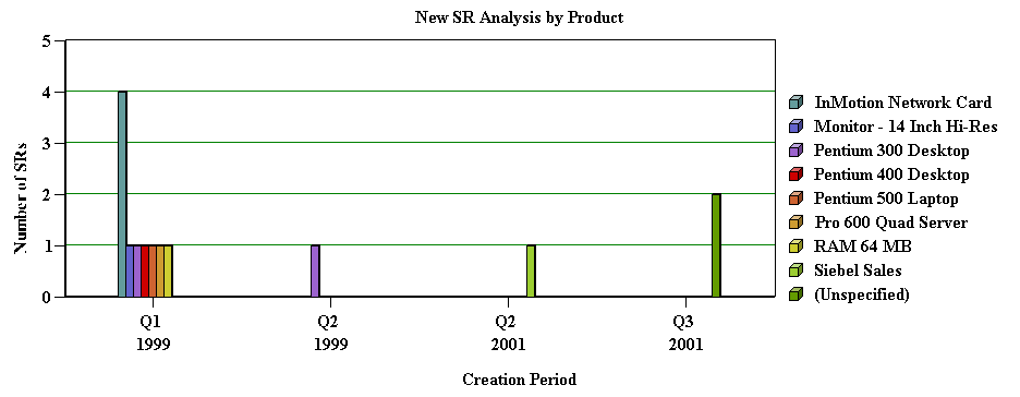
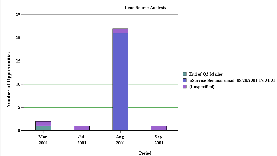
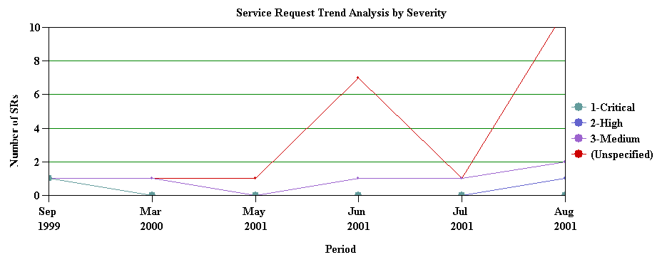
Each quarter along the X-axis includes a stack of bars. Each bar in the stack indicates the revenue reached in a quarter. The stacks in each bar indicate individual projects. Two Dimensional Bar ChartFigure 46 includes a two dimensional bar chart that is functionally equivalent to a three dimensional bar chart except it displays data without the illusion of depth. A two dimensional chart is typically easier to read accurately but might be less visually attractive than the three dimensional chart. If a series axis is present, then the two dimensional bar chart displays bars in a cluster. Two Dimensional Horizontal Bar ChartFigure 47 includes a two dimensional horizontal bar chart that is functionally equivalent to the three dimensional horizontal bar chart except it displays data without the illusion of depth. Two Dimensional Stacked Bar ChartFigure 48 includes a two dimensional stacked bar chart that is functionally equivalent to the three dimensional stacked bar chart except it displays without the illusion of depth. Line ChartsA line chart is a type of chart that displays trends across categories or over time.This topic incudes examples of different line charts. Two Dimensional Line ChartFigure 49 includes a two dimensional line chart that displays one or more lines plotted against an X-Y grid. If a series axis does not exist, then Siebel CRM displays a single line. If a series axis does exist, then Siebel CRM displays one line for each color in the legend. Three Dimensional Line ChartFigure 50 includes a three dimensional line chart that is functionally equivalent to the two dimensional line chart except it displays with the illusion of depth. Two Dimensional Spline Line ChartFigure 51 includes a two dimensional spline line chart that displays one or more lines plotted against the X-Y grid with the points plotted accurately but the line between points smoothed mathematically:
Three Dimensional Spline Line ChartFigure 52 includes a three dimensional spline line chart that is functionally equivalent to the two dimensional spline line chart except the three dimensional spline line chart includes the following differences:
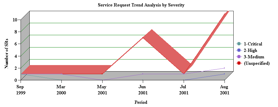
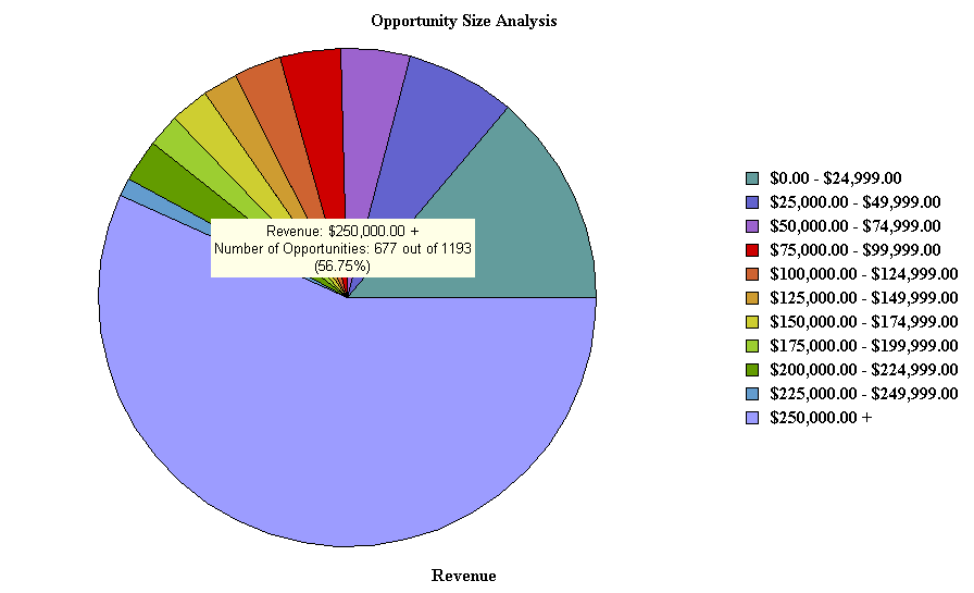
Combo Line ChartFigure 53 includes a Combo line chart that displays a single bar chart with superimposed dots. The two charts share the category axis but each chart includes separate data points axes that Siebel CRM displays in the following ways: Pie ChartsA pie chart is a type of that compares the relative difference across categories. It divides a circle into segments that represents the percentage of the whole for each category. This topic includes examples of pie charts. Three Dimensional Pie ChartFigure 54 includes a three dimensional pie chart that aggregates data in the records according to category and displays each category as a separate segment in the pie:
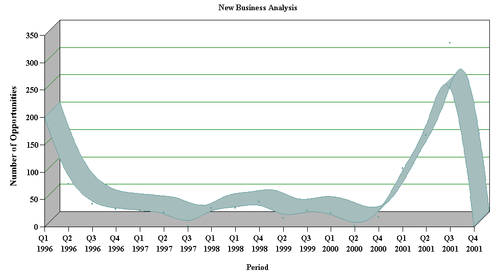
You cannot define a series axis for a pie chart. The three dimensional pie chart gives the illusion of depth for visual attractiveness. Two Dimensional Pie ChartFigure 55 includes a two dimensional pie chart that is functionally the same as the three dimensional pie chart except without the illusion of depth. Scatter ChartsA scatter chart is a type of that displays the distribution of data across two dimensions, which is useful for probability distribution and other uses. The category axis must contain only numeric data, so you cannot convert the two dimensional scatter chart to other chart types, such as the bar chart, line chart, or pie chart. For this reason, the following conditions apply for the two dimensional scatter chart: Figure 56 includes a two dimensional scatter chart. |
 |
|
| Configuring Siebel Business Applications | Copyright © 2013, Oracle and/or its affiliates. All rights reserved. Legal Notices. | |