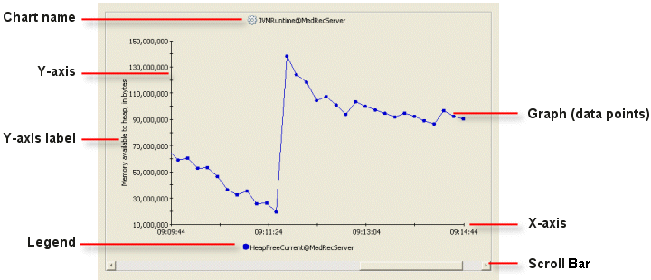
The WLDF Console Extension supports two types of charts and graphs:
Metrics charts contain one or more graphs that real-time and harvested MBean metric information.
Method performance charts contain one or more graphs displaying elapsed time information for a given instrumented method.
Both kinds of charts can display information from one or more running server instances in the domain.
Many of the tasks you perform when working with charts are the same for both types. Some tasks are different for the different types. The following sections describe how to work with both kinds of charts:
Several graph styles are available for presenting data: area, area radar, bar, plot, scatter plot, stacking area, stacking bar, linear gauge, and radial gauge. For instructions on how to set those styles, see Setting a Chart Graphing Style.
Adding Charts to Views
You create and add charts to views by dragging items from the Metricstab or the Requests tab, as described in the following steps.
Select the Views tab and select the view to which you want to add a chart (or create a new view). Figure 6-2 shows an empty view.
Figure 6-2 Empty View
Select the Metrics tab to create a chart based on metrics, or select the Requests tab to create a chart based on events generated by instrumented methods.
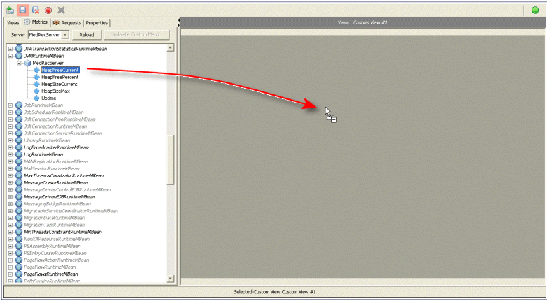
Drag a valid item from the tree to the view. The cursor changes shape, and the background darkens when you drag it into an area where you can insert a chart, as shown in Figure 6-3. For information about what items can be dragged from the Metrics tab, see Working with Metrics Charts and Graphs. For information about what items can be dragged from the Requests tab, see Working with Method Performance Charts and Graphs.
Figure 6-3 Dragging a Metric to Create a New Chart in an Empty View
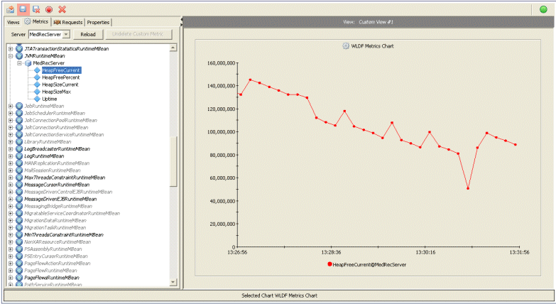
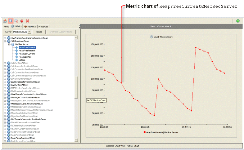
When you release the mouse button, a chart is created that contains a graph based on the item you dragged from the tree in the left panel, as shown in Figure 6-4.
Figure 6-4 A Chart in a View
Here is another way to drag an item into a chart:
Right-click the item in the left panel (the Metrics tab or the Request tab) to display the menu. Then either:
select Create New Chart to create a new chart containing a graph based on the selected item
select Add To Chart, then the name of an existing chart, to add a graph to the named chart.
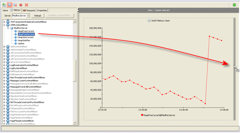
To add another chart to the view, drag another item from the tree to a position above, below, or to the side of an existing chart. Figure 6-5 shows an item dragged to the right of a chart.
Figure 6-5 Dragging a Metric Into an Existing View to Create a Second Chart
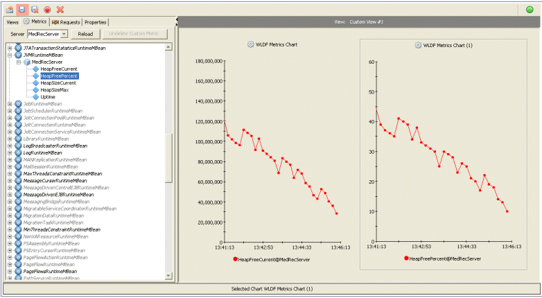
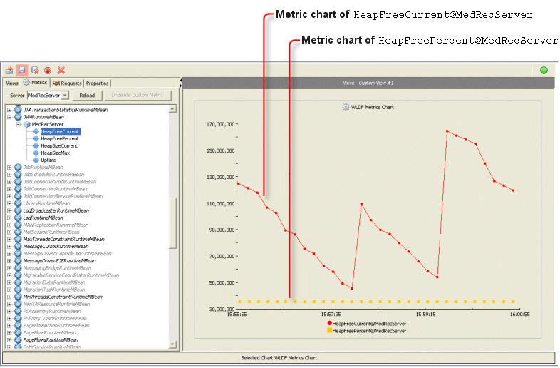
The new chart appears where it was dropped, as shown in Figure 6-6. In this example, the new chart is inserted to the right of the existing chart. All charts in the view are resized to fit together.
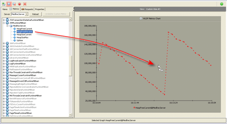
To graph data from more than one data source on the same chart (that is to add a graph to an existing chart), drag the appropriate item from the Metrics tab or the Requests tab to the existing graph in the View panel, as described in the following steps:
Select the Views tab to display the list of views.
Click the view containing the chart to which you want to add another graph (data source). Figure 6-7 shows a chart with one graph.
Figure 6-7 Chart with One Graph
Select the Metrics tab to add a graph based on metrics, or click the Requests tab to add a graph based on instrumentation events.
Note:
All graphs in a chart must be based on the same type of diagnostic data. That is, you cannot add metrics data to a method performance chart or instrumentation data to a metrics chart.
Select the Views tab and select the view containing the chart you want to reposition.
Drag the chart to the new position in the view. That is, click the chart and hold the mouse button down while you drag. You position the chart above, below, to the left, or to the right of an existing chart. When the chart is in an acceptable position, a band of the background is darkened. This behavior is the same as when creating a new chart, as illustrated in Figure 6-5.
When you merge charts, all the graphs and associated legend entries of the source chart are added to the graphs and the legend of the target chart. Properties of the target chart--such as the title, colors, and the Y-axis label--are maintained, and any conflicting properties from the source chart are lost. Once successfully merged, the source chart is deleted.
You can merge one or more charts in the same view or in different views.
When merging charts, be careful about the y-axis scale of the charts you are merging. For example, you don’t want to merge a chart that has a scale in the thousands (or higher) with a chart that has a scale in the single digits (or lower).
To merge one chart with another in the same view:
Select the Views tab and select the view containing the charts you want to merge.
Drag the source chart onto the target chart. That is, click the chart and hold the mouse button down while you drag. When the source chart is positioned correctly over the target chart, the background of the target chart is darkened.
Release the mouse button.
All the graphs and associated legend entries of the source chart are added to the graphs and the legend of the target chart. Properties of the target chart--such as the title, colors, and the Y-axis label--are maintained, and any conflicting properties from the source chart are lost. Once successfully merged, the source chart is deleted.
Moving a Graph to a Different Chart or to a New Chart
You can move a graph to a different chart only if the target chart does not already contain a graph based on the same data source.
To move a graph from one chart to another:
Select the Views tab and select the view containing the graph you want to move. The source chart and the target chart must be in the same view.
Shift-click the graph (or its legend entry) to select it. Release the Shift key and the mouse button, and do not click or select anything else until you perform the instructions in the following step.
Drag the graph from the source chart to the target chart or to an empty area in the view. That is, click the already selected graph and hold the mouse button down while you drag. When the graph is positioned correctly over the target chart (or over the empty area), the background of the target chart (or the empty area) is darkened.
Release the mouse button. The graph and its legend are added to the target chart and removed from the source chart. If you dragged to an empty area, a new chart containing the graph is created.
Table 6-1 shows how to copy, move, and duplicate charts and graphs by dragging and dropping with the mouse, by using context menus with the mouse, and by using the keyboard. For brevity, some common information is not repeated for each item in the table. That information is as follows:
When you move a chart or graph, the original is deleted (that is, it is removed from its original position).
When you copy or duplicate a chart or graph, the original remains unchanged.
When you merge a chart, the original chart is deleted.
Dragand drop means to click an item with the mouse, move it to a new location without releasing the mouse button, then releasing the mouse button to place the item in the new location.
To copy a graph or chart by dragging and dropping, start dragging the item, press the Ctrl key before releasing the mouse button, then drop the item (release the button) in the selected position.
When you right-click on a graph in the View panel, a context menu is displayed. The menu contains commands that are appropriate for the current context. Context menus in the View panel contain several commands for arranging charts and graphs.
To select a chart using the mouse, click the chart in the View panel. To select a graph in a chart, Shift-click the graph, or Shift-click the name of the graph in the chart legend. You can then right-click the selected graph (or graph name) to display a context menu.
To select a chart in the View panel using the keyboard, press Tab or Shift+Tab to cycle through the items, that is, to select one item after the other. See also Keyboard Reference.
When you select Paste chart to new chart from a context menu or press Ctrl+Shift+V from the keyboard, the most recently cut or copied item is inserted at the top of the current view. If the item is a graph, a new chart containing that graph is created.
You can drag and drop a graph or chart to place it in a specific location above, below, or to the left or right of an existing chart. To do this, you drag the item to a border area, which is highlighted when it is selected. You can’t, however, select a border area using context menus or the keyboard. Therefore you cannot use those methods to select a specific location to insert a chart. You can, however, select Paste Chart to a New Chart (or Paste Graph to a New Chart) from a context menu or press Ctrl+Shift+V from the keyboard to insert an item at the top of the current view
While currently in the View (left) pane, here is how to use the keyboard to select a different view:
Press Ctrl+to select the Tabs (right) panel.You will see the message “Focus has been set to left panel” in the status bar.
Press Tab (to tab forward) or Shift-Tab (to tab backward) repeatedly until a tab title is selected.
If the selected tab is not the Views tab, press or repeatedly until the Views tab is selected.
Press Tab to enter the list of Views.
Press or repeatedly until the desired view is selected.
Press Enter.
Press Ctrl+ to select the View panel again.
Table 6-1 Arranging Charts and Graphs
Action
Using Drag and Drop
Using Context Menus
Using the Keyboard
Move a chart to a different position in the same view
Drag the chart to the new position.
Drop the chart.
Right-click the chart.
Select Move Chart, then select a position from the submenus.
Select the chart.
Press Ctrl+X.
Press Ctrl+Shift+V.
Move a chart to a different view
Not available
Right-click the chart.
Select Cut Chart.
Select the target view.
Right-click anywhere in the view.
Select Paste Chart to a New Chart.
Select chart.
Press Ctrl+X.
Select the target view.
Press Ctrl-Shift-V.
Copy a chart to a different view
Not available
Right-click the chart.
Select Copy Chart.
Select the target view.
Right-click in view.
Select Paste Chart to a New Chart.
Select the chart.
Press Ctrl+C.
Select the target view.
Press Ctrl+Shift+V.
Duplicate a chart in the same view
Drag the chart to the new position
Press Ctrl while dragging.
Drop the chart.
Right-click the chart.
Select Copy Chart.
Right-click anywhere in the view.
Select Paste Chart to a New Chart.
Select the chart.
Press Ctrl+C.
Press Ctrl+Shift+V.
Merge a chart with another chart in the same view
Drag the source chart to the target chart.
Drop the chart.
Right-click the source chart.
Select Cut Chart.
Right-click the target chart.
Select Paste Chart.
Select the source chart.
Press Ctrl+X.
Select the target chart.
Press Ctrl+V.
Merge a copy of a chart with another chart in the same view
Drag the source chart to the target chart
Press Ctrl while dragging.
Drop the chart.
Right-click the source chart.
Select Copy Chart.
Right-click the target chart.
Select Paste Chart.
Select the source chart.
Press Ctrl+C.
Select the target chart.
Press Ctrl+V.
Merge a chart with a chart in a different view
Not available
Right-click the source chart.
Select Cut Chart.
Select the other view.
Right-click the target chart.
Select Paste Chart.
Select the source chart.
Press Ctrl+X.
Select the other view.
Select the target chart.
Press Ctrl+V.
Merge a copy of a chart with a chart in a different view
Not available
Right-click the source chart.
Select Copy Chart.
Select another view.
Right-click the target chart.
Select Paste Chart.
Select the source chart.
Press Ctrl+C.
Select the other view.
Select the target chart.
Press Ctrl+V.
Move a graph to a different chart in the same view
Drag the graph to the target chart.
Drop the graph.
Shift-click the graph.
Right-click the selected graph.
Select Cut Graph.
Right-click the target chart.
Select Paste Graph.
Select the source graph.
Press Ctrl+X.
Select the target chart.
Press Ctrl+V.
Copy a graph to another chart in the same view
Drag the graph to the target chart.
Press Ctrl while dragging.
Drop the graph.
Shift-click the graph.
Right-click the selected graph.
Select Copy Graph.
Right-click the target chart.
Select Paste Graph.
Select the source graph.
Press Ctrl+C.
Select the target chart.
Press Ctrl+V.
Move a graph to a chart in a different view
Not available
Shift-click the graph.
Right-click the selected graph.
Select Cut Graph.
Select the other view.
Right-click the target chart.
Select Paste Graph.
Select the source graph.
Press Ctrl+X.
Select the other view.
Select the target chart.
Press Ctrl+V.
Copy a graph to a chart in a different view
Not available
Shift-click the graph.
Right-click the selected graph.
Select Copy Graph.
Select the other view.
Right-click the target chart.
Select Paste Graph.
Select the source graph.
Press Ctrl+C.
Select the target chart.
Press Ctrl+V.
Copy a graph to create a new chart in the same view
Drag the graph to a border in the view.
Press Ctrl while dragging.
Drop the graph.
Shift-click the graph.
Right-click the selected graph.
Select Copy Graph.
Right-click anywhere in the view.
Select Paste Chart to a New Chart.
Select the source graph.
Press Ctrl+C.
Press Ctrl+Shift+V.
Move a graph to create a new chart in the same view
Shift-click the graph.
Drag the selected graph to a border area in the view.
Drop the graph to create a new chart.
Shift-click the graph.
Right-click the selected graph.
Select Cut Graph.
Right-click anywhere in the view.
Select Paste Chart to a New Chart.
Select the source graph.
Press Ctrl+X.
Press Ctrl+Shift+V.
Copy a graph to create a new chart in a different view
Not available
Shift-click the graph.
Right-click the selected graph.
Select Copy graph.
Select the other view.
Right-click anywhere in the view.
Select Paste Chart to a New Chart.
Select the source graph.
Press Ctrl+C.
Select the other view.
Press Ctrl+Shift+V.
Move a graph to create a new chart in a different view
Not available
Shift-click the graph.
Right-click the selected graph.
Select Cut Graph.
Select the other view.
Right-click anywhere in the view.
Select Paste Chart to a New Chart.
Select the source graph.
Press Ctrl+X.
Select the other view.
Press Ctrl+Shift+V.
Starting and Stopping Data Collection for Charts in a View
To start data collection for the charts in a view:
Select the Views tab.
Click the name of the view you want to start. Alternatively, right-click the name of the view and select Start. The view is displayed in the View panel, and data collection begins.
To stop data collection for the charts in a view:
Select the Views tab.
Right-click the name of the view you want to stop and select Stop.
To stop all data collection for all views, click the (Stop All Active Views) button in the toolbar. (It is not necessary to first select the Views tab.)
Scrolling and Zooming the Data Displayed in a Chart
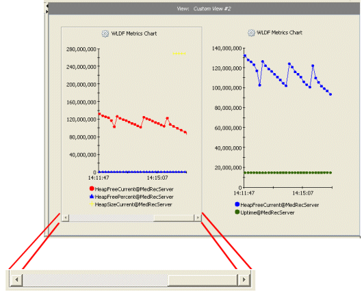
The scroll bar contains controls for scrolling through historical data. The controls are shown in Table 6-2.
Table 6-2 Controls in the Scroll Bar
Control
Name
Use
Thumb
Drag to scroll through historical data.
Left scroll arrow
Click to scroll backwards through historical data.
Right scroll arrow
Click to scroll forwards through historical data.
To display or hide the scroll bar for a chart:
Right-click anywhere in the chart.
From the context menu, select Show Scroll Bar to display the scroll bar or Hide Scroll Bar to hide it.
To zoom in and out of a chart:
Right-click on the chart to display the context menu.
Select Zoom In, Zoom Out or Zoom Reset as appropriate. Selecting a zoom command also causes the scroll bar to appear automatically.
Each time you zoom in, the time frame of the chart becomes shorter. Each time you zoom out, the time frame becomes longer. When you reset the zoom, it resets to the default time frame for the chart.
Scrolling Through Historical Data in a Chart
Under certain circumstances, described below, you can scroll back and forth through a chart’s history, to see both historical and current data for the chart. Historical data is always retrieved from an archive, which means that historical data is only available if you have configured WLDF to gather metrics data (for metrics charts) and/or if you have configured WLDF to gather instrumentation data (for method performance charts). For more information about how this is handled, see Understanding How Data Is Collected and Presented.
To scroll through historical data:
Make sure that WLDF was configured to collect the metrics or instrumentation data you want to monitor.
Select the chart containing the data you want to monitor.
Drag the scroll bar’s thumb control to the interval you want to monitor. As you drag the thumb control, a message is displayed that shows the beginning and end times of the intervals you are scrolling through.
Alternatively, click (left scroll arrow) to scroll backwards or click (right scroll arrow) to scroll forward. Clicking these buttons scrolls the viewport (the span displayed in the chart) by 10% of the viewport width. Clicking directly on the scroll bar (not on the thumb control) scrolls the viewport by 50% of the viewport width.
While you scroll, a message is displayed showing the time intervals you are scrolling through. When you stop scrolling, the data is retrieved for the selected interval. To display the dates and times for the visible interval, position the mouse pointer anywhere on the scroll bar.
If no archived data is available for a metrics graph, only the data available in the cache of actively polled metrics can be displayed. If you scroll to a point earlier than the data available in the cache, no data is displayed for that graph.
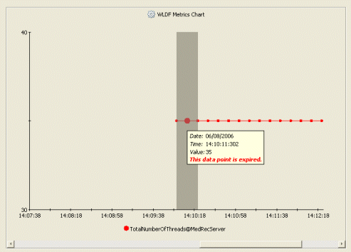
It can happen that you scroll back to view historical data that is not backed by the WLDF archive, and then that data expires from the cache while it is still displayed in the chart. If that happens, you will not be able to view that historical data again once you scroll away from it. To alert you that the data points have expired, the chart behind those data points is darkened, and tooltips for the chart and for the expired data points display messages to report that the data has expired. For example, see Table 6-11.
Figure 6-11 Expired Data Points
To display current data after scrolling:
Select the chart.
Do one of the following:
Move the thumb control all the way to the right on the scroll bar, or
Right-click the chart, then select View Current Data from the context menu.
Zooming In and Out of Data in a Chart
You can zoom into the data shown in a chart to expand the view of data points for a shorter time span, and you can zoom out to show details about a longer time span.
Zoom in and out as follows:
To zoom in on the X-axis, right-click anywhere in the chart and select Zoom In (or press Alt-z). You zoom in to a percentage displayed time interval. Set the percentage in the Global Properties tab.
To zoom out of the X-axis, right-click anywhere in the chart and select Zoom Out (or press Alt-o).
To zoom in on the X-axis by a custom interval, Shift-drag over an area of the chart. That is, press and hold the Shift key, then drag the mouse pointer over the area of the chart you want to display. (You must release the mouse button before you release the Shift key.)
To reset the interval to its state before it was zoomed, right-click the chart and select Zoom Reset from the context menu (or press Alt-R). Resetting the zoom state resets the interval back to the default interval of five minutes, starting at the start time which was in effect before zooming.
Deleting a Graph from a Chart
To delete a graph from a chart:
Select the Views tab and select the view containing the chart containing the graph you want to delete.
Select the graph in either of the following ways:
Shift-click anywhere on the graph.
Shift-click on the legend entry for the graph.
Click the (Delete) button in the toolbar, or press the Delete key.
Note:
If you discard changes to the view containing the deleted graph, you can recover it. However, you cannot selectively discard changes, so you will lose any other changes you made, too. Once you save changes to the view, the deleted graph is permanently deleted and cannot be recovered.
Deleting a Chart
To delete a chart:
Select the Views tab and select the view containing the chart you want to delete.
Click the chart. A border appears around the chart to show it has been selected.
Click the (Delete) button in the toolbar, or press the Delete key.
Note:
If you discard changes to the view containing the deleted chart, you can recover it. However, you cannot selectively discard changes, so you will lose any other changes you made, too. Once you save changes to the view, the deleted chart is permanently deleted and cannot be recovered.
Setting Chart Properties
When you create a chart, it is created with default visual and control properties. To change those properties for a chart:
Select the Views tab and select the view containing the chart whose properties you want to change.
In the View panel,click anywhere in the chart to select it.
Select the Properties > Selected Item Properties tab to display controls for changing properties.
Make changes by setting the properties in the Properties > Selected Item Properties tab, as described in the following sections:
Click the Apply Changes button to apply your changes to the selected chart.
Note:
You can change some properties directly in the View panel. For example, you can right-click a chart name or view name to display an edit field and then type a new name in the field. In that case, you do not have to click Apply Changes. Just click outside the text box to see your changes.
Alternatively, click Discard Changes to restore the settings that were in effect when you started changing them, or click Reset Defaults to restore the WLDF Console Extension default settings for charts.
Note:
Applying a change to a property does not save it for future use. See step 6.
If this is a chart in a custom view, you can save the changes so they will be restored the next time you open the WLDF Console Extension. (You cannot save changes to a chart in a built-in view.) To save a custom chart, you must save the view, as follows:
Select the Views tab.
Click the Save button.
Alternatively, on the toolbar, click the (Save All Modified Views) button.
Note:
You cannot save changes to the properties of a chart in a built-in view.
Changing a Chart Name
You can change the name of charts in built-in and custom views. But you can save the name only for charts in custom views. To change the name of a chart:
Select the chart and select the Properties > Selected Item Properties tab, as explained in steps 1-3 in Setting Chart Properties.
No Y-Axis label is assigned by default for a chart, but you can create one, as follows:
Select the chart and select the Properties > Selected Item Properties tab, as explained in steps 1-3 in Setting Chart Properties.
Select the General subtab.
In the Y-Axis field, enter text to be used as the Y-Axis label.
Apply and save the changes, discard them, or reset to the defaults, as explained in steps 5 and 6 of Setting Chart Properties.
Setting a Chart Graphing Style
By default, graphs are created using the “plot” style (dots connected by lines). However, you can change the style, as follows:
Select the chart and select the Properties > Selected Item Properties tab, as explained in steps 1-3 in Setting Chart Properties.
Select the General subtab.
Select a style from the Style drop down list to change the visual style of each graph on the selected chart. Radial and linear styles are not available if a chart contains more than one graph. Styles include:
Table 6-3 Graph Styles
Style
Example
Description
Area
Solid area under a line
Area radar
Circular area, with new data sweeping clockwise, as with a radar
Bar
Bars alternating for each graph
Plot
Sequential dots connected by lines
Scatter plot
Dots only
Stacking area
Areas for each graph, stacked on top of each other
Stacking bar
Bars for each graph, one stacked on top of the other
Linear Gauge
Shows current value only of a single graph displayed horizontally or vertically. (When displayed vertically, this graph appears like a “thermometer” gauge.)
Radial Gauge
Shows current value only of a single graph displayed as a radial gauge. (This graph appears like a “speedometer” gauge.)
Apply and save the changes, discard them, or reset to the defaults, as explained in steps 5 and 6 of Setting Chart Properties.
Resetting Auto-Scaling in Linear and Radial Gauges
Before the first metric value is received and displayed in an empty gauge, the gauge is in “auto-scale” mode. This means that the minimum and maximum values for the scale are not yet set and will be determined based on the value of the first metric. When that first value is received, the scale’s maximum value is set to 150% of the value and the scale’s minimum value is set to -150% of the value, thus placing the current value in the middle of the scale. If a metric reports a value higher or lower than those thresholds, the needle points to the maximum or minimum value. That is, the scale is not automatically rescaled.
To return a gauge to auto-scale mode, do one of the following:
Select Gauge Auto-scale from the gauge’s context menu.
Press Alt-A.
When the first value is received by the chart, the scale will be set to 150% maximum and 150% minimum, as described above, and will remain that way until you reset auto-scale again.
Changing the Scale of a Linear or Radial Gauge
For charts that contain a single radial gauge or linear gauge, you can change the upper and lower values for the gauge.
To set the upper and lower values:
Select the chart and select the Properties > Selected Item Properties tab, as explained in steps 1-3 in Setting Chart Properties.
Select the General subtab.
Enter the following:
In the Scale Min field, enter the minimum number to appear on the gauge scale.
In the Scale Max field, enter the maximum number to appear on the gauge scale.
Apply and save the changes, discard them, or reset to the defaults, as explained in steps 5 and 6 of Setting Chart Properties.
Displaying Thresholds in Linear and Radial Gauges
You can indicate a threshold value on a gauge to call attention to any value that is outside the normal value range for the metric. When the threshold is exceeded, the area below the needle in the gauge is displayed in the “highlight” color specified for the gauge. (See Changing Chart Foreground and Background Colors.)
To set an upper threshold:
Select the chart and select the Properties > Selected Item Properties tab, as explained in steps 1-3 in Setting Chart Properties.
Select the General subtab.
Enter a number for the maximum threshold value in the Threshold box.
Click Apply Changes.
Note:
You can only explicitly set an upper threshold, as explained above. However, you can create the effect of reporting on a metric value that falls below a lower threshold by switching the background and highlight colors for the gauge.
Turning a Chart Legend On and Off
A chart’s legend identifies each graph on the chart. Each line in the legend shows the color and graphic used to plot the data points and identifies the data source for the graph.
Select the chart and select the Properties > Selected Item Properties tab, as explained in steps 1-3 in Setting Chart Properties.
Select the General subtab.
Check the Legend checkbox to display the legend, or uncheck it to hide the legend.
Apply and save the changes, discard them, or reset to the defaults, as explained in steps 5 and 6 of Setting Chart Properties.
Alternatively:
Display the view containing the chart.
Right-click anywhere in the chart.
From the context menu, select Hide Legend to turn the legend off, or select Show Legend to turn the legend back on. (You can also press Alt-L to toggle the legend on and off.)
Turning a Chart Scroll Bar On and Off
You can use the scroll bar to scroll back through historical data and use the right-click menu zoom controls to zoom in and out of data, as explained in Scrolling and Zooming the Data Displayed in a Chart. The scroll bar is hidden by default. You can, however, display it and hide it again, as follows:
Select the chart and select the Properties > Selected Item Properties tab, as explained in step 1-3 in Setting Chart Properties.
Select the General subtab.
Check the Scroll Bar checkbox to display the scroll bar, or uncheck it to hide the scroll bar.
Apply and save the changes, discard them, or reset to the defaults, as explained in steps 5 and 6 of Setting Chart Properties.
Alternatively:
Display the view containing the chart.
Right-click anywhere in the chart.
From the context menu, select Hide Scroll Bar to turn the scroll bar off, or select Show Scroll Bar to turn the scroll bar back on. (You can also press Alt-S to toggle the scroll bar on and off.)
Changing Chart Foreground and Background Colors
The foreground color for a chart includes the color of the text used for the legend and the color of the X- and Y-axis lines and values. The background color is the color used for the background of the entire chart.
Select the chart and select the Properties > Selected Item Properties tab, as explained in steps 1-3 in Setting Chart Properties.
Click the Colors > Foreground subtab to change the foreground colors, or click the Colors > Background subtab to change the background colors.
Note:
If you set the background color to black or a very dark color, you won’t be able to see the chart name.
Select your preferred color chooser, by clicking one of the subtabs: Swatches, HSB, or RGB.
Apply and save the changes, discard them, or reset to the defaults, as explained in steps 5 and 6 of Setting Chart Properties.
Changing a Graph Sample Interval
The sample interval for a chart is the frequency (in seconds) at which samples are gathered for it.
This setting is not available for linear gauges or radial gauges. Those gauges are updated every ten seconds.
Select the graph and select the Properties > Selected Item Properties tab, as explained in steps 1-3 in Setting Individual Graph Properties.
Select the General subtab.
Slide the Sample Interval slider to select the number of seconds for the sample interval, or enter the number directly in the seconds field.
Apply and save the changes, discard them, or reset to the defaults, as explained in steps 5 and 6 of Setting Chart Properties.
Setting Individual Graph Properties
When you create a graph in a chart, it is created with default visual and control properties. To change those properties:
Select the Views tab and select the view containing the chart with the graph whose properties you want to change.
In the View panel, select the graph in either of the following ways:
Shift-click anywhere on the graph.
Shift-click on the legend entry for the graph. Graph legend entries are listed below the chart.
Select the Properties > Selected Item Properties tab to display controls for changing graph properties.
Make changes by setting the properties in the Properties > Selected Item Properties tab, as described in the following sections:
Click the Apply Changes button to apply your changes to the selected chart.
Alternatively, click Discard Changes to restore the settings that were in effect when you started changing them, or click Reset Defaults to restore the WLDF Console Extension default settings for charts.
Note:
Applying a change to a property doesn’t save it for future use. See step 6.
If this graph is in a chart in a custom view, you can save the changes so they will be restored the next time you open the WLDF Console Extension. (You cannot save changes to a chart in a built-in view.) To save a custom chart, you must save the view, as follows:
Select the Views tab.
Click the Save button.
Alternatively, on the toolbar, click the (Save All Modified Views) button.
Note:
You cannot save changes to the properties of a chart in a built-in view.
Changing a Graph Name
When you drag an item onto a chart to create a graph of the item’s data points, a name is assigned by default. This name appears in the legend for the chart containing the graph. You can change the name, as follows:
Select the graph and select the Properties > Selected Item Properties tab, as explained in steps 1-3 in Setting Individual Graph Properties.
Adjusting the scaling factor for a graph adjusts the units used for the Y-Axis. For example, if a Y-Axis unit of 60,000 is scaled to 1, and you change the scaling factor to 10, the units are changed to 600,000.
Changing the scaling factor of a graph is useful when a chart contains more than one graph, and you want to adjust the different graphs to be able to see them in relation to each other. For example, if you have one graph whose points fall within the 40,000-60,000 range, and a second graph in the same chart whose points fall within the 300,000-700,000 range, you could set the scaling factor of the first graph to 10, causing its points to display in the 400,000-600,000 range. Alternatively, you could set the scaling factor of the second graph to 0.1 to cause its points to display in the 30,000-70,000 range.
To set the scaling factor of a graph:
Select the graph and select the Properties > Selected Item Properties tab, as explained in steps 1-3 in Setting Individual Graph Properties.
Select the General subtab.
From the Scale drop-down list, select the scale factor for the graph.
The foreground color for a graph includes the color of the line and symbols used to plot data in the graph, where appropriate. The background color is the fill color for the graph, where appropriate for the selected graph style. These colors are assigned by default, but you can change them, as follows:
Select the graph and select the Properties > Selected Item Properties tab, as explained in steps 1-3 in Setting Individual Graph Properties.
Click the Colors > Lines subtab to change the border line color (line and point color for plot charts or scatter charts), or click the Colors > Fill subtab to change the fill color (does not apply to plot charts or scatter plot charts).
Select your preferred color chooser by clicking one of the subtabs (Swatches, HSB, or RGB), and select the color.
Global properties apply to all active views. To set global properties, click the Properties tab, then click the Global Properties subtab. You can set the following properties:
Polled Data Set Size. The number of dynamically gathered samples retained in the data cache on the server for each monitored metric. For information about the data caches, see Understanding How Data Is Collected and Presented.
Autoscroll Speed. If a view contains several charts, you may have to scroll the window to see all the charts. If you drag an item from the Tabs panel towards an edge of such a view, the window scrolls so you can add the item to the hidden part of the view. The Autoscroll Speed setting sets the speed of the scrolling, in centimeters per second.
Autoscroll Insets. The width of the region (in centimeters) surrounding a panel that is used to trigger automatic scrolling.
Default Viewport Size. The default size of the chart viewport in minutes. You can change the viewport size by zooming in or out.
Zoom Percentage. The percentage by which the chart viewport size is changed during a zoom in (Alt-z) or a zoom out (Alt-o) operation.
Default Chart Style. The style of chart created by default when you create a new chart. See Setting a Chart Graphing Style.


 (Stop All Active Views) button in the toolbar. (It is not necessary to first select the Views tab.)
 to the interval you want to monitor. As you drag the thumb control, a message is displayed that shows the beginning and end times of the intervals you are scrolling through.
 (left scroll arrow) to scroll backwards or click
  (right scroll arrow) to scroll forward. Clicking these buttons scrolls the viewport (the span displayed in the chart) by 10% of the viewport width. Clicking directly on the scroll bar (not on the thumb control) scrolls the viewport by 50% of the viewport width.
 (Delete) button in the toolbar, or press the Delete key.

 (Save All Modified Views) button.


