Screen Shot(s)
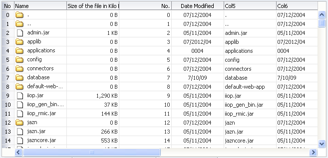
Table component.
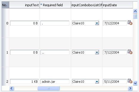
Table component with editingMode attribute set to "editAll".
| Oracle Fusion Middleware Tag Reference for Oracle ADF Faces 11g Release 2 (11.1.2.0.0) E17491-01 |
UIComponent class: oracle.adf.view.rich.component.rich.data.RichTable
Component type: oracle.adf.RichTable
Naming container: Yes. When referring to children of this component ("partialTriggers", findComponent(), etc.), you must prefix the child's ID with this component's ID and a colon (':')
Table is used to display tabular data. It also supports row/column selection (both single and multiple), sorting, record navigation. Table is not meant for use as a layout component of disparate information. For more information about this, see the Accessibility Guidelines section.
Detail Stamp can be selectively displayed for rows in the table by EL binding the "rendered" attribute of the "detailStamp" facet to "true" or "false". The EL binding can contain references to the table "var" attribute since during rendering it will be executed in the context of the row. Disclosure icon is displayed only for rows which have rendered="true".
Components that themselves support stamping are not supported within this facet of the table, such as table, treeTable, tree, region or carousel.
Banding is a technique where groups of rows (or columns) are displayed with alternating background colors. This helps to differentiate between adjacent groups of rows (or columns).
The "rowBandingInterval" attribute on the Table controls how many consecutive rows form a row group (for the purposes of banding). If this is "0" all rows will have the same background color. If this is a positive number then adjacent row groups will have different background colors.
The "columnBandingInterval" attribute on the Table controls how many columns form a column group (for the purposes of banding). If this is "0" all columns will have the same background color. If this is a positive number then adjacent column groups will have different background colors.
"width" attribute value should not be "auto".
The "rows" attribute is not currently supported for the rich render kit. Use inlineStyle to set the height of a table.
Note that when a collection is displayed in emailable or printable mode, only the collection rows currently present on the client will be included as part of the emailable or printable content. If you are looking for a way to provide all table rows, your best strategy is to provide an export data option for the collection (using an exportCollectionActionListener). However, an alternative to an export option would be to dynamically adjust the rows and fetchSize properties to a upper limit in printable mode. This would of course be subject to some good judgment. If the table contained one thousand rows, you would want to place a upper limit of maybe one hundred rows in print mode.
<af:table value="#{bindings.EmployeesView1.collectionModel}" var="row"
  emptyText="#{bindings.EmployeesView1.viewable ? 'No data to display.' : 'Access Denied.'}"
  rows="#{adfFacesContext.outputMode ne 'printable' ?  bindings.EmployeesView1.rangeSize : 100}"
  fetchSize="#{adfFacesContext.outputMode ne 'printable' ?  bindings.EmployeesView1.rangeSize : 100}"
  rowBandingInterval="0" ...
<af:table value="#{myManagedBean.allEmployees}"
          rowBandingInterval="1" var="emp"
          id="t1">
  <af:column id="c1">
    <f:facet name="header">
      <af:outputText value="Name" id="ot1"/>
    </f:facet>
    <af:outputText value="#{emp.ename}" id="ot2"/>
  </af:column>
  <af:column id="c2">
    <f:facet name="header">
      <af:outputText value="Department Number" id="ot3"/>
    </f:facet>
    <af:outputText value="#{emp.deptno}" id="ot4"/>
  </af:column>
</af:table>
| Type | Phases | Description |
|---|---|---|
| oracle.adf.view.rich.event.ColumnSelectionEvent | Invoke Application | The ColumnSelectionEvent is delivered when a column selection change occurs in Table or TreeTable. |
| oracle.adf.view.rich.event.QueryEvent | Invoke Application | The Query event is delivered when a query action is triggered. |
| org.apache.myfaces.trinidad.event.RowDisclosureEvent | Apply Request Values, Invoke Application |
The expansion event is generated for a table when the detail facet of a row is expanded or collapsed. For tree or a treeTable, the expansion event is generated when tree nodes are expanded or collapsed. |
| org.apache.myfaces.trinidad.event.SelectionEvent | Apply Request Values, Invoke Application |
The selection event is delivered when the table selection changes. |
| org.apache.myfaces.trinidad.event.RangeChangeEvent | Apply Request Values, Invoke Application |
The range change event is delivered when the user navigates. |
| org.apache.myfaces.trinidad.event.SortEvent | Apply Request Values, Invoke Application |
The sort event is delivered when the table column sort criteria is changed. |
| org.apache.myfaces.trinidad.event.AttributeChangeEvent | Invoke Application, Apply Request Values |
Event delivered to describe an attribute change. Attribute change events are not delivered for any programmatic change to a property. They are only delivered when a renderer changes a property without the application's specific request. An example of an attribute change event might include the width of a column that supported client-side resizing. |
| Name | Description |
|---|---|
| bodyContextMenu | popup component containing the context menu that will be shown on right click within the table body, but outside of any table row. The af:popup must contain an af:menu to display the context menu. Note that the bodyContextMenu facet does not currently support a popup with the childCreation attribute set to deferred. |
| contextMenu | popup component containing the context menu that will be shown on right click of any table row. The af:popup must contain an af:menu to display the context menu. Note that the contextMenu facet does not currently support a popup with the childCreation attribute set to deferred. |
| detailStamp | the component to stamp below every row which is disclosed. Adding a detail facet will automatically cause the detail column to be displayed. |
| footer | the component used to render the table footer. This facet existed in 10.1.3, but is currently not supported in RichTable and RichTreeTable |
| header | the component used to render the table header. This facet existed in 10.1.3, but is currently not supported in RichTable and RichTreeTable |
| Name | Type | Supports EL? | Description |
|---|---|---|---|
| activeRowKey | Object | Yes | this is the row that is currently active on the client. In click-to-edit mode, the active row will be made editable and is brought into view (if not already visible). Upon initial display, the click-to-edit component defaults the active row to the first visible row. |
| allDetailsEnabled | boolean | Yes | Default Value: false whether or not to enable the show/hide all links above the table, which allow the user to show/hide all the detail rows. To enable the detail rows, a "detailStamp" facet must be set on this Table. This attribute existed in 10.1.3, but is currently not supported in RichTable Not supported on the following renderkits: oracle.adf.rich |
| attributeChangeListener | javax.el.MethodExpression | Only EL | a method reference to an attribute change listener. Attribute change events are not delivered for any programmatic change to a property. They are only delivered when a renderer changes a property without the application's specific request. An example of an attribute change events might include the width of a column that supported client-side resizing. |
| autoHeightRows | int | Yes | Default Value: -1 The number of rows used to size the component height. The default value is -1 (no auto-sizing for any number of rows).
Not supported on the following renderkits: org.apache.myfaces.trinidad.core |
| binding | oracle.adf.view.rich.component.rich.data.RichTable | Only EL | an EL reference that will store the component instance on a bean. This can be used to give programmatic access to a component from a backing bean, or to move creation of the component to a backing bean. |
| bodyContextMenuId | String | Yes | A search expression to identify the popup component containing the context menu that will be shown within the table body, for clicks outside of any table row. Expressions are relative to this table component and must account for NamingContainers (for example, table and panelCollection are NamingContainer components). You can prepend a single colon to start the search from the root, or multiple colons to move up through the NamingContainers. For example, a leading "::" will pop out of one NamingContainer (including the component itself if it is a naming container, like table) and begin search from there, ":::" will pop out of two NamingContainers and begin search from there, etc. Not supported on the following renderkits: org.apache.myfaces.trinidad.core |
| clientComponent | boolean | Yes | Default Value: false whether a client-side component will be generated. A component may be generated whether or not this flag is set, but if client Javascript requires the component object, this must be set to true to guarantee the component's presence. Client component objects that are generated today by default may not be present in the future; setting this flag is the only way to guarantee a component's presence, and clients cannot rely on implicit behavior. However, there is a performance cost to setting this flag, so clients should avoid turning on client components unless absolutely necessary. |
| columnBandingInterval | int | Yes | Default Value: 0 the interval between which the column banding occurs. This value controls the display of the column banding in the table. For e.g, columnBandingInterval=1 would display alternately banded columns in the Grid. |
| columnResizing | String | Yes | Valid Values: enabled, disabled Default Value: enabled Setting this value to "disabled" will turn off user column resizing. The default is "enabled". Not supported on the following renderkits: org.apache.myfaces.trinidad.core |
| columnSelection | String | Yes | Valid Values: none, single, multiple Default Value: none whether columns in this table are selectable. Not supported on the following renderkits: org.apache.myfaces.trinidad.core |
| columnSelectionListener | javax.el.MethodExpression | Only EL | a method reference to a ColumnSelectionListener |
| columnStretching | String | Yes | Default Value: none Indicates what kind of stretching you want applied to the columns. For optimal performance, use the "none" (default) option. If you want the last column to stretch to fill up any unused space inside of the viewport, use the "last" option. If you want to have an empty blank column be automatically inserted and have it stretch (so the row background colors will span the entire width of the table), use the "blank" option. If you want to have a specific leaf (non-group) column stretch to fill up any unused space inside of the viewport, use the option where you specify "column:" followed by the ID of the column that you want to have stretched, e.g. "column:myColId". If you want more than one column stretched, use the "multiple" option. When the "multiple" option is used you can set the widths in the columns (non-group) to be percentages. See the column documentation for how percentages are handled. Note that row headers and frozen columns will not be stretched because doing so could easily leave the user unable to access the scrollable data body of the table. Not supported on the following renderkits: org.apache.myfaces.trinidad.core |
| contentDelivery | String | Yes | Valid Values: immediate, lazy, whenAvailable Default Value: whenAvailable whether data should be fetched when the component is rendered initially. When contentDelivery is "immediate", data is fetched and inlined into the component chrome. If contentDelivery is "lazy", data will be fetched and delivered to the client during a subsequent request. If contentDelivery is set to "whenAvailable", upon initial rendering, the renderer queries the model for available data. Data is fetched and rendered immediately if model indicates that data is available. So contentDelivery="whenAvailable" behaves like "immediate" if data is available upon initial rendering. |
| contextMenuId | String | Yes | A search expression to identify the popup component containing the context menu that will be shown on right click of any table row. Expressions are relative to this table component and must account for NamingContainers (for example, table and panelCollection are NamingContainer components). You can prepend a single colon to start the search from the root, or multiple colons to move up through the NamingContainers. For example, a leading "::" will pop out of one NamingContainer (including the component itself if it is a naming container, like table) and begin search from there, ":::" will pop out of two NamingContainers and begin search from there, etc. Not supported on the following renderkits: org.apache.myfaces.trinidad.core |
| contextMenuSelect | boolean | Yes | Default Value: true Indicates if we should actually select the row clicked when right clicking to show a context menu. By default the row is selected before the context menu is displayed. However if contextMenuSelect="false", and if user right clicks a row, the new row is highlighted and the highlighting for the currently selected row(s) is cleared when the context menus is displayed. The highlighting of the currently selected row(s) is restored after the context menu is dismissed. It should be noted that when the context menu is displayed, the attribute selectedRowKeys still contains the selected row(s). The highlighted row key is established as a currency in the table when the action for context menu item is executed. The currency in the table can be retrieved by calling "table.getRowKey()". |
| customizationId | String | Yes | This attribute is deprecated. The 'id' attribute should be used when applying persistent customizations. This attribute will be removed in the next release. |
| disableColumnReordering | boolean | Yes | Default Value: false whether column reordering is disabled in the table. Column reordering is on by default. Not supported on the following renderkits: org.apache.myfaces.trinidad.core |
| disclosedRowKeys | org.apache.myfaces.trinidad.model.RowKeySet | Yes | the set of disclosed rows for this component. Each entry in the set is a rowKey. |
| displayRow | String | Yes | Valid Values: first, last, selected Default Value: first the row to display in the table during intial display. The possible values are "first" to display the first row, "last" to display the last row and "selected" to display the first selected row in the table. The default value for this is null which means that the first row is displayed. Please note that this API will have no effect if the total number of rows are not known from the table model (model.getRowCount()==-1). |
| displayRowKey | Object | Yes | the rowkey to display in the table during intial display. Specifying this attribute will override the displayRow attribute. Please note that this API will have no effect if the total number of rows are not known from the table model (model.getRowCount()==-1). |
| dontPersist | String[] | Yes | a list of attributes whose changes are NOT to be persisted by FilteredPersistenceChangeManager via the "Persistent Change Manager" registered in adf-config.xml. The token 'ALL' can be used in the list here to indicate that all attribute changes that the component implicitly persists should be excluded. If there is a conflict of values, "dontPersist" always precedes "persist". |
| editingMode | String | Yes | Valid Values: editAll, clickToEdit Default Value: editAll Indicates the mode used to edit the table when it contains editable components. When a table is rendered as readOnly, the editingMode attribute is ignored. The possible values are "clickToEdit" and "editAll". In "editAll" mode all the editable components are displayed at a time in the table view area. In "clickToEdit" mode a single row is editable at a time. The following is the behavior:
|
| emptyText | String | Yes | Default Value: No data to display. the text of an empty table. If the text is enclosed in an open and closing html tag, it will be formatted. The formatting behavior is similar to outputFormatted component. If it is not enclosed in an open and closing html tag, it will not be formatted. |
| fetchSize | int | Yes | Default Value: 25 the number of rows in the data fetch block Not supported on the following renderkits: org.apache.myfaces.trinidad.core |
| filterModel | Object | Yes | the model used for filtering of data in the table. This attribute must be bound to an instance of FilterableQueryDescriptor class. |
| filterVisible | boolean | Yes | Default Value: false whether the filter fields are displayed on the top of the table. |
| first | int | Yes | Default Value: 0 the first property is used internally in the rich client and should not be set externally Not supported on the following renderkits: oracle.adf.rich |
| horizontalGridVisible | boolean | Yes | Default Value: true whether the Horizontal GridLines are to be drawn. |
| id | String | No | the identifier for the component. The identifier must follow a subset of the syntax allowed in HTML:
|
| immediate | boolean | Yes | Default Value: false whether or not data validation - client-side or server-side - should take place when events are generated by this component. When immediate is true, the default ActionListener provided by the JavaServer Faces implementation should be executed during Apply Request Values phase of the request processing lifecycle, rather than waiting until the Invoke Application phase. |
| inlineStyle | String | Yes | the CSS styles to use for this component. This is intended for basic style changes. The inlineStyle is a set of CSS styles that are applied to the root DOM element of the component. Be aware that because of browser CSS precedence rules, CSS rendered on a DOM element takes precedence over external stylesheets like the skin file. Therefore skins will not be able to override what you set on this attribute. If the inlineStyle's CSS properties do not affect the DOM element you want affected, then you will have to create a skin and use the skinning keys which are meant to target particular DOM elements, like ::label or ::icon-style. |
| partialTriggers | String[] | Yes | the IDs of the components that should trigger a partial update. This component will listen on the trigger components. If one of the trigger components receives an event that will cause it to update in some way, this component will request to be updated too. Identifiers are relative to the source component (this component), and must account for NamingContainers. If your component is already inside of a naming container, you can use a single colon to start the search from the root of the page, or multiple colons to move up through the NamingContainers - "::" will pop out of the component's naming container (or itself if the component is a naming container) and begin the search from there, ":::" will pop out of two naming containers (including itself if the component is a naming container) and begin the search from there, etc. |
| persist | String[] | Yes | a list of attributes whose changes are to be persisted by FilteredPersistenceChangeManager via the "Persistent Change Manager" registered in adf-config.xml. The token 'ALL' can be used in the list here to indicate that all attribute changes that the component implicitly persists should be included. |
| queryListener | javax.el.MethodExpression | Only EL | a method reference to a Querylistener. The queryListener is called when the user preforms a query on the table using the query filter feature (see the filterModel and filterVisible attributes for how to enable the query filter feature) |
| rangeChangeListener | javax.el.MethodExpression | Only EL | a method reference to a rangeChange listener that will be called when a new range is selected. |
| rendered | boolean | Yes | Default Value: true whether the component is rendered. When set to false, no output will be delivered for this component (the component will not in any way be rendered, and cannot be made visible on the client). If you want to change a component's rendered attribute from false to true using PPR, set the partialTrigger attribute of its parent component so the parent refreshes and in turn will render this component. |
| rowBandingInterval | int | Yes | Default Value: 1 the interval between which the row banding occurs. This value controls the display of the row banding in the table. For e.g, rowBandingInterval=1 would display alternately banded rows in the Grid. |
| rowDisclosureListener | javax.el.MethodExpression | Only EL | a method reference to an ExpansionListener |
| rowSelection | String | Yes | Valid Values: none, single, multiple, multipleNoSelectAll Default Value: none whether rows in this table are selectable. If row selection is allowed, you need to make sure at least one column is set as a row header with rowHeader=true. Use the value "single" to enable single selection, "multiple" to enable multiple selection and "multipleNoSelectAll" to enable multiple selection but disable the user from doing select all. |
| rows | int | Yes | Default Value: 25 the rows property is used internally in the rich client and should not be set externally Not supported on the following renderkits: oracle.adf.rich |
| selectedRowKeys | org.apache.myfaces.trinidad.model.RowKeySet | Yes | the selection state for this component. |
| selectionListener | javax.el.MethodExpression | Only EL | a method reference to a selection listener |
| shortDesc | String | Yes | the short description of the component. This text is commonly used by user agents to display tooltip help text, in which case the behavior for the tooltip is controlled by the user agent, e.g. Firefox 2 truncates long tooltips. For form components, the shortDesc is displayed in a note window. For components that support the helpTopicId attribute it is recommended that helpTopicId is used as it is more flexible and is more accessibility-compliant. |
| sortListener | javax.el.MethodExpression | Only EL | a method reference to a sort listener |
| styleClass | String | Yes | a CSS style class to use for this component. The style class can be defined in your jspx page or in a skinning CSS file, for example, or you can use one of our public style classes, like 'AFInstructionText'. |
| summary | String | Yes | the summary of this table's purpose and structure for user agents rendering to non-visual media. |
| unsecure | java.util.Set | Yes | A whitespace separated list of attributes whose values ordinarily can be set only on the server, but need to be settable on the client. Currently, this is supported only for the "disabled" attribute. Note that when you are able to set a property on the client, you will be allowed to by using the the .setProperty('attribute', newValue) method, but not the .setXXXAttribute(newValue) method. For example, if you have unsecure="disabled", then on the client you can use the method .setProperty('disabled', false), while the method .setDisabled(false) will not work and will provide a javascript error that setDisabled is not a function. |
| value | Object | Yes | the data model being used by this component. The specific model class is org.apache.myfaces.trinidad.model.CollectionModel. You may also use other model instances, e.g., java.util.List , array, and javax.faces.model.DataModel. This component will automatically convert the instance into a CollectionModel. |
| var | String | No | Name of the EL variable used to reference each element of this collection. Once this component has completed rendering, this variable is removed (or reverted back to its previous value). |
| varStatus | String | No | Name of the EL variable used to reference the varStatus information. Once this component has completed rendering, this variable is removed (or reverted back to its previous value). The VarStatus provides contextual information about the state of the component to EL expressions. For components that iterate, varStatus also provides loop counter information. Please see the this component's documentation for the specific properties on the varStatus. The common properties on varStatus include:
|
| verticalGridVisible | boolean | Yes | Default Value: true whether the vertical GridLines are to be drawn. |
| visible | boolean | Yes | Default Value: true the visibility of the component. If it is "false", the component will be hidden on the client. Unlike "rendered", this does not affect the lifecycle on the server - the component may have its bindings executed, etc. - and the visibility of the component can be toggled on and off on the client, or toggled with PPR. When "rendered" is false, the component will not in any way be rendered, and cannot be made visible on the client. In most cases, use the "rendered" property instead of the "visible" property. Not supported on the following renderkits: org.apache.myfaces.trinidad.core |
| width | String | Yes | the width of this component. Default value is 300 PX |