| Oracle® Fusion Middleware Developer's Guide for Oracle WebCenter 11g Release 1 (11.1.1) E10148-02 |
|
 Previous |
 Next |
| Oracle® Fusion Middleware Developer's Guide for Oracle WebCenter 11g Release 1 (11.1.1) E10148-02 |
|
 Previous |
 Next |
This chapter provides an overview of Oracle Composer and describes the basic tasks involved in enabling runtime editing in your application pages.
This chapter includes the following sections:
Section 4.2, "Designing Editable Pages Using Oracle Composer Components"
Section 4.3, "Designing Editable Pages Using Oracle Composer Components: Example"
When you create a service-oriented application, you may want to build in customization features so that one application can serve different audiences and domains. Ideally, users can edit the application at site and save the changes as metadata, separate from the base application definitions. Site-level customization eliminates the need to revise the application and redeploy it to the production environment. Because changes are stored separately, there are no issues when the application is upgraded and redeployed.
Oracle Composer, in conjunction with Metadata Services (MDS), provides a runtime editing tool that enables business users to edit application pages. Users can customize a page in View mode and Edit mode. Depending on the business requirement, users can save changes as personalizations or customizations. Personalizations affect an individual user's view of the application and are available to all users. Customizations affect everyone's view of the application and are available only to logged-in users with customization-level access privileges.
You can configure MDS to save changes in a single layer or in multiple layers. In a single-layer configuration, changes are saved to a common layer that is accessible to all users. In a multiple-layer configuration, changes are saved at separate locations based on specified criteria, for example, the mode in which the page is edited, the user editing the page, or the user role.
The tasks for creating, deploying, and using applications are performed by different categories of users in different environments:
Application developers create applications in design time, which traditionally represents an IDE-based environment for creating or editing applications. Oracle JDeveloper provides the design-time environment for creating web applications.
Application administrators deploy these applications to managed servers.
End users access the deployed applications at runtime, which represents a browser-based environment for using web applications.
The concept of design time at runtime describes an environment that provides users with the option of editing application pages at runtime. Oracle Composer provides components for controlling the application's design time at runtime behavior. This section describes those components. It contains the following subsections:
Changes can be made to a page in the following modes:
View mode—The default mode in effect when you run an application to a browser. In this mode, you can perform tasks such as rearranging components, collapsing and expanding components, and changing the layout. You can save the changes you make in View mode as personalizations or customizations. How you save runtime changes depends on how MDS is configured in your application.
Edit mode—The mode available to authenticated users with access privileges to edit page content. Oracle Composer provides controls for switching to page Edit mode and performing tasks such as rearranging components, collapsing and expanding components, changing the layout, adding components, deleting components, and editing component properties. You can save changes made to the page in Edit mode as personalizations or customizations. How you save runtime changes using MDS customization layers is described later in this chapter.
|
Note: To ensure clarity and consistency while discussing runtime editing, this document uses the terms personalize and edit while referring to the tasks performed in View mode and Edit mode respectively. |
Oracle Composer enables users to personalize pages in View mode and edit pages in Edit mode. This section provides an overview of personalization tasks users can peform in page View mode. Such tasks include rearranging components, collapsing and expanding components, and changing the layout. You can enable the capabilities described in this section by adding the following Oracle Composer design-time components to a page: Panel Customizable, Show Detail Frame, Custom Actions, and Layout Customizable. For more information about these components, see Section 4.1.4, "Oracle Composer Components." Changes made to a page in View mode are available only to the user making these changes.
This section includes the following subsections:
|
Note: For a detailed description of the editing tasks that you can perform on a page, see "Personalizing Your Page View" and "Working with Page Content" in the Oracle Fusion Middleware User's Guide for Oracle WebCenter. |
A Collapse icon on the header of a Show Detail Frame or portlet enables users to collapse such a component and display only its header. Figure 4-1 shows the Collapse icon on a Show Detail Frame component.
Figure 4-1 Collapse Icon on a Show Detail Frame

The Expand icon on a collapsed component enables users to disclose the component such that it displays the header and content. Figure 4-2 shows the Expand icon on a collapsed Show Detail Frame component.
Figure 4-2 Expand Icon on a Show Detail Frame
You can rearrange components in two ways:
Dragging and dropping
Users can rearrange components by dragging and dropping them within the Panel Customizable component or across Panel Customizable components on the page. As it is difficult to identify a Panel Customizable component in View mode, users can simply drag the component over the spot they want to place it. A solid box indicates a receptive drop location.
Using the Actions menu
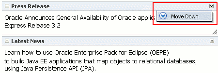
The Move actions on a Show Detail Frame or portlet component enable users to move these components within a parent Panel Customizable component. If a Panel Customizable has multiple child components, then a child Show Detail Frame or portlet can be moved to the left and right or above and below, relative to the position of other child components. Figure 4-3 shows a sample Show Detail Frame component with a Move Down action. In this example, selecting Move Down moves the Press Release component immediately below the Latest News component.
Figure 4-3 Actions Menu on a Show Detail Frame
A layout changer icon on the page enables users to define a different layout by selecting from a set of eight predefined layouts. The Layout Customizable component enables the display of a layout changer icon on the page, as shown in Figure 4-4.
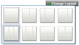
Figure 4-5 shows the layout options available with the Layout Customizable component. A gray colored border highlights the layout currently applied to the page or area. The default page layout is threeColumn.
If the application contains portlets, then users can make them display the information that they want to see, hide them, or remove them from the page. Figure 4-6 shows the actions users can perform on a Web Clipping portlet.
Figure 4-6 Actions on a Web Clipping Portlet

If you define custom actions on task flows enclosed in Show Detail Frame components, then users can switch between views of a child task flow using these custom actions. Figure 4-7 shows the custom actions available to switch between views of a child task flow.
Oracle Composer's Edit mode provides a wide range of page customization capabilities. In Edit mode users can add content, edit page and component properties, delete components, rearrange components, change the page layout, and so on. For a detailed description of the runtime editing tasks that you can perform on a page, see "Personalizing Your Page View" and "Working with Page Content" in the Oracle Fusion Middleware User's Guide for Oracle WebCenter.
You can provide the capabilities described in this section to your application by adding the following Oracle Composer design-time components to a page: Change Mode Link or Change Mode Button, Page Customizable, Panel Customizable, Show Detail Frame, Custom Actions, and Layout Customizable. For more information about these components, see Section 4.1.4, "Oracle Composer Components."
The Change Mode Link or Button switches the page to Edit mode. In Edit mode, users can add content to the page, edit component properties, edit page properties, and so on. When you add the Page Customizable component to a page at design time, it enables these editing capabilities at runtime.
Figure 4-8 shows a Change Mode Link on an application page.
When users click the Change Mode Link or Button, the page opens in Design view as shown in Figure 4-9. Design view (the default) provides a WYSIWYG rendering of the page and its content, where Edit and Delete controls are directly selectable on each component. In Design view users can also perform such tasks as adding content, editing page and component properties, changing page layout, and deleting components.
The View menu in page Edit mode (Figure 4-10) provides two viewing options—Design and Source.
Source view (Figure 4-11) provides a WYSIWYG and a hierarchical rendering of page components, where Edit, Delete, and Refresh controls are available on the header of the hierarchical list. Source view is used to access and modify properties of components that are otherwise not selectable in the Design view. For example, ADF Faces components included in Show Detail Frames can be edited only in Source view.
In Source view, users can perform such tasks as editing page and component properties, changing page layout, and deleting components. However, users cannot move or rearrange components in Source view.
|
Note: The Save button is displayed on the Oracle Composer toolbar (both in Design view and Source view) only if you enabled a sandbox for the application. For more information about sandboxes, see Section 5.1.6, "Oracle Composer Sandbox." |
This section provides an overview of the editing capabilities that Oracle Composer enables in page Edit mode. It includes the following subsections:
Users can add content only in Design view. The Catalog dialog, shown in Figure 4-12, contains resources users can add to a page. These include documents, Oracle ADF components, portlets, and task flows. This dialog is invoked by clicking the Add Content button in any of the Panel Customizable components on the page.
|
Notes:
|
The Catalog dialog contains folders and components. An Open link next to an item in the Catalog indicates that the item is a folder. Users can drill down into the folder by clicking this link. An Add link next to an item indicates that the item can be added to the page. An Add link can appear next to a component or a folder. Users can navigate to a component or folder and add it to the page by clicking the Add link next to it. The component is added as the first child in the Panel Customizable component on which the Add Content link was clicked.
Depending on its configuration, the Catalog exposes all or a subset of the following components to users:
|
Note: For information about Resource Catalog configurations, see Chapter 6, "Configuring the Resource Catalog for Oracle Composer." |
ADF Faces Components
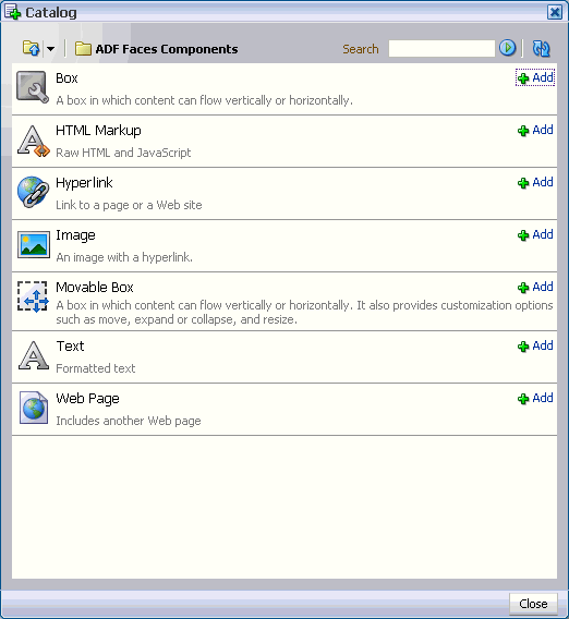
The ADF Faces Components folder provides Box, Movable Box, and Image components that are analogous to the JDeveloper design time components Panel Customizable, Show Detail Frame, and Image Link respectively. In JDeveloper, these components are available in the Oracle Composer tag library.
This folder also provides HTML Markup, Hyperlink, Text, and Web Page components that are analogous to the JDeveloper design time components Output Text, Go Link, Rich Text Editor, and Inline Frame respectively. In JDeveloper, these components are available in the ADF Faces tag library.
The ADF Faces Components folder in the Catalog dialog contains these components, as shown in Figure 4-13.
Figure 4-13 ADF Faces Components You Can Add to the Page
Task Flows
Users can add custom task flows and out-of-the-box service task flows only if you have configured them in the catalog definition file. See Section 6.2.1.3, "Enabling Task Flows in the Resource Catalog" for details.
A task flow added to a page is automatically enclosed in a Movable Box component. As a result, the task flow displays a header with options to move or delete the component.
|
Note: The Top icon in the Catalog dialog enables users to return to a top-level folder. |
Portlets
The Portlets folder lists all the registered producers. Users can navigate to the required portlet and add it to the page. The Portlets folder exposes portlets from any Java-PDK or WSRP producer that was registered in Oracle JDeveloper. For information about registering portlet producers, see Chapter 9, "Consuming Portlets."
Documents
The Documents folder lists documents and folders from the Documents service that users can add to the page.
To display documents, ensure that you have performed the steps in Section 6.2.1.4, "Enabling Documents in the Resource Catalog."
See "Adding Content to a Page" in Oracle Fusion Middleware User's Guide for Oracle WebCenter for detailed information.
In Design view, users can rearrange content on the page in the following ways:
Drag and drop a component within a Panel Customizable component or across Panel Customizable (or Box) components on the page.
Use the Move actions on the Actions menu of a Show Detail Frame or portlet to move it within the parent Panel Customizable component. Depending on the number of child components in the Panel Customizable and how these components are oriented, a component can be moved to the left and right, or up and down.
The Component Properties dialog enables users to edit component properties and the parameters associated with components, such as portlets and task flows. The Component Properties dialog can be accessed in both Design view and Source view.
|
Note: A component cannot be edited if:
|
In Design view, clicking the Edit icon on a component displays the Component Properties dialog, shown in Figure 4-14.
In Source view, users can select a component from the hierarchy and click the show properties of component_name icon on the Source View panel header.
Users can delete a component from the page in the following ways:
In Design view, by clicking the Delete icon on its header.
In Source view, by selecting a component in the hierarchy and clicking the Delete icon on the header of the Source View panel.
Alternatively, by right-clicking a component and selecting Delete from the context menu.
A Delete dialog prompts users to confirm deletion.
|
Notes:
|
In Design view, the Change Layout icon enables users to select a layout from a set of eight predefined layouts. The default page layout is threeColumn.
In Source view, users can select the Layout Customizable component and view its properties. The layout options are displayed in the Component Properties dialog. Users can select any predefined layout and click Apply or OK.
|
Note: Predefined layout options are available to users only if you have added aLayout Customizable component to the page at design time. For more information, see Section 4.1.4.3, "Layout Customizable." |
Users can access the Page Properties dialog from both Design view and Source view. In this dialog, users can create or edit a page's parameters and display properties. In addition, a Security tab is provided when you implement security in your application.
Figure 4-15 shows the Security tab in the Page Properties dialog.
On the Parameters tab, users can create page parameters that can be linked to component properties, thereby enabling any component on the page to adapt to the page context. For example, a page has a parameter called SYMBOL with the default value ORCL. This page contains the Stock Chart, Stock Price, and Company Info task flows. The task flows can be linked with the page parameter such that all the task flows respond to a change in the value of SYMBOL and show information pertaining to the chosen symbol.
The Add a page parameter link enables users to add a new page parameter. A value can then be specified for this parameter on the Parameters tab.
See "Renaming Pages and Revising Page Keywords and Descriptions" and "Wiring Components and Pages" in Oracle Fusion Middleware User's Guide for Oracle WebCenter for detailed information about editing page settings.
Switching to Source view displays the hierarchy of page components in a tree structure. The root of the tree is the component that you added as the direct child of the Page Customizable component at design time (Figure 4-16).
Figure 4-16 Component Hierarchy in Source View
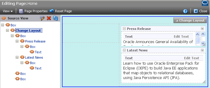
When a node is selected in the tree structure, the corresponding component is selected on the page. Similarly, when a component is selected directly on the page, the corresponding node is selected in the tree structure.
Components, such as portlets and task flows, may use parameters to link related components such that their contents are synchronized based upon the context. Oracle Composer enables users to link portlets and task flows with page parameters so that these components can read the page parameters and change their behavior accordingly.
Users can wire portlet and task flow parameters to page parameters using the Component Properties dialog. For more information, see "Wiring Pages, Task Flows, Portlets, and UI Components Together" in Oracle Fusion Middleware User's Guide for Oracle WebCenter.
In addition to wiring components and page parameters, Oracle Composer also enables users to pass values for display options and parameters through page URLs. For more information, see "Passing Parameter Values Through the Page URL" in Oracle Fusion Middleware User's Guide for Oracle WebCenter.
The Reset Page button enables users to remove all edits, regardless of when they were made, and reset the page to its original, out-of-the-box state. This button is available on the page in both Design view and Source view.
|
Note: Users cannot reset page customizations on the following:
|
To make any JSPX document (*.jspx) editable at runtime, you must add Oracle Composer components to your page in Oracle JDeveloper at application design time.
|
Note: Oracle Composer works only with JSPX pages. You cannot add these components to JSP pages. For information about adding Oracle Composer components to your page, see Section 4.2, "Designing Editable Pages Using Oracle Composer Components." |
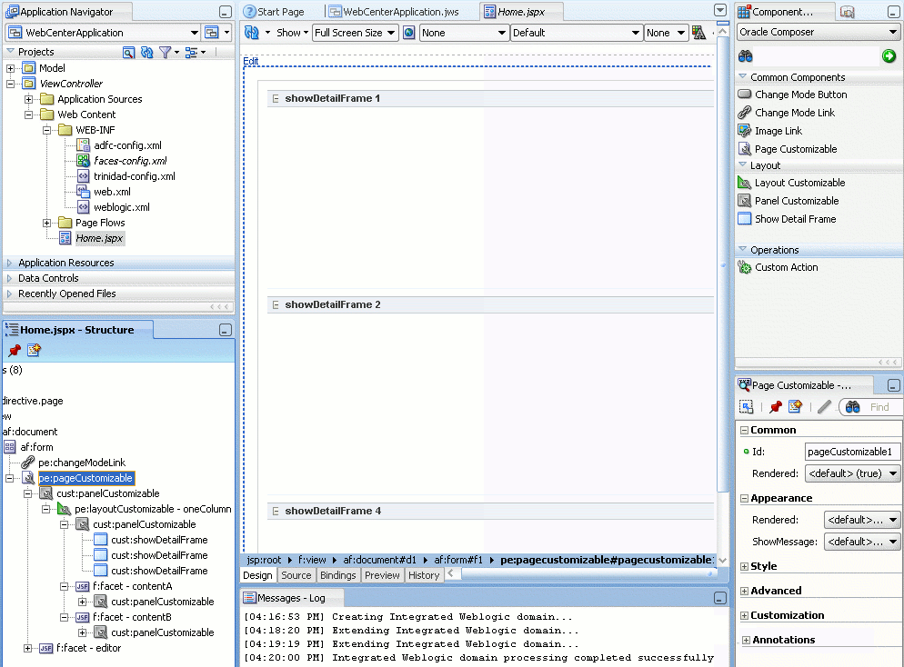
The Oracle Composer tag library (Figure 4-17) available from the Component Palette provides components that you can add to make a page editable. By adding these components you can revise the layout and content of application pages.
Figure 4-17 Oracle Composer Tag Library in the Component Palette
This section contains overviews of the Oracle Composer components that are used to enable page editing. It contains the following subsections:
For more information about these components, see Appendix B, "Oracle Composer Component Properties and Files."
The Page Customizable component defines the editable area of a page. Within this area, you can edit component properties, add content to the page, arrange content, and so on.
Adding a Page Customizable component enables the runtime inclusion of Oracle Composer on the page. End users can edit pages in Oracle Composer using page-related controls available across the top of the page, Add Content buttons on each content region, and Edit buttons on each component, as shown in Figure 4-18.
To enable runtime editing for multiple application pages in one operation, add a Page Customizable component to the ADF page template used for those pages. This avoids the need to manually add a Page Customizable to each page. For more information about adding the Page Customizable component, see Section 4.2.2, "How to Enable Runtime Customization Using a Page Customizable."
The Change Mode Link or Change Mode Button component provides an easy way to switch from View mode of the page to Edit mode. Figure 4-19 shows a Change Mode Link component on the page.
For more information about using Change Mode Link or Change Mode Button, see Section 4.2.3, "How to Enable Switching Between Page Modes Using a Change Mode Link or Change Mode Button."
The Layout Customizable component is a container that enables end users to lay out its child components in several predefined ways (for example, two column, three column, and so on). You can design your page such that all components on the page are enclosed in a Layout Customizable component. In such a case, the layout is applied to the entire page.
Access predefined layouts using the layout changer. By default, the layout changer displays as a small green icon both in page View mode and page Edit mode. By using the Layout Customizable component attributes you can choose to display the layout changer as an icon, text, or icon and text. In addition, you can decide whether to show or hide the layout changer in View mode. Figure 4-20 shows a Layout Customizable component and the predefined layouts that display when users click the layout changer.
Figure 4-20 Layout Customizable Component
For more information, see Section 4.2.5, "How to Enable Layout Customization for a Page Using a Layout Customizable."
A Panel Customizable defines an area of the page onto which users can add components at runtime. Users can move or minimize Show Detail Frame components and portlets that are added as child components of a Panel Customizable. Users can also move these components across Panel Customizable components.
In Edit mode, the Panel Customizable component is rendered as a box with dotted lines. In fact, a Panel Customizable is referred to as a Box in the runtime Catalog. An Add Content button appears on each Panel Customizable component on the page, as shown in Figure 4-21. You can use this button to open the Resource Catalog Viewer and add components within the Panel Customizable.
For more information, see Section 4.2.4, "How to Define Editable Areas of a Page Using Panel Customizable Components."
A Show Detail Frame component renders a border or chrome around its child component along with a header that contains an Actions menu. The actions available on this menu enable users to move the component, along with its content, to new positions on the page (Figure 4-22). Note that a Show Detail Frame must be included inside a Panel Customizable component for it to be movable.
A Show Detail Frame component enables the following types of actions:
Collapse and expand the child component
Move content to different positions on the page
If you add a task flow as a child component, then it enables task flow navigation using the Actions menu.
If you add an ADF Faces Rich Text Editor as a child component, then it enables end users to edit and save text in the Rich Text Editor.
You can add your own UI controls to further customize the display of content by using facets of the Show Detail Frame. For information about using these facets, see Section 4.2.11, "How to Enable Custom Actions on Show Detail Frame Components by Using Facets."
For information about adding this component to a page, see Section 4.2.6, "How to Enable Component Customization Using Show Detail Frame Components."
Use Custom Action components to trigger navigational flow in a task flow when a region is included inside a Show Detail Frame component. You can define custom actions corresponding to the ADFc outcomes of the task flows. At runtime, these custom actions are displayed on the Show Detail Frame header as icons, menu options, or both.
A Custom Action must always be defined as a child component of a Show Detail Frame and is useful only when the Show Detail Frame also contains a task flow as its child component.
You can define custom actions for Show Detail Frame components at the global and instance levels. For more information, see Section 4.2.13, "How to Enable Custom Actions on a Show Detail Frame Enclosing a Task Flow."
You can define application security on many levels, including on a page, an operation, a component, or a component attribute. Oracle Composer provides a means of addressing the various levels of application security. For example, before users can customize components, the components' sources of security restrictions are queried to determine if customization is allowed. If a component does not permit customization, Oracle Composer considers it restricted; that is, Oracle Composer treats the component as if it were explicitly secured. Table 4-1 describes Oracle Composer behavior to reflect customization restrictions.
Table 4-1 Customization Restrictions on Oracle Composer Components
| Restriction | Behavior |
|---|---|
|
The page (and its contents) is open for all customizations |
Oracle Composer allows editing of components without restrictions. |
|
The page is restricted |
Oracle Composer displays but none of the options are accessible. |
|
Some operations are restricted |
Oracle Composer displays but the options corresponding to the restricted operations are disabled. |
|
A component is restricted |
The component is selectable. Oracle Composer shows all its properties as read-only. Oracle Composer's API enables the developer to determine if a component is restricted or not. |
|
A component's attributes are restricted |
The component is selectable. Oracle Composer shows its restricted properties as read-only. Oracle Composer's API enables the developer to determine if a component's attributes are restricted or not. |
Depending on the privileges granted while implementing security, users can perform different personalization and editing tasks when they log in to the application at runtime.
This section describes the default security behavior of Oracle Composer components. It contains the following subsections:
For information about overriding default security behavior, see Section 5.8, "Overriding Default Security Behavior of Oracle Composer Components."
The page definition file is the respository for page-level security information. Oracle Composer enables editing capabilities based on a user's privileges:
A user with the Personalize privilege on a page can perform only the personalizations described in Section 4.1.2, "Personalizing Capabilities in View Mode."
A user with the Edit or Customize privilege can perform all runtime editing tasks, such as adding content, editing component properties, and deleting components. Oracle Composer and WebCenter Customizable Components do not differentiate between Edit and Customize privileges.
|
Notes: Oracle Composer and WebCenter Customizable Components support cascading of page privileges with Grant being a super set of all privileges. A user with Grant privilege on a page is considered to have Edit, Personalize, and View privileges. A user with Personalize privilege is considered to additionally have the View privilege. |
Table 4-2 explains Oracle Composer behavior based on page-level privileges. Only those page privileges that are relevant to Oracle Composer and WebCenter Customizable Components privileges are listed in this table. The Grant privilege is not listed as it is a super set of all privileges. Users with the Grant privilege can perform all editing tasks. The table also does not list the View privilege because users with the View privilege cannot personalize or edit a page.
Table 4-2 Mapping of Page Privileges to Oracle Composer Behavior
| Privilege | Oracle Composer Behavior |
|---|---|
|
Edit or Customize |
Users can switch to Edit mode, where Oracle Composer is invoked, and edit the page. Oracle Composer does not differentiate between the Edit and Customize privilege. That is, users with either the Edit or Customize privilege can perform all runtime editing tasks. With the Edit or Customize privilege, users can:
If users without Edit or Customize permission try to edit a page, a message appears stating that they do not have permission to do so. |
|
Personalize |
In View mode users can:
Note: Having Personalize permission does not enable users to perform portlet customizations. If users without Personalize, Edit, or Customize permission try to edit a page, a message appears stating that they do not have permission to do so. |
WebCenter applications have a default MDS configuration that restricts customization on all application objects. This default restriction must be addressed if you intend to enable runtime page editing. You can address default restrictions by adding a Page Customizable component to the page. Default customization restrictions do not affect the Page Customizable and all its child components.
You can further enable customization on a set of attributes for the component using MDS type-level restrictions or instance-level restrictions. Type-level restrictions are applicable to a specified component type across instances. At runtime, attributes on which you have enabled customization are shown as editable properties in Oracle Composer, and restricted attributes are shown as read-only properties. For information, see Section 5.8.1, "Applying Component-Level Restrictions by Defining Customization Policies."
Show Detail Frame components enable the placement of restrictions on individual supported actions. For example, one can specify a restriction on whether the current user is allowed to minimize the Show Detail Frame.
It is left to components to enforce restrictions on their supported actions and to provide well-defined APIs to check the availability of the action. You can specify restriction on Show Detail Frame components actions in adf-config.xml. If a restriction is specified and applicable to the current user, the Show Detail Frame does not render the action.
For information about applying action-level restrictions, see Section 5.8.4, "Applying Action-Level Restrictions on Show Detail Component Actions."
Similarly, you can define customization restrictions on a Layout Customizable component. Specifically, if you place a restriction on the Show Layout Changer attribute, then layout changer options are shown as disabled and users cannot use them to change the page layout.
The Oracle Composer tag library provides design-time components that you can add to a page in Oracle JDeveloper to enable runtime page editing. When you create a page with Composer components at design time, at runtime Oracle Composer provides options for entering page edit mode and designing the page according to your requirements.
You can enable customizations in WebCenter and non-WebCenter applications. Within an application, you can enable customization of the following types of pages:
A regular JSPX page, not based on a page template
A JSPX template page
A JSPX page based on a template
You must add Oracle Composer components to a page at design time to make it editable at runtime. The Oracle Composer tag library provides the components required for making the page editable. For more information, see Section 4.1.4, "Oracle Composer Components."
This section explains how to add Oracle Composer components to a page at design time to make it editable at runtime. It contains the following subsections:
Section 4.2.2, "How to Enable Runtime Customization Using a Page Customizable"
Section 4.2.4, "How to Define Editable Areas of a Page Using Panel Customizable Components"
Section 4.2.5, "How to Enable Layout Customization for a Page Using a Layout Customizable"
Section 4.2.6, "How to Enable Component Customization Using Show Detail Frame Components"
Section 4.2.8, "What Happens When You Add Oracle Composer Components"
Section 4.2.10, "What You May Need to Know When Designing Editable Pages"
Section 4.2.11, "How to Enable Custom Actions on Show Detail Frame Components by Using Facets"
Section 4.2.13, "How to Enable Custom Actions on a Show Detail Frame Enclosing a Task Flow"
Section 4.2.14, "How to Enable Custom Actions On a Show Detail Frame Enclosing a Task Flow: Example"
The steps for creating a customizable JSPX page in your WebCenter application are available in Section 3.3, "Creating WebCenter Application-Enabled Pages."
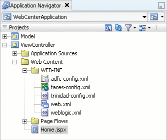
When you create a new page in JDeveloper, it is listed in the Application Navigator under Web Content as shown in Figure 4-23. Additionally, the page is opened in the editor and becomes the active editor panel.
Figure 4-23 New Customizable Page (Home.jspx) Shown in the Application Navigator
Security Considerations
You can test how user privileges impact runtime customization capabilities by implementing security and configuring your application to authenticate users such that they have distinct identities. For the steps to implement a basic security model in your application, see Section 11.1.1.1, "Implementing Security for Services."
To enable users to edit a page in a secured application, you must ensure that you grant Edit or Customize privileges to users or roles.
Adding a Page Customizable component to the page ensures that Oracle Composer is invoked when users switch to Edit mode of the page. When you add a Page Customizable component, some configuration files are updated automatically with the default composer-specific settings. For more information, see Section 4.2.8, "What Happens When You Add Oracle Composer Components."
|
Note: For considerations you must make before adding aPage Customizable to the page, see Section 4.2.10, "What You May Need to Know When Designing Editable Pages." |
To add a Page Customizable component to the page:
Open a customizable JSPX page.
In the Component Palette, select ADF Faces and drag a Panel Stretch Layout component onto the page.
|
Notes:
|
In the Component Palette, select Oracle Composer.
Add a Page Customizable component to the center facet of the Panel Stretch Layout.
You must ensure that the Page Customizable is nested inside an af:document element. The Page Customizable is a rich client component that requires the rich client framework to function properly.
The required attributes for a Page Customizable component are populated with default values when you add the component to the page.
You can define or modify attribute values by referring to Table B-1 in Section B.1, "Oracle Composer Component Properties."
Save the page.
By default, a Panel Customizable component is added as a child component and the Page Editor Panel is added as a facet in the Page Customizable component, as shown in Figure 4-24.
Example 4-1 shows the pe:pageCustomizable tag in the page source view.
To enable users to switch to Edit mode of a page easily, you must add a Change Mode Link or Change Mode Button component to the page.
|
Note: An alternative way to enable switching to Edit mode is by using the Change Mode API. For more information about this API, see Oracle Fusion Middleware Composer Components Java API Reference for Oracle WebCenter.For things you should consider before adding a |
To add a Change Mode Link or Change Mode Button component:
From the Component Palette, select Oracle Composer.
In the Structure window, within the top facet of the Panel Stretch Layout that you added in the previous section, drag a Change Mode Link or Change Mode Button component.
You must ensure that the Change Mode Link or Change Mode Button is nested in an af:document element. The Change Mode Link or Change Mode Button component is a rich client component that requires the rich client framework to function properly.
|
Notes:
|
The required attributes for a Change Mode Link or Change Mode Button component are set by default when you add the component to the page.
Optionally, you can set any other attributes by referring to Table B-2 in Section B.1, "Oracle Composer Component Properties."
The pe:changeModeLink or pe:changeModeButton tag displays within the af:form tag in the Structure window, as shown in Figure 4-25.
Figure 4-26 shows the Change Mode Link in the Design view of the page in JDeveloper.
Figure 4-26 Change Mode Link in Design View

The Panel Customizable component is required for page composition or content management tasks, such as adding, arranging, or removing portlets or regions. By default, one Panel Customizable component is automatically added as a direct child of the Page Customizable component. You can add more Panel Customizable components within this Panel Customizable component according to your requirements.
All components within a Panel Customizable component are available for selection at runtime and can be edited. It is only within a Panel Customizable component that you can drag and drop components at runtime.
|
Note: For considerations you must make before adding aPage Customizable to the page, see Section 4.2.10, "What You May Need to Know When Designing Editable Pages." |
To add a Panel Customizable component to the page:
From the Component Palette, select Oracle Composer.
Drag a Panel Customizable component to the Structure window and drop it at any suitable location within the form.
You must ensure that the Panel Customizable is nested in an af:document element. The Panel Customizable component is a rich client component that requires the rich client framework to function properly.
|
Notes:
|
The required attributes for a Panel Customizable component are set by default when you add the component to the page.
Optionally, you can set any other attributes by referring to Table B-6 in Section B.1, "Oracle Composer Component Properties."
|
Notes: If you selectstretch layout for the Panel Customizable, then the first child component is stretched to fill up available space in the Panel Customizable component. Any other child components are ignored, though they are not removed from the page. |
Use the Layout Customizable component to enable the runtime definition or modification of the layout of components on a page or an area of a page.
To add a Layout Customizable component:
From the Component Palette, select Oracle Composer.
Drag a Layout Customizable component to the Structure window and drop it inside the Panel Customizable component.
The target Panel Customizable component must be a child of the Page Customizable component.
Ensure that the Layout Customizable is nested in an af:document element. The Layout Customizable is a rich client component and requires the rich client framework to function properly.
|
Note: You can delete the direct childPanel Customizable in the Page Customizable and add the Layout Customizable as a direct child of the Page Customizable. However, you must ensure that the Page Customizable has only one direct child component. |
The required attributes for a Layout Customizable component are set by default when you add the component to the page.
Optionally, you can set any other attributes by referring to Table B-3 in Section B.1, "Oracle Composer Component Properties."
|
Note: To ensure that theLayout Customizable component is clearly visible on the page at runtime, provide a descriptive label for the component by using the Text attribute. |
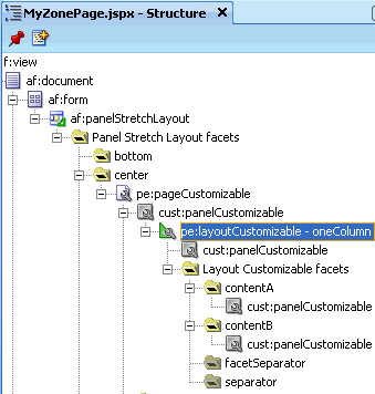
The pe:layoutCustomizable tag is located inside a cust:panelCustomizable tag in the Structure window as shown in Figure 4-27. A child Panel Customizable component is added by default in the Layout Customizable component. Additionally, a Panel Customizable component is added within each facet of the Layout Customizable component. These Panel Customizable components enable you to add content inside the Layout Customizable component at runtime.
The Panel Customizable added as a direct child provides the main area—the central area in a layout at runtime. The Panel Customizable components added within the two default Layout Customizable facets provide the two content areas, A and B. When you select a predefined layout at runtime, these three areas are arranged to display content in the selected pattern. See Predefined Layout Types for more information about how the content is laid out for each layout type.
Figure 4-27 Layout Customizable Component
When you want to enable customizations, such as moving, minimizing, or removing components, you can drop a Show Detail Frame component inside a Panel Customizable component on the page. You can then add a component inside the Show Detail Frame.
|
Note: EachShow Detail Frame component should have only one direct child component. If you add multiple child components, then only the first one is rendered. The other direct child components are not rendered at design time or runtime.
If multiple components must be enclosed in a |
Use the Show Detail Frame component to enable customizations in View and Edit modes of the page. Changes made in View mode are available to that user only, and changes made in Edit mode are available to all application users.
To add a Show Detail Frame component to the page:
From the Component Palette, select Oracle Composer.
Drag a Show Detail Frame component to the Structure window and drop it inside a Panel Customizable component.
The Show Detail Frame should be nested in a Panel Customizable component on the page.
The required attributes for a Show Detail Frame component are set by default when you add the component to the page.
Optionally, you can set any other attributes by referring to Table B-7 in Section B.1, "Oracle Composer Component Properties."
The cust:showDetailFrame tag is added inside the cust:panelCustomizable tag as show in Figure 4-28.
For a better understanding of this type of task, see Section 4.3, "Designing Editable Pages Using Oracle Composer Components: Example."
When you have an existing ADF application with JSPX pages that are populated with content, and you want to enable customization, you can do so by moving all content inside a Page Customizable component.
You must first add the Page Customizable, then a Layout Customizable, and then the required hierarchy of Panel Customizable and Show Detail Frame components. Drag each of the existing components and drop them onto suitable locations inside the Page Customizable.
|
Note: For best results, move components using the Structure window and not by editing the source code. |
When you add a Page Customizable component to the page, the following configurations are performed automatically:
A default Resource Catalog definition file, default-catalog.xml, is configured in the application. The default-catalog.xml file is located in the <Application_Root>\mds\oracle\adf\rc\metadata directory.
A Resource Catalog Viewer is configured for the application. At runtime, Oracle Composer provides users the option to add resources from this viewer to the page.
When you create an application, a minimal adf-config.xml file is also created. When you add a Page Customizable to an application page, the required configuration is added to the adf-config.xml file.
The web.xml file available in the <Application_Root>\<Project_Name>\public_html\WEB-INF directory is updated to:
Enable change persistence
Configure the MDS JSP provider
The DataBindings.cpx file in the <Application_Root>\<Project_Name>\public_html\WEB-INF\adfmsrc\<Project_Name> directory, is updated to enable the presence of task flows on the page.
The page definition file is updated with the binding for the Oracle Composer task flow, which is available as part of the WebCenter Framework extension JAR file. Example 4-2 shows the code in the page definition file after a Page Customizable component is added to an application page.
Example 4-2 Page Definition File After Adding Page Customizable Component
<?xml version="1.0" encoding="UTF-8" ?>
<pageDefinition xmlns="http://xmlns.oracle.com/adfm/uimodel"
                version="11.1.1.46.16" id="customizable_ComposerPagePageDef"
                Package="customization.pageDefs">
  <parameters/>
  <executables>
    <taskFlow id="pageeditor"
              taskFlowId="#{pageEditorBean.pageEditor}"
              xmlns="http://xmlns.oracle.com/adf/controller/binding"/>
  </executables>
  <bindings/>
</pageDefinition>
|
See Also: Section B.2, "Oracle Composer-Specific Files and Configurations" for information about files that are created or modified when you add Oracle Composer components. |
At runtime, users can perform all the tasks described Section 4.1.2, "Personalizing Capabilities in View Mode" and Section 4.1.3, "Editing Capabilities in Edit Mode."
Each Oracle Composer component provides runtime capabilities that are described in Section 4.1.4, "Oracle Composer Components."
|
Note: Runtime customizations that you perform on a page are not carried over when you deploy the application to a target server. |
When adding Oracle Composer components to your customizable page, consider the following:
To enable runtime customization of components, add only one Page Customizable to a page.
|
Note: Do not add a secondPage Customizable component to your page. This causes an error when you run the page. |
Ensure that the Page Customizable component has only one direct child component. Adding multiple direct child components may cause the application to be unstable at runtime.
When you add multiple direct child components at design time, only the first child component is rendered at runtime. The first child component is stretched to fit the page. All other direct child components are ignored and not rendered on the page.
Place all components you want to be customizable within the Page Customizable component.
To enable runtime editing, you must ensure that the ID attribute is defined on all components on the page. Runtime editing of components that have no ID value is not supported in Oracle Composer.
If your page includes components with no ID value, then you may encounter problems while editing the page in Oracle Composer.
To ensure that the Change Mode Link or Change Mode Button is displayed properly at runtime, in the Structure window, add it above the Page Customizable component.
To enable View mode personalization, place a Show Detail Frame component within a Panel Customizable component.
Use a Show Detail Frame to enclose a single child only. If you must enclose multiple components in a Show Detail Frame, then place a grouping component, such as a Panel Group Layout or Panel Customizable, within the Show Detail Frame component and then place the ADF Faces components or other content within this grouping component.
Portlets need not be placed within Show Detail Frame components. Portlets come equipped with a header and display options that are similar to Show Detail Frame components.
You can use the Show Detail Frame facets to define and display custom actions on Show Detail Frame components. For example, if your Show Detail Frame contains a list of services provided in your application, you can add a custom action, Show Detailed Information, which opens up a task flow containing details about the various services.
For information about the facets supported by Show Detail Frame components, see Section B.1.5, "Show Detail Frame Component."
Oracle JDeveloper displays all facets available to the Show Detail Frame component in the Structure window, however, only those that contain UI components appear activated.
To add a Show Detail Frame facet, perform the following steps:
Right-click a Show Detail Frame component in the Structure window, and select Facets - Show Detail Frame.
Click the arrow to the right of this option.
From the list of supported facets, select the facet you want to add.
|
Note: A check mark next to a facet name means the facet is already inserted in theShow Detail Frame component. Selecting that facet name again would result in the facet getting deleted from the page. |
The f:facet element for that facet is inserted in the page.
Add components in the facet according to your design requirements.
For an end-to-end example of creating and using Show Detail Frame facets, see Section 4.2.12, "How to Enable Custom Actions on Show Detail Frame Components By Using Facets: Example."
Assume a JSPX page, Page1, with a Panel Customizable component. Inside the Panel Customizable is a Show Detail Frame component (showDetailFrame1). Inside the Show Detail Frame is an ADF task flow. The Panel Customizable has two other Show Detail Frame components, one above and the other below showDetailFrame1. The task flow displays two Output Text components on the page.
You can configure an Additional Actions facet on the Show Detail Frame component to display a Customize action on the Actions menu along with the Move Up and Move Down actions. At runtime, the Customize action enables users to customize the text in the Output Text components. This section describes the steps you take to achieve this effect. It contains the following subsections:
Section 4.2.12.2, "How to Include an Additional Actions Facets"
Section 4.2.12.4, "How to Create Navigation Rules Between Pages"
To create an ADF task flow:
From the File menu, select New.
In the New dialog, select JSF under Web Tier node, and select ADF Task Flow under Items.
Click OK.
In the Create Task Flow dialog, click OK to create a task flow definition file by accepting the default values.
From the ADF Task Flow tag library in the Component Palette, drop two view elements, view1 and view2, onto the task flow definition file.
Drop a Control Flow Case from view1 to view2.
Click the first view element and then click the second view element to draw the control flow line.
Name this control flow case next.
Similarly, drop a Control Flow Case from view2 back to view1 and name it prev.
Create a backing bean called BackingBean.java to contain values for two variables view1 and view2.
view1 and view2 are initialized with initialValue1 and initialValue2 respectively. Ensure that the code of the bean is as show in the following example:
package view;

public class BackingBean {
    public BackingBean() {
    }

    private String view2 ="initial Value1";
    private String view1 = "initial Value2";

    public void setView2(String view2) {
        this.view2 = view2;
    }

    public String getView2() {
        return view2;
    }

    public void setView1(String view1) {
        this.view1 = view1;
    }

    public String getView1() {
        return view1;
    }
}
In the task flow definition file, double-click view1 to create the page fragment (view1.jsff) for that element.
Add a Panel Group Layout and two Output Text components to view1.jsff.
Specify the Value for the first Output Text component to be #{backingBean.view1}, and specify the Value for the second Output Text component to be #{backingBean.view2}.
Save view1.jsff, and close it.
In the task flow definition file, double-click view2 to create the page fragment (view2.jsff) for that element.
Add just one Output Text component to view2.jsff, and specify Value to be #{backingBean.view2}.
Save view2.jsff, and close it.
To include an Additional Actions facet:
Create a JSPX page, Page1.jspx, with a Panel Customizable component and a nested Show Detail Frame component.
Add two more Show Detail Frame components, above and below the existing Show Detail Frame component.
The purpose of adding three Show Detail Frame components is to enable the display of Move Up and Move Down actions along with the additional action on the first Show Detail Frame component, showDetailFrame1.
Add the task flow definition file that you created in the previous step inside showDetailFrame1.
Right-click the first Show Detail Frame in the Structure window, and select Facets - Show Detail Frame.
Click the arrow to the right of this option, and from the list of supported facets, select Additional Actions.
The f:facet-additionalActions element for that facet is inserted in the page.
Add a Panel Group Layout inside the Additional Actions facet, and add a Button component inside the Panel Group Layout component.
Set the Text attribute for the Button to Customize, and specify customize as the Action value.
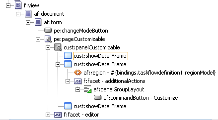
The page in the Structure Navigator should appear as shown in Figure 4-29.
Figure 4-29 Page1.jspx in Structure Navigator
Save the page.
To create the redirection page:
Create a JSPX page called Page2.jspx, and add two Input Text components and a Button component.
Specify the Value for the first Input Text component to #{backingBean.view2}, and set the Value attribute for the second Input Text component to #{backingBean.view1}.
The purpose of adding Input Text components with references to the backing bean is to enable the passing of a user's input to the bean so that it can be reflected in the Output Text components on Page1.jspx.
On the Button component, set the Text attribute to OK and specify back as the Action value.
Save the page.
You can now enable switching between the two pages by defining navigation rules.
To define navigation rules between the pages:
In the Application Navigator, under the project's WEB-INF folder, double-click the faces-config.xml file to open it.
Click the Overview tab to view the file in Overview mode.
Click the Add button in the Managed Bean section.
In the Create Managed Bean dialog, specify backingBean as the name.
For the Class Name field, click the Browse button adjacent to it and browse to the BackingBean Java class that you created earlier. Click OK.
Click OK.
From the Scope list, select session and click OK.
Select the Navigation Rules tab on the page.
In the From Views table, select Page1.jspx.
Under Navigation Cases, select Page2.jspx in the To View ID column, customize in the From Outcome column, and true in the Redirect column.
In the From Views table, select Page2.jspx.
Under Navigation Cases, select Page1.jspx in the To View ID column, back in the From Outcome column, and true in the Redirect column.
In Source view, these entries appear as follows:
<managed-bean>
    <managed-bean-name>backingBean</managed-bean-name>
    <managed-bean-class>view.BackingBean</managed-bean-class>
    <managed-bean-scope>session</managed-bean-scope>
  </managed-bean>
  <navigation-rule>
  <from-view-id>/Page1.jspx</from-view-id>
  <navigation-case>
    <from-outcome>customize</from-outcome>
    <to-view-id>/Page2.jspx</to-view-id>
      <redirect/>
    </navigation-case>
  </navigation-rule>
  <navigation-rule>
    <from-view-id>/Page2.jspx</from-view-id>
  <navigation-case>
    <from-outcome>back</from-outcome>
    <to-view-id>/Page1.jspx</to-view-id>
      <redirect/>
    </navigation-case>
</navigation-rule>
Save the file.
What Happens at Runtime
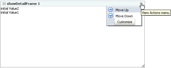
In JDeveloper, run Page1.jspx. The Actions menu on the showDetailFrame1 component displays the Customize action, as shown in Figure 4-30.
Figure 4-30 Customize Action on the Actions Menu
Clicking Customize takes you to Page2.jspx (Figure 4-32), where you can update the values for Label1 and Label2.
Figure 4-31 Page with Option to Edit Text

Clicking OK takes you back to Page1.jspx, which reflects the recent text changes, as shown in Figure 4-32.
You can customize a task flow by including it in a Show Detail Frame component on which you define custom actions. Further, you can define custom actions that, when invoked at runtime, trigger the desired navigational flow. For example, you can define a custom action on a Show Detail Frame that specifies that the target task flow fragment opens in a separate browser window rather than inside the Show Detail Frame.
On a Show Detail Frame component, you can define custom actions at both the global and instance levels.
This section provides information about defining custom actions on a Show Detail Frame. It includes the following subsections:
Section 4.2.13.1, "Defining Custom Actions at the Instance Level"
Section 4.2.13.2, "Defining Custom Actions at the Global Level"
Define custom actions on a particular Show Detail Frame component instance using the Custom Action component. You can find the Custom Action component in the Oracle Composer tag library. Custom actions are stored in the JSPX page definition file of the page that contains the Show Detail Frame.
To define custom actions at the instance level:
From the Component Palette, select Oracle Composer.
Drag a Custom Action and drop it on the page inside the Show Detail Frame component, below the af:region element.
Add one Custom Action component for each internal task flow action you want to display as a custom action on the Show Detail Frame header.
|
Note: AddCustom Action components below the af:region element. Otherwise, you might face problems if the region is not the first child component of the Show Detail Frame. |
Define attributes for the Custom Action by referring to Table B-9 in Section B.1, "Oracle Composer Component Properties."
Ensure that you populate the Action attribute of each Custom Action with the correct ADFc outcomes of the associated task flow. The code should be similar to the one shown in Example 4-3.
Example 4-3 Custom Action Code
<cust:showDetailFrame text="showDetailFrame 1" id="sdf1">
  <af:region value="#{bindings.taskflowdefinition1.regionModel}"
             id="r1"/>
  <cust:customAction action="navigatefromview1" id="ca1"
                     location="both" icon="/Logo1.JPG"
                     text="View1 Action"
                     shortDesc="Custom View1 Action"/>
  <cust:customAction action="navigatefromview2"
                     location="both" id="ca2"
                     icon="/Logo2.JPG" text="View2 Action"
                     shortDesc="Custom View2 Action"/>
</cust:showDetailFrame>
|
Note: If you define a custom action without a corresponding task flow action, then the custom action is not rendered on theShow Detail Frame header at runtime. |
|
See Also: "Creating ADF Task Flows" in Oracle Fusion Middleware Fusion Developer's Guide for Oracle Application Development Framework |
Save and run the page.
At runtime, when you select an action from the Show Detail Frame's Actions menu, the associated control flow rule is triggered and the target task flow fragment is rendered.
Defining custom actions at the global level means making those custom actions available for all Show Detail Frame instances in an application. Though global-level custom actions are available for all Show Detail Frame components in an application, at runtime the header of any Show Detail Frame displays only those custom actions that correspond to the ADFc outcomes of the current view of the task flow.
Define global-level custom actions in your application's adf-config.xml file.
To define custom actions at the global level:
Open the application's adf-config.xml file, located in the ADF META-INF folder under Descriptors in the Application Resources panel.
Define custom actions using the <customActions> element with nested <customAction> tags for each action, as shown in Example 4-4:
Example 4-4 Custom Actions Definitions in the adf-config.xml File
<cust:adf-config-child xmlns="http://xmlns.oracle.com/adf/faces/customizable/config">
  <enableSecurity value="true" />
  <customActions>
    <cust:customAction action="forward" displayName="Move Forward"
                       location="menu" rendered="true"
                       icon="/move_forward.png"/>
    <cust:customAction action="backward" tooltip="Move Backward"
                       location="chrome" rendered="true"
                       icon="/move_backward.png"/>
  </customActions>
</cust:adf-config-child>
|
Notes:
|
Save the adf-config.xml file.
For additional information about defining custom actions, see Section 4.2.14, "How to Enable Custom Actions On a Show Detail Frame Enclosing a Task Flow: Example."
Resolving Conflicts Between Global-Level and Instance-Level Custom Actions
Each custom action is uniquely identified by the value of its action attribute. If you have defined custom actions with the same action attribute value at the global and instance levels, then there may be conflicts in how these custom actions are invoked at runtime, depending on other attribute values. At such times, the inheritGlobalActions attribute of the Show Detail Frame defines the behavior of other custom action attributes (other than the action attribute) as follows:
|
Note: Regardless of theinheritGlobalActions setting (true or false) on the Show Detail Frame component:
|
If inheritGlobalActions=true, or you have not specified a value for inheritGlobalActions (defaults to false), the behavior of custom action attributes is as follows:
If you defined a custom action attribute at the global and instance levels, then the attribute value specified at the instance level is used.
If you defined a custom action attribute only at the instance level, then that attribute value is used.
If you defined a custom action attribute only at the global level, then that value is ignored and the default value is used.
If inheritGlobalActions=true, the behavior of custom action attributes is as follows:
If you defined a custom action attribute at the instance level, then its value is used regardless of whether the same attribute is specified at the global level.
If you defined a custom action attribute only at the global level, then that value is used.
If you have not defined a custom action attribute at the global or instance levels, then the attribute's default value is used.
After you have designed your application pages, you must deploy the application to the production environment. For more information, see Chapter 25, "Testing and Deploying Your WebCenter Application."
|
Note: Runtime customizations that you perform on the page in the development environment are not carried over when you deploy the application to a target server. |
Custom actions typically display the target task flow views in place, inside the Show Detail Frame component. However, if you want to display a task flow's view in a dialog, you can define a custom action to display that task flow view in a separate browser window.
To display a task flow view in a separate browser window, the control flow rule to that view must be prefixed with dialog: in the task flow definition file and in the action attribute of the custom action corresponding to that view. The following example shows an action attribute definition:
<cust:customAction action="dialog:Next" id="ca1"
                   location="both" icon="/move_forward.png"
                   text="Next Action"
                   shortDesc="Next Action"/>
In this example, assume that your application contains a task flow, customactions, residing inside a Show Detail Frame. The task flow includes three view elements, view_gadget, edit_settings, and about_gadget, and three associated control flow rules, ViewGadget, EditSettings, and AboutGadget. Your object is to define custom actions such that the control flow rules are available as actions on the Actions menu of the Show Detail Frame component.
In this example, the control flow rules are added such that users can navigate back and forth between the three views. Each view element has an associated page fragment of the same name:
The view_gadget.jsff fragment has a Panel Stretch Layout component. The center facet of this component is populated with an Active Output Text component whose Value attribute is set to View Gadget.
The edit_settings.jsff fragment has a Panel Stretch Layout component. The center facet of this component is populated with an Active Output Text component whose Value attribute is set to Edit Gadget Settings.
The about_gadget.jsff fragment has a Panel Stretch Layout component. The center facet of this component is populated with an Active Output Text component whose Value attribute is set to About This Gadget.
To enable custom actions on the task flow:
Place the customactions task flow inside a Show Detail Frame component on a customizable page, MyPage.jspx.
For information about creating a customizable page, see Section 4.2.1, "How to Create a Customizable Page."
Add a Custom Action component from the Oracle Composer tag library as a child of the Show Detail Frame component, and set the Action and Text attributes to ViewGadget and View Gadget respectively.
Add two more Custom Action components to the Show Detail Frame:
Set the Action and Text attributes for the first component to EditSettings and Edit Settings respectively.
Set the Action and Text attributes for the second component to AboutGadget and About Gadget respectively.
Save and run MyPage.jspx.
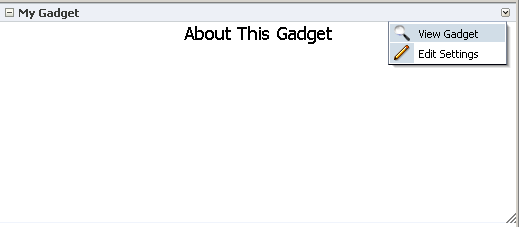
The view_gadget page fragment is rendered in the Show Detail Frame component (named My Gadget) on the page. The Actions menu displays the About Gadget and Edit Settings options. Click About Gadget to navigate to the about_gadget fragment. Note that the Actions menu now displays the navigation rules for the other two fragments (Figure 4-33).
Figure 4-33 Custom Actions on a Show Detail Frame Enclosing a Task Flow
To see this in action, look at the sample application, CustomActions.jws, on the Oracle WebCenter Suite 11g Demonstrations and Samples page on the Oracle Technology Network (OTN):
Oracle Composer provides a means of contextually wiring task flow events. You can wire a contextual event to an action handler to enable the passing of values from a producer component to a consumer component when the event is triggered on the producer.
For events to be available at runtime, event capability must be included in the task flow at design time. When you add event-enabled task flows to your customizable page, each task flow's Component Properties dialog includes an Events tab, where much of the wiring activity takes place. For information about including event capabilities, see "Creating Contextual Events" in Oracle Fusion Middleware Fusion Developer's Guide for Oracle Application Development Framework.
You can change the look and feel of Oracle Composer components by applying different styles to the component header and content using one of the following methods:
Build a skin using style selectors, and apply the skin to a WebCenter application. For more information about style selectors and skins, see Chapter 19 "Customizing the Appearance Using Styles and Skins" in Oracle Fusion Middleware Web User Interface Developer's Guide for Oracle Application Development Framework.
Use JDeveloper style properties to specify style information through the Property Inspector. For more information, see Understanding contentStyle and inlineStyle Properties.
|
Notes: Using JDeveloper style properties overrides the style information from the skin CSS. However, when you define a style property using JDeveloper, this style overrides styles for the selected component only—child components continue to use the styles specified in the skin. |
You can adjust the look and feel of Page Customizable, Panel Customizable, Layout Customizable, and Show Detail Frame components at design time by changing the style-related properties inlineStyle and styleClass.
Show Detail Frame components have another associated style property, contentStyle, which defines the style for the content inside the component. The styleClass property enables you to select an extra style from the skin, whereas the inlineStyle and contentStyle properties override the comparable styles specified in the application skin for that particular instance of the component.
The inlineStyle property overrides styleClass. Additionally, properties set on a component instance affect only that instance of the component. Other component instances in the application are not affected.
|
Note: Thebackground property is also useful in adjusting the look and feel of Show Detail Frame components. Unlike inlineStyle, contentStyle, and styleClass properties, the background property works with skins. |
Understanding contentStyle and inlineStyle Properties
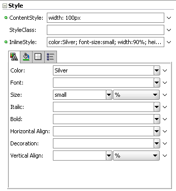
The style properties inlineStyle and contentStyle are alike in the types of attributes they support. They differ in their range of influence. While inlineStyle provides style information for the entire component, contentStyle provides style information only for component content. The contentStyle property is available to Show Detail Frame components but not to Panel Customizable components.
The inlineStyle property applies CSS to the root of the component, that is, the topmost DOM element. It does not override styles on child elements that are picking up color, font, and so on from a skin. For example, if a component header is skinned, then setting inlineStyle does not affect the component header. The contentStyle applies CSS to the DOM element that surrounds the content part of the component. In a Show Detail Frame, content refers to the area below the header.
On component content, the value specified for contentStyle takes precedence over the value specified for inlineStyle. Additionally, contentStyle on a component instance takes precedence over both inlineStyle and the contentStyle values of a parent component (such as a portlet nested in a Panel Customizable component).
Figure 4-34 Defining Styles for contentStyle and inlineStyle in the Property Inspector
In this example, assume you want to create a page that is customizable at runtime. The page is named MyPage.jspx in a WebCenter application named MyWebCenterApp.
To create a customizable page:
Create a WebCenter application named MyWebCenterApp by performing the steps in Section 3.2, "Creating a WebCenter Application."
Create a JSPX page named MyPage.jspx by performing the steps in Section 3.3, "Creating WebCenter Application-Enabled Pages."
Add a Panel Stretch Layout to MyPage.jspx.
|
Note: ThePanel Stretch Layout component stretches the child in the center facet to fill all the available space in the browser. This is true even if you resize the browser. Therefore, by placing your components within this child component, you can ensure that the customizable portion of your page occupies the complete browser area. |
Add a Page Customizable to the center facet by following the steps in Section 4.2.2, "How to Enable Runtime Customization Using a Page Customizable."
Set the border color of the Page Customizable to blue to differentiate the editable area from other noneditable areas.
Under the Style category in the Property Inspector for the Page Customizable, click the Box tab and set the Border Color attribute to Blue.
Set the border color of child Panel Customizable to red.
Under the Style category in the Property Inspector for the Panel Customizable, click the Box tab and set the Border Color attribute to Red.
Add a Change Mode Link to the top facet of the Panel Stretch Layout by performing the steps in Section 4.2.3, "How to Enable Switching Between Page Modes Using a Change Mode Link or Change Mode Button."
Inside the Panel Customizable that is a direct child of the Page Customizable, add a Layout Customizable component by following the steps in Section 4.2.5, "How to Enable Layout Customization for a Page Using a Layout Customizable."
Add Show Detail Frame components inside each Panel Customizable on the page by performing the steps in Section 4.2.6, "How to Enable Component Customization Using Show Detail Frame Components."
For the sake of this example, add a Rich Text Editor and an Image component inside two of the Show Detail Frame components nested in the Layout Customizable.
Drag and drop each of these components from the ADF Faces tag library to the required location on the page.
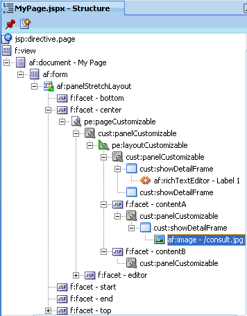
The hierarchy of components on the page is as shown in Figure 4-35.
Figure 4-35 Component Hierarchy in MyPage.JSPX
Run MyPage.jspx.
The page opens in View mode. Click the Edit link on the page to enter Edit mode. The page opens in Oracle Composer. In Oracle Composer, you can perform all editing tasks described in Section 4.1.3, "Editing Capabilities in Edit Mode."
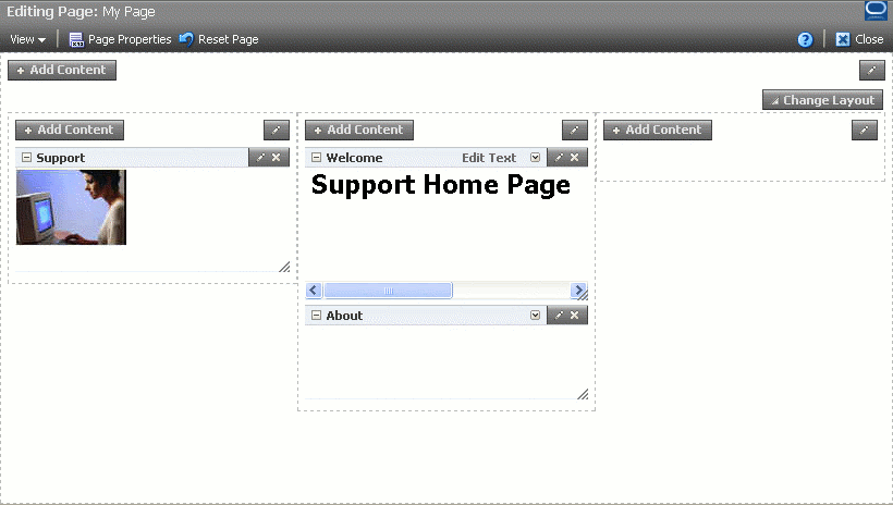
Figure 4-36 shows how the page appears in Edit mode at runtime.
Figure 4-36 MyPage Opened in Oracle Composer
To use this sample page in other examples in this guide, configure ADF security on the application.
To configure security in your application:
Configure ADF Security with form-based authentication, generating a default login page.
For more information, see Section 3.5.1, "How to Configure ADF Security."
Create three users ahunold, sking, and ngreenbe.
For the detailed procedure, see Section 3.5.2, "How to Create an Application Role."
When you run MyPage.jspx, a login screen is displayed. You can log in with any of the three user names that you created.
After you create an editable page with the required Oracle Composer components, you can populate the page with content just like a regular JSPX page. However, there are certain limitations and recommendations that you must be aware of when adding content to your Oracle Composer-enabled page.
Populating editable pages at design time is like populating any other ADF Faces page. You can drag and drop components from different areas of the IDE onto the page. You can add components like portlets, task flows, and ADF Faces components.
When you drag and drop a component anywhere inside a Page Customizable component, the Id attribute is set to a unique value. The Id attribute is required for editing a component and persisting its changed state. When you add a component to a page at runtime, the Id attribute is set automatically.
Consider the following when adding content to your editable page:
Components placed inside a Panel Customizable component that is nested in a Page Customizable component can be edited at runtime.
When adding an ADF Faces component within the Page Customizable component, ensure that you wrap it in a Show Detail Frame component. You can then perform customizations on the component at runtime.
You can include any Oracle ADF Faces component or task flow as child component of a Show Detail Frame component. However, portlets contain headers similar to those provided by Show Detail Frame components and can be added to Panel Customizable components directly. There are no additional benefits to including portlets in Show Detail Frame components.
The clientComponent attribute is not applicable to Panel Customizable and Show Detail Frame components within the Page Customizable component. In these components, the clientComponent attribute is inherently defined.
If your page has the ADF Faces components Output Text and Output Formatted nested inside a Page Customizable component, then ensure that you set the clientComponent attribute value. If this attribute value is not set, then you may encounter errors while trying to move or rearrange components on the page at runtime.
To consume portlets in your editable page, you must first register the portlet producers with your application. See Chapter 9, "Consuming Portlets" for details.