A User Interface
This appendix provides information about the user interface screens for Content Server administration applications. It contains the following topics:
A.1 Content Repository Interface
This section provides information about the interfaces used with Content Server repository.
Note:
If you are using Firefox set to open new tabs instead of windows, help screens launched from an Admin Applet are not accessible until the applet window that launched the help is closed. Therefore, it is preferable to set Firefox to open in new windows instead of tabs.It contains the following topics:
A.1.1 Configuration Manager Application Page
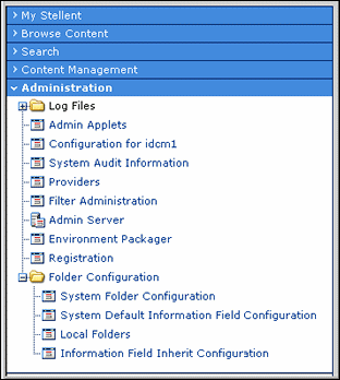
The Configuration Manager application is an administration application used to manage content types, file formats, and custom metadata fields. To access this page, log in as an administrator or subadministrator, and click the Administration tray in the portal navigation bar. Click Admin Applets, then click Configuration Manager.
Note:
If you are using Firefox set to open new tabs instead of windows, help screens launched from an Admin Applet are not accessible until the applet window that launched the help is closed. Therefore, it is preferable to set Firefox to open in new windows instead of tabs.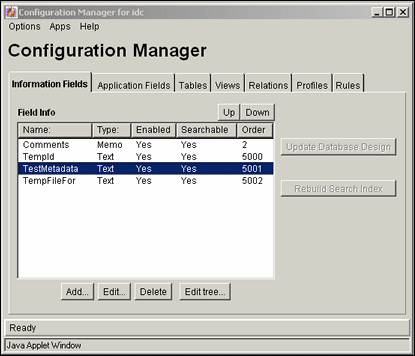
Note:
Only administrators can work with Configuration Manager. Subadministrators do not have access to this application.| Element | Description |
|---|---|
| Options menu | Opens additional administrative applications to manage information fields and file format. Also provides options to republish schema, set up trace programs, and exit the Configuration Manager application. Many of these options are also available on the Actions shortcut menu under the Administration tray link in the portal navigation bar |
| Apps menu | Used to open other administration applications. The other applications will open in the same mode (applet or stand-alone) as the current application. |
| Help menu | Contents: Displays the content server online help.
About Content Server: Displays version, build, and copyright information for the content server. |
| Information Fields tab | Used to add, edit, and delete custom metadata fields. See "Configuration Manager: Information Field Tab" for details. |
| Application Fields tab | Used to add, edit, and delete fields that are used to customize Content Server forms. |
| Tables tab | Used to add and define tables for schemas. See "Configuration Manager: Tables Tab". |
| Views tab | Used to add and define views to schemas. See "Configuration Manager: Views Tab". |
| Relations tab | Used to add and define relationships between tables and columns. See "Configuration Manager: Relations Tab". |
| Profiles tab | Used to create and define content profiles. See "Configuration Manager: Profiles Tab". |
| Rules tab | Used to create and define the rules to include in profiles. See "Configuration Manager: Rules Tab" |
The following screens are used in many administration applications for a variety of detailed purposes; however, their basic use remains the same:
A.1.1.1 Content Item View Screen
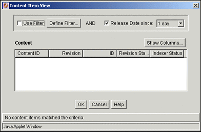
The Content Item View screen is used to select content to use when previewing different content profile scenarios. To access this screen, click the Select button that corresponds to the Content ID field on the Preview Profile Screen. The Content Item View screen is also accessed from the following content profile screens:
-
Edit Activation Condition: see "Edit Activation Condition Screen Tabs"
-
Edit Default Value: see "Edit Default Value: Conditions Tab"
-
Edit Derived Value: see "Edit Derived Value: Conditions Tab"
| Element | Description |
|---|---|
| Use Filter check box | Used to narrow the list of content items that are included in the Content pane.
Selected: Enables filtering of content items in the list based on any selected and defined filter fields and release date since filter (if specified). Clear: Disables filtering of content items in the list. |
| Define Filter button | Displays the Define Filter Screen, from which selections for filters can be made. Selected items activate those filter fields. |
| Release Date since check box/ date list | Selected: Enables filtering of content items in the list based on their respective release date since the specified elapsed time period of 1 day, 1 week, or 4 weeks.
Clear: Disables filtering of content items in the list. |
| Show Columns button | Displays the Show Columns Screen. This screen is used to select the property columns that are displayed for each content item included in the Content list. Selected items activate those property columns. |
| Content pane | Displays the applicable values of the selected display columns for each content item included in the Content items list. |
A.1.1.2 User View Screen
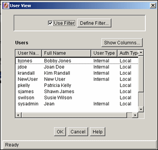
The User View screen is used to select users to include when previewing profile scenarios. To access this screen, click the Select button that corresponds to the User Name field on the Preview Profile Screen.
| Element | Description |
|---|---|
| Use Filter check box | Used to narrow the list of users to be included in the Users pane.
Selected: Enables filtering of the users in the list based on the criteria selected. Clear: Disables filtering of users in the list. |
| Define Filter button | Displays the Define Filter Screen, from which selections for filters can be made. Selected items activate those filter fields. |
| Show Columns button | Displays the Show Columns Screen. This screen is used to select the property columns that are displayed for each user included in the Users list. Selected items activate those property columns. |
| Users pane | Displays the applicable values of the selected display columns for each user included in the Users list. |
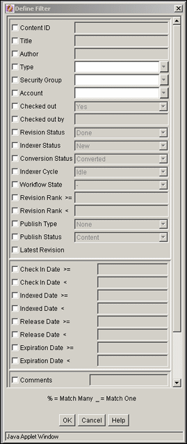
A.1.1.3 Define Filter Screen
The Define Filter screen is used to narrow the list of revisions, users, and so forth that is displayed on several administration application screens. Access this screen by clicking the Define Filter button on the User View Screen. Select one or more check boxes to activate the filter fields.
The items displayed will be filtered based on the criteria entered. The following wildcards can be used in these fields:
-
% = one or more characters; _ = single character.
A.1.1.4 Show Columns Screen
The Show Columns screen is used to select the columns that are displayed on several administration application screens. Access this screen by clicking the Show Columns button on the User View Screen.

| Element | Description |
|---|---|
| Check boxes | Selected: The field is displayed on the Content Item Subscribed Screen.
Cleared: The field is not displayed on the Content tab of the Repository Manager or the Content Item Subscribed screen. Note: See "Define Filter Screen" for field descriptions. |
| Save Settings check box | Selected: The column settings are applied every time the Content tab of the Repository Manager or Content Item Subscribed screen is displayed.
Cleared: The column settings apply only until the Content tab of the Repository Manager or Content Item Subscribed screen is closed. |
A.1.2 Content Type Interface Screens
The following screens are used when working with Content Types:
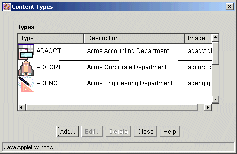
A.1.2.1 Content Types Screen
The Content Types screen is used to add, edit, and delete content types. You can also use it to view the name, description, and associated GIF for existing content types and to manage the corresponding images. To access this screen, select Content Types from the Options menu of the Configuration Manager Application Page.
| Element | Description |
|---|---|
| Type column | Shows the name of each content type and the GIF image associated with that type. |
| Description column | Shows the description of each content type. |
| Image column | Shows the file name for the GIF image associated with each content type. |
| Add button | Displays the Add New/Edit Content Type Screen. |
| Edit button | Displays the Add New/Edit Content Type Screen. |
| Delete button | Enables you to delete the selected content type. (You will not be able to delete a content type if any content has that type.) |
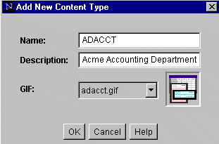
A.1.2.2 Add New/Edit Content Type Screen
The Add New/Edit Content Type screen is used to add or edit a content type. To access this screen, click Add or Edit on the Content Types Screen.
A.1.3 Native File Format Interface Screens
This section covers these screens:
A.1.3.1 File Formats Screen
The File Formats screen is part of the Configuration Manager applet, and is used to set the file formats and file extensions for file conversions. To access this option, select File Formats from the Options menu on the Configuration Manager applet.
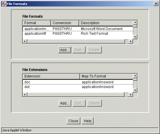
File Formats pane:
| Element | Description |
|---|---|
| Format column | This is generally the MIME (Multipurpose Internet Mail Extensions) type. |
| Conversion column | The method to use to convert the file. |
| Description column | The description for the file format. |
| Add button | Displays the Add New/Edit File Format Screen. |
| Edit button | Displays the Add New/Edit File Format Screen. |
| Delete button | Enables you to delete the selected file format. |
File Extensions pane:
| Element | Description |
|---|---|
| Extension column | The file extensions that are mapped to file formats. |
| Map to Format column | The file format that will be referenced to convert files with the specified file extension. |
| Add button | Displays the Add/Edit File Extension Screen. |
| Edit button | Displays the Add/Edit File Extension Screen. |
| Delete button | Enables you to delete the selected file extension. |
A.1.3.2 Add New/Edit File Format Screen
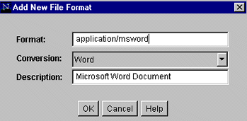
The Add New/Edit File Format screen is used to set up conversion methods for specific file formats. To access this screen, click Add or Edit in the File Formats pane on the File Formats Screen.
| Element | Description |
|---|---|
| Format field | This is generally the MIME (Multipurpose Internet Mail Extensions) type. |
| Conversion field | The method to use to convert the file. To not convert this file type, select Passthru. To use a custom conversion method, select Custom. |
| Description field | The description for the file format. |
A.1.3.3 Add/Edit File Extension Screen
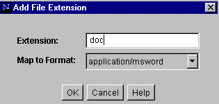
The Add/Edit File Extension screen is used to map file extensions to specific file formats. To access this screen, click Add or Edit in the File Extensions pane on the File Formats Screen.
| Element | Description |
|---|---|
| Extension field | The file extension of files to be converted. |
| Map to Format field | The file format that will be referenced to convert files with the specified file extension. |
A.1.4 Custom Fields Interface Screens
The following screens are used to add metadata fields and application fields:
A.1.4.1 Configuration Manager: Information Field Tab
The Information Fields tab of the Configuration Manager is used to add, edit, and delete custom metadata fields. Other tabs are this screen are used in conjunction with schemas and profiles.
To access this tab, click Information Fields on the Configuration Manager Application Page.

| Element | Description |
|---|---|
| Name column | Lists the names of custom metadata fields. |
| Type column | Shows the type for each field:
Text: 30 characters. Long Text: 100 characters. Date: Date format (such as dd/mm/yyyy or dd/mm/yy for the English-US locale). Memo: 255 characters. Integer: -231 to 231 (-2 billion to +2 billion). By definition, an integer is a natural number, so decimal values and commas are not permitted. Note: The size indicated is the character input length, not an indication of the actual number of bytes needed to store the field. |
| Enabled column | Shows whether the field is displayed on content server pages. |
| Searchable column | Shows whether the field is indexed and available for searches. |
| Order column | Shows the place the field occupies in the sort order. |
| Up and Down button | Used to rearrange the order of fields for sorting. To use, highlight a field and click the appropriate button. The field's position in the sort order is changed accordingly. |
| Update Database Design button | Saves changes to the database tables. This button becomes active when an update is required. |
| Rebuild Search Index button | Rebuilds the search index. This button becomes active when a rebuild is required. |
| Add button | Displays the Add Metadata Field Name Screen. |
| Edit button | Displays the Add Metadata Field Name Screen. |
| Delete button | Deletes the selected custom metadata field. |
| Edit Tree | If a field is associated with a schema relationship, this displays a parent/child (tree and node) structure for the entries in the selected table. This option becomes active after the field has been added and the database design has been updated. See "Edit Tree Screen" for more information. |
A.1.4.2 Add Metadata Field Name Screen
This screen is used to define the name of a new custom metadata field. To access this screen, click Add on the Configuration Manager: Information Field Tab.

| Element | Description |
|---|---|
| Field Name field | Duplicate names are not allowed. Maximum field length is 29 characters. The following are not acceptable: spaces, tabs, linefeeds, carriage returns and ; ^ ? : @ & + " # % < * ~ |
Note: When you add a custom metadata field, the system automatically prefixes the name with an 'x' to ensure that it is unique and does not conflict with any reserved names. Similarly, when you define a custom user information (metadata) field, the system automatically prefixes the name with a 'u' to ensure that it is also unique and does not conflict with any reserved names. |
Screens for Adding and Editing Metadata
These screens cover adding and editing metadata:
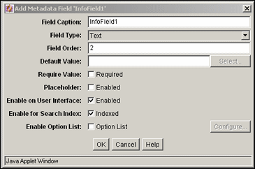
A.1.4.3 Add/Edit Metadata Field Screen
This screen is used to define a custom metadata field. To access this screen, do one of the following:
-
Enter a field name, and click OK on the Add Metadata Field Name Screen.
-
Select a field, and click Edit on the Configuration Manager: Information Field Tab.
| Element | Description |
|---|---|
| Field Caption field | Label for the field that is displayed on content server pages. |
| Field Type list | Text: 30 characters.
Long Text: 100 characters. Date: Date format (such as dd/mm/yyyy or dd/mm/yy for the English-US locale). Memo: 255 characters. Integer: -231 to 2 31 (-2 billion to +2 billion). By definition, an integer is a natural number, so decimal values and commas are not permitted. |
| Field Order field | Sequence in which the field is displayed on content server pages. Starting at 2, the number automatically increments as new fields are added. However, it is recommended to manually increment the numbers by 5, such as 15, 20, 25, etc. This will accommodate fields added in the future; for example: a field can be inserted between 15 and 20 by giving it a Field Order of 16. |
| Default Value field | The default value of the metadata field being created. |
| Require Value check box | Prevents files from being checked in if the field does not contain a value. |
| Placeholder check box | When selected, makes this a field which is not stored or indexed. Placeholders are often used for the parent level of a dependent choice list. |
| Enable on User Interface check box | Selected: The field is displayed on content server pages (checkin, search, content information, and so forth).
Clear: The field is not displayed on content server pages. |
| Enable for Search Index check box | Selected: The field will be indexed, so the field can be used as search criteria.
Clear: The field will not be indexed. Because the field cannot be used as search criteria, it is not displayed on search pages. |
| Enable Option List check box | Creates a user-selectable option list on content server pages. If you enable this check box then click Configure, the Add/Edit Custom Info Field: Configure Option List is displayed. |
A.1.4.4 Add/Edit Custom Info Field: Configure Option List
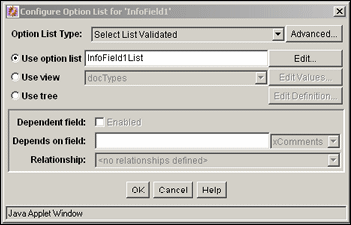
The Configure Option List screen is used to specify the type of option list, the values for the option list and any dependencies associated with the option list. To access this screen, click Enable Option List then click Configure on the Add Metadata Field Name Screen or on the Add/Edit Metadata Field Screen.
| Element | Description |
|---|---|
| Option List Type | Specifies the type of option list:
|
| Advanced button | Displays the Option List Storage Screen, used to specify how the option list is stored and displayed. |
| Use option list | Used to create a new option list. The name of the new list is inserted into the field. |
| Edit button | Displays the Option List Screen, used to add or alter choices on the list associated with the metadata field. |
| Use view | Used to choose values in a view instead of a created option list. |
| Edit Values button | Displays the Edit View Values Screen or the Option List Screen, depending on the type of view selected. |
| Use tree | Used to choose values in a tree instead of an option list or a view. |
| Edit Definition button | Displays the Option List Screen, used to alter how the tree is defined and displayed. |
| Dependent field check box | Determines whether this metadata field will be subordinate to another metadata field. This is only available when using a view. Click the check box to enable the dependency. |
| Depends on field list | Enter a field name or choose from the list of metadata that can be used to set dependencies. |
| Relationship | If relationships have previously been defined for the view, they are available from the list. See "Configuration Manager: Relations Tab" for details about relations.
If an option list or a view without a defined relationship is selected for use, <no relationship defined> is displayed. |
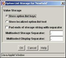
A.1.4.5 Option List Storage Screen
The Option List Storage Screen is used to specify how the option list will be displayed and stored. To access this screen, click the Advanced button next to the option list on the Add/Edit Custom Info Field: Configure Option List.
| Element | Description |
|---|---|
| Store option list keys | Select this option to permanently store option list keys. You can store keys or localized option list text. |
| Store localized option list text | Select this option to store localized versions of the option list. You can store keys or localized option list text. |
| Pad ends of storage string with separator | Active only if one of the Multiselect options is chosen on the Add/Edit Custom Info Field: Configure Option List. Use this option to pad the length of the separator used to store multiselect values. |
| Multiselect Storage Separator | Active only if one of the Multiselect options is chosen on the Add/Edit Custom Info Field: Configure Option List. Use this option to change the separator used to store multiselect values. |
| Multiselect Display Separator | Active only if one of the Multiselect options is chosen on the Add/Edit Custom Info Field: Configure Option List. Use this option to change the separator used to display multiselect values. |
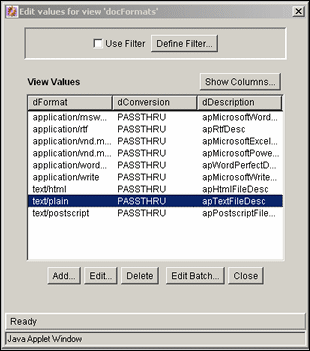
A.1.4.6 Edit View Values Screen
The Edit View Values screen is used to edit the values defined in a view. To access this screen, click Edit Value next to Use View on the Add/Edit Metadata Field Screen. The columns of fields on this screen depend on the type of view selected.
| Element | Description |
|---|---|
| Use Filter/Define Filter | Used to alter which values are displayed in the selected columns. |
| Show Columns | Limits the number of columns to show in the view. See "Show Columns Screen". |
| Add | Displays the Add/Edit Value Screen, used to edit values in the view. |
| Edit | Displays the Add/Edit Value Screen, where you can alter the values in a column. |
| Delete | Used to delete a value from the table. You are prompted to confirm the deletion. |
| Edit Batch | Displays the Edit Values: Edit Batch, used to copy and paste large amounts of information in order to alter values. |
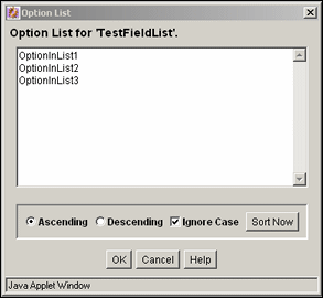
A.1.4.7 Option List Screen
The Option List screen is used to create an option list for a custom field. To access this screen, click the Edit button next to Use Option List on the Add/Edit Custom Info Field: Configure Option List.
| Element | Description |
|---|---|
| Option list | Enter the values that can be selected for the custom metadata field. Each value must be on a separate line, with a carriage return between values. |
| Ascending option | Sort the list in alpha-numeric order, with capital letters preceding lower-case letters. For example, an Ascending list with Ignore Case disabled will list ABCDF before abcde. |
| Descending option | Sort the list in reverse alpha-numeric order, with lower-case letters preceding capital letters. For example, a descending list with Ignore Case disabled will list abcde before ABCDE. |
| Ignore Case check box | Sort the list in either Ascending or Descending order and ignore the case of the list items. |
| Sort Now button | Sorts the list in the manner specified by the Ascending, Descending, and Ignore Case options. |
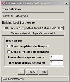
A.1.4.8 Edit Tree Definition Screen
The Edit Tree Definition Screen is used to define how a tree used in an option list is stored and displayed. To access this screen, click the Edit Definition button next to Use Tree on the Add/Edit Custom Info Field: Configure Option List.
| Element | Description |
|---|---|
| Select relationship menu | Select a relationship between the levels of the option list. |
| Remove view option bar | Click on this bar to remove the selected view. |
| Show complete selection path | Select this checkbox to display the complete path when the option is selected. |
| Store complete selection path | Select this checkbox to save the complete path when the option is selected. |
| Tree node storage separator | Use this option to store a different operator between values. |
| Tree node display separator | Use this option to change the separator between values. |
A.1.4.9 Select Root Node for the Tree
When you configure a schema tree for a metadata field that uses a tree to choose values instead of an option list or a view, the Select Root field is displayed on the Edit Tree Definition Screen. It enables you to select parent values when browsing for a child in a DCL schema. That is, you can choose the row in a table that is the root of the tree.
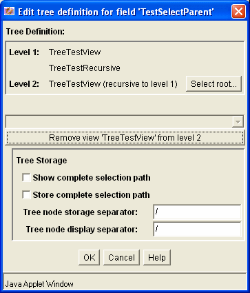
| Element | Description |
|---|---|
| Tree Definition pane | Displays the tree schema hierarchy. |
| Select Root button | Displays a popup dialog to select parent values for a child value. |
| Other screen elements | For descriptions of the other screen elements. See "Edit Tree Definition Screen". |
A.1.4.10 Update Database Design Screen
The Update Database Design screen is used to add or delete metadata fields in the content server database. To access this screen, add or delete a custom metadata field and click Update Database Design on the Configuration Manager: Information Field Tab.
The following table lists the events after which a database update or search index rebuild may be required depending on the search engine.
| Event | Action Required |
|---|---|
| Add metadata field | Update database |
| Edit metadata field | Update database* |
| Delete metadata field | Update database |
| Enable or disable Enable for Search Index for metadata field | Rebuild search index |
| Add metadata field with Enable for Search Index selected | Rebuild search index |
Changes to the Require Value, Option List Default Value, Option List Key, and Option List values do not require a database update.
Caution:
Depending on the size of your search index and available system resources, the search index rebuild process may take several days. If rebuilding is necessary, rebuild at times of non-peak system usage.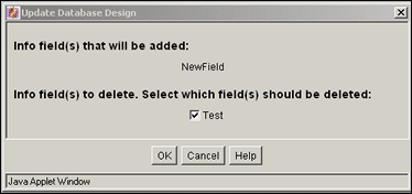
| Element | Description |
|---|---|
| Info field(s) that will be added | Lists the metadata fields that were added since the last time the database was updated. |
| Info field(s) to delete check boxes | Lists the metadata fields that were deleted since the last time the database was updated.
Selected: The metadata field will be deleted from the database. Clear: The metadata field will not be deleted from the database. The field remains hidden on the Configuration Manager screen and checkin and search pages, but it still exists in the database. |
A.1.4.11 Configuration Manager: Application Fields Tab
The Application Fields Tab is used to add, edit, and delete custom fields used on Content Server forms. To access this tab, click Application Fields on the Configuration Manager Application Page.
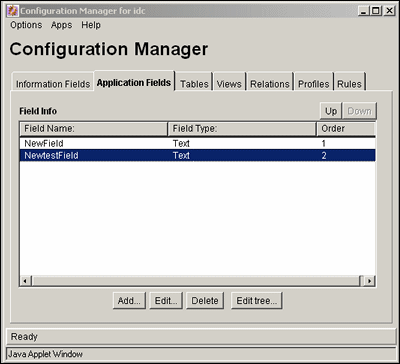
| Element | Description |
|---|---|
| Field Name column | Lists the names of custom application fields. |
| Field Type column | Shows the type for each field. |
| Order column | Shows the place the field occupies in the sort order. |
| Up and Down button | Used to rearrange the order of fields for sorting. To use, highlight a field and click the appropriate button. The field's position in the sort order is changed accordingly. |
| Add button | Displays the Add/Edit Metadata Field Screen. |
| Edit button | Displays the Add/Edit Metadata Field Screen. |
| Delete button | Deletes the selected custom metadata field. |
| Edit Tree | If a field is associated with a schema relationship, this displays a parent/child (tree and node) structure for the entries in the selected table. This option becomes active after the field has been added and the database design has been updated. See "Edit Tree Screen" for more information. |
A.1.4.12 Add/Edit Application Field Screen
This screen is used to add the necessary information for a custom application field. To access this screen, click Add or highlight a field and click Edit on the Configuration Manager: Application Fields Tab screen.
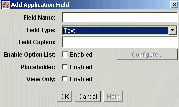
| Element | Description |
|---|---|
| Field Name field | Enter the name of the field. Duplicate names are not allowed. Maximum field length is 29 characters. The following are not acceptable: spaces, tabs, linefeeds, carriage returns and ; ^ ? : @ & + " # % < * ~ | |
| Field Type list | Text: 30 characters.
Long Text: 100 characters. Date: Date format (such as dd/mm/yyyy or dd/mm/yy for the English-US locale). Memo: 255 characters. Integer: -231 to 231 (-2 billion to +2 billion). By definition, an integer is a natural number, so decimal values and commas are not permitted. |
| Field Caption field | Label for the field that is displayed on content server pages. |
| Enable Option List check box | Creates a user-selectable option list on content server pages. If you enable this check box then click Configure, the Add/Edit Custom Info Field: Configure Option List is displayed. |
| Placeholder check box | When selected, makes this a field which is not stored or indexed. Placeholders are often used for the parent level of a dependent choice list. |
| View Only check box | When selected, makes this a field which is only used in a schema view. |
A.1.5 Repository Manager Interface Screens
The following screens are used to access the Repository Manager:
A.1.5.1 Repository Manager Main Screen
The Repository Manager Main Screen shows the options and tabs available with the Repository Manager. To display this screen, click Repository Manager on the Admin Applets screen or start Repository Manager in standalone mode.
Note:
If you are using Firefox set to open new tabs instead of windows, help screens launched from an Admin Applet are not accessible until the applet window that launched the help is closed. Therefore, it is preferable to set Firefox to open in new windows instead of tabs.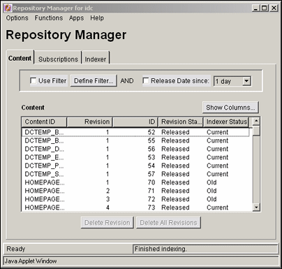
| Element | Description |
|---|---|
| Options menu | Contains options to start tracing or to exit and close the Repository Manager. |
| Functions menu | Info: Displays the Approve Revision Screen.
Add Revision: Displays the Add New Revision Screen. This option is available only in the stand-alone Repository Manager application. Update: Displays the Update Content Info Screen. Subscribers: Displays the Users Subscribed Screen. Check Out: Displays the Check Out Item Screen. Undo Check Out: Displays the Undo Check Out Screen. Approve: Displays the Approve Revision Screen. Reject: Displays the Reject Revision Screen. Resubmit: Displays the Resubmit Revision Screen. Delete Revision: Displays the Delete Revision Screen. Delete All Revisions: Displays the Delete All Revisions Screen. Note: All of the options on the Functions menu are also available from a shortcut menu, which is accessed by right-clicking a revision in the Content list. |
| Apps menu | Used to open other administration applications. The other applications will open in the same mode (applet or stand-alone) as the current application. |
| Help menu | Contents: Displays the online help for system administrators.
About Content Server: Displays version, build, and copyright information for the content server. |
| Content tab | Displays the Repository Manager: Content Tab Screen. |
| Subscriptions tab | Displays the Repository Manager: Subscriptions Tab. |
| Indexer tab | See Repository Manager: Indexer Tab, in the Oracle Fusion Middleware Application Administrator's Guide for Content Server. |
A.1.5.2 Repository Manager: Content Tab Screen
The Content tab of the Repository Manager is used to display content item revisions. To access this tab, display the Repository Manager Main Screen and click Content.

| Element | Description |
|---|---|
| Use Filter check box | Select this check box to narrow the Content list as defined by the Show Columns Screen. |
| Define Filter button | Displays the Define Filter Screen |
| Release Date since check box and list | Select this check box to narrow the Content list as defined by the Release Date option list. |
| Show Columns button | Displays the Show Columns Screen. |
| Content list | Shows the revisions in the content server repository that match the filter settings.
|
| Add New button | Displays the Add New Content Item Screen.
This button is available only in the stand-alone Repository Manager application. |
| Add Revision button | Displays the Add New Revision Screen.
This button is available only in the stand-alone Repository Manager application. |
| Delete Revision button | Displays the Delete Revision Screen. |
| Delete All Revisions button | Displays the Delete All Revisions Screen. |
A.1.6 Content Interface Screens
The following screens are used to manage content:
A.1.6.1 Information Screen
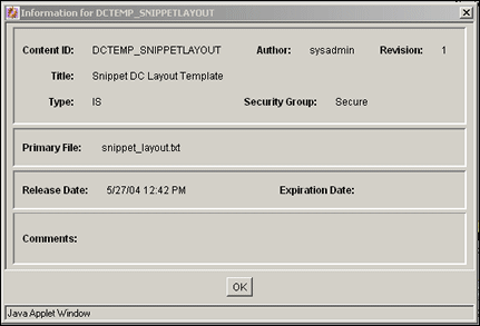
The Information screen is used to view the metadata for a revision. To access this screen, do one of the following:
-
Select a revision on the Repository Manager: Content Tab Screen, and select Functions, Info.
-
Right-click a revision on the Repository Manager: Content Tab Screen, and select Info.
All of the standard metadata fields and any custom metadata fields are displayed on this screen.
A.1.6.2 Add New Content Item Screen
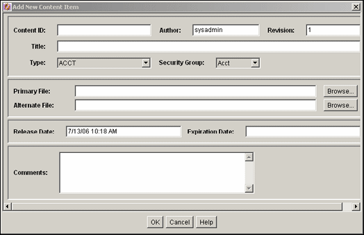
The Add New Content Item screen is used to check a new content item into the system without using a content server check in page. To access this screen, click Add New on the stand-alone Repository Manager: Content Tab Screen.
All of the standard metadata fields and any custom metadata fields are displayed on this screen.
A.1.6.3 Update Content Info Screen
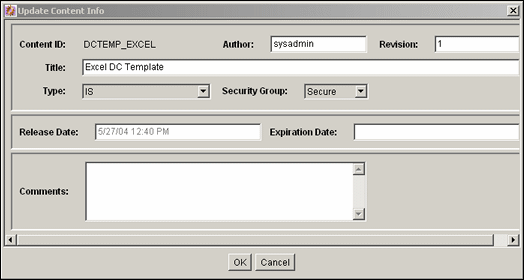
The Update Content Info screen is used to change the metadata of an existing revision. To access this screen, do one of the following:
-
Select a revision on the Repository Manager: Content Tab Screen, and select Functions, Update.
-
Right-click a revision on the Repository Manager: Content Tab Screen, and select Update.
All of the standard metadata fields and any custom metadata fields are displayed on this screen.
A.1.7 Revision Interface Screens
The following screens are used when working with revisions:
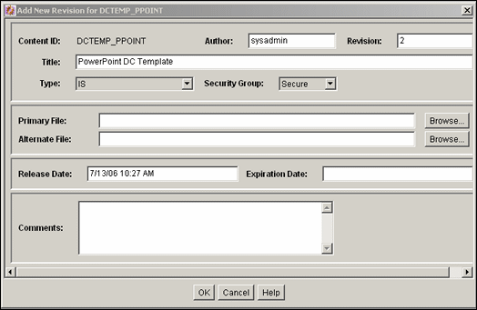
A.1.7.1 Add New Revision Screen
The Add New Revision screen is used to check in a revision of an existing content item. To access this screen, do one of the following on the stand-alone Repository Manager Main Screen:
-
Select a revision and click Add Revision.
-
Select a revision and select Functions, Add Revision.
-
Right-click a revision and select Add Revision.
All of the standard metadata fields and any custom metadata fields are displayed on this screen.
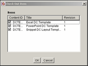
A.1.7.2 Check Out Item Screen
The Check Out Item screen is used to check out revisions. To access this screen, select one or more revisions on the Repository Manager: Content Tab Screen and do one of the following:
-
Select Functions, Check Out.
-
Right-click and select Check Out.
| Element | Description |
|---|---|
| Check boxes | Selected: The revision will be checked out.
Clear: The revision will not be checked out. |
| OK button | Checks out the selected revisions. |
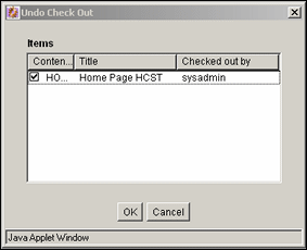
A.1.7.3 Undo Check Out Screen
The Undo Check Out screen is used to undo a checkout. To access this screen, select one or more revisions on the Repository Manager: Content Tab Screen, and do one of the following:
-
Select Functions, Undo Check Out.
-
Right-click and select Undo Check Out.
| Element | Description |
|---|---|
| Check boxes | Selected: The checkout will be undone for the revision.
Clear: The revision will remain checked out. |
| OK button | Undoes the checkout for the selected revisions. |
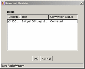
A.1.7.4 Resubmit Revision Screen
The Resubmit Revision screen is used to submit a file to the Inbound Refinery for conversion. To access this screen, select one or more revisions on the Repository Manager: Content Tab Screen, and do one of the following:
-
Select Functions, Resubmit.
-
Right-click and select Resubmit.
Note:
You cannot resubmit files that are in the Inbound Refinery queue.
| Element | Description |
|---|---|
| Check boxes | Selected: The revision will be resubmitted to the Inbound Refinery.
Clear: The revision will not be resubmitted to the Inbound Refinery. |
| OK button | Submits the selected revisions to the Inbound Refinery for conversion. |
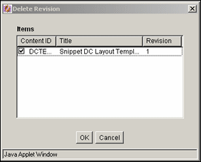
A.1.7.5 Delete Revision Screen
The Delete Revision screen is used to delete individual revisions. To access this screen, select one or more revisions on the Repository Manager: Content Tab Screen and do one of the following:
-
Click Delete Revision.
-
Click Functions, Delete Revision.
-
Right-click then select Delete Revision.
| Element | Description |
|---|---|
| Check boxes | Selected: The revision will be deleted.
Clear: The revision will not be deleted. |
| OK button | Deletes the selected revisions. |
A.1.7.6 Delete All Revisions Screen
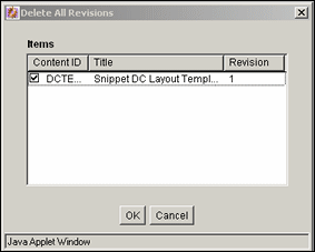
The Delete All Revisions screen is used to delete all revisions of selected content items. To access this screen, select one or more revisions on the Repository Manager: Content Tab Screen and do one of the following:
-
Click Delete All Revisions.
-
Select Functions, Delete All Revisions.
-
Right-click then select Delete All Revisions.
| Element | Description |
|---|---|
| Check boxes | Selected: All revisions of the content item will be deleted.
Clear: No revisions of the content item will be deleted. |
| OK button | Deletes all revisions of the selected content items. |
A.1.8 Workflow Revision Interface Screens
The following screens are used when handling workflows:
A.1.8.1 Approve Revision Screen
The Approve Revision screen is used to approve revisions that are in a workflow. To access this screen, select one or more revisions in a workflow on the Repository Manager: Content Tab Screen and do one of the following:
-
Select Functions, Approve.
-
Right-click, and select Approve.
Note:
Only revisions that are in a workflow will be displayed on this screen.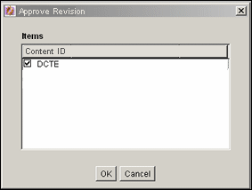
| Element | Description |
|---|---|
| Check boxes | Selected: The revision will be approved.
Clear: The revision will not be approved. |
| OK button | Approves the selected revisions. |
A.1.8.2 Reject Revision Screen
The Reject Revision screen is used to approve revisions that are in a workflow. To access this screen, select one or more revisions on the Repository Manager: Content Tab Screen and do one of the following:
-
Select Functions, Reject.
-
Right-click, and select Reject.
Note:
Only revisions that are in a workflow will be displayed on this screen.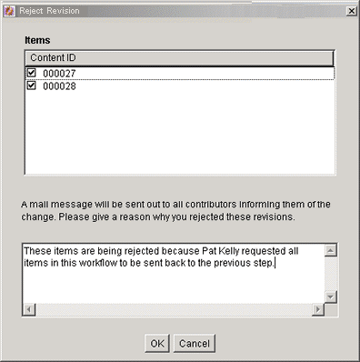
| Element | Description |
|---|---|
| Check boxes | Selected: The revision will be rejected.
Clear: The revision will not be rejected. |
| Rejection message field | Enter a message that will be included in the rejection notification e-mail. This message will be sent for all rejected revisions. |
| OK button | Returns the selected revisions to the last reviewer/contributor step, and sends a rejection notification e-mail to the reviewers for that step. |
A.1.9 Subscription Interface Screens
The following screens are used when managing subscriptions:
A.1.9.1 Repository Manager: Subscriptions Tab
The Subscriptions tab of the Repository Manager is used to create and edit Criteria subscriptions. To access this tab, click the tab on the Repository Manager Main Screen.
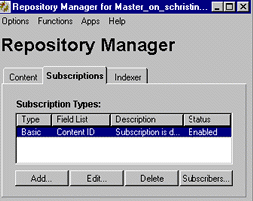
| Element | Description |
|---|---|
| Type column | The name that you give to the subscription. |
| Field List column | The active criteria fields assigned to the subscription. |
| Description column | The description that corresponds to the subscription. |
| Status column | The status: enabled or disabled for the subscription. |
| Add button | Displays the Add New/Edit Subscription Type Screen. |
| Edit button | Displays the Add New/Edit Subscription Type Screen. |
| Delete button | Removes the subscription from the list. |
| Subscribers button | Displays the Users Subscribed Screen, on which you add and delete users subscribed to the subscription. Additionally, you can use this screen to view the files in this subscription. |
A.1.9.2 Add New/Edit Subscription Type Screen
The Add New/Edit Subscription Type screen is used to add or edit a subscription. To access this screen, click Add or Edit on the Repository Manager: Subscriptions Tab.
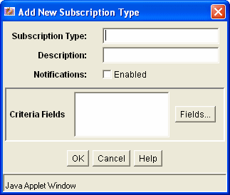
| Element | Definition |
|---|---|
| Subscription Type field | The name that you give to the subscription. |
| Description field | A description of the subscription. |
| Notifications check box | Enabled: Causes e-mail messages to be sent to subscribers when content meeting the subscription criteria is checked in or updated.
Disabled: Turns off e-mail notifications to subscribers. This is useful when a mail server is down or overwhelmed. |
| Criteria Fields box | Lists the metadata fields used to define the subscription. |
| Fields button | Displays the Fields Screen, which you use to define the metadata fields for the subscription. |
A.1.9.3 Fields Screen
The Fields screen is used to define the metadata fields for a subscription. To access this screen, click Fields on the Add New/Edit Subscription Type Screen.
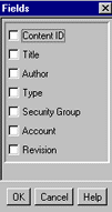
| Element | Definition |
|---|---|
| Check boxes | Selected: The metadata field is included in the subscription criteria.
Clear: The metadata field is not included in the subscription criteria. |
A.1.9.4 Users Subscribed Screen
The Users Subscribed screen is used to view, add, and delete specific users and aliases for a subscription. You can also use this screen to view the content items that meet the subscription criteria. To access this screen, select a subscription and click Subscribers on the Repository Manager: Subscriptions Tab.
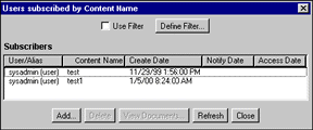
| Element | Description |
|---|---|
| Use Filter check box | Select this check box to narrow the Subscribers list as defined by the Show Columns Screen. |
| Define Filter button | Displays the Define Filter Screen. |
| Subscribers list | Shows the subscribed users and aliases that match the filter settings.
User/Alias column: The specific user/alias for the subscription. Criteria columns: A column is displayed for each metadata field that is included in the subscription criteria. Create Date column: The date the user or alias was added to the subscription (regardless of enabled/disabled status). Notify Date column: The last date that the user was notified by e-mail about a revision to the subscribed content item. (The notify date is not recorded for an alias.) Access Date column: The last date that the user accessed the file defined by the subscription criteria. (The access date is not recorded for an alias.) |
| Add button | Displays the Add Subscription Screen. |
| Delete button | Deletes the user or alias from the subscription. |
| View Content Items button | Displays the Content Item Subscribed Screen. |
| Refresh button | Refreshes the screen with the most current data. |
A.1.9.5 Define Filter Screen
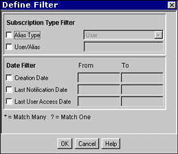
The Define Filter screen is used to narrow the list of users and aliases that is displayed on the Users Subscribed screen. To access this screen, click Define Filter on the Users Subscribed Screen.
| Element | Description |
|---|---|
| Check boxes | Select one or more check boxes to activate the filter fields. |
| Fields | The Users Subscribed Screen will be filtered based on the criteria entered. The following wildcards can be used in these fields:
With MS Access or MSDE, * = one or more characters; ? = single character. With all other databases, % = one or more characters; _ = single character. |
| Alias Type field | User: Shows only users.
Alias: Shows only aliases. |
| User/Alias field | A specific user or alias name. |
| Creation Date field | The date the user or alias was added to the subscription (regardless of enabled/disabled status). |
| Last Notification Date field | The last date that the user was notified by e-mail about a revision to the subscribed content item. |
| Last User Access Date field | The last date that the user accessed the file defined by the subscription criteria. |
A.1.9.6 Content Item Subscribed Screen
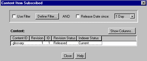
The Content Item Subscribed screen is used to view content items that match the criteria for a subscription. To access this screen, click View Content Items on the Users Subscribed Screen.
| Element | Description |
|---|---|
| Use Filter check box | Select this box to use the filter defined by the Show Columns Screen. |
| Define Filter button | Displays the Define Filter Screen. |
| Release Date since check box and list | Select this check box to narrow the Content list as defined by the Release Date option list. |
| Show Columns button | Displays the Show Columns Screen. |
| Content list | Shows the subscribed revisions that match the filter settings.
The list displays 50 revisions per page. Double-clicking a revision displays the Information Screen for that revision. See "Define Filter Screen" for column descriptions. |
A.1.9.7 Add Subscription Screen
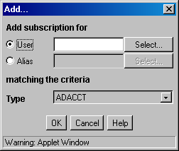
The Add screen is used to add a specific subscription for a user or alias. To access this screen, click Add on the Users Subscribed Screen.
| Element | Description |
|---|---|
| User option | The specified user is to be added to the subscription. |
| Alias option | The specified alias is to be added to the subscription. |
| Select (User) button | Displays the Select User Screen. |
| Select (Alias) button | Displays the Select Alias Screen. |
| Criteria fields | The specific metadata values that the selected user or alias will be subscribed to. All criteria fields specified for the subscription are displayed. |
A.1.9.8 Select User Screen
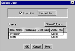
The Select User screen is used to select a user to assign to a subscription. To access this screen, select the User option and click Select on the Add Subscription Screen.
| Element | Description |
|---|---|
| Use Filter check box | Select this check box to narrow the Users list as defined by the Define Filter Screen. |
| Define Filter button | Displays the Define Filter Screen. |
| Show Columns button | Displays the Show Columns Screen. |
| Users list | Shows the users that match the filter settings.
See "Define Filter Screen" for column descriptions. |
A.1.9.9 Select Alias Screen
The Select Alias screen is used to select an alias to assign to a subscription. To access this screen, select the Alias option and click Select on the Add Subscription Screen.
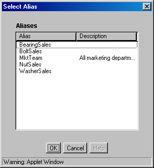
| Element | Description |
|---|---|
| Alias column | Lists the available aliases. |
| Description column | A description of the alias. |
A.1.9.10 Subscribers Screen
The Subscribers screen is used to view and unsubscribe users from subscriptions to a particular revision. To access this screen, select a revision on the Repository Manager: Content Tab Screen, and do one of the following:
-
Select Functions, Subscribers.
-
Right-click and select Subscribers.
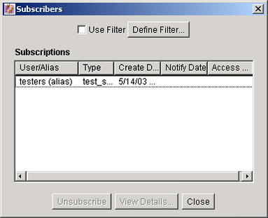
| Element | Description |
|---|---|
| Use Filter check box | Select this check box to narrow the Subscriptions list as defined by the Show Columns Screen. |
| Define Filter button | Displays the Define Filter Screen. |
| User/Alias column | The user or alias that is subscribed to the revision. |
| Type column | The subscription type. |
| Create Date column | The date the user or alias was added to the subscription (regardless of enabled/disabled status). |
| Notify Date column | The last date that the user was notified by e-mail about a revision to the subscribed content item. |
| Access Date column | The last date that the user accessed the file defined by the subscription criteria. |
| Unsubscribe button | Cancels the selected subscription. |
| View Details button | Displays the Subscription Detail Screen. |
| Close button | Closes the Subscribers screen. |
A.1.9.11 Subscription Detail Screen
The Subscription Detail screen is used to view the details of a subscription. To access this screen, select a user or alias on the Subscribers Screen, and click View Details.
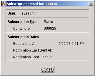
| Element | Description |
|---|---|
| User or Alias field | The user or alias subscribed to the revision. |
| Subscription Type field | The type of subscription. |
| Metadata fields | The fields and values that define the subscription criteria. |
| Subscribed At field | The date the user or alias was added to the subscription (regardless of enabled/disabled status). |
| Notification Last Sent At field | The last date that the user was notified by e-mail about a revision to the subscribed content item. |
| Notification Last Used At field | The last date that the user accessed the file defined by the subscription criteria. |
A.1.10 Schema Interface Screens
The following screens are used to create a schema:
A.1.10.1 Configuration Manager: Tables Tab
Important:
While you can use core Content Server system tables such as Revisions, Alias, Documents, and Users you cannot save any edits to those tables (if you try to remove columns, alter column length, etc.)The Tables tab on the Configuration Manager is used to create or edit tables and columns used in schemas. To access this screen, click the Tables tab on the Configuration Manager Application Page.
Note:
If you are not using existing tables when establishing views and relationships, you will need to use an external tool to generate records and populate the tables that you create using the Tables tab.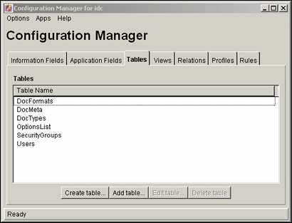
| Element | Description |
|---|---|
| Table Name column | Lists the existing tables. |
| Create table button | Displays the Create/Edit Table 'name' Screen. |
| Add table button | Displays the Select Table Screen. |
| Edit table button | Displays the Create/Edit Table 'name' Screen. |
| Delete table button | Enables you to delete the selected table. |
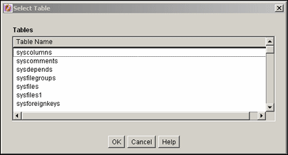
A.1.10.2 Select Table Screen
The Select Table screen is used to indicate which tables will be used in the schema. This screen displays a list of tables that can be used. It is accessed by clicking Add Table from the Configuration Manager: Tables Tab screen or Add Table on the Add View Screen: Select Table page.
| Element | Description |
|---|---|
| Table Name list | Lists the existing Content Server database tables from the list. |
A.1.10.3 Create/Edit Table 'name' Screen
This screen is used to specify the columns in tables to be used in a schema. To access this screen, click Create Table or Edit Table on the Configuration Manager: Tables Tab screen or click Create Table on the Add View Screen: Select Table page.
Important:
While you can use core Content Server system tables such as Revisions, Alias, Documents, and Users you cannot save any edits to those tables.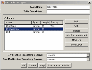
| Element | Description |
|---|---|
| Table Name field | The name of the table to be created or edited. |
| Table Description field | A brief description of the table to be created of edited. |
| Column fields | Displays the columns and their properties that are included in this table. |
| Add button | Displays the Add/Edit Column Screen. |
| Edit button | Displays the Add/Edit Column Screen. |
| Delete button | Enables you to delete the selected column. |
| Add Recommended button | Standard, recommended columns that are added to the table. For example, schPrimaryKey, schCreateTimestamp, schModifyTimestamp, and schSourceID. |
| Row Creation Timestamp Column list | This column must be added to the table to ensure that table replication functions properly. This field indicates the timestamp when a row in the table is created. |
| Row Modification Timestamp Column list | This column must be added to the table to ensure that table replication functions properly. This field indicates the timestamp when a row in the table is modified. |
| Synchronize definition | Loads the definition of the table from the database and synchronizes it with the one currently in view. This is particularly useful when two people are manipulating the table simultaneously and a warning is issued, indicating that the copy of the table is outdated. Synchronizing the definition will update the table. |
A.1.10.4 Add/Edit Column Screen
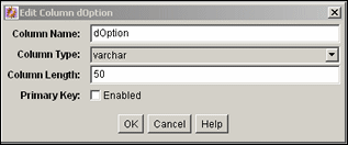
The Add/Edit Column screen is used to select the column that will be the primary key in the schema. To access this screen, select a column from the Create/Edit Table 'name' Screen and click Edit or click Add to create a new column.
| Element | Description |
|---|---|
| Column Name field | The name of the column to be created or edited.
Note: To avoid potential conflicts with Content Server database tables, always add a prefix to column names. For example, schColumnOne. |
| Column Type list | Select the column type from the list (varchar is the default value). |
| Column Length field | The length of the value to be stored in the column. |
| Primary Key check box | If selected, this column is designated as a primary key for the table. |
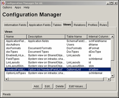
A.1.10.5 Configuration Manager: Views Tab
The Views tab is used to create the views used with the schemas. To access this screen, click the Views tab on the Configuration Manager Application Page.
| Element | Description |
|---|---|
| Views list | Lists the existing views. |
| Add button | Displays the Add View Screen: Select Table screen. |
| Edit button | Displays the Add/Edit View Screens. |
| Delete button | Enables you to delete the selected view. |
| Edit Values button | Displays a screen such as the Add/Edit Value Screen or the Option List Screen where you can add or change values in the table associated with the view. The screen which appears is dependent on the type of table used for the view. |
A.1.10.6 Add View Screen: Select Table
The Select Table screen is used to create a new view for a schema. To access this screen, click Add from the Add View Screen: Select Table screen.
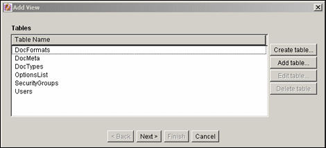
| Element | Description |
|---|---|
| Table Name list | Lists the tables created that do not already have a view. |
| Create table button | Displays the Create/Edit Table 'name' Screen, used to create a new table. |
| Add table button | Displays the Select Table Screen, used to add a table to the view. |
| Edit table button | Displays the Create/Edit Table 'name' Screen, used to alter the table and the primary keys. |
| Delete table button | Enables you to delete the selected table in this schema. |
A.1.10.7 Add View Screen: Select Columns
The Select Column screen is used to choose the columns for the schema view. To access this screen, select a table from the Add View Screen: Select Table page and click Next.
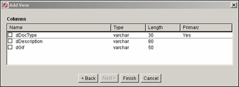
| Element | Description |
|---|---|
| Name list | Lists the names of the existing table columns that can be selected to be included in the view and published out to schema. |
A.1.10.8 Add/Edit View Screens
The Add View screen has four main tabs that are used when adding views.
Add/Edit View Screen: Info Tab
The Info Tab of the Add View screen is used to name the new view for the schema. This screen is displayed after you choose the columns to use for the view on the Add View Screen: Select Columns page and click Finish or if you choose a view to edit on the Configuration Manager: Views Tab.
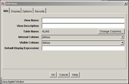
| Element | Description |
|---|---|
| View Name field | The name of the view to be created or edited. |
| View Description field | A brief description of the view to be created. |
| Table Name field | The table associated with this view. |
| Change Columns button | Displays the Change Column screen. Changes the columns originally selected. |
| Internal Column list | The column name in the view being created (used internally). |
| Visible Column list | The column name displayed to system users. |
| Default Display Expression field | This field determines how the name in the corresponding option list will be displayed. The value in this field can be either text or an Idoc Script expression.
Note: Whatever value is set for this field will be displayed on the Content Information page rather than the actual value that is assigned to that field. To avoid this, clear this field when creating the view. |
The Change Column screen is used to change the list of columns to be used in the schema view. This screen is accessed by click the Change Columns button next to the table name on the Info tab of the Add/Edit View Screens.
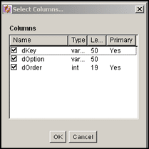
| Element | Description |
|---|---|
| Columns list | Lists the existing view columns and is used to change the columns originally selected using the Add View Wizard. See "Add View Screen: Select Columns". |
Add/Edit View Screen: Display Tab
The Display tab on the Add View Screen is used to specify rules for the display of the schema data. This screen is displayed after you select a view and click Edit on the Configuration Manager: Views Tab or after you click Add on the Configuration Manager: Views Tab and follow the steps needed to create a new view. Click the Display tab to display this screen.
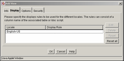
| Element | Description |
|---|---|
| Locale/Display Rule list | Lists the defined display rules for the locales. |
| Edit button | Displays the Edit Display Rule screen for the selected rule. |
| Delete button | Enables you to delete the selected locale/display rule. |
| Reset button | Resets the display rule for the selected locale. |
| Reset all button | Resets all of the display rules for their respective locales. |
Display Tab: Edit Display Rule
The Edit Display Rule screen is used to alter the display rules for the schema. To access this screen, click the Edit button on the Display Tab.

| Element | Description |
|---|---|
| Display Rule list | The menu lists the columns originally selected on the Add View Screen: Select Columns screen. |
Add/Edit View Screen: Options Tab
The Options tab of the Add View Screen is used to establish the sort order and criteria for the data in the schema. This screen is displayed after you click Edit on the Configuration Manager: Views Tab or after you click Add on the Configuration Manager: Views Tab and follow the steps needed to create a new view. Click the Options tab to display this screen.
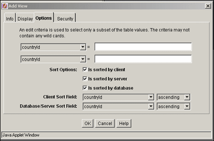
| Element | Description |
|---|---|
| Column list | Lists the columns originally selected using Add View Screen: Select Columns. |
| Edit criteria field | Enter or edit the edit criteria statement which will be used to narrow the table values used in the view. |
| Is sorted by check boxes | As selected, either the server, the database, or the client database provides sorting functionality. |
| Sort Field lists | Lists the columns to be used in sorting. |
| Sort Order | Sorts either in ascending or descending order. |
Add/Edit View Screen: Security Tab
The Security tab on the Add/Edit View Screen is used to establish the security rules to use for the schema. This screen is displayed after you click Edit on the Configuration Manager: Views Tab or after you click Add on the Configuration Manager: Views Tab and follow the steps needed to create a new view. Click the Security tab to display this screen.
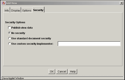
| Element | Description |
|---|---|
| Publish view data | Allows the view that was set up to be visible to other users. |
| No security | Disables standard filter security for the schema. |
| Use standard document security | Provides a minimal level of security for the schema and the documents in the schema. |
| Use custom security implementator | Enables you to alter the security filter. |
A.1.10.9 Edit Values For Views Screen
The Edit Value for Views screen is used to select values that are assigned to the view for editing. To access this screen, click Edit Values on the Configuration Manager: Views Tab. This screen is identical to the Edit View Values Screen, which can be accessed through the Configuration Manager.
Note:
The type of information displayed on this screen is dependent on the type of option list you chose to use for the view.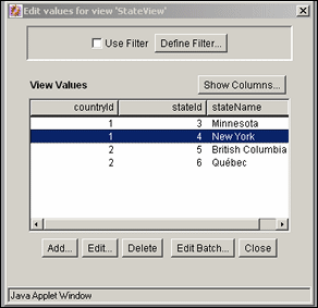
| Element | Description |
|---|---|
| Use Filter/Define Filter | Used to alter which values are displayed in the selected columns. |
| Show Columns | Limits the number of columns to show in the view. See Show Columns Screen. |
| Add | Displays the Add/Edit Value Screen, used to edit values in the view or to add a new column to the table. |
| Edit | Displays the Add/Edit Value Screen, where you can alter the values in a column. |
| Delete | Used to delete a value from the table. You are prompted to confirm the deletion. |
| Edit Batch | Displays the Edit Values: Edit Batch screen, used to copy and paste large amounts of information in order to alter values. |
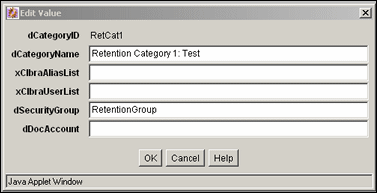
A.1.10.10 Add/Edit Value Screen
This screen is used to change the values in the view or to add a new column to the table associated with the new metadata field. To access this screen, highlight a value assigned to the view on the Edit Values For Views Screen and click Edit.
A.1.10.11 Edit Values: Edit Batch
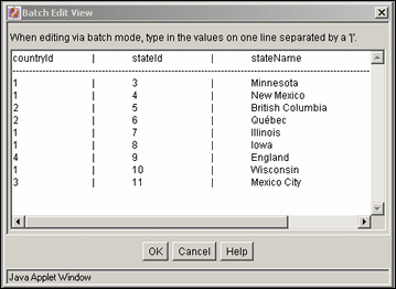
The Edit Batch screen is used to alter large amounts of information in a line editor, compared to the single line edits made with the Add/Edit Value Screen or the Edit View Values Screen.
To access this screen, click Edit Batch on the Edit Values For Views Screen.
The existing columns in the table are displayed. You can add values to the table by entering the data in the appropriate columns, separated by a pipe (|) symbol. Each row in the table should begin on a new line.
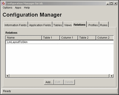
A.1.10.12 Configuration Manager: Relations Tab
The Relations tab of the Configuration Manager is used to establish the relationship between schema views and schema tables. To access this screen, click the Relations tab on the Configuration Manager.
| Element | Description |
|---|---|
| Relations list | Lists the existing relationships between specific tables and columns. |
| Add button | Displays the Add/Edit Relationship Screen. |
| Edit button | Displays the Add/Edit Relationship Screen. |
| Delete button | Enables you to delete the selected relationship. |
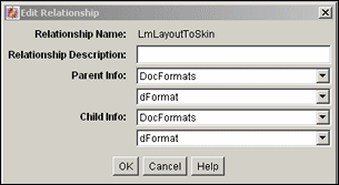
A.1.10.13 Add/Edit Relationship Screen
The Add/Edit Relationship Screen is used to add or alter a schema relationship between a table and a view. To access this screen, select Add or Edit from the Configuration Manager: Relations Tab.
| Element | Description |
|---|---|
| Relationship Name field | Name of relationship being created or edited. |
| Relationship Description field | Brief description of relationship. |
| Parent Info list | Name of the table that determines choices in dependent choice list. |
| Field list | Name of the column in the parent table. |
| Child Info list | Name of the table that is dependent upon the choice from the parent table. |
| Field list | Name of the column in the child table. |
A.1.10.14 Edit Tree Screen
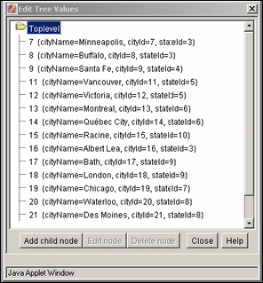
The Edit Tree screen provides a hierarchical view of the values in an option list or table. To access this screen, highlight a field associated with a table and select Edit Tree from the Configuration Manager: Information Field Tab. Note that if you are using an option list created with the Option List Screen, that option list appears rather than the hierarchical view of a tree.
| Element | Description |
|---|---|
| Add Child Node | Active when a parent node is selected. This displays the Add Node screen, which has the same functionality as the Add/Edit Value Screen. See those field descriptions for details on use. |
| Edit Child Node | When a node is selected, displays the Edit Node screen, which has the same functionality as the Add/Edit Value Screen. See those field descriptions for details on use. |
| Delete node | Used to delete a node from the table. If a parent is deleted, subsequent children are also deleted. |
A.1.11 Content Profile Interface Screens
The following screens are used in the creation of a content profile:
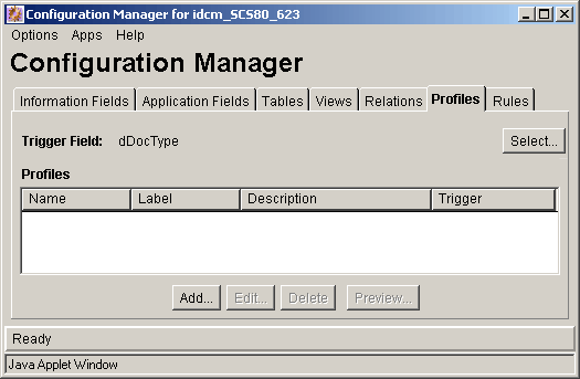
A.1.11.1 Configuration Manager: Profiles Tab
The Profiles tab of the Configuration Manager is used to create, edit, delete, and preview profiles. You can also use it to define a profile trigger value and change or disable the associated profile trigger field values including selected filter and column options.
| Element | Description |
|---|---|
| Select button | Displays the Edit Trigger Field Screen. |
| Name column | Lists the names of the existing created profiles. |
| Description column | Shows the description of each profile. Profile descriptions are provided when defining the profiles using the Add/Edit Profile Screen. |
| Trigger column | Lists the option list values used to identify checked in documents. This is the value selected from the Trigger list for this profile using the Add/Edit Profile Screen. |
| Add button | Displays the Add Profile Screen. |
| Edit button | Displays the Add/Edit Profile Screen. |
| Delete button | Enables you to delete the selected profile. |
| Preview button | Displays the Preview Profile Screen. |
A.1.11.2 Edit Trigger Field Screen
The Edit Trigger Field screen is used to select or change the trigger field. To access this screen, click Select on the Configuration Manager: Profiles Tab.
Caution:
The trigger field may be changed. However, when it is changed, profiles may become invalid and it is the responsibility of the system administrator to resolve the situation. The user interface provides hints about invalid profiles.
| Element | Description |
|---|---|
| Field Name list | The metadata fields that are defined as option lists are included in this drip-down list. If a metadata field is selected, the applicable option list values are provided in the Trigger field list on the Add/Edit Profile Screen.
none specified: If selected, all profiles are essentially disabled. |
A.1.11.3 Add Profile Screen
The Add Profile screen is used to create and name a new profile. To access this screen, click Add on the Configuration Manager: Profiles Tab.

| Element | Description |
|---|---|
| Profile Name field | The name of the profile being created. |
A.1.11.4 Add/Edit Profile Screen
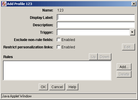
The Add/Edit Profile screen is used to define or edit a profile. This screen is displayed after clicking OK on the Add Profile Screen or by selecting a profile on the Configuration Manager: Profiles Tab and clicking Edit.
| Element | Description |
|---|---|
| Name | Lists the name assigned to the profile that is being defined or edited. This is the name assigned to the newly created profile using the Add Profile Screen. |
| Display Label field | Used as the profile name displayed in the My Check ins and My Searches document profile links included in the My Oracle tray of the Content Server's Navigation area. |
| Description field | Description of the profile currently being defined. |
| Trigger list | Lists the option list values for the Trigger field selected on the Add Profile Screen. The choices consist of the applicable option list values associated with the profile trigger. |
| Exclude non-rule fields check box | Selected: Excludes all the metadata fields that do not belong to the rules included in the profile.
Clear: All the metadata fields belonging to all rules are included. |
| Restrict personalization links | Selected: Allows admin user to suppress any or all check in or search links to a particular user or group of users. When selected, an Idoc Script based on user info is entered into the Profile Links Screen and must evaluate to true before a link is displayed.
Clear (default): All check in or search links are displayed for all users by default, unless handled by another profile. |
| Edit button | Displays the Profile Links Screen. |
| Rules pane | Lists the rules included with the profile currently being defined. |
| Up button | Adjusts the specific placement order of the rules in the list. The position of each rule in the list is relevant to its priority in the evaluation process. The general position (top, middle, or bottom) in the list is established when the rule is initially added to the profile. See "Add Rule Screen" for more details. However, the Up button further refines the placement by moving the rule to a higher, more precise position. |
| Down button | Adjusts the specific placement order of the rules in the list. The position of each rule in the list is relevant to its priority in the evaluation process. The general position (top, middle, or bottom) in the list is established when the rule is initially added to the profile. See "Add Rule Screen" for more details. However, the Down button further refines the placement by moving the rule to a lower, more precise position. |
| Add button | Adds the profile to the system and includes it in the list of profiles on the Configuration Manager: Profiles Tab. |
| Delete button | Enables you to delete the selected rule and remove it from this profile. |
A.1.11.5 Profile Links Screen
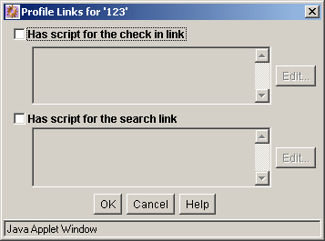
The Profile Links screen allows admin user to suppress the display of any or all check in or search links to a particular user or group of user by adding an Idoc Script that must evaluate to true before the link is displayed in the browser. To access the Profile Links screen, select the Restrict personalization links check box on the Add/Edit Profile Screen and click Edit.
| Element | Description |
|---|---|
| Has script for the check in link | Selected: Enables the associated Idoc Script which must evaluate to true before allowing the display of link on the Content Check In Form.
Clear (default): Disables any associated Idoc Script. |
| Has script for the search link | Selected: Enables the associated Idoc Script which must evaluate to true before allowing the display of link on the Advanced Search Form.
Clear (default): Disables any associated Idoc Script. |
| Edit | Displays the Check In/Search Link screen for either the check in or search link. |
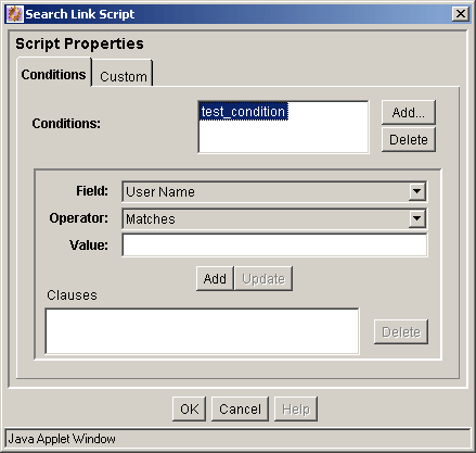
A.1.11.6 Check In/Search Link Screen: Conditions Tab
The Check In/Search Link screen is used to add the conditions that determine if any or all check in or search links are displayed on the Check In or search pages. The Conditions tab and Custom tab are mutually exclusive. If the Conditions tab is used to define the conditions, the Custom tab is disabled and vice versa. See the "Check In/Search Link Screen: Custom Tab". When the Conditions tab on the Check In/Search Link screen initially displays, only the Conditions list pane is visible.
After a new default value is added using the Check In/Search Link: Add Condition Screen, the lower expression pane is displayed. If an existing condition is selected, the lower expression pane also is displayed with populated fields available for editing. The fields in the lower expression pane are used to create and define the condition clauses.
To access the Check In/Search Link screen to define conditions for the display or suppression of the Check and Search links, select the Has script for the check in link check box or the Has script for the search link check box and click the corresponding Edit button on the Profile Links Screen.
| Element | Description |
|---|---|
| Conditions text pane | Displays the names of the conditions created for displaying or suppressing links. |
| Add button | Displays the Check In/Search Link: Add Condition Screen. |
| Delete button | Enables you to delete the selected condition. |
| Field list | Displays a choice list of metadata options. |
| Operator list | The operator specifies the method for searching the metadata fields. The selected field determines the set of available values.
Matches: The entire text within the specified metadata field contains the specified metadata Value. Contains Word: The text within the specified metadata field contains the metadata Value. Begins With: The text within the specified metadata field starts with the metadata Value. |
| Value field | Depending on the selected metadata Field, the Value field provides:
|
| Add button | Adds the completed clause (Field + Operator + Value) to the Clauses pane |
| Update button | Used to edit the completed clause without deleting and redefining the clause. Use it by highlighting the clause in the Clauses pane, edit the Value field, and click Update. The revised clause displays in the Clause pane. |
| Clauses pane | Lists the existing clauses for the metadata field attribute value. |
| Delete button | Enables you to delete the selected clause. |
A.1.11.7 Check In/Search Link: Add Condition Screen
The Add Condition screen is used to provide the name of the new condition. To access this screen, click Add on the Check In/Search Link Screen: Conditions Tab.
Note:
This screen is identical to the Add Condition screen used to add a new activation condition. To view a sample Add Condition screen and read the applicable field description, see "Edit Activation Condition: Add Condition Screen".A.1.11.8 Check In/Search Link Screen: Custom Tab
The Check In/Search Link screen is used to add the conditions that determine if any or all check in or search links are displayed on the Check In or search pages. The Conditions tab and Custom tab are mutually exclusive. If the Custom tab is used to define the display conditions, the Conditions tab is disabled and vice versa. See "Check In/Search Link Screen: Conditions Tab".
Note:
This screen is identical to the Custom tab used to define specific activation condition attributes for a rule. To view a sample Custom tab and read the applicable field descriptions, see "Check In/Search Link Screen: Custom Tab".A.1.11.9 Add Rule Screen
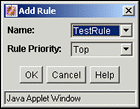
The Add Rule screen is used to include one or more rules in a profile. To access this screen, click Add on the Add/Edit Profile Screen.
| Element | Description |
|---|---|
| Name list | Lists the names of available rules that can be added to the profile currently being defined. |
| Rule Priority list | The selected option adjusts the general placement order of the rules in the list on the Add/Edit Profile Screen. The position of each rule in the list is relevant to its priority in the evaluation process. Placement can be further refined using either the Up or Down buttons.
Top: Moves the rule to a relatively higher position. Middle: Moves the rule to a relatively central position. Bottom: Moves the rule to a relatively lower position. |
A.1.11.10 Preview Profile Screen
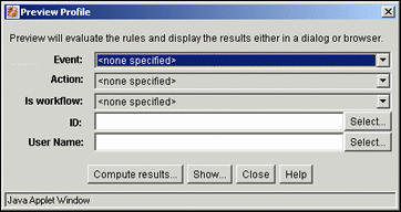
The Preview Profile screen is used to review the rules and trigger field that comprise a selected profile. By selecting different options from the metadata field lists, a profile is simulated and you can preview what might occur based on various choices.
The evaluation results are displayed in either a dialog or browser window using the Compute results button or the Show button. This screen is useful to assess how rules affect metadata fields during the rule evaluation process. To access this screen, click Preview on the Configuration Manager: Profiles Tab.
| Element | Description |
|---|---|
| Event list | none specified: An event is not included in the profile evaluation.
On Request: Includes the internal event resulting from a user's request to view a Content Server page. On Submit: Includes the internal event resulting from a content item contribution process. On Import: Includes the internal event resulting from a batch loading or archiving procedure. If the activation condition for a rule requires On Import, the rule is only active for Archiver, batch loading, or any other process that uses a special check in service (for example, Content Publisher). |
| Action list | none specified: A user action is not included in the profile evaluation.
Check in new: Includes the user action to contribute a new content item. Check in selected: Includes the user action to submit revisions to an existing checked in document. Content information: Includes the user action requesting to view the document information page. Content update: Includes the user action to submit revisions to the document information page. Search: Includes the user action requesting to view the search page. |
| Is workflow list | none specified: A workflow state is not included in the profile evaluation. The document may or may not be in a workflow, but its workflow state has not been specified.
Yes: The document is in a workflow and you may want to display a different Content Information page. No: The document is not in a workflow. |
| Content ID field/Select button | The Content ID field displays the content ID of the selected document to use in the evaluation process to assess the profile's validity. This value is obtained based on the selected filter criteria.
Clicking the corresponding Select button displays the Content Item View Screen. |
| User Name field/Select button | The User Name field displays the selected user to use in the evaluation process to assess the profile's validity. This value is obtained based on the selected filter criteria. This field is only used with the Compute results button and is not used with the Show button.
Clicking the corresponding Select button displays the User View Screen. |
| Compute Results button | Displays the Preview Results Screen. |
| Show button | Launches a browser window that displays a duplicate of the page that the end user will see. It is necessary to select On Request as the Event field value, select an Action value, and leave the User Name field blank. |
A.1.11.11 Preview Results Screen
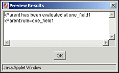
The Preview Results screen is used to compute and review the selections made on the Preview Profile screen. This screen displays the coded rule statements (script strings) that result from the preliminary evaluation and reflects any field value changes made to facilitate previewing various profile scenarios. To access this screen, click Compute results on the on the Preview Profile Screen.
A.1.12 Profile Rules Interface Screens
The following screens are used to create profile rules:
A.1.12.1 Configuration Manager: Rules Tab
The Rules tab of the Configuration Manager is used to create, define, edit, and delete the rules used in content profiles. Activation conditions can be defined and included in each rule and the display and values of information fields (metadata) can also be customized.
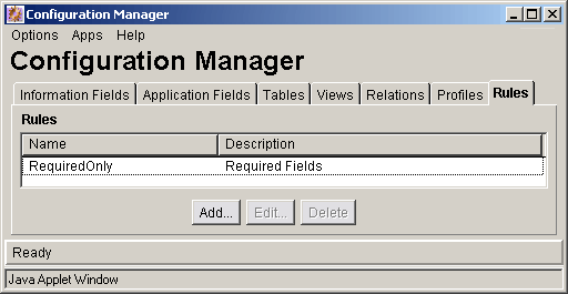
| Element | Description |
|---|---|
| Name column | Lists the names of the existing created rules. |
| Description column | Shows the description of each rule. Rule descriptions are provided when defining the rules using the Add/Edit Rule Screens, Field Tab. |
| Add/Edit buttons | Displays the Add/Edit Rule Screens. |
| Delete button | Enables you to delete the selected rule. |
A.1.12.2 Add/Edit Rule Screens
The Add/Edit Rule screen has two tabs used to specify rules and conditions for profiles.
Add/Edit Rule Screen: General Tab
The General tab on the Add/Edit Rule screen is used to specify global rules, define rule groups with optional headers, and define activation conditions. To access this screen, click Add or Edit on the Configuration Manager: Rules Tab.
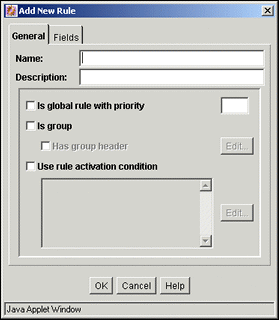
| Element | Description |
|---|---|
| Name field | The name of the rule being defined or edited. You cannot edit the name of an existing rule. |
| Description field | Description of the rule being defined or edited. You can edit the description of an existing rule. |
| Is global rule with priority check box/ priority field | Check box:
Selected: Enables the rule as a global rule. Clear: Disables the rule as a global rule. Priority field: Lists the priority number of the global rule and determines the order in which the rule is evaluated. A low priority number means lower precedence. A lower priority rule is executed before higher priority rules. This allows higher priority rules to override the changes made by lower priority rules. |
| Is group check box | Selected: Enables metadata fields that belong to the rule being defined or edited to be relocated into a group.
Clear: Disables custom metadata field grouping for the rule being defined or edited. |
| Has group header check box/ Edit button | Check box:
Selected: Enables adding a label to a group of metadata fields that belong to the rule being defined or edited. Clear: Disables group labeling. Edit button: Displays the Edit Group Header Screen. |
| Use rule activation condition check box | Selected: Enables a profile to change based on rules that are applied or suppressed if specific conditions are met. Sets an activation condition for the rule being defined or edited.
Clear: Disables the use of activation conditions for the rule being defined or edited. |
| Edit button | Displays the Edit Activation Condition Screen Tabs. |
| Activation condition text pane | Displays the computed Idoc Script for each activation condition created for the rule being defined or edited. The script statements are automatically generated after the condition is added and its properties are defined.
Also displays any customized text entered in the custom text pane on the Custom Tab. |
Add/Edit Rule Screen: Fields Tab
The Fields tab on the Add/Edit Rule screen is used to select and add specific metadata fields to use in the rule being defined or edited. Each metadata field is assigned specific attributes such as the general position within the list of fields in the rule and a display type. Each metadata field can also be assigned optional attributes such as a required message, a default value, derivation features, or a restricted list.
For more information about assigning attributes to metadata fields in rules, see "Add Rule Field Screen" and "Add/Edit Rule Field 'name' Screen". To access the Fields tab, click Add or Edit on the Configuration Manager: Rules Tab and select the Fields tab.
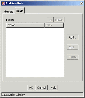
| Element | Description |
|---|---|
| Up button | Adjusts the specific placement order of the metadata fields in the list. The position of each metadata field in the list is relevant to its priority in the evaluation process. The general position (top, middle, or bottom) in the list is established when the field is initially added to the rule the Add Rule Field Screen. However, the Up button further refines the placement by moving the metadata field to a higher, more precise position. |
| Down button | Adjusts the specific placement order of the metadata fields in the list. The position of each metadata field in the list is relevant to its priority in the evaluation process. The general position (top, middle, or bottom) in the list is established when the field is initially added to the rule. However, the Down button further refines the placement by moving the metadata field to a lower, more precise position. |
| Name column | Lists the names of the metadata fields that belong to the rule being created or edited. |
| Type column | Provides the kind of display attribute assigned to each metadata field. |
| Add button | Displays the Add Rule Field Screen. |
| Edit button | Displays the Add/Edit Rule Field 'name' Screen with the previously defined attribute values of the metadata field being edited. |
| Delete button | Enables you to delete the selected metadata field and remove it from this rule. |
A.1.12.3 Edit Group Header Screen
The Edit Group Header screen is used to add or edit a header to a group of metadata fields belonging to a rule being defined or edited. To access this screen, select Is group and Has group header and click the corresponding Edit button on the Add/Edit Rule Screens.
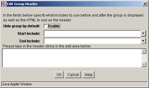
| Element | Description |
|---|---|
| Hide Group by default | Selected: Hides the group metadata fields and displays only the group header with a [Show] link when the page loads. Clicking the [Show] link displays the metadata fields.
Clear (default): Displays the group metadata fields and group header with a [Hide] link when the page loads. Clicking the [Hide] link hides the metadata fields. |
| Start Include | Standard separator: Separates the group on a page by placing a standard horizontal rule above the header.
Start HTML table: Begins a standard table border above the group header. When used in conjunction with End HTML table, the group is displayed in an HTML table with standard borders for each row, beginning above the header and ending after the last grouped metadata field. Display Nothing (default): No distinction is made on the page to separate the grouped fields, other than the group heading. |
| End Include | Standard separator: Separates the group on a page by placing a standard horizontal rule below the last metadata field.
End HTML table: Ends a standard table border below the last grouped metadata field. When used in conjunction with Begin HTML table, the group is displayed in an HTML table with standard borders for each row, beginning above the header and ending after the last grouped metadata field. Display Nothing (default): No distinction is made on the page to separate the grouped fields, other than the group heading. |
| Header text pane | Displays the header associated with a group of metadata fields belonging to the rule being defined or edited. |
Note:
The standard include options listed in the Start Include and End Include lists are defined in the DpDisplayIncludes table of the std_resources.htm file. To add additional include options, a custom component must be written defining the new includes and merging them into the DpDisplayIncludes table.A.1.12.4 Edit Activation Condition Screen Tabs
The Edit Activation Condition screen is used to define specific conditions for a rule that when met affect the behavior of the associated profile.
To access the Edit Activation Condition screen, select the Use rule activation condition check box and click the corresponding Edit button on the Add/Edit Rule Screens.
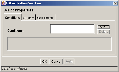
| Element | Description |
|---|---|
| Conditions list pane | Displays the names of the activation conditions created for the rule being defined or edited. |
| Add button | Displays the Edit Activation Condition: Add Condition Screen. |
| Delete button | Enables you to delete the selected activation condition and remove it from the rule being defined or edited. |
Edit Activation Condition: Conditions Tab
The Conditions tab and Custom tab are mutually exclusive. If the Conditions tab is used to define rule conditions, the Custom tab is disabled for the current rule and vice versa.
The Conditions tab on the Edit Activation Condition screen is used to add activation conditions and define them using the General and Clauses tabs displayed after adding the first condition.
Edit Activation Condition: Conditions Tab / General Tab
The General tab (on the Condition tab) is used to specify the event, action, or state that will trigger the activation condition of the rule being defined or edited. The General and Clauses tabs display after adding an activation condition using the Edit Activation Condition: Add Condition Screen.
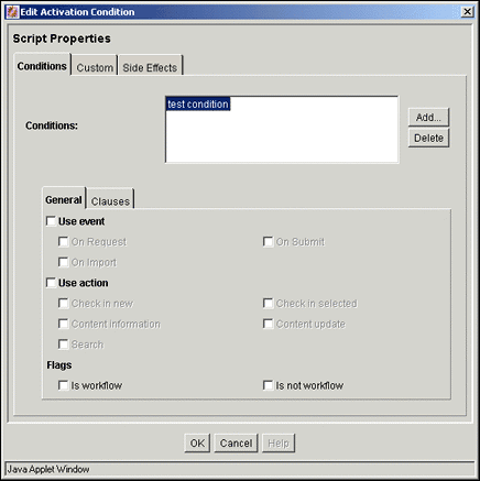
| Element | Description |
|---|---|
| Use event check box | If selected, enables a profile and/or rule to perform differently using activation conditions that are based on event acknowledgements detected by the system. Depending on the event, some profile rules may be activated while others are not.
Selected: Enables event-based profile and/or rule behavior changes and activates the On Request, On Import, and On Submit check box options. Clear: Disables event-driven profile and/or rule behavior changes. |
| On Request check box | Selected: Enables profile and/or rule behavior change that is dependent on activation conditions defined with request events.
Clear: Disables this type of profile and/or rule behavior change. |
| On Import check box | Selected: Enables profile and/or rule behavior change that is dependent on activation conditions defined with import events.
Clear: Disables this type of profile and/or rule behavior change. |
| On Submit check box | Selected: Enables profile and/or rule behavior change that is dependent on activation conditions defined with submit events.
Clear: Disables this type of profile and/or rule behavior change. |
| Use action check box | If selected, enables a profile and/or rule to perform differently using activation conditions that are based on a user action detected by the system. Depending on the action, some profile rules may be activated while others are not.
Selected: Enables action-based profile and/or rule behavior changes and activates the Check in new, Content Information, Search, Check in selected, and Content update check box options. Clear: Disables action-driven profile and/or rule behavior changes. |
| Check in new check box | Selected: Enables profile and/or rule behavior change that is dependent on activation conditions defined with new contribution actions.
Clear: Disables this type of profile and/or rule behavior change. |
| Content Information check box | Selected: Enables profile and/or rule behavior change that is dependent on activation conditions defined with information page viewing actions.
Clear: Disables this type of profile and/or rule behavior change. |
| Search check box | Selected: Enables profile and/or rule behavior change that is dependent on activation conditions defined with search actions.
Clear: Disables this type of profile and/or rule behavior change. |
| Check in selected check box | Selected: Enables profile and/or rule behavior change that is dependent on activation conditions defined with content item revision actions.
Clear: Disables this type of profile and/or rule behavior change. |
| Content update check box | Selected: Enables profile and/or rule behavior change that is dependent on activation conditions defined with information page revision actions.
Clear: Disables this type of profile and/or rule behavior change. |
| Is in Workflow check box | If selected, enables a profile and/or rule to perform differently using activation conditions that are based on the workflow state of a document. Depending on the state, some profile rules may be activated while others are not. When a document is in workflow, you may want to display a different Content Information page.
Selected: Enables the in workflow flag for this activation condition. Clear: Disables the in workflow flag for this activation condition. |
| Is not workflow check box | Selected: Enables the not in workflow flag for this activation condition.
Clear: Disables the not in workflow flag for this activation condition. |
Note:
If neither workflow check box is selected, then the workflow state is ignored as a criteria for activation.Edit Activation Condition: Conditions Tab / Clauses Tab
The Clauses tab (on the Condition tab) is used to generate custom Idoc Script clauses for the activation condition of the rule being defined or edited. The General and Clauses tabs are displayed after adding an activation condition using the Edit Activation Condition: Add Condition Screen. The Clauses tab is essentially an Idoc Script wizard. It is primarily used to automate the process of creating Idoc Script statements.
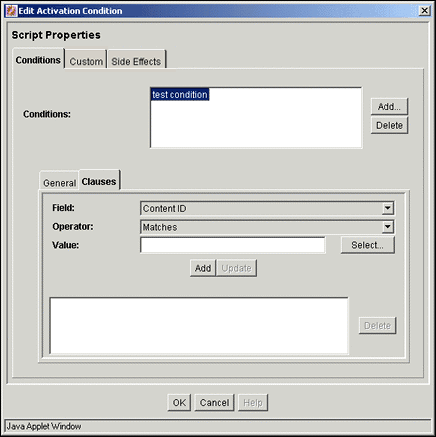
| Element | Description |
|---|---|
| Field list | Displays a choice list of metadata options. |
| Operator list | The operator specifies the method for searching the metadata fields. The selected field determines the set of available values. The following operators are available for all fields except Release Date and Expiration Date:
Matches: The entire text within the specified metadata field contains the specified metadata Value. Contains Word: The text within the specified metadata field contains the metadata Value. Begins With: The text within the specified metadata field starts with the metadata Value. Release Date and Expiration Date operators: Is Date Before: The date in the specified metadata field occurs before the Value date. Is Date After: The date in the specified metadata field occurs after the Value date. |
| Value field/ Select button | Value field:
Depending on the selected metadata Field, the Value field provides:
Select button:
|
| Add button | Adds the completed clause (Field + Operator + Value) to the Clause pane. |
| Update button | Used to edit the completed clause without deleting and redefining the clause. Use it by highlighting the clause in the Clause pane, edit the Value field, and click Update. The revised clause displays in the Clause pane. |
| Clause pane | Lists the existing clauses for the activation condition currently being defined or edited. |
| Delete button | Enables you to delete the selected clause. |
Edit Activation Condition: Custom Tab
The Edit Activation Condition screen is used to define specific conditions for a rule that, when met, will affect the behavior of the associated profile. The Custom tab and Conditions tab are mutually exclusive. If the Custom tab is used to define rule conditions, the Conditions tab is disabled for the current rule and vice versa. See "Edit Activation Condition Screen Tabs".
The Custom tab on the Edit Activation Condition screen is used to manually write custom Idoc Script statements. To access this screen, select the Use rule activation condition check box and click the corresponding Edit button on the Add/Edit Rule Screens.
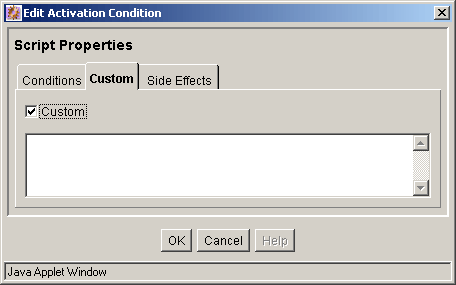
| Element | Description |
|---|---|
| Custom check box | Selected: Activates the custom text pane and enables you to write custom Idoc Script statements. If you use the Custom tab, then the Condition tab is disabled.
Clear: Disables the custom text pane but enables the Conditions tab. |
| Custom text pane | Used to enter customized text when the Custom check box is selected. The information displays in the activation condition text pane on the Add/Edit Rule Screens. |
Edit Activation Condition: Side Effects Tab
The Side Effects tab on the Add/Edit Activation Conditions screen allows you to do two things:
-
Easily add name:value pairs as Idoc Script variables that get pushed to local data using Idoc Script if the activation condition is true.
-
Add custom Idoc Script to a rule that is only evaluated if the activation condition is true.
This means that because the side effect is Idoc Script and evaluated once a rule is activated, you can also include logical statements such as like if, elseif, and else statements, and can execute any Idoc Script function. For example, you can establish a rule that can control the activation of other rules. For more information scripting in Idoc Script, see the Oracle Fusion Middleware Idoc Script Reference Guide.
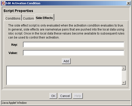
| Element | Description |
|---|---|
| Key | The name used as the Idoc Script variable. |
| Value | A literal string equating to the Idoc Script variable. |
| Add | Converts the entered key and value to Idoc Script and displays it in the Idoc Script pane. |
| Idoc Script pane | Displays the Idoc Script of the entered keys and values, and allows direct entry of Idoc Script. Any Idoc Script function and logic entered here will be executed subsequent to the activation condition being met. |
A.1.12.5 Edit Activation Condition: Add Condition Screen
The Add Condition screen is used to provide the name of the new activation condition being added to the current rule. To access this screen, click Add on the Edit Activation Condition Screen Tabs.

| Element | Description |
|---|---|
| Name field | Displays the name of the activation condition being created. |
A.1.12.6 Add Rule Field Screen
The Add Rule Field screen is used to include one or more metadata fields to the rule being created or edited. To access this screen, click Add on the Add Rule Screen, Fields Tab.
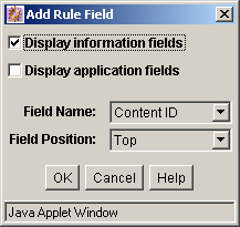
| Element | Description |
|---|---|
| Display information fields | Selected (default): Lists metadata fields in the Field name list, making them available for display on the standard check in and search pages.
Clear: Hides any metadata fields in the Field name list. |
| Display application fields | Selected: Lists any custom application fields in the Field name list, making them available for display on the standard check in and search pages.
Clear (default): Hides any custom application fields in the Field name list. Important: By selecting an application field for display through the use of a rule, you are changing the field behavior as defined for the application normally used to display the field. |
| Field Name list | Displays a choice list of available metadata fields that can be added to the rule being defined or edited. |
| Field Position list | The position attribute is required for each metadata field added. The selected option adjusts the general placement order of the metadata fields in the list on the Add/Edit Rule Screens, Field Tab. The position of each metadata field in the list is relevant to its priority in the evaluation process. Placement can be further refined using either the Up or Down buttons.
Top: Moves the metadata field to a relatively higher position. Middle: Moves the metadata field to a relatively central position. Bottom: Moves the metadata field to a relatively lower position. |
A.1.12.7 Add/Edit Rule Field 'name' Screen
The Add/Edit Rule Field name screen is used to add and define the required and optional attributes to the metadata fields belonging to the rule being created or defined. This screen displays after adding a metadata field using the Add Rule Field Screen. If you are editing an existing metadata field selected from the list on the Add/Edit Rule Screens, Field Tab, this screen is displayed after clicking the Edit button.
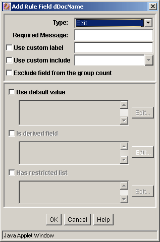
| Element | Description |
|---|---|
| Type list | Each metadata field is required to have a display attribute assigned. The selected option determines how the metadata field is displayed on the Check In and Search pages.
Edit: If selected, the metadata field is editable even if a default value is provided. Label: If selected, the metadata field is read-only (fixed but displayed). Hidden: If selected, the field does not display. However, when the user submits a content item, this metadata field value goes with and remains on the source page. Excluded: If selected, the field does not display. Unlike a hidden metadata field, an excluded value does not remain on the source page. Required: If selected, the metadata field is required. Two configuration variables can be set to distinctively format the metadata field name. |
| Required Message field | The required message field attribute is optional for all type attributes except the Required type. If the metadata field is designated as required, a required message must be specified. |
| Use custom label | This field changes the label displayed in the Content Server interface for the field being included in the rule. This allows different content profiles to label and display metadata with user-specific terms. |
| Use custom include | This option provides a way to insert a custom include in the page display, as a way to facilitate moving fields on the page. This provides a way to easily reposition standard fields. For example, creating a group that includes a placeholder field and the title field moves the title field below the other standard fields on the page. A custom include can then be used for the placeholder field to control how or if it is displayed.
Selected: Allows the use of a custom include to replace the field in the page display. The provided includes are:
Clear (default): The field is displayed. See Note below. |
| Exclude field from the group count | If the number of fields in a group is greater than zero, then the group header is displayed. For example, a placeholder field used for presentation purposes may be the only field in a group that is displayed. Enabling this check box prevents the group header from being displayed while keeping the presentation properties of the placeholder field.
Selected: Prevents the field from being counted as part of the group. Clear (default): Includes the field when counting number of fields in a group. |
| Use default value check box | The default value field attribute is optional. This attribute allows a default value to display on the Content Check In Form or Search page. Default values are computed for On Request events. This field attribute is Idoc Script enabled. Additional schema values can also be used in creating the value if the selected metadata field is associated with a schema view. This is done using the Edit Default Value: Select Field Screen. For more detailed information about schema views, see "Configuration Manager: Views Tab".
Selected: Activates the corresponding Edit button and enables the metadata field to use a default value. Clear (default): Disables the default value field attribute. |
| Default value text pane/Edit button | Displays the computed Idoc Script for the default value field attribute. The script statements are automatically generated after the default value attribute is added and its properties are defined. See "Edit Default Value: Conditions Tab" and "Edit Default Value: Custom Tab". |
| Is derived field check box | The derived value field attribute is optional. This attribute enables the metadata field to be set to a specified value on update or check-in. Derived values are computed for On Submit and On Import events. This field attribute is Idoc Script enabled. Also, additional schema values can be used in creating the value if the selected metadata field is associated with a schema view. This is done using the Edit Derived Value: Select Field Screen. For more detailed information about schema views, see "Configuration Manager: Views Tab".
Selected: Activates the corresponding Edit button and enables the metadata field to use a derived value. Clear: Disables the derived value field attribute. |
| Derived field text pane/Edit button | Displays the computed Idoc Script for the derived value field attribute. The script statements are automatically generated after the derived value attribute is added and its properties are defined. See "Edit Derived Value: Conditions Tab" and "Edit Derived Value: Custom Tab". |
| Has restricted list check box | The restricted list field attribute is optional. On presentation, this attribute allows the option list metadata field to be restricted to either a specific list of values or to a filtered list of values.
Selected: Activates the corresponding Edit button and enables the metadata field to use a restricted list. Clear: Disables the restricted list field attribute. |
| Restricted list text pane/Edit button | Displays the computed Idoc Script for the restricted list field attribute. The script statements are automatically generated after the restricted list attribute is added and its properties are defined. See "Edit Restricted List Screen". |
Note:
The standard include options listed in the Start Include and End Include lists are defined in the DpDisplayIncludes table of the std_resources.htm file. To add additional include options, a custom component must be written defining the new includes and merging them into the DpDisplayIncludes table.A.1.12.8 Edit Default Value: Conditions Tab
The Edit Default Value screen is used to add and define default value field attributes. The Conditions tab and Custom tab are mutually exclusive. If the Conditions tab is used to define the default value field attribute, the Custom tab is disabled and vice versa. See "Edit Default Value: Custom Tab". When the Conditions tab on the Edit Default Value screen initially displays, only the Conditions list pane is visible.
After a new default value is added using the Edit Default Value: Add Condition Screen, the lower expression pane is displayed. If an existing default value is selected, the lower expression pane also is displayed with populated fields available for editing. The fields in the lower expression pane are used to create and define the default value field attribute that is Idoc Script enabled.
To access the Edit Default Value screen to define default value field attributes, select the Use default value check box and click the corresponding Edit button on the Add/Edit Rule Field 'name' Screen.
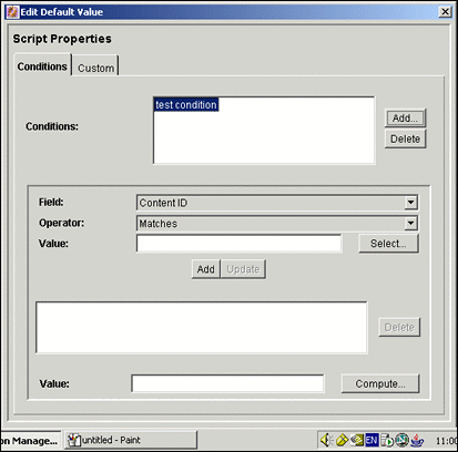
| Element | Description |
|---|---|
| Conditions text pane | Displays the names of the conditions created for the metadata field attribute value. |
| Add button | Displays the Edit Default Value: Add Condition Screen. |
| Delete button | Enables you to delete the selected condition for the metadata field attribute value. |
| Field list | Displays a choice list of metadata options. |
| Operator list | The operator specifies the method for searching the metadata fields. The selected field determines the set of available values. The following operators are available for all fields except Release Date and Expiration Date:
Matches: The entire text within the specified metadata field contains the specified metadata Value. Contains Word: The text within the specified metadata field contains the metadata Value. Begins With: The text within the specified metadata field starts with the metadata Value. Release Date and Expiration Date operators: Is Date Before: The date in the specified metadata field occurs before the Value date. Is Date After: The date in the specified metadata field occurs after the Value date. |
| Value field/ Select button | Value field:
Depending on the selected metadata Field, the Value field provides:
Select button:
|
| Add button | Adds the completed clause (Field + Operator + Value) to the Clause pane |
| Update button | Used to edit the completed clause without deleting and redefining the clause. Use it by highlighting the clause in the Clause pane, edit the Value field, and click Update. The revised clause displays in the Clause pane. |
| Condition expression pane | Lists the existing clauses for the metadata field attribute value. |
| Delete button | Enables you to delete the selected clause. |
| Value field | Displays the computed value after clicking the Compute button on this screen and the OK button on the Edit Default Value: Select Field Screen. |
| Compute button | Displays the Edit Default Value: Select Field Screen. |
A.1.12.9 Edit Default Value: Add Condition Screen
The Add Condition screen is used to provide the name of the new default value field attribute. To access this screen, click Add on the Edit Default Value: Conditions Tab.
Note:
This screen is identical to the Add Condition screen used to add a new activation condition. To view a sample Add Condition screen and read the applicable field description, see "Edit Activation Condition: Add Condition Screen".A.1.12.10 Edit Default Value: Select Field Screen
The Select Field screen is used to select a default metadata value to include when the completed default value clause (Field + Operator + Value) is processed. Additionally, schema values can be used to create the default value field attribute if the metadata field is associated with a schema view. To access this screen, click Compute on the Edit Default Value: Conditions Tab. For more detailed information about schema views, see "Configuration Manager: Views Tab".
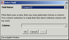
| Element | Description |
|---|---|
| Field Name list | Displays a choice list of metadata options. |
| Column list | Displays a choice list of table columns. A column is shown only if the metadata field is associated with a schema view. In this case, you can select a column value from the table and use it in the computation. For more detailed information about schema views, see "Configuration Manager: Views Tab". |
A.1.12.11 Edit Default Value: Custom Tab
The Edit Default Value screen is used to add and define default value field attributes. The Conditions tab and Custom tab are mutually exclusive. If the Custom tab is used to define the default value field attribute, the Conditions tab is disabled and vice versa. See "Edit Default Value: Conditions Tab".
Note:
This screen is identical to the Custom tab used to define specific activation condition attributes for a rule. To view a sample Custom tab and read the applicable field descriptions, see "Edit Activation Condition Screen Tabs", Custom Tab.A.1.12.12 Edit Derived Value: Conditions Tab
The Edit Default Value screen is used to add and define derived value field attributes. The Conditions tab and Custom tab are mutually exclusive. If the Conditions tab is used to define the default value field attribute, the Custom tab is disabled and vice versa. When the Conditions tab on the Edit Default Value screen initially displays, only the Conditions list pane is visible.
After a new default value is added using the Edit Derived Value: Add Condition Screen, the lower expression pane is displayed. Or, if an existing default value is selected, the lower expression pane displays with populated fields available to be edited. The fields in the lower expression pane are used to create and define the default value field attribute that is Idoc Script enabled. To access the Edit Default Value screen to define derived value field attributes, select the Use derived value check box and click the corresponding Edit button on the Add/Edit Rule Field 'name' Screen.
Note:
This screen is identical to the Conditions tab (on the Edit Default Value screen) used to add and define default value field attributes. To view a sample Custom tab and read the applicable field descriptions, see "Edit Default Value: Conditions Tab".A.1.12.13 Edit Derived Value: Add Condition Screen
The Add Condition screen is used to provide the name of the new derived value field attribute. To access this screen, click Add on the Edit Derived Value: Conditions Tab.
Note:
This screen is identical to the Add Condition screen used to add a new activation condition. To view a sample Add Condition screen and read the applicable field description, see the "Edit Activation Condition: Add Condition Screen".A.1.12.14 Edit Derived Value: Select Field Screen
The Select Field screen is used to select a default metadata value to include when the completed derived value clause (Field + Operator + Value) is processed. Schema values can also be used to create the default value field attribute if the metadata field is associated with a schema view. To access this screen, click Compute on the Edit Derived Value: Conditions Tab. For more detailed information about schema views, see "Configuration Manager: Views Tab".
Note:
This screen is identical to the Select Field screen used to select a default metadata value to include in the processed default value clause. To view a sample Select Field screen and read the applicable field descriptions, see "Edit Default Value: Select Field Screen".A.1.12.15 Edit Derived Value: Custom Tab
The Edit Derived Value screen is used to add and define default value field attributes. The Conditions tab and Custom tab are mutually exclusive. If the Custom tab is used to define the default value field attribute, the Conditions tab is disabled and vice versa. See "Edit Derived Value: Conditions Tab".
Note:
This screen is identical to the Custom tab used to define specific activation condition attributes for a rule. To view a sample Custom tab and read the applicable field descriptions, see "Edit Activation Condition Screen Tabs", Custom Tab.A.1.12.16 Edit Restricted List Screen
The Edit Restricted List screen is used to allow the option list metadata field (on presentation) to be restricted to either a specific list of values or to a filtered list of values resulting from the evaluation process of one or more regular expressions.
Selecting or not selecting the option to use regular expressions determines how the system interprets the values entered in the text pane. To access this screen, select the Has restricted list check box and click the corresponding Edit button on the Add/Edit Rule Field 'name' Screen.
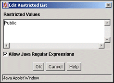
| Element | Description |
|---|---|
| Restricted value text pane | Allows you to enter the specific items to be included in the modified option list. If the metadata field for this restricted list has been defined as an option list, then the displayed results in the user interface will include the values entered in this pane if they are also in the master option list. |
| Allow Java Regular Expressions check box | Selected: Enables displaying a filtered list of values based on the evaluation of one or more regular expressions. Using wild cards and other special characters in the expression will display a subset of all values in the metadata field's usual option list that match the evaluated regular expression.
Clear: Enables displaying a specific set of actual values, as they are specified in the text pane provided each value is in the master list. This selection overrides the metadata field's master option list and sets the list to a specified set of values. The values are not evaluated, so whatever is entered into the text pane will be displayed. |
A.2 Workflows User Interface
This section contains information about the interface screens used with workflows.
Note:
If you are using Firefox set to open new tabs instead of windows, help screens launched from an Admin Applet are not accessible until the applet window that launched the help is closed. Therefore, it is preferable to set Firefox to open in new windows instead of tabs.This section covers the following topics:
A.2.1 The Workflow Admin Application
The Workflow Admin application is an administration application used to manage workflows. To access this screen, launch the Administration menu and select Admin Applets.
Note:
If you are using Firefox set to open new tabs instead of windows, help screens launched from an Admin Applet are not accessible until the applet window that launched the help is closed. Therefore, it is preferable to set Firefox to open in new windows instead of tabs.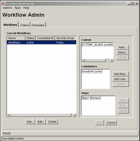
| Element | Description |
|---|---|
| Options menu | Script Templates: Displays the Workflow Scripts User Interface.
Tokens: Displays the Workflow Tokens Screen. Tracing: Displays the Tracing Configuration screen. Exit: Closes the Workflow Admin application. |
| Apps menu | Lets you access other options from the Admin Applets menu. The other applications will open in the same mode (applet or stand-alone) as the current application. |
| Help menu | Contents: Displays the content server online help.
About Content Server: Displays version, build, and copyright information for the content server. |
| Workflows tab | Used to add, edit, and delete Basic workflows. |
| Criteria tab | Used to add, edit, and delete Criteria workflows. |
| Templates tab | Used to add, edit, and delete workflow templates. |
A.2.2 The Criteria Workflow User Interface
The following screens are used in the creation of criteria workflows:
A.2.2.1 Workflow Admin: Criteria Tab
The Criteria tab of the Workflow Admin application is used to add, edit, enable, disable, and delete Criteria workflows and sub-workflows.
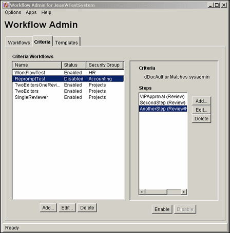
| Element | Description |
|---|---|
| Name column | Lists the workflow names. |
| Status column | The status of the workflow: enabled or disabled. |
| Security Group column | The security group that will cause the content to enter the workflow. |
| Add (Workflow) button | Displays the New/Edit Criteria Workflow Screen. |
| Edit (Workflow) button | Displays the New/Edit Criteria Workflow Screen. |
| Delete (Workflow) button | Enables you to delete the selected workflow. |
| Criteria field | Shows the criteria defined for the selected workflow. |
| Steps list | Lists the steps and step types included in the selected workflow. |
| Add (Step) button | Displays the Add New/Edit Step Screen. |
| Edit (Step) button | Displays the Add New/Edit Step Screen. |
| Delete (Step) button | Enables you to delete the selected step. |
| Enable button | Enables the selected workflow. |
| Disable button | Disables the selected workflow. If there are any content items still in the workflow process, all of the content revisions will be released to the system before the workflow is disabled. |
A.2.2.2 New/Edit Criteria Workflow Screen
The New/Edit Criteria Workflow screen is used to add or edit a Criteria workflow or sub-workflow. To access this screen, click Add or Edit in the left pane of the Workflow Admin: Criteria Tab.
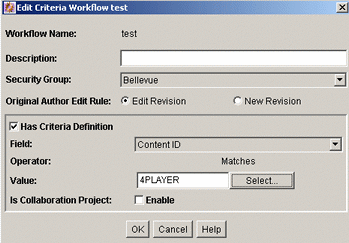
| Element | Description |
|---|---|
| Workflow Name field | The name for the workflow. The Workflow Name has a maximum field length of 30 characters, and the following characters should not be used: spaces, tabs, and the symbols ; ^ : @ & + " # % < > * ~ | |
| Description field | A description of the workflow. |
| Security Group list | Specifies the security group that the revisions must be in to enter the workflow process. |
| Use Template check box | Select this check box if you want to use a workflow template. This check box is displayed only if at least one workflow template exists. |
| Use Template list | Lists the workflow templates that have been created. This list is displayed only if at least one workflow template exists. |
| Original Author Edit Rule | Edit Revision: Ensures that the content item in the workflow stays at the existing revision when the original author edits it.
New Revision: Permits the original author to create a new revision of the content when the author edits the content item during the workflow. |
| Has Criteria Definition check box | Selected: Criteria workflow
Cleared: Sub-workflow |
| Field list | The metadata field that will be evaluated when each content item is checked in. Options are Content ID, Author, Type, Account (if accounts are enabled), and any custom metadata fields that you have created. |
| Operator field | Defaults to matches. |
| Value field | The value for the specified metadata field.
|
| Select button | Displays a list of existing items (such as content items or users), from which you can select a value for the Value field. This button appears only when certain metadata fields are selected. |
A.2.2.3 Add New/Edit Step Screen
The Add New/Edit Step screen is used to add or edit a Criteria workflow step. To access this screen, select a workflow in the left pane and click Add or Edit in the right pane of the Workflow Admin: Criteria Tab.
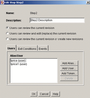
| Element | Description |
|---|---|
| Name field | The name for the step. Typically this is the type of review (such as initial review or copy edit) or the function of the reviewer (such as manager or copy editor). |
| Description field | A description for the step. |
| Users can review the current revision | Users can approve or reject the revision. |
| Users can review and edit (replace) the current revision | Users can edit the revision, approve it, or reject it. Any edit will not update the revision of the content item. |
| Users can review the current revision or create new revisions. | Users can edit the revision, approve it, or reject it. Any edit updates the revision of the content item. |
| Element | Description |
|---|---|
| Alias/User list | Lists the users, aliases, and tokens currently assigned to the step. |
| Add Aliases button | Displays the Add Alias to Step Screen. |
| Add User button | Displays the Add User to Step. |
| Add Token button | Displays the Add Token to Step. |
| Delete button | Enables you to delete the selected step from the workflow. |
| Element | Description |
|---|---|
| All reviewers option | If this is selected, all users assigned to the step must approve the revision before the workflow passes to the next step. |
| At least this many reviewers option and field | If this is selected, the workflow passes to the next step as soon as the specified number of users have approved the revision. |
| Use Additional Exit Condition check box | If this is selected, the conditions defined in the text box must be met before the workflow passes to the next step. |
| Edit button | Displays the Edit Additional Exit Condition Screen. |
| Clear button | Clears the Exit Condition text box. |
A.2.2.4 Add Alias to Step Screen
The Add Alias to Step screen is used to assign aliases to a Criteria workflow step. To access this screen, click Add Alias on the Users tab of the Add New/Edit Step Screen.
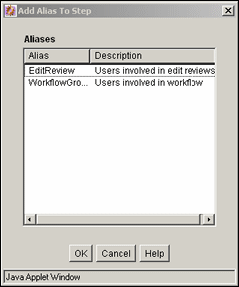
| Element | Description |
|---|---|
| Alias column | Lists the available aliases. |
| Description column | A description of the alias. |
A.2.2.5 Add User to Step
The Add User to Step screen is used to assign users to a Criteria workflow step. To access this screen, click Add User on the Users tab of the Add New/Edit Step Screen.
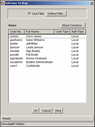
| Element | Description |
|---|---|
| Use Filter check box | Select this check box to narrow the Users list as defined by the Define Filter Screen (described in the Oracle Fusion Middleware Application Administrator's Guide for Content Server). |
| Define Filter button | Displays the Define Filter Screen (described in the Oracle Fusion Middleware Application Administrator's Guide for Content Server). |
| Show Columns button | Displays the Show Columns Screen. |
| Users list | Shows the users that match the filter settings. |
A.2.2.6 Add Token to Step
The Add Token to Step screen is used to assign workflow tokens to a Criteria workflow step. To access this screen, click Add Token on the Users tab of the Add New/Edit Step Screen. This screen is only accessible if tokens have already been added to the system.
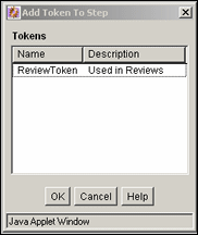
| Element | Description |
|---|---|
| Name column | Lists the available tokens. |
| Description column | A description of the token. |
A.2.2.7 Edit Additional Exit Condition Screen
The Edit Additional Exit Condition screen is used to define exit conditions for a Criteria workflow step. To access this screen, click Edit on the Exit Conditions tab of the Add New/Edit Step Screen.
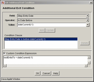
| Element | Description |
|---|---|
| Field list | Select the workflow condition or metadata field to be evaluated. |
| Operator list | Select an operator. This is a dependent option list that shows only the operators associated with the Field option. |
| Value field | The value for the specified metadata field.
|
| Select button | Displays a list of existing items (such as content items or users), from which you can select a value for the Value field. This button appears only when certain fields are selected. |
| Add button | Adds the conditional statement defined by the Field, Operator, and Value fields to the exit condition clause. |
| Update button | Changes the selected conditional statement to the statement defined by the Field, Operator, and Value fields. |
| Condition Clause box | Lists the conditional statements that have been added to the exit condition. Multiple clauses can be appended as AND statements. |
| Delete button | Deletes the selected conditional statement. |
| Custom Condition Expression check box and field | Enables display and edit of the Idoc Script generated from the condition clauses.
Caution: If you clear the Custom Condition Expression check box, the expression reverts to its original definition; all modifications will be lost. |
A.2.3 The Basic Workflow User Interface
The following screens are used in the creation of Basic workflows:
Many of the screens used in the creation of the Criteria workflow are the same screens used in Basic workflows. They are repeated here for completeness.
A.2.3.1 Workflow Admin: Workflows Tab
The Workflows tab of the Workflow Admin application is used to add, edit, start, cancel, and delete Basic workflows. To access this tab, click the Workflows tab on the The Workflow Admin Application.

| Element | Description |
|---|---|
| Name column | Lists the workflow names. |
| Status column | The status of the workflow: active or inactive. |
| Completed At column | Date and time the content in a finished workflow was released to the system. |
| Security Group column | The security group assigned to the workflow. This security group will be assigned to all new content in the workflow. |
| Add (Workflow) button | Displays the Add New/Edit Workflow Screen. |
| Edit (Workflow) button | Displays the Add New/Edit Workflow Screen. |
| Delete (Workflow) button | Enables you to delete the selected workflow. |
| Content list | Lists the content items included in the selected workflow. |
| New button | Displays the Add Content to Workflow (New Content) Screen. |
| Select button | Displays the Add Content to Workflow (Existing Content) Screen. |
| Delete (Content) button | Enables you to delete the selected content item. |
| Contributors list | Lists the users, aliases, and tokens assigned to the initial contribution step of the selected workflow. |
| Add Alias button | Displays the Add Alias to Workflow Screen. |
| Add User button | Displays the Add User: Basic Workflow. |
| Delete (Contributor) button | Enables you to delete the selected user from the initial contribution step. |
| Steps list | Lists the steps and step types included in the selected workflow. |
| Add (Step) button | Displays the Add New/Edit Step Screen. |
| Edit (Step) button | Displays the Add New/Edit Step Screen. |
| Delete (Step) button | Enables you to delete the selected step. |
| Start button | Displays the Start Workflow Screen. |
| Cancel button | Cancels the selected workflow. If there are any content items still in the workflow process, any revisions in the workflow are deleted from the system. Any edits that have been made to the content items will be lost unless they have also been saved on a local hard drive. |
A.2.3.2 Add New/Edit Workflow Screen
The Add New/Edit Workflow screen is used to add or edit a Basic workflow. To access this screen, click Add or Edit in the left pane of the Workflow Admin: Workflows Tab.
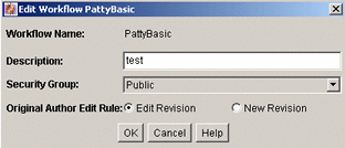
| Element | Description |
|---|---|
| Workflow Name field | The name for the workflow. Workflow Name has a maximum field length of 30 characters. The following characters are NOT acceptable: spaces, tabs, and the symbols ; ^ : @ & + " # % < > * ~ | |
| Description field | A description of the workflow. |
| Security Group list | Specifies the security group for the content items. |
| Original Author Edit Rule | Identifies whether to permit the original author to create a new revision of the content when the author edits the content item. |
| Use Template check box and field | Select this check box and a template name if you want to use a workflow template. This box is displayed only if a template exists. |
A.2.3.3 Add Content to Workflow (New Content) Screen
The Add Content to Workflow (New Content) screen is used to specify a new content item for a Basic workflow. To access this screen, select a workflow in the left pane and click New in the Content pane of the Workflow Admin: Workflows Tab.
| Element | Description |
|---|---|
| Content ID field | The name or the ID of the content to add to the workflow. Content ID has a maximum field length of 30 characters, and the following should not be used: spaces, tabs, and the symbols ; ^ : @ & + " # % < > * ~ |
If you are using an Oracle database, all Content IDs will be converted to uppercase letters automatically. |
A.2.3.4 Add Content to Workflow (Existing Content) Screen
The Add Content to Workflow (Existing Content) screen is used to add existing content items to a Basic workflow. To access this screen, select a workflow in the left pane and click Select in the Content pane of the Workflow Admin: Workflows Tab.
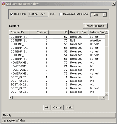
| Element | Description |
|---|---|
| Use Filter check box | Select this check box to narrow the content list as defined by the Define Filter screen. |
| Define Filter button | Displays the Define Filter screen. |
| Release Date since check box and list | Select this check box to narrow the content list as defined by the Release Date option list. |
| Show Columns button | Displays the Show Columns screen, used to select the columns to display. |
| Content list | Shows the revisions in the content server repository that match the filter settings.
Double-clicking a revision displays the Info screen for that revision. |
A.2.3.5 Add Alias to Workflow Screen
The Add Alias to Workflow screen is used to assign aliases to the initial contribution step of a Basic workflow. To access this screen, select a workflow in the left pane and click Add Alias in the Contributors pane of the Workflow Admin: Workflows Tab.
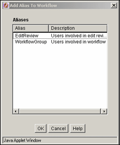
| Element | Description |
|---|---|
| Alias column | Lists the available aliases. |
| Description column | A description of the alias. |
A.2.3.6 Add New/Edit Step Screen
The Add New/Edit Step screen is used to add or edit a Basic workflow review step. To access this screen, select a workflow in the left pane and click Add or Edit in the Steps pane of the Workflow Admin: Workflows Tab.

| Element | Description |
|---|---|
| Name field | The name for the step. Typically this is the type of review (such as initial review or copy edit) or the function of the reviewer (such as manager or copy editor). |
| Description field | A description for the step. |
| Users can review the current revision | Users can approve or reject the revision. |
| Users can review and edit (replace) the current revision | Users can edit the revision, approve it, or reject it. Any edit will not update the revision of the content item. |
| Users can review the current revision or create new revisions. | Users can edit the revision, approve it, or reject it. Any edit updates the revision of the content item. |
| Element | Description |
|---|---|
| Alias/User list | Lists the users, aliases, and tokens currently assigned to the step. |
| Add Aliases button | Displays the Add Alias to Step Screen. |
| Add User button | Displays the Add User: Basic Workflow screen. |
| Add Token button | Displays the Add Token: Basic Workflow screen. |
| Delete button | Enables you to delete the selected step from the workflow. |
| Element | Description |
|---|---|
| All reviewers option | If this is selected, all users assigned to the step must approve the revision before the workflow passes to the next step. |
| At least this many reviewers option and field | If this is selected, the workflow passes to the next step as soon as the specified number of users have approved the revision. |
| Use Additional Exit Condition check box and field | If this is selected, the conditions defined in the text box must be met before the workflow passes to the next step. |
| Edit button | Displays the Edit Additional Exit Condition Screen. |
| Clear button | Clears the Exit Condition text box. |
A.2.3.7 Add Alias to Step Screen
The Add Alias to Step screen is used to assign aliases to a Basic workflow review step. To access this screen, click Add Alias on the Add New/Edit Step Screen.

| Element | Description |
|---|---|
| Alias column | Lists the available aliases. |
| Description column | A description of the alias. |
A.2.3.8 Add User: Basic Workflow
The Add User to Step screen is used to assign users to a Basic workflow step. To access this screen, do one of the following:
-
For the contribution step, select a workflow in the left pane and click Add User in the Contributors pane of the Workflow Admin: Workflows Tab.
-
For a review step, click Add User on the Add New/Edit Step Screen.
| Element | Description |
|---|---|
| Use Filter check box | Select this check box to narrow the Users list as defined by the Define Filter Screen. |
| Define Filter button | Displays the Define Filter Screen. |
| Show Columns button | Displays the Show Columns Screen. |
| Users list | Shows the users that match the filter settings. |

A.2.3.9 Add Token: Basic Workflow
The Add Token to Step screen is used to assign a workflow token to a Basic workflow review step. To access this screen, click Add Token on the Add New/Edit Step Screen.

| Element | Description |
|---|---|
| Name column | Lists the available tokens. |
| Description column | A description of the token. |
A.2.3.10 Edit Additional Exit Condition Screen
The Edit Additional Exit Condition screen is used to define exit conditions for a Basic workflow review step. To access this screen, click Edit in the Exit Conditions tab of the Add New/Edit Step Screen.

| Element | Description |
|---|---|
| Field list | Select the workflow condition or metadata field to be evaluated. |
| Operator list | Select an operator. This is a dependent option list that shows only the operators associated with the Field option. |
| Value list | The value for the specified metadata field.
|
| Select button | Displays a list of existing items (such as content items or users), from which you can select a value for the Value field. This button appears only when certain metadata fields are selected. |
| Add | Adds the conditional statement defined by the Field, Operator, and Value fields to the exit condition clause. |
| Update | Changes the selected conditional statement to the statement defined by the Field, Operator, and Value fields. |
| Condition Clause | Lists the conditional statements that have been added to the exit condition. Multiple clauses can be appended as AND statements. |
| Delete | Deletes the selected conditional statement. |
| Custom Condition Expression | Enables display and edit of the Idoc Script generated from the condition clauses.
If you clear the Custom Condition Expression check box, the expression reverts to its original definition; all modifications are lost. |
A.2.3.11 Start Workflow Screen
The Start Workflow screen is used to start a Basic workflow and add to the e-mail message that is sent to initial contributors. To access this screen, select a workflow in the left pane and click Start on the Workflow Admin: Workflows Tab.
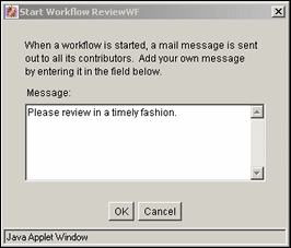
| Element | Description |
|---|---|
| Message field | Enter a message for the workflow contributors. |
A.2.4 Tokens User Interface
The following screens are all used in the creation and editing of tokens:
A.2.4.1 Workflow Tokens Screen
The Workflow Tokens screen is used to add, edit, and delete workflow tokens. To access this screen, select Tokens from the Options menu in Workflow Admin: Workflows Tab.
The predefined tokens in the Name list are associated with the sample workflow template that is included with the Workflow Admin application. You can use these tokens as is, or you can use them as templates to customize your own tokens.
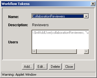
| Element | Description |
|---|---|
| Name list | Lists the token names. |
| Description field | A description of the selected token. |
| Users box | Shows the Idoc Script code that defines the token. |
| Add button | Displays the Add/Edit Token Screen. |
| Edit button | Displays the Add/Edit Token Screen. |
| Delete button | Enables you to delete the selected token. |
| Close button | Closes the Workflow Tokens screen. |
A.2.4.2 Add/Edit Token Screen
The Add/Edit Token screen is used to add or edit a workflow token. To access this screen, click Add or Edit on the Workflow Tokens Screen.
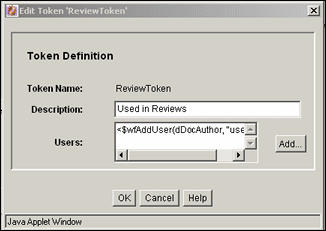
| Element | Description |
|---|---|
| Token Name field | The name of the workflow token. |
| Description field | A description of the token. |
| Users box | The Idoc Script code that defines the token. |
| Add button | Displays the Add Token User Screen. |
A.2.4.3 Add Token User Screen
The Add Token User screen is used to add a user or alias to a workflow token. To access this screen, click Add on the Add/Edit Token Screen.
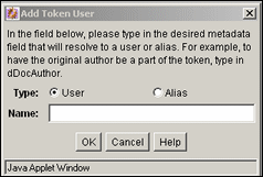
| Element | Description |
|---|---|
| Type options | User: An individual user login.
Alias: A group of users defined by an alias. |
| Name field | Enter the metadata field that corresponds to a user or alias.
Original author (User): Type dDocAuthor. Alias: Type the alias name exactly. |
A.2.5 The Jump User Interface
The following screens are used to create jumps:
A.2.5.1 Add New/Edit Step Screen: Events Tab
The Events tab of the Add New/Edit Step screen is used to add or edit step event scripts. To access this tab, click the Events tab on the Add New/Edit Step Screen for a Criteria workflow or the Add New/Edit Step Screen for a Basic workflow.
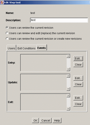
| Element | Description |
|---|---|
| Name field | The name for the step. Typically this is the type of review (such as initial review or copy edit) or the function of the reviewer (such as manager or copy editor). |
| Description field | A description for the step. |
| Users can review the current revision | Users can approve or reject the revision. |
| Users can review and edit (replace) the current revision | Users can edit the revision, approve it, or reject it. Any edit will not update the revision of the content item. |
| Users can review the current revision or create new revisions. | Users can edit the revision, approve it, or reject it. Any edit updates the revision of the content item. |
| Entry field | Displays the script that will be evaluated when the step is entered. |
| Edit (Entry) button |
|
| Clear (Entry) button | Deletes the script from the Entry field. |
| Update field | Displays the script that will be evaluated when any of the following events occurs:
|
| Edit (Update) button |
|
| Clear (Update) button | Deletes the script from the Update field. |
| Exit field | Displays the script that will be evaluated when the revision has completed the requirements of the workflow step. |
| Edit (Exit) button |
|
| Clear (Exit) button | Deletes the script from the Exit field. |
A.2.5.2 Edit Script for StepName Screen
The Edit Script for StepName screen is used to select an editing option for a step event script. To access this screen, click Edit for the desired event on the Add New/Edit Step Screen: Events Tab.
| Element | Description |
|---|---|
| Edit Current option | Displays the Jump Tab with the current script. This option is displayed only if a script already exists for the event. |
| Create New option | Displays a blank Jumps Tab. |
| Use Script Template option and list | Displays the Jumps Tab with the selected script template. This option is displayed only if a script template exists. |
A.2.5.3 Script Properties Screen
The Edit Script Properties screen is used to create, modify, and test step event scripts. To access this screen, do one of the following:
-
If an event script or script template does not exist, click Edit on the Add New/Edit Step Screen: Events Tab.
-
If an event script or script template exists, click OK on the Edit Script for StepName Screen.
| Element | Description |
|---|---|
| Jumps tab | Used to create the step event script. |
| Custom tab | Used to view and customize the step event script. |
| Test tab | Used to test the step event script. |
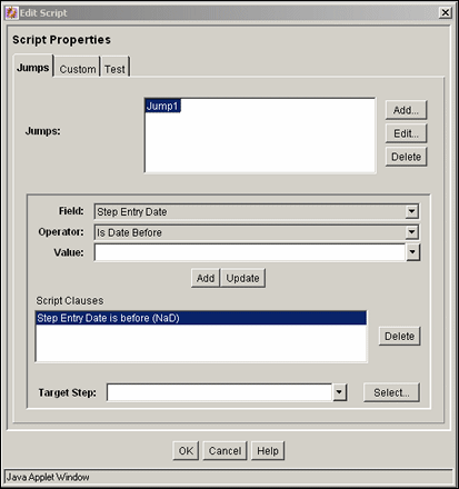
The Jumps tab of the Edit Script screen is used to create step event script code. To access this tab, click the tab on the Script Properties Screen.

| Element | Description |
|---|---|
| Jumps list | Lists the jumps that are included in the script. |
| Add or Edit (Jumps) button | Displays the Side Effects Tab. |
| Delete (Jumps) button | Enables you to delete the selected jump. |
| Field list | Select the workflow condition or metadata field to be evaluated. |
| Operator list | Select an operator. This is a dependent option list that shows only the operators associated with the Field option. |
| Value list | The value for the specified metadata field.
|
| Select button | Displays a list of existing items (such as content items or users), from which you can select a value for the Value field. This button appears only when certain metadata fields are selected. |
| Add (Script Clauses) button | Adds the conditional statement defined by the Field, Operator, and Value fields to the selected jump. |
| Update button | Changes the selected conditional statement to the statement defined by the Field, Operator, and Value fields. |
| Script Clauses list | Lists the conditional statements that have been added to the jump. Multiple clauses can be appended as AND statements. |
| Delete (Script Clauses) button | Deletes the selected conditional statement. |
| Target Step list | Specifies a target step for the jump.
|
The Custom tab of the Edit Script screen is used to edit the script that was generated automatically by the options on the Jumps tab. To access this tab, click the tab on the Script Properties Screen.
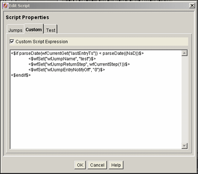
| Element | Description |
|---|---|
| Custom Script Expression check box | Selected: The script can be edited, and the revised script will be saved. The jumps cannot be edited from the Jumps tab.
Cleared: The script reflects the statements as defined on the Jumps tab. If you clear the Custom Script Expression check box, the expression reverts to its original definition; all modifications will be lost. |
| Script field | Shows the script of all jumps in the script template. |
The Test tab of the Edit Script screen is used to test a step event script. To access this tab, click the tab on the Script Properties Screen.
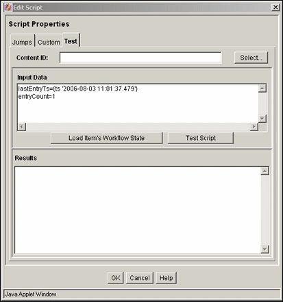
| Element | Description |
|---|---|
| Content ID field | Enter the Content ID for a content item to be tested. |
| Select button | Displays the Content Item View Screen. |
| Input Data field | When the screen is first displayed, this field shows the default state. When a workflow is selected and when the content items's workflow state is loaded, this field shows the data that will be tested. |
| Load Item's Workflow State button | Loads the companion file for the selected content item. If the selected content item is not in a workflow, the content item is treated like it newly entered the workflow. |
| Test Script button | Tests the script and displays the results in the Results pane. |
| Results field | Displays the results of the script test. Idoc script error messages will be displayed if there are processing errors. |
A.2.5.4 Select Target Step Screen
The Select Target Step screen is used to add a specific target step to a jump. To access this screen, click Select on the Script Properties Screen, Jump Tab.
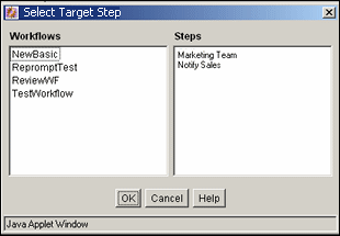
| Element | Description |
|---|---|
| Workflows list | Select a workflow to display the workflow steps in the Steps field. |
| Steps list | Select a step to use as the target step. |
A.2.5.5 Add/Edit Jump Screen Tabs
The Add/Edit Jump screen is used to add or edit jump side effects and notification messages. To access this screen, click Add or Edit in the Jumps pane of the Script Properties Screen, Jump Tab.
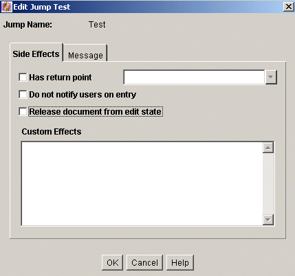
| Element | Description |
|---|---|
| Side Effects tab | Used to specify the jump name, return point, custom side effects, and to enable notification for the jump. |
| Message tab | Used to enter a notification message for the jump. |
Add/Edit Jump Screen: Side Effects Tab
The Side Effects tab of the Add/Edit Jump screen is used to add or edit jump side effects. To access this tab, click the tab on the Script Properties Screen, Jump Tab.

| Element | Description |
|---|---|
| Jump Name field | The name of the jump. |
| Has return point check box and list | Cleared: No return step is defined for the jump.
Selected: Select a return step for the jump. |
| Do not notify users on entry check box | Cleared: Reviewers for the step will receive the message defined on the Message tab when the jump is entered.
Selected: Reviewers will not be notified that the jump has been entered. |
| Release document from edit state | Cleared: Document is not released until it is approved.
Selected: Document is released for indexing, searching, and so forth prior to approval. |
| Custom Effects field | Enter custom side effects using Idoc script. |
Add/Edit Jump Screen: Message Tab
The Message tab of the Add/Edit Jump screen is used to enter a notification message for the jump. To access this tab, click the tab on the Script Properties Screen.
To change a notification message, you can use Component Architecture to customize the following include files and templates. These files contain the mail information that is the default for the system:
-
wf_approve_mail_subject include
-
wf_approve_mail_message include
-
wf_started_subject include
-
wf_rejected_subject include
-
reviewer_mail.htm template
-
reject_mail.htm template
-
contributor_mail.htm template
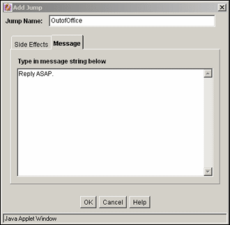
| Element | Description |
|---|---|
| Type in message string below field | Enter the message that reviewers for the step will receive when the jump is entered. This field can include Idoc Script (for example, <$dDocName$> is ready for your review.). |
A.2.5.6 Content Item View Screen
The Content Item View screen is used to select an existing revision for event script testing purposes. To access this screen, click Select on the Script Properties Screen, Test Tab.

| Element | Description |
|---|---|
| Use Filter check box | Select this check box to narrow the Content list as defined by the Define Filter Screen. |
| Define Filter button | Displays the Define Filter Screen. |
| Release Date since check box and list | Select this check box to narrow the Content list as defined by the Release Date option list. |
| Show Columns button | Displays the Show Columns screen. |
| Content list | Shows the revisions in the content server repository that match the filter settings.
|
A.2.6 Workflow Template Interface Screens
The following screens are used to create templates:
A.2.6.1 Workflow Admin: Templates Tab
The Templates tab of the Workflow Admin application is used to add, edit, and delete workflow templates. To access this tab, click the tab on The Workflow Admin Application.
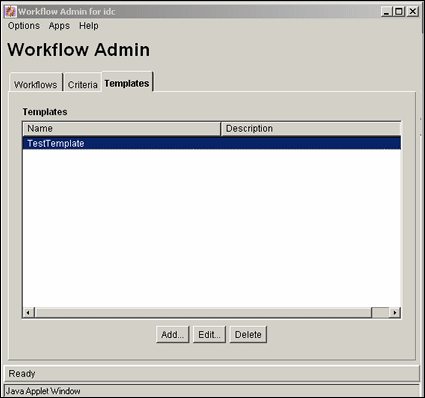
| Element | Description |
|---|---|
| Name column | Lists the workflow template names. The following characters are not allowed: spaces, tabs, line feeds, carriage returns, and ; : ^ ? @ & + " # % < * ~ | |
| Description column | A description of the workflow template. |
| Add button | Displays the Add/Edit Template Screen. |
| Edit button | Displays the Add/Edit Template Screen. |
| Delete button | Enables you to delete the selected workflow template. |
A.2.6.2 Add/Edit Template Screen
The Add/Edit Template screen is used to add or edit a workflow template. To access this screen, click Add or Edit on the Workflow Admin: Templates Tab.
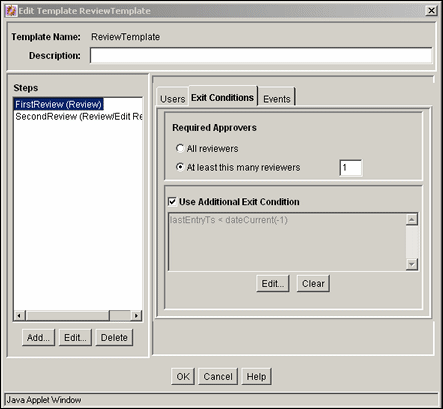
| Element | Description |
|---|---|
| Template Name field | The name of the workflow template. The following characters are not allowed: spaces, tabs, line feeds, returns, and ; : ^ ? @ & + " # % < * ~ | |
| Description field | A description of the workflow template. |
| Element | Description |
|---|---|
| Steps list | Lists the steps included in the workflow template. |
| Add button | Displays the Add New/Edit Step Screen. |
| Edit button | Displays the Add New/Edit Step Screen. |
| Delete (Step) button | Enables you to delete the selected step from the workflow template. |
| Element | Description |
|---|---|
| Alias/User list | Lists the users, aliases, and tokens currently assigned to the selected step. |
| Add Alias button | Displays the Add Alias to Step Screen. |
| Add User button | Displays the Add User to Step. |
| Add Token button | Displays the Add Token: Templates. |
| Delete (User) button | Enables you to delete the selected alias, user, or token from the step. |
| Element | Description |
|---|---|
| All reviewers option | If this is selected, all users assigned to the step must approve the revision before the workflow passes to the next step. |
| At least this many reviewers option and field | If this is selected, the workflow passes to the next step as soon as the specified number of users have approved the revision. |
| Use Additional Exit Condition check box and field | If this is selected, the conditions defined in the text box must be met before the workflow passes to the next step. |
| Edit button | Displays the Edit Additional Exit Condition Screen. |
| Clear button | Clears the Exit Condition text box. |
A.2.6.3 Add New/Edit Step Screen
The Add New/Edit Step screen is used to add or edit a step in a workflow template. To access this screen, select a step and click Add or Edit in the Steps pane of the Add/Edit Template Screen.
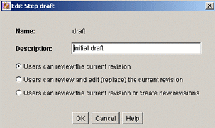
| Element | Description |
|---|---|
| Name field | The name for the step. Typically this is the type of review (such as initial review or copy edit) or the function of the reviewer (such as manager or copy editor). |
| Description field | A description for the step. |
| Type list | Reviewer: Approves or rejects the revision.
Reviewer/Contributor: Can edit the revision and approves or rejects it. |
A.2.6.4 Add Alias to Step Screen
The Add Alias to Step screen is used to assign aliases to a workflow template step. To access this screen, click Add Alias on the Users tab of the Add/Edit Template Screen.

| Element | Description |
|---|---|
| Alias column | Lists the available aliases. |
| Description column | A description of the alias. |
A.2.6.5 Add User to Step
The Add User to Step screen is used to assign users to a workflow template step. To access this screen, click Add User on the Users tab of the Add/Edit Template Screen.

| Element | Description |
|---|---|
| Use Filter check box | Select this check box to narrow the Users list as defined by the Define Filter screen. |
| Define Filter button | Displays the Define Filter screen. |
| Show Columns button | Displays the Show Columns screen. |
| Users list | Shows the users that match the filter settings. |
A.2.6.6 Add Token: Templates
The Add Token to Step screen is used to assign workflow tokens to a workflow template step. To access this screen, click Add Token on the Users tab of the Add/Edit Template Screen.

| Element | Description |
|---|---|
| Name column | Lists the available tokens. |
| Description column | A description of the token. |
A.2.6.7 Edit Additional Exit Condition Screen
The Edit Additional Exit Condition screen is used to define exit conditions for a workflow template step. To access this screen, click Edit on the Exit Conditions tab of the Add/Edit Template Screen.

| Element | Description |
|---|---|
| Field list | Select the workflow condition or metadata field to be evaluated. |
| Operator list | Select an operator. This is a dependent option list that shows only the operators associated with the Field option. |
| Value list | The value for the specified metadata field.
|
| Select button | Displays a list of existing items (such as content items or users), from which you can select a value for the Value field. This button appears only when certain metadata fields are selected. |
| Add button | Adds the conditional statement defined by the Field, Operator, and Value fields to the exit condition clause. |
| Update button | Changes the selected conditional statement to the statement defined by the Field, Operator, and Value fields. |
| Condition Clause list | Lists the conditional statements that have been added to the exit condition. Multiple clauses can be appended as AND statements. |
| Delete button | Deletes the selected conditional statement. |
| Custom Condition Expression check box and field | Enables display and edit of the Idoc Script generated from the condition clauses.
Caution: If you clear the Custom Condition Expression check box, the expression reverts to its original definition; all modifications will be lost. |
A.2.7 Workflow Scripts User Interface
The following screens are used to create workflow scripts:
A.2.7.1 Workflow Scripts Screen
The Workflow Scripts screen is used to add, edit, and delete script templates. To access this screen, select Script Templates from the Options menu in The Workflow Admin Application.
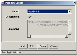
| Element | Description |
|---|---|
| Name field | Lists the script template names. |
| Description field | A description of the script template. |
| Summary field | Shows the code that is defined for the script template. |
| Add button | Displays the Add/Edit Script Screen. |
| Edit button | Displays the Add/Edit Script Screen. |
| Delete button | Enables you to delete the selected script template. |
| Close button | Closes the Workflow Scripts screen. |
A.2.7.2 Add/Edit Script Screen
The Add/Edit Script screen is used to create, modify, and test script templates. To access this screen, click Add or Edit on the Workflow Scripts Screen.

| Element | Description |
|---|---|
| Script Name field | The name of the script template. The following characters are not allowed: spaces, tabs, line feeds, returns, and ; : ^ ? @ & + " # % < * ~ | |
| Description field | A description of the script template. |
| Jumps tab | Used to create the script template code. See "Add/Edit Script Screen: Jumps Tab". |
| Custom tab | Used to view and customize the script template code. See "Add/Edit Script Screen: Custom Tab". |
| Test tab | Used to test the script template. See "Add/Edit Script Screen: Test Tab". |
A.2.7.3 Add/Edit Script Screen: Jumps Tab
The Jumps tab is used to create the script template code. To access this tab, click the tab on the Add/Edit Script Screen.

| Element | Description |
|---|---|
| Jumps list | Lists the jumps that are included in the script. |
| Add (Jumps) button | Displays the Add/Edit Jump Screen. |
| Edit button | Displays the Add/Edit Jump Screen. |
| Delete (Jumps) button | Enables you to delete the selected jump. |
| Field list | Select the workflow condition or metadata field to be evaluated. |
| Operator list | Select an operator. This is a dependent option list that shows only the operators associated with the Field option. |
| Value list | The value for the specified metadata field.
|
| Select button | Displays a list of existing items (such as content items or users), from which you can select a value for the Value field. This button appears only when certain metadata fields are selected. |
| Add (Script Clauses) button | Adds the conditional statement defined by the Field, Operator, and Value fields to the selected jump. |
| Update button | Changes the selected conditional statement to the statement defined by the Field, Operator, and Value fields. |
| Script Clauses list | Lists the conditional statements that have been added to the jump. Multiple clauses can be appended as AND statements. |
| Delete (Script Clauses) button | Deletes the selected conditional statement. |
| Target Step list | Select a target step for the jump. |
A.2.7.4 Add/Edit Script Screen: Custom Tab
The Custom tab is used to edit the script that was generated automatically by the options on the Jumps tab. To access this tab, click the tab on the Add/Edit Script Screen.

| Element | Description |
|---|---|
| Custom Script Expression check box | Selected: The script can be edited, and the revised script will be saved. The jumps cannot be edited from the Jumps tab.
Cleared: The script reflects the statements as defined on the Jumps tab. Caution: If you clear the Custom Script Expression check box, the expression reverts to its original definition; all modifications will be lost. |
| Script field | Shows the script of all jumps in the script template. |
A.2.7.5 Add/Edit Script Screen: Test Tab
The Test tab is used to test a script template. To access this tab, click the tab on the Add/Edit Script Screen.

| Element | Description |
|---|---|
| Content ID field | Enter the Content ID for a content item to be tested. |
| Select button | Displays the Content Item View Screen. |
| Input Data field | When the screen is first displayed, this field shows the default state. When a workflow is selected and when the content item's workflow state is loaded, this field shows the data that will be tested. |
| Select Workflow button | Displays the Select Workflow Step Screen |
| Load Item's Workflow State button | Loads the companion file for the selected content item. If the selected content item is not in a workflow, the content item is treated like a new contribution. |
| Test Script button | Tests the script and displays the results in the Results pane. |
| Results field | Displays the results of the script test. Idoc script error messages will be displayed if there are processing errors. |
A.2.7.6 Add/Edit Jump Screen
The Add/Edit Jump screen is used to add or edit jump side effects and notification messages for a script template. To access this screen, click Add or Edit in the Jumps pane of the Add/Edit Script Screen: Jumps Tab.

| Element | Description |
|---|---|
| Side Effects tab | Used to specify the jump name, return point, custom side effects, and to enable notification for the jump. See "Add/Edit Jump Screen: Side Effects Tab". |
| Message tab | Used to enter a notification message for the jump. See "Add/Edit Jump Screen: Message Tab". |
A.2.7.7 Add/Edit Jump Screen: Side Effects Tab
The Side Effects tab is used to add or edit jump side effects for a script template. To access this tab, click the tab on the Add/Edit Jump Screen.

| Element | Description |
|---|---|
| Jump Name field | The name of the jump. |
| Has return point check box and list | Cleared: No return step is defined for the jump.
Selected: Select a return step for the jump. |
| Do not notify users on entry check box | Cleared: Reviewers for the step will receive the message defined on the Message tab when the jump is entered.
Selected: Reviewers will not be notified that the jump has been entered. |
| Release document from edit state | Cleared: Document is not released until it is approved.
Selected: Document is released for indexing, searching, and so forth prior to approval. |
| Custom Effects field | Enter custom side effects using Idoc Script. |
A.2.7.8 Add/Edit Jump Screen: Message Tab
The Message tab is used to enter a notification message for a jump in a script template. To access this tab, click the tab on the Add/Edit Jump Screen.

| Element | Description |
|---|---|
| Type in message string below field | Enter the message that reviewers for the step will receive when the jump is entered. |
A.2.7.9 Content Item View Screen
The Content Item View screen is used to select an existing revision for script template testing purposes. To access this screen, click Select on the Add/Edit Script Screen: Test Tab.

| Element | Description |
|---|---|
| Use Filter check box | Select this check box to narrow the Content list as defined by the Define Filter screen. |
| Define Filter button | Displays the Define Filter screen. |
| Release Date since check box and list | Select this check box to narrow the Content list as defined by the Release Date option list. |
| Show Columns button | Displays the Show Columns screen, where you can select which columns to display. |
| Content list | Shows the revisions in the content server repository that match the filter settings.
|
A.2.7.10 Select Workflow Step Screen
The Select Workflow Step screen is used to select an existing workflow step for script template testing purposes. To access this screen, click Select Workflow on the Add/Edit Script Screen: Test Tab.
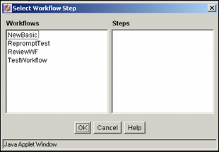
| Element | Description |
|---|---|
| Workflows list | Selecting a workflow displays the workflow steps in the Steps field. |
| Steps list | The selected step will be used for testing purposes. |
A.3 PDF Watermark Interface
This section displays and describes the PDF Watermark user interface screens.
Note:
If you are using Firefox set to open new tabs instead of windows, help screens launched from an Admin Applet are not accessible until the applet window that launched the help is closed. Therefore, it is preferable to set Firefox to open in new windows instead of tabs.This section covers the following topics:
A.3.1 PDF Watermark Administration Screen
The PDF Watermark Administration screen is used to specify rules, templates, and metadata values for templates used in watermarking content. Access this screen by selecting Administration, then selecting PDF Watermark Administration. The Help menu provides a Contents option.
| Administration Screen Tabs | Description |
|---|---|
| Rules | Displays the Rules Tab. |
| Templates | Displays the Templates Tab. |
| Configuration | Displays the Configuration Tab. |
A.3.2 Rules Tab
Use the Rules tab to define a rule or ruleset, which determines which content is dynamically watermarked, upon user request.
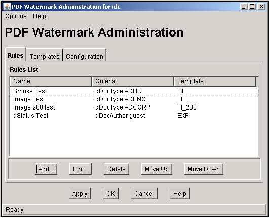
| Field | Description |
|---|---|
| Add | Adds a new rule and displays the Add New/Edit Rule Screen. |
| Edit | Enables you to edit the selected rule and displays the Add New/Edit Rule Screen. |
| Delete | Removes the selected rule from the list. |
| Move Up/Down | Used to adjust the specific placement order of the selected entry in the rules list. The position of each rule in the list is relevant to its priority. The higher or lower a rule is positioned in the list, the higher or lower its priority is in the hierarchy. |
| Apply | Applies the changes to the rules list. |
| OK | Saves the changes and exits the screen. |
| Cancel | Discards the changes and exits the screen. |
A.3.3 Add New/Edit Rule Screen
The Add New/Edit Rule screen is used to specify a rule for a PDF watermark template. The Edit Rule screen has a list of previously defined templates.
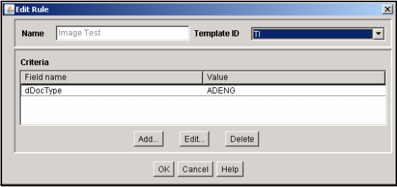
| Field | Description |
|---|---|
| Name | Rule Name |
| Template ID | Template Content ID |
| Add | Adds new criteria to the rule and displays the Add New/Edit Criteria Screen. Specify a value for any or all of the available criteria. |
| Edit | Permits editing of the individual criteria as previously defined and displays the Add New/Edit Criteria Screen. |
| Delete | Deletes the selected criteria from the list. |
| OK | Saves the changes and exits the screen. |
| Cancel | Discards the changes and exits the screen. |
A.3.4 Add New/Edit Criteria Screen
The Add New/Edit Criteria screen enables you to add a new criteria or change an existing one. You can choose a field and specify a trigger value. To access this screen, click Add or Edit on the Add New/Edit Rule Screen.
| Field | Description |
|---|---|
| Field Name | Name of the new or edited field. |
| Value | Name of the trigger value. |
| Options | If the field is an Option List, the available values populate this drop-down list. |
| OK | Saves the changes and exits the screen. |
| Cancel | Discards the changes and exits the screen. |
A.3.5 Templates Tab
Use the Templates tab to design and edit templates. Templates are checked into content server as managed content items. Templates may be used for either static or dynamic watermarking. Templates are stored as .hda files.
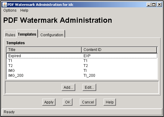
| Field | Description |
|---|---|
| Add | Adds a new template and displays the Add New/Edit Template Screen. |
| Edit | Enables you to edit the selected template and displays the Add New/Edit Template Screen. |
| Apply | Applies the changes to the templates list. |
| OK | Saves the changes and exits the screen. |
| Cancel | Discards the changes and exits the screen. |
A.3.6 Add New/Edit Template Screen
The Add New/Edit Template screen is used to specify values for a template for PDF watermarks.
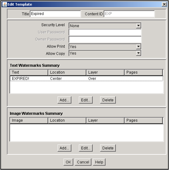
| Field | Description |
|---|---|
| Title | Enter the template title. |
| Content ID | Content ID for this template. This must be manually assigned; auto-generation of Content # ID is not currently supported. |
| Security Level | Set to NONE, 40, or 128. 40 and 128 signify the level of bit encryption. Default is NONE. |
| User Password | When security is applied, this password is required to view the PDF. No modification of the PDF is allowed. |
| Owner Password | When security is applied, this password permits the user to modify the PDF passwords, permissions, and security level. |
| Allow Print | Set to YES to allow printing, NO to disallow, or DEGRADED. |
| Allow Copy | Set to YES to allow copying, NO to disallow. |
| Text Watermarks Summary | Enables users to create, edit, or delete text watermarks for this template. |
| Image Watermarks Summary | Enables users to specify image watermarks, and edit or delete them. |
| OK | Applies the selections made, saves the template, and exits the screen. |
| Cancel | Cancels the selections made and exits the screen. |
A.3.7 Add New/Edit Text Watermark Screen
The Add New/Edit Text Watermark screen is used to specify values for text appearing in a PDF watermark.
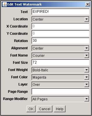
| Field | Description |
|---|---|
| Text | Text to appear in the watermark. The text may include embedded symbols. |
| Location | Location where the watermark appears. Choices are CENTER, HEADER, FOOTER, or EXPLICIT, with CENTER as the default. |
| X Coordinate | X coordinate specified in points with each point =1/72" from baseline 0;0 location. |
| Y Coordinate | Y coordinate specified in points with each point =1/72" from baseline 0;0 location |
| Rotation | 0 through 359 degrees counter clock wise. |
| Alignment | Alignment of the watermark is selected here. Choices are: ALIGN LEFT, ALIGN RIGHT, ALIGN CENTER and EXPLICIT. |
| Font Name | Available fonts are COURIER,TIMES ROMAN, HELVETICA, SYMBOL, ZAPFDINGBATS, STSong-Light, STSongStd-Light, MHei-Medium, MSung-Light, MSungStd-Light, HeiseiMin-W3, HeiseiKakuGo-W5, KozMinPro-Regular, HYGoThic-Medium, HYSMyeongJo-Medium, HYSMyeongJoStd-Medium. COURIER is the default. |
| Font Size | The size of the font in the watermark. Values are: 8, 9, 10, 11, 12, and so on. |
| Font Weight | The weight of the font in the watermark. Choices are NORMAL, BOLD, ITALIC, BOLDITALIC. This selection is disabled for fonts not having an extended weight (Asian fonts). |
| Font Color | BLACK, BLUE, CYAN, DKGRAY, GRAY, GREEN, LTGRAY, MAGENTA, ORANGE, PINK, RED, WHITE, YELLOW. |
| Layer | Places the watermark in the layer either OVER or UNDER the text. Default is OVER. |
| Page Range | Pages number ranges to watermark, for example 1,2,4,10:15,19,23:LAST. Ranges are indicated with a colon. When left blank the watermark includes all pages. |
| Range Modifier | All Pages, Odd Pages Only, and Even Pages Only. |
A.3.8 Add New/Edit Image Watermark Screen
The Add New/Edit Image Watermark screen is used to specify values for an image appearing in a PDF watermark.
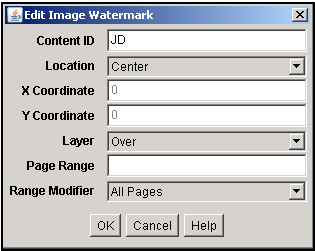
| Field | Description |
|---|---|
| Content ID | The Content ID of the image to be used for the watermark. |
| Location | Location where the watermark appears. Choices are CENTER, HEADER, FOOTER, or EXPLICIT, with CENTER as the default. |
| X Coordinate | X coordinate specified in points with each point =1/72" or from baseline 0;0 location. |
| Y Coordinate | Y coordinate specified in points with each point =1/72" or from baseline 0;0 location. |
| Layer | Places the watermark in the layer either OVER or UNDER the text. Default is OVER. |
| Page Range | Pages number ranges to watermark, for example 1,2,4,10:15,19,23:LAST. Ranges are indicated with a colon. When left blank the watermark includes all pages. |
| Range Modifier | All Pages, Odd Pages Only, and Even Pages Only. |
A.3.9 Configuration Tab
Use the Configuration tab to specify default metadata field values for PDF watermarking.
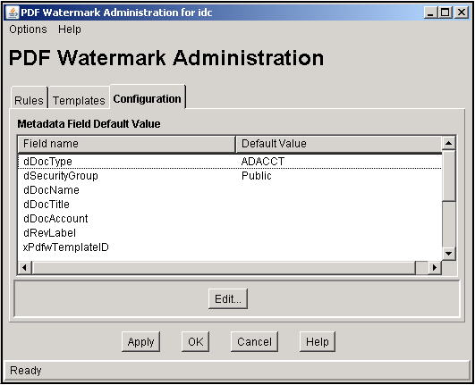
| Field | Description |
|---|---|
| Edit | Permits the user to specify a value for any or all of the available metadata field default values. |
| Apply | Applies the changes to the metadata. |
| OK | Applies the changes to the metadata and exits the screen. |
| Cancel | Exits the screen without applying any changes to the metadata. |
A.3.10 Edit Default Value Screen
Use the Edit Default Value screen to edit the default values of the metadata fields for checking in new templates.
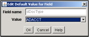
| Field | Description |
|---|---|
| Field Name | Name of the new or edited field. |
| Value | Name of the trigger value. |
| OK | Saves the changes and exits the screen. |
| Cancel | Discards the changes and exits the screen. |
A.4 Folders Interface
This section describes the Folders administrative interface screens.
Note:
If you are using Firefox set to open new tabs instead of windows, help screens launched from an Admin Applet are not accessible until the applet window that launched the help is closed. Therefore, it is preferable to set Firefox to open in new windows instead of tabs.This section covers the following topics:
A.4.1 Folder Configuration Link
When the Folders component is enabled, a new Folder Configuration link appears in the Administration tray.
If you click on this link, the Virtual Folder Administration Configuration Page is displayed.
If you expand this link, the following pages are displayed:
A.4.2 Virtual Folder Administration Configuration Page
The Virtual Folder Administration Configuration page is used to limit the number of virtual folders and content items in the folders, and provides access to the other Folder system configuration pages. To access this page, click the Folder Configuration link in the Administration tray.
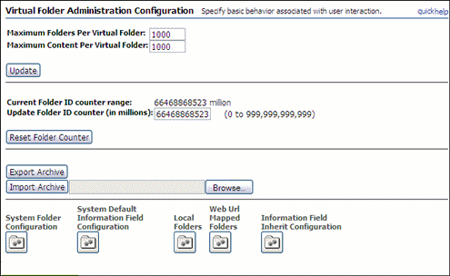
| Element | Description |
|---|---|
| Maximum Folders Per Virtual Folder field | Sets the maximum number of virtual folders that any user can define. If a user attempts to define more than this number of virtual folders, the Save command will return an error message. |
| Maximum Content Per Virtual Folder field | Sets the maximum number of files that any virtual folder can contain. |
| Update button | Applies the changes to the system. |
| Export Archive button | Exports the folder hierarchy as an archive file. |
| Import Archive button and field | Imports the specified folder archive.
Caution: When you import a folder archive file, all current folders are removed from the content server and replaced by the imported hierarchy. |
| Browse button | Enables you to select the folder archive file that you want to import. |
| System Folder Configuration button | Displays the System Folder Configuration Page. |
| System Default Information Field Configuration button | Displays the System Default Information Field Configuration Page. |
| Local Folders button | Displays the Local Folders Page. |
| Information Field Inherit Configuration button | Displays the Information Field Inherit Configuration Page. |
A.4.3 System Folder Configuration Page
The System Folder Configuration page is used to enable and disable system-level virtual folders. To access this page, do either of the following:
-
In the Administration tray, expand the Folder Configuration Link and click the System Folder Configuration link.
-
Click the System Folder Configuration button on the Virtual Folder Administration Configuration Page.
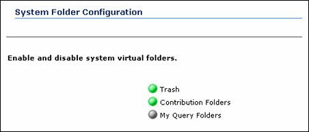
| Element | Description |
|---|---|
| Enabled/Disabled icon | Clicking an icon displays the associated system folder and enables or disables the folder.
Green = Enabled; users see the folder in the Exploring pages. Gray = Disabled; users do not see the folder in the Exploring pages. |
A.4.4 System Default Information Field Configuration Page
The System Default Information Field Configuration page is used to set system default metadata for folders. To access this page, do either of the following:
-
In the Administration tray, expand the Folder Configuration Link and click the System Default Information Field Configuration link.
-
Click the System Default Information Field Configuration button on the Virtual Folder Administration Configuration Page.
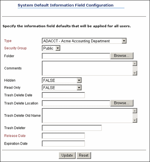
| Element | Description |
|---|---|
| Information fields | Define the metadata values that will be applied to content checked in through a virtual folder if values are not already defined for the folder or by the user.
These metadata values are applied only on initial check-in. The setting do not affect revisions to existing content.
|
| Update button | Applies changes to the system defaults. |
| Reset button | Resets the fields to the last saved values. |
A.4.5 Local Folders Page
The Local Folders page is used to map a contribution folder structure to a local file system. To access this page, do either of the following:
-
In the Administration tray, expand the Folder Configuration Link and click the Local Folders link.
-
Click the Local Folders button on the Virtual Folder Administration Configuration Page.
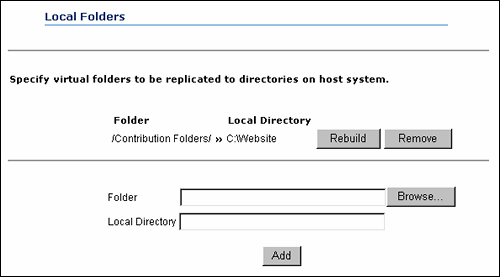
| Element | Description |
|---|---|
| Rebuild button | Deletes the existing local directory structure and recreates the folder structure. Any subdirectories and files will be deleted from and then re-copied to the local directory. |
| Remove button | Removes the local directory from the file system. |
| Folder field | The contribution folder to be mapped to a local directory. |
| Browse button | Displays the Browsing dialog, which is used to select the folder to be mapped to a local directory. |
| Local Directory field | The directory on a file system where the folder structure will be replicated. |
| Add button | Replicates the specified folder to the specified directory on the file system. |
A.4.6 Information Field Inherit Configuration Page
The Information Field Inherit Information page is used to select which metadata values will be propagated from a folder to its subfolders and content items. To access this page, do either of the following:
-
In the Administration tray, expand the Folder Configuration Link and click the Information Field Inherit Configuration link.
-
Click the Information Field Inherit Configuration button on the Virtual Folder Administration Configuration Page.
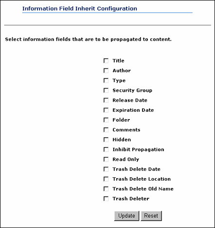
| Element | Description |
|---|---|
| Information Field check boxes | Selects the metadata fields to be propagated. |
| Update button | Saves the current settings. |
| Reset button | Resets the check boxes to their last saved settings. |
A.5 Folios Interface
Folio structure can be pre-defined in a template using the Create/Edit Folio Template Page. Also, default properties can be specified for both the folio and the template.
Note:
If you are using Firefox set to open new tabs instead of windows, help screens launched from an Admin Applet are not accessible until the applet window that launched the help is closed. Therefore, it is preferable to set Firefox to open in new windows instead of tabs.This section covers the following topics:
A.5.1 Create/Edit Folio Template Page
The Create/Edit Folio Template page is accessed by clicking Create Folio Template in the Folio Administration folder on the Administration tray. It is used to create a template that can be selected by a user when creating an advanced folio to provide predefined structure to the folio. The main areas of the Create/Edit Folio Template page are:
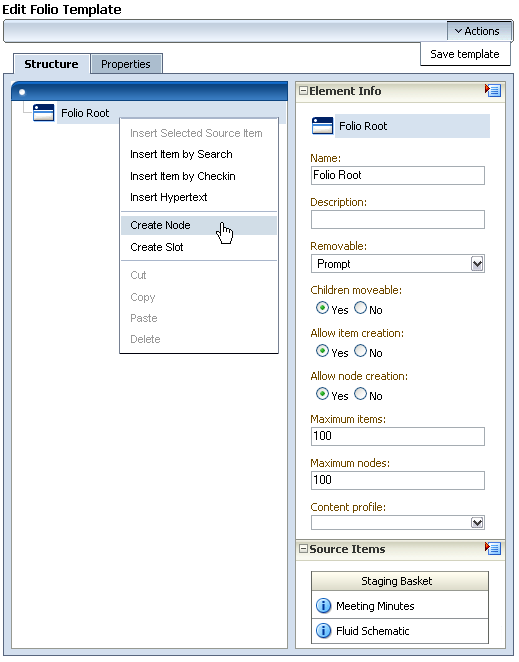
A.5.1.1 Structure Tab
One side of the Create/Edit Folio Template Structure tab displays the folio structure. The other side of the tab is a series of trays, similar to the navigation area of Content Server. Clicking the heading of a tray expands or collapses the tray. The main areas on the Create/Edit Folio Template page are:
A.5.1.2 Folio Structure Tray
One side of the Create/Edit Folio Template page is the folio structure section. It displays the nodes, slots, and items that make up the folio hierarchy. Right-clicking within the folio structure area displays a contextual menu for performing a variety of tasks, such as adding and deleting nodes and slots, or inserting content items.
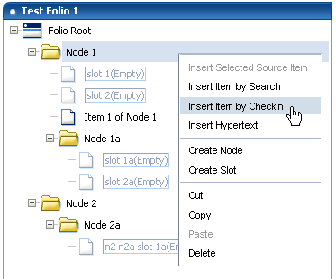
| Item | Description |
|---|---|
| Insert Selected Source Item | Inserts the item in the folio slot with the selected item from the Source Items Tray. If the slot currently contains a content item, the item is replaced with the source item. |
| Insert Item by Search | Displays a child window with a search form that searches Content Server for a previously checked-in item, and adds it to the folio in the selected node or slot. If the slot currently contains a content item, the item is replaced with the found content. Available in all contexts: Nodes, Slots, and Items. |
| Insert Item by Checkin | Displays a child window with a content check in form that checks a new content item into Content Server and adds it to the folio in the selected node or slot. If the slot currently contains a content item, the content item is replaced with the checked in content. Available in all contexts: Nodes, Slots, and Items |
| Remove Content Item | Removes a content item from a slot. Note that this does not delete the slot, but empties it, leaving the folio structure intact. To delete a slot, you must select Delete from the contextual menu. Available in Item context only. |
| Insert Hypertext | Creates a new item in the folio structure that can establish a hypertext link to the specified URL. Available in all contexts: Nodes, Slots, and Items |
| Create Node | Creates a new node or sub-node in the folio structure. |
| Create Slot | Creates an empty slot in the folio structure. |
| Cut | Cuts an item, node, or slot from the folio structure for placement elsewhere in the same folio. Available in all contexts: Nodes, Slots, and Items |
| Copy | Copies an item, node, or slot from the folio structure for placement elsewhere in the same folio. Available in all contexts: Nodes, Slots, and Items |
| Paste | Pastes an item, node, or slot that was previously cut or copied from the folio structure into another area of the same folio. Available in all contexts: Nodes, Slots, and Items |
| Delete | Deletes an item, node, or slot from the folio structure. Available in all contexts: Nodes, Slots, and Items |
A.5.1.3 Element Info Tray
The first tray on the other side of the Create/Edit Folio Template page is the element info tray. Use this tray to articulate the details of each element of the XML template file checked into Content Server to define the folio. When a node, slot, or item is selected in the folio structure section of the page, information about what is selected is displayed in the element info section, where it can be modified. Modified information is written back to the XML file checked into Content Server.
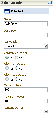
Important:
The element information is unique to the folio template, and not to the content item associated with the template. A single content item may be associated with several different folio templates, and the element information about that item may be different in each template. It is important to remember that if you change the element information in one template, it does not change in another.Use the following fields to specify the information for each element in the template.
| Information | Description |
|---|---|
| Name | The name given the element, as displayed in the folio hierarchy.
Displayed for all elements. |
| Description | A description of the element to help identify its intended use. For example, a slot named Field Report could have a description of Information gathered at the scene by first responders.
Displayed for all elements. |
| Attributes (slots and items) | Allowable uses and limitations of an element. Attributes are identical for slots and items, but differ for nodes.
Default attributes for slots and items:
|
| Attributes (nodes) | Default attributes for nodes:
|
| Content ID | The unique identifier of a content item used by Content Server.
Displayed for items and slots. Slots display this attribute as blank. |
| Create Date | The date a content item was created.
Displayed for items and slots. |
| last modified | The date changes were last made to the content item.
Displayed for items and slots. |
| link | The URL of the hyperlink.
Displayed for hyperlinks only. |
A.5.1.4 Source Items Tray
The Source Items tray provides the ability to collect items checked into Content Server for use in the folio. The default allows you to search Content Server and display a listing of search results in the tray, from which you can select items to insert into the folio. This is useful if you have multiple items from a search result that you want included in your folio.

Additionally, the selection menu in the Source Items tray heading allows you to choose a content basket to display in the tray. This is useful if you have previously collected items in a content basket, and now want to add them to a folio.
A.5.1.5 Properties Tab
The Properties tab of the Create/Edit Folio Template page allows a system administrator to define the default folio template properties and enable a folio template. The main sections of the Properties tab are Template Properties and Folio Default Properties.
| Form Element | Description |
|---|---|
| Template Enabled | Specifies whether or not the template is enabled and available to the user when creating an advanced folio. |
| Checkin Profile | Specifies the profile to be used when a user checks in a newly created folio based on this template. Specifying a profile here suppresses the option for the user to select one on check in. |
| Viewer | Specifies the viewer to use for the View Folio page. |
| Renderers | Specifies what options are available in the Renderers menu on the Edit Folio page. Options are:
|
| Archive revised folio content | Enabling this causes the current revisions of folio content to be compressed into a flat file and stored as the native file of the folio revision each time it is locked or a snapshot is made. This would allow for a system administrator to recover a content item from a previous revision of a folio, even if the content item was subsequently remove from Content Server. This is disabled by default. |
| Clone Folio Items | Enabling this causes any content items you specify in the template to be cloned when a folio is created from the template. Cloning an item causes a copy to be made and checked into Content Server as a new content item. If this is not enabled, any content item specified in the template is associated with the folio using the existing content ID. |
| Form Element | Description |
|---|---|
| Default Folio Profile | Specifies the profile to be used for searching and checking in when adding content items to the folio. |
| Allow Node Creation | Specifies if nodes can be created. |
| Allow Item Creation | Specifies if items can be created. |
| Allow Nested Folios | Specifies if other folios can be added as an item to the folio. |
| Allow External Items | Specifies if external links can be added to the folio. |
A.6 Content Tracker Interface
This section describes the Content Tracker interface screens.
Note:
If you are using Firefox set to open new tabs instead of windows, help screens launched from an Admin Applet are not accessible until the applet window that launched the help is closed. Therefore, it is preferable to set Firefox to open in new windows instead of tabs.This section covers the following topics:
A.6.1 Data Engine Control Center
The Data Engine Control Center is the applet interface that provides access to the user-controlled functions of the Data Engine. You access the applet by clicking the Content Tracker Administration link on the Administration tray. Then you click the Data Engine Control Center icon on the resulting page.
Through the interface, you can:
-
Enable and disable data collection.
-
Start and stop data reduction.
-
Monitor progress of data reduction.
-
Delete data.
-
Schedule data reduction to run automatically.
-
Enable activity metrics and collect search relevance information about managed content accesses.
-
Add, configure, and edit service calls to be logged.
-
Define specific event details that are to be logged for a given service.
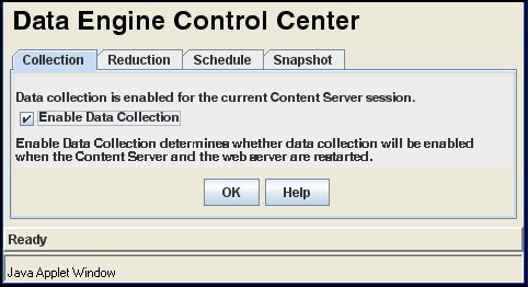
This section covers the following topics:
A.6.1.1 Collection Tab
Use the Collection tab to enable web traffic data collection for a Content Server session. When data collection is enabled, the Content Tracker Data Engine collects and writes raw data to logs located in the /data directory (<cs_root>/data/contenttracker/data/). These logs provide part of the input used in the reduction process and will accumulate as long as the collection process is properly enabled. Data accumulates whether or not the reduction process is performed.
Note:
Changing the status of the check box does not immediately enable or disable data collection. The Content Server and the web server must be restarted before any changes will be in effect. Look carefully at the sentence above the check box to determine whether data collection is enabled.When enabled, the sentence reads "Data collection is enabled..."
When disabled, the sentence reads "Data collection is not enabled..."

| Element | Description |
|---|---|
| Enable Data Collection check box | Selecting this check box enables data collection for the current Content Server session. |
| OK button | Implements the current data collection setting. |
| Help Button | Opens the online Help system. |
A.6.1.2 Reduction Tab
Use the Reduction tab to start and stop data reduction manually, to monitor progress of a data reduction operation, and to delete the raw data files from which the table rows are generated. During reduction, data is written to the appropriate tables and creates a log file that reflects the reduction process. These log files reside in the log/ directory (<cs_root>/data/contenttracker/logs/).
Each line item on the Reduction tab is raw (input) data that is gathered and organized on a daily basis. The raw data is the unprocessed data collected from the web server filter plugin. This data is ultimately used as input to the Content Tracker reduction process.
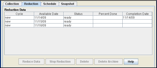
The Delete and Delete Archive buttons enable users to eliminate raw data logs. Records are 'deleted' from the primary tables when they are moved to the archive tables. Users are responsible for deleting records from the archive tables. If the raw data is deleted using the Delete and Delete Archive buttons, any reduced data in the tables will not be affected.
A.6.1.3 Schedule Tab
Use the Schedule tab to enable automatic data reduction. Using the Schedule tab, reduction runs can be configured to run on a scheduled basis. The recommended policy is to schedule reduction runs for each and every day.

| Element | Description |
|---|---|
| Scheduling Enabled check box | Selecting this check box enables data reduction to run automatically. |
| Days to Run check boxes | Selecting one or more check boxes sets the days when the data reduction will run. |
| Time to Run fields | Used to select the hour and minute to set the time when the data reduction will run. |
| OK button | Saves the current reduction schedule settings. |
| Help button | Opens the online Help system. |
A.6.1.4 Snapshot Tab
Use the Snapshot tab to selectively enable and automatically assign specific activity metrics to pre-defined, custom metadata fields.
The fields on the Snapshot tab are case-sensitive. Therefore, it is important that all field values are spelled and capitalized correctly. Content Tracker uses the following error checks to validate each enabled activity metric field value:
-
Content Tracker checks the DocMeta database table to ensure that the custom metadata field actually exists.
-
Content Tracker ensures that the custom metadata field is of the correct type. That is, the Last Access metadata field must be of type Date and the Short / Long Access Count fields must be of type Integer.
-
Content Tracker checks to explicitly exclude the dID metadata field.
Note:
If you make any changes to the configuration, all of the content items are updated during the next reduction cycle.
A.6.1.5 Services Tab
Use the Services tab to log additional Content Server service calls along with data values relevant to the associated services. The Services tab enables you to conveniently add or configure service entries and, optionally, their corresponding field map ResultSets in the service call configuration file (SctServiceFilter.hda). Every service that you want to be logged must have a service entry in the SctServiceFilter.hda file.
Note:
The Services tab is not displayed if Content Access Only mode is ON (the default). The Content Access Only mode is one of Content Tracker's optimization functions that ensure information tracking processes are performed as efficiently as possible. This operating mode determines what types of information is collected. When enabled (the default), only content access events are recorded which excludes content searches and user profile information.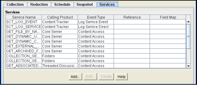
| Element | Description |
|---|---|
| Services list | Provides the names and result set values of each service logged by Content Tracker. |
| Add button | Opens the Extended Services Tracking Screen. |
| Edit button | Opens the Extended Services Tracking Screen. Applicable fields are populated with the current result set values. |
| Delete button | Deletes the selected service. |
| Help button | Opens the online Help system. |
A.6.1.6 Extended Services Tracking Screen
Use the Extended Services Tracking screen to configure (add, edit, or delete) the service entries contained in the ServiceExtraInfo ResultSet that is included in the SctServiceHandler.hda file. To access this screen, click the Add button on the Services Tab.
Content Tracker does not perform error checking (such as field type or spelling verification) for the extended services tracking function in the Data Engine Control Center. Errors resulting from field name conflicts are not generated until you perform a reduction. The fields on the Extended Services Tracking screen are case-sensitive. Therefore, be careful to enter proper service entry field values, especially service call names. Ensure that all field values are spelled and capitalized correctly.
The ServiceExtraInfo ResultSet in the SctServiceHandler.hda file contains a service entry for each service to be logged. If you select an existing service entry from the Service Name field, the applicable fields will already be populated with the existing service entry's field values. However, if you are adding a service, the new service entry will use the values you enter for the Service Name field, Calling Product field, Event Type field, Reference field, and Field Map field.
| Element | Description |
|---|---|
| Service Name field | The name of the service to be logged. For example, GET_FILE. If the line for the service name is not included in the service entry, the service is not logged. |
| Calling Product field | An arbitrary string that will be copied to the SctAccessLog table when the service is logged. It is generally set to "Core Server" for all standard Content Server entries. |
| Event Type field | An arbitrary string that will be copied to the SctAccessLog table when the service is logged. It is generally set to "Content Access" for all standard Content Server entries. |
| Reference field | Used to set the sc_scs_reference field in the SctAccessLog table. If blank, the internal getReference logic is used. |
| Field Map field | The name of the field map ResultSet that is added to the SctServiceFilter.hda file. This field is only required if you plan to use the extended service call tracking function. This function enables you to log arbitrary DataBinder field information to one or more of the general purpose columns in the SctAccessLog table.
To help you design your field map, a configuration variable can be set that writes out the object when the service is called. This enables you to see what data is available at the time the event is recorded. |
| Field Name/Field Location/Column Name list | Lists each set of data field, location, and table column names associated with a field map ResultSet. The Field Map Screen field values are used to populate this list. |
| Add button | Opens the Field Map Screen. |
| Delete button | Deletes the selected field map ResultSet. |
| OK button | Saves the field values and adds or updates the service entry to the ServiceExtraInfo ResultSet. Clicking OK will also add the field map ResultSet to the SctServiceFilter.hda file if you have created one. Refer to the "Field Map Screen". |
| Cancel button | Closes the Extended Services Tracking screen without saving any changes. |
| Help button | Opens the online Help system. |
A.6.1.7 Field Map Screen
Use the Field Map screen to configure the field map ResultSets that are linked to the service entries and included in the SctServiceHandler.hda file. To access this screen, click the Add button on the Extended Services Tracking Screen.
Content Tracker does not perform error checking (such as field type or spelling verification) for the extended services tracking function in the Data Engine Control Center. Errors are not generated until you perform a reduction. The fields on the Field Map screen are case-sensitive. Therefore, be careful to enter proper field and column names. Ensure that all field values are spelled and capitalized correctly.
To use the extended service call tracking function, you must map a service entry to a field map ResultSet in the SctServiceHandler.hda file. The value in the Field Map field on the Extended Services Tracking Screen is the name of the field map ResultSet.
Tip:
Content Tracker provides a debugging configuration variable that, if enabled, configures the service handler filter to write out the service DataBinder objects into dump files (SctDebugServiceBinderDumpEnable). These can be used as diagnostic tools when you are developing field map screens. The dump files enable you to see what data is available at the time the particular service events are recorded.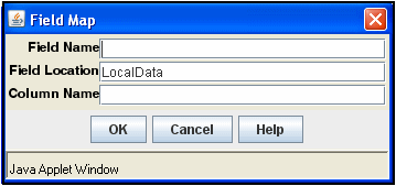
A.6.2 Content Tracker Report Generator Main Page
The Content Tracker Reports component provides pre-defined queries organized into several main categories. These pre-defined reports are designed to answer the most common questions about system activity. The individual reports provide drill-down reports based on applicable criteria. The Content Tracker Report Generator main screen is accessed by clicking the Content Tracker Reports link in the Administration tray.
Note:
By default, Content Tracker is configured for maximum performance using several optimization functions. As such, Content Tracker collects and records only content access event data. This excludes information gathering on non-content access events like searches as well as the collection and synthesis of user profile summaries.Because non-content event data is not gathered, various pre-defined report options are not displayed on the Content Tracker Report Generator main page. However, all of the pre-defined report options can be available if you reconfigure Content Tracker. This is done by changing the settings of the optimization functions in Content Server's config.cfg file or using the Component Manager's Update function.
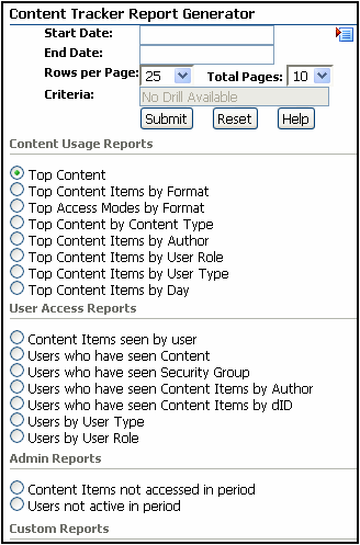
| Field | Description |
|---|---|
| Start Date field | Designates the beginning of a specific time period for records to be searched. |
| End Date field | Designates the end of a specific time period for records to be searched. |
| Date menu | Yesterday: Enters the date of the previous day into the Start Date and today's date into the End Date fields.
Latest Week: Enters the beginning and ending dates of the previous week into the Start Date and End Date fields. Latest Month: Enters the beginning and ending dates of the previous month into the Start Date and End Date fields. Latest Year: Enters the beginning and ending dates of the previous year into the Start Date and End Date fields. |
| Rows per Page field | Specifies the number of results rows each page of the report can contain. |
| Total Pages field | Specifies the maximum number of results pages the report can contain. |
| Criteria field | Filters the search results and immediately accesses the applicable drill-down report. For example, if you are searching top content items by author, entering a specific author in the criteria field displays the drill-down report listing the content items authored by that user. Leaving this field blank causes the top level query to be executed, which provides a list of authors on the system. |
| Submit button | Generates and displays the selected report type. |
| Reset button | Clears the screen selections. |
| Help button | Opens the online Help system. |
| Top Content radio button | Lists the most frequently accessed content items in the system. |
| Top Content Items by Format radio button | Lists the most frequently accessed content items by application type (i.e., pdf or txt). |
| Top Access Modes by Format radio button | Lists the most frequently accessed content item application types (i.e., pdf or txt) by access mode. |
| Top Content by Content Type radio button | Lists the most frequently accessed content items by content item type. |
| Top Content Items by Author radio button | Lists the most frequently accessed content items by author. |
| Top Content Items by User Role radio button | Lists the most frequently accessed content items by user role. |
| Top Content Items by User Type radio button | Lists the most frequently accessed content items by user type. |
| Top Content Items by Day radio button | Lists the most frequently accessed content items for each day. |
| Search Summary radio button | Lists the types of searches that have been done and the search criteria. |
| Content Items seen by user radio button | Lists, by specific users, the number of content items most frequently opened by the indicated user. |
| Users who have seen Content radio button | Lists, by specific content item, the users who have accessed the content item. |
| Users who have seen Security Group radio button | Lists, by specific users, the content items most frequently accessed in specific security groups. |
| Users who have seen Content Items by Author radio button | Lists, by specific users, the content items most frequently accessed that have been authored (checked in) by specific users. |
| Users who have seen Content Items by dID radio button | Lists, by specific users, the content items most frequently accessed based on the internal content item identification numbers. |
| Users by User Type radio button | Lists, by specific users, the content items most frequently accessed based on the user type. |
| Users by User Role radio button | Lists, by specific users, the content items most frequently accessed based on the user role. |
| Content Items not accessed in period radio button | Lists the content items that have not been accessed followed by the content items most frequently accessed. |
| Users not active in period radio button | Lists the users that have not accessed content items followed by users that have accessed content items. |
| Authorization Failures by User radio button | Lists the users that tried unsuccessfully to access content items to which they did not have authorization privileges. |
| Login Failures radio button | Lists the users that tried unsuccessfully to log in to the system. |
A.7 Content Categorizer Interface
This section describes the Content Categorizer interface screens.
Note:
If you are using Firefox set to open new tabs instead of windows, help screens launched from an Admin Applet are not accessible until the applet window that launched the help is closed. Therefore, it is preferable to set Firefox to open in new windows instead of tabs.This section covers the following topics:
A.7.1 Content Categorizer Admin Applet Page
The Content Categorizer Admin Applet is used to define the configuration and search rules for Content Categorizer, register categorizer engines, and build query trees. Work with the Content Categorizer Administration applet by selecting the applicable link below the Administration area.
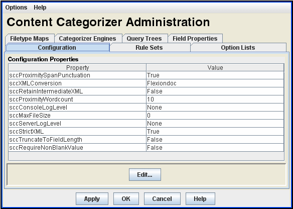
| Element | Description |
|---|---|
| Options menu | Save Tab Changes = Saves the settings on the current tab.
Save All Tab Changes = Saves the settings on all tabs. Exit = Closes the CC Admin Applet screen. |
| Help menu | Help = Opens the online Help system.
About Content Categorizer = Displays version information for Content Categorizer and Content Server. |
| Tabs | The applet screen contains these tabs: |
| Apply button | Saves the settings on the current tab. |
| OK button | Saves the settings on all tabs and exits the CC Admin Applet screen. |
| Cancel button | Exits the CC Admin Applet screen without saving any changes to settings. |
| Help button | Opens the online Help system. |
A.7.2 Configuration Tab
The Configuration tab is used to set Content Categorizer runtime configuration settings.

| Element | Description |
|---|---|
| Property column | Lists the properties that can be configured:
sccXMLConversion = Name of the XML conversion method used to convert native documents into XML when operating in Interactive mode or Batch mode. sccRetainIntermediateXML = If true, all intermediate files (temporary files created during the categorization process of a content document) are retained and INFO trace entries in the server log map the temp files to the content. If false, all intermediate files are deleted after use. sccConsoleLogLevel = Level of execution trace information that will appear in the console window when Content Server is run as a foreground process, not started as a background service. sccServerLogLevel = Level of execution trace information that will appear in the content server log (accessed from the Server Logs link on the Administration page). sccProximityWordcount = Number of words that can lie between two keywords in an Option List search rule for the keywords to be considered "near" each other. Default value is 10. Used with $$NEAR$$ operator. sccStrictXML = Set to true. (This property should be set to false only if the XML includes have leading whitespace.) sccRequireNonBlankValue = If true, search results will not return blank metadata values if XML tags are empty. If false, search results will include blank metadata values if XML tags are empty. sccProximitySpanPunctuation = If true, leading and trailing punctuation is eliminated from strings during the normalization process. If false, punctuation is retained in strings. Used in Option List search rule. sccTruncateToFieldLength = If true, XML tag contents that are too long for their target metadata fields will automatically be truncated to fit. If false, XML tag contents that are too long for their target metadata fields will produce errors. |
| Value column | Shows the current value for each property. |
| Edit button | Displays the Property Config screen for a selected property. |
This section covers the following topics:
A.7.2.1 Property Config Screen
The Property Config screen is used to edit the value of the property selected on the Configuration tab.
| Element | Description |
|---|---|
| Property field | Used to change the setting of the selected property. Either a text field or choice list, depending on the property. |
| OK button | Applies the change and closes the Property Config screen. |
| Cancel button | Closes the Property Config screen without applying changes. |
| Help button | Opens the online Help system. |
A.7.2.2 Log Levels
The following log levels are listed in order from least to most log information:
| Setting | Level of Information |
|---|---|
| NONE | Fatal errors only. |
| ERROR | Operational errors. |
| WARNING | Actions that are well-defined but unusual. |
| INFO | All internal processes. Use for diagnosing problems with execution traces. |
Follow these instructions to set log levels:
-
On the CC Admin Applet Configuration tab, select sccConsoleLogLevel or sccServerLogLevel.
-
Click Edit.
-
Select the desired log level from the drop-down list.
-
Click OK.
-
Click Apply to save the changes.
A.7.3 Rule Sets Tab
The Rule Sets tab is used to define the search rules that Content Categorizer uses to find metadata values. Named rulesets allows you to define multiple, independent rulesets for use with different types of content.
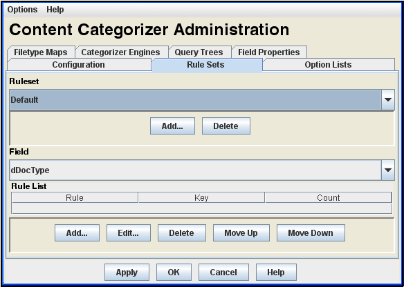
The ruleset to be used for a given content item is determined by a set of specifiers that includes the document type (doc, txt, xls, etc.).
| Element | Description |
|---|---|
| Ruleset choice list | Lists the search rulesets currently defined. A defined ruleset contains multiple rules that apply to specific documents or a particular document type. If a specific ruleset is not defined for a given document or document type, the default ruleset is used.
Rulesets are unitary and completely independent. One ruleset cannot be included in another ruleset and only one ruleset can be applied to a given document. |
| Add button (Ruleset) | Displays the Add Ruleset Screen, which is used to add a new ruleset. |
| Delete button (Ruleset) | Deletes the selected search ruleset.
The default ruleset cannot be deleted. |
| Field choice list | Selects a metadata field for viewing or defining search rules. Only the metadata fields that allow search rules are included in the list. |
| Rule List | Lists the search rules currently defined for the selected metadata field. Content Categorizer runs the search rules in the order shown, from the top of the list to the bottom. |
| Rule column | Shows the type of search rule. |
| Key column | Shows the search key for the search rule. |
| Count column | Shows the count for the search rule. |
| Add button (Rule List) | Displays the Add/Edit Rule for Field Screen, which is used to add a new search rule. |
| Edit button (Rule List) | Displays the Add/Edit Rule for Field Screen, which is used to edit the selected search rule. |
| Delete button (Rule List) | Deletes the selected search rule. |
| Move Up button (Rule List) | Moves the selected search rule up in the list. |
| Move Down button (Rule List) | Moves the selected search rule down in the list. |
This section covers the following topics:
A.7.3.1 Add Ruleset Screen
The Add Ruleset screen is used to define a new search ruleset on the Rule Sets tab. Access this screen by clicking the Add button on the Ruleset tab of the Content Categorizer Administration screen.
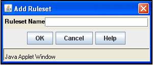
Important:
Content Categorizer requires a non-empty rule set for any file type (.doc, .txt, .xml, etc.) it is called to examine. If no rules exist for a given file type, Content Categorizer will throw an exception.The easiest way to protect against this is to add at least one rule to the Default rule set. The Default rule set is used for all file types which do not have a custom rule set assigned.| Element | Description |
|---|---|
| Ruleset Name field | Used to add a ruleset name. |
| OK button | Applies the change and closes the Add Ruleset Screen. |
| Cancel button | Closes the Add Ruleset Screen without applying changes. |
| Help button | Opens the online Help system. |
A.7.3.2 Add/Edit Rule for Field Screen
The Add/Edit Rule for Field screen is used to define a new search rule or edit the rule selected on the Rule Sets tab.
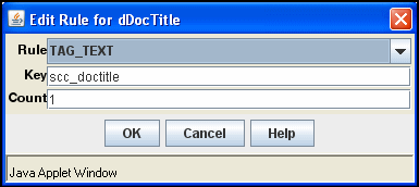
| Element | Description |
|---|---|
| Rule choice list | Selects the type of search rule. |
| Key field | Defines the search key for the search rule. See "Key Field" for additional information. |
| Count field | Defines the count for the search rule. See Count Field for additional information. |
| OK button | Applies the change and closes the Add/Edit Rule for Field Screen. |
| Cancel button | Closes the Add/Edit Rule for Field Screen without applying changes. |
| Help button | Opens the online Help system. |
A.7.3.3 Key Field
| Search Rule | Key Description |
|---|---|
| TAG_TEXT | XML element [without angle brackets] |
| TAG_ALLTEXT | XML element [without angle brackets] |
| TEXT_REMAINDER | Text phrase |
| TEXT_ALLREMAINDER | Text phrase |
| TEXT_FULL | Text phrase |
| TEXT_ALLFULL | Text phrase |
| TEXT_NEXT | Text phrase |
| TEXT_ALLNEXT | Text phrase |
| FIRST_PARAGRAPH | XML element [without angle brackets] |
| FIRST_SENTENCE | XML element [without angle brackets] |
| OPTION_LIST | Option List name (must match the Option List name on the Option Lists Tab.) |
| CATEGORY | Categorization engine name (if more than one is defined in list of Categorizer Engines), followed by forward slash (/), followed by taxonomy name.
For example: EngineName/TaxonomyName |
| FILETYPE | Not applicable for this rule; leave this field blank. |
A.7.3.4 Count Field
| Search Rule | Count Description |
|---|---|
| TAG_TEXT
TAG_ALLTEXT TEXT_REMAINDER TEXT_ALLREMAINDER TEXT_FULL TEXT_ALLFULL TEXT_NEXT TEXT_ALLNEXT |
The number of tags or text phrases that must be matched before the rule returns results. For example, a count of 4 will look for the fourth occurrence of the key. If only three occurrences of the key are found in the document, the rule fails.
The default count of 1 returns the first occurrence of the key. |
| FIRST_PARAGRAPH | Size threshold measured in percent. The first paragraph matching the key that is larger than the count percentage multiplied by the average paragraph size is returned.
For example, if the count is set to 75 and the average paragraph size is 100 characters, the rule returns the first paragraph larger than 75 characters that matches the key. If the count is set to the default of 1, the rule is likely to return the first paragraph that matches the key. |
| FIRST_SENTENCE | The number of elements that have their first sentences returned.
For example, if the count is set to 3, the rule returns the first sentence from each of the first three elements that match the key. |
| OPTION_LIST | The minimum threshold score for the rule to return results.
For example, if the count is set to 50, and the highest accumulated keyword score is 45, the rule fails. |
| CATEGORY | The minimum confidence level threshold for the rule to return results.
For example, if the count is set to 50, and the highest-confidence category has a confidence level of 45, the rule fails. |
| FILETYPE | Not applicable for this rule; leave this field blank. |
A.7.4 Option Lists Tab
The Option Lists tab is used to define the keywords and weights for Option List search rules.
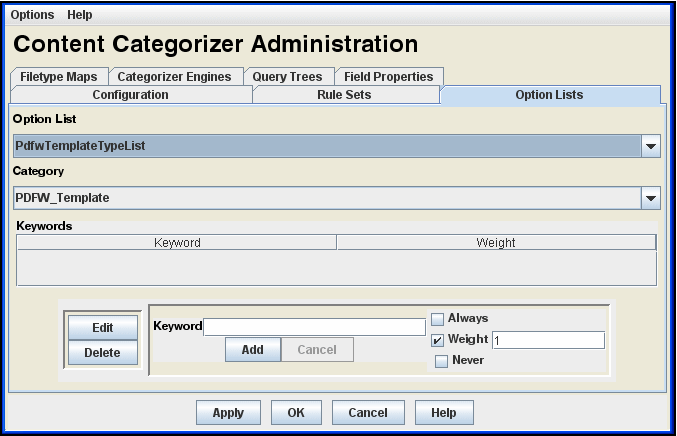
| Element | Description |
|---|---|
| Option List choice list | Selects the option list. The list includes the Type ($DocType) option list, plus option lists of all custom metadata fields that have an option list defined in the Configuration Manager. |
| Category choice list | Selects a value on the selected option list. Only the pre-defined values for the option list are included. |
| Keyword column | Lists the keywords associated with the selected category. |
| Weight column | Shows the weights assigned to each keyword. |
| Edit button | Changes the Add button to Update and enters the selected keyword and weight in the editing area. |
| Delete button | Deletes the selected keyword. |
| Keyword field | Used to add or edit a keyword. |
| Add/Update button | Adds a new keyword and weight value, or changes the selected keyword and weight value. |
| Cancel button | Changes the Update button to Add without saving changes to the selected keyword and weight value. |
| Weight options | Defines the weight assigned to the keyword.
Always = If the keyword is found, the selected category will be returned as the suggested value, regardless of the score. Weight = This number multiplied by the number of occurrences of the keyword contributes to the score for a category. The category with the highest score is returned as the suggested value for the option list field. Never = If the keyword is found, the selected category will not be returned as the suggested value, regardless of the score. |
A.7.5 Filetype Maps Tab
The Filetype Maps tab is used to create and modify a filetype map, which determines the specific converter, stylesheet and ruleset are used for a particular content item type (such as doc, txt, xls).
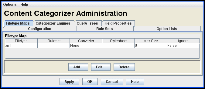
If no Filetype Map entry is defined for a particular content item, then the default ruleset, XML Converter, stylesheet, and maximum size values will be used.
| Element | Description |
|---|---|
| Filetype Map list | Lists the filetype maps currently defined. |
| Properties columns | Shows the following properties for a filetype map:
|
| Add button | Displays the Add/Edit Filetype Map Screen, which is used to add a filetype map. |
| Edit button | Displays the Add/Edit Filetype Map Screen, which is used to edit the selected filetype map. |
| Delete button | Deletes the selected filetype map. |
This section covers the following topics:
A.7.5.1 Add/Edit Filetype Map Screen
The Add/Edit Filetype Map screen is used to define a new filetype map or edit the map selected on the Filetype Maps tab. The filetype map entries determine which XML converter, which XSLT stylesheet, and which ruleset are to be used for a particular filetype (doc, txt, xle, evt.).
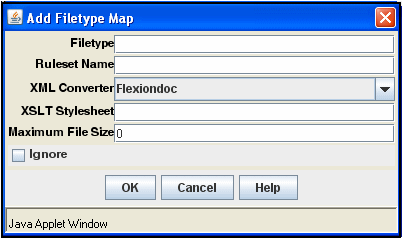
Defining a filetype entry for a particular content file type makes possible special, content-specific processing alternatives. For example, you may use a custom ruleset for a particular content type, set a maximum file size, or direct Content Categorizer to ignore such files altogether.
| Element | Description |
|---|---|
| Filetype field | Used to specify the filetype (such as doc, txt, xls). Enter $$NONE$$ to define a map entry for files with no filetype. |
| Ruleset Name field | Used to specify the ruleset to be applied. If no ruleset is specified, the default ruleset will be used. |
| XML Converter list | Lists the applicable XML converter. Three values are available: Flexiondoc, SearchML, and None. (None is available if the content is already in XML format or if it will be when the custom XSLT stylesheet completes its processing.) The default value for the XML converter is set as a configuration parameter. |
| XSLT Stylesheet field | Used to specify the file path (absolute or relative) of the XSLT stylesheet to be applied. XSLT stylesheets are stored in the IntradocDir/custom/ContentCategorizer/stylesheets/ directory.
Customized, content-specific XSLT translation stylesheets can be used as the back-end of the XML conversion. The selected stylesheet is used in a transformation operation after the XML conversion (if any) is complete. Stylesheets allow document properties and content to be isolated with he results extracted to a metadata field. The stylesheet to be used for a given content item is determined by a set of specifiers that includes the document type (doc, txt, xls, etc.). The default value for XSLT Stylesheet depends on the XML converter actually used. Flexiondoc uses flexion_to_scc.xsl and SearchML uses searchml_to_scc.xsl. |
| Maximum File Size field | Used to establish the maximum file size for a given file type (doc, txt, xls, etc.). Files of this type that exceed the maximum size will be ignored by Content Categorizer. |
| Ignore check box | Selected = directs Content Categorizer to disregard a particular file type (doc, txt, xls, etc.).
Clear = directs Content Categorizer to consider files of this type. |
| OK button | Saves the settings in all the fields and exits the Add/Edit Filetype Map Screen. |
| Cancel button | Exits the Add/Edit Filetype Map Screen without saving any changes to settings. |
| Help button | Opens the online Help system. |
A.7.5.2 Filetype Mapping Operation
When a document is submitted to Content Categorizer for processing, the following shows the selection process to determine the applicable combination of a ruleset, XML converter, and XSLT stylesheet:
-
The check-in page is checked for certain Content Categorizer specific field values (sccRuleset, sccXMLConversion, and sccXSLTStylesheet). If the field exists and is non-blank, the contents of the field determine which ruleset, XML converter, or XSLT stylesheet is to be used.
-
If the form field is missing or empty, a filetype map entry for the content type is sought. If the map entry exists and if the relevant field is non-blank, the contents are used to determine which ruleset, XML converter, maximum file size, or XSLT stylesheet is to be used. If the map entry exists, and the Ignore check box is selected, Content Categorizer will not perform the XML conversion or apply any search rules.
-
If the form field is missing or empty and the filetype map entry is missing or the relevant field of the map entry is blank, the default ruleset is used, the maximum file size is used, the default XML converter defined in the configuration settings is used, and/or the default XSLT stylesheet is used.
A.7.6 Categorizer Engines Tab
The Categorizer Engines tab is used to register a third-party categorization engine for integration with Content Categorizer.
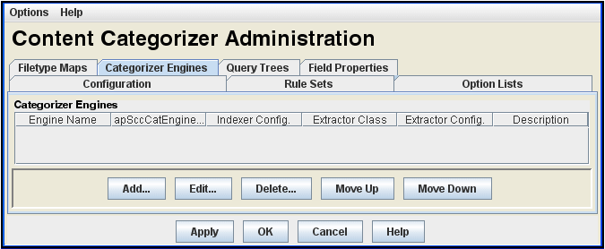
The values used to register an engine will normally be provided by the third-party categorization vendor.
| Element | Description |
|---|---|
| Categorizer Engines list | Lists the Categorizer Engines currently defined. |
| Properties columns | Shows the following properties for a Categorizer Engine:
|
| Add button | Displays the Add Categorizer Engine screen, which is used to register a new engine. |
| Edit button | Displays the Edit Categorizer Engine screen, which is used to edit the selected engine. |
| Delete button | Deletes the registration for the selected engine. |
| Move Up button | Moves the selected engine up in the list. |
| Move Down button | Moves the selected engine down in the list. |
This section covers the following topic:
A.7.6.1 Add/Edit Categorizer Engine Screen
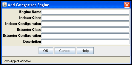
| Element | Description |
|---|---|
| Engine Name field | A unique identifier for a categorization engine for which SCC has an adaptor module. This identifier is used in the Key field of a CATEGORY rule, for example, "EngineName/TaxonomyName". |
| Indexer Class field | The name of the Java class in an SCC adaptor module that is used to ask the categorizer engine to categorize a given document or set of documents. |
| Indexer Configuration field | A string that is passed to the Indexer Class's setup() method. It is usually a comma-separated list of engine-specific initialization parameters. |
| Extractor Class field | The name of the Java class in an SCC adaptor module that is used to ask the categorizer engine for the set of categories in a given taxonomy. |
| Extractor Configuration field | A string that is passed to the Extractor Class's doExtract() method. It is usually a comma-separated list of engine-specific initialization parameters. |
| Description | A description of the categorization engine. |
| OK button | Saves the settings and exits the screen. |
| Cancel button | Exits the screen without saving changes to settings. |
| Help button | Opens the online Help system. |
A.7.7 Query Trees Tab
The Query Trees tab is used to create a browsable hierarchy of categorized documents.
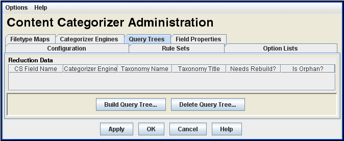
A query tree consists of:
-
a "taxonomy cache" of machine-generated files located in IntradocDir/data/contentcategorizer/taxonomies/<engine_name>/<taxonomy_name>
-
a "root link" on Content Server's Library page
Query trees are associated with a CATEGORY rule, and are generated from the taxonomy used in the CATEGORY rule definition. If you do not have a categorization engine defined, you will not be able to generate a Query Tree.
| Element | Description |
|---|---|
| Query Trees List | Lists the Query Trees currently defined. |
| Properties columns | Shows the following properties and status for a Query Tree:
|
| Build Query Tree button | Displays the Build Query Tree Screen. |
| Delete Query Tree button | Displays the Delete Query Tree Screen. |
This section covers the following topics:
A.7.7.1 Build Query Tree Screen
The Build Query Tree screen is accessed from the Query Trees tab.
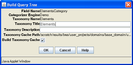
| Element | Description |
|---|---|
| Field Name | Name of the content information (metadata) field for which the CATEGORY search rule was defined. |
| Categorizer Engine | Name of the categorizer engine specified for the CATEGORY search rule that was defined for the metadata field. |
| Taxonomy Name | Name of the taxonomy specified for the CATEGORY search rule that was defined for the metadata field. In addition to being displayed as a property in the Query Trees list, this name is displayed and used:
in the Content Server Library navigation hierarchy. in the Value field of the Query Link Definition screen in Web Layout Editor. |
| Taxonomy Title field | Title of taxonomy. In addition to being displayed as a property in the Query Trees list, this name is displayed and used:
as a root link on the Content Server Library main page. in the Page Links list of the Web Layout Editor screen. in the Link Title field of the Query Link Definition screen in Web Layout Editor. |
| Taxonomy Description field | Description of taxonomy, which is used:
under the root link on the Content Server Library main page. in the Description field of the Query Link Definition screen. |
| Taxonomy Cache Path | Path to the taxonomy cache:
IntradocDir/data/contentcategorizer/taxonomies/engine_name/taxonomy_name/ |
| Build Taxonomy Cache check box | Selected = Clicking OK builds (or rebuilds) the taxonomy cache.
Clear = Clicking OK does not build (or rebuild) the taxonomy cache. |
| OK button | Saves the settings and builds (or rebuilds) the query tree. |
| Cancel button | Exits the screen without building (or rebuilding) the query tree and without saving changes to settings. |
| Help button | Opens the online Help system. |
A.7.7.2 Delete Query Tree Screen
The Delete Query Tree screen is accessed from the Query Trees tab.
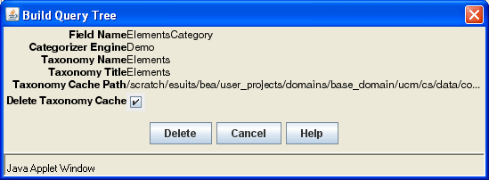
| Element | Description |
|---|---|
| Field Name | Name of the content information (metadata) field for which the CATEGORY search rule was defined. |
| Categorizer Engine | Name of the categorizer engine specified for the CATEGORY search rule that was defined for the metadata field. |
| Taxonomy Name | Name of the taxonomy specified for the CATEGORY search rule that was defined for the metadata field. In addition to being displayed as a property in the Query Trees list, this name is displayed and used:
|
| Taxonomy Title field | Title of taxonomy. In addition to being displayed as a property in the Query Trees list, this name is displayed and used:
|
| Taxonomy Cache Path | Path to the taxonomy cache:
IntradocDir/data/contentcategorizer/taxonomies/engine_name/taxonomy_name/ |
| Delete Taxonomy Cache check box | Selected = Clicking Delete deletes the taxonomy cache.
Clear = Clicking Delete does not delete the taxonomy cache. |
| Delete button | Deletes the selected taxonomy cache. |
| Cancel button | Exits the screen without building (or rebuilding) the query tree and without saving changes to settings. |
| Help button | Opens the online Help system. |
A.7.7.3 Needs Rebuild? and Is Orphan? Status
The following fields are used to indicate status.
| Element | Description |
|---|---|
| Needs Rebuild? column | No indicates that the query tree is current. No action is required.
Yes indicates that the taxonomy cache, the Library page link to the cache, or both, are old or do not exist. A rebuild of the query tree is necessary. |
| Is Orphan? column | No indicates that the query tree is not an orphan. No action is required.
Yes indicates that the taxonomy cache, the Library page link to the cache, or both, are orphans; that is, there are no longer any CATEGORY rules that refer to them. Check the rule associated with the query tree. |
A.7.8 Field Properties Tab
The Field Properties tab is used to set override and default properties that Content Categorizer will use during Batch mode.
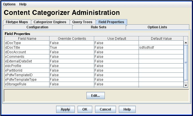
| Element | Description |
|---|---|
| Field Properties List | Lists the standard and custom content information (metadata) fields and their property settings. |
| Field Name column | Lists the metadata fields that have values defined. |
| Override Contents column | Shows whether a field's contents will be overridden if the field already has an existing value. True = value returned by the categorization process will override an existing value. False = value returned by the categorization process will not override an existing value. |
| Use Default column | Shows whether a field's default value will be used if all rules fail (or are not defined) when the categorization process runs. True = default value will be used. False = default value will not be used. |
| Default Value column | Shows the default value for each field. |
| Edit button | Displays the Field Properties Screen. |
This section covers the following topic:
A.7.8.1 Field Properties Screen
The Field Properties screen is used to edit settings for a field selected in the Field Properties list.
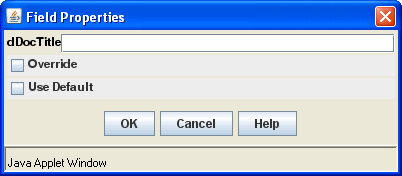
| Element | Description |
|---|---|
| Metadata field | Used to change the default value of the selected field. |
| Override check box | Selected = sets Override to true.
Clear = sets Override to false. |
| Use Default check box | Selected = sets Use Default to true.
Clear = sets Use Default to false. |
| OK button | Applies edits and closes the Field Properties screen. |
| Cancel button | Closes the Field Properties screen without applying changes. |
| Help button | Opens the online Help system. |
A.7.9 Batch Categorizer Screen
The Batch Categorizer utility is used to run Content Categorizer in Batch mode and is accessed by running the BatchCategorizer application, which is located in the <cs_root>/data/contentcategorizer/bin/ directory.
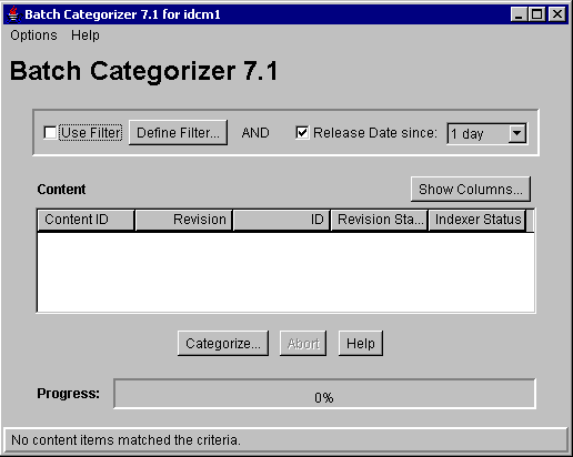
| Element | Description |
|---|---|
| Options menu | Save Settings = Saves all the current settings.
Exit = Closes Batch Categorizer. |
| Help menu | Help = Opens the online Help system.
About Content Categorizer = Displays version information for Content Categorizer and Content Server. |
| Use Filter check box | Selected = enables filtering of content in the repository based on any defined filters and release date filter (if specified).
Clear = disables filtering of content in the repository based on defined filters. |
| Define Filter button | Displays the Define Filter Screen, from which selections for filters can be made. |
| Release Date since check box and list | Selected = enables filtering of content in the repository based on release date since 1 day, 1 week, or 4 weeks.
Clear = disables filtering of content in the repository based on release date. |
| Content list | Filtered lists of content items in the repository. |
| Show Columns button | Displays the Show Columns Screen, from which selections for displaying properties in the content list can be made. |
| Content list properties columns | Shows the following properties for each content item:
|
| Categorize button | Displays the Categorize Existing Screen. |
| Abort button | Cancels the categorization batch process. |
| Help button | Opens the online Help system. |
| Progress bar | Shows the progress of the batch process. |
A.7.10 Define Filter Screen
The Define Filter screen is accessed from the Batch Categorizer utility.
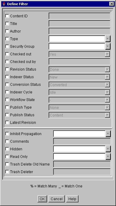
| Element | Description |
|---|---|
| Content ID check box and field | The unique identifier of the content item. Enter the value.
Selected / Clear = Item is used / not used as a filter. |
| Title check box and field | The descriptive name identifying the file. Enter the value.
Selected / Clear = Item is used / not used as a filter. |
| Author check box and field | Name of the person who checked in the file. Enter the value.
Selected / Clear = Item is used / not used as a filter. |
| Type check box and field | An identifier used to group files. Select value from list.
Selected / Clear = Item is used / not used as a filter. |
| Security Group check box and field | A security group is a set of files with the same access privileges. Select value from list.
Selected / Clear = Item is used / not used as a filter. |
| Checked out check box and field | Existing files that are checked out. Select value from list.
Selected / Clear = Item is used / not used as a filter. |
| Checked out by check box and field | Person who has checked out the file(s). Enter the value.
Selected / Clear = Item is used / not used as a filter. |
| Revision Status check box and field | Represents the number of revisions in the file's life cycle. Select value from list:
Selected / Clear = Item is used / not used as a filter. |
| Indexer Status check box and field | The status of the file's Index Refinery. Select value from list:
Selected / Clear = Item is used / not used as a filter. |
| Conversion Status check box and field | The status of all defined connections. Select value from list:
Selected / Clear: is used / not used as a filter. |
| Indexer Cycle check box and field | The status of the index cycle. Select value from list:
Selected / Clear: is used / not used as a filter. |
| Workflow State check box and field | Revision state of content in a given workflow.
Selected / Clear: Item is used / not used as a filter. |
| Publish Type check box and field | The published project type. This field is only used for files that originate from Content Publisher. If the content item checked in is not a Content Publisher file, the Publish Type field will default to None and the Publish Status field will default to Content. Select value from list:
Selected / Clear: Item is used / not used as a filter. |
| Publish Status check box and field | The status of the published project type. This field is only used for files that originate from Content Publisher. If the content item checked in is not a Content Publisher file, the Publish Type field will default to None and the Publish Status field will default to Content. Select value from list:
Selected / Clear: Item is used / not used as a filter. |
| Latest Revision check box | The most current revision of the file.
Selected / Clear: Item is used / not used as a filter. |
| Inhibit Propagation check box and field | Propagation enables default metadata values to be copied from a higher-level content item and applied to other lower-level content items.
Selected / Clear: Item is used / not used as a filter. |
| Comments check box and field | Words or phrases used to narrow the search and selected file results. Enter the word or phrase.
Selected / Clear: Item is used / not used as a filter. |
| Hidden check box and field | Specifies whether the content is hidden from the folder view.
Selected / Clear: Item is used / not used as a filter. |
| Read Only check box and field | Specifies whether the content should not be altered.
Selected / Clear: Item is used / not used as a filter. |
| Trash Delete Old Name check box and field | Defines a file name metadata field for the Trash function which enables the original file name to be recorded as metadata for items that are moved to the Trash folder. Enter the value.
Selected / Clear: Item is used / not used as a filter. |
| Trash Deleter check box and field | Defines a user metadata field for the Trash function which enables the user's login information to be recorded as metadata for items that are moved to the Trash folder. Enter the value.
Selected / Clear: Item is used / not used as a filter. |
| OK button | Saves the filter settings and exits the Define Filter dialog. |
| Cancel button | Exits the Define Filter dialog without saving any changes or filter settings. |
| Help button | Opens the online Help system. |
A.7.11 Show Columns Screen
The Show Columns screen is accessed from the Batch Categorizer utility.
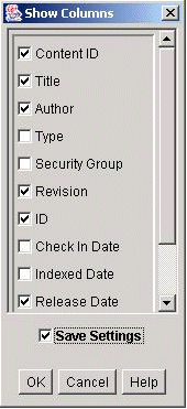
| Element | Description |
|---|---|
| Properties columns check boxes | Selected: Displays the column on the Batch Categorizer Screen.
Clear: Does not display the column on the Batch Categorizer Screen. |
| Save Settings check box | Selected: The column settings are applied every time the Batch Categorizer Screen is opened.
Clear: The column settings apply only until the Batch Categorizer Screen is closed. |
| OK button | Saves the filter settings and exits the Define Filter dialog. |
| Cancel button | Exits the Define Filter dialog without saving any changes or filter settings. |
| Help button | Opens the online Help system. |
A.7.12 Categorize Existing Screen
The Categorize Existing screen is accessed from the Batch Categorizer utility.
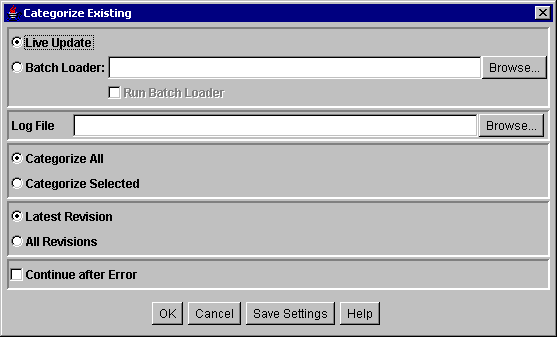
| Element | Description |
|---|---|
| Live Update option | When Live Update is selected, existing selected repository content is categorized and updated. |
| Batch Loader option | When Batch Loader is selected, existing selected repository content is categorized, and Update Records are written to the Batch Loader control file. |
| Batch Loader field | Defines the location and file name for the Batch Loader control file. A typical file name is batchinsert.txt. You can edit/filter this file before submitting it to Batch Loader, or submit it directly to Batch Loader by selecting the Run Batch Loader check box. |
| Run Batch Loader check box | Selected: Clicking OK runs Content Categorizer and then runs the Batch Loader utility.
Clear: Clicking OK runs only Content Categorizer. |
| Log File field | Defines the location and file name for the Content Categorizer log file. |
| Categorize options | Categorize All: all content items in the filtered list of content will be categorized.
Categorize Selected: only the selected content items in the filtered list of content will be categorized. |
| Revision options | Latest Revision: only the latest revision of content items that have been selected for categorization will be categorized.
All Revisions: all revisions of content items that have been selected for categorization will be categorized. |
| Continue after Error check box | Selected: Batch Categorizer continues processing when it encounters an error and logs the error.
Clear: Batch Categorizer stops processing when it encounters an error. |
| OK button | Runs the categorization process, and if selected, the Batch Loader utility. |
| Cancel button | Exits without running the categorization process. |
| Save Settings button | Saves the settings on the dialog screen. |
| Help button | Opens the online Help system. |
A.8 Web Layout Editor Interface
This section describes the screens used to create web pages with the Web Layout Editor.
Note:
If you are using Firefox set to open new tabs instead of windows, help screens launched from an Admin Applet are not accessible until the applet window that launched the help is closed. Therefore, it is preferable to set Firefox to open in new windows instead of tabs.This section covers the following topics:
The following screens are used to create and edit queries via the Web Layout Editor.
A.8.1 Web Layout Editor Page
To access the Web Layout Editor page, click Administration in the content server navigation pane, next click Admin Applets, then click the Web Layout Editor icon on the Administration Applets page for your instance. The Web Layout Editor page contains three panes: the Web Page Hierarchy pane, the Page Properties pane, and the lower page (usually the Page Links pane).
Note:
If you are using Firefox set to open new tabs instead of windows, help screens launched from an Admin Applet are not accessible until the applet window that launched the help is closed. Therefore, it is preferable to set Firefox to open in new windows instead of tabs.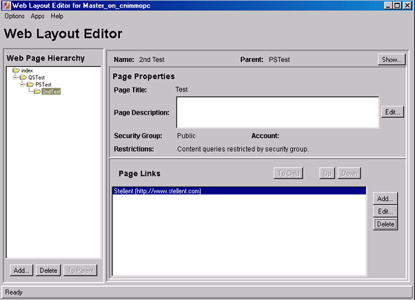
| Element | Description |
|---|---|
| Web Page Hierarchy Pane | Displays the web site structure and relationship between pages. Child pages are shown in the parent's folder. A page must be selected in this pane to edit it. |
| Page Properties Pane | Defines the page header text and the security group that filters the content for the page. |
| Lower pane | The page selected in the Web Page Hierarchy pane determines what is displayed in the lower pane:
|
A.8.1.1 Web Page Hierarchy Pane
The Web Page Hierarchy pane displays the organization of the local web pages in the Library. Child pages are shown in the parent's folder. A page must be selected in this pane to edit it.
For subadministrators to see a page in this pane, they must be able to view its parent. For subadministrators to delete a page, the page must be a directory page and the subadministrator must have access to that page and all of its children.
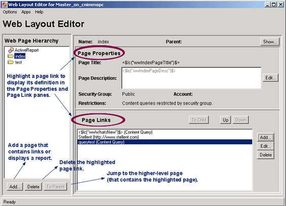
| Element | Description |
|---|---|
| Add button | Adds a page that contains links or displays a report. |
| Delete button | Deletes the highlighted page link. |
| To Parent button | Jumps to the higher-level page that contains the highlighted paged. |
A.8.1.2 Page Properties Pane
For subadministrators to edit a page, it must be a directory page, and the subadministrator must have admin access to that page and all of its children. This prevents a subadministrator from editing a public page that has links to secure pages.
The Page Properties pane controls page header text and the security group that filters its content.
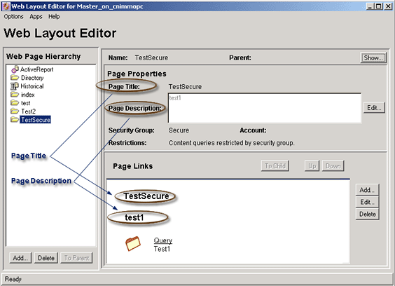
| Element | Description |
|---|---|
| Name field | The page name as it appears in the Web Page Hierarchy pane. |
| Parent field | The name of the parent page, if the page has a parent. |
| Show button | Displays the web page. |
| Page Title field | The title of the web page. |
| Page Description field | A description of the web page. |
| Security Group list | Names of the security groups that filter the files that appear on the web page. Only files within the security group for which end user has permission will be displayed. |
| Account field | Assigns the account to the page. Only users with Read permission to the account can access this page. |
| Restrictions | Shows any restrictions, such as whether content queries are restricted by security group or account. |
A.8.1.3 Page Links Pane
The Page Links pane displays the contents of the local page that is selected in the Web Page Hierarchy Pane. This pane enables you to edit a link in the page and change its position as it is displayed on the web page.
For subadministrators to see the contents of a page, they must have Read access to that page and all of its parents. This prevents the subadministrators from seeing a page that they cannot get to through the Library link.
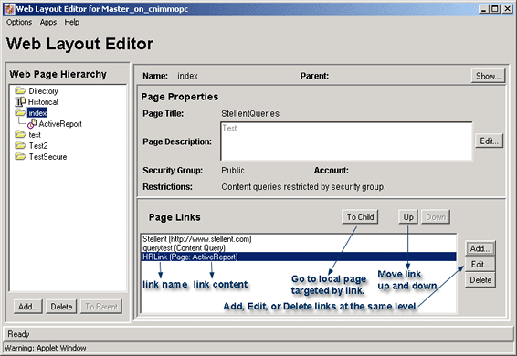
| Element | Description |
|---|---|
| To Child button | Goes to the local page targeted by the link selected in the Page Links pane. |
| Up button | Moves the selected link up in the list of links. |
| Down button | Moves the selected link down in the list of links. |
| Lower pane | The page selected in the Web Page Hierarchy pane determines what is displayed in the lower pane:
|
| Add button | Displays the Add Page Link Screen to add a link at the same level. |
| Edit button | Displays the relevant screen for editing a link at the same level. For example, when editing a query, a Query Link Definition page is displayed, or when editing a URL, an Edit URL page is displayed. |
| Delete button | Deletes the selected link at the same level. |
A.8.2 Add Page Link Screen
This screen is used to start the process of setting up a link to a new web page. To access it, click Add on the Page Links Pane.
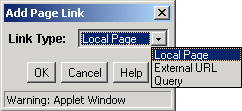
| Element | Description |
|---|---|
| Link Type menu | Specifies which type of page link to add to the web page:
|
A.8.3 Add Web Page Screen
This screen is used to add a new web page. To access this screen, go to the Web Page Hierarchy Pane, then click Add.
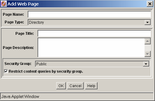
| Element | Description |
|---|---|
| Page Name field | This name appears in the Web Page Hierarchy pane. |
| Page Type list |
|
| Page Title field | To view where this field appears on a web page, see Page Properties Pane. |
| Page Description field | To view where this field appears on a web page, see Page Properties Pane. |
| Security Group list | Filters the files that appear on the web page. Only files within the security group for which end user has permission will be displayed. |
| Restrict content queries by security group check box | Enabling this box ensures that the security group applies to all queries that originate from this page. All queries will inherit the security group of this page. |
| Account field | Assigns the account to the page. Only users with Read permission to the account can access this page. |
| Restrict content queries by account check box | Enabling this box ensures that the account applies to all queries that originate from this page. |
A.8.4 Edit Local Page Link Screen
This screen is used to enter information about a local page. To access this screen, from the Page Links Pane in the Web Page Hierarchy Pane, click Add and then select Local Page.
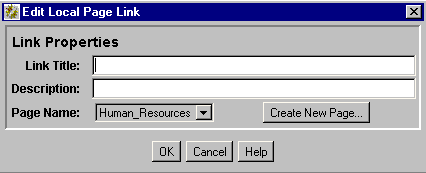
| Element | Description |
|---|---|
| Link Title field | This text is displayed as the link. |
| Description field | Optional field text or HTML. This text is displayed under the link to provide additional description about the link destination. |
| Page Name list | Select the page that the link will appear on. |
| Create New Page button | Creates a link to a new local page. This displays the Add Web Page screen and automatically initiates the same process as adding a new web page from the Web Page Hierarchy pane. |
A.8.5 Edit External URL Screen
This screen is used to specify information for an external URL. To access this screen, from the Page Links Pane in the Web Page Hierarchy Pane, click Add and then select External URL.
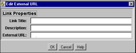
| Element | Description |
|---|---|
| Link Title field | This text is displayed as the link. |
| Description field | Optional field, text or HTML. This text is displayed under the link to provide additional description about the link destination. |
| External URL field | The address of the link's destination. It must start with http://. |
A.8.6 Edit Page Properties Screen
This screen is used to modify the page properties for a web page. To access this page, select a page in the Web Page Hierarchy Pane, then click the Edit button in the Page Properties Pane.
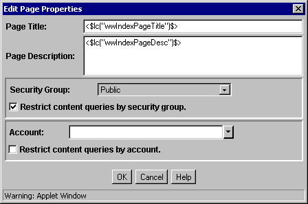
| Element | Description |
|---|---|
| Page Title field | Specifies the title of the web page. |
| Page Description field | Describes the web page. |
| Security Group list | Specifies the security group for the web page. |
| Restrict content queries by security group checkbox | If checked, specified that content queries are restricted to users assigned to the specified security group. |
| Account list | Assigns the account to the web page. Only users with Read permission to the account can access this page. |
| Restrict content queries by account checkbox | If checked, specifies that content queries are restricted to users assigned to the specified account. |
A.8.7 Edit Active Report Query Screen
The Edit Active Report Query screen is used to define the data source, template, and query definition for an active report. To access this screen, select an active report page in the Web Page Hierarchy pane, and click Edit Report Query in the Active Report Specification pane.
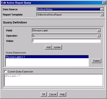
| Element | Description |
|---|---|
| Data Source list | Select the type of report to create:
|
| Report Template list | Provides a list of selectable templates that control how the query links are displayed. |
| Query Definition pane | Description |
|---|---|
| Field list | The field that the query will search. Available fields are dependent on the Data Source selected. |
| Operator list | Provides a list of query operators. The operators available are the result of the field selected. |
| Value field | The target data for the query, dependent on the Field selected. |
| Add button | Enters the query specified by Field, Operator, and Value fields into the Query Expression box. One or more query lines can be appended. |
| Update button | Updates the selected query line with parameters specified in the Field, Operator, and Field Value fields. |
| Query Expression box | Displays each query as a single line when added by the Add button. |
| Delete button | Deletes a selected query line. |
| Custom Query Expression Pane | Description |
|---|---|
| Custom Query Expression check box | Enables display and edit of SQL code generated from the query expression.
Caution: If you clear the Custom Query Expression check box, the expression reverts to its original definition; all modifications will be lost. |
| Custom Query Expression box | Used to edit the query expression. |
A.8.8 Create Historical Report Screen
This screen is used to specify the information to be included in an historical report. To access this screen, from the Web Layout Editor add a new web page and specify that it be a historical report. When Historical Report Specification is shown in the lower pane of the Web Layout Editor, click the Create Report Data button and the Create Historical Report screen is displayed.
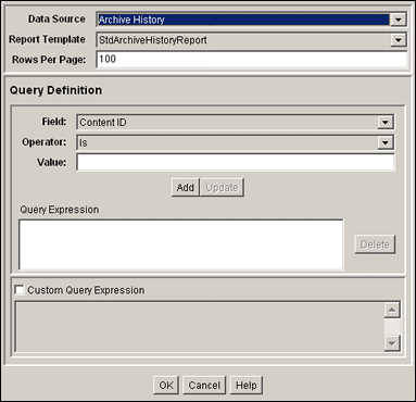
| Element | Description |
|---|---|
| Data Source list | Select Archive History from the list of data sources. |
| Report Template list | When Archive History is selected for the data source, this field is automatically populated with the tdArchiveHistoryReport selection. |
| Rows Per Page field | Specifies the rows per page in the report. A default number is provided. |
| Element | Description |
|---|---|
| Field list | Select a metadata field that the query will search. |
| Operator list | The operator specifies the method for searching the metadata fields. The selected field determines the set of available values. Lists the following operators:
|
| Value list | The target data for the query. |
| Add button | Enters the query specified by Field, Operator, and Value fields into the Query Expression box. One or more query lines can be appended. |
| Update button | Updates the selected query line with parameters specified in the Field, Operator, and Value fields. |
| Query Expression box | Displays each query as a single line. |
| Delete button | Deletes the selected query line. |
| Custom Query Expression check box | Enables display and edit of Idoc Script generated from the query expression.
Caution: If you clear the Custom Query Expression check box, the expression reverts to its original definition; all modifications will be lost. |
| Custom Query Expression box | Used to edit the query expression. |
A.8.9 Query Link Definition Screen
This screen is used to specify the information to be used in a query. To access this screen for a new query link definition, from the Web Layout Editor add a new web page, then click the Add button in the lower pane. To access this screen to edit an existing query link definition, from the Web Layout Editor select an existing web page, then select a page link in the lower pane and click Edit.
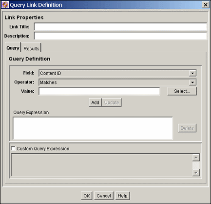
| Element | Description |
|---|---|
| Link Title field | This text is displayed as the link. |
| Description field | This text is displayed under the link to provide a description about the link destination (optional field). |
| Query Tab | Description |
|---|---|
| Field list | Select a metadata field that the query will search. |
| Operator list | The operator specifies the method for searching the metadata fields. The selected field determines the set of available values. |
| Value list | The target data for the query. |
| Select button | Displays the Content Item View screen or User View screen, which you use to select content items or users. |
| Add button | Enters the query specified by Field, Operator, and Value fields into the Query Expression box. One or more query lines can be appended. |
| Update button | Updates the selected query line with parameters specified in the Field, Operator, and Value fields. |
| Query Expression box | Displays each query as a single line. |
| Delete button | Deletes the selected query line. |
| Custom Query Expression check box | Enables display and edit of Idoc Script generated from the query expression.
Caution: If you clear the Custom Query Expression check box, the expression reverts to its original definition; all modifications will be lost. |
| Custom Query Expression box | Used to edit the query expression. |
Note:
The following fields can be edited directly to add Idoc Script variables and HTML tags.| Results Tab | Description |
|---|---|
| Page Title field | Heading of the query results page. |
| Sort Results By list | Specifies the metadata field by which the list of results is sorted. |
| Sort Order list | Defines how the results are ordered (ascending or descending). |
| Results Template Page list | Provides a list of selectable templates that control how the query links are displayed. The list contains a Standard Results page and any templates created with the Query Results Pages screen. |
| Use Customized Text check box | Displays custom text for each row on the query results page. |
| Text 1 field | The text that is displayed as the first line in each row on the query results page.* |
| Text 2 field | The text that is displayed as the second line in each row on the query results page.* |
| Arrow buttons | Moves the selected field from the Field list to the Text 1 or Text 2 field. |
| Field list | Lists the metadata fields that are available for display on the query results page. |
A.8.10 Add/Edit Query Results Page
The Add Query Results page and the Edit Query Results page are used to add or edit specifications for query results. To access the Query Result Pages screen, from the Web Layout Editor page, from the Options list in the top menu bar, select Query Result Pages.
To add a query result page, click Add on the Query Result Pages screen. To edit a query result page, select the name of the page from the Query Result Pages screen, then click Edit.
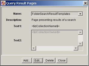
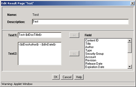
Note:
These fields can be edited directly to add Idoc Script variables and HTML tags.| Element | Description |
|---|---|
| Name field | The name for the Query Results Page. This name can be selected from the Results Template Page Properties. |
| Description field | Helps identify the results page. This text is not displayed on a web page. |
| Text 1 field | The text that is displayed as the first line in each row on the query results page.* |
| Text 2 field | The text that is displayed as the second line in each row on the query results page.* |
| Arrow buttons | Moves the selected field from the Field list to the Text 1 or Text 2 field. |
| Field list | Lists the metadata fields that are available for display on the query results page. |
When adding Idoc Script variables and HTML tags to the Text 1 and Text 2 fields, keep in mind that any resulting HTML tags can affect the display of the search results page. See the Oracle Fusion Middleware Idoc Script Reference Guide for more information.
