| Skip Navigation Links | |
| Exit Print View | |

|
Oracle Solaris Studio 12.2: Performance Analyzer MPI Tutorial |
1. Performance Analyzer MPI Tutorial
About MPI and Performance Analyzer
Collecting Data on the ring_c Example
Viewing Function Details and Application Source Code
With MPI_Init and MPI_Finalize already filtered out, explore the MPI Chart features. The initial chart shows which functions took the most time.
Click the MPI Chart tab to see a chart similar to the following.
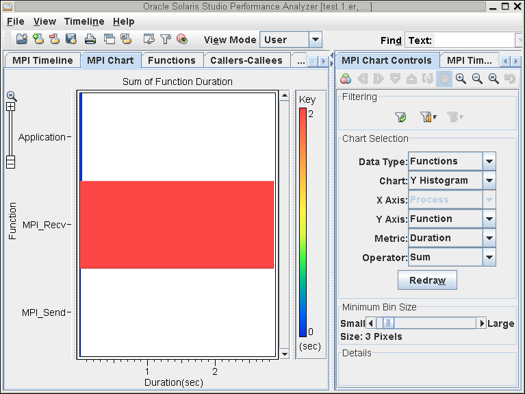
The MPI Chart tab opens with a chart that shows the sum of the durations of the functions as they ran in all the processes. The vertical rainbow scale to the right of the chart shows the mapping between colors and values. The MPI_Send and Application functions take almost no time, whereas in the example, the cumulative time in MPI_Recv was nearly three seconds.
Click on the bar for the MPI_Recv function.
The exact value of the bar is displayed in the MPI Chart Controls tab.
In this particular application, every process waits until the token has passed to every other process. As a result, significant time is spent in MPI_Recv, and little time is spent in Application, a state that represents time between MPI functions. As you will see later, a delay in message delivery to one rank prevents all other ranks from making progress.
This section shows how to use the MPI Chart Controls tab in different ways to visualize the data. Depending on the program under analysis, some chart options are more useful than others. See Appendix A, MPI Chart Control Settings for descriptions of all the MPI Chart controls.
Create a chart to look at messages by making the following selections in the MPI Chart Controls tab:
Messages
2–D Chart
Send Process
Receive Process
Duration
Maximum
Click Redraw, and you should see a chart similar to the following:
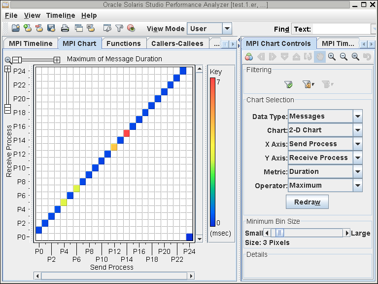
This chart shows that Process 0 sends only to Process 1. Process 1 only sends to Process 2, and so on. The color of each box is set by the metric selected (Duration) and the operator (Maximum). Since this graph's Data Type is Messages, this will be the sum of duration of the messages, or the length of message lines in the time dimension.
The chart colors indicate maximum message durations between ranks. In this example, the message that took the longest to arrive was sent from P14 to P15.
Make the following selections in the MPI Chart Controls tab:
Messages
Y Histogram
N/A
Receive Process
Duration
Maximum
Click Redraw to draw a new chart
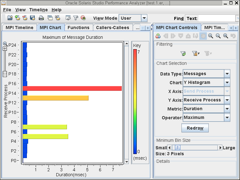
In this example, the chart shows that the P15 rank waited the longest to receive a message.
To show a histogram for when these long duration messages occurred, make the following selections for the controls:
Messages
X Histogram
Receive Time
N/A
Duration
Maximum
Click Redraw to see a chart similar to the following:
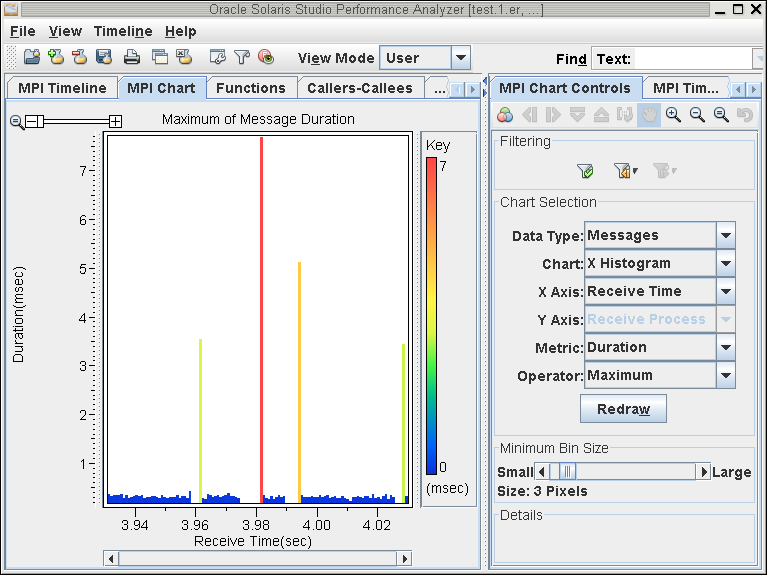
In this example, the slowest message was received at 3.981 seconds.
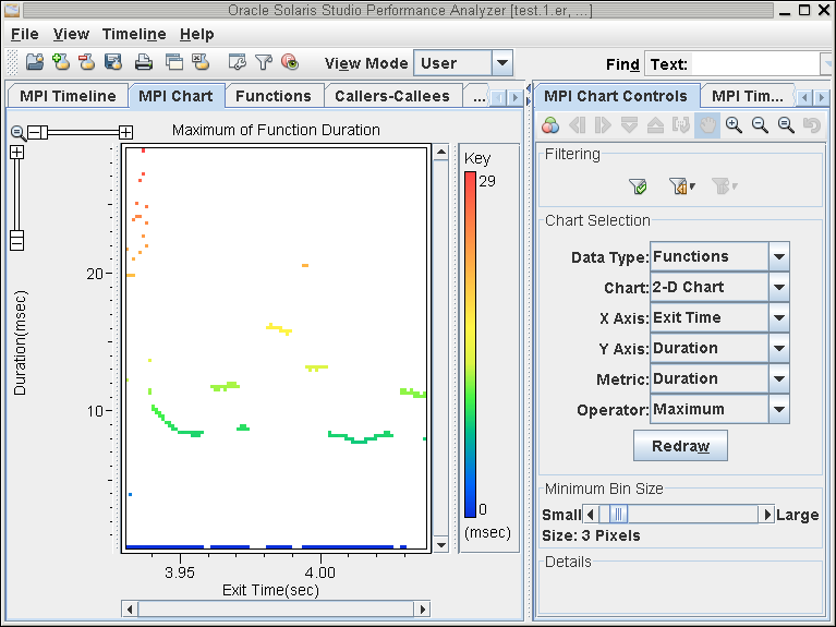
To see the effect of the long duration messages, create a graph that shows duration of functions versus time.
Create a chart to look at messages by making the following selections in the MPI Chart Controls tab:
Functions
2–D Chart
Exit Time
Duration
Duration
Maximum
Click Redraw.
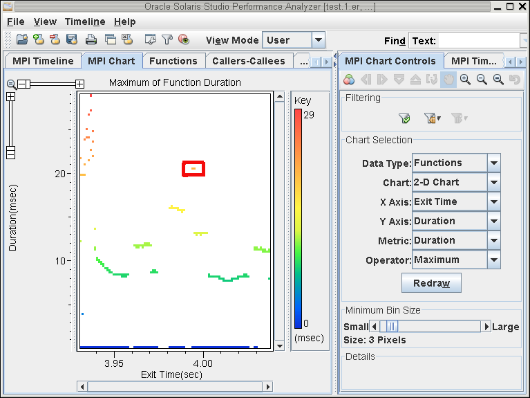
In this example, the graph shows several time regions that have long-duration functions. Note that at t=3.99, there are function durations longer than 20 seconds. This time corresponds to the long message flight-times viewed in the previous chart.
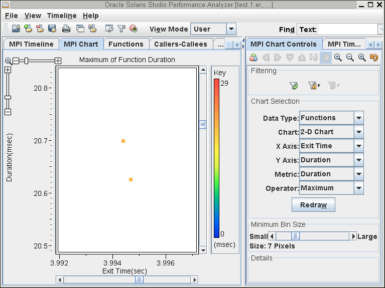
Isolate these long duration functions by dragging a box around them to zoom:
Click the Filter button to examine the only these function calls.
Click the MPI Timeline tab.
You can now identify the high duration functions on the MPI Timeline. They are the result of messages with slow delivery times.
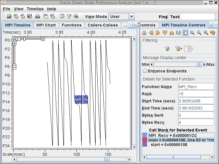
Click the Filter Undo and Redo buttons to toggle the context around the long duration functions.
For more information about the MPI Chart Controls, see Appendix A, MPI Chart Control Settings