Working with the Worksheet Graph
This chapter covers the following topics:
Graph Styles and Variations
This section provides a quick overview of the available graph types. Within a given worksheet, a graph does not necessarily display all the series. The series definition and the worksheet definition both control this.
Data Plots
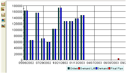
The line graph, bar chart, data points only, and stacked bar chart format all behave in an obvious manner. The vertical axis is the y-axis, and this usually corresponds to the series in the worksheet, depending on the worksheet layout you have chosen; multiple series can be displayed in different colors (chosen automatically). The horizontal axis (the x-axis) usually corresponds to time. A typical graph looks like this:
Pie Charts
The pie chart format is a little different. It uses the following rules:
-
Oracle Demantra includes one pie chart for each graphed category that is on the y-axis.
-
Within that pie chart, it shows the percentage breakdown according to each category or unit on the x-axis.
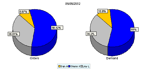
For example, the previous data would appear as follows:
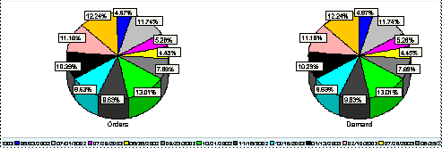
Because the Orders and Demand series are on the y-axis in this worksheet, each of these series is displayed in a separate pie chart. The breakdowns in each pie chart correspond to the time buckets in the worksheet.
More typically, you would prefer to break down the data according to a more interesting category such as some aggregation level. To make the pie charts more useful, you redefine the worksheet layout to put at least one of the aggregation levels on the x-axis, as follows:
See also:
-
Defining the View Layout
-
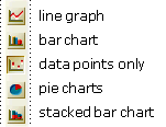
Changing the Graph Style
Changing the Graph Style
To change the style of the graph
Click any of the graph style buttons to the left of the graph:
To display only one pie chart
Click View > Show Multiple Pie Charts. This option is a toggle. If you click it again, you redisplay the other pie charts.
See also Graph Styles and Variations.