
 Read more...
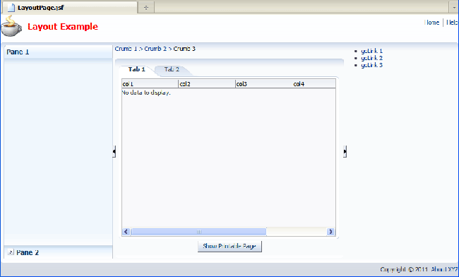
You will nest various layout components in the top and bottom facets to create a page header and footer. Then you will
use insert Panel Splitter components to create a three-column layout in the center facet. Next you will use Panel Accordion,
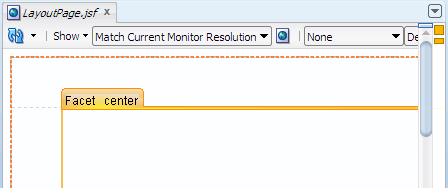
Panel List, Panel Tabbed, Panel Collection and Table components to organize the page contents. The final page layout will look similar to this:
| Purpose | Duration | Application |
|---|---|---|
This tutorial shows you how to use various Oracle ADF Faces layout components to achieve desired page layouts. To see the complete application you will create, click the Download button to download a zip of the final application, and then unzip it in your JDeveloper mywork folder. |
50 minutes |  |
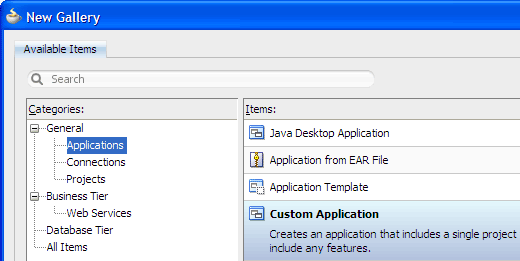
From the main menu, choose File > New. In the New Gallery, expand the General category and select Applications. Then in the Items list, select Custom Application and click OK.
To follow along with the example, enter
LayoutAppas the application name and click Finish.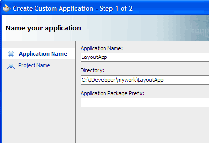
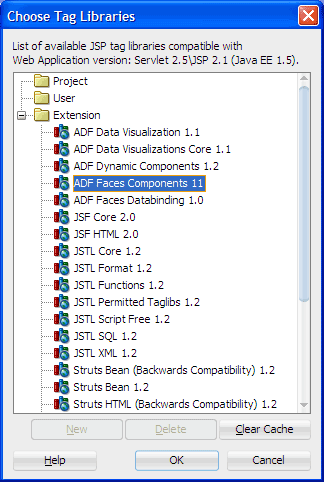
In the Application Navigator, double-click the project you just created to open the Project Properties dialog. Select JSP Tag Libraries and Distributed libraries, then click Add.
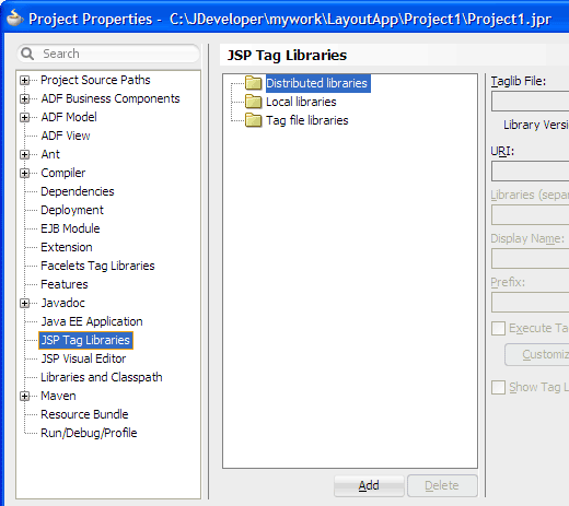
In the Choose Tag Libraries dialog, select ADF Faces Components 11 and click OK twice to close both dialogs.
Click
 Save All to save your work.
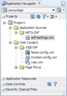
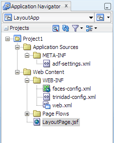
The Projects panel in the Application Navigator should look like this:
Read more...
At the same time, it keeps track of your projects and all
environment settings.Based on prebuilt templates, a JDeveloper application allows you to specify a predefined type of environment, depending on the type of application you want to create (web application, Java application, and so on). Application templates provide you with a quick way to create the project structure for standard applications with the appropriate combination of features already specified. The application template also filters the work you do in JDeveloper such that the choices available are focused only on the features you are working with.
In this tutorial, you will use the Custom Application template, which makes available objects associated with all the features that JDeveloper supports in a single project.
Once you have created an application using a suitable template, you can still add new projects to the application and specify what features are to be included. To do this, in the Application Navigator, right-click the application name and choose New Project. In the New Gallery, you can select any type of project in the Items list.
Read more...
The project or projects in the application define the associated features.
A JDeveloper project, which is used to logically group files that are related, keeps track of the source files, packages, classes, images, and other elements that your program may need. Projects manage environment variables such as the source and output paths used for compiling and running your program. Projects also maintain compiler, runtime, and debugging options so that you can customize the behavior of those tools per project.
You can add multiple projects to your application to easily access, modify, and reuse your source code. Different projects might contain files representing different tiers of a multi-tier application, for instance, or different subsystems of a complex application. These files can reside in any directory and still be contained within a single project.
Read more...
ADF Faces provides the ADF Faces Components JSP tag library. When you add the ADF Faces Components tag library, JDeveloper adds the name and location of the tag library descriptor (TLD) file, the unique identifier of the tag library, the Java library names required to execute tags from the tag library at runtime, and the preferred value for the prefix of tags when the library is used in a JSF page.
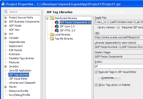
By default, JDeveloper will display the ADF Faces tags on the ADF Faces page of the Component Palette, and execute all tags in the tag library in a simulated JSP/Servlet container available in the JSP visual editor. To customize the tags that should be executed during design time, select the tag library in the JSP Tag Libraries page of the Project Properties dialog, and click Customize.
Read more...
Projects are displayed as the top level in the hierarchy in the
Application Navigator. The Custom Application template that you used for your application creates one project using a default project name
(or the project name you entered).
In the Application Navigator you can collapse and expand any panel. You adjust the size of panels by dragging the splitter between two panels. To group and sort items in the Projects panel, use the
 Navigator
Display Options dropdown menu. For application operations, you can
click
Navigator
Display Options dropdown menu. For application operations, you can
click  Application Menu and choose an
option from the dropdown menu.
Application Menu and choose an
option from the dropdown menu.
JDeveloper has the capability of recognizing many different file types, displaying each in its appropriate viewer or editor when you double-click the file in the Application Navigator. Closing an application or project closes all open editors or viewers for files in that application or project and unloads the files from memory.
Note: Nodes in italics in the Application Navigator mean that the elements have not yet been saved. A project node is bold when a file in the project is selected.
From the main menu, choose Application > Show Overview. The Application Overview window opens in the editor window area.
All objects that you create within JDeveloper appear in the Application Overview file summary pages, arranged by object type. As you create new files and artifacts, you can view them filtered by status and project.
You can optionally close the Application Overview window, since you will not be using it to create objects for this application.
-
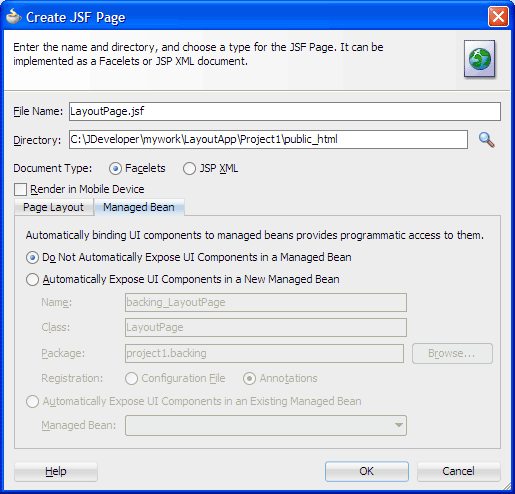
In the Application Navigator, right-click the project and choose New > Web Tier > JSF/Facelets > Page, then click OK.
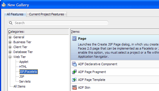
-
Enter
LayoutPage.jsfas the file name. Make sure Facelets is the selected document type.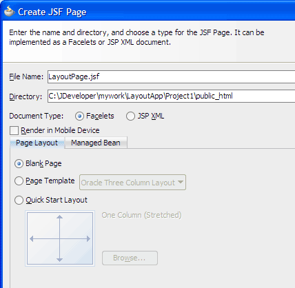
The New Gallery
The JSF navigation diagrammer
The ADF task flow diagrammer (available only in the Studio edition of JDeveloper)
On the Page Layout page, select Blank Page. On the Managed Bean page, select Do Not Automatically Expose UI Components in a Managed Bean.
Click OK.
By default JDeveloper displays the new JSF Facelets page in the visual editor.
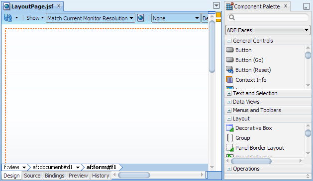
In the Component Palette, ADF Faces page, Layout panel, drag
 Panel Stretch Layout
and drop it on the blank page in the visual editor.
Panel Stretch Layout
and drop it on the blank page in the visual editor.
When you drag the component to the visual editor, you should see a target rectangle with the name Form on the page; this means the component you are dragging will be inserted inside that target.
Decorative Box
Panel Accordion
Panel Box when
type="stretch"ortype="default"Panel Collection
Panel Dashboard
Panel Group Layout when
layout="scroll"orlayout="vertical"Panel Splitter
Panel Stretch Layout
Panel Tabbed
Panel Border Layout
Panel Box when
type="flow"Panel Form Layout
Panel Group Layout when
layout="default"orlayout="horizontal"Panel Header
Panel Label and Message
Panel List
-
In the Component Palette, Layout panel, drag and drop
 Decorative Box into the center facet of the root panel stretch layout.
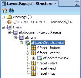
In the Structure window, select af:panelStretchLayout (that is just below af:form).
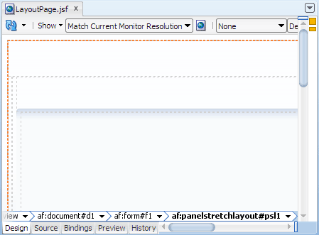
In the Property Inspector for panel stretch layout, Common section, change the following attributes to these values:
Attribute Value StartWidth 5pxEndWidth 5pxBottomHeight 25pxClick
Save All to
save your work.
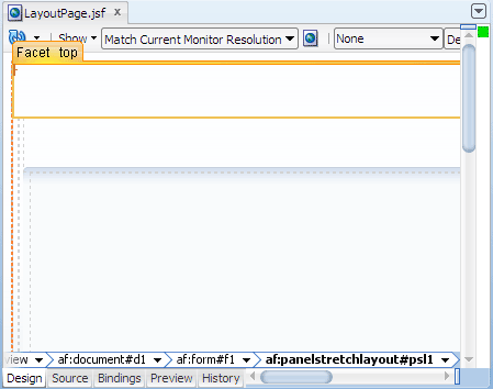
The visual editor should look something like this:
To maximize the visual editor, double-click the LayoutPage.jsf document tab at the top of the editor window. Double-clicking the tab again brings it back to its original size.Web Content folder: Contains the pages you create, along with other files that must be visible to the client browser (such as stylesheet files and images) for your application.
/WEB-INF/ folder: Contains the required Web Application Deployment Descriptor (
web.xml) and the JSF configuration file (faces-config.xml).web.xml file: The web application deployment descriptor for your application. This is an XML file describing the components that make up your application, along with any initialization parameters and container-managed security constraints that you want the server to enforce for you.
faces-config.xml file: Where you register the JSF application's configuration resources, such as validators, converters, managed beans, and navigation rules.
trinidad-config.xml file: Where you configure ADF Faces features such as skin family and level of page accessibility support.
jsf) or JSP documents written in XML syntax (which have file extension .jspx).
Read more...
You can create both types of JSF pages with the Create JSF Page dialog, opening it from:
Read more...
By default components are not exposed to managed beans. If you wish to bind components to managed beans, select one of the automatic binding options on the Managed Bean page in the dialog.
The option to bind to an existing managed bean is enabled only if the application has a managed bean already configured.
If you choose to automatically expose UI components in a managed bean, JDeveloper automatically creates a backing bean for any new JSF page that you create. When you drop a component on the page, JDeveloper inserts a bean property for each component, and uses the
binding attribute to bind component instances to those properties, allowing the
bean to accept
and return component instances.
Note: If you intend to add ADF bindings to a page, do not use the automatic binding feature. If you use the automatic binding feature, you will have to remove the managed bean bindings later, after you have added the ADF bindings.
.jsf), JDeveloper automatically
creates a starter page structure
Read more...
with one xmlns attribute for the JSF Core tag library and one
xmlns attribute for the ADF Faces tag library.
The other elements included in a starter file are elements for laying out a page,
specifically everything else within <f:view> and </f:view>.
To view the page code, click the Source tab to switch from the visual editor to the XML editor. For example, the following code is generated for the new page:
<!DOCTYPE html PUBLIC "-//W3C//DTD XHTML 1.0 Transitional//EN"
 "http://www.w3.org/TR/xhtml1/DTD/xhtml1-transitional.dtd">
<f:view xmlns:f="http://java.sun.com/jsf/core"
        xmlns:af="http://xmlns.oracle.com/adf/faces/rich">
  <af:document title="LayoutPage.jsf" id="d1">
    <af:form id="f1"></af:form>
  </af:document>
</f:view>af:document
and af:form tags:
Read more...
<f:view>
  <af:document>
    <af:form></af:form>
  </af:document>
</f:view>af:document tag is required for all pages that use ADF Faces components. All components that make up the page
contents should then be inserted within af:form. In most cases you would want stretched contents in a page,
so you would start with one root component that can both be stretched by af:document and can stretch it child
components. The root component contains all other child components that make up the layout and contents of the page.
By default in JDeveloper, the
maximized attribute on af:document is set to true for
a root component to stretch and use the entire visible portion of the browser (provided the root component used can be stretched).
Examples of layout components you can use as a root component for stretched page contents include Panel Stretch Layout and Panel Splitter.
At runtime, because there is a single root component that can both be stretched and stretch its children, the
page contents will stretch to fit the browser window. When users resize the window, the page contents are resized to fit within
the available browser space.
Most other layout components, such as Panel Group Layout, Panel Form Layout and Panel Border Layout, cannot stretch their child components. A few other layout components, such as Panel Accordion and Panel Tabbed, can stretch their children only if certain conditions are met.
While Panel Stretch Layout and Panel Splitter can stretch their child components (such as tables, other layout components, and regions), not all layout components can be stretched. The following layout components can be stretched by a parent stretching component:
inlineStyle attribute of components to get stretching;
doing so will cause inconsistent page display across different web browsers.
The following layout components cannot be stretched by a parent stretching component:
layout="scroll" or layout="vertical").
In summary, to achieve a desired layout that displays page contents consistently across browsers, Oracle recommends that you start with a root component and build a stretchable structure using a combination of components that support being stretched and that stretch their child components. Within this stretchable structure, build your page contents by inserting components that can be stretched (for example, a table or a layout component that can be stretched), or inserting Panel Group Layout with
layout="scroll" or layout="vertical" to create areas of flowing components that are not
stretched. At runtime, the single maximized root component inside af:document will stretch or resize along
with the browser window. The contents inside the root component will stretch or resize accordingly down the hierarchy of
components in the stretchable structure until transition components are reached. At that point, normal browser flow and
layout takes over, and contents inside the transition components will flow instead of being automatically stretched by the
parent stretching components. This process of creating a layout ensures that you always achieve stretched contents and
flowing contents where needed.
Note: Oracle does not recommend using nested layers of Panel Group Layout with
layout="scroll", as this causes the user to see and use multiple scroll bars.
Read more...
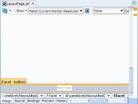
Panel Stretch Layout supports five facets that specify the panes where children contents can be inserted: top, bottom, start, end, and center:
<af:panelStretchLayout ..>
  <f:facet name="bottom"/>
  <f:facet name="center"/>
  <f:facet name="start"/>
  <f:facet name="end"/>
  <f:facet name="top"/>
</af:panelStretchLayout>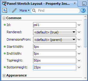
Panel Stretch Layout is a stretching layout component, that is, it forces specific dimensions onto its children components so that the children in the
center facet are stretched to fill up available space in the browser when end
users resize the browser.
The available space in the
center facet may be constrained by the presence of children in the top, bottom, start,
and end facets. The height of the top facet is determined by the TopHeight attribute of Panel
Stretch Layout; the height of the bottom facet is determined by the BottomHeight attribute.
Similarly, the width of the start and end facet is determined by the StartWidth
and EndWidth attribute, respectively.
By default, JDeveloper uses 50 pixels each for the TopHeight, BottomHeight, StartWidth, and EndWidth attributes. When children are present in the
top, bottom, start, and end facets, they occupy space defined by those attributes. Children components in the top and bottom facets are stretched up to the height set by TopHeight and BottomHeight, respectively, and children in the start and end facets are stretched up to the width set by StartWidth and EndWidth, respectively. Children components in the center facet are then stretched according to available space.
Read more...
In the project, the folders and files that conform to the Java EE Web module directory structure are:
You will work within the top facet of the root Panel Stretch Layout to create page header contents.
First you will insert another Panel Stretch Layout, then work within the start and end facets of the
nested Panel Stretch Layout.
-
In the Component Palette, Layout panel, drag and drop
Panel Stretch Layout into the top facet of the root panel stretch layout (psl1).
In the Property Inspector, Common section, change the facet widths and heights of the panel stretch layout you just added, using these values:
Attribute Value StartWidth 200pxEndWidth 200pxTopHeight 5pxBottomHeight 5px-
In the Component Palette, Layout panel, drag and drop
 Panel Group Layout
into the start facet of the panel stretch layout you just modified.
In the Property Inspector, Common section, change the Layout value to scroll.
Panel Group Layout
into the start facet of the panel stretch layout you just modified.
In the Property Inspector, Common section, change the Layout value to scroll. In the Component Palette, drag another
Panel Group Layout
and drop it into the panel group layout component you just added. In the Property Inspector, change the Layout value to horizontal.
The second panel group layout simply arranges any children components in a horizontal fashion.
In the Component Palette, General Controls panel, drag and drop
 Image
into the panel group layout you just added.
Image
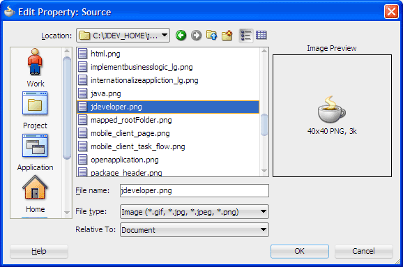
into the panel group layout you just added.In the Insert Image dialog, from the
 dropdown menu next
to the Source field, choose Edit.
Then use the dialog to locate and select an image file.
dropdown menu next
to the Source field, choose Edit.
Then use the dialog to locate and select an image file.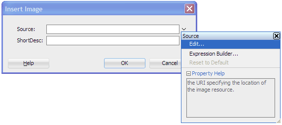
-
Click OK. When prompted, click Yes to add the image under the resources directory, then click Save.
You should see#{resource['images:jdeveloper.png']}in the Source field.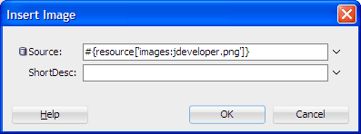
Click OK to close the Insert Image dialog.
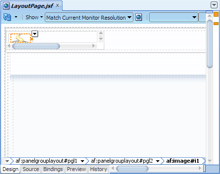
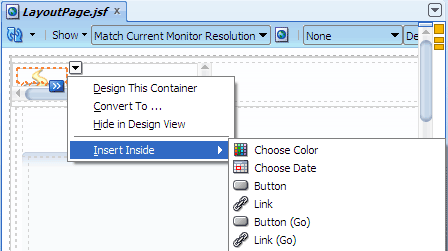
In the breadcrumb links at the bottom of the visual editor, click the component name af:panelgrouplayout that is just before af:image.
-
In the visual editor, place your cursor over
 at
the top right corner of the selected panel group layout.
at
the top right corner of the selected panel group layout.
You should see the tooltip text Panel Group Layout Actions on the page.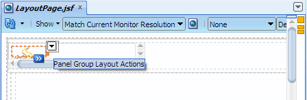
Click
and
choose Insert Inside > Spacer from the dropdown menu.
-
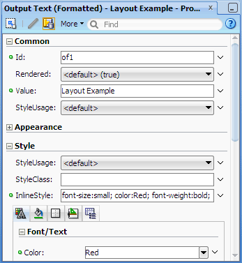
In the visual editor breadcrumb links, click af:panelgrouplayout that is before af:spacer. On the page, click
and
choose Insert Inside > Output Text (Formatted). In the Property Inspector, Common section, change the Value attribute to
Layout Example. Then expand the Style section and in the InlineStyle field, enterfont-size:small; color:Red; font-weight:bold;and press Enter.
You have finished adding contents into thestartfacet.In the Component Palette, Layout panel, drag and drop
Panel Group Layout
into the end facet of the nested panel stretch layout (psl2).
In the Property Inspector, Common section, change the Halign value
to end, and the Layout value
to scroll. -
In the Component Palette, Layout panel, Interactive Containers and Headers section, drag and drop
 Navigation Pane
into the panel group layout you just modified. In the Property Inspector, Common section,
change the Hint value to buttons.
In the Style section, enter
Navigation Pane
into the panel group layout you just modified. In the Property Inspector, Common section,
change the Hint value to buttons.
In the Style section, enter padding-top:5pxin the InlineStyle field and press Enter. -
In the Structure window, right-click af:navigationPane and choose Insert Inside af:navigationPane > Navigation Item from the context menu.
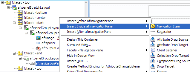
-
In the Property Inspector, Common section, change the Text value to
Homeand press Enter. Repeat the procedure (steps 16 and 17) to add one more navigation item component, using the Text value
Help.Click
Save All to save your work.
The top part of the page in the visual editor should look similar to this: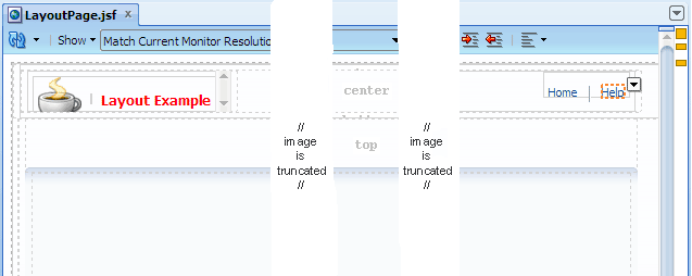
Read more...
wrap the component in a transition component that can be stretched but does not stretch its children,
for example, a Panel Group Layout with layout="scroll".
Panel Group Layout does not stretch its children, but the component itself can be stretched by its parent stretching component such as Panel Stretch Layout. The Panel Group Layout component can be stretched only when its Layout attribute is
scroll or vertical. When
the Layout attribute of Panel Group Layout is horizontal or default,
the Panel Group Layout cannot be stretched.
Once you introduce any non-stretching layout component into a layer of stretching components, normal browser flow and layout takes over and the parent stretching component will no longer automatically stretch contents from that point. In other words, Panel Group Layout with
layout="scroll" will create an area of flowing layout where any
content inside the non-stretching component will be scrolled instead of stretched by the parent stretching component (Panel Stretch Layout).
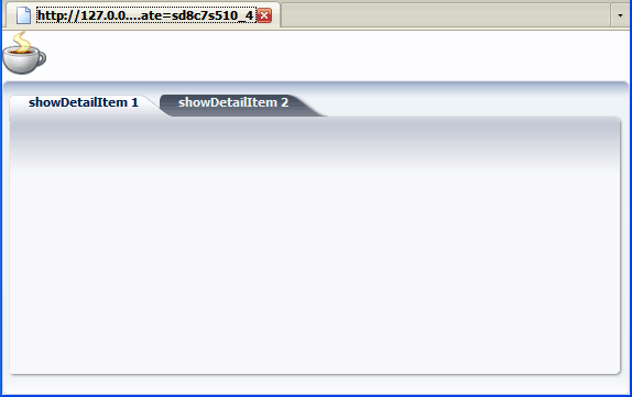
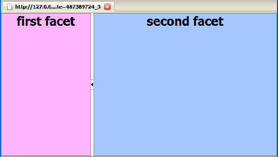
For example, if you have a Panel Tabbed component (which can be stretched) inside a stretching layout parent, the page would look like this in the browser, where the tabbed panes are stretched in width and height:
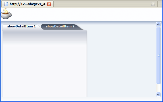
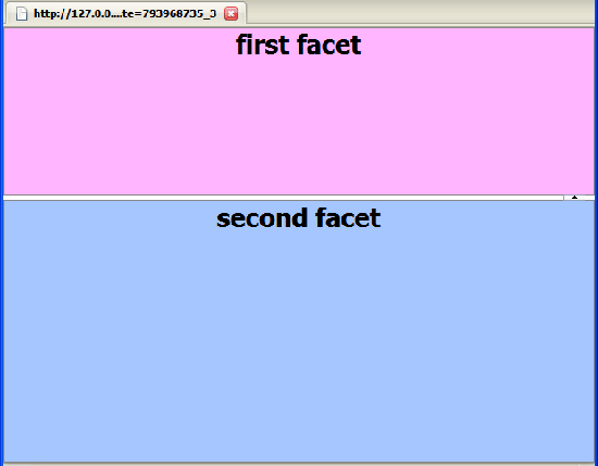
If the same Panel Tabbed component is first wrapped in Panel Group Layout with
layout="scroll" and
then inserted into a stretching layout parent, the tabbed panels will not appear stretched in the browser; instead scroll bars
will appear when needed:
<jdev_home>/jdeveloper/ide/lib/ folder
and double-click oicons.jar to open it.
Read more...
Then navigate to oracle/javatools/icons/header and select the image file jdeveloper.png.
 Read more...
The last name in the path (shown in bold font) is the currently selected component; the names preceding the last name are the
parent components. If a component has its Id attribute set, the Id attribute value is appended to the component name
(for example,
Read more...
The last name in the path (shown in bold font) is the currently selected component; the names preceding the last name are the
parent components. If a component has its Id attribute set, the Id attribute value is appended to the component name
(for example, af:panelgrouplayout#pgl2, where pgl2 is the Id attribute value).
When you click a component name in the editor breadcrumb links, JDeveloper shows the selected component on the page with a dotted outline box. At the top right corner of the box is the
Actions
context menu for the selected component.
If you click you will see a dropdown menu of action items for the selected component. One of the menu items is Insert Inside, which allows you to choose from a submenu of components that could be inserted into the selected component.
Read more...
A page hierarchy is a tree-like hierarchy of nodes that represent a series of related pages in an application.
End users gain access to information on the pages by drilling down a path of links.
The navigation items could be tabs, bars, or buttons, for example. The Navigation Pane component accepts a series of Command Navigation Item components as children, with each Command Navigation Item representing one item.
<af:navigationPane hint="buttons">
  <af:commandNavigationItem text="Link 1"../>
  <af:commandNavigationItem text="Link 2"../>
  <af:commandNavigationItem text="Link 3"../>
</af:navigationPane>Each type is used to represent one level of nodes or pages in a page hierarchy. Typically, when you use Navigation Pane for navigation within a page hierarchy, you would use tabs for first level nodes, and bar for second level nodes. For pages that can be accessed from any page in the hierarchy (for example, a Help page), you would use buttons to represent global links. In the example, you are merely using Navigation Pane to create a series of text links.
The Navigation Pane component can be declaratively bound to an XML menu model. Then instead of using individual Command Navigation Item components to represent the navigation links, you would use the
nodeStamp facet and only one Command
Navigation Item to stamp out the appropriate number of links for that level.
bottom facet of the root Panel Stretch Layout to add page footer contents.
In the Component Palette, Layout panel, drag and drop
Panel Group Layout
into the bottom facet of the root panel stretch layout component (psl1).
In the Property Inspector, Common section, change Halign to end, and Layout to scroll.
-
In the Component Palette, drag another
Panel Group Layout
and drop it into the panel group layout component you just added. In the Property Inspector,
change Layout to horizontal. Then expand
the Style section and in the InlineStyle field,
enter padding-top:5pxand press Enter.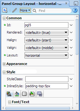
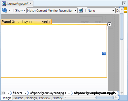
On the selected panel group layout component in the visual editor, click
and choose Design This Container from the dropdown menu. 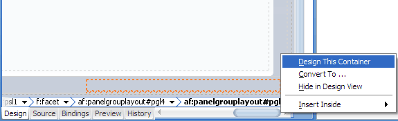
-
In the Component Palette, Text and Selection panel, drag and drop
 Output Text (Formatted)
into the horizontal panel group layout component in the design container.
Output Text (Formatted)
into the horizontal panel group layout component in the design container.
-
In the Property Inspector, Common section, replace the default value in the Value field with
Copyright © 2011. Then in the Style section, InlineStyle field, entermargin:0 6px 0 6px; display:blockand press Enter. -
In the Component Palette, General Controls panel, drag and drop
 Link (Go)
into af:panelGroupLayout - horizontal in the Structure window.
Link (Go)
into af:panelGroupLayout - horizontal in the Structure window. -
In the Property Inspector, Common section, change the Text value to
About XYZand press Enter.
The container visual editor should now look like this: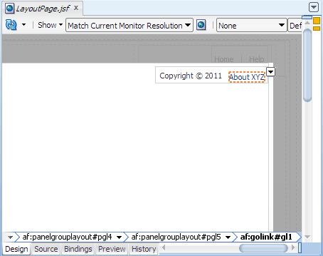
Click anywhere in the gray area outside the container to return to the entire page in the visual editor.
In the Application Navigator, right-click LayoutPage.jsf and choose Run.
If the Create Default Domain dialog displays, enter the default password, for exampleweblogic1, in the Password and Confirm Password fields, then click OK.
The page in the browser should look similar to this: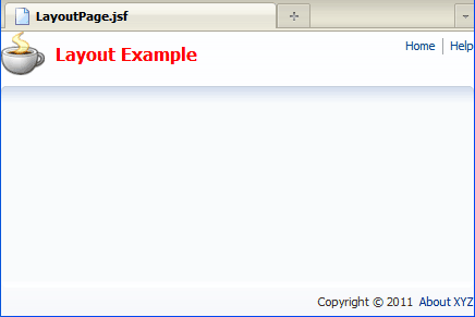
Starts Integrated WebLogic Server, if not already running.
Compiles and deploys the application to Integrated WebLogic Server.
Launches the application in your default browser using the following default address:
http://<your_machine_IP_address>:<http_port>/<your_application_name>-<your_project_name>-context-root>/faces/<path_to_the_page>
Read more...
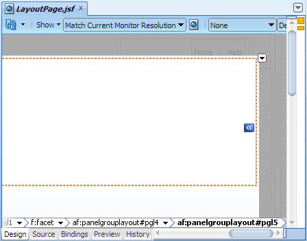
Alternatively you can click the  design container icon (if available) to open the selected component in a container.
When working in the container, JDeveloper displays only the selected component and its contents for editing. Everything else that is not part of the selected component will be grayed out on the page.
margin property can have four values, such as 5px 5px 2px 1px to specify the top, right, bottom and left margins, respectively.
Read more...
There are some components where setting even pixel-based width and height values have no effect. This is rare for layout components but typical for input and output components. For example, an input or output component uses a "span" element when an InlineStyle attribute is provided. Span elements do not respect dimensions ( even pixel dimensions). You can make a span honor pixel dimensions and percentage widths by adding
display: block; to the
InlineStyle attribute.
Read more...
Integrated WebLogic Server is a Java EE runtime service for packaged archive deployment. Based on zero-copy deployment, Integrated WebLogic Server lets you run and test an application and its projects as a Java EE application in a Java EE container. No special connection setup is required to use Integrated WebLogic Server. You can run the entire application, a project, or individual JSF pages.
When you run a JSF application in the IDE, JDeveloper automatically:
 Terminate in JDeveloper and choose the application bound instance LayoutApp
from the dropdown menu.
Terminate in JDeveloper and choose the application bound instance LayoutApp
from the dropdown menu.
Note: Terminating the application stops and undeploys the application from Integrated WebLogic Server but it does not terminate Integrated WebLogic Server.
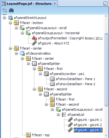
You will work within the center facet of Decorative Box (db1) to create three panes, then add contents into the left and right panes.
-
In the Component Palette, Layout panel, Interactive Containers and Headers section, drag and drop
 Panel Splitter
into the center facet of the decorative box in the middle of the page to create two panes.
Panel Splitter
into the center facet of the decorative box in the middle of the page to create two panes. 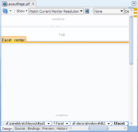
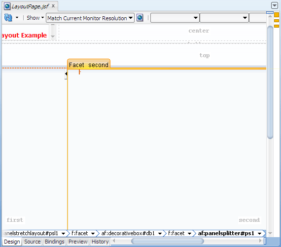
Drag another
Panel Splitter
and drop it into the second facet of the panel splitter you just added to split the right
pane into two.
-
In the Property Inspector of the second panel splitter you just added, Common section, change the value of PositionedFromEnd to true.
There are now three split panes in the visual editor: left, middle, and right, corresponding to the first facet of panel splitter ps1, first facet of panel splitter ps2, and second facet of panel splitter ps2, respectively.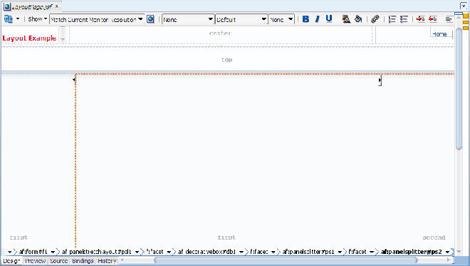
Orientation:
horizontal. This means the panes are arranged side by side (left to right or right to left, depending on the language reading direction). Change the value toverticalfor panes to be arranged one on top of the other (top to bottom).PositionedFromEnd:
false. This means the placement of the adjustable splitter will be measured from the first facet, which is the left or right pane in a horizontal arrangement (depending on the language reading direction), or the top pane in a vertical arrangement. Change the value totrueto measure the initial position of the splitter from the second facet (which is the right or left pane in a horizontal arrangement, or the bottom pane in a vertical arrangement).SplitterPosition:
200 pixels. This is the distance of the adjustable splitter measured from the first or second facet, depending on the PositionedFromEnd value.Collapsed:
false. This means a pane is expanded. When a pane is expanded, clicking the arrow on the adjustable splitter collapses the pane in the direction of the arrow on the adjustable splitter; clicking the arrow again expands the pane. Change the value totruefor a collapsed pane.-
To add contents into the left pane, from the Component Palette, Layout panel, Interactive Containers and Headers section, drag and drop
 Panel Accordion
into the first facet of the first panel splitter (ps1). In the Property Inspector, Common section,
change DiscloseMany to true.
Panel Accordion
into the first facet of the first panel splitter (ps1). In the Property Inspector, Common section,
change DiscloseMany to true. In the Structure window, expand af:panelAccordion. Click the child af:showDetailItem. In the Property Inspector, Common section, change the Text value to
Pane 1.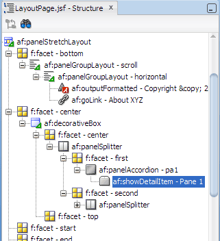
Expand the Appearance section. Change the Flex value to
1, then change the value of StretchChildren to first.There is only one child component inside of Show Detail Item
The StretchChildren attribute on Show Detail Item is set to
firstThe child component has no width, height, border, margin, or padding property set
The child component can be stretched
In the Structure window, right-click af:panelAccordion and choose Insert Inside af:panelAccordion > Show Detail Item to add a second pane. In the Property Inspector, Common section, change the Text value to
Pane 2. In the Appearance section, change Flex to2. Then change StretchChildren to first.Click
Save All
to save your work.
The left pane in the visual editor should look something like this: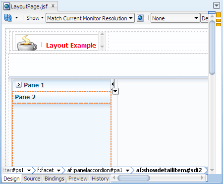
-
To add contents into the right pane, from the Component Palette, Layout panel, drag and drop
Panel Group Layout
into the second facet on the visual editor. In the Property Inspector, Common section,
change Layout to scroll. -
From the Component Palette, drag and drop
 Panel List
into the panel group layout you just added. In the Structure window, right-click af:panelList and
choose Insert Inside af:panelList > Link (Go) to add a goLink component. Repeat the procedure to insert
two more goLink components.
Panel List
into the panel group layout you just added. In the Structure window, right-click af:panelList and
choose Insert Inside af:panelList > Link (Go) to add a goLink component. Repeat the procedure to insert
two more goLink components.
Click
Save All
to save your work.
The right pane in the visual editor should look something like this: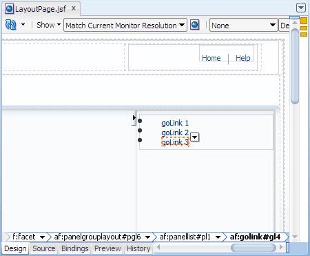
-
To set up the middle pane, in the Component Palette, Layout panel, drag and drop
Decorative Box
into the first facet on the visual editor.
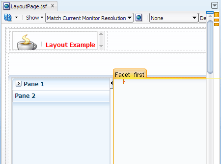
In the Property Inspector, Common section, change the TopHeight value to
30pxand press Enter.-
In the Component Palette, drag and drop
Panel Group Layout
into the top facet of the decorative box (db2) you just added. In the Property Inspector, Common section,
change Layout to scroll. In the Component Palette, General Controls panel, Location section, drag and drop
 Bread Crumbs
into the panel group layout you just added. In the Structure window, right-click af:breadCrumbs
and choose Insert Inside af:breadCrumbs > Navigation Item to add a link. In the Property
Inspector, Common section, change the Text value to
Bread Crumbs
into the panel group layout you just added. In the Structure window, right-click af:breadCrumbs
and choose Insert Inside af:breadCrumbs > Navigation Item to add a link. In the Property
Inspector, Common section, change the Text value to Crumb 1and press Enter.In the Structure window, right-click af:breadCrumbs and choose Insert Inside af:breadCrumbs > Navigation Item to add a second item. In the Property Inspector, Common section, change the Text value to
Crumb 2and press Enter. Then repeat the procedure to insert a third navigation item, using the Text value ofCrumb 3.
The middle pane of the page in the visual editor should look similar to this: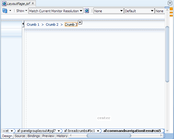
In the Application Navigator, right-click LayoutPage.jsf and choose Run.
The page in the browser should look similar to this: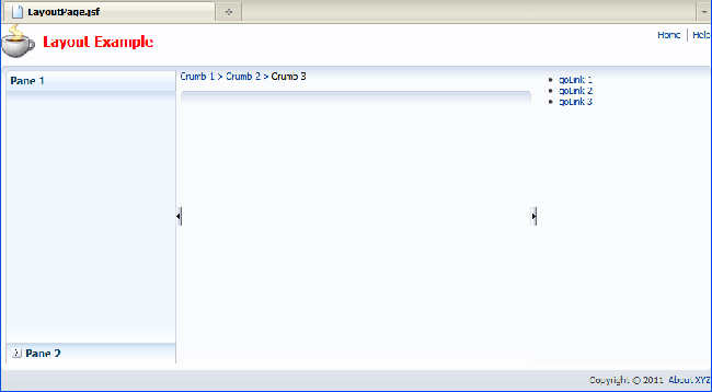
Read more...
The panes can be placed horizontally (side by side) or vertically (top to bottom), as determined by the Orientation attribute.
By default, the orientation is horizontal. Panel Splitter allows end users to redistribute space between its children.
Dragging the adjustable splitter resizes the panes. Clicking the arrow on the splitter collapses the pane (with its contents)
in the direction of the arrow.
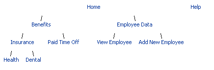
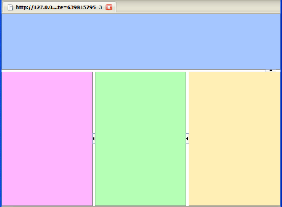
You can nest Panel Splitter components of different orientations to create multiple vertical and horizontal panes, as shown in the following illustration:
Like Panel Stretch Layout, Panel Splitter does not accept direct children; children contents can be placed inside facets only. Panel Splitter supports two facets that specify the panes where children contents can be inserted: first and second.
<af:panelSplitter ..>
  <f:facet name="first">
    <!-- pane contents here -->
  </f:facet>
  <f:facet name="second">
    <!-- pane contents here -->
  </f:facet>
</af:panelSplitter>false
and SplitterPosition is 200, the initial position of the
adjustable splitter will be 200 pixels from the first facet or left pane.
In a vertical arrangement, if PositionedFromEnd is false
and SplitterPosition is 200, the initial position of the
adjustable splitter will be 200 pixels from the first facet or top pane.
When PositionedFromEnd is
false, the arrow on the adjustable splitter
points in the direction of the first facet;
when PositionedFromEnd is true, the arrow on the adjustable splitter points
in the direction of the second facet.
By changing PositionedFromEnd to true on the second horizontal Panel Splitter (ps2),
the adjustable splitter is now 200 pixels from the end of the right pane (in a left-to-right reading direction), making the
center pane larger than the right pane.
Read more...
At runtime the contents are organized within collapsible and expandable accordion panes or tabbed panes, respectively.
One or more Show Detail Item must be used as children components inside Panel Accordion or Panel Tabbed. Each Show Detail Item will correspond to one accordion pane or one tabbed pane. One or more child components inside of Show Detail Item then make up the accordion pane or tabbed pane contents. For example:
<af:panelAccordion discloseMany="true">
  <af:showDetailItem text="Pane 1" ..>
    <af:outputText value="Pane contents here"/>
  </af:showDetailItem>
  ...
</af:panelAccordion>The DiscloseMany attribute of Panel Accordion determines whether more than one pane (Show Detail Item) can be disclosed (open) at a time. By default, DiscloseMany is
false, that is only one pane can be disclosed at a time. By setting DiscloseMany
to true, you are allowing end users to disclose multiple panes at a time.
Read more...
A Show Detail Item component will allow stretching, as long as the following
conditions are met:
af:panelAccordion or af:panelTabbed tag documentation.
If you do not want a child inside of Show Detail Item to be stretched, first wrap the child in a layout component that can be stretched but does not stretch its children, for example, a Panel Group Layout with
layout="scroll".
The Flex attribute of Show Detail Item determines the flexibility of the component in the container Panel Accordion. When more than one Show Detail Item in the container has a Flex value greater than zero, the container uses the Flex values to determine how space is distributed among the disclosed pane contents. Show Detail Item components with larger values will be made larger then components with smaller values.
Read more...
Children contents can be placed inside facets only. Decorative Box supports two facets that specify the panes where children contents can be inserted:
top and center.
<af:decorativeBox topHeight="30px"..>
  <f:facet name="center"/>
  <f:facet name="top"/>
</af:decorativeBox>first facet of the second panel splitter (ps2), you are setting up the
middle pane before you add contents.
Read more...
Like the Navigation Pane component, the Bread Crumbs component accepts a series of Command Navigation Item components
as children, with each Command Navigation Item representing one link.
<af:breadCrumbs>
  <af:commandNavigationItem text="Crumb 1"../>
  <af:commandNavigationItem text="Crumb 2"../>
  <af:commandNavigationItem text="Crumb 3"../>
</af:breadCrumbs>vertical.
The last breadcrumb link (that is, the last Command Navigation Item child) is always the current page. Depending on the renderer or client device type, the last breadcrumb link may not be displayed, but you still have to add a Command Navigation Item component for it. On clients that do display the last breadcrumb link, ADF Faces by default displays the current page link as "selected".
Like the Navigation Pane component, the Bread Crumbs component can be declaratively bound to an XML menu model. Then instead of using individual Command Navigation Item components to represent the links, you would use the
nodeStamp facet and only one Command Navigation Item to stamp out the appropriate number of links.
You will complete the page by working within the center facet of Decorative Box (db2) to create the middle pane contents.
-
In the Component Palette, Layout panel, drag and drop
Panel Stretch Layout
into the center facet below the bread crumb links.
In the Property Inspector, Common section, change the following attributes of panel stretch layout to these values:
Attribute Value StartWidth 5pxEndWidth 5pxTopHeight 5pxBottomHeight 25px-
In the Component Palette, Layout panel, Interactive Containers and Headers section, drag and drop
 Panel Tabbed
into the center facet of the panel stretch layout you modified.
Panel Tabbed
into the center facet of the panel stretch layout you modified. 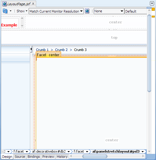
There is only one child component inside of Show Detail Item
The StretchChildren attribute on Show Detail Item is set to
firstThe child component has no width, height, border, margin, or padding property set
The child component can be stretched
In the Structure window, expand af:panelTabbed. Click the child af:showDetailItem. In the Property Inspector, Common section, change the Text value to
Tab 1. In the Appearance section, change StretchChildren to first.In the Structure window, right-click af:panelTabbed and choose Insert Inside af:panelTabbed > Show Detail Item to add a second tab. In the Property Inspector, Common section, change the Text value to
Tab 2. In the Appearance section, change StretchChildren to first.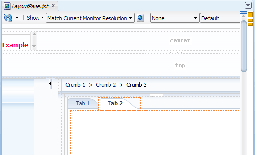
In the visual editor, select the first tab Tab 1.
-
In the Component Palette, Data Views panel, drag and drop
 Table
into the first tab. In the Create ADF Faces Table dialog, make sure Bind Data Now is
not selected, then click OK.
Table
into the first tab. In the Create ADF Faces Table dialog, make sure Bind Data Now is
not selected, then click OK.
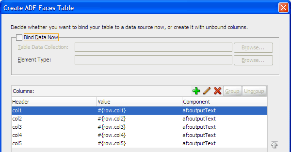
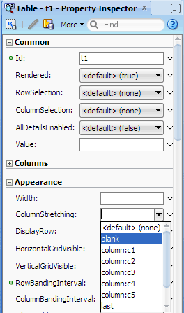
In the Property Inspector of the table component, Appearance section, select blank from the ColumnStretching dropdown list.
The table in the visual editor should look similar to this: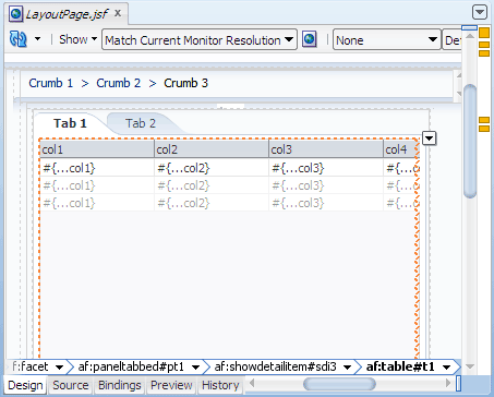
none: No column is stretched. This is the default. For optimal performance, use the default.blank: An empty, blank column will be automatically inserted after the table's last column. The blank column will be stretched to fill up any unused space inside the visible portion of the browser. The table row background colors will then span the entire width of the table.last: The last column will be stretched to fill up any unused space inside the viewport of the browser.multiple: Select this if you want more than one column to be stretched. Then set the width of the relevant columns to a percentage. When widths using percentages exist and the table columnStretching is set to "multiple", the percentages are used to determine a normalized ratio.-
In the visual editor, select the second tab Tab 2. In the Component Palette, Layout panel, drag and drop
 Panel Collection
into the second tab.
Panel Collection
into the second tab. 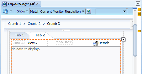
There is only one child inside of Show Detail Item
The StretchChildren attribute on Show Detail Item is set to first
The child has no width, height, border, margin, or padding property set
In the Component Palette, Data Views panel, drag and drop
Table
into the panel collection you just added. In the Create ADF Faces Table dialog, make sure Bind Data Now
is not selected, then click OK. In the Property Inspector of the table component,
Appearance section, select last from
the ColumnStretching dropdown list.
-
In the Component Palette, Layout panel, drag and drop
Panel Group Layout
into the bottom facet below the table in the panel tabbed.
In the Property Inspector, Common section, change Halign to center, and Layout to scroll.
In the Component Palette, General Controls panel, drag and drop
 Button
into the panel group layout you just added and modified. In the Property Inspector, change
the Text value to
Button
into the panel group layout you just added and modified. In the Property Inspector, change
the Text value to Show Printable Pageand press Enter.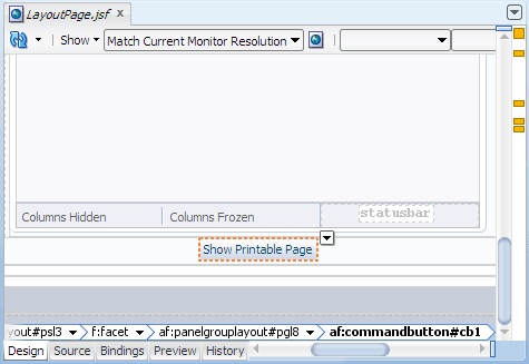
-
In the Component Palette, expand the Operations panel. In the Behavior section, drag and drop
 Show Printable Page Behavior
into the command button you just added.
Show Printable Page Behavior
into the command button you just added.
In the Structure window, the hierarchy of components inside the bottom facet should like this: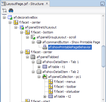
In the Application Navigator, right-click LayoutPage.jsf and choose Run.
The page in the browser should look similar to this:
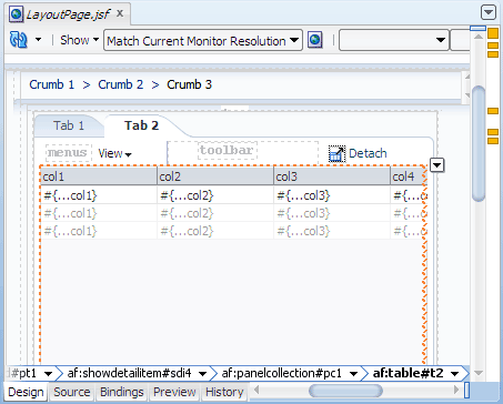
Since you did not bind the tables to any data source, you should see only table column headings in the tables.Collapse the right pane by clicking the right-pointing arrow on the splitter bar.
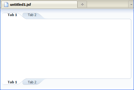
The table in Tab 1 should have six columns, the last column header is blank and stretched: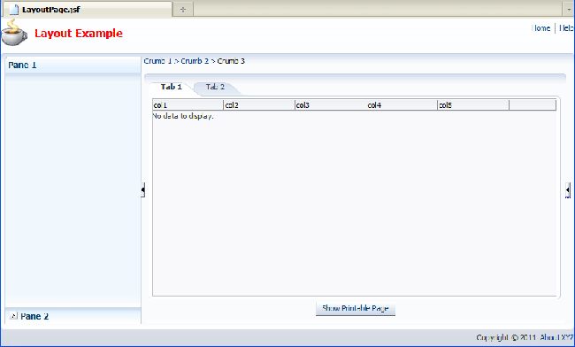
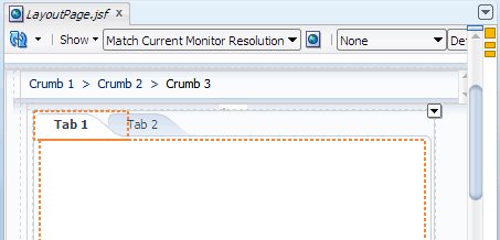
Click Tab 2.
The table should have five columns. The last column, col5, should be stretched: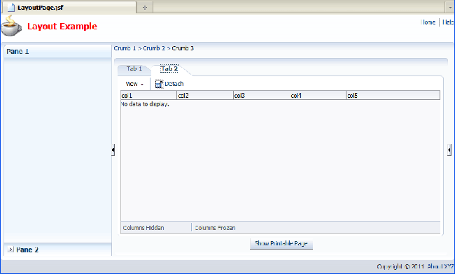
Click the Show Printable Page button.
You should see a new browser window or new tab in a browser window that contains only the contents of the selected tab: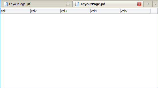
Read more...
When you add a Panel Tabbed, JDeveloper uses above as the default value for the Position attribute.
This means the tabs will display above the pane contents only. Other valid values of Position are
below and both. The following illustration shows a Panel Tabbed component with its Position
attribute set to both:
Like Panel Accordion, one or more Show Detail Item components must be used inside of Panel Tabbed. One or more child components inside of a Show Detail Item then make up the tabbed pane contents. For example:
<af:panelTabbed position="both"..>
  <af:showDetailItem text="Tab 1"..>
    <af:outputText value="Pane contents here"../>
  </af:showDetailItem>
  <af:showDetailItem text="Tab 2"..>
    <af:outputText value="Pane contents here"../>
  </af:showDetailItem>
</af:panelTabbed>Panel Tabbed can be stretched by a parent stretching layout component such as Panel Stretch Layout. When inserted into a facet of Panel Stretch Layout, you do not have to set the width and height properties of Panel Tabbed for the component to be stretched.
Panel Tabbed does not stretch its children contents; Show Detail Item does. But certain conditions must be met for Show Detail Item to allow stretching, namely:
af:panelTabbed tag documentation.
Note: Do not confuse Panel Tabbed with Navigation Pane. The Navigation Pane component creates a series of navigation items (including tabs) that represent one level of navigation in a page hierarchy.
Read more...
Valid values of columnStretching are:
column:. For example, if the column id is
myCol1, enter column:myCol1 in the columnStretching field. Alternatively,
you can select the column id from the columnStretching dropdown list.
Note: When Table is used within Show Detail Item, you do not have to set the width and height properties of Table for the component to be stretched.
Read more...
The type of top level default menu and toolbar items it provides will vary according to the child component it contains.
For example, when the child is Table, Tree, or Tree Table, the default top level menu item is View, and the default toolbar item
is Detach.
Panel Collection can be stretched by a parent stretching component such as Panel Stretch Layout and Show Detail Item. When inserted into a facet of Panel Stretch Layout, you do not have to set the width and height properties of Panel Collection for the component to be stretched. When inserted into Show Detail Item, certain conditions must be met for Show Detail Item to allow Panel Collection to be stretched, namely:
Read more...
When associated with a Command Button component, Show Printable Page Behavior generates and displays a printable version of the
current page when users activate the command component.
<af:commandButton text="Show Printable Page"..>
  <af:showPrintablePageBehavior/>
</af:commandButton>In the example, by placing the Command Button (with its nested Show Printable Page Behavior) within a facet of Panel Stretch Layout, this ensures that only the contents of the center pane will be printable.
When the command button is activated at runtime, a request is sent to the server to get a printable page; the action event, which is typically fired when a command component is activated, is not sent. ADF Faces displays the printable version of the page in a new browser window or in a new tab in the browser window.
- Use JDeveloper wizards and dialogs to create applications and starter pages
- Use the visual editor, Component Palette, Property Inspector, and Structure window to create UI pages
- Create a stretchable outer frame for page contents
- Use a layer of container components for stretched page contents and non-stretched contents
- Achieve component stretching in a variety of layout components
- Use Integrated WebLogic Server to run an ADF Faces application
 Expand all |
Hide all
Expand all |
Hide all