
 Read more...
The page holds the content of a shopping cart on one side and displays the available products on the other side. An other pane displays the product details. You implement a drag and drop functionality enabling you to fill your shopping cart by moving a selected product in the shopping cart area. You also create Tabs and Accordions and add a popup window.
| Purpose | Duration | Application |
|---|---|---|
This tutorial shows you how to develop a page based on a page template. Then you design the layout, add data components and change th elook and feel of the page. To see the complete application you will create, click the Download button to download a zip of the final application, and then unzip it in your JDeveloper mywork folder. The file contains two zip files (tutorial.zip and tutorialsolution.zip), one with the starter application, the other the completed solution. |
2 to 2.5 hours |  |
In this section you open the starter application and create a page template to be used for additional pages you will create: To create the page template perform the following steps:
Page templates let you define entire page layouts, including values for certain attributes of the page. Read more...
When pages are created using a template, they all inherit the defined layout. When you make layout modifications to the template, all pages that consume the template will automatically reflect the layout changes. You can either create the layout of your template yourself, or you can use one of the many quick layout designs. These predefined layouts automatically insert and configure the correct components required to implement the layout look and behavior you want. For example, you may want one column's width to be locked, while another column stretches to fill available browser space.
To use page templates in an application, you first create a page template definition. Page template definitions must be JSF documents written in XML syntax (with the file extension of .jspx) because page templates embed XML content. In contrast to regular JSF pages where all components on the page must be enclosed within the f:view tag, page template definitions cannot contain an f:view tag and must have pageTemplateDef as the root tag. The page that uses the template must contain the document tag, (by default, JDeveloper adds the document tag to the consuming page).
A page template can have fixed content areas and dynamic content areas. For example, if a Help button should always be located at the top right-hand corner of pages, you could define such a button in the template layout, and when page authors use the template to build their pages, they do not have to add and configure a Help button. Dynamic content areas, on the other hand, are areas of the template where page authors can add contents within defined facets of the template or set property values that are specific to the type of pages they are building.
The entire description of a page template is defined within the pageTemplateDef tag, which has two sections.
One section is within the xmlContent tag, which contains all the page template component metadata that describes the template's supported content areas (defined by facets), and available properties (defined as attributes). The second section (anything outside of the xmlContent tag) is where all the components that make up the actual page layout of the template are defined. The components in the layout section provide a JSF component subtree that is used to render the contents of the page template.
-
In the Applications Navigator, click Open Application .
-
In the Open Application(s) dialog, locate the folder where you unzipped the application and select Tutorial.jws.
Click Open. If prompted with a migration warning message, continue and finish the migration operation.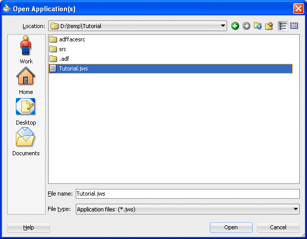
-
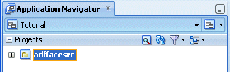
The application is loaded up in the Application Navigator, showing the adffacesrc project.
-
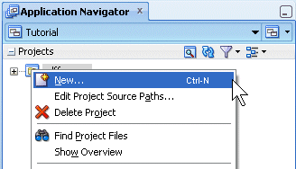
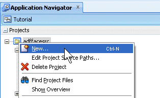
In the Application Navigator, right-click the adffacesrc project and select New from context menu.
-
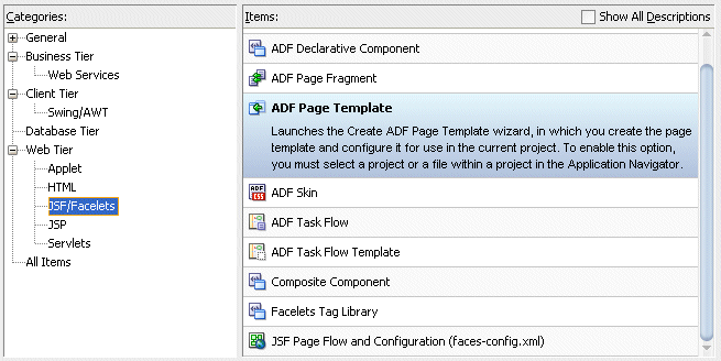
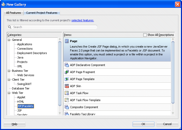
In the New Gallery, in the Categories pane, select Web Tier | JSF/Facelets, then select the ADF Page Template item.
Then click OK.
-
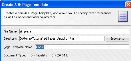
In the Create ADF Page Template, type simple for the Page Template Name.
-
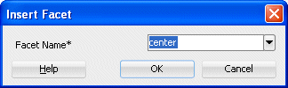
In the Facet Definitions tab, click the Add
 button and type center as the Name.
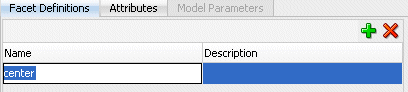
-
Click the Attributes tab, click the Add
button , then type title as the Name and Default Title as the Default Value.
Then click OK.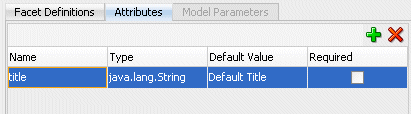
-
The simple.jspx template page opens up in the design editor.
-
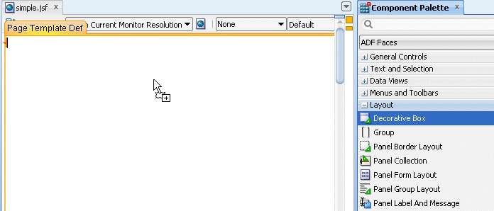
From the Component Palette, expand the ADF Faces - Layout nodes and drag a Decorative Box onto the empty page.
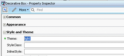
Using the Property Inspector, in the Style and Theme tab, set the Theme property to light from the list .
-
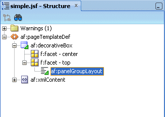
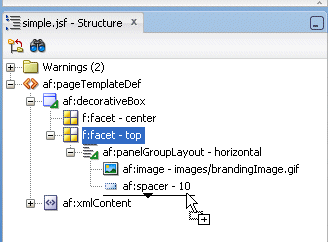
In the Structure Pane, drag and drop a Panel Group Layout into the top facet.
-
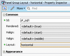
With the panelGroupLayout selected, set the Layout property, in the Property Inspector, to horizontal.
-
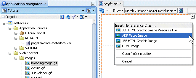
In the Application Navigator, expand the Web Content | images nodes and drag and drop the brandingImage.gif node onto the Panel Group Layout. In the context menu select ADF Faces Image .
-
From the ADF Faces - Layout, drop a Spacer next to the image.
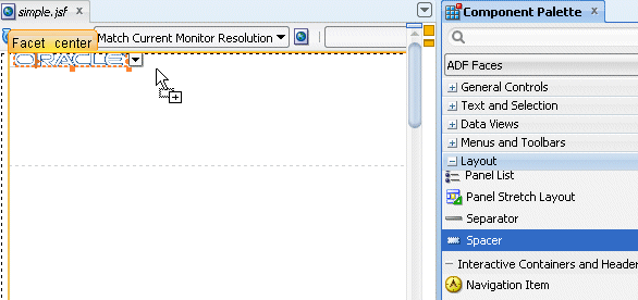
Then set the Width property to 100.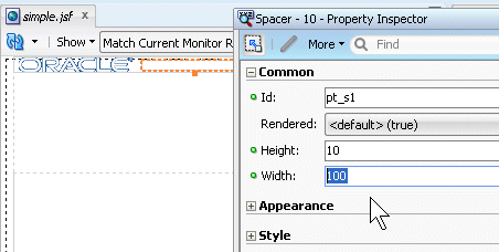
-
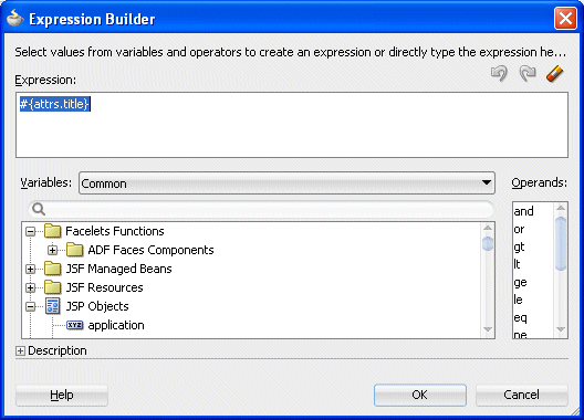
From the ADF Faces | Common Components, drop an Output Text under the spacer component.
In the Value field, select Expression Builder from the drop-down list .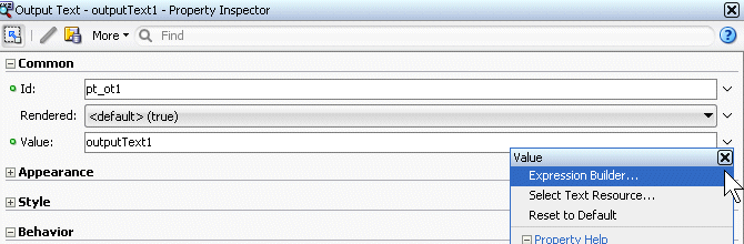
-
In the Expression Builder, clear out the existing expression and set the value to #{attrs.title}.
Then click OK.
-
In the Component Palette, under the ADF Faces drop-down, expand the Layout node and scroll down to the Core Structure section. Drag and drop a Facet onto the center facet.
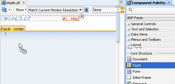
In the Insert Facet Ref dialog, select center as the facet name, then click OK.
-
Click the Save All
 icon in the JDeveloper menu bar, or select File - Save All from the menu to save the page.
Now that the template has been created you can create a new page, and use the template as the default structure for the page. To do this, perform the following steps:
Read more... If you modify the layout section of a page template later, all pages or page fragments that use the template are automatically updated with the layout changes.
Typically, you create JSF pages in the same project where page template definitions are created and stored. If the page templates are not in the same project as where you are going to create template-based pages, first deploy the page templates project to an ADF Library JAR. and the page that consumes a template, you can add content before and after the pageTemplate tag. In general, you would use only one pageTemplate tag in a page, but there are no restrictions for using more than one.
JDeveloper simplifies the creation of JSF pages based on page templates by providing a template selection option in the Create JSF Page or Create JSF Page Fragment wizard
-
Right-click the adffaces project and select New from the context menu.
-
In the New Gallery, expand the Web Tier node and select JSF/Facelets. Then select the Page item and click OK.
-
In the Create JSF Page dialog, leave the file name to the untitled1.jspx default value and ensure the Document Type is set to Facelets. Then select simple from the drop-down list for the Page Layout section.
Then click OK.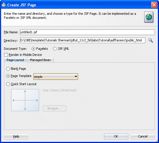
-
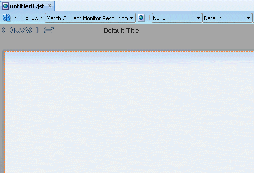
The untitled1.jspx appears as a new node in the Application Navigator and it opens up in the Design editor using the simple.jspx template.
-
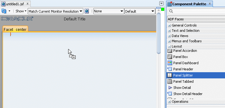
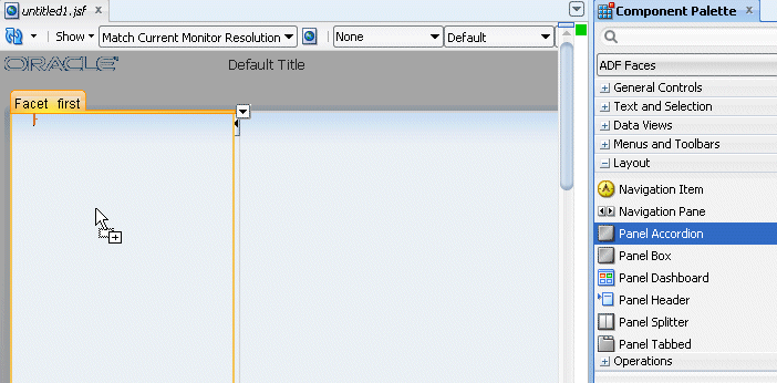
From the component palette, using the ADF Faces | Layout library, drag and drop a Panel Splitter component onto the center facet.
In addition to the Panel Splitter, ADF Faces provides a number of other layout components that can be used to arrange other components on a page.Read more...
Usually, you begin building your page with these components. You then add components that provide other functionality (for example rendering data or rendering buttons) either inside facets or as child components to these layout components. In addition to layout components that simply act as containers, ADF Faces also provides interactive layout components that can display or hide their content, or that provide sections, lists, or empty space. Some layout components also provide geometry management functionality, such as stretching their contents to fit the browser windows as the window is resized, or the capability to be stretched when placed inside a component that stretches. Some layout type and components are listed below.
Page Layout Containers
- panelStretchLayout: Contains top, bottom, start, center, and end facets where you can place other components.
- panelSplitter: Divides a region into two parts (first facet and second facet) with a repositionable divider between the two. You can place other components within the facets.
- panelDashboard: Provides a columnar display of child components (usually panelBox components).
- panelBorderLayout: Can have child components, which are placed in its center, and also contains 12 facets along the border where additional components can be placed. These will surround the center.
- panelFormLayout: Positions input form controls, such as inputText components so that their labels and fields line up vertically. It supports multiple columns, and contains a footer facet.
Components with Show/Hide Capabilities
- showDetailHeader: Can hide or display contents below the header. Often used as a child to the panelHeader component.
- showDetailItem: Used to hold the content for the different panes of the panelAccordion or different tabs of the panelTabbed component.
- panelBox: Titled box that can contain child components. Has a toolbar facet.
- panelAccordion: Used in conjunction with showDetailItem components to display as a panel that can be expanded or collapsed.
- panelTabbed: Used in conjunction with showDetailItem components to display as a set of tabbed panels.
-
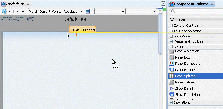
Drag and drop another Panel Splitter component onto the 'second' facet of the panel splitter.
-
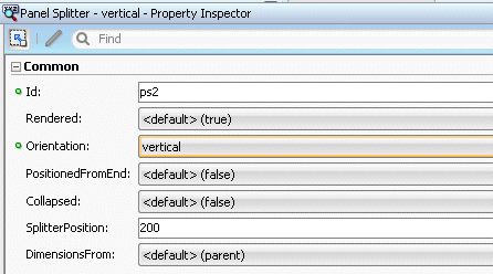
In the Structure pane, expand the first panelSplitter component and select the second one. Using the property inspector, set the Orientation to vertical.
-
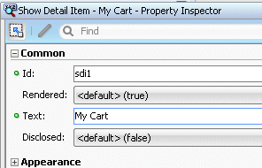
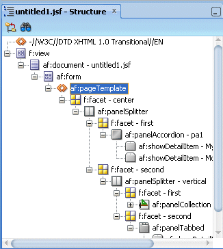
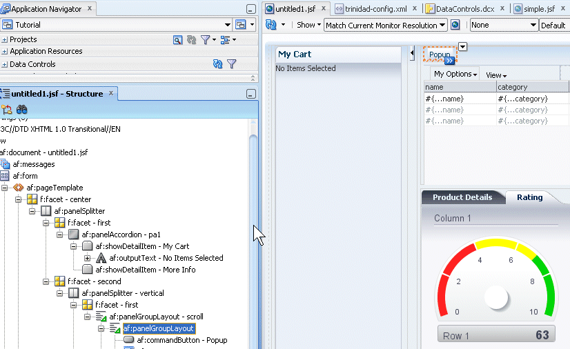
Drag and drop a Panel Accordion component onto the 'first' facet on the left hand side of the panel splitter.
In the Property Inspector, set the Text to My Cart.
-
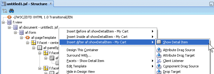
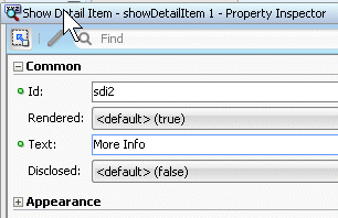
Click within the accordion you just created, then right-click on the showDetailItem and from the context menu select Insert after Show Detail Item - Show Item Detail.
For the show detail item that you just added, using the Common tab of the Property Inspector, change the Text field to More Info.
-
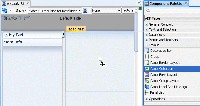
Drag and drop a Panel Collection component onto the right hand side 'first' facet.
-
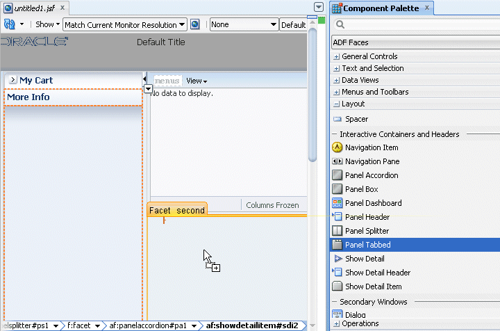
Drag and drop a Panel Tabbed component onto the right hand side 'second' facet. The component can be found in the Interactive Containers and Headers grouping.
In the Structure pane, select the af:showDetailItem component you just created and In the Property Inspector, enter Product Details in the Text field.
-
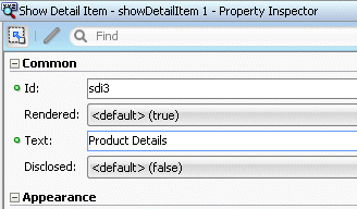
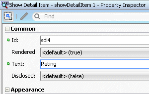
Right click the Product Details tab and select Insert After Show Detail Item - Show Detail Item from context.
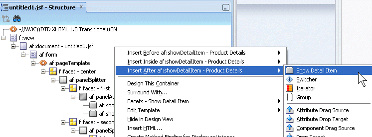
In the Structure pane, select the af:showDetailItem component you just created and in the Property Inspector, enter Rating in the Text field.
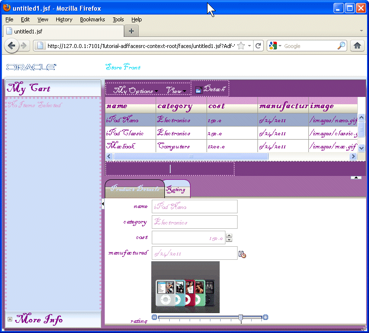
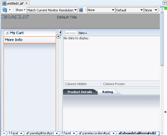
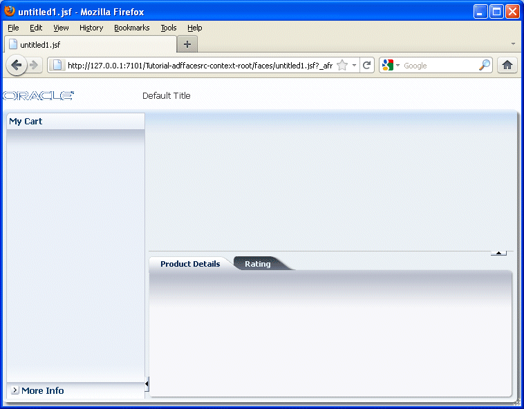
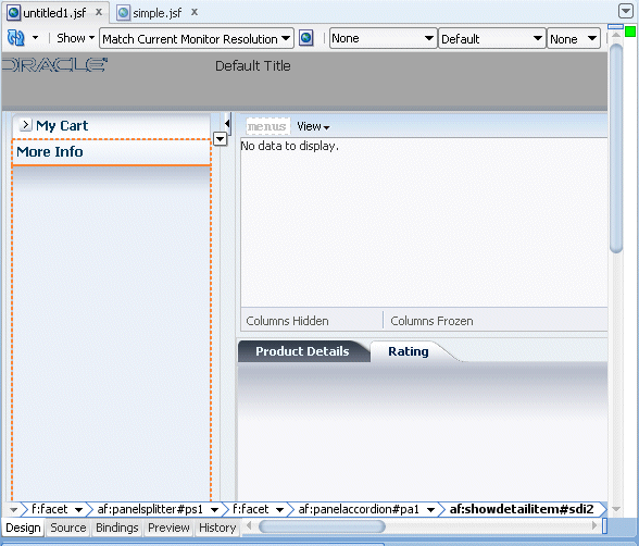
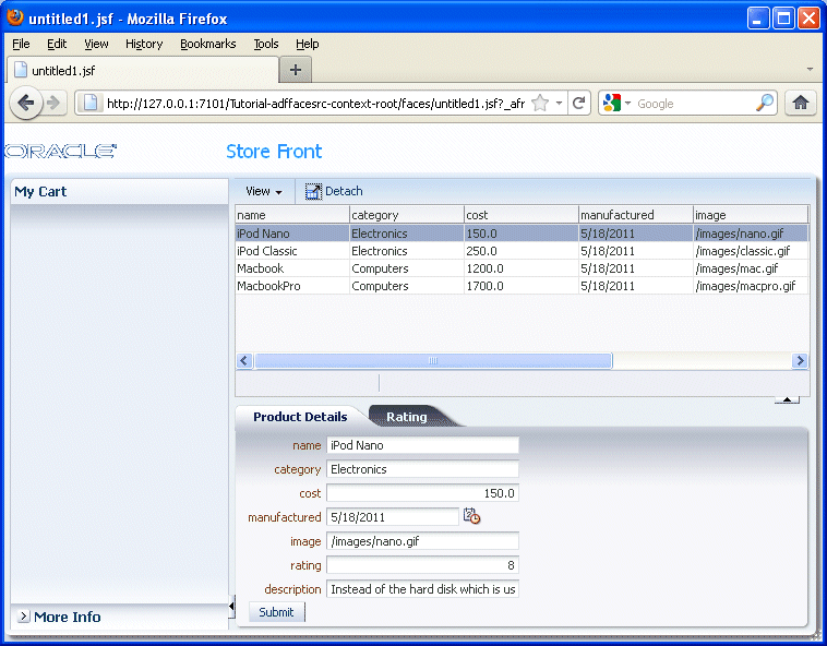
The page should look like the following image.
-
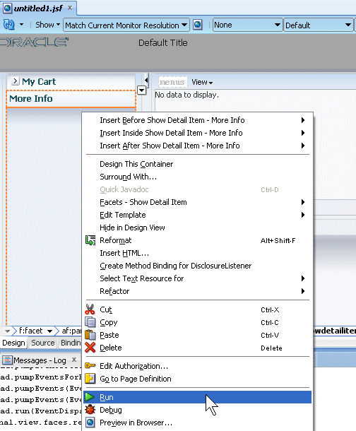
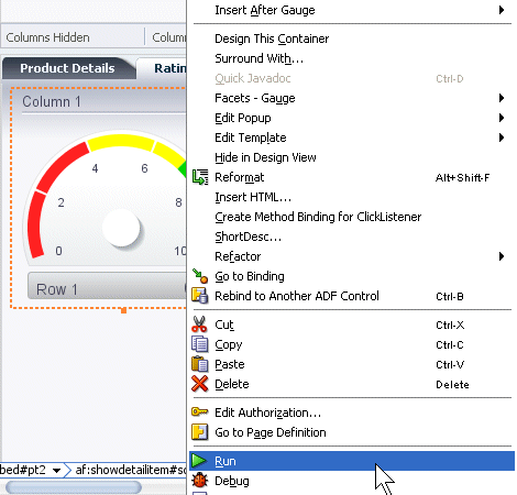
Save all your work. Then right-click in the page and from the context menu, select Run.
-
The page will load in your browser. Experiment with selecting the tabs and expanding the More Info panel. Once you're finished, keep the browser open and return to JDeveloper
-
In the next steps, you customize the page title and see how it is consumed in the existing page. To start the process, open the simple.jsf template page you created earlier.
-
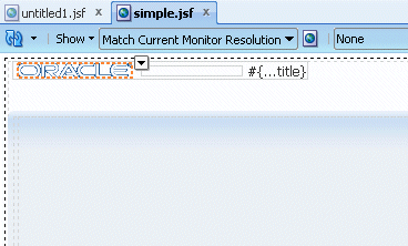
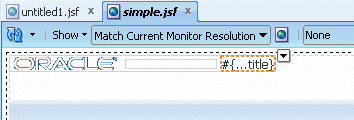
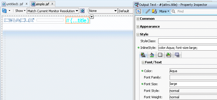
In the page designer, select the title component.
In the Property Inspector, expand the Style node, and using the Font/Text node, in the Color field click the Color drop-down list and select the color of your choice (Aqua in our example).
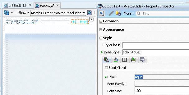
In the Font Size property, and select large from the drop-down list.
-
Save all your work. Then go back to the browser and reload the page to see the new characteristics.
Note that after saving your JDeveloper application, refreshing your browser window reflects the new changes made to your application as long as you haven't updated any binding component. In that case you will need to reRun the page from JDeveloper in order to have the changes reflected in your browser.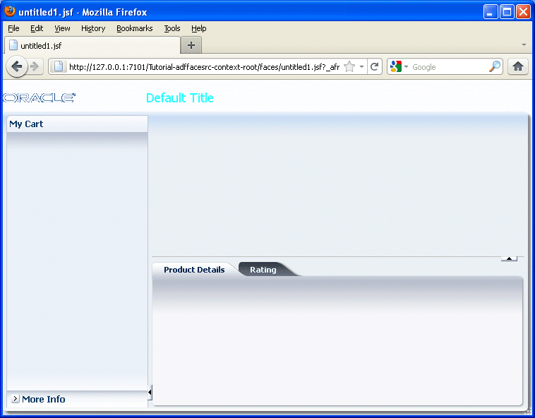
-
Open the untitled page in the design editor.
-
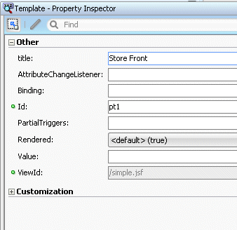
In the Structure pane, select the pageTemplate tag and in the Property Inspector, set the Title property to Store Front.
-
Save all your work. Then go back to the browser and reload the page to see the new characteristics.

The page layout is complete, now it's time to add some data. The first step in this process it to create data controls from the POJOs. To do this, perform the following steps:
Read more... In a Java EE application, you normally create entity beans that represent tables in a database and then create a session facade over all the EJBs. This facade provides a unified interface to the underlying entities. In an Oracle ADF application, you can create a data control for the session bean, and that data control will contain representation of all the EJBs under the session bean. You can also create Data Controls from simple POJOs.
You generate data controls with the Create Data Control command. Data controls consist of one or more XML metadata files that define the capabilities of the services that the bindings can work with at runtime. The data controls work in conjunction with the underlying beans without changing the implementation of the beans.
-
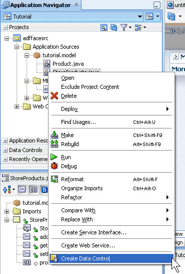
From an existing POJO Class, we now create the data control using the ADF Data Binding facility.
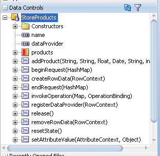
In the Application Navigator, expand the Application Sources node and right-click StoreProducts.java in the Application Sources - tutorial.model path and select Create Data Control from context.
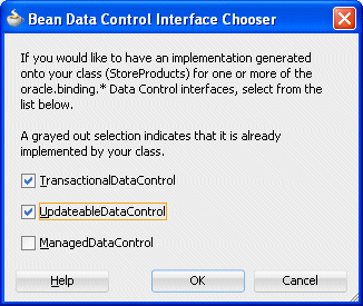
In the Bean Data Control Interface select the TransactionalDataConrtol and UpdatableDataControl, then click OK.
Following data control creation, the Application Navigator should include a DataControl.dcx file .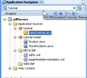
-
In the Application Navigator, open the Data Controls accordion and expand the StoreProducts node. The Data Controls pane should look like this .
-
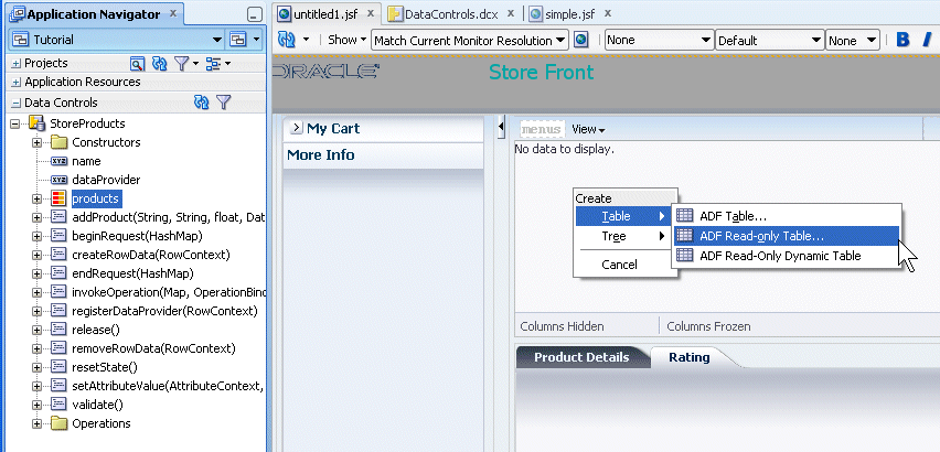
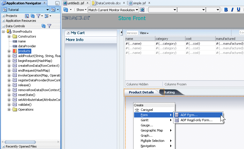
Drag and drop the StoreProducts - products data control onto the af:panelCollection in the design editor of the untitled1 page. From the popup menu, select Table - ADF Read-only Table....
Structured data can be displayed as tables consisting of rows and columns using the ADF Faces table component.Read more...
The table component uses a CollectionModel class to access the data in the underlying collection. This class extends the JSF DataModel class and adds on support for row keys and sorting. In the DataModel class, rows are identified entirely by index. This can cause problems when the underlying data changes from one request to the next, for example a user request to delete one row may delete a different row when another user adds a row.
To work around this, the CollectionModel class is based on row keys instead of indexes. The immediate children of a table component must be column components. Each visible column component is displayed as a separate column in the table. Column components contain components used to display content, images, or provide further functionality.
The child components of each column display the data for each row in that column. The column does not create child components per row; instead, the table uses stamping to render each row. Each child is stamped once per row, repeatedly for all the rows. As each row is stamped, the data for the current row is copied into a property that can be addressed using an EL expression. You specify the name to use for this property using the var property on the table. Once the table has completed rendering, this property is removed or reverted back to its previous value.
-
From the Edit Table Columns dialog, select the Row Selection (Single Row) and Sorting options.
Then click OK.
-
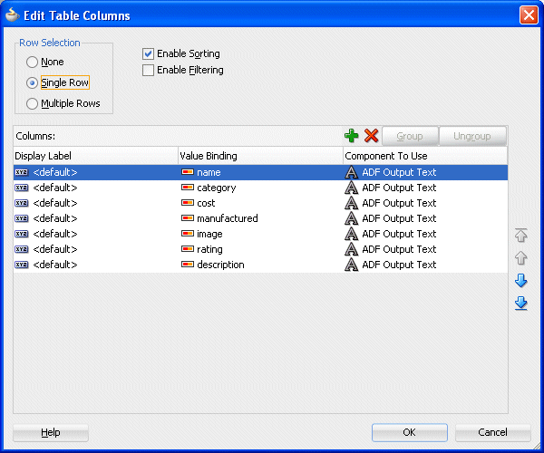
In the Structure Pane, select the af:table component and in the Property Inspector, expand the Behavior node. Set the EdtingMode property to clickToEdit and ColumnStretching to Last.
Then save all your work.
-
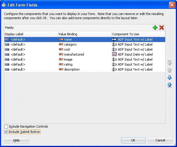
Back in the Data Controls pane, drag and drop the products onto the Product Details tab component. In the popup menu, select Form - ADF Form.
-
In the Edit Form Fields dialog, select the Include Submit Button checkbox.
Then click OK.
-
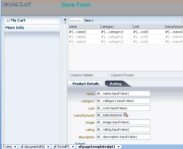
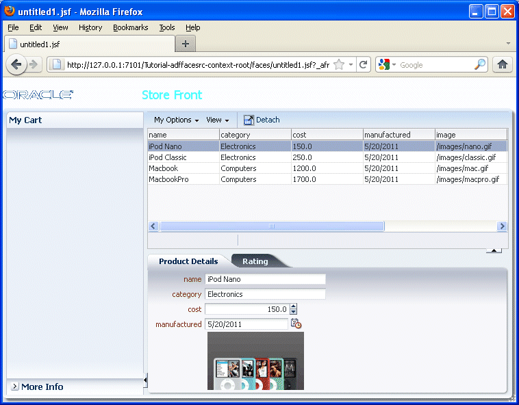
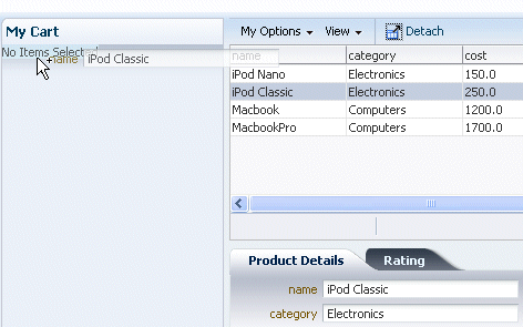
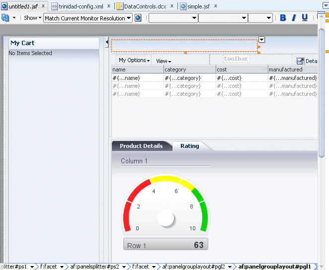
The page should look like the image below.
-
Save all your work and Run the page.
-
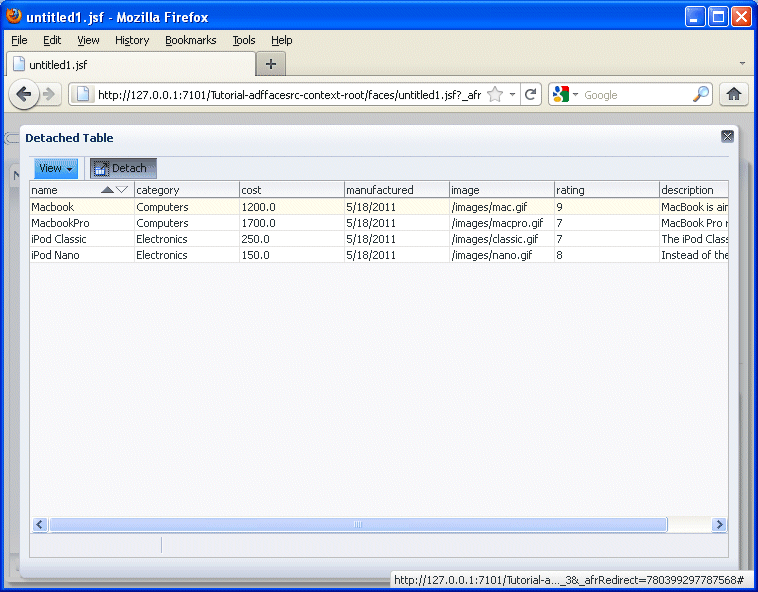
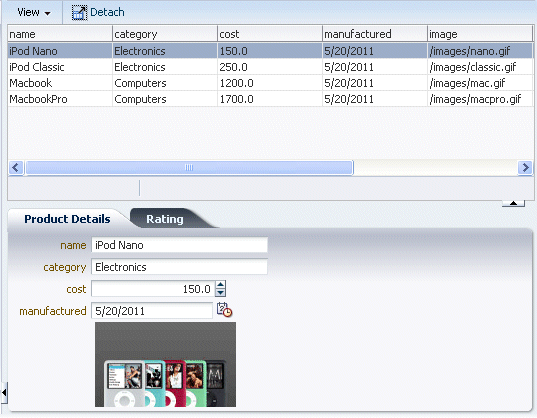
Once the page loads, by default a list of products should be displayed.
-
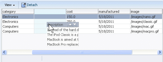
Select one of the column headers and move it to another location.
-
Experiment with column resizing using the description column.
-
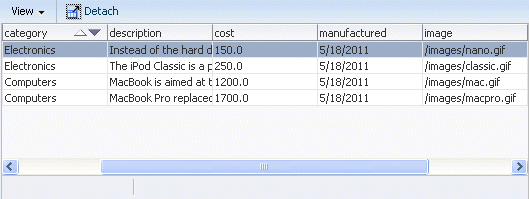
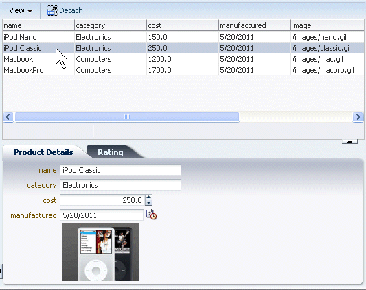
Select the name column then click the Detach menu option to isolate the content of the panel in the browser.
Then click the Detach option again to return to the original display.
-
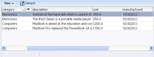
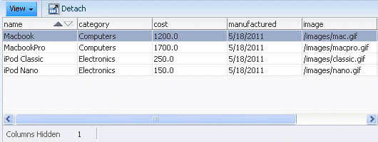
Explore the View menu option and hide some of the columns.
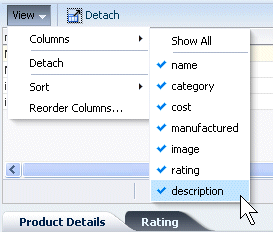
The columns will remain hidden until you redisplay them. You'll always know there are columns hidden by the message displayed below the table.
When you're finished experimenting, close the browser and return to JDeveloper
-
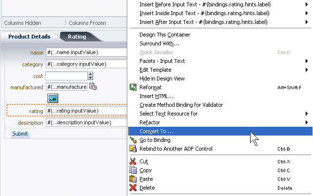
In the next few steps you add some image and graphical items to the page.
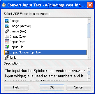
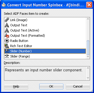
In the Product Details pane, right-click the cost field and select Convert To... from the context menu.
There are a variety of ways to make it easier for end users, using graphical components.Read more...
The slider components present the user with a slider with one or two markers whose position on the slider corresponds to a value. The slider values are displayed and include a minus icon at one end and a plus icon at the other. The user selects the marker and moves it along the slider to select a value. The inputNumberSlider component has one marker and allows the user to select one value from the slider.
To display an image on a page, you use the image component and set the source attribute to the URI where the file is located. The image component also supports accessibility description text by providing a way to link to a long description of the image. The image component can also be used as a link and can include an image map, however, it must be placed inside a goLink component.
The richTextEditor component provides rich text input that can span many lines and can be formatted using different fonts, sizes, justification, and other editing features that may be required when you want users to enter more than simple text. For example, the richTextEditor might be used in a web-based discussion forum, allowing users to format the text that they need to publish.
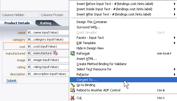
In the Convert DIalog, select Input Number Spinbox.
Then click OK, then OK again in the Confirm Convert box.
-
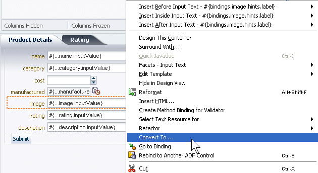
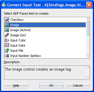
Notice that the image column is set to a text type of value. To be able to display an image, you need to convert the structure of the column. In the Product Details pane, right-click the image field and select Convert To... from context.
In the Convert DIalog, select Image.
Then click OK, then OK again in the Confirm Convert box.
-
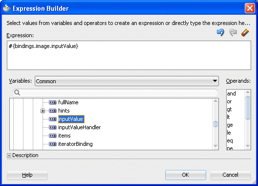
With the new image field selected, go to the Property Inspector and next to the source field, select Expression Builder from the drop-down list.
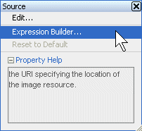
-
In the Expression Builder dialog, select ADF Bindings - bindings - image - inputValue.
Then click OK.
-
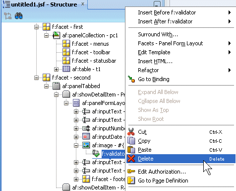
In the Structure pane underneath the image component, delete the f:validator component to remove the error appearing on the design of the page.
-
In the Product Details pane, right-click the rating field and select Convert To... from the context menu .
In the Convert DIalog, select Slider(Number) .
Then click OK, then OK again in the Confirm Convert box.
-
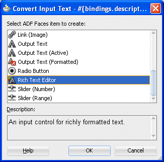
In the Product Details pane, right-click the description field and select Convert To... from context menu.
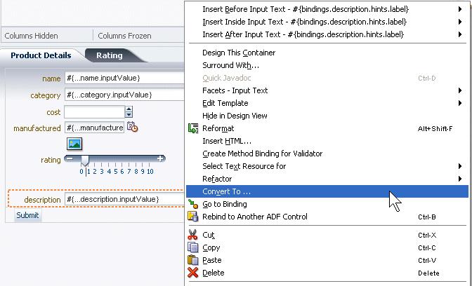
In the Convert DIalog, select Rich Text Editor.
Then click OK, then OK again in the Confirm Convert box.
-
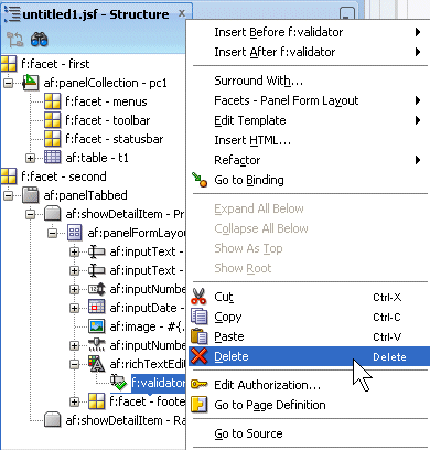
In the Structure pane underneath the richTextEditor component, delete the validator component to remove the error appearing on the design of the page.
-
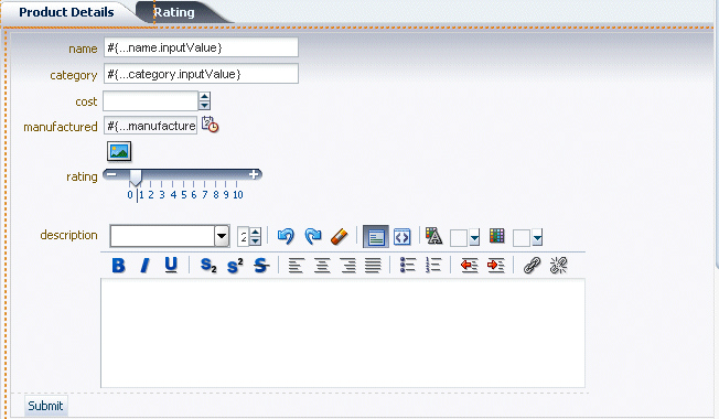
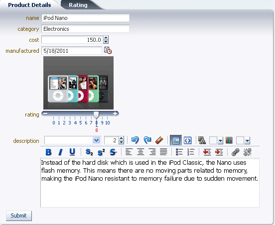
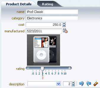
The Products Details pane should now look like this.
Save all your work.
-
Switch back to the browser and reload the page.
-
Experiment moving the rating slider, the cost spinbox, the popup calendar and the rich text editor.
-
Finally, double-click on any of the rows in the product table. Notice that the Product Details pane does not reflect the change in the selected product. To implement this synchronization, we need to add partial page rendering functionality.
In order to have a refresh of the Product Details when you select another row in the Product table, we need to set the Partial Rendering behavior. To do so, perform the following steps:
Read more... Ajax (Asynchronous JavaScript and XML) is a web development technique for creating interactive web applications, where web pages appear more responsive by exchanging small amounts of data with the server behind the scenes, without the whole web page being rerendered.
With ADF Faces, the feature that delivers the Ajax partial page render behavior is called partial page rendering (PPR). PPR allows certain components on a page to be rerendered without the need to rerender the entire page. For example, an output component can display what a user has chosen or entered in an input component, or a command link or button can cause another component on the page to be rerendered, without the whole page rerendering. In order for PPR to work, boundaries must be set on the page that allow the lifecycle to run just on components within the boundary. In order to determine the boundary, the framework must be notified of the root component to process. The root component can be identified in two ways:
- Events: Certain events indicate a component as a root. For example, the disclosure event sent when expanding or collapsing a showDetail component, indicates that the showDetail component is a root. When the showDetail component is expanded or collapsed, only that component goes through the lifecycle. Other examples of events identifying a root component are the disclosure event when expanding nodes on a tree, or the sort event on a table.
- Components: Certain components are recognized as a boundary, and therefore a root component. For example, the framework knows a popup dialog is a boundary. No matter what event is triggered inside a dialog, the lifecycle does not run on components outside the dialog. It runs only on the popup.
In addition to built-in PPR functionality, you can configure components to use cross-component rendering, which allows you to set up dependencies so that one component acts as a trigger and another as the listener. When an event occurs on the trigger component, the lifecycle is run only on listener components and child components to the listener, and only the listener components and their children are rerendered. Cross-component rendering can be implemented declaratively. However, by default, all events from a trigger component will cause PPR (note that some components, such as table, trigger partial targets on only a subset of their events). For these cases where you need strict control over the event that launches PPR, or for cases where you want to use some logic to determine the target, you can implement PPR programmatically.
-
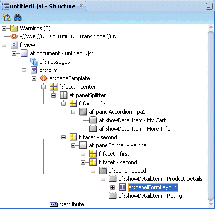
Back in JDeveloper, navigate to the af:panelFormLoyout in the Product Details component.
-
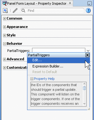
In the Property Inspector, expand the Behavior node, and using the down arrow next to the Partial Trigger field, select Edit.
-
In the Edit Property dialog, expand the panelCollection* - pc1 component, and using the right arrow button, shuttle table* - t1 in the Selected pane. This defines what will trigger the refresh of the Panel Form Layout containing the product details.
Then click OK and save all your work.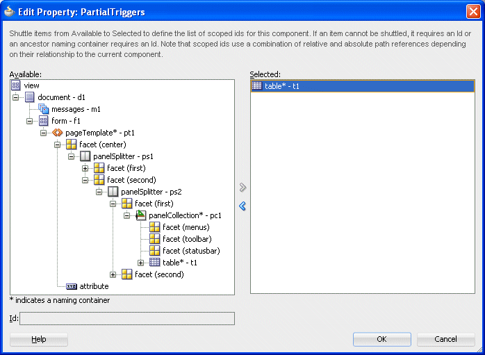
-
Switch back to the browser window and reload the page.
-
Select another row in the table to change the product details. The product details are now synchronized with the selected product record in the table.
-
Leave the browser window open and return to JDeveloper.
Operational components are those that provide functionality to an application. In this section you will create menus, popup and printable pages and allow end users to drag products into their shopping cart. To implement this type of functionality, perform the following steps:
Read more... In most cases, drag and drop can easily be implemented by added the appropriate tags to the source and target and implementing code in a managed bean. Drag and drop provides users with the GUI experience that is expected in web applications. For example, in the File Explorer application, you can drag a file from the Table tab and drop it into another directory folder.
When users click on a source and begin to drag, the browser displays the element being dragged as a ghost element attached to the mouse pointer. Once the ghost element hovers over a valid target, the target component shows some feedback (for example, it becomes highlighted). If the user drags the ghost element over an invalid target, the cursor changes to indicate that the target is not valid.
When dragging attribute values, the user can only copy the value to the target. For all other drag and drop scenarios, on the drop, the element can be copied (copy and paste), moved (cut and paste), or linked (creating a shortcut for a file in a directory in which the link is a reference to the real file object).
-
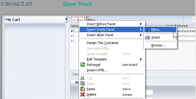
Click To implement menus in your application, go back to JDeveloper. In the second panel, right-click within the menu component facet and from context, select Insert inside Facets menus - Menu .
-
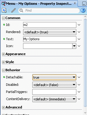
Using the Property Inspector, set the Text field to My Options.
Also, in the Behavior node, set the Detachable property to true.
-
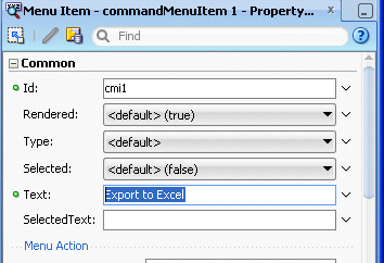
Right click the Menu and select Insert inside Menu - My Options - Menu Item from context.
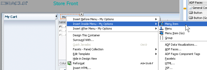
In the Property Inspector set the Text property to Export to Excel.
-
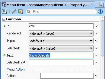
In the Structure Window, right-click the af:commandMenuItem component and select Insert after af:commandMenuItem - Export to Excel - Menu Item from context.
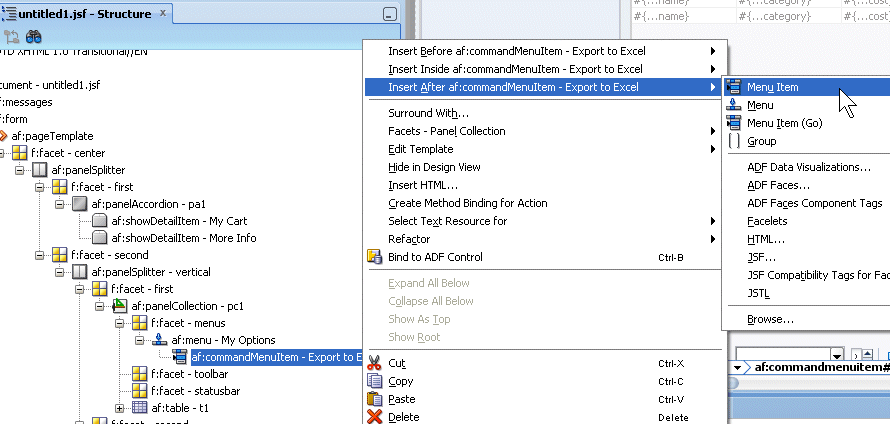
In the Property Inspector set the Text property to Show Specials.
-
From the Component Palette, expand the ADF Faces - Operations - Listeners library node. Then, select Export Collection Action Listener component and drop it under the Export to Excel menu item in the Structure pane.
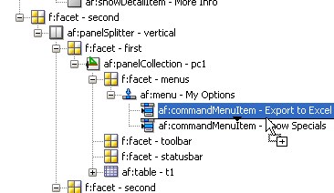
In the Insert Export Collection dialog, type t1 as the ExportedId and select excelHTML for the Type.
Then click OK.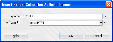
-
Save all your work, return to the browser and reload the page.
-
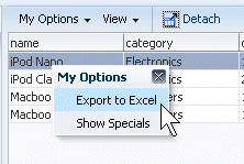
Click the My Options menu option.
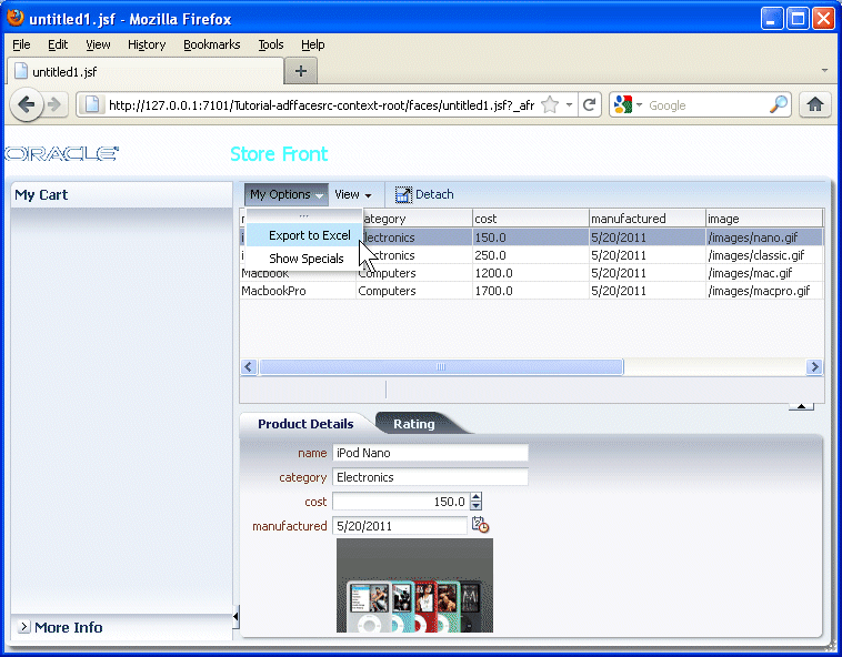
Notice that you can detach the menu options from the menu bar.

-
Select the Export to Excel menu option.
-
Your browser may prevent you from downloading files, except to download. A dialog prompts you for an action to perform with the file, allowing you to open it with Excel or save it.
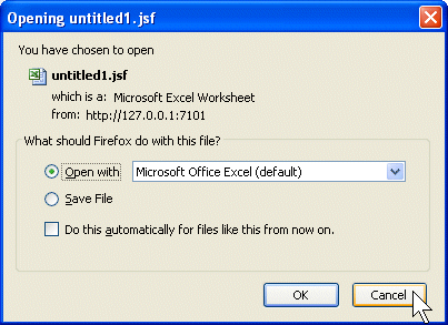
Click Cancel. Leave the browser window open and switch back to JDeveloper.
-
Now lets create a popup window to enhance the properties of a specific product.
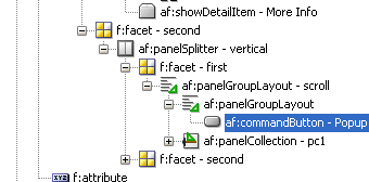
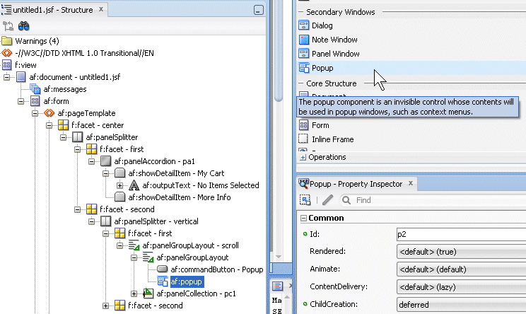
In the Structure pane, select the form component. In the Component Palette, expand the ADF Faces - Layout - Secondary Windows library and select the Popup item and drop it onto the form.
You can use the popup component with a number of other ADF Faces components to create a variety of dialogs, menus, and windows that provide information or request input from end users.Read more...
Using these components, you can configure functionality to allow your end users to show and hide information in secondary windows, input additional data, or invoke functionality. The capabilities offered by these components allow you to render content or functionality that is supplemental to the content rendered on the primary interface and, as a result, develop uncluttered and user friendly interfaces.
The popup component is an invisible layout control, used in conjunction with other components to display inline (that is, belonging to the same page) dialogs, windows, and menus. The popup component is invoked from within the primary interface and the application manages the content that renders in the popup component like content in the primary interface without interference from popup blockers. It is recommended that the content type you render in a popup component be HTML. Other types of content, such as Flash or PDF files, may not render appropriately in a popup component.
-
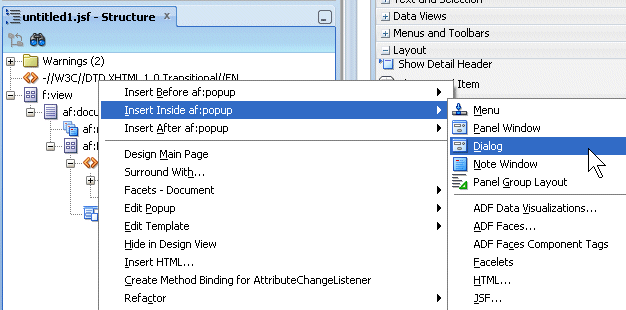
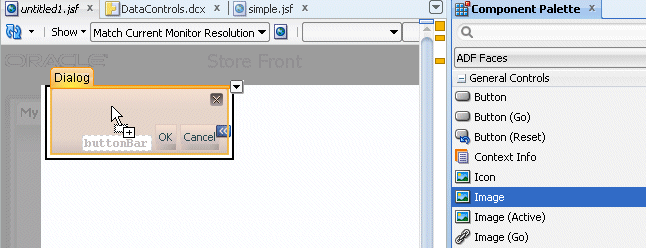
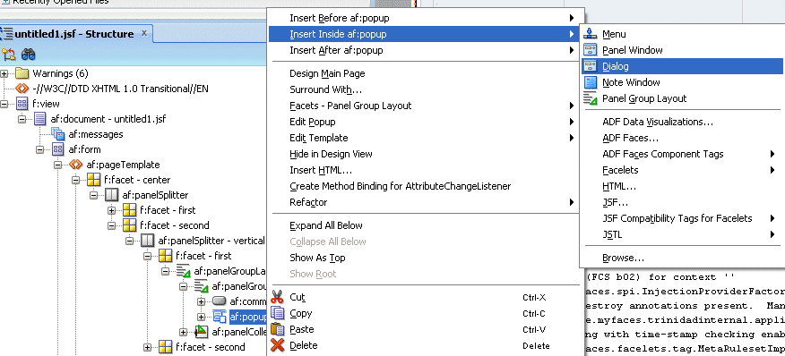
Right click the popup component and select Insert inside Popup - Dialog from the context menu.
-
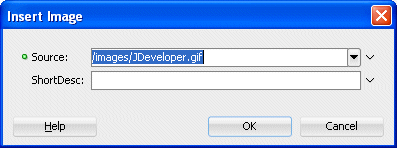
From the Component Palette, expand the General Controls and select the Image component, then drop it within the Dialog.
Click In the Insert Image dialog, from the drop-down list, select the /images/JDeveloper.gif image as the source.
Then click OK.
-
Click outside the image to get rid of the dialog. If the untitled1.jsf page come to the front, select af:dialog from the Structure Pane.
-
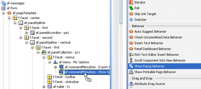
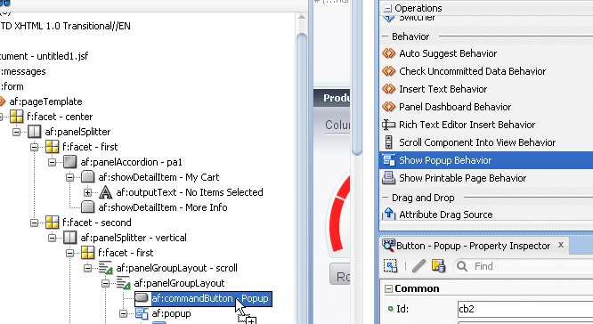
From the Component Palette, in the Operations - Behavior library, select the Show Popup Behavior component and drop it onto the second commandMenuItem.
-
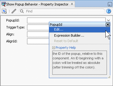
In the Property Inspector, for the PopupId field, select Edit from the drop-down list.
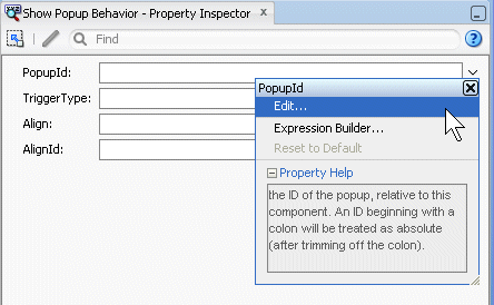
Click in the Edit Property Dialog, expand the nodes and select the popup - p1 component, and then click OK.
-
Save all your work, go back to the browser and reload the page.
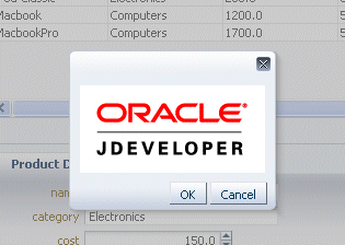
Click the My Options menu and select, Show Specials.
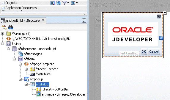
The Dialog pops up containing the JDeveloper image.
-
You will now provide drag and drop functionality between Product Details and the shopping cart allowing users to fill the cart from the Product Details using a simple drag and drop operation.
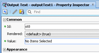
Back in JDeveloper, select an Output Text component and drop it onto the My Cart pane.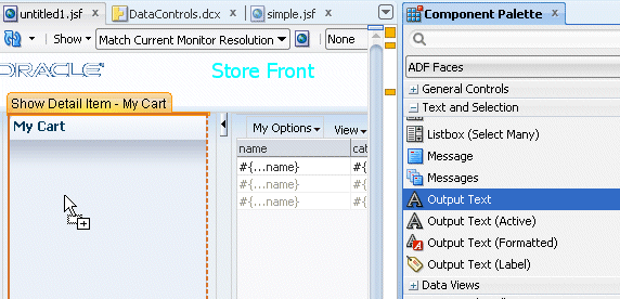
In the Property Inspector type No Item Selected as the Value for the Output Text.
-
In the Component Palette, from the ADF Faces - Operations - Drag and Drop library, select the Attribute Drag Source component and drop it onto the name field of the Product Details pane.
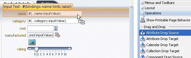
In the Insert Attribute Drag Source dialog, select value from the drop-down list. Product Details pane.
Click OK.
-
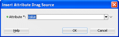
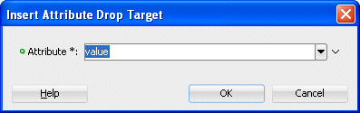
From the Component Palette ADF Faces - Operations - Drag and Drop, drag and drop an Attribute Drop Target component onto the No Item Selected text field.
In the Insert Attribute Drop Target dialog, select value in the Attribute field. Then click OK.
-
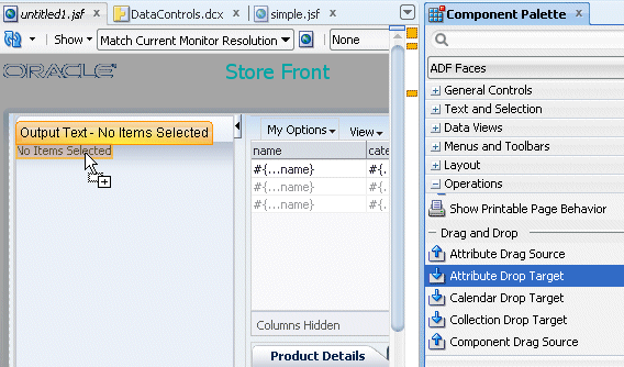
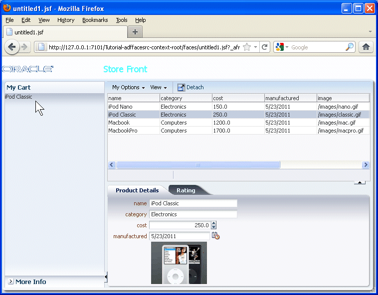
Save all your work, then in the browser reload the page, then select an item in the table to display the corresponding Product Details.
In the Product Details pane, select the name field..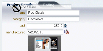
... and drag it, then drop it onto the No Items Selected text in My Cart.
The product should be added to the cart.
Click Cancel. Leave the browser window open and switch back to JDeveloper.
-
In the next few steps, add a menu option to take the current information and make it into a printable page. In JDeveloper, add another Menu Item and set the Text property to Printable Page.
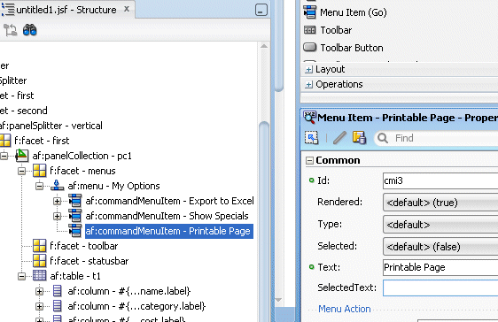
-
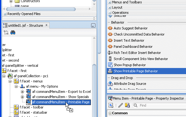
Expand the Operations - Behavior components, drag a Show Printable Page Behavior onto the menu option.
-
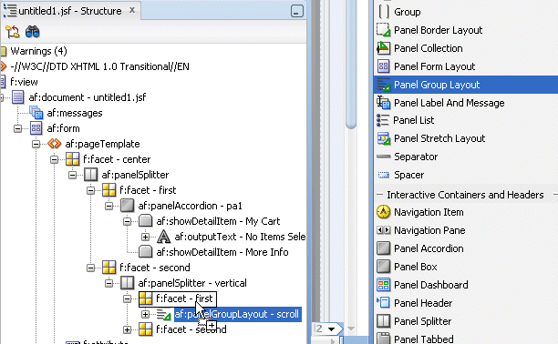
In the next couple of steps, add a popup page to show products using a carousel.
From the Layout components, select a Panel Group Layout and drag it to the f:facet - first component in the Structure pane.
You can display images in a revolving carousel.Read more...
Users can view a series of images, one for each record. Then they can change the image at the front either by using the slider at the bottom or by clicking one of the auxiliary images to bring that specific image to the front.
By default, the carousel displays horizontally. The objects within the horizontal orientation of the carousel are vertically-aligned to the middle and the carousel itself is horizontally-aligned to the center of its container.
You can configure the carousel so that it can be displayed vertically, as you might want for a reference rolodex. By default, the objects within the vertical orientation of the carousel are horizontally-aligned to the center and the carousel itself is vertically aligned middle. You can change the alignments using the carousel's alignment attributes.
-
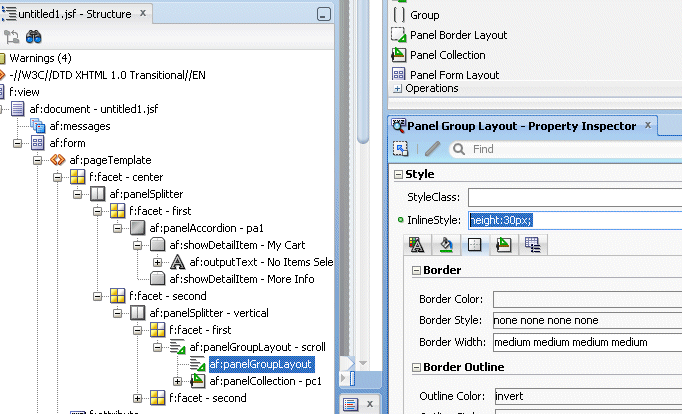
Move it so it's above the af:panel collection. Then in the Property Inspector, expand the Style node and set the Inline Style to 30px.
The page should look like the following image
-
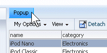
Drag a Button from the General Controls library onto the af:panelGroupLayout. Then set the Text property to Popup
-
From the Layout - Secondary Windows library, drag a Popup onto the af:panelGroupLayout. It will be positioned below the Popup button
-
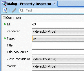
Right click the new af:popup and select Insert Inside Popup - Dialog .
In the Property Inspector, set the Dialog Type to ok.
-
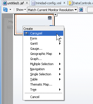
In the Data Controls pane, expand the StoreProducts and select the products node.
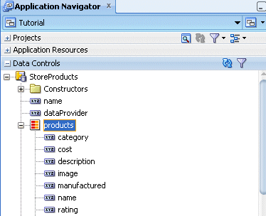
Drag it onto the dialog and drop it. In the menu, select Carousel.
-
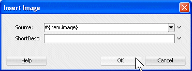
In the General Controls library, select the Image component then drag and drop it onto the carousel.
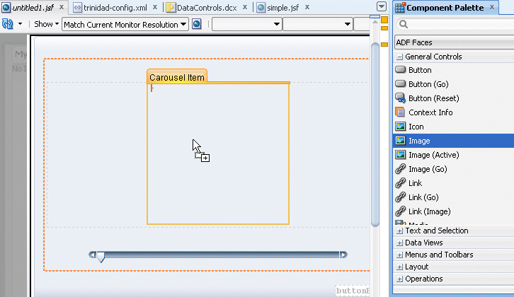
In the Insert Image dialog, enter #{item.image} as the value for the Source property. You can leave the ShortDesc blank.
Then click OK.
-
Save all your work and then in the Structure pane, select the af:panelGroupLayout to bring the untitled1 page back to the forefront.
-
Expand the Operations - Behavior library and drop a Show Popup Behavior component onto the Popup button.
-
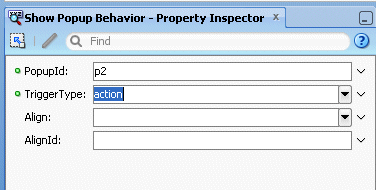
From the Property Inspector, select Edit in the PopupId property.
-
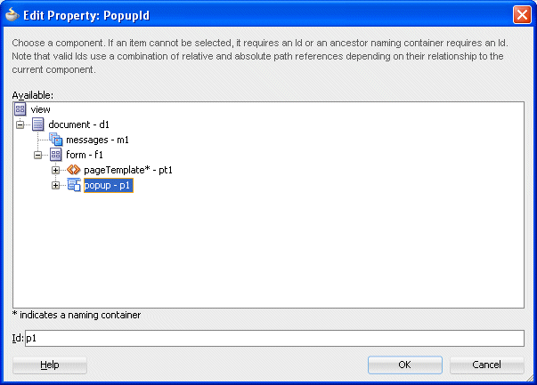
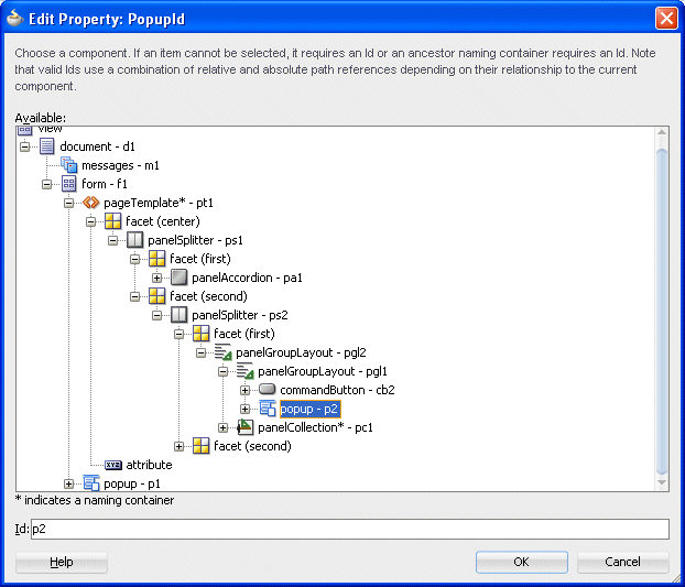
In the Edit Property: PopupId dialog, expand the view - document - form nodes and select the popup - p2 component.
Then click OK.
-
In the Property Inspector, set the Trigger Type property to action.
-
Save all your work and Run the page. When it is displayed in the browser, click the My Options - Printable Page menu.
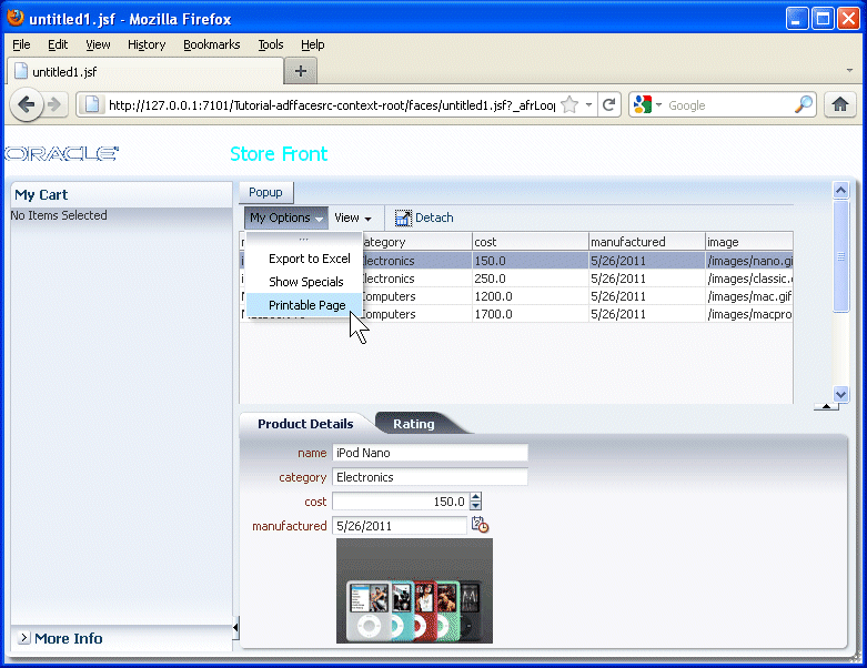
The table component of the page is displayed in a separate tab in the browser and ready to be sent to a printer .
-
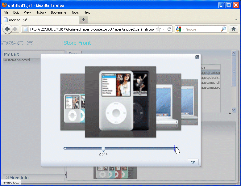
Switch back to the original untitled1.jsf page and click the Popup button.
-
In the popup window the product images will display. Click the widget to view all the product images. When done testing, click OK.
-
Leave the browser window open and switch back to JDeveloper.
We want to add a gauge to display the rating of any particular product. To create this gauge, perform the following steps:
The ADF data visualization components provide significant graphical and tabular capabilities for displaying and analyzing data. Read more...
These data visualization components provide the following common features:
-
They are full ADF Faces components that support the use of ADF data controls.
-
They provide for declarative design time creation using the Data Controls Panel, the JSF visual editor, Property Inspector, and Component Palette.
Each component offers live data preview during design. This feature is especially useful to let you see the effect of your design as it progresses without having to compile and run a page. Data visualization components include: graph, gauge, pivot table, geographic map, thematic map, Gantt charts, and hierarchy viewer. The prefix dvt: occurs at the beginning
The gauge (gauge) component renders graphical representations of data. Unlike the graph, a gauge focuses on a single data point and examines that point relative to minimum, maximum, and threshold indicators to identify problem areas. One gauge component can create a single gauge or a set of gauges depending on the data provided. The following kinds of gauges can be produced by this component:
Dial gauge: Creates a gauge that indicates its metric value along an 180-degree arc. This type of gauge usually has an indicator in the shape of a line or an arrow that points to the value that the gauge is plotting.
Status meter gauge: Creates a gauge that indicates the progress of a task or the level of some measurement along a horizontal rectangular bar. An inner rectangle shows the current level of a measurement against the ranges marked on an outer rectangle.
Status meter gauge (vertical): Creates a gauge that indicates the progress of a task of the level of some measurement along a vertical rectangular bar
LED (lighted electronic display) gauge: Creates a gauge that depicts graphically a measurement, such as key performance indicator (KPI). Several styles of graphics are available for LED gauges such as arrows that indicate good (up arrow), fair (left- or right-pointing arrow), or poor (down arrow).
You can specify any number of thresholds for a gauge. However, some LED gauges (such as those with arrow or triangle indicators) support a limited number of thresholds because there are a limited number of meaningful directions for them to point. For arrow or triangle indicators, the threshold limit is three.
-
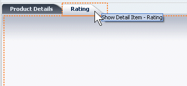
Back in JDeveloper, click the Rating tab.
-
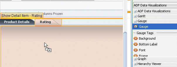
In the Component Palette, from the ADF Data Visualization - Gauge library, drag and drop the Gauge component onto the Rating pane .
-
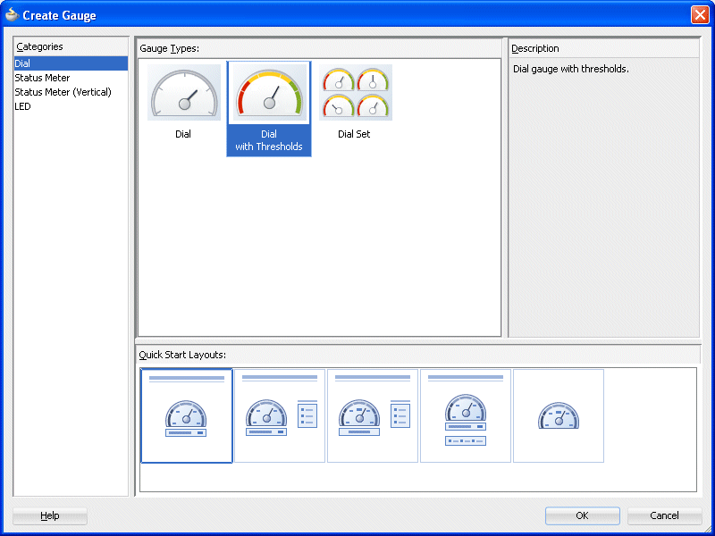
In the Create Gauge dialog, select the Dial category, then Dial with Thresholds as the gauge type and finally pick up the left most quick start layout proposal. Then click OK.
-
The new gauge appears in the Rating pane.
-
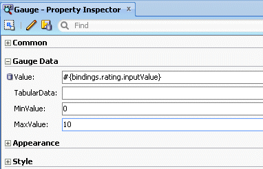
In the Property Inspector, for the Value field, select Expression Builder from the drop-down list.
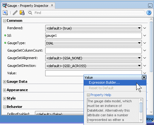
In the Expression Builder dialog select ADF Bindings - binding - rating - inputValue as the expression.
Then click OK.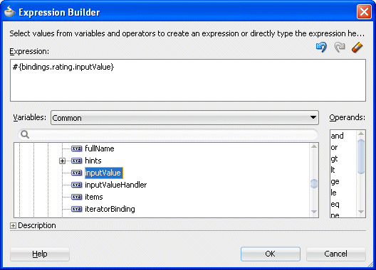
-
In the Structure pane, select the gauge component and in the Property Inspector, set the Gauge Data | Max Value field to 10.
Then click OK.
-
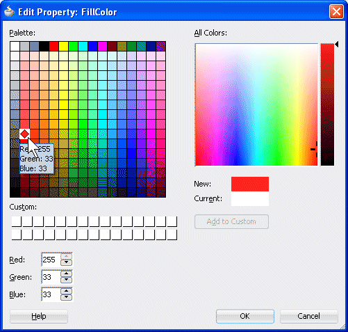
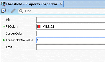
In the Structure pane, expand the gauge | thresholdSet component. Then select the first threshold and in the Property Inspector, for the FillColor select Edit from the drop-down list
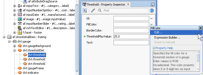
In the Edit Property dialog, select a reddish color from the palette and click OK.
Set the ThresholdMaxValue to 4.
-
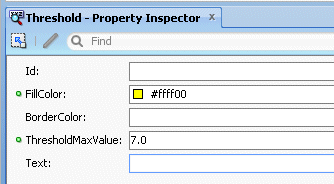
In the e Structure pane, select the second threshold and repeat the last step with a yellowish color for the FillColor property and a ThresholdMaxValue set to 7 .
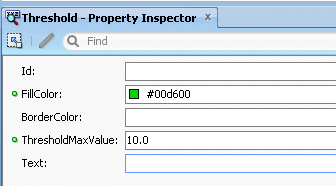
Finally, select the third threshold and repeat the last step with a greenish color for the FillColor property and a ThresholdMaxValue set to 10 .
-
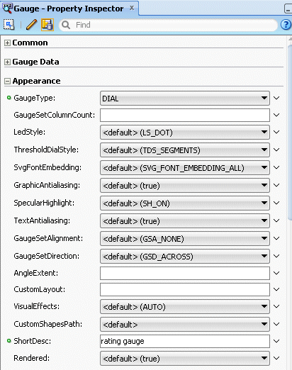
In the Structure Pane, select the dvt:gauge component and set the Appearance - ShortDesc property to rating gauge.
-
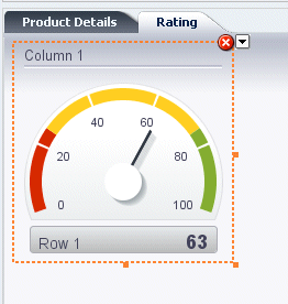
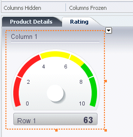
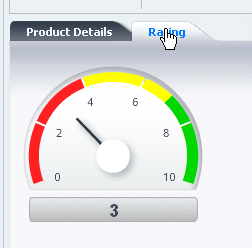
Save all you work. The gauge should look like the following image
-
Right click within the page and select Run.
-
If you select a product from the table, and click the Rating tab, the gauge displays the current rating value for that product.
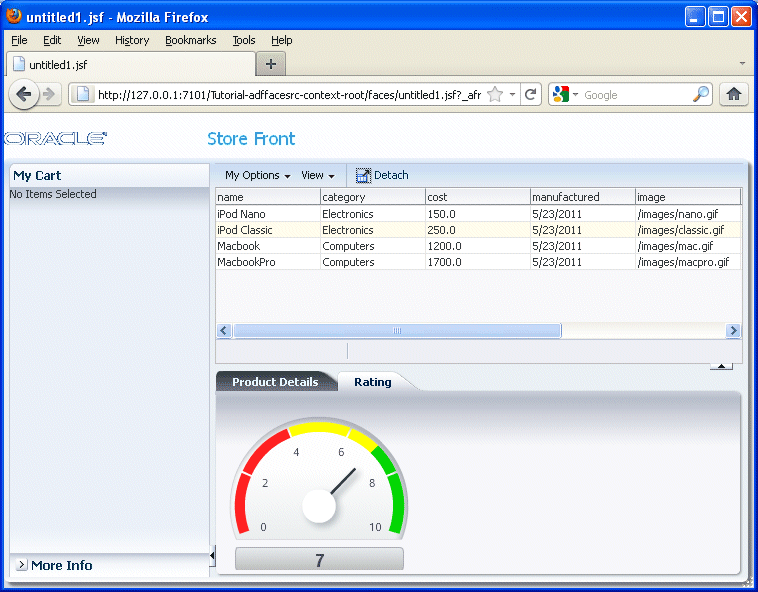
Click the Product Details tab and move the slider to change the rating value.
Click the Rating tab to see the new value reflected in the gauge.
Finally in this section you'll see how to change the look and feel of the whole application using a parameterized css file. To implement this functionality, perform the following steps:
Read more... You can apply an ADF skin to the application or by applying CSS style properties directly to an ADF Faces or ADF DVT component if the component exposes a style-related property (styleClass or inlineStyle). Choosing the latter option means that you override style properties defined in your application's ADF skin for the component. You might do this when you want to change the style for an instance of a component on a page rather than for all components throughout the application or you want to programmatically set styles conditionally. For example, you want to display text in red only under certain conditions.
An ADF skin is a type of CSS file where you define CSS style properties based on the Cascading Style Sheet (CSS) specification for the component for which you want to customize the appearance. The ADF skin defines rules that determine how to apply CSS style properties to specific components or groups of components. The end user's browser interprets these rules and overrides the browser's default settings.
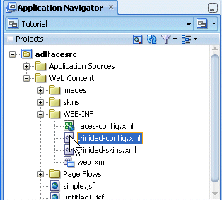
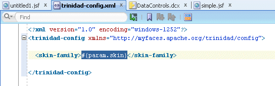
In the Application Navigator, expand the Web Content - WEB-INF node and double-click the trinidad-config.xml file to open the file in the editor.
-
The file contains a parameter enabling you to use a different css file.
-
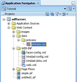
In the Application Navigation, notice that there is a princess.css file in the skins - princess folder.
-
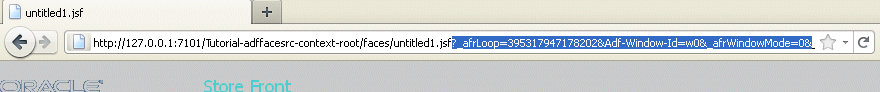
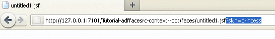
In the browser window, remove the last part of the URL (after the untitled1.jspx page name).
-
Append the following string ?skin=princess at the end of the URL and press Enter.
-
Notice the changes in the look and feel of the application.
Colors, Tabs and Accordions are now using the princess css.Experiment with the page.
When finished, close your browser window. You have successfully completed this tutorial
- Create a Page Template
- Design a Page using the Page Template
- Use Input and Output Components
- Implement Partial Page Rendering
- Work with Operational Components
- Work with ADF Data Visualization Components
- Use Skins to Change the Look and Feel of an Application
 Expand all |
Hide all
Expand all |
Hide all