Rendering Components for Selecting Multiple Values
In some cases, you need to allow your users to select multiple values rather than just one value from a list of choices. You can do this using one of the following kinds of components:
-
A set of check boxes
-
A drop-down menu
-
A list box
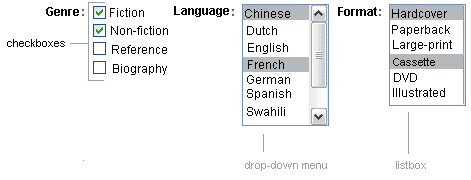
Figure 11–5 shows examples of these components.
Figure 11–5 Example Select Many Components

The UISelectMany class defines a component that allows the user to select zero or more values from a set of values. This component can be rendered as a set of check boxes, a list box, or a menu. This section explains the selectManyCheckbox tag. The selectManyListbox tag and selectManyMenu tag are written in a similar way.
A list box differs from a menu in that it displays a subset of items in a box, whereas a menu displays only one item at a time when the user is not selecting the menu. The size attribute of the selectManyListbox tag determines the number of items displayed at one time. The list box includes a scroll bar for scrolling through any remaining items in the list.
The selectManyCheckbox tag renders a set of check boxes, with each check box representing one value that can be selected. Duke’s Bookstore uses a selectManyCheckbox tag on the bookcashier.jsp page to allow the user to subscribe to one or more newsletters:
<h:selectManyCheckbox
    id="newsletters"
    layout="pageDirection"
    value="#{cashier.newsletters}">
    <f:selectItems
        value="#{newsletters}"/>
</h:selectManyCheckbox>
The value attribute of the selectManyCheckbox tag identifies the CashierBean backing bean property, newsletters, for the current set of newsletters. This property holds the values of the currently selected items from the set of check boxes. You are not required to provide a value for the currently selected items. If you don’t provide a value, the first item in the list is selected by default.
The layout attribute indicates how the set of check boxes are arranged on the page. Because layout is set to pageDirection, the check boxes are arranged vertically. The default is lineDirection, which aligns the check boxes horizontally.
The selectManyCheckbox tag must also contain a tag or set of tags representing the set of check boxes. To represent a set of items, you use the selectItems tag. To represent each item individually, you use a selectItem tag for each item. The following subsection explains these tags in more detail.
- © 2010, Oracle Corporation and/or its affiliates
