| C H A P T E R 27 |
|
Widget Reference |
This chapter provides a brief description of each of the Motif widgets in the widget palette and gives hints for their effective use. It also describes some of the quirks of each widget. Only basic information is given here. For a full description of each widget, including all its resources, see the Motif Programmer's Reference Manual.
Each widget description starts with a list of resources grouped by page in the resource panel. Also listed are the callbacks applicable to the widget. Although, strictly speaking, the callbacks for a widget are resources, they are added, edited and viewed in a separate callbacks dialog.
Core resources are not listed to avoid repetition. Resources in bold typeface are frequently set and so are of interest to users regardless of their level of expertise. Resources in normal typeface are less commonly used and you may require more knowledge to use them effectively. Resources that are in italics are not applicable to that widget and are insensitive on the resource panel.
PrintShell and GrabShell are treated slightly differently in X-Designer. By default they do not appear on the widget palette. To display them on the palette, you should remove them from the "stopList" resource in in X-Designer's resource file. Editing the stopList resource is described in Palette Contents. These widgets are not on the palette because they would only be used in very specific circumstances.
|
Note - If you invoke X-Designer using the command smallxd, the widget icons are smaller and slightly different from those shown here. |
The ArrowButton widget provides a button with an arrow on it instead of a text label. The arrow can point up, down, left, or right. Choose one of the four directions by selecting the appropriate direction from the option menu on the ArrowButton resource panel which is shown in FIGURE 27-1.
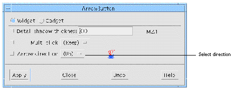
Unlike other button widgets, ArrowButtons are not derived from the Label and cannot display text or pixmap labels.
The BulletinBoard widget is the most basic container widget. It is most commonly used internally by Motif to implement other container or composite widgets such as the Form, SelectionBox and MessageBox. These derived widgets are often more useful than the BulletinBoard itself.
As a container widget, the BulletinBoard does not impose any particular layout on its children. It provides absolute positioning, margin constraints and lets you specify whether the widgets inside are allowed to overlap or not. Resizing the BulletinBoard does not move or resize the widgets in it.
The BulletinBoard is most useful for transient dialogs that are not meant to be resized. For resizable dialogs, use a Form or DialogTemplate. You can also use a BulletinBoard for cases where complicated positioning is required and code is to be written for this purpose.
Only the Move and Resize options of the Layout Editor can be used with a BulletinBoard. Attachments between widgets and position attachments are not available. For more flexible layout options, use a Form widget.
If a BulletinBoard is the child of a Shell, the BulletinBoard's "Title" resource is used as the title of the Shell's window.
Note that the "Title", "Dialog style", "Default position" and "No resize" resources are disabled if the BulletinBoard is a child of the Form.
The "Auto unmanage" resource, when set to "Yes", makes the dialog disappear whenever you click on a button child of a BulletinBoard. This behavior, which is the default behavior in Motif, is useful for transient dialogs but can be confusing in main windows. X-Designer explicitly sets this resource to "No" for the BulletinBoard and two of its derivatives, the DialogTemplate and the Form. With other BulletinBoard derivatives, X-Designer does not override the default "Yes" setting and so the dialog does disappear if you click any button. To restore your dynamic display, reset the Shell or select the Shell icon in the window holding area.
The "Default position" resource controls how the position of the window on the screen is determined. If you set this resource to "No" on a BulletinBoard (or derivative) that is a child of a Shell, the window is displayed in the position determined by the x and y resources of the BulletinBoard, not those of the Shell. As this behavior is dependent on the window manager, it may not be consistent.
The CascadeButton widget is used to display a menu. A CascadeButton can only be used as the child of a MenuBar or Menu. When it is the child of a MenuBar, a pulldown menu is displayed and when it is the child of a Menu, a pullright menu is displayed. Sample hierarchies showing these specific uses of the CascadeButton are located in the Menu widget description.
The only permissible child of a CascadeButton is a Menu. When a user clicks on a CascadeButton, a menu is displayed.
In Motif, a Menu is not technically a child of a CascadeButton but of the button's parent. To indicate this, the connection between a CascadeButton and its menu is drawn with a dotted line instead of the normal solid line.
You can set keyboard mnemonics for CascadeButtons to let the user navigate through the menus without using the mouse.
Note that the Mapping delay resource can be used only when the Button is used to instigate a pullright menu.
ComboBox is a composite widget which includes a TextField and a ScrolledList. It combines text entry and selection from a list. It can be configured in a number of ways depending on whether the TextField is editable and whether the ScrolledList is permanently visible. When the list is not visible, an arrow is drawn. When the arrow is pressed, the list drops down into view. When an item is selected from the list, the item is placed in the TextField and the list disappears. If a value is typed directly into the TextField, any corresponding item is not selected from the list.
By default, the ComboBox always displays the ScrolledList. Since this is not the best use of a ComboBox, X-Designer automatically sets the "ComboBox type" resource (from the Settings page of the resource panel) to "Drop-down list". This causes the TextField and arrow to be visible and the list to drop down when the arrow is pressed. Because this is a resource which is set only when the widget is created, you cannot see the effect of changing it in X-Designer. If you do wish to change this resource, whatever you choose will be correctly generated and the effect you require will be visible in the resulting application.
The choices for the "ComboBox type" resource are:
You can set the behavior of the ComboBox so that when a character is typed, instead of appearing in the TextField, an item from the list is selected whose first character matches the character typed. To do this, you must have the following set in X-Designer:
Another resource of interest to the ComboBox is "Layout direction" in the core resource panel of the ComboBox's Shell ancestor. When this resource is set to "Left to right", which is the default, the arrow appears on the right of the TextField. When it is changed to "Right to left", the arrow appears on the left. Because this resource is checked only when the ComboBox is created, it cannot be set dynamically inside X-Designer other than through loose bindings. You would need to set the "Resource name" in the Loose Bindings dialog to "layoutDirection" and the "Resource value" to "RIGHT_TO_LEFT". See Loose Bindings for more information on using loose bindings.
The Command widget is a composite widget used to select a command from a scrollable history list of commands. Commands can be typed into a text area at the bottom of the widget. When a command is entered, it is added to the end of the history list. A Command inherits some BulletinBoard resources. To display the BulletinBoard resource panel, click on "Bulletin Board Resources" in the resource panel.
A Command contains a ScrolledList widget for the command history region, a Label widget for the command line prompt and a Text widget for the command entry region. These components are contained in a BulletinBoard widget that is not visible in the design hierarchy. You can change the default resource settings for the component widgets but you cannot delete them. To change the prompt, change the "Prompt string" resource in the resource panel of the Command, not in the resource panel of its Label child.
A Command is usually used in a Shell or MainWindow.
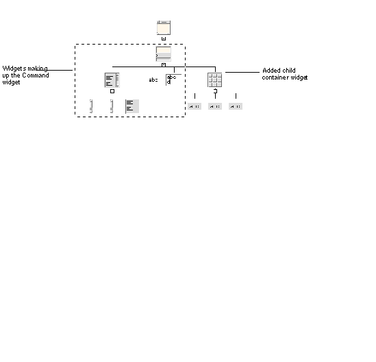
You can add multiple children to a Command. The first child becomes the work area. This can be a container widget containing additional widgets. The "Work area placement" resource controls where the work area appears in the dialog, even though it appears at the end of the Command widget's hierarchy as shown in FIGURE 27-2. The additional children can include a MenuBar and any number of PushButton widgets.
 [ D ]
[ D ]
A Container is a constraint widget which takes only IconGadget children. The Container has three layout styles each of which provides a different appearance and function. They are:
The Outline layout style provides a tree view onto the items inside the Container, such as you might find in a file manager browser window. With this style, the Container creates PushButtonGadgets that are used for folding and unfolding portions of the tree. The Detail style gives a tabular layout and behaves like a grid, allowing the IconGadget children to span more than one column. Detail can be combined with Outline constraints to give multi-column tree format. The Spatial style provides a more generic layout in which the exact positioning of the items is controlled by further resources. It also acts as a drag and drop icon box in which the items can be moved around using the mouse pointer.
In X-Designer, the layout style is dynamic and controlled by the "Layout type" resource on the Settings page of the Container resource panel.
For each IconGadget child of the Container, you can set Constraints. Select the IconGadget and choose "Constraints" from the Widget menu. You may need to use these Constraints if you need to add "Detail" to an IconGadget.
The Convert and Destination callbacks are integral to the drag-and-drop ability in the Spatial layout style. These form part of the Uniform Transform Model for drag-and-drop which came into being with Motif 2. The Container widget is the only widget which, through these callbacks, may require some programming in order to interact with the Uniform Transfer Model. It handles drag-and-drop only in Spatial mode, whereas for other widgets, drag-and-drop is handled by the Model implicitly.
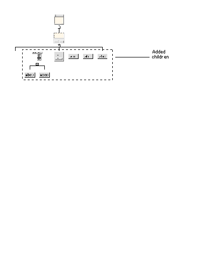
The DialogTemplate widget is usually used as the child of a Shell for a broad range of dialogs. It provides a standard layout that includes, from top to bottom, a menu bar, a work area, a Separator, and a button box.
The DialogTemplate is a specially configured MessageBox and shares its resource panel. It also inherits some BulletinBoard resources. To display the BulletinBoard resource panel, click on "Bulletin Board Resources" in the resource panel.
The Separator is a component part of the DialogTemplate. You must add the other elements of the standard layout if you want them: for example, a MenuBar, any type of widget for the work area and buttons of any type for the button box, as shown in FIGURE 27-3. The work area can be a container widget, such as a Form, with children. The DialogTemplate always arranges its children in the standard order from bottom to top, regardless of the order in which you add them to the hierarchy.
 [ D ]
[ D ]
The areas of the standard layout are constrained to be the same width, with the buttons in the button box evenly spaced in one or more rows. The buttons are automatically rearranged as needed when the window resizes.
The DrawingArea widget provides an area in which an application can display output graphics. For example, the design hierarchy in the main X-Designer window is drawn in a DrawingArea contained in a ScrolledWindow.
To display the Layout Editor, select "Layout..." from the Widget menu or press the Layout button on the toolbar. Only the Move and Resize options of the Layout Editor can be used with a DrawingArea. Attachments between widgets and position attachments are not available.
To display the resource panel, select "Resources..." from the Widget pulldown menu or double-click over the widget.
Although a DrawingArea can have any number and types of children, it is not very useful for managing the geometry of other widgets. Other container widgets such as the Form should be used for this purpose instead.
X-Designer cannot help you with drawing in the drawing area. To do this, you must write code containing X Graphics calls. This code is normally put in the "Expose" callback.
The DrawnButton widget is similar to a PushButton except that its face must be drawn by the application instead of being drawn automatically. It can be used to provide a button that has a context-sensitive appearance.
To display a picture on a button, it is usually easier to use a PushButton with a pixmap for the image. Drawing the picture on a DrawnButton requires writing code containing X graphics calls, which is normally put in the "Expose" callback.
The FileSelectionBox widget is a composite widget that lets users browse through the file system and select a file. The file browser in X-Designer is an example of a FileSelectionBox. The Generate Dialog is a FileSelectionBox with a work area child. The FileSelectionBox is derived from the SelectionBox and shares its resource panel.
The FileSelectionBox combination includes two ScrolledLists, two TextFields, four Labels, a Separator and four PushButtons, which are gadgets. These components are contained in a BulletinBoard widget that is not visible in the design hierarchy. To display the resources inherited from the BulletinBoard, click on "Bulletin Board Resources" in the resource panel.
While a FileSelectionBox can be used anywhere that a BulletinBoard can, it is usually placed in a Dialog Shell that is popped up for file selection.
To change the labels of button or label widgets from the defaults, change the resources in the resource panel of the FileSelectionBox, not in the resource panels of the individual widgets.
You can add multiple children to a FileSelectionBox. The first child becomes the work area. This can be a container widget containing additional widgets. The "Work area placement" resource controls where the work area appears in the dialog, even though it appears at the end of the FileSelectionBox widget's hierarchy. The additional children can include a MenuBar and any number of PushButton widgets.
The Form widget is a container widget that provides both absolute and relative positioning of its children widgets. It is commonly used to lay out widgets in a dialog, either as a child of a Shell or as the work area in a DialogTemplate or similar widget.
The layout of widgets in a Form is specified by using attachments on children of the Form. Different types of attachments let you specify different types of spatial relationships such as a fixed location within the Form, a relative location within the Form, or a fixed distance between widgets. These capabilities allow considerable flexibility and reliable behavior when widgets or windows are resized. X-Designer lets you specify these attachments interactively in the Layout Editor. For more information, see the Layout Editor chapter.
You can view the attachments set on any child of a Form by using the Constraints panel. Select any child of the Form, pull down the Widget Menu and select "Constraints...". Use of this panel is described in the Using the Resource Panels chapter. It is particular useful if you have to superimpose one widget over another.
The "Auto unmanage" resource, if set to "Yes", makes the dialog erase whenever you click on a button child of a Form. This behavior, the default behavior in Motif, is useful for transient dialogs. However, because a Form is often used for main windows, X-Designer explicitly sets this resource to "No" in the case of the Form. Set it to "Yes" if you want a Form to auto unmanage.
For more details, see BulletinBoard.
The Frame widget is used to provide a border, possibly with a title, around a widget that otherwise has none, to enhance the border of a widget that already has one, or to create a border around a group of widgets. A Frame can be used to provide three-dimensional effects, like indenting a DrawingArea.
A Frame can have two children. The first is placed inside the Frame and the second (which is optional) is used as a title. The second child is usually a Label.
To create a border around a group of widgets, they must be placed in a container widget such as a RowColumn or a Form, that is the child of a Frame, as shown in FIGURE 27-4.
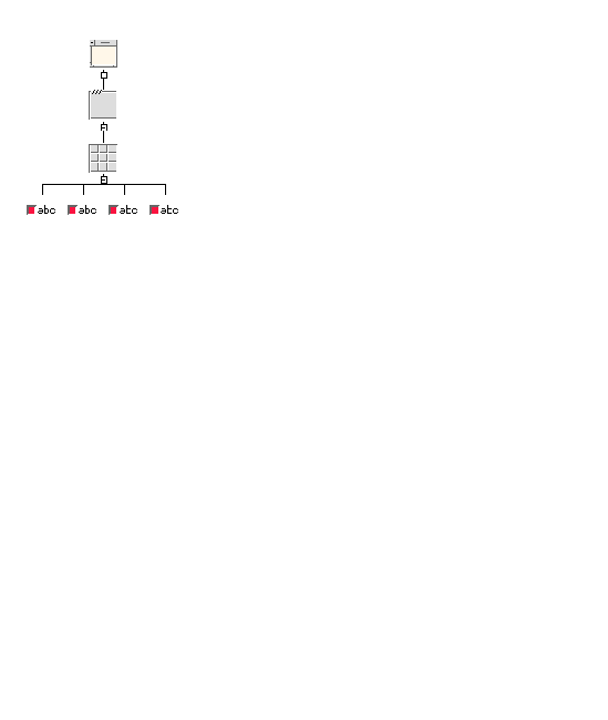
The Frame sizes itself to match the size of its children.
|
Note - This widget does not appear on the palette by default. It is on the X-Designer stop list. |
When it is mapped, GrabShell immediately grabs the pointer and keyboard. Possible uses include a dialog or popup menu which, when it appears, directs focus to one of its children. the ComboBox uses a GrabShell to implement its popup List.
You should only use GrabShell if you have a specific need for the behavior it provides. For this reason it is only available if you edit X-Designer's resource file to remove it from the list of widgets which, by default are not displayed on the widget palette.
This is a gadget for displaying both text and a pixmap. The text can be centered below the pixmap or placed to the side. This is controlled by the "View type" resource on the Settings page of the resource panel. A view type of "Large" centers the text below the pixmap, while "Small" aligns the text and pixmap horizontally. Since you can specify different large and small pixmaps, the view type resource controls which pixmap is visible.
IconGadgets are the only type of children that a Container can take and were created for that purpose. They can, however, exist without a Container. The "Details" resource on the Items page of the resource panel only has an effect when the IconGadget is the child of a Container. This is a list of strings which represent the detail information associated with an IconGadget.
The Label widget provides a static display area for text or pixmap images. Labels are commonly used to display descriptive text strings or icons or logos. Labels can be placed in menus to provide unselectable titles for groups of menu items.
A string in a Label can extend over multiple lines and have multiple fonts. Multiple fonts are supported using the Compound String Editor, which is discussed in Compound Strings.
If you set a pixmap for a Label, the Label does not display it until you also change its "Type" setting to "Pixmap".
The List widget is used to display a list of text items, one or more of which can be selected, depending on the setting of the "Selection policy" resource.
For a scrolling list of text items, use a ScrolledList widget, a composite widget that contains a List widget.
The Items page of the List resource panel lets you add items to the list so you can see what the list looks like. To add items, enter them into the "Items" resource box and press "Apply". To remove an item from the list, delete it from the resource box and press "Apply".
To see additional items, change the "Visible items" resource.
The Motif toolkit provides a large number of functions for manipulating Lists such as adding, removing and replacing items. For further details, see the Motif documentation.
Note that each item in a List is a compound string (XmString). It is therefore theoretically possible to use different fonts for different items, or for different parts of a single item. In practice, limitations of the toolkit make this inadvisable in Motif 1.2, but in Motif 2.1 items can also be colored differently.
The MainWindow provides a standard layout for an application's primary window. This standard layout includes, from top to bottom:
The MainWindow is a composite widget with three Separators and two ScrollBars. You must add the widgets for each element in the standard layout. Use a MenuBar for the menu bar and a Command for the command area. A Text or TextField is usually used for the message area. You must give the message area widget a variable name and specify that name as the "Message window" resource of the MainWindow.
The work area can be almost any other kind of widget. It can be a container widget with other widgets as children. A MainWindow ordinarily displays a scrolled window onto a work area whose size is fixed. If your work area is a Form, you may want to change the "Scrolling policy" resource to "Application defined". This removes the scroll bars and lets the Form resize with the window so that you can use the features of the Layout Editor to control resize behavior.
|
Note - "Scrolling policy" does not take effect in the dynamic display but works correctly in the generated code. |
If you do not add a work area to a MainWindow, the generated code produces warning messages when you run it.
Careful use of resources can make a Form emulate the behavior of a MainWindow. Experience has shown that it is often more convenient to use.
|
Popup enabled[1] |
|
|
Accelerator [2] |
|
|
Menu post1. |
|
The Menu widget provides pulldown, pullright and popup menus and is a specially configured RowColumn widget.
The active items in a menu can be PushButtons, ToggleButtons, or CascadeButtons. Menus can also contain Separators and Labels for display purposes.
To create a pulldown menu, add a Menu as a child of a CascadeButton that is a child of a MenuBar or OptionMenu. When a user clicks on the CascadeButton, the menu appears.
To create a pullright menu, add a Menu as a child of a CascadeButton that is a child of a Menu. When a user clicks on the CascadeButton, the menu appears. Pullright menus are only permitted in menus that are pulled down from a MenuBar, not in OptionMenus.
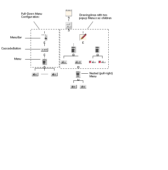
To create a popup menu using Motif 1.2, add a Menu as a child of a DrawingArea. When a user clicks on the DrawingArea with the right mouse button, the menu appears. A DrawingArea can have more than one popup menu as a child. In this case, the menu that pops up in the dynamic display depends on which menu is selected in the design hierarchy. For Motif 2, you can add popup menus to other widget classes as well. The menu is popped up automatically by the toolkit once you have set the "Popup enabled" resource to "Automatic".You can add Popup menus to gadgets but you must then set the "Popup enabled" resource to "Automatic recursive". Popup menus can only be attached to widgets so this resource tells the toolkit to find a widget in the hierarchy above the gadget. The popup menu will then appear when you press the mouse button over the gadget.
To create a Tear-off menu, set the Tear-off modal resource to enabled. Note that some Motif versions have a bug where, if this resource is not hard-coded and is part of the applications resource file, a call to XmRepTypeInstallTearOffModalConverter() must be made from either the main program or the Menu's pre-create prelude for the resource to take effect. X-Designer generates this code as appropriate into the main module.
FIGURE 27-5 shows design hierarchies for the three types of menus.
 [ D ]
[ D ]
Unlike pulldown and pullright menus, popup menus must be explicitly managed by the generated code. X-Designer does not do this automatically because popup menus are context-sensitive in most applications. You can do this by using the input callback of the DrawingArea to position and manage the menu, or with an action routine using the translations mechanism. Normally, the menu is positioned using XmMenuPosition() and managed using XtManageChild().
The alternative in Motif 2.1 is to use an XmNpopupHandler callback and set the XmNpopupEnabled resource to Automatic.
To create a Menu with mutually exclusive toggle buttons, set the "Radio behavior" resource to "Yes".
In Motif, Menus are technically siblings, not children, of the DrawingAreas or CascadeButtons from which they appear. However, X-Designer displays its hierarchy as if the Menus were children of these widgets because the DrawingArea or CascadeButton affects the Menu's behavior just as a parent widget does. X-Designer uses a dotted rather than a solid line to connect the Menu to its CascadeButton or DrawingArea. The dotted line indicates that the connection is not a true Motif parent-child relationship.
The MenuBar widget displays a set of CascadeButtons from which you can pull down menus.
MainWindow, DialogTemplate and SelectionBox provide standard layouts that can include a MenuBar. If you do not use one of these to contain the MenuBar, you must use a Form and attach the MenuBar to its top, left and right sides. For further information about the differences, see the descriptions of the MainWindow, DialogTemplate, SelectionBox and Form. For a design hierarchy that includes a MenuBar with a typical configuration of children, see FIGURE 27-5.
The default resource settings provide a standard menu bar as defined in the Motif Style Guide. You can change the "Packing" resource setting from "Tight" to "Column". "Tight" makes all buttons the minimum size to accommodate their text "Column" makes all buttons the same size
If you use "Column" packing, the "Alignment" resource can be set to center the labels on the buttons. Changing other resources is not recommended.
A MenuBar positions all its CascadeButtons close together starting at the left. If your menu bar has a "Help" button, the Motif Style Guide recommends placing it at the right end of the menu bar. To designate a CascadeButton as the "Help" button, enter its variable name as the "Help widget" resource of the MenuBar.
The MessageBox widget displays a message to the user. X-Designer's error messages are examples of MessageBoxes. The MessageBox is a composite widget that consists of three PushButton gadgets, two Labels and a Separator. These components are contained in a BulletinBoard that is not visible in the design hierarchy. To view the inherited BulletinBoard resources, click on "Bulletin Board Resources" in the resource panel.
Although a MessageBox can be used anywhere that a BulletinBoard can be used, it is usually placed in a Dialog Shell that is popped up to alert the user.
To display a message or pixmap in the message area, or to change the labels of buttons, change the resources in the resource panel of the MessageBox, not in the resource panels of the component widgets.
You can add a MenuBar and any number of button widgets as children of a MessageBox, as well as a single widget of another type, which becomes the work area. The work area can be a container widget, such as a Form, with children.
The Notebook widget is a container which lays out its children in "pages". With a binding pixmap and the appearance of overlapping pages behind the current page, the widget resembles a notebook. You can also specify tabs to divide the pages into sections and to navigate directly to a specific page. There are major and minor tabs; major tabs divide the Notebook's pages into sections and the minor tabs divide the pages within a section. An automatically created tab scroller consisting of four arrow button gadgets allows you to move between the tabs when it is not possible to display them all.
The Notebook also has a page scroller which allows you to move between the pages. This can be any widget or group of widgets capable of performing this function, but must be specified when the Notebook is created. By default, a SpinBox is automatically created as the page scroller.
The other element of a Notebook is the status area. Each page may have one of these for displaying information such as the page number.
When adding children to a Notebook, any of the Motif widgets from the standard X-Designer palette automatically becomes a page of the Notebook with the following exceptions:
Whether a widget is a page, tab, scroller or status bar is controlled by a constraint resource which can be viewed in the Constraint dialog for each child widget. The effect of this resource, however, cannot be seen in X-Designer, although it is generated correctly into the code and can then be viewed in the resulting application.
As pages are added to the Notebook, they are given a default page number and ordering. This can be changed in the Constraint dialog of the child widget. Similarly, the tabs and status areas can be assigned to different pages by changing the "Page number" resource in each individual widget's Constraints dialog.
Also on the X-Designer palette is a TabManager. This is a pre-configured Notebook whose resources have been set to provide a tabbed panel, as used for X-Designer's resource panels. The TabManager is described in its own section--TabManager.
The OptionMenu widget is used to display a one-of-many choice without using the screen space required by a set of radio buttons. The page selectors in X-Designer's resource panels are examples of OptionMenus.
An OptionMenu is a composite widget that includes a Label and a CascadeButton. You should add a Menu child to the CascadeButton, with a PushButton for each choice. You can use Separators to divide groups of options. FIGURE 27-6 shows a sample hierarchy. Note that you cannot have a cascading option menu.
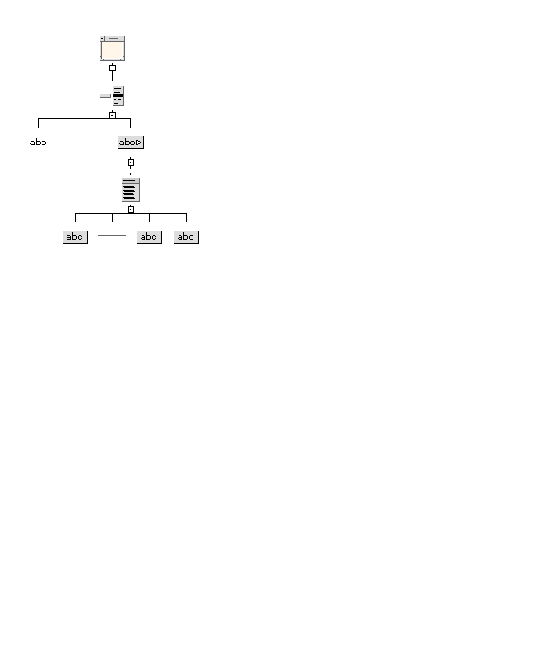
Set the label identifying the OptionMenu by changing the "Label" resource in the resource panel of the Label. Do not change the label of the CascadeButton as this displays the current setting of the OptionMenu.
The PanedWindow widget is used to lay out a set of widgets in a vertical column of uniform width. Each child widget is laid out in a vertical partition that is separated from adjacent children by a movable separator like a window sash. The user can move the sash to determine how much vertical space is allotted to each child. Since the height of a PanedWindow is less than the aggregate height of its children, a PanedWindow saves vertical space without sacrificing functionality. The children of a PanedWindow can be container widgets that control the layout of other widgets.
In Motif 2.1 the orientation of the separator can be vertical or horizontal.
The PanedWindow is a constraint widget. The Constraints panel applies to any child of the PanedWindow, not to the PanedWindow itself. You can display the Constraints panel by selecting "Constraints" from the Widget menu when one of the PanedWindow's children is selected. The Resource Panels chapter discusses how to use this panel.
The Constraints panel lets you set the "Minimum" and "Maximum" height resources for the child. These provide limits on the height of the widget's partition and positioning of the sashes.
The children in a PanedWindow are constrained to be the same width as the widest child.
You may need to reset a PanedWindow whenever you rearrange or resize its children.
|
Accelerator[3] |
|
The PushButton widget displays a button that can be "pressed" by clicking a mouse button over it. Like the Label, it can display either text or a pixmap.
There are different kinds of buttons for different needs, such as the ArrowButton and DrawnButton. For a button that pops up a menu, use a CascadeButton.
Setting the "Show as default" resource is not recommended since a BulletinBoard parent often changes this setting. The BulletinBoard decides which button to make the default.
A RadioBox widget is used to contain a group of ToggleButtons that act as radio buttons, meaning that they are mutually exclusive. Selecting one toggle in the group deselects the previously selected one. You can set the "Packing", "Columns", and "Orientation" resources to create multiple columns as for RowColumn.
The ToggleButtons in the RadioBox are gadgets.
You can make a RowColumn act like a RadioBox by setting its "Radio behavior" resource to "Yes". This configuration of the RowColumn provides more flexibility than the RadioBox does, e.g. to have Labels, Separators, or other widgets inside the box with the ToggleButtons, or to use the widget version of the ToggleButton instead of the gadget.
The RowColumn widget is used to arrange child widgets in a grid. It is often used for arranging items such as groups of buttons or toggles. For example, a Menu is a specially configured RowColumn widget. Other widgets that are based on RowColumn are OptionMenu, MenuBar, Menu and RadioBox.
A RowColumn can have any number of children. The default arrangement of RowColumn items is one vertical column. To create multiple columns, set the "Packing" resource to "Column", then set the "Columns" resource.
Items are read in order starting down the first column when the "Orientation" resource setting is "Vertical" and across the first row when the "Orientation" resource setting is "Horizontal". When the "Orientation" resource setting is "Horizontal", the "Columns" setting refers to the number of horizontal rows.
Because a RowColumn widget is not designed to have its layout changed dynamically, it may not display the changes you expect. If its children seem to be the wrong size on the dynamic display, try resetting the RowColumn.
|
Note - When you use multiple columns, a RowColumn forces all items to be the same width. Sometimes this results in wasted space, as in the "Before" view of FIGURE 27-7, where the left column has short Labels and the right column has long TextFields. You can resize the TextFields to match the width of the Labels. However, although the new value is accepted in the resource panel, the difference in width is not apparent in the dynamic display until you have changed the value for all of the TextFields, as shown in the "After" view. |
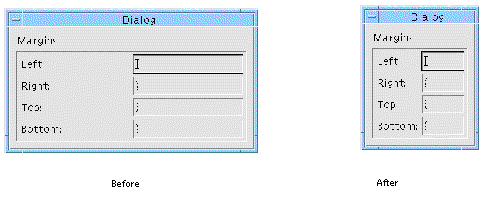
To create columns of unequal width, use a Form instead of a RowColumn. You can also nest RowColumns to create layouts that are more complex than rows and columns.
To create a group of radio buttons inside a RowColumn, use ToggleButtons and set the "Radio behavior" resource of the RowColumn to "Yes".
The Scale widget offers a range of values to choose from and displays a slider that can be moved to change the current value. You can drag the slider to move it continuously, click in the trough with the left mouse button to move the slider incrementally, or click in the trough with the middle mouse button to move the slider to the cursor location.
A Scale can have children of almost any type. These are usually Labels, which the Scale lays out evenly along its length.
Changing the orientation of a Scale can have strange effects. If problems occur, try resetting the Scale or its parent.
The ScrollBar widget lets users view data that requires more space than the display area provides. ScrollBars are rarely used alone. It is easiest to use them as part of a composite widget such as a ScrolledWindow, ScrolledList, or ScrolledText.
Each ScrollBar is represented as a rectangle with an arrow pointing outward at each end and a slider inside it. The display area is scrolled either by moving the slider or by clicking on an arrow. You can drag the slider to move it continuously, click in the trough or on the arrows with the left mouse button to move the slider incrementally, or click in the trough with the middle mouse button to move the slider to the cursor location. You can edit the resources to control the amount by which the display area scrolls on each scrolling action.
A ScrollBar cannot have children.
The ScrolledList widget is a composite widget that displays a scrollable list of items. A ScrolledList is a specially configured ScrolledWindow that contains a List widget. The resources of a List widget child can be set in the normal way.
A ScrolledList resizes itself whenever you add or delete items from the List so that its width always matches that of the widest item in the list. In some versions of the Motif toolkit, the ScrolledList may become confused about its correct width.
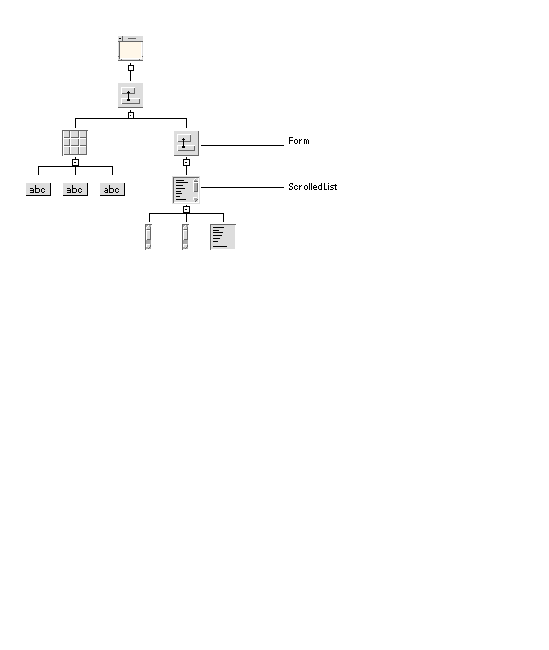
To prevent unwanted resizing, you must constrain a ScrolledList in some way. You can constrain it in a Form by using attachments and positions. However, if the Form also contains other widgets, this can produce strange results. To avoid this, use a ScrolledList in a Form containing nothing except a ScrolledList, as shown in FIGURE 27-8:
 [ D ]
[ D ]
You can then place this Form in another Form with other widgets. Attach the ScrolledList to its parent Form on all four sides and set the "Resize policy" of the Form to either "Grow" or "None". You can set the width and height of the Form to define a reasonable size for the ScrolledList, or fix the initial size of the Form, and therefore the ScrolledList it contains, by using attachments.
Constraints set in the Form supersede the ScrolledList's "Visible items" resource setting and the width of individual items in the list.
The ScrolledText widget is a composite widget that provides a scrollable text area. A ScrolledText is a specially configured ScrolledWindow that contains a Text widget. The resources of the Text widget child can be set in the usual way.
The ScrolledWindow widget is used to display data that requires more space than is available. It is a composite widget consisting of two scroll bars and a viewing area onto a visible object that can be larger than the ScrolledWindow. A ScrolledWindow can have one child of almost any type.
Although the visible object can be any kind of widget, it is commonly a DrawingArea or a composite widget containing other widgets. For example, a ScrolledWindow can be used to scroll through a form or table of widgets by placing a Form or RowColumn in it. For a scrollable list or text display, use the ScrolledList or ScrolledText widget.
If you do not add a child to a ScrolledWindow, the generated code produces warning messages when you run it.
If the "Scrolling policy" resource is set to "Automatic", the toolkit handles scrolling for you and the scroll bars are created automatically.
If the "Scrolling policy" resource is set to "Application defined", you must respond to movements of the scroll bars by changing the information displayed in the ScrolledWindow's child. In this case, X-Designer generates code to create the scroll bars for you if any resource, callback, or name is set.
The effect of the resources that control scroll bar behavior--"Scrolling policy" and "Scroll bar display"--is not reflected in the dynamic display but they work correctly in the generated code.
The SelectionBox widget is a composite widget used to select one or more items from a scrollable list. The SelectionBox combination includes a ScrolledList for the item list, two Labels, a Separator and four PushButtons, which are gadgets. These components are contained in a BulletinBoard widget that is not visible in the design hierarchy. To view resources inherited from the BulletinBoard, click on "Bulletin Board Resources" in the resource panel.
While a SelectionBox can be used anywhere that a BulletinBoard can be used, it is usually placed in a Dialog Shell that is popped up to get a selection from the user.
To change the labels of button or label widgets, change the resources in the resource panel of the SelectionBox, not in the resource panels of the individual widgets.
You can add multiple children to a SelectionBox. The first child becomes the work area. This can be a container widget containing additional widgets. The "Work area placement" resource controls where the work area appears in the dialog, even though it appears at the end of the SelectionBox widget's hierarchy. The additional children can include a MenuBar and any number of PushButton widgets.
The four PushButtons provided are labeled "OK", "Apply", "Cancel", and "Help". The "Apply" PushButton can be displayed by setting the "Managed" toggle in the PushButton's Core resource panel.
The SelectionPrompt widget is used to prompt the user for text input. It is a composite widget consisting of a Label used for a question or prompt, a Text box into which the answer is typed and three PushButtons ("OK", "Cancel", and "Help"). An "Apply" PushButton is also provided. It is displayed by setting the "Managed" toggle in that PushButton's Core resource panel. These components are contained in a BulletinBoard that is not visible in the design hierarchy. To view the resources inherited from the BulletinBoard, click on "Bulletin Board Resources" in the resource panel.
Most of the information about the SelectionBox applies to the SelectionPrompt, except that the SelectionPrompt does not include a List. While a SelectionPrompt can be used anywhere that a BulletinBoard can be used, it is usually placed in a Dialog Shell that is popped up to query the user for input. To change the prompt or the labels of the buttons, change the resources in resource panel of the SelectionPrompt, not in the resource panels of the individual widgets. The SelectionPrompt can have multiple lines.
The PushButtons in a SelectionPrompt are gadgets. You can add multiple children to a Prompt. The first child becomes the work area. This can be a container widget. The "Work area placement" resource controls where the work area appears in the dialog, even though it appears at the end of the Prompt widget's hierarchy. The additional children can include a MenuBar and any number of PushButtons.
The Separator widget is a line used to separate objects visually. A Separator cannot have children. Set the "Orientation" resource to specify a vertical or horizontal line. Set the "Type" resource to specify a different line type such as a double line or a dashed line.
Separators can be used to separate items in a Menu or RowColumn or to separate widgets in a dialog box. To separate widgets in a Form, make a Separator a child of the Form along with the other widgets. The Separator is very small until it is constrained in some way. To stretch it the length or width of the Form, attach it to both sides of the Form, or to other widgets on each side. Setting the size of a Separator explicitly is not recommended. A Separator with a "Type" of "No line" can be used as an invisible widget.
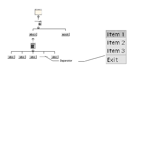
Separators are often used inside Menus to divide items into groups. The Separator appears between its adjacent siblings, as shown in FIGURE 27-9.
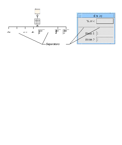
You can use Separators inside a RowColumn. FIGURE 27-10 shows a sample hierarchy and the resulting dynamic display. When you use Separators in a RowColumn, set the orientation of the Separators explicitly to "Vertical" or "Horizontal". Separators in a RowColumn span a cell the size of every other element in the array. This can produce more white space around the Separator than is pleasing. If you want different proportions, use a Form for your column layout.
Set the RowColumn's "Spacing" resource to 0 to eliminate a gap between adjacent separators.
|
Icon name[4] |
||
The Shell widget forms the interface between your design and the Motif window manager. Every X-Designer design hierarchy must have a Shell as its root widget.
The X-Designer palette contains four types of Shell widget--the Dialog shell, Top Level shell, Application shell and Session shell. These shells can be switched to any of the others by setting the appropriate toggle in the Shell resource panel.
The SessionShell can be used as the main shell of an application. It is derived from ApplicationShell. Strictly speaking it is not a Motif widget--it is part of the X toolkit but it is used in X-Designer as any other Motif widget.
The SessionShell gives you the ability to specify how an application can save the current session and restart with the same environment. There are resources, on the Session page of the resource panel, to set the current directory and environment. You can also set commands so that the SessionShell knows what to do in circumstances such as shutting down and restarting. If you are intending to generate code for Motif 2, you should use SessionShell in place of ApplicationShell, which has been deprecated. The resources on the Session page only apply to Session shells.
The ApplicationShell is used as the main application window. Your application must have at least one (and usually only one) main application shell. The SessionShell is also a main application shell, so if you have one already in your design then you do not need an ApplicationShell. If, however, you are intending to generate code for Motif 1.0, 1.1 or 1.2, then you must use ApplicationShell as SessionShell is not available in those versions of Motif.
Top level shells look and act like Application shells. Typically, they are used for all primary windows in the application except the first. Dialog shells are used for secondary windows such as pop-up dialogs. If an Application or Top level shell is closed or iconified, all associated Dialog windows also disappear.
An Application or Top level shell appears as a Dialog shell in the dynamic display but the generated code produces the correct type of Shell. To check the icon pixmap, set the "Transient" resource to "No", then reset the shell. This produces the full set of decorations, allowing you to iconify the dynamic display window.
A Shell can only have one child, which can be of any type. However, much of the Shell's behavior is based on the assumption that its child is a BulletinBoard, Form, or similar container widget, since the Shell exercises no geometry management over its descendants. A Shell is not visible until it has a child.
Setting a Shell's width and height on its Core resource panel does not control the window size. To control initial window size, set the minimum width and height resources of the Shell, or set the width and height of the Shell's child.
To control the initial position of a window, set the "Default position" resource of the Shell's child to "No", and set the x and y resources of the child, not the Shell.
The SimpleSpinBox is a subclass of SpinBox. A single TextField is created internally by the SimpleSpinBox and it cannot be given additional children (other than a PopupMenu).
The SimpleSpinBox keeps a list of items and cycles through them when the arrow is pressed. One item at a time is displayed in the TextField. Items can be strings or numbers. The "Child type" resource on the Settings page of the resource panel lets you change between the two types. If you wish to display strings, type them into the text area on the Items page. If you wish to cycle through numbers, set the minimum and maximum values and the amount by which to increment on the Display page. The SimpleSpinBox will then cycle through accordingly.
This is a more complex widget than the SimpleSpinBox although it essentially performs the same function of cycling through lists of items, displayed in its children. The main difference is that the SpinBox can take any number of children of the following types:
The SpinBox does not add any children automatically--it is up to you to add them. For each child, use its Constraints dialog to set up the items it is going to display. The "Child type" resource on the Settings page of the Constraints dialog gives you the option of string or numeric. For strings, type them in on the Items page or load them dynamically when the application is running (you will have to write extra code to do this). To cycle through a list of numbers, set the "Child type" to "Numeric" and then, on the Display page of the Constraints dialog, set the minimum and maximum values of the numbers you wish to display and the amount by which they should increment. The SpinBox will then cycle through these numbers accordingly.
The Settings page of the SpinBox resource panel lets you change the location and orientation of the arrows. The arrows are not real widgets--they are drawn.
The TabManager widget is a pre-configured version of the Notebook supplied by X-Designer. Some of the resources have been set so that this version of the Notebook acts as a container with pages and tabs to switch between the pages.
To add pages and tabs to the TabManager, you should add a page and then a tab, alternating in this way until you have the required number. Put widgets inside a container if you wish to have more than one on a page. Tabs are always buttons (PushButton, ArrowButton or DrawnButton). Any of these buttons added to the TabManager is assumed to be a tab. Resource panels in X-Designer provide a good example of how they may be used.
The Text widget provides an area for entering multi-line text. A wide range of callbacks is provided to deal with input verification and validation.
To use multi-line text, you must set the "Edit mode" resource to "Multi line". To change the height of the Text widget to display multiple lines of text, you can change the "Rows" resource setting to a number greater than 1. Changing the number of Rows may or may not be effective, depending on the type of widget used as the Text widget's parent.
To create a scrollable text editing area, use a ScrolledText, a composite widget that includes a Text widget. Although the Text widget can be the child of a ScrolledWindow, this configuration does not work well. If you use this configuration, change the "Edit Mode" resource to "Multi line" and increase the number of Rows and Columns to exceed the size of the ScrolledWindow viewing area.
The Motif toolkit provides functions for accessing and modifying the text in the widget. For details, see the Motif documentation.
The TextField widget is a variant of the Text widget that provides an area for entering only a single line of text. It has all the Text's editing features except multi-line capability.
You can change from TextField to Text by using the toggle. However, to get multi-line capability, you must also set the "Edit mode" resource to "Multi line".
The Motif toolkit provides functions for accessing and modifying the text in the widget. For details, see your Motif documentation. Books on X and Motif provides some suggestions for further reading on this subject.
|
Accelerator[5] |
||
The ToggleButton widget provides a simple on/off toggle for indicating "yes/no" choices.
ToggleButtons can be made into mutually exclusive radio buttons by placing them inside a RadioBox, or inside a Menu or RowColumn whose "Radio behavior" resource is set to "Yes". Radio buttons have a different shape from normal toggles, as shown in FIGURE 27-11.

You can configure the ToggleButton to resemble a PushButton that appears to push in and out to represent on and off settings. To do this:
1. Set the "Shadow Thickness" Core resource to 2. This draws a border around the button.
2. Set the "Indicator on" resource to "No". This suppresses the small square indicator.
3. Set the left margin to 0. This removes the space which was occupied by the indicator.
Following is a list of the Motif widgets which can be selected from within X-Designer in Microsoft Windows mode along with the way in which they are mapped to a Microsoft Windows class.
Widget tranformations are particularly useful if you have an existing design that you wish to make Microsoft Windows Complaint. See for a list of the permissable transformations.
Maps to CDialog if the MFC Resources toggle is set, otherwise CFrameWnd.
Map to CWnd unless they are the child of a Shell, in which case they are ignored for Microsoft Windows. If the ScrolledWindow has its Scrolling Policy resource set to "Automatic", it maps to a CScrollView.
Map to CWnd if they are structured as a C++ class.
Maps to CWnd unless its parent is a ScrolledWindow, MainWindow or Shell in which case it is ignored for Microsoft Windows. Otherwise it is forced to be structured as a C++ class.
Maps to a CWnd if structured as a class. If not, it is ignored and the child widgets are dealt with as stand-alone components.
Maps to a CTabCtrl if structured as a class. If not, it is ignored and the child widgets are dealt with as stand-alone components.
Maps to a CWnd if structured as a class. If not, it is ignored and the child widgets are dealt with as stand-alone components.
Map to a CMenu and cannot be structured as a C++ class.
Maps to a CComboBox and cannot be structured as a C++ class.
Maps to a CButton if XmNlabelType is XmLABEL or to a CBitmapButton if XmNlabelType is XmPIXMAP.
This is not mapped to an object on Microsoft Windows--instead it is added as a Menu attribute, if part of a menu. If not in a menu, it is ignored.
Maps to CScrollbar unless it is part of a ScrolledWindow in which case the appropriate style is added to the enclosing class and it is ignored as a widget.
This maps to CEdit with appropriate scrolling styles and the ScrolledWindow part is ignored.
This maps to CListBox with appropriate scrolling styles and the ScrolledWindow part is ignored.
Maps to a CWnd if structured as a class. If not, it is ignored and the child widgets are dealt with as stand-alone components.
This maps to a CListBoxCtrl together with a CSpinBoxCtrl. This gives a closer match with the Motif SimpleSpinBox than using the MFC SpinBox which only allows numeric items.
Although Microsoft Windows uses resources, the way in which they are used is different from X/Motif. Resources used by Microsoft Windows are compiled into the application. There is also a far more restricted set than on Motif.
X-Designer only generates bitmaps, icons and accelerators as Microsoft Windows resources. Other Motif resources are mapped to visual window attributes or written into the source code.
When a Microsoft Windows object is created, window styles can be specified. These are bit flags which are or'd together. The following example shows how a toggle button would be created:
Create ( "Classical", WS_CHILD | WS_VISIBLE | WS_TABSTOP | BS_AUTORADIOBUTTON, rect, this, IDC_shell_classical);
The second parameter to this method, which is a method inherited from a basic MFC class, is the window style. When you set resources in X-Designer, suitable window styles are chosen. Below is a list of the window styles available for each widget which can be mapped to a Microsoft Windows object. The list also shows when they are used and the corresponding Motif resource.
In addition to Shell styles, has:
Exactly the same styles as ApplicationShell.
|
Note - This does not mean that ApplicationShell and TopLevelShell are exactly the same on Microsoft Windows--they are different classes. |
In addition to Shell styles, has:
These widgets are not windows on Microsoft Windows, as all other objects are--they are CMenu objects. CMenu is not derived from CWnd. This means that they have no window styles associated with them. Their children (or the children of the PulldownMenu in the case of the CascadeButton) are generated by a call to AppendMenu for each child. The following flags are passed to AppendMenu depending on the type of child:
The following apply to calls to AppendMenu from a PopupMenu or CascadeButton only:
This maps to a CFileDialog class. Since the Create method is not called explicitly for a CFileDialog (instead InitDialog and DoModal are called) there are no styles. Instead, resources are mapped to parameters passed to the New method:
<XmNfilterLabelString>(<XmNpattern>)|XmNpattern|All files(*.*)|*.*||
If XmNpattern is not set this parameter is NULL
SimpleSpinBox maps to a CListBox together with a CSpinButtonCtrl. Therefore, there are two sets of resources--one for each control.
Window styles for the CListBox:
Window styles for the CSpinBoxCtrl:
Copyright © 2003, Sun Microsystems, Inc. All rights reserved.