Appendix A App Builder Windows and Dialog Boxes
This appendix describes the major windows and dialog boxes in App Builder, including illustrations of the windows and dialog boxes and descriptions of the window and dialog box elements.
App Builder Primary Window
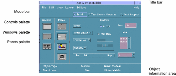
The App Builder primary window is the starting point for building a graphical user interface. The interface is created by dragging objects from the App Builder object palettes (Windows, Panes, and Controls) to the workspace, editing the properties of the resultant interface objects, and adjusting the layout of the interface. See "Overview of the App Builder Process" in Chapter 1, Getting Started, for a summary of the steps involved in creating an interface.
- Title bar
-
Includes the name of the application, "Application Builder," the window manager menu, a minimize button, a maximize button, the name of the current project (if one is open), and a "(Save Needed)" indication if the current project has changed since being saved.
- Mode bar
-
Includes Build, Test Shown Modules, and Test Project radio buttons for specifying build and test modes.
Build is for designing and building an interface.
Test Shown Modules is for testing help, menus, and connections in current, shown modules. All window objects will be shown, including those for which the initial state is not set to Visible.
Test Project is for testing help, menus, and connections in the current project. Objects for which the initial state is not set to Visible will not be shown.
- Windows palette
-
Includes the three App Builder window objects: main window, custom dialog, and file selection dialog. Window objects are dropped on the workspace. See "Windows Palette" below for details.
- Panes palette
-
Includes the four App Builder pane objects: control pane, text pane, draw area pane, and term pane. Pane objects are dropped on main windows, custom dialogs, or other panes. See "Panes Palette" for details.
- Controls palette
-
Includes 14 App Builder control objects: button, menu button, combo box, option menu, menu bar, radio box, check box, gauge, scale, separator, text field, label, list, and spin box. Control objects are dropped on control panes. See "Controls Palette" for details.
- Object information area
-
Provides information about the object beneath the cursor. See "Object Information Area" for details.
Windows Palette
The Windows palette contains three objects: main window, custom dialog, and file selection dialog.
Main Window
A main window is the basic App Builder object. It is created by dropping a main window icon on the workspace. The starting point for a user interface is built in a main window. A main window has a minimize button and therefore can be minimized.
The status region includes the name of the module the window is part of and indicates when the window object is selected. It does not appear in the compiled application.
Examples of main windows used in building App Builder itself are the App Builder primary window, the Project Organizer, the Module Browser, and the Code Generator.
Custom Dialog
A custom dialog is a window for displaying information or providing a pop-up for a specific task within an interface. It is created by dropping a custom dialog icon on the workspace. A custom dialog might be "connected" to a button or a menu in a main window, causing the pop-up dialog to be displayed when the button is clicked or a menu item is chosen. A custom dialog cannot be closed to an icon.
The status region includes the name of the module the dialog is part of and indicates when the dialog object is selected. It does not appear in the compiled application.
Examples of custom dialogs used in building App Builder include the File Selection Dialog, the Project Name and Module Name dialog boxes, all of the editors, and the message dialog boxes.
File Selection Dialog
A file selection dialog is a specialized pop-up dialog for specifying a file in an Open or Save operation. It is created by dropping a file selection dialog icon on the workspace.
The status region includes the name of the module the dialog is part of and indicates when the dialog object is selected. It does not appear in the compiled application.
Panes Palette
The Panes palette contains four objects: control pane, text pane, draw area pane, and term pane. All panes can be dropped on a main window, a custom dialog, or another pane. If a pane is dropped on a pane, the dropped pane will become a child of the first pane or a layered pane will be created. See "To Create a Layered Pane" " in Chapter 5, Creating and Editing Panes, Menus, and Messages ," for more information.
Control Pane
A control pane is the drop site for App Builder controls. It is created by dropping a control pane icon on a main window, a custom dialog, or another pane. In the figure above, a control pane has been dropped on the top-left corner of a main window, in anticipation of resizing it to fill the entire canvas.
Examples of control panes used in building App Builder include the pane on which the three panes palettes reside on the App Builder primary window and the pane beneath the controls on each of the property editors.
Text Pane
A text pane is a multi-line text-entry area in the completed application. It is created by dropping a text pane icon on a main window, custom dialog, or another pane.
Examples of the use of text panes in building App Builder include the Initial Value field in the Text Pane property editor and the Help Text field in the Help Editor.
Draw Area Pane
A draw area pane is used as a drawing or display area in the completed application. It is created by dropping a draw area pane icon on a main window, custom dialog, or another pane.
Note the horizontal and vertical scroll bars, which enable you to view objects outside the current view area.
Examples of the use of draw area panes in building App Builder include the panes displaying modules and module objects in the Module Browser, and the pane displaying modules in the Project Organizer.
Term Pane
A term pane is a terminal emulation object which accepts user input and echoes standard output. It is created by dropping a term pane icon on a main window, custom dialog, or another pane.
Controls Palette
The Controls palette contains 14 objects, including buttons, lists, text fields, and a menu bar. To find out how to edit the properties of these objects, see Chapter 4, Editing Properties of Interface Objects. To find out how to create menus and submenus and attach them to objects, see "Creating and Editing Menus" in Chapter 5, Creating and Editing Panes, Menus, and Messages.
- Button
-
A control which, when clicked, performs a specified action. A button can be a push button, a drawn button, or a menu button, settable in the Button property editor. A drawn button, like a push button, performs a specific function when clicked; the label on a drawn button, however, can change dynamically, depending on the status of the application.
- Menu Button
-
A specialized button, ready for attachment of a menu. Note that there is no menu button property editor; edit the properties of a menu button in the Button Property Editor.
- Combo Box
-
A combination text field and option menu object. As with an option menu, you can select an item from a pop-down menu, but you can also edit any of the items in the list--if you have checked "Editable" in the property editor, and if you write code to make it work.
- Option Menu
-
One of the three "choice" objects (option menu, radio box, check box). When you click on an option menu, a menu is displayed, providing a choice of items to choose from. The chosen item remains in the option menu box and becomes the active choice. Examples of option menus in App Builder are Object Type in the property editors and Source and Target in the Connections Editor. An option menu is an exclusive-choice object.
- Radio Box
-
One of the three "choice" objects (option menu, radio box, check box). A radio box is comprised of a label and two or more round buttons representing application functions, only one of which can be selected (hence the term "radio button," named for the type of buttons on an automobile radio). A radio box is an exclusive-choice object.
- Check Box
-
One of the three "choice" objects (option menu, radio box, check box). A check box is comprised of a label and one or more check boxes, each with its own label. Each check box has a "binary" (on or off) state, and each is independent of the other. A check box is a nonexclusive-choice object.
- Gauge
-
One of two "scale" objects (gauge, scale). A gauge is used to indicate a value.
- Scale
-
One of two "scale" objects (gauge, scale). A scale, like a gauge, indicates a value, but a user can modify the value of a scale by moving the slider.
- Separator
-
A horizontal or vertical line used to indicate separate functions in an application window.
- Menu Bar
-
A horizontal bar of menu buttons arrayed across the top of a main window. The buttons are cascade buttons, for attaching menus. The default menu bar includes File, Edit, and Help topics. You can change, delete, or add to this group of topics. Note that the menu bar is not strictly a control object: it is a control pane with three buttons.
- Text Field
-
A single-line text-entry area with a label (in contrast to a text pane, which is a is a multi-line text-entry area).
- Label
-
A text string or graphic icon which can be attached to an object for identification purposes.
- Scrolling List
-
An object for listing selectable options. A scrolling list is comprised of a variable-length list with scroll bars and an optional label. A list can allow single or multiple selections, and it can include a pop-up menu.
- Spin Box
-
An object for selecting from a number of choices, only one of which is visible at any one time. A spin box is comprised of a text field, a label, and a set of arrows for sequencing through the choices.
Object Information Area
The object information area provides information about the object directly beneath the cursor--either on one of the primary window palettes or in the user interface. It includes the following information fields:
- Object Type
-
The type of object beneath the cursor (main window, control pane, text field, for example). This field is active in the App Builder primary window, so you can use it to identify object types in the object palettes.
- Object Name
-
The name of the interface object beneath the cursor. This name, in combination with the module name, uniquely identifies App Builder objects. Palette objects do not have names, so the field will be blank if the cursor is over the App Builder primary window. Note that all palette objects are given unique names when they are instantiated in the interface; you can change the name in the property editor for the object.
- Position
-
The (x,y) pixel coordinates of the top-left corner of the object beneath the cursor, measured in the coordinate system of the object that contains it. If the object is a window object (main window, custom dialog, or file selection dialog), the position will be relative to the top-left corner of the monitor screen.
If the object is a pane that was dropped on the top-left corner of a window, its position will be 0,0, since 0,0 are the coordinates of the top-left corner of the parent window. A pane that is dropped on another pane and made a layered pane also has coordinates of 0,0.
If the object is a control or a pane that has been made a child of a control pane, its coordinates are measured from the top-left corner of the parent object to the top-left corner of the child object.
- Size
-
The size, in pixels, of the object beneath the cursor, in the form "width X, height Y."
- Cursor Position
-
The (x,y) pixel coordinate location of the cursor, measured in the coordinate system of the object that contains it. Every object, including controls, has its own coordinate system. Some compound objects, comprised of more than one widget, have multiple coordinate systems; a custom dialog, for instance, includes a control pane, a tool bar, and buttons, each with its own coordinate system.
- Editing Module
-
The name of the module currently being edited. Any window dragged from the Windows palette becomes part of that module. If more than one module is shown on the workspace, you can change the current module by selecting an object in another module.
Project Organizer
The Project Organizer is used to open, save, or close a project, and to save, show, hide, import, export, or remove modules.
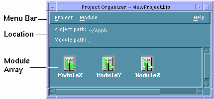
- Location
-
A control pane with Project Path and Module Path fields; indicates the full-path location of the current project and the relative path to modules. The module will normally be in the same folder as the project, and its path will be noted as "." ("dot," signifying the current folder).
- Module Array
-
A draw area pane that depicts each of the modules in the current project as a single icon with the module name beneath the App Builder icon.
Module Browser
The Module Browser (also called the browser) provides a hierarchical, tree view of a module. Use it to view modules, edit the interface, group or ungroup objects, create connections, and display object property editors for editing. About the only things you can't do in the Browser that you can do in the interface is move or align objects.
To display the Browser, choose Module Browser from the View menu in the App Builder primary window and select a module in the pull-right menu displayed or select an object in the interface and Choose Browse from the pop-up menu (displayed by pressing mouse button 3 in the interface).
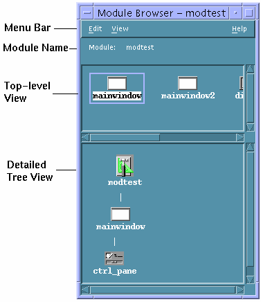
- Edit menu
-
Includes the same functions as the Edit menu in the App Builder primary window: Undo, Cut, Copy, Paste, and Delete. If you select an object or objects in the Browser and choose a menu item, the objects selected will be selected in the interface and the function chosen will be performed in the interface.
- View menu
-
Horizontal displays child objects to the right of their parent object. Toggles with Vertical, which displays child objects below their parent object. Vertical is the default view.
Hide Object Glyph hides the icons/glyphs that represent the objects in the interface. Toggles with Show Object Glyph, which is the default.
Show Object Type displays the object types of objects in the interface. Toggles with Hide Object Type, which is the default.
Collapse "undisplays" the children of selected parent objects. This enables you to see more of the interface in a smaller space.
Expand displays the children of selected collapsed parent objects.
Expand All expands all collapsed parent objects.
Module displays the module chosen from the submenu.
Find displays a Find Object dialog box, for finding objects by object name; if the object is found, the object is selected and the canvas scrolls to show the object.
Tearoff Browser displays a new browser, enabling you to view more than one module.
- Module name
-
Indicates the module being viewed. Can be changed through the View menu.
- Top-level view
-
Shows all direct children of the module--windows, menus, and messages. A detailed view of each of the objects selected here is shown in the detailed tree view.
- Detailed tree view
-
Shows a detailed view of the top-level objects selected. All children of the selected top-level objects are shown.
Note -
When you group objects or edit the interface in the Browser, be sure to check the interface to see that you haven't obscured any objects. In particular, if you group objects, the rectangular group created may hide an object behind it.
Code Generator Window
The Code Generator window is used to generate code for the created interface and to make and run the completed application. Display the window by choosing Code Generator from the File menu of the App Builder primary window.
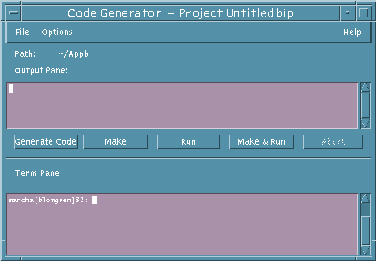
- Path
-
Indicates the path to the current project, which is included in the title bar at the top of the window.
- Output Pane
-
Refers to the text pane below this label. The results when you click on the buttons below the pane are displayed in this text pane. (The functions of the buttons also appear as menu items in the File menu.)
- Generate Code
-
Generates code for the current project. The output for this action is displayed in the output pane.
- Make
-
"Makes" the application for the current project. The output for this action is displayed in the Output Pane.
- Run
-
Runs the compiled application after generating code and making the application. The output for this action is displayed in the Output Pane. The primary window for the compiled application will be displayed.
- Make & Run
-
Combines the functions of the first three buttons (Generate Code, Make, Run). The output for this action is displayed in the Output Pane. The primary window for the compiled application will be displayed.
- Abort
-
Aborts the currently running function. If the compiled application is being run, clicking Abort quits the application.
- Term Pane
-
Performs any terminal emulation functions.
Code Generator Options Dialog Box
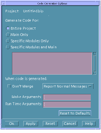
The Code Generator Options dialog box, accessible from the Options menu in the Code Generator window, is used to set options that determine what will happen when various Code Generator functions are performed.
- Project
-
The name of the current project.
- Generate Code For
-
Specifies whether code will be generated for Entire Project, Main Only, Specific Modules Only, or Specific Modules and Main. If one of the latter two choices is specified, the modules in the scrolling list are active.
- Don't Merge
-
Specifies whether user-written code will be merged into the generated code; if you check Don't Merge, any user-written code will be discarded when code is generated.
- Report Normal Messages
-
Determines whether Normal Messages will be displayed in the output pane when code is generated, whether no messages will be generated (Be Silent), or whether all messages will be displayed (Be Verbose).
- Make Arguments
-
Specifies what arguments will be appended to the Make command when it is run in the Code Generator.
- Run Time Arguments
-
Specifies what arguments will be appended to the Run command when it is run in the Code Generator.
- Reset to Defaults
-
Resets all Code Generator Options settings to their default values.
Code Generator Environment Options Dialog Box
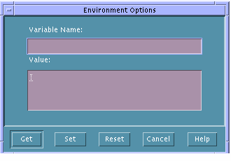
The Code Generator Environment Options dialog box, accessible from the Options menu in the Code Generator window, is used for specifying a Variable Name and a Value for the variable, which value will be used for functions performed in the Code Generator window.
- Variable Name
-
Specifies the name of an environment variable.
- Value
-
Specifies a value for the variable specified in Variable Name. This value is only set for the Code Generator window and has no effect on the value of the variable outside of the Code Generator.
- Get
-
Gets the current Code Generator value of Variable Name and displaying it in the Value text field.
- Set
-
Sets Variable Name to the value in Value. This value is set for Code Generator window functions only.
- Reset
-
Resets Value for Variable Name to its value as set outside of the Code Generator.
- Cancel
-
Cancels any changes made to Value and closes the Environment Options dialog box.
- © 2010, Oracle Corporation and/or its affiliates
