Achieving the Etched Look
You must be familiar with dynamic colors to apply etching. Start with a size 48 icon that does not use the entire 48x48 space. The artwork should leave a few pixels on all sides for the etching.
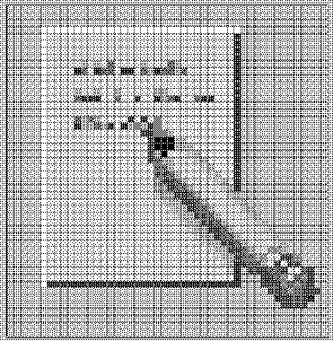
Figure 4-18 Example of an icon lighted from the top left edge

The icon has to be rendered with both light and dark colors, preferably grays. The icon must be lit from above and to the left. The upper and left edges must be light in color, while the lower and right edges must be dark in color. Figure 4-18 shows the desktop Text Editor icon before any etching has been applied.
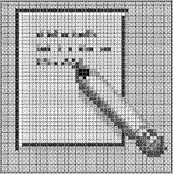
Figure 4-19 Applying the bottomShadow and topShadow colors

The etched effect is applied by drawing a single-pixel line of the bottomShadow color just outside the upper and left edges of the icon artwork, and by drawing a single-pixel line of topShadow color just below and to the right of the artwork.
The lighting model of the icon and of the etched shadow must be consistent or the effect does not work. If your icon is drawn with black lines, the etched look will be flawed by doubling the dark lines on the top and left edges.
The style of the icon is critical to making the etched effect look right and to making your icon blend in with other Front Panel icons. Study the Front Panel icons supplied with the desktop for guidance. Icons with perspective scenes, icons with black outlines, and icons on raised "slabs" will not work.
- © 2010, Oracle Corporation and/or its affiliates
