A Classic HTML Conversion Editor User Interface
The Dynamic Converter Classic HTML Conversion Editor includes several dialog boxes and administrative pages that you use to customize your Classic conversion templates:
A.1 Classic HTML Conversion Editor Main Dialog
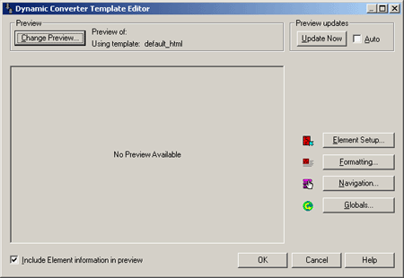
The Classic HTML Conversion Editor main dialog allows you to preview and update your document, and edit document elements, formatting, navigation, and globals.
| Element | Description |
|---|---|
| Change Preview | Click this button to view the selected document in the Preview window. |
| Preview of: | Lists the document you are current working on. |
| Using Template: | Lists the template you are currently using. |
| Update Now | Click this button to update your document. |
| Auto | Select this option to preview updates automatically. |
| Element Setup | Click this button to edit elements. In Element Setup you can review the elements generated for the ranks applied to your source document, create new ranks and elements, and control the treatment of content in the web pages you create. |
| Formatting | Click this button to edit formatting. The settings in Formatting determine the look and behavior of a Web page created from any source document associated with the template. Most of the work is done in the Character and Paragraph tab dialogs, where you decide how text will display in a Web browser. |
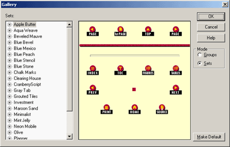
| Navigation | Click this button to edit navigation. In Navigation, you create links to help users navigate your Web pages. Among the options are the ability to create a page button bar or a page text bar and to create an element button bar or an element text bar. Whichever type of navigation bar you create, a range of buttons is available for the links. The Gallery offers 28 graphics sets, each consisting of a uniquely designed set of buttons suitable for all navigation purposes. In addition to the usual links for previous page, next page, etc., the Classic HTML Conversion Editor provides special-purpose links. |
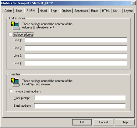
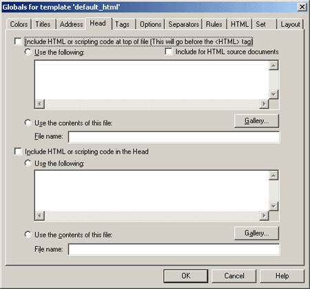
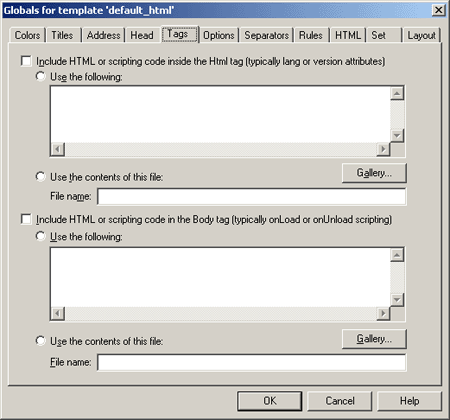
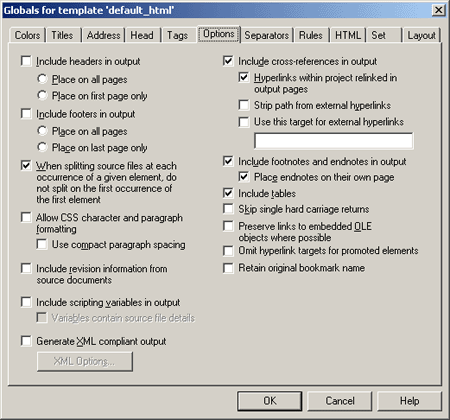
| Globals | Click this button to edit globals. Globals is one of four property sheets used to edit templates. In Globals, your settings apply to a Web page as a whole. The settings are still saved as part of the template but are not associated with specific elements. |
| Include Element information in preview | Select this option to include the element information in the document preview. |
| OK | Saves your settings and closes the dialog box. |
| Cancel | Cancels changes to your settings and closes the dialog box. |
A.2 Select a Document Dialog
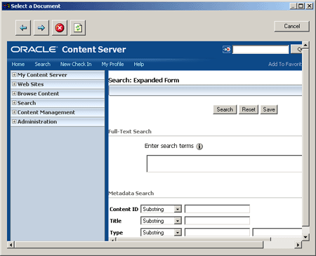
The Select a Document dialog allows you to view the selected document in the Preview window.
| Element | Description |
|---|---|
| Move back to a previous preview. | |
| Move forward to a different preview. | |
| Stop loading or cancel the operation. | |
| Refresh the preview. | |
| Preview pane | View the selected document in the Preview window. |
| Cancel | Cancels changes to your settings and closes the dialog box. |
A.3 Select Preview Document Dialog
The Select Preview Document dialog allows you to choose a document for preview.
| Element | Description |
|---|---|
| Content ID | Enter the Content ID of the document you want to preview or select Browse and navigate to the document. |
| Browse | Click this button to navigate to the document you want to preview. |
| Start with this preview document next time | Select this option to start with the selected document the next time you open preview. |
| OK | Saves your settings and closes the dialog box. |
| Cancel | Cancels changes to your settings and closes the dialog box. |
A.4 Element Setup Dialog
Classic HTML Conversion Editor uses elements as "handles" to format the content of source documents and associate the ranks in those documents (as well as any styles or patterns you may have create) with the HTML tags that control the appearance of web pages. The Classic HTML Conversion Editor does this automatically, so you don't need to worry about the HTML tags themselves.
When you check a source document into Content Server, you choose a template for the document and the Classic HTML Conversion Editor automatically applies ranks to the content of the document. Then it generates a corresponding element for each rank and places those elements in the template. You can create additional ranks or styles or patterns, and create elements to assign to them.
You create the look of a particular Web page by editing the template that is associated with the source document. Some of the instructions apply to the template itself, but most apply to the individual elements in the template.
Elements lists throughout the Classic HTML Conversion Editor can help you select the elements to edit. For example, an Elements list is always available in Formatting, no matter which tab dialog you're working in, and the currently selected element is always highlighted on the list.
The Element Setup Dialog consists of these tabs:
A.4.1 Elements Tab
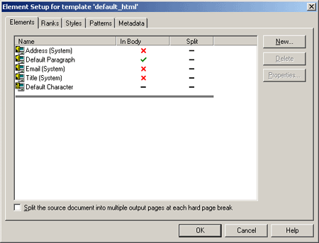
The Elements tab allows you to view your elements, see whether the element is in the body of the document, and to split the selected document into multiple output pages.
The Elements tab can additionally generate these dialog boxes:
| Element | Description |
|---|---|
| Name | Lists the element name. |
| In Body | Indicates whether the element is in the document body. |
| Split | Indicates whether the element is to be split into multiple output pages. |
| Split the source document into multiple output pages at each hard page break | Select this option to split the selected document into multiple output pages at each hard page break. |
| New | Click this button to add a new element. Also see "New Element Dialog". |
| Delete | Click this button to delete the selected element. |
| Properties | Click this button to view the properties of the selected element. |
| OK | Saves your settings and closes the dialog box. |
| Cancel | Cancels changes to your settings and closes the dialog box. |
A.4.2 New Element Dialog
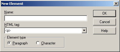
The New Element dialog allows you to create a new element.
| Element | Description |
|---|---|
| Name | Provide a descriptive name. |
| HTML tag | Select an HTML tag from the drop-down list. |
| Element type | Choose an element type of paragraph or character. |
| OK | Saves your settings and closes the dialog box. |
| Cancel | Cancels changes to your settings and closes the dialog box. |
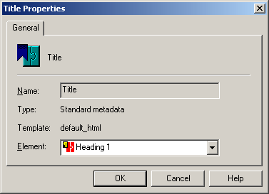
A.4.3 Element Properties: General Tab
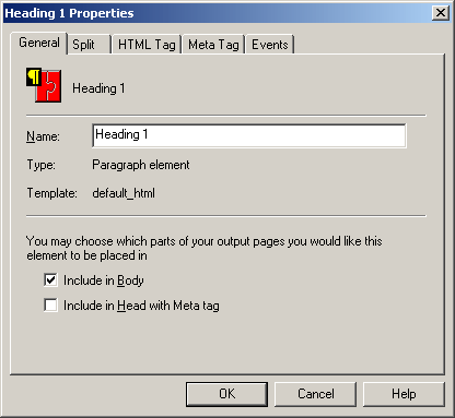
The General tab allows you to name your element and choose in which part of your output pages you would like this element to be placed.
| Element | Description |
|---|---|
| Name | Provide a descriptive name. |
| Type | The element type. |
| Template | The name of the template being edited. |
| Include in Body | Select this option to place this element in the body of the output pages. |
| Include in Head with Meta tag | Select this option to place this element in the head of the output pages using a meta tag. |
| OK | Saves your settings and closes the dialog box. |
| Cancel | Cancels changes to your settings and closes the dialog box. |
A.4.4 Element Properties: Split Tab
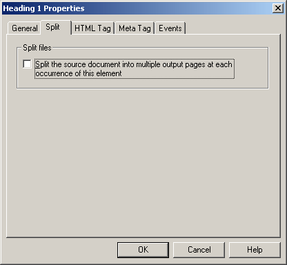
The Split tab allows you to split the source document into multiple output pages.
| Element | Description |
|---|---|
| Split files | Select this option to split the source document into multiple output pages at each occurrence of this element. |
| OK | Saves your settings and closes the dialog box. |
| Cancel | Cancels changes to your settings and closes the dialog box. |
A.4.5 Element Properties: HTML Tag Tab
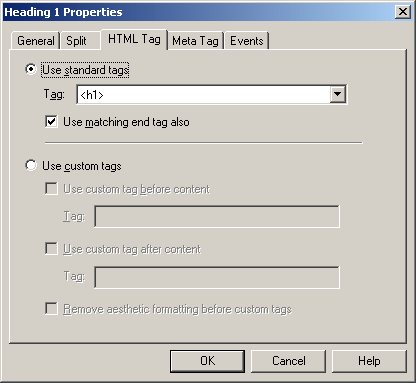
The HTML Tag tab allows you to choose whether to use standard HTML tags or custom tags.
| Element | Description |
|---|---|
| Use standard tags | Select this option to use standard HTML tags. |
| Tag | Select the HTML tag from the drop-down list. |
| Use matching end tag also | Select this option to have the closing tag automatically included. |
| Use custom tags | Select this option to use custom tags. |
| Tag | The tag, including brackets, that will be automatically applied before or after the content, as selected. There are two Tag fields and they can have different values. |
| Remove aesthetic formatting before custom tags | Select this option to remove any aesthetic formatting before the custom tags. Use this to remove the hard-break before each paragraph for the content associated with a particular element. This option might be especially useful where you are including JavaScript in your code. |
| OK | Saves your settings and closes the dialog box. |
| Cancel | Cancels changes to your settings and closes the dialog box. |
A.4.6 Element Properties: Meta Tag Tab
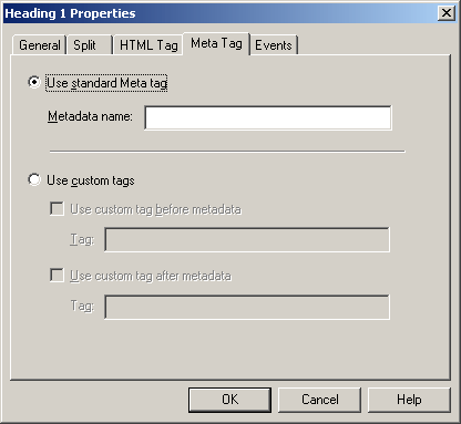
The Meta Tag tab allows you to choose whether to use the standard Meta tag or use custom tags.
| Element | Description |
|---|---|
| Use standard Meta tag | Select this option to use the standard Meta tag. |
| Metadata name | Provide a metadata name. |
| Use custom tags | Select this option to use custom tags to mark metadata. |
| Tag | The tag, including brackets, that will be automatically applied before or after the content, as selected. There are two Tag fields and they can have different values. |
| OK | Saves your settings and closes the dialog box. |
| Cancel | Cancels changes to your settings and closes the dialog box. |
A.4.7 Element Properties: Events Tab
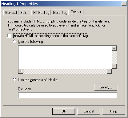
The Events tab allows you to choose whether to include HTML or scripting code inside the tag for this element.
| Element | Description |
|---|---|
| Include HTML or scripting code in the element's tag | Select this option to include HTML or scripting code in the element's tag. |
| Use the following | Select this option to view the list of HTML and scripting code. |
| Use the contents of this file | Select this option to use the entire contents of the selected file in the element's tag. |
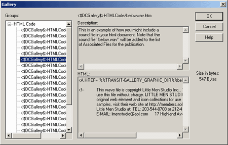
| Gallery | Click this button to open the Gallery and locate the graphics file that you want to use. Also see "Gallery Dialog". |
| File name | Enter the path and file name or click Gallery to view the available graphics. Also see "Gallery Dialog". |
| OK | Saves your settings and closes the dialog box. |
| Cancel | Cancels changes to your settings and closes the dialog box. |
A.4.8 Ranks Tab
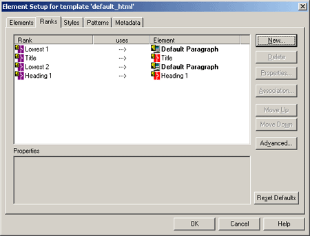
When you check a document into Content Server, Dynamic Converter applies a default set of ranks in the template to content: Lowest 1, Title, Lowest 2, Heading 1. These ranks are designed to identify content hierarchy in source documents so that top-level content, in particular, can be handled consistently. At the same time, Dynamic Converter generates an element for each rank. The elements are saved in the template.
The following table shows a simple example of what would happen for two documents with the manually formatted styles shown:
| Content | Doc A | Doc B | Rank | Element |
|---|---|---|---|---|
| Title | Times 20 pt Bold | Arial 16pt Bold | Title | Title |
| First level Heading | Times 14 pt Italic | Arial 12 pt Bold | Heading 1 | Heading 1 |
| Other Heading | Times 12 pt Underscore | Lowest 2 | Default Paragraph | |
| Caption | Times 9 pt Bold | Lowest 2 | Default Paragraph | |
| Text | Times 10 pt | Times 9 pt | Lowest 1 | Default Paragraph |
With ranks, Dynamic Converter doesn't recognize the complete variety of content your source documents might contain. But Dynamic Converter can recognize content that helps define the top-level hierarchy of your source documents and thus successfully format the most important content in your source documents
Note how Dynamic Converter determines which portion of content should be designated. The order of Title, Heading 1, Lowest 1, or Lowest 2 is determined by Rank Rules. You can customize these.
The Ranks tab can additionally generate these dialog boxes:
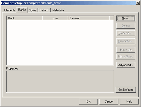
The Ranks tab allows you to change, edit, and associate your element rank.
| Element | Description |
|---|---|
| Rank | Lists the element rank. When you check a document into Content Server, Dynamic Converter applies a default set of ranks in the template to content: Lowest 1, Title, Lowest 2, Heading 1. These ranks are designed to identify content hierarchy in source documents so that top-level content, in particular, can be handled consistently. At the same time, Dynamic Converter generates an element for each rank. The elements are saved in the template. |
| uses | Indicates whether it is used by an element. |
| Element | Lists the elements. |
| New | Click this button to create a new rank. |
| Delete | Click this button to delete the selected rank. |
| Properties | Click this button to change the rank properties. You can change the name of a rank and also the element assigned to it. You can also change the hierarchical level of the rank plus the frequency with which the rank appears in the source document. These properties are especially important when creating new ranks to help identify unique content in source documents. You may have to experiment with hierarchy and frequency to successfully identify unique content. |
| Association | Click this button to associate the selected rank with a different element. |
| Move Up | Click this button to move the selected rank up. |
| Move Down | Click this button to move the selected rank down. |
| Advanced | Click this button to open the Rank Rules dialog for the selected rank. Rank rules dictate how content in your source documents will be treated when Classic HTML Conversion Editor assigns ranks to identify hierarchy. Rank rules consist of "effects," which represent all possible characteristics of text. For ranking purposes, each effect has the properties "significance" and "order." By changing these, you change the rank rules that govern how Dynamic Converter assigns ranks. If you use ranks a great deal you may want to change the rank rules, depending on the nature of the content of your source documents. You can change the rules by changing the significance and/or order of each effect. Also see "Rank Rules Dialog". |
| Set Defaults | Click this button to use the current ranks as the default. |
| OK | Saves your settings and closes the dialog box. |
| Cancel | Cancels changes to your settings and closes the dialog box. |
A.4.9 New Rank Dialog
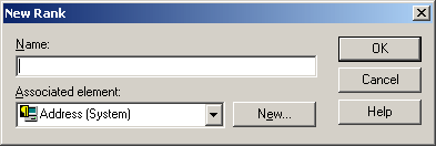
The New Rank dialog allows you to create a new rank and associate an element.
| Element | Description |
|---|---|
| Name | Provide a descriptive name. |
| Associated element | Select the associated element from the drop-down list or click New to create a new element. Also see "New Element Dialog". |
| New | Click this button to create a new element. Also see "New Element Dialog". |
| OK | Saves your settings and closes the dialog box. |
| Cancel | Cancels changes to your settings and closes the dialog box. |
A.4.10 Rank Defaults Dialog
The Ranks Default dialog allows you to create new ranks, delete ranks, change rank properties, associate ranks, and move ranks up and down.
| Element | Description |
|---|---|
| Rank | Lists the element rank. When you check a document into Content Server, Dynamic Converter applies a default set of ranks in the template to content: Lowest 1, Title, Lowest 2, Heading 1. These ranks are designed to identify content hierarchy in source documents so that top-level content, in particular, can be handled consistently. At the same time, Dynamic Converter generates an element for each rank. The elements are saved in the template. |
| uses | Indicates whether it is used by an element. |
| Element | Lists the elements. |
| New | Click this button to create a new rank. |
| Delete | Click this button to delete the selected rank. |
| Properties | Click this button to change the rank properties. You can change the name of a rank and also the element assigned to it. You can also change the hierarchical level of the rank plus the frequency with which the rank appears in the source document. These properties are especially important when creating new ranks to help identify unique content in source documents. You may have to experiment with hierarchy and frequency to successfully identify unique content. |
| Association | Click this button to associate the selected rank with a different element. |
| Move Up | Click this button to move the selected rank up. |
| Move Down | Click this button to move the selected rank down. |
| Advanced | Click this button to open the Rank Rules dialog for the selected rank. Rank rules dictate how content in your source documents will be treated when Classic HTML Conversion Editor assigns ranks to identify hierarchy. Rank rules consist of "effects," which represent all possible characteristics of text. For ranking purposes, each effect has the properties "significance" and "order." By changing these, you change the rank rules that govern how Dynamic Converter assigns ranks. If you use ranks a great deal you may want to change the rank rules, depending on the nature of the content of your source documents. You can change the rules by changing the significance and/or order of each effect. Also see "Rank Rules Dialog". |
| Reset Defaults | Click this button to reset the defaults to the original settings. |
| OK | Saves your settings and closes the dialog box. |
| Cancel | Cancels changes to your settings and closes the dialog box. |
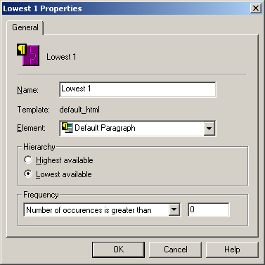
A.4.11 Rank Properties Dialog
The Rank Properties dialog allows you to assign an element and define the hierarchy.
| Element | Description |
|---|---|
| Name | Provide a descriptive name. |
| Template | Lists the current template used. |
| Element | Select the element to use from the drop-down list. |
| Hierarchy | Select whether to use the highest available hierarchy or lowest available hierarchy. |
| Frequency | Select the appropriate option from the list, and in the second text box enter a value. For example, if you were seeking to create a rank for a second-level heading, you would probably select the frequency Number of occurrences if greater than and enter the value 0.
|
| OK | Saves your settings and closes the dialog box. |
| Cancel | Cancels changes to your settings and closes the dialog box. |
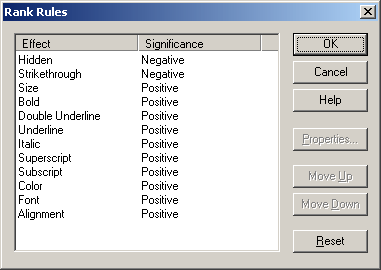
A.4.12 Rank Rules Dialog
Rank rules dictate how content in your source documents will be treated when Classic HTML Conversion Editor assigns ranks to identify hierarchy. Rank rules consist of "effects," which represent all possible characteristics of text. For ranking purposes, each effect has the properties "significance" and "order." By changing these, you change the rank rules that govern how Dynamic Converter assigns ranks. If you use ranks a great deal you may want to change the rank rules, depending on the nature of the content of your source documents. You can change the rules by changing the significance and/or order of each effect
| Element | Description |
|---|---|
| Effect | Lists the formatting effect. |
| Significance | Negative effect means that Dynamic Converter will place ranks with this effect at the bottom of its list when it is determining content hierarchy. Positive effect means that Dynamic Converter will use this effect to ascertain the ranks for top-level content in source documents. |
| OK | Click this button when your changes are complete. |
| Cancel | Click this button to cancel your changes. |
| Properties | Click this button to change the rank properties. You can change the name of a rank and also the element assigned to it. You can also change the hierarchical level of the rank plus the frequency with which the rank appears in the source document. These properties are especially important when creating new ranks to help identify unique content in source documents. You may have to experiment with hierarchy and frequency to successfully identify unique content. |
| Move Up | Click this button to change the order of the selected effect by moving it up. |
| Move Down | Click this button to change the order of the selected effect by moving it down. |
| Reset | Click this button to reset the effects to their original settings. |
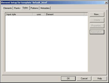
A.4.13 Styles Tab
"Styles" in Dynamic Converter refers to named styles typically found in word processing documents. A named style is a set of formatting characteristics that are saved and given a name so that they can be applied to any paragraph in a document.
When you check a document into Content Server, Dynamic Converter applies a default set of ranks in the template to content: Lowest 1, Title, Lowest 2, Heading 1. Ranks are designed to identify content hierarchy in source documents so that top-level content, in particular, can be handled consistently. At the same time, Dynamic Converter generates an element for each rank, which are saved in the template.
You can achieve greater control over your HTML output if you're source documents contain styles. You can create a style in Element Setup and a complementary element for each style in your source document. The Classic HTML Conversion Editor will recognize these styles, and you will be able to format the elements associated with them and thus gain greater control, over the content associated with the styles.
The Styles tab can additionally have these dialogs:
The Styles tab allows you to add a new style, delete styles, change properties, and change associations.
| Element | Description |
|---|---|
| Rank | Lists the element rank. When you check a document into Content Server, Dynamic Converter applies a default set of ranks in the template to content: Lowest 1, Title, Lowest 2, Heading 1. These ranks are designed to identify content hierarchy in source documents so that top-level content, in particular, can be handled consistently. At the same time, Dynamic Converter generates an element for each rank. The elements are saved in the template. |
| uses | Indicates whether it is used by an element. |
| Element | Lists the elements. |
| New | Click this button to create a new style. |
| Delete | Click this button to delete the selected style. |
| Properties | Click this button to change the properties of the selected style. The properties of a style consist of its name and the element it is associated with. |
| Association | Click this button to associate the selected style with a different element. |
| OK | Saves your settings and closes the dialog box. |
| Cancel | Cancels changes to your settings and closes the dialog box. |
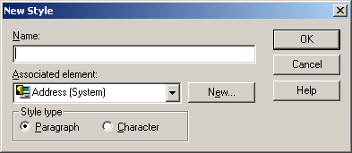
A.4.14 New Style Dialog
The New Style dialog allows you to create a new style and associate an element.
| Element | Description |
|---|---|
| Name | Provide a descriptive name. |
| Associated element | Select the associated element from the drop-down list or click New to create a new element. Also see "New Element Dialog" |
| New | Click this button to create a new element. Also see "New Element Dialog" |
| Style type | Select your style type. |
| OK | Saves your settings and closes the dialog box. |
| Cancel | Cancels changes to your settings and closes the dialog box. |
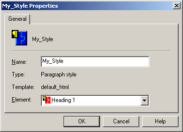
A.4.15 Style Properties Dialog
The Style Properties dialog allows you to create a new style property and associate an element.
| Element | Description |
|---|---|
| Name | Provide a descriptive name. |
| Type | Lists the style type. |
| Template | Lists the current template. |
| Element | Select an element from the drop-down list. |
| OK | Saves your settings and closes the dialog box. |
| Cancel | Cancels changes to your settings and closes the dialog box. |
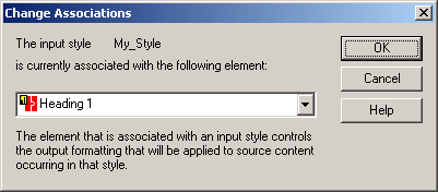
A.4.16 Change Style Associations Dialog
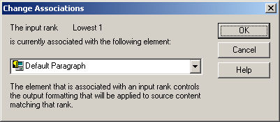
The Change Associations dialog allows you to change the associated element. The element that is associated with an input style controls the output formatting that will be applied to source content occurring in that style.
| Element | Description |
|---|---|
| Element | Select an element from the drop-down list. |
| OK | Saves your settings and closes the dialog box. |
| Cancel | Cancels changes to your settings and closes the dialog box. |
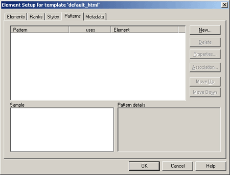
A.4.17 Patterns Tab
With the Classic HTML Conversion Editor you have the option of creating additional ranks, styles, and/or patterns to increase your formatting options. By identifying such characteristics as typeface, font size, font effects (bold, italic, etc.), and color, the Classic HTML Conversion Editor can separate content in the document into similarly formatted groups, known as patterns.
The Patterns tab can additionally have these dialog boxes:
The Patterns tab allows you to add a new pattern, delete styles, change properties, move the pattern, and change associations.
| Element | Description |
|---|---|
| Rank | Lists the element rank. When you check a document into Content Server, Dynamic Converter applies a default set of ranks in the template to content: Lowest 1, Title, Lowest 2, Heading 1. These ranks are designed to identify content hierarchy in source documents so that top-level content, in particular, can be handled consistently. At the same time, Dynamic Converter generates an element for each rank. The elements are saved in the template. |
| uses | Indicates whether it is used by an element. |
| Element | Lists the element name. |
| Sample | View the pattern in the sample window. |
| Pattern details | View the pattern details in the window. |
| New | Click this button to create a new pattern. |
| Delete | Click this button to delete the selected pattern. |
| Properties | Click this button to change the properties of the selected pattern. |
| Association | Click this button to associate the pattern with a different element. |
| Move Up | Click this button to move the selected pattern up. |
| Move Down | Click this button to move the selected pattern down. |
| OK | Saves your settings and closes the dialog box. |
| Cancel | Cancels changes to your settings and closes the dialog box. |
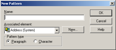
A.4.18 New Pattern Dialog
The New Pattern dialog allows you to create a new pattern and associate an element.
| Element | Description |
|---|---|
| Name | Provide a descriptive name. |
| Associated Element | Select the associated element from the drop-down list or click New to create a new element. Also see "New Element Dialog". |
| New | Click this button to create a new element. Also see "New Element Dialog". |
| Pattern type | Select your pattern type. |
| OK | Saves your settings and closes the dialog box. |
| Cancel | Cancels changes to your settings and closes the dialog box. |
A.4.19 Change Pattern Association Dialog
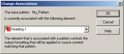
The Change Associations dialog allows you to change the associated element. The element that is associated with a pattern controls the output formatting that will be applied to source content matching that pattern.
| Element | Description |
|---|---|
| Element | Select the element from the drop-down list. |
| OK | Saves your settings and closes the dialog box. |
| Cancel | Cancels changes to your settings and closes the dialog box. |
A.4.20 Pattern Property: General Tab
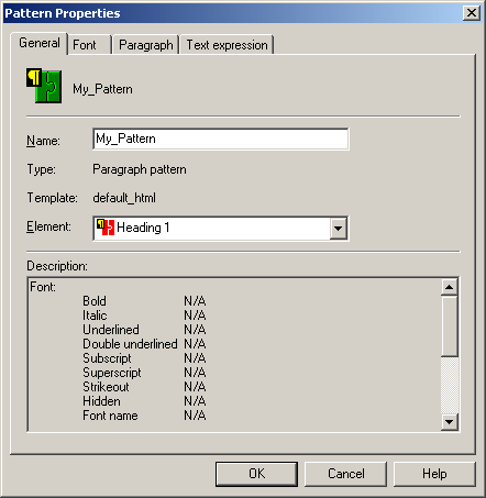
The General tab allows you to name your property and associate an element.
| Element | Description |
|---|---|
| Name | Provide a descriptive name. |
| Type | Lists the pattern type. |
| Template | Lists the current template used. |
| Element | Select an element from the drop-down list. |
| Description | Provides the pattern description in the window. |
| OK | Saves your settings and closes the dialog box. |
| Cancel | Cancels changes to your settings and closes the dialog box. |
A.4.21 Element Setup - Pattern Property: Font Tab
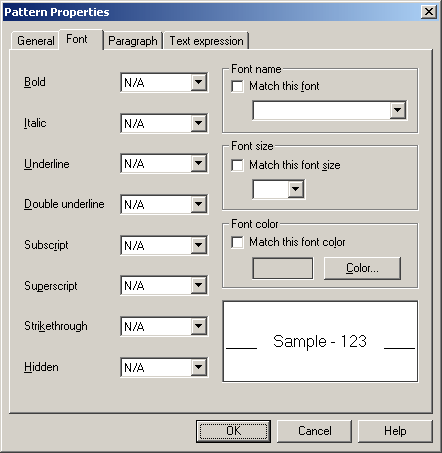
The Font tab allows you to change the font properties This lets you use characteristics of the text in the source document to match patterns.
| Element | Description |
|---|---|
| Bold | Select the desired setting. Three settings are available. Yes means a pattern match will occur only if content contains this characteristic. No means it will occur only if content does not contain this characteristic. And N/A means that matching will be successful whether or not this characteristic is present. |
| Italic | Select the desired setting. Three settings are available. Yes means a pattern match will occur only if content contains this characteristic. No means it will occur only if content does not contain this characteristic. And N/A means that matching will be successful whether or not this characteristic is present. |
| Underline | Select the desired setting. Three settings are available. Yes means a pattern match will occur only if content contains this characteristic. No means it will occur only if content does not contain this characteristic. And N/A means that matching will be successful whether or not this characteristic is present. |
| Double underline | Select the desired setting. Three settings are available. Yes means a pattern match will occur only if content contains this characteristic. No means it will occur only if content does not contain this characteristic. And N/A means that matching will be successful whether or not this characteristic is present. |
| Subscript | Select the desired setting. Three settings are available. Yes means a pattern match will occur only if content contains this characteristic. No means it will occur only if content does not contain this characteristic. And N/A means that matching will be successful whether or not this characteristic is present. |
| Superscript | Select the desired setting. Three settings are available. Yes means a pattern match will occur only if content contains this characteristic. No means it will occur only if content does not contain this characteristic. And N/A means that matching will be successful whether or not this characteristic is present. |
| Strikethrough | Select the desired setting. Three settings are available. Yes means a pattern match will occur only if content contains this characteristic. No means it will occur only if content does not contain this characteristic. And N/A means that matching will be successful whether or not this characteristic is present. |
| Hidden | Select the desired setting. Three settings are available. Yes means a pattern match will occur only if content contains this characteristic. No means it will occur only if content does not contain this characteristic. And N/A means that matching will be successful whether or not this characteristic is present. |
| Font name | Select this option, and then pick the font name from the drop-down list. |
| Font size | Select this option, and then pick the font size from the drop-down list. |
| Font color | Select this option, and then click Color to choose a color. Also see "Colors Tab". |
| OK | Saves your settings and closes the dialog box. |
| Cancel | Cancels changes to your settings and closes the dialog box. |
A.4.22 Pattern Property: Paragraph Tab
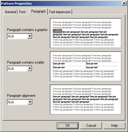
The Paragraph tab allows you to change pattern properties. This lets you identify paragraphs that contain graphics or tables, and also by their alignment. Each paragraph contains boxes (for a graphic, a table, and alignment), which have three settings.
| Element | Description |
|---|---|
| Paragraph contains a graphic: | Select an option form the drop-down list. Yes means that pattern matching will be successful only if a paragraph in the source document contains a graphic. No means that pattern matching will be successful only if the content does not contain a graphic. N/A means that pattern matching will be successful whether or not this characteristic is present. This option is useful when you want to create a new pattern for all paragraphs containing graphics so you can format the graphics consistently (in the Graphics tab dialog in Formatting). |
| Paragraph contains a table: | Select an option form the drop-down list. Yes means that pattern matching will be successful only if a paragraph in the source document contains a table. No means that pattern matching will be successful only if the content does not contain a table. N/A means that pattern matching will be successful whether or not this characteristic is present. Here, you are actually identifying the paragraph that precedes the table. It is the element associated with that style that must be selected in the Tables tab dialog in Formatting if you want to format the appearance of a table. |
| Paragraph alignment: | Select an option from the drop-down list. Pattern matching will be successful only if the paragraph has the alignment selected: Left, Center, or Right. N/A means that pattern matching will be successful whether or not this characteristic is present. This option might be useful, for example, if you want to create a pattern for a particular heading that is centered on the page. You would combine the Center option with specific font settings in the Font tab dialog. |
| OK | Saves your settings and closes the dialog box. |
| Cancel | Cancels changes to your settings and closes the dialog box. |
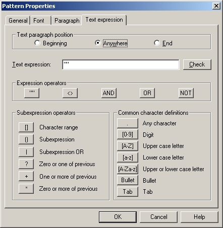
A.4.23 Pattern Property: Text Expression Tab
The Text Expression edit box allows you to edit the string you want to match. You can select the pattern you want to change or define, and click Properties to open Pattern Properties.
The Text Expression tab allows you to modify text expression settings, which allow you to match paragraphs (or text strings for character elements) based on their content instead of their formatting. You can match content at the beginning or end of a paragraph, or anywhere in a paragraph, by using the appropriate radio button under Text Paragraph Position.
| Element | Description |
|---|---|
| Text paragraph position | Select your text paragraph position. |
| Text expression | Enter your text expression. |
| Check | Click this button to parse and validate the string to ensure that it has proper syntax for pattern matching. |
| Expression operators | See list below. |
| Subexpression operators | See list below. |
| Common character definitions | See list below. |
| OK | Saves your settings and closes the dialog box. |
| Cancel | Cancels changes to your settings and closes the dialog box. |
| Element | Description |
|---|---|
| " " | Quotation marks. Every expression must be surrounded by quotation marks to denote the start and end of an expression. |
| < > | Can be used to nest expressions |
| AND | Used to command that both sub expressions be found |
| OR | Used to command that either sub expression be found |
| NOT | Used to command that a sub expression not be found |
| Element | Description |
|---|---|
| [ ] | Allows you to express a character range, for example, for the digits zero to nine, use [0-9] |
| ( ) | Allows you to nest sub expressions |
| | | Used to set an OR expression within a sub expression |
| ? | Look for zero or one of the previous. Used to express when only one more of the previous expressions may exist. |
| + | Look for one or more of the previous. Used to express when more than one of the previous expressions definitely exists. |
| * | Look for zero or more of the previous. Used to express when more of the previous expression may exist. |
Use these to match certain characters:
| Element | Description |
|---|---|
| . | Use to find any character |
| [0-9] | Use to find any digit |
| [A-Z] | Use to find any uppercase character in the English alphabet |
| [a-z] | Use to find any lowercase character in the English alphabet |
| [A-Za-z] | Use to find any uppercase or lowercase character in the English alphabet |
| Bullet | Use to find any bullet character. Bullets are frequently ANSI characters 0149 or 0183. The characters inserted represent these ANSI values. |
| Tab | Use to find any tab character. The representation of a tab character is the result of an ANSI value insertion. |
The following four text combinations can also be used:
| Element | |
|---|---|
| \d | Use to find any digit |
| \u | Use to find any uppercase character |
| \l | Use to find any lowercase character |
| \t | Use to find a tab |
Another character that can be used is the caret, which represents any character but the one that follows it. For example [^ ] would represent any character except a space.
The backslash is used as an escape character. If you need to match characters that are used in the search syntax, such as the quotation marks or parentheses, place a backslash before each.
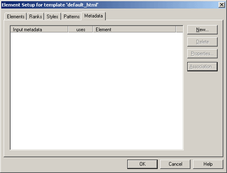
A.4.24 Metadata Tab
When you check a document into Content Server, Dynamic Converter applies a default set of ranks in the template to content: Lowest 1, Title, Lowest 2, Heading 1. These ranks are designed to identify content hierarchy in source documents so that top-level content, in particular, can be handled consistently. At the same time, Dynamic Converter generates an element for each rank. The elements are saved in the template.
With the Classic HTML Conversion Editor you have the option of creating additional ranks, styles, and/or patterns to increase your formatting options. By identifying such characteristics as typeface, font size, font effects (bold, italic, etc.), and color, the Classic HTML Conversion Editor can separate content in the document into similarly formatted groups, known as patterns.
Classic HTML Conversion Editor recognizes:
-
Standard metadata: Properties automatically generated by the application that was used to create the source document.
-
Custom metadata: Special properties you create in the application for the source document.
Note:
Not every source document has standard or custom metadata.
Metadata can be used to improve the usability of your Web site by being placed in Web pages and also the Meta tags of those Web pages, to facilitate information searches on your site.
You must make metadata element-based in order to place the metadata in your Web pages and in Meta tags. Once element-based, standard and custom metadata can be published to a content server.
Whatever metadata you plan to use must exist in, or be associated with, the source documents if Dynamic Converter is to successfully place that metadata in your Web output.
The properties (standard metadata) of a source document may not accurately describe the document. For example, if you create a new document by making a copy of an existing one, the new document may inherit the properties of the existing one.
The Metadata tab includes these dialog boxes:
| Element | Description |
|---|---|
| Input metadata | Lists the input metadata. |
| uses | Indicates whether it is used by an element. |
| Element | Lists the elements. |
| New | Click this button to add new metadata. |
| Delete | Click this button to delete the selected metadata. |
| Properties | Click this button to open the Element Properties dialog. Also see "Element Properties: General Tab". |
| Association | Click this button to associate the selected metadata with a different element. |
| OK | Saves your settings and closes the dialog box. |
| Cancel | Cancels changes to your settings and closes the dialog box. |
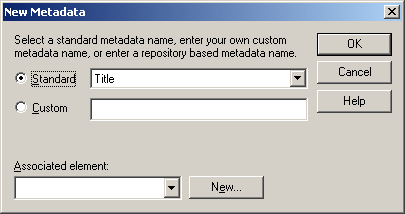
A.4.25 New Metadata Dialog
The New Metadata dialog allows you to select a standard metadata name, enter your own custom name, or enter a repository based metadata name.
| Element | Description |
|---|---|
| Standard | Select this option to use a standard metadata name from the drop-down list. |
| Custom | Select this option to enter your own custom metadata name. |
| Associated element | Select the associated element from the drop-down list or click New to create a new element. Also see "New Element Dialog" |
| New | Click this button to create a new element. Also see "New Element Dialog" |
| OK | Saves your settings and closes the dialog box. |
| Cancel | Cancels changes to your settings and closes the dialog box. |
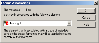
A.4.26 Change Metadata Associations Dialog
The Change Associations dialog allows you to change the associated element. The element that is associated with a piece of metadata controls the output formatting that will be applied to source content of that metadata.
| Element | Description |
|---|---|
| Element | Select an element from the drop-down list. |
| OK | Saves your settings and closes the dialog box. |
| Cancel | Cancels changes to your settings and closes the dialog box. |
A.4.27 Metadata Properties Dialog
The Metadata Properties dialog allows you to associate an element.
| Element | Description |
|---|---|
| Name | Provide a descriptive name. |
| Type | Lists the metadata type. |
| Template | Lists the current template. |
| Element | Select an element from the drop-down list. |
| OK | Saves your settings and closes the dialog box. |
| Cancel | Cancels changes to your settings and closes the dialog box. |
A.5 Formatting Dialog
The Formatting Dialog includes these dialogs:
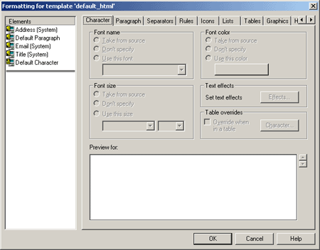
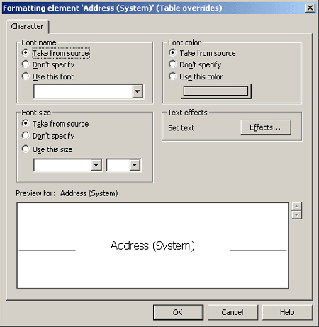
A.5.1 Formatting Character Dialog
Formatting is one of four property sheets in Classic HTML Conversion Editor used to edit templates. The settings in Formatting determine the look and behavior of a Web page created from any source document associated with the template. Most of the work is done in the Character and Paragraph tab dialogs, where you decide how text will display in a Web browser.
Among the many options in Formatting are the ability to:
-
Handle the special challenges posed by tables and lists
-
Add graphical aids to set off content and reinforce document hierarchy
-
Select conversion options for graphics in source documents
-
Associate HTML code with elements
The Formatting Character Dialog includes these dialog boxes:
| Element | Description |
|---|---|
| Elements | Lists the elements. |
| Font name | Select the desired option. "Take From Source" means that Dynamic Converter uses what is in the source document. "Don't Specify" means the Web browser used to view the Web page may substitute its own default settings. If you select "Use this font," choose a specific font from the drop-down list. |
| Font size | Select the desired option. "Take From Source" means that Dynamic Converter uses what is in the source document. "Don't Specify" means the Web browser used to view the Web page may substitute its own default settings. If you select "Use this size," choose a specific font from the drop-down list. |
| Font color | Select the desired option. "Take From Source" means that Dynamic Converter uses what is in the source document. "Don't Specify" means the Web browser used to view the Web page may substitute its own default settings. If you select "Use this color," click Color to choose a color. Also see "Colors Tab". |
| Text effects | Click this button to open the Text Effects dialog. Also see "Text Effects Dialog". |
| Table overrides | Choose this option if you want to format the content of tables in the document differently. |
| OK | Saves your settings and closes the dialog box. |
| Cancel | Cancels changes to your settings and closes the dialog box. |
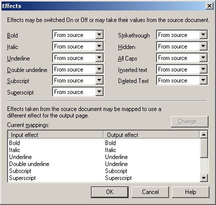
A.5.2 Text Effects Dialog
Text effects are formatting attributes associated with individual characters within a paragraph. Paragraphs often contain words or phrases set in bold or italic, say, that are not part of the paragraph style. When you translate a source document, you can retain these input effects in your Web pages. You can also turn them off or map them to different output effects.
| Element | Description |
|---|---|
| Font effect | Select the desired font effect.
Select the desired font effect. |
| Current mappings | The current input and output effects are listed. |
| Change | Click this button to change the effect. |
| OK | Saves your settings and closes the dialog box. |
| Cancel | Cancels changes to your settings and closes the dialog box. |
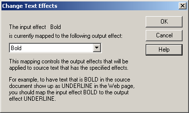
A.5.3 Change Text Effects Dialog
The Change Text Effects dialog allows you to change the mapped output effect. This mapping controls the output effects that will be applied to source text has the specified effect.
Text effects are formatting attributes associated with individual characters within a paragraph. Paragraphs often contain words or phrases set in bold or italic, say, that are not part of the paragraph style. When you translate a source document, you can map individual input effects to other output effects.
| Element | Description |
|---|---|
| Mapped effect | Select the desired output effect from the drop-down list. |
| OK | Saves your settings and closes the dialog box. |
| Cancel | Cancels changes to your settings and closes the dialog box. |
A.5.4 Table Override Dialog
The Table Override dialog allows you to change the appearance of tables. When you format characters for an element in a template, the formatting instructions apply throughout your Web pages, including to text in tables.
Ideally, you will want to use unique styles for table content. But if you use the same styles as for the rest of your source document, you can still use Table Overrides to format text in tables differently.
| Element | Description |
|---|---|
| Font name | Select the desired option. "Take From Source" means that Dynamic Converter uses what is in the source document. "Don't Specify" means the Web browser used to view the Web page may substitute its own default settings. If you select "Use this font," choose a specific font from the drop-down list. |
| Font size | Select the desired option. "Take From Source" means that Dynamic Converter uses what is in the source document. "Don't Specify" means the Web browser used to view the Web page may substitute its own default settings. If you select "Use this size," choose a specific size from the drop-down list. |
| Font color | Select the desired option. "Take From Source" means that Dynamic Converter uses what is in the source document. "Don't Specify" means the Web browser used to view the Web page may substitute its own default settings. If you select "Use this color," click Color to choose a color. Also see "Colors Tab". |
| Text effects | Click this button to open the Text Effects dialog. Also see "Text Effects Dialog". |
| OK | Saves your settings and closes the dialog box. |
| Cancel | Cancels changes to your settings and closes the dialog box. |
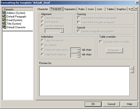
A.5.5 Formatting Paragraph Dialog
The Paragraph tab allows you to set options for paragraphs such as alignment, indentation, and spacing. For each element selected, the formatting instructions apply throughout the web page, including to paragraphs in tables.
Ideally, you will want to use unique styles for table content. But if you use the same styles for the content of tables as for the rest of your source document, you can still use Table Overrides to format paragraphs in tables differently.
| Element | Description |
|---|---|
| Elements | Lists the elements. |
| Alignment | Select this option to change paragraph alignment. |
| Indentation | Select this option to change paragraph indentation. |
| Spacing | Select this option to change paragraph spacing. |
| Special | Select this option to render the paragraph as a graphic. |
| Table overrides | Select this option to override when in a table. |
| OK | Saves your settings and closes the dialog box. |
| Cancel | Cancels changes to your settings and closes the dialog box. |
A.5.6 Margins Dialog
The Margins dialog allows you to change margin alignment, indentation, and spacing.
| Element | Description |
|---|---|
| Elements | Lists the elements. |
| Alignment | Select this option to change margin alignment. |
| Indentation | Select this option to change margin indentation. |
| Spacing | Select this option to change margin spacing. |
| Special | Select this option to render the margin as a graphic. |
| Table overrides | Select this option to override when in a table. |
| OK | Saves your settings and closes the dialog box. |
| Cancel | Cancels changes to your settings and closes the dialog box. |
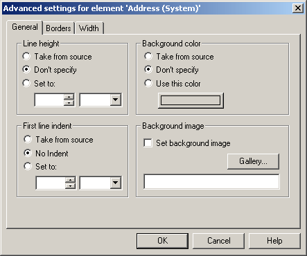
A.5.7 Advanced Settings Dialog: General Tab
The General tab allows you to define advanced settings such as line height, first line indent, background color, and background image.
| Element | Description |
|---|---|
| Line Height | Select the desired option. "Take From Source" means that Dynamic Converter uses what is in the source document. "Don't Specify" means the Web browser used to view the Web page may substitute its own default settings. If you select "Set To," you must define the line height. |
| First Line Indent | Select the desired option. "Take From Source" means that Dynamic Converter uses what is in the source document. "Don't Specify" means the Web browser used to view the Web page may substitute its own default settings. If you select "Set To," you must define the line indent. |
| Background Color | Select the desired option. "Take From Source" means that Dynamic Converter uses what is in the source document. "Don't Specify" means the Web browser used to view the Web page may substitute its own default settings. If you select "Use this color," click Color to choose a color. Also see "Colors Tab". |
| Background Image | If you choose this option you must either enter the image (and path) to be used for the background or click Gallery and select an image. Also see "Gallery Dialog". |
| Gallery | Click this button to open the Gallery and locate the graphics file that you want to use as the background image. Also see "Gallery Dialog". |
| OK | Saves your settings and closes the dialog box. |
| Cancel | Cancels changes to your settings and closes the dialog box. |
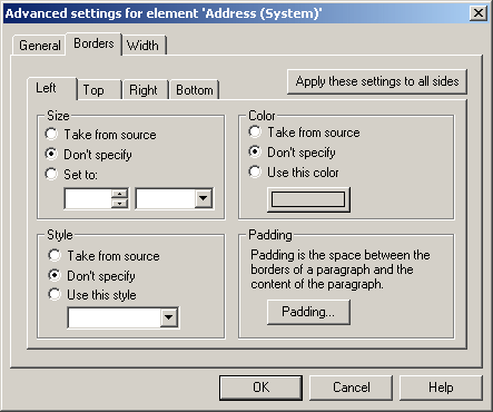
A.5.8 Advanced Settings Dialog: Borders Tab
The Borders tab allows you to define the border size, style, color, and padding for the left, top, right, and bottom.
| Element | Description |
|---|---|
| Size | Select the desired option. "Take From Source" means that Dynamic Converter uses what is in the source document. "Don't Specify" means the Web browser used to view the Web page may substitute its own default settings. If you select "Set To," you must define the border size. |
| Style | Select the desired option. "Take From Source" means that Dynamic Converter uses what is in the source document. "Don't Specify" means the Web browser used to view the Web page may substitute its own default settings. If you select "Use this Style," select the desired style from the drop-down list. |
| Color | Select the desired option. "Take From Source" means that Dynamic Converter uses what is in the source document. "Don't Specify" means the Web browser used to view the Web page may substitute its own default settings. If you select "Use this Color," click Color to choose a color. Also see "Colors Tab". |
| Padding | Click this button to open the Padding dialog. Also see "Advanced Settings Dialog: Padding Dialog". |
| Apply these settings to all sides | After selecting your choices, click this button to apply the settings to all sides; left, top, right, and bottom. |
| OK | Saves your settings and closes the dialog box. |
| Cancel | Cancels changes to your settings and closes the dialog box. |
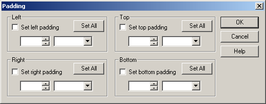
A.5.9 Advanced Settings Dialog: Padding Dialog
The Padding dialog allows you to set the padding for the borders to the left, right, top, and bottom.
| Element | Description |
|---|---|
| Left | Enable this option to add padding to the left border, and then define the padding size. |
| Right | Enable this option to add padding to the right border, and then define the padding size. |
| Top | Enable this option to add padding to the top border, and then define the padding size. |
| Bottom | Enable this option to add padding to the bottom border, and then define the padding size. |
| Set All | After setting our padding for one side, click this button to apply the settings to all sides; left, right, top, and bottom. |
| OK | Saves your settings and closes the dialog box. |
| Cancel | Cancels changes to your settings and closes the dialog box. |
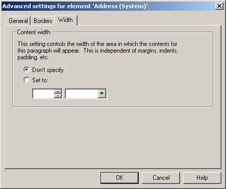
A.5.10 Advanced Settings Dialog: Width Tab
The Width tab allows you to set the content width. This setting controls the width of the area in which the contents for this paragraph will appear. This is independent of margins, indents, padding, etc.
| Element | Description |
|---|---|
| Content Width | You can choose to not specify the width or chose "Set To" and then define the width size. |
| OK | Saves your settings and closes the dialog box. |
| Cancel | Cancels changes to your settings and closes the dialog box. |
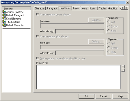
A.5.11 Formatting Separators Dialog
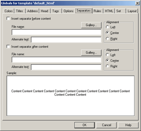
The Formatting Separators dialog allows you to insert separators. Separators are graphics you add to Web pages to set off content. Separators, rules, and icons all can be used the same way. So in creating Web pages, you should consider the effect you are trying to achieve before deciding which to use.
| Element | Description |
|---|---|
| Elements | Lists the elements. |
| Insert separator before element | Select this option to insert the separator before the element. |
| Insert separator after element | Select this option to insert the separator after the element. |
| File name | Enter the path and file name of the separator graphic, or click Gallery to view the available graphics. |
| Gallery | Click this button to open the Gallery and select a separator from the Separators group of graphics. Also see "Gallery Dialog". |
| Alternate text | Optionally, you may add alternate text. |
| Alignment | Select the alignment; left, center, or right. |
| Omit separators when element is within a table | Select this option to omit separators when the element is within a table. |
| OK | Saves your settings and closes the dialog box. |
| Cancel | Cancels changes to your settings and closes the dialog box. |
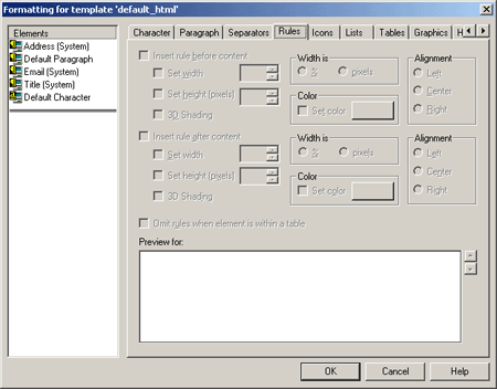
A.5.12 Formatting Rules Dialog
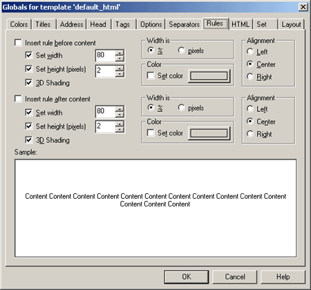
The Formatting Separators dialog allows you to insert rules. You can add rules to Web pages to set off content. Rules, separators, and icons all can be used the same way. So in creating Web pages, you should consider the effect you're trying to achieve before deciding which to use.
| Element | Description |
|---|---|
| Elements | Lists the elements. |
| Insert rule before content | Select this option to insert the rule before the element and then choose to set the width, height, and 3D shading. |
| Insert rule after content | Select this option to insert the rule before the element and then choose to set the width, height, and 3D shading. Select 3D shading if you want to apply a 3D effect to the rule rather than color it. |
| Width is | Select this option to define the rule as a percent or in pixels. |
| Color | Select this option and then click the Color button to open the Color dialog. Also see "Colors Tab". |
| Alignment | Select the alignment; left, center, or right. |
| Omit rules when element is within a table | Select this option to omit rules when the element is within a table. |
| OK | Saves your settings and closes the dialog box. |
| Cancel | Cancels changes to your settings and closes the dialog box. |
A.5.13 Formatting Icons Dialog
The Formatting Icons dialog allows you to insert icons before or after content, select an icon from the graphics Gallery, and define alignment and alternate text.
| Element | Description |
|---|---|
| Elements | Lists the elements. |
| Insert Icon before content | Select this option to insert the icon before content. |
| Insert Icon after content | Select this option to insert the icon after content. |
| File name | Enter the path and file name of the icon, or click Gallery to view the available graphics. |
| Gallery | Click this button to open the Gallery and locate the graphics file that you want to use. Also see "Gallery Dialog". |
| Alternate text | Optionally, you may add alternate text. |
| Alignment | Select the alignment; left, center, or right. |
| Omit Icons when element is within a table | Select this option to omit icons when the element is within a table. |
| OK | Saves your settings and closes the dialog box. |
| Cancel | Cancels changes to your settings and closes the dialog box. |
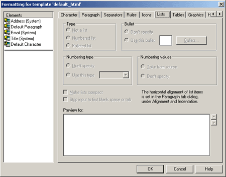
A.5.14 Formatting Lists Dialog
The Formatting Lists dialog allows you to format bulleted and numbered lists. Lists are a special kind of content consisting of a related series of items that are either numbered or bulleted. You may have to apply special formatting instructions to a template to ensure that lists display properly in a web browser.
Dynamic Converter does not apply the <LI> list tag to lists in source documents. As a result, any list in your source document can be "passed through" during translation. Tabs may be lost and bullets may appear smaller, but otherwise the list content will display satisfactorily in your web pages.
For best results in formatting lists, you should assign the list tag <LI> to list content. To do this, you must associate a unique style with lists in the source document, which is highly recommended. If you haven not done so, you can either create a new style in the source document, or create a character pattern to search for list content. You can use patterns even if your document is styled (as long as the pattern is mapped to a unique element).
| Element | Description |
|---|---|
| Elements | Lists the elements. |
| Type | Select the type of list you want to format (numbered or bulleted). If this is not a list select the "Not a list" option. |
| Numbering Type | Select the numbering type from the drop-down list. "Don't Specify" means the Web browser used to view the Web page may substitute its own default settings. |
| Bullet | Select the bullet style to use. "Don't Specify" means the Web browser used to view the Web page may substitute its own default settings. |
| Numbering Values | Select the desired option. "Take From Source" means that Dynamic Converter uses what is in the source document. "Don't Specify" means the Web browser used to view the Web page may substitute its own default settings. |
| Make lists compact | Select this option to minimize the space between list items. |
| Strip input to first blank space or tab | Select this option to strip out numbers from the source data. |
| OK | Saves your settings and closes the dialog box. |
| Cancel | Cancels changes to your settings and closes the dialog box. |
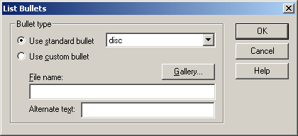
A.5.15 List Bullets Dialog
The List Bullets dialog allows you to use standard HTML bullets or select a custom bullet style.
| Element | Description |
|---|---|
| Use standard bullet | Select this option to use standard HTML bullets. |
| Use custom bullet | Select this option to use a graphic file from the Gallery as a custom bullet. |
| Gallery | Click this button to open the Gallery and locate the graphics file that you want to use. Also see "Gallery Dialog". |
| File name | Enter the path and file name of the graphic to use as a custom bullet, or click Gallery to view the available graphics. Also see "Gallery Dialog". |
| Alternate text | Optionally, you may add alternate text. |
| OK | Saves your settings and closes the dialog box. |
| Cancel | Cancels changes to your settings and closes the dialog box. |
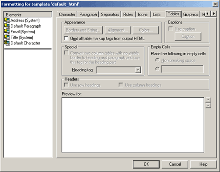
A.5.16 Formatting Tables Dialog
The Formatting Tables dialog allows you to format both the content of tables and their appearance. You format the appearance of tables in the Tables tab dialog. To format the appearance of a table, you must select the element that is associated with the style that immediately precedes the table in the source document.
The Formatting Tables dialog includes these dialog boxes:
| Element | Description |
|---|---|
| Elements | Lists the elements. |
| Appearance | Click the desired button to open the Borders and Sizing dialog, Alignment dialog, or Colors dialog. |
| Omit table markup tags from output HTML | Select this option if you want to ensure that no tables are contained in your output. When selected, the preview window for that element becomes blank, because no output for that element will appear within a table. |
| Special | Select this option, then select a heading, if you want to convert tables containing two columns and no border into headings and paragraphs. |
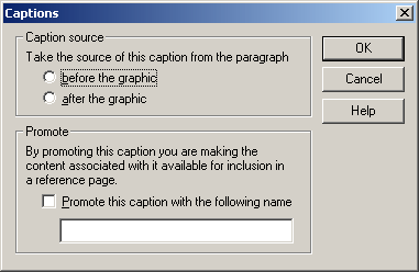
| Caption | Select this option and then click the Caption button to open the Captions dialog. Also see "Captions Dialog".
Caption text is any text that appears immediately before or after a graphic in your source document. Either portion of text can be used as alternative text in your output Web pages. It will appear on screen when the user passes the mouse over the graphic. It will also take the place of the graphic in the event that the graphic does not display on the web page. |
| Empty Cells | Select the "Non breaking space" option to place a non-breaking space in the output HTML for the table. In HTML, non-breaking spaces are required in blank cells of tables to retain proper formatting. If you would rather add text than leave an empty cell, select the blank text box and enter the text you want to appear, such as "intentionally left blank." |
| Headers | Choose whether to "Use row headings' or select "Use column headings" if you want the first row of the table or the first column to be treated as headings on your Web pages. |
| OK | Saves your settings and closes the dialog box. |
| Cancel | Cancels changes to your settings and closes the dialog box. |
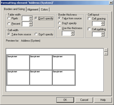
A.5.17 Borders and Sizing Tab
The borders and sizing tab allows you to specify table width, cell width, border thickness, and cell layout.
| Element | Description |
|---|---|
| Table width | Choose to define the table width in pixels or percent and then enter a value or use the up/down controls. "Don't Specify" means the Web browser used to view the Web page may substitute its own default settings. |
| Cell width | Select the desired option. "Take From Source" means that Dynamic Converter uses what is in the source document. "Don't Specify" means the Web browser used to view the Web page may substitute its own default settings. |
| Border thickness | Define the border thickness by entering a value in pixels or using the up/down controls. "Take From Source" means that Dynamic Converter uses what is in the source document. "Don't Specify" means the Web browser used to view the Web page may substitute its own default settings. |
| Cell layout | Define the cell spacing and cell padding by entering a value in pixels or using the up/down controls. |
| OK | Saves your settings and closes the dialog box. |
| Cancel | Cancels changes to your settings and closes the dialog box. |
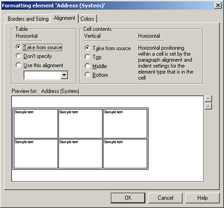
A.5.18 Alignment Tab
The Alignment tab allows you to define the horizontal alignment of a table and the vertical alignment of cells. Horizontal positioning within a cell is set by the paragraph alignment and indent settings for the element type that is in the cell.
| Element | Description |
|---|---|
| Table | Select the desired alignment from the drop-down list. "Take From Source" means that Dynamic Converter uses what is in the source document. "Don't Specify" means the Web browser used to view the Web page may substitute its own default settings. |
| Cell contents | Choose to align the cell contents; top, middle, or bottom. Select the desired alignment from the drop-down list. "Take From Source" means that Dynamic Converter uses what is in the source document. |
| OK | Saves your settings and closes the dialog box. |
| Cancel | Cancels changes to your settings and closes the dialog box. |
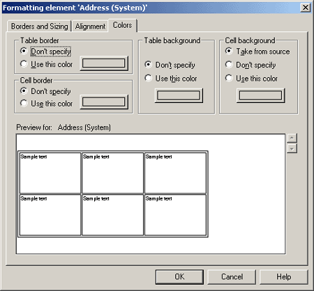
A.5.19 Colors Tab
The Colors tab allows you define colors for the table border, cell border, table background, and cell background.
| Element | Description |
|---|---|
| Table border | Select the desired option. "Don't Specify" means the Web browser used to view the Web page may substitute its own default settings. If you choose "Use this color," click the Color button to open the Color dialog. Also see "Colors Tab". |
| Cell border | Select the desired option. "Don't Specify" means the Web browser used to view the Web page may substitute its own default settings. If you choose "Use this color," click the Color button to open the Color dialog. Also see "Colors Tab". |
| Table background | Select the desired option. "Don't Specify" means the Web browser used to view the Web page may substitute its own default settings. If you choose "Use this color," click the Color button to open the Color dialog. Also see "Colors Tab". |
| Cell background | Select the desired option. "Don't Specify" means the Web browser used to view the Web page may substitute its own default settings. If you choose "Use this color," click the Color button to open the Color dialog. Also see "Colors Tab". |
| OK | Saves your settings and closes the dialog box. |
| Cancel | Cancels changes to your settings and closes the dialog box. |
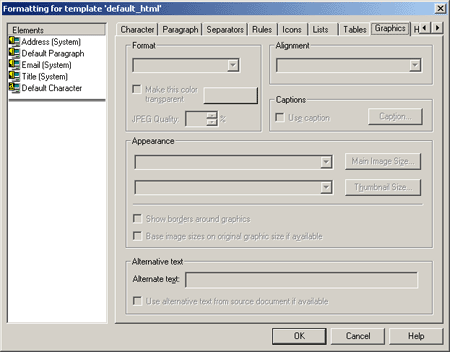
A.5.20 Formatting Graphics Dialog
The Formatting Graphics Dialog includes these dialog boxes:
The Formatting Graphics dialog allows you to set the format, alignment, captions, appearance, and alternative text for graphics.
| Element | Description |
|---|---|
| Elements | Lists the elements. |
| Format | Select the format to use from the drop-down list. |
| Alignment | Select the alignment from the drop-down list. |
| Use caption | Select this option and then click the Caption button to open the Captions dialog. Also see "Captions Dialog".
Caption text is any text that appears immediately before or after a graphic in your source document. Either portion of text can be used as alternative text in your output Web pages. It will appear on screen when the user passes the mouse over the graphic. It will also take the place of the graphic in the event that the graphic does not display on the web page. |
| Caption | Click this button to open the Captions dialog. Also see "Captions Dialog". |
| Main Image Size | Click this button to open the Main Image Size dialog. Also see "Main Image Size Dialog". |
| Thumbnail Size | Use this option to define the thumbnail size. |
| Show borders around graphics | Choose this option to show borders around graphics. |
| Base image sizes on original graphic if available | Select this option to base the image sizes on the original graphic, if available. Use this option if you want to use the original sizes of the graphics for your Web page. (For example, you may have resized a graphic when you placed it in a Word file. With this option, you can revert to the original size of the graphic for displaying in your body pages.) |
| Alternate text | Optionally, you may add alternate text. This alternate text will display in the Web page should the reader's Web browser fail to display a particular graphic. |
| Use alternative text from source document if available | Select this option if you want the alternate text from the source document to be used, if available. |
| OK | Saves your settings and closes the dialog box. |
| Cancel | Cancels changes to your settings and closes the dialog box. |
A.5.21 Main Image Size Dialog
The Main Image Size dialog allows you to define the image size.
| Element | Description |
|---|---|
| Automatic | Select this option to have the Web browser use the default settings to specify the image size. |
| Specific Dimensions | Enter the width and height, in pixels. |
| Maximum Dimensions | Choose this option to define a maximum width or height. |
| Keep aspect ratio | Select this option to maintain the original aspect ratio of the image. |
| OK | Saves your settings and closes the dialog box. |
| Cancel | Cancels changes to your settings and closes the dialog box. |
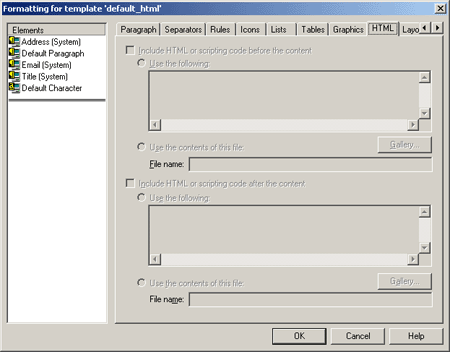
A.5.22 Formatting HTML Dialog
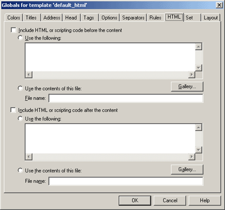
The Formatting HTML dialog allows you to Include HTML or scripting code before or after the content.
| Element | Description |
|---|---|
| Elements | Lists the elements. |
| Include HTML or scripting code before the content | Select this option to include HTML or scripting code before the content. You can choose to "Use the following" and enter the code you want to use in the box or "Use the contents of this file" and enter the path and file name in the text box or click Gallery to locate the file. Also see "Gallery Dialog" |
| Include HTML or scripting code after the content | Select this option to include HTML or scripting code after the content. You can choose to "Use the following" and enter the code you want to use in the box or "Use the contents of this file" and enter the path and file name in the text box or click Gallery to locate the file. Also see "Gallery Dialog" |
| Gallery | Click this button to open the Gallery and locate the graphics file that you want to use. Also see "Gallery Dialog". |
| File name | Enter the path and file name, or click Gallery to view the available graphics. Also see "Gallery Dialog". |
| OK | Saves your settings and closes the dialog box. |
| Cancel | Cancels changes to your settings and closes the dialog box. |
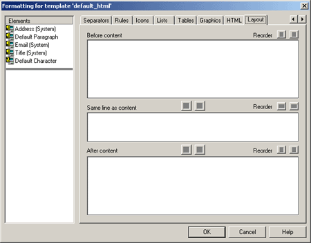
A.5.23 Formatting Layout Dialog
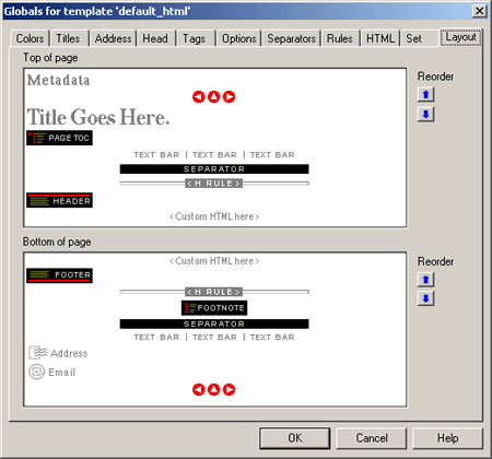
The Formatting Layout dialog allows you to set the order in which elements should appear before or after content, or on the same line as content. You can only format a single element at a time when you are using the Layout dialog.
| Element | Description |
|---|---|
| Elements | Lists the elements. |
| Before content | Choose this option to place the element before the content. |
| Same line as content | Choose this option to place the element on the same line as the content. |
| After content | Choose this option to place the element after the content. |
| Reorder | Select this option to reorder the elements. |
| OK | Saves your settings and closes the dialog box. |
| Cancel | Cancels changes to your settings and closes the dialog box. |
A.6 Navigation Dialog
The Navigation Dialog includes these tabs and dialog boxes:
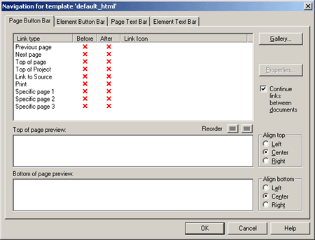
A.6.1 Page Button Bar Tab
Among the navigation options in the Classic HTML Conversion Editor are several special-purpose links that can be added to a page or element button bar. Included is the Link to Source link, which lets users open the source document used to create the Web page on which the link resides. For a user to be able to open a source document in its native format from a Web page, the application used to create the source document must be available on the user's machine.
| Element | Description |
|---|---|
| Reorder | Select this option to reorder the elements. |
| Gallery | Click this button to open the Gallery and locate the graphics file that you want to use. Also see "Gallery Dialog". |
| Properties | Click this button to open the Link Properties dialog. Also see "Link Properties Dialog". |
| Continue links between documents | The option is selected by default. As a result, users can scroll through the Web pages created from all of the source documents in a given publication. To create a formal break after the last Web page of each document, clear this check box. |
| Align top | Select left, center, or right to position the graphic on the page. If several graphics are displayed in the preview boxes, you can use drag and drop to change their order. |
| Align bottom | Select left, center, or right to position the graphic on the page. If several graphics are displayed in the preview boxes, you can use drag and drop to change their order. |
| OK | Saves your settings and closes the dialog box. |
| Cancel | Cancels changes to your settings and closes the dialog box. |
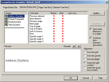
A.6.2 Navigation Element Button Bar Tab
Among your navigation options is the ability to create an element text bar to link the elements of a Web page. The text is drawn from headings (or other content) on the Web page on which the text bar resides.
| Element | Description |
|---|---|
| Name | Lists the elements. |
| Link type | Lists the link type and indicated whether it is used before or after the element. |
| Reorder | Select this option to reorder the elements. |
| Gallery | Click this button to open the Gallery and locate the graphics file that you want to use. Also see "Gallery Dialog". |
| Properties | Click this button to open the Link Properties dialog. Also see "Link Properties Dialog". |
| Omit when element is in a table | Choose this option to omit the link when in a table. |
| Continue links between documents | The option is selected by default. As a result, users can scroll through the Web pages created from all of the source documents in a given publication. To create a formal break after the last Web page of each document, clear this check box. |
| Alignment | Select left, center, or right depending on how you want the new link to be positioned in this page |
| OK | Saves your settings and closes the dialog box. |
| Cancel | Cancels changes to your settings and closes the dialog box. |
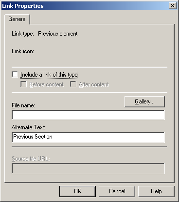
A.6.3 Navigation Element Button Bar Link Properties
This dialog allows you to specify link properties for a navigation element.
| Element | Description |
|---|---|
| Link Type | Lists the link type. |
| Link icon | Lists the link icon, if applicable. |
| Include a link of this type | Chose to include a link of this type either before content or after content. |
| Gallery | Click this button to open the Gallery and locate the graphics file that you want to use. Also see "Gallery Dialog". |
| Alternate text | Optionally, you may add alternate text. |
| Source file URL | Applicable only when creating a Link to Source navigation button. You can use different URLs (the default is%%TRANSIT-INPUTPATH%%), depending on the location of the source document you are linking to. See "Link to Source Link" on page 4-2 for more information. |
| OK | Saves your settings and closes the dialog box. |
| Cancel | Cancels changes to your settings and closes the dialog box. |
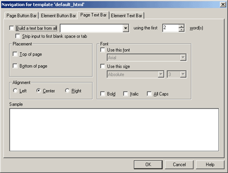
A.6.4 Navigation Page Text Bar Tab
Among your navigation options is the ability to add a page text bar to your Web page. The text is drawn from headings (or other content) of the source document.
| Element | Description |
|---|---|
| Build a text bar from all | Select this option to build a text bar from all. From the first list, select the element to be used for building the text bar. From the second list, select the number of words to be used for each entry.
For example, if you select Heading 1 and accept the default of 2 words, Dynamic Converter creates a text bar comprising an entry for each heading at that level, using the first two words of each heading. |
| Strip input to first blank space or tab | Select this option to strip input to first blank space or tab, if necessary (recommended if the element selected is numbered, so that only the text of the element will appear in the text bar). |
| Placement | For placement, select "Top of page" or "Bottom of page" to place the text bar at the top or bottom of Web pages. To place the text bar before or after a specific element, click "Before every" or "After every" and choose that element from the appropriate list. |
| Alignment | Select the alignment; left, center, or right. |
| Font | Choose "Use this Font," and select the desired font from the drop-down list. Choose "Use this Size," and select the desired font size and characteristics from the drop-down lists. Optionally, select an emphasis style; bold, italics, all capitols. |
| OK | Saves your settings and closes the dialog box. |
| Cancel | Cancels changes to your settings and closes the dialog box. |
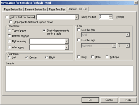
A.6.5 Navigation Element Text Bar Tab
Among your navigation options is the ability to create an element text bar to link the elements of a Web page. The text is drawn from headings (or other content) on the Web page on which the text bar resides.
| Element | Description |
|---|---|
| Build a text bar from all | Select this option to build a text bar from all. From the first list, select the element to be used for building the text bar. From the second list, select the number of words to be used for each entry.
For example, if you select Heading 1 and accept the default of 2 words, Dynamic Converter creates a text bar comprising an entry for each heading at that level, using the first two words of each heading. |
| Strip input to first blank space or tab | Select this option to strip input to first blank space or tab, if necessary (recommended if the element selected is numbered, so that only the text of the element will appear in the text bar). |
| Placement | Select the alignment; left, center, or right. |
| Alignment | Select the alignment; left, center, or right. |
| Font | Choose "Use this Font," and select the desired font from the drop-down list. Choose "Use this Size," and select the desired font size and characteristics from the drop-down lists. Optionally, select an emphasis style; bold, italics, all capitols. |
| OK | Saves your settings and closes the dialog box. |
| Cancel | Cancels changes to your settings and closes the dialog box. |
A.7 Globals Dialog
Globals is one of four property sheets used to edit templates. When you use Globals, your settings apply to a Web page as a whole. The settings are still saved as part of the template but are not associated with specific elements.
The Globals Dialog includes these tabs:
A.7.1 Global Colors Tab
The global settings available to enhance the look of your Web page include the option to set colors for the text, links, and background of Web pages. The Colors tab allows you to select text, link, and background colors and also enables you to use a graphic instead of a color as the background for the Web page.
| Element | Description |
|---|---|
| Text color | Select this option to define your text color and then click the Color button to open the Color dialog. Also see "Colors Tab". |
| Link colors | Select this option to define your link colors and then click the Color button to open the Color dialog. Also see "Colors Tab". |
| Background colors | Select this option to define your background colors and then click the Color button to open the Color dialog. Also see "Colors Tab". |
| OK | Saves your settings and closes the dialog box. |
| Cancel | Cancels changes to your settings and closes the dialog box. |
A.7.2 Titles Tab
The global settings available to enhance the look of Web pages include the option to add titles. Classic HTML Conversion Editor lets you place the titles in both the title bar of the Web browser and the body of the Web page.
| Element | Description |
|---|---|
| Title placement | Under Title Placement, click Place a title in the body of the Web pages.If you also want to the title to appear in the title bar of your Web browser, click Place a Title in the title bar of the Web browser. |
| Document component of title | Choose whether you want the title to come from an element (click the appropriate radio buttons for the Title element or select an alternative element from the list) or from the Title entry in the Document Properties dialog (click the last radio button). |
| Title contents | Select the appropriate options to decide which components you want to use to create the title. |
| Page component of title | Choose whether you want to use content derived from an element (select from the list) or type a title in the text box. |
| OK | Saves your settings and closes the dialog box. |
| Cancel | Cancels changes to your settings and closes the dialog box. |
A.7.3 Address Tab
The global settings available to enhance the look of your Web page include the option to add an address to Web pages.
| Element | Description |
|---|---|
| Include address | Select this option and inn the text boxes, enter the information you want to display in your Web page. It will appear at the end of the page. The address can contain any kind of information. For example, you might enter a copyright line here. Adding an Address to your Web Page
You can format the address by using Address (System), the special element that is automatically a part of every template in Classic HTML Conversion Editor. However, the address will always appear in italic because that is how browsers interpret the <ADDRESS> tag that Dynamic Converter applies to this information. If you don't want the address to appear in italic, you can apply the <P> tag, instead, to this content. |
| Include Email address | Select this option to include and email address. In the Email Prompt text box, enter the text you want to appear on the Web page to signify an email link. In the Email Address text box, enter the complete email address you want to use.
You can format this email address by using Email (System), the special element that is automatically a part of every template in Classic HTML Conversion Editor. |
| OK | Saves your settings and closes the dialog box. |
| Cancel | Cancels changes to your settings and closes the dialog box. |
A.7.4 Head Tab
The global settings available to enhance the look of your Web page include an option to place HTML code in the head of the page.
| Element | Description |
|---|---|
| Include HTML or scripting code at top of file | You can include HTML or scripting code at the top of the file. Typically, the most likely use of this would be to convert source files (for example, ASP files) by adding the appropriate header information to the output files. In addition to adding the code containing the header information, you should select the "Include for HTML documents" option. The specified code will be added to the top of all HTML source files associated with the selected template. |
| Include HTML or scripting code in the Head | Select this option to include HTML or scripting code in the Head. Select "Use the following" and enter the code in the box or select "Use the contents of this file" and enter the path and file name in the text box or click Gallery to locate the file. Also see "Gallery Dialog" |
| OK | Saves your settings and closes the dialog box. |
| Cancel | Cancels changes to your settings and closes the dialog box. |
A.7.5 Tags Tab
You can include HTML or scripting code inside the HTML tag, which will be applied globally to your Web output pages. Typically, the most likely use of this would be to drop in the LANG or Version attributes.
The LANG attribute allows you to identify the language being used for the Web pages associated with the template, while the Version attribute allows you to include a version number in the output. The LANG attribute can be used by a user agent in different ways, including assisting search engines and speech synthesizers.
| Element | Description |
|---|---|
| Include HTML or scripting code inside the HTML tag | Select this option, and then choose either "Use the following" or "Use the Contents of this file."
If you choose "Use the following," enter the code you want to use. For example, to denote Web pages in Italian, you would enter LANG="it" (note the quotations marks around the language abbreviation). If you choose "Use the contents of this file," enter the path and file name in the text box to locate the file |
| Include HTML or scripting code in the Body tag | Select this option, and then choose either "Use the following" or "Use the contents of this file."If you choose "Use the following," enter the code you want to use in the box provided. If you choose "Use the contents of this file", enter the path and file name in the text box, or click Gallery to pick a file from the HTML Code folder in the Gallery. Also see "Gallery Dialog" |
| OK | Saves your settings and closes the dialog box. |
| Cancel | Cancels changes to your settings and closes the dialog box. |
A.7.6 Options Tab
The global settings available to enhance the look of your Web page include the option to place headers and footers in output pages. The Classic HTML Conversion Editor does not automatically include headers and footers in Web pages, but you can display them, if you want.
| Element | Description |
|---|---|
| Include headers in output | Select this option if you want to include headers in the output pages. Choose "Place on all pages" or "Place on first page." You may want to choose the second option if you're splitting a source document into several Web pages. |
| Include footers in output | Select this option if you want to include footers in the output pages. Choose "Place on all pages" or "Place on first page." You may want to choose the second option if you're splitting a source document into several Web pages. |
| When splitting source files at each occurrence of a given element, do not split on the first occurrence of the first element | Select this option to when splitting source files at each occurrence of a given element, to not split on the first occurrence of the first element |
| Allow CSS character and paragraph formatting | Select this option to allow CSS character and paragraph formatting. |
| Use compact paragraph spacing | Select this option to use compact paragraph spacing. |
| Include revision information from source documents | Select this option to include revision information from source documents. The global settings available to enhance the look of Web pages include the option to include revision information in output pages.
By default, if a source document contains text that has been inserted or deleted with revisions turned on, Dynamic Converter will implement the revisions in the output Web page. That is, the Web page will look the same as if the revisions had been accepted in the source document before translation. You can, instead, display the revisions just as they are in the source document. |
| Include scripting variables in output | Select this option to include scripting variables in output. The global settings available to enhance the look or functionality of Web pages include the option to include scripting variables in output pages. With JavaScript, these variables can be used to access different information stored in the output HTML file |
| Variables contain source file details | Select this option to have variables contain source file details. Use this option f you want the TRANSIT_SOURCE variable to include the path of source documents. |
| Generate XML compliant output | Select this option to generate XML compliant output. |
| XML options | Click this button to open the XML Options dialog. Also see "XML Options Dialog". |
| Include cross-references in output | Select this option to include cross-references in output. |
| Hyperlinks within project relinked in output pages | Select this option to have hyperlinks within project relinked in output pages. |
| Strip path from external hyperlinks | Select this option to strip path from external hyperlinks. |
| Use this target for external hyperlinks | Select this option to use this target for external hyperlinks. To include cross-references in output, select this option and enter _blank in the text box. |
| Include footnotes and endnotes in output | Select this option to include footnotes and endnotes in output. You should ensure that any elements associated with footnotes and endnotes are not included in the body of your Web pages. Open Element Setup and check the status of any such elements in the Elements dialog. Also see "Elements Tab". |
| Place endnotes on their own page | Select this option to place endnotes on their own page. |
| Include tables | Select this option to include tables. If you clear this option, tables in the source document will no longer appear in the web page. |
| Skip single hard carriage returns | Select this option to skip single hard carriage returns (hard breaks). This may be useful if your source document is in ASCII format. |
| Preserve links to embedded OLE objects where possible | Select this option to preserve links to embedded OLE objects where possible. |
| Omit hyperlink targets to promoted elements | Select this option to omit hyperlink targets to promoted elements. |
| Retain original bookmark name | Select this option to retain original bookmark name. |
| OK | Saves your settings and closes the dialog box. |
| Cancel | Cancels changes to your settings and closes the dialog box. |
A.7.7 XML Options Dialog
The XML Options dialog allows you to include XML code at the top or end of the output pages.
| Element | Description |
|---|---|
| Include the following at the top of the output pages | Select this option, and then choose either "Use the following" or "Use the contents of this file."If you choose "Use the following," enter the code you want to use in the box provided. If you choose "Use the contents of this file", enter the path and file name in the text box, or click Gallery to pick a file from the HTML Code folder in the Gallery. Also see "Gallery Dialog" |
| Include the following at the end of the output pages | Select this option, and then choose either "Use the following" or "Use the contents of this file."If you choose "Use the following," enter the code you want to use in the box provided. If you choose "Use the contents of this file", enter the path and file name in the text box, or click Gallery to pick a file from the HTML Code folder in the Gallery. Also see "Gallery Dialog" |
| Gallery | Click this button to open the Gallery and locate the graphics file that you want to use. Also see "Gallery Dialog". |
| OK | Saves your settings and closes the dialog box. |
| Cancel | Cancels changes to your settings and closes the dialog box. |
A.7.8 Separators Tab
The Separators tab allows you to insert a separator before or after content.
| Element | Description |
|---|---|
| Insert separator before content | Select this option to insert separator before content. Enter the path and file name of the graphic you want to use in the text box, or click Gallery to locate the graphic. If you already have a default graphics set, the separator from that Set will appear when you click the check box. Also see "Gallery Dialog" |
| Insert separator after content | Select this option to insert separator after content. Enter the path and file name of the graphic you want to use in the text box, or click Gallery to locate the graphic. If you already have a default graphics set, the separator from that Set will appear when you click the check box. Also see "Gallery Dialog" |
| Alternate text | Optionally, you may add alternate text. |
| Alignment | Select the alignment; left, center, or right. |
| OK | Saves your settings and closes the dialog box. |
| Cancel | Cancels changes to your settings and closes the dialog box. |
A.7.9 Rules Tab
The Rules tab allows you insert a rule before or after content, and define the width, color, and alignment.
| Element | Description |
|---|---|
| Insert rule before comment | Select this option to insert the rule before the element and then choose to set the width, height, and 3D shading. |
| Insert rule after comment | Select this option to insert the rule before the element and then choose to set the width, height, and 3D shading. Select 3D shading if you want to apply a 3D effect to the rule rather than color it. |
| Width is | Select this option to define the rule as a percent or in pixels. |
| Color | Select this option and then click the Color button to open the Color dialog. Also see "Colors Tab". |
| Alignment | Select the alignment; left, center, or right. |
| OK | Saves your settings and closes the dialog box. |
| Cancel | Cancels changes to your settings and closes the dialog box. |
A.7.10 HTML Tab
The HTML tab allows you to include HTML or scripting code before and after the content.
| Element | Description |
|---|---|
| Include HTML or scripting code before the content | Select this option to include HTML or scripting code before the content. You can choose to "Use the following" and enter the code you want to use in the box or "Use the contents of this file" and enter the path and file name in the text box or click Gallery to locate the file. Also see "Gallery Dialog" |
| Include HTML or scripting code after the content | Select this option to include HTML or scripting code after the content. You can choose to "Use the following" and enter the code you want to use in the box or "Use the contents of this file" and enter the path and file name in the text box or click Gallery to locate the file. Also see "Gallery Dialog" |
| Gallery | Click this button to open the Gallery and locate the graphics file that you want to use. Also see "Gallery Dialog". |
| OK | Saves your settings and closes the dialog box. |
| Cancel | Cancels changes to your settings and closes the dialog box. |
A.7.11 Set Tab
The global settings available to enhance the look of Web pages include the option to select one of the 28 graphics sets supplied with the Classic HTML Conversion Editor. Making one of the graphics sets the default Set for a particular template ensures the consistent use of navigation buttons and visual aids for all the Web pages created with that template. You can switch between Sets at any time to dramatically alter the look and feel of your Web pages.
| Element | Description |
|---|---|
| Gallery | Click this button to open the Gallery and locate the graphics file that you want to use. Also see "Gallery Dialog". |
| Apply Set Selection | Click this button to apply the set selection. This will change all graphics currently specified in the template. A dialog box appears and asks you to confirm your selection of the Set.
If you make a graphics set the default for a particular template, the background graphic from that Set will automatically be applied by Classic HTML Conversion Editor to all Web pages created with that template. You can change or turn off the background graphic in the Colors tab dialog of Globals. |
| Current Set | Lists the current set. |
| OK | Saves your settings and closes the dialog box. |
| Cancel | Cancels changes to your settings and closes the dialog box. |
A.7.12 Layout Tab
The Layout tab in Globals is used for setting the layout order of navigation and visual aids for the Web page as a whole. All possible navigation and visual aids appear in the two Preview windows, including ones you may not be using. You can use a different order for the same aids at the top versus the bottom of the page. You can also change the alignment of the items.
| Element | Description |
|---|---|
| Top of page | In the Preview pane for Top of Page, select the navigation aid, separator, or rule that you want to move, and use the Reorder arrows to change its order in the sequence. Or select the navigation aid, separator, or rule, and with the mouse button held down, drag and drop the item to reposition it. To change the alignment of the navigation or visual aid, select the item and with the mouse button held down, drag and drop the item so that it is flush left, centered, or flush right in the pane. The cursor changes as you drag the image, indicating the Left, Center, or Right alignment. |
| Bottom of page | In the Preview pane for Bottom of Page, select the navigation aid, separator, or rule that you want to move, and use the Reorder arrows to change its order in the sequence. Or select the navigation aid, separator, or rule, and with the mouse button held down, drag and drop the item to reposition it. To change the alignment of the navigation or visual aid, select the item and with the mouse button held down, drag and drop the item so that it is flush left, centered, or flush right in the pane. The cursor changes as you drag the image, indicating the Left, Center, or Right alignment. |
| Reorder | Use the up/down buttons to reorder the selection. |
| OK | Saves your settings and closes the dialog box. |
| Cancel | Cancels changes to your settings and closes the dialog box. |
A.8 Captions Dialog
The Captions dialog allows you choose the caption source and promote the caption.
| Element | Description |
|---|---|
| Caption source | For Caption Source, select "Before the graphic" or "After the graphic." The text immediately before or after each graphic associated with the selected template will now be used as alternative text in your Web output pages.
If you want to use the text of actual captions in this way, the captions must immediately follow the graphic (and not a figure number, for example). If you want to use caption text for alternative text, do not select the Use alternative text from source document if available check box on the Graphics tab dialog. Otherwise, that text will be used instead. |
| Promote | By promoting this caption you are making the content associated with it available for inclusion in a reference page. |
| OK | Saves your settings and closes the dialog box. |
| Cancel | Cancels changes to your settings and closes the dialog box. |
A.9 Link Properties Dialog
The Link Properties dialog allows you to include a link of this type before or after content, select a graphic, and provide alternate text.
| Element | Description |
|---|---|
| Link Type | The type of link you are adding to the page or element button bar. In addition to the usual links for Previous Page, Next Page, etc., Dynamic Converter offers special links for Link to Source and Specific Page. You must choose a Link Type before entering the Link Properties dialog. |
| Link icon | The button, representing the link, that will display on your Web page. If you have already selected a button for a particular link, it will display in the Link Properties dialog. |
| Include a link of this type | Places the link in your Web page. The "Before content" option places the link at the top of the Web page for a page button bar and before the selected element for an element button bar. The "After content" option places it at the bottom of the Web page or after the element. |
| Gallery | Click this button to open the Gallery and locate the graphics file that you want to use. Also see "Gallery Dialog". |
| File name | The path and file name for the graphic representing the link. If you have associated a graphics set with your template, the appropriate button will be selected automatically. If a button isn't automatically selected, click the Gallery button to open the Gallery and choose a button. Also see "Gallery Dialog". |
| Alternate text | The text that displays as a screen tip when you pass your cursor over the navigation button on a Web page. Also the text that displays instead of the graphic if the user chooses to view only text in the browser. |
| Source file URL | Applicable only when creating a Link to Source navigation button. You can use different URLs (the default is%%TRANSIT-INPUTPATH%%), depending on the location of the source document you are linking to. See "Link to Source Link" on page 4-2 for more information. |
| OK | Saves your settings and closes the dialog box. |
| Cancel | Cancels changes to your settings and closes the dialog box. |
A.10 Change Associations Dialog
The Change Associations dialog allows you to change the associated element. The element that is associated with an input rank controls the output formatting that will be applied to source content matching that rank.
| Element | Description |
|---|---|
| Element | Select an element from the drop-down list. |
| OK | Saves your settings and closes the dialog box. |
| Cancel | Cancels changes to your settings and closes the dialog box. |
A.11 Gallery Dialog
Graphics can enhance your Web pages in many ways. The Classic HTML Conversion Editor ships with over 900 GIFs that can be selected from 28 pre-arranged Sets that contain navigation and visual aids in the same graphics style. You can also select graphics grouped in categories such as backgrounds and separators (the same categories are reflected in the folders found in the Gallery directory). You can even create your own Sets.
The Graphics Gallery has two modes: Sets and Groups. In the Sets mode you can click the options in the Sets window (Apple Butter, etc.) to view the various navigation buttons and other visual aids available in a particular style. (To view the graphic individually, click the plus box next to the Set name to open a folder and then click the graphics you want to view.)
In the Groups mode, click any plus box in the Groups window to open the folder to reveal all the graphics of a particular type available. You can select the first graphic in the group and press the down arrow repeatedly to scroll through all the options available.
The Gallery Dialog includes these dialogs:
The Gallery dialog lists all groups and sets (by selecting the Groups or Sets mode) and provides a preview pane.
| Element | Description |
|---|---|
| Groups | Lists all the groups when in Group mode. |
| Preview (untitled) | Select an item from the Gallery to view it in the preview pane. |
| OK | Saves your settings and closes the dialog box. |
| Cancel | Cancels changes to your settings and closes the dialog box. |
| Mode | Choose whether to view groups or sets. |
A.11.1 Gallery Example Dialog
The Gallery Example dialog allows you to view Gallery images in the preview pane.
| Element | Description |
|---|---|
| Groups | Lists all the groups when in Group mode. |
| Preview (untitled) | Select an item from the Gallery to view it in the preview pane. |
| OK | Saves your settings and closes the dialog box. |
| Cancel | Cancels changes to your settings and closes the dialog box. |
| Mode | Choose whether to view groups or sets. |
A.11.2 Gallery Groups Dialog
The Gallery Groups dialog allows you to view all groups in your Gallery.
| Element | Description |
|---|---|
| Groups | Lists all the groups when in Group mode. |
| OK | Saves your settings and closes the dialog box. |
| Cancel | Cancels changes to your settings and closes the dialog box. |
| Mode | Choose whether to view groups or sets. |
A.11.3 Gallery Groups Example Dialog
The Gallery Groups Example dialog allows you to view all images in your Gallery groups in the preview pane.
| Element | Description |
|---|---|
| Groups | Lists all the groups when in Group mode. |
| Preview (untitled) | Select an item from the Gallery to view it in the preview pane. |
| OK | Saves your settings and closes the dialog box. |
| Cancel | Cancels changes to your settings and closes the dialog box. |
| Mode | Choose whether to view groups or sets. |
A.11.4 Gallery HTML Code
The Gallery HTML Code dialog allows you to view the description and code in the preview panes.
| Element | Description |
|---|---|
| Groups | Select the HTML code group and then choose a specific code to view the description and code in the preview panes. |
| Description | This preview pane provides a description of the selected item. |
| HTML | This preview pane provides the HTML code for the selected item. |
| OK | Saves your settings and closes the dialog box. |
| Cancel | Cancels changes to your settings and closes the dialog box. |
A.11.5 Gallery Set Dialog
The Classic HTML Conversion Editor ships with over 900 GIFs for use as navigation and visual aids. Many of them are available as part of the 28 graphics sets you can choose from to ensure a consistent look to your Web pages.
Each Set consists of all the navigation buttons you'll need to create the necessary jumps between the pages of your Web page, plus a separator, a horizontal rule, a bullet, and a background. And each Set has its own distinctive design.
You can make any of the Sets your default Set for a particular template. Once you do that, graphics from that Set are immediately available from the Set at appropriate points in the program.
For example, if in Formatting you want to place a separator before the element selected, simply click the Insert Separator Before Content check box in the Separators tab dialog. The separator from the default graphics set will display immediately in the Preview window and the path and file name for the graphic will display in the File Name text box.
When you associate a graphics set with a template, the background graphic is automatically applied to all Web pages controlled by that template. You can change this, if you want, in the Colors tab dialog of Globals.
| Element | Description |
|---|---|
| Sets | Lists all the sets when in Set mode. |
| Preview (untitled) | Select an item from Sets to view it in the preview pane. |
| Mode | Choose whether to view groups or sets. |
| OK | Saves your settings and closes the dialog box. |
| Cancel | Cancels changes to your settings and closes the dialog box. |
| Make Default | Choose whether to view graphics by groups or sets. |
Templates and Associated Graphics Sets
The table below lists all 19 body templates in the default project file. The graphics set listed for each body template is also associated with templates. (There are 28 graphics sets in Dynamic Converter, so not all are used.)
| Template | Graphics Set |
|---|---|
| Academy | Aqua Weave |
| Acclaim CSS | Investment |
| Account | Clearing House |
| Adagio CSS | Gray Tab |
| Administration | Planner |
| Analysis | Grouted Tiles |
| Archive CSS | Scalloped |
| Blank | None |
| Business | Blue Bevel |
| Ceremonial | Blue Mexico |
| Courtesy CSS | Cranberry Script |
| Executive | Gray Tab |
| Introduction CSS | Blue Peach |
| Lotus 1-2-3 | Royal Cloth |
| Lotus Freelance | Olive |
| MS Excel | Skill Set |
| MS PowerPoint | Maroon Sand |
| Purple Frost | Lilac Spiral |
| Retrofied! CSS | Salmon Retro |
