20 Understanding Grid Controls
This chapter contains the following topics:
20.1 Grid Controls
A grid control is similar to a spreadsheet. Use grids to display data and to enable users to enter information. Unlike an edit control, grid controls can show multiple data items and multiple table rows at once. You also can use grid controls to enable users to edit table records. In end-user documentation, grid controls are referred to as detail areas.
A grid can either be a browse grid or an update grid. You can use a browse grid for viewing only, and you cannot select individual cells. The find/browse, search & select, power browse, and portlet browse forms have browse grids, as do browse subforms.
You can use an update grid to add, delete, or update records. Cells in an update grid can be selected individually. The header detail, headerless detail, power edit, and portlet edit forms have update grids, as do update subforms.
Grid controls of both types contain columns. The columns are specified at design time and are one of these types:
-
Database column or
-
Data dictionary (DD) column.
A database column is associated with an item in the business view (BV) and through that connection to a DD item. Database columns represent a field in a database record.
Although only one type of column is referred to as a DD column, both types have a connection to a specific DD item. The difference is that a database column has the additional connection to a BV field. A grid column is affected by the properties of the associated dictionary item. For example, if a grid column is associated with a dictionary item of type string with a length of 30, that grid column will not permit more than 30 characters to be typed into the cell.
Grid controls can also have a query-by-example (QBE) line. The QBE columns have a one-to-one correspondence with the grid columns. You use a QBE value to change the selection criteria of a database fetch. Only database columns enable entry in the QBE columns because the purpose of the QBE is to affect the selection and only database columns are in the BV. A QBE column can have one of these comparison types:
-
Equal.
-
Not equal.
-
Less than.
-
Less than or equal to.
-
Greater than.
-
Greater than or equal to.
The comparison type is equal unless you specify otherwise. You can specify the comparison type in the QBE column or by using system functions. You can use wildcards (* or %) for an inexact search on a string field.
Grid values can be retrieved on a cell-by-cell basis or on a row-by-row basis. Internal storage for the grid columns exists in the runtime engine. The way the grid column value is stored is based on the type of the associated dictionary item (for example, math numeric, string, character), and it is distinct from the screen representation of the value. Only one row of data can be acted upon at any given time. Each event executes in the context of a specific row.
20.2 Grid Control Design-Time Considerations
Grid columns can have a heading row and might also have a QBE row to facilitate user searches. Additionally, you can specify rows or columns to display information that you acquire or calculate during runtime. Typically, the rest of the rows contain data. Generally, this data comes from database tables.
Usually, when you make the grid control, you place data items in the grid. The data items can come from the BV attached to the form, or they can be based on DD items. Either way, each data item becomes a column. Just as the grid control itself has a variety of property settings, you can set property values for each column in the grid as well.
You have a great deal of control, both at design time and at runtime, over how the grid appears, what it displays, and how it functions.
This section discusses how to:
-
Design the grid.
-
Add columns to the grid control.
-
Display grid data as icons.
-
Set property values for the grid control.
-
Show multiple currencies per column.
20.2.1 Designing the Grid
This task outlines the overall process for creating a grid.
To design the grid:
-
Create a form.
Find/Browse, header detail, headerless detail, and search & select forms have a grid control on them automatically.
Power edit, power browse, reusable and embedded edit subforms, reusable and embedded browse subforms, edit portlet, and browse portlet forms will accept a grid control.
-
On the form level, attach a BV for the engine to use to populate the grid or use values assigned in ER and system functions to insert grid rows.
-
Drop a grid control onto the form.
-
Configure the control.
If you are working with a header detail form, you can attach a different BV to the control.
-
Add columns to the control.
-
Configure each column.
-
Add logic.
20.2.2 Adding Columns to the Grid Control
To add columns to a grid control:
-
Perform one of these tasks:
-
To add a data item to the grid from the BV associated with the form, double-click a data item in the Business View Columns Browser.
-
To add a data item to the grid that is not in the BV associated with the form, search for a data item in the Data Dictionary Browser, and then double-click it.
Each time you double-click an item, Form Design Aid (FDA) adds it as a column to the grid control.
-
-
Repeat step one until you have added all of the columns you need.
-
Double-click the grid control.
-
On Grid Properties, click the Columns tab and arrange the column order by selecting a column and then using the Up and Down buttons to shift its position in the list.
-
Click the Sort Order tab and set the order in which the system will sort returned records by performing these steps:
-
Select a data item in the Unsorted Columns list and click the right arrow. Repeat for each data item on which you want to sort.
The data item moves to the Sorted Columns list.
-
To toggle between displaying by ascending and descending order, click the data item in the Sorted Columns list.
The letter A next to the data item indicates that the system will display records in ascending order. The letter D next to the data item indicates that the system will display records in descending order.
-
Arrange the column sort order by choosing a column in the Sorted Columns list and then using the Up and Down buttons to shift its position in the list.
-
20.2.3 Displaying Grid Data as Icons
You can display grid cell data as icons to provide quicker, more meaningful visual feedback on certain types of data, such as status flags or other data where the internal value of a flag is not directly meaningful to a user. The ability to display grid data as icons enables you to associate values or ranges of values with an icon image, and then display that image in a grid, instead of the underlying data value.
You can optionally make icons clickable so that a behavior is associated with them. You can also optionally create tooltip popups to display supplementary information about the data. These tooltips are displayed when the user hovers the mouse pointer over the icon image.
20.2.3.1 Icon Display States
An icon can have several states. It can be clickable or non-clickable, and it can be enabled or disabled. It can also display a slightly different image when the mouse hovers over it. The appearance of the icon should be different in each case. This enables the user to understand quickly the current interactivity state of a grid cell.
Icons are therefore represented physically by a group of related graphic images, each of which corresponds to one of the different icon states. The naming convention enables these graphic images to be an interrelated set grouped under a single icon. The base or normal image represents the icon under normal, non-clickable conditions. Standard suffixes identify the other, related images for that same icon.
This table shows the icon naming convention:
| State | Filename Suffix | Example |
|---|---|---|
| Normal (non-clickable) | None | status_ok.gif |
| Clickable | _cl | status_ok_cl.gif |
| Clickable – mouseover | _mo | status_ok_mo.gif |
| Clickable – disabled | _di | status_ok_di.gif |
The graphic image types can be in gif, bmp, jpg and png formats. For each new icon you want to use, you must create four images (one for each state), and then store those images in system\OC4J\j2ee\home\applications\webclient.ear\webclient\img directory.
20.2.3.2 Associating Icons to Data Values
To use an icon to represent an underlying data value or range of values in a column, you use a client-side NER. Client-side NER offers some key advantages when representing data values as icons:
-
Reusability. The NER can be used from any icon column. An example is that you use a NER to capture the decision process associated with each icon data item and then use the same NER in all columns displaying that same data item.
-
Consistency. The same type of data is represented with the same set of icons on multiple grids, over multiple applications.
-
Flexibility. When you need a one-off or non-standard icon representation, you can create special NERs. Alternately, you can use data structures to pass more information than the current value of that single data column to the icon decision-making process. This enables more flexible icon representation.
20.2.3.3 Tooltips on Icons
Displaying data as icons has the disadvantage of hiding detailed and possibly necessary information about the icon from the user.
Tooltips enable you to augment the icon with detailed information. When the user's mouse pointer hovers over an icon, the extended information about that grid cell is displayed. The information that displays is specific to the form and the grid column, but can include any or all of:
-
Icon-specific text for the currently displayed icon.
This text can, for example, provide short, explanatory context information to the user about why the icon is displayed, or its meaning when it is selected for display. This tooltip is labeled Show Icon Tootip in the dialog box.
-
DD Name for the column.
This tooltip is labeled Show DD Name Tooltip in the dialog box.
-
The underlying data value.
This tooltip is labeled Show Value Tooltip in the dialog box.
-
DD Alias for the column.
This tooltip is labeled Show DD Alias Tooltip in the dialog box.
20.2.3.4 Implementing Icons on Grids
Use these steps to display grid data as icons:
-
Identify data values or ranges of values that you want to represent as icons, and then decide which icons to use to represent them. Ensure that all required images for all icons are in the designated location.
-
Create the icon-setting (client-only) NER to define the value-to-icon relationships:
-
Define a data structure that enables enough information to be passed to the NER to make all icon-setting decisions.
-
Use ER to define all necessary data value conditions.
-
Provide at least one call to the Set Grid Cell Icon system function. Each call to this system function enables you to select the icon's base (normal) image using the Image Picker and then to optionally set icon-specific tooltip text to apply under that specific data
-
-
Associate the NER function that sets the icon with the grid columns:
-
From the Column Properties dialog, set Display Style to Icon.
Update the ER for the Grid Cell Display Changed event by adding a call to the NER function that sets the icon.
-
Optionally, to make an icon clickable, select Clickable, and then update the ER for the Grid Column Clicked event
-
20.2.4 Setting Property Values for the Grid Control
Use design-time settings in FDA to affect grid display (including showing multiple currencies per column), loading and processing, and how a user can enter data.
In the next subsections, it is assumed that you access all property values from the Property Browser in FDA.
20.2.4.1 Grid Control Display
You control grid appearance through a combination of property values that you set at design time and system function values you program to occur during runtime. Consider carefully the design-time settings you make because you may not be able to change them during runtime.
In addition to these property settings, use these system functions to affect grid appearance:
-
Set Grid Color
-
Set Grid Font
-
Set Grid Row Format
20.2.4.2 Loading and Processing Behavior
FDA provides some options to automate fetches. You can choose to load the grid based on the fetch logic when the user launches an application if the grid resides on a find/browse or headerless detail form. Use automatic loading options with care; in some cases, enabling these features can have a significantly negative impact on performance.
Especially in HTML environments, the page-at-a-time processing feature can enhance performance. This option enables you to populate the grid at the rate of one page at a time (the runtime engine only loads enough data to fill the grid, and then loads enough data to fill the grid again if the user clicks Next). Page-at-a-time processing is enabled by default, and the JD Edwards standard is to leave it enabled for all form types.
20.2.4.3 Data Entry Behavior
These properties affect how the user interacts with the grid.
20.2.5 Showing Multiple Currencies per Column
When a column has the Support Multiple Currencies option enabled, the runtime engine assumes that each cell contains its own currency setting, and it formats each cell based on that cell's currency decimal setting. The runtime engine will not apply the currency settings to other grid rows, however. Therefore, the application needs to apply currency to each grid row individually. For example, the Amount column in row 1 might have a JPY currency type and be formatted with no decimals, while the Amount column in row 2 might have a USD currency type and be formatted with two decimals.
When a column has the Support Multiple Currencies option disabled, the runtime engine assumes that all of the cells in that column share the same currency setting, and so it applies that currency setting to other grid rows. Therefore, if you specify the currency setting in one row, the system overwrites the currency setting for all the other rows in the grid to match. This feature offers a performance benefit for those grids that contain only one currency because the application needs to specify a currency setting to one grid row only to affect the entire grid.
These currency rules apply:
-
When assigning values using conventions such as target = source, if the source object does not have any currency information (currency code = null or empty string), then the target object keeps its own currency.
-
When a GB object is cleared, the currency code and currency decimal information for that column is not cleared.
20.3 Grid Control Events
This section discusses the events that runtime fires while processing a grid control.
Depending on the type and mode of the form, runtime fires a variety of events in response to events regarding the grid control.
If you set up a custom fetch routine, you will want to make use of Get Custom Grid Row. To perform a custom fetch, attach logic to this event to fetch a single row. To indicate that there are more records to fetch, use the system function, Continue Custom Data Fetch (set it to True).
When runtime loads the grid control, it fires Add Last Entry Row to Grid when (and if) it adds an entry row as the last line in the grid.
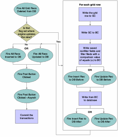
The pattern for adding and updating records is to fire an event immediately before and after commit. Then, runtime fires another event after all the records have been processed. This is a list of applicable events:
-
Add Grid Rec to DB - Before
-
Add Grid Rec to DB - After
-
All Grid Recs Added to DB
-
Update Grid Rec to DB - Before
-
Update Grid Rec to DB - After
-
All Grid Recs Updated to DB
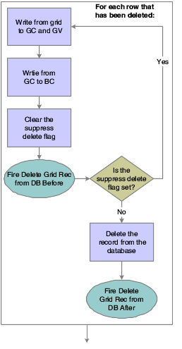
The pattern for deleting a row is similar except that runtime notifies you before and after the user action as well as the commits:
-
Delete Grid Rec Verify - Before
-
Delete Grid Rec Verify - After
-
Delete Grid Rec from DB - Before
-
Delete Grid Rec from DB - After
-
All Grid Recs Deleted from DB
Runtime notifies you of these user actions:
-
Column Selection Changed
This event applies to check box grid columns only. Column Selection Changed fires if the user selects or clears an editable check box grid cell. It does not fire if the grid cell is modified by event rules.
-
Grid Column Clicked
This event fires only if the grid column was configured as being clickable during design time.
-
Visual Assist Button Clicked and Post Visual Assist Clicked
If you want to override the default UDC form that appears automatically in response to clicking the Visual Assist, these are the events to which to add the logic.
-
Double Click on Row Header
Finally, runtime signals as the user works through the grid, starting when the grid gets focus and ending when the grid loses focus.
-
Set Focus on Grid
This event fires whether the user or runtime changes the focus.
-
Grid Cell Display Changed
This event applies only to icon grid columns (those for which the Display Style property has been set to Icon.) The event fires and the cell's display icon setting changes whenever the value of the data in the cell changes. The value can change by fetching data, adding or updating records in a grid, setting the output parameter of a system or business function call, or by explicit ER assignment. It can therefore fire at many different times during the grid population, navigation and editing life cycle, including within other grid events.
This event should reference a client-side NER, which internally calls the Set Grid Cell Icon system function, which sets the new icon or tooltip to display for the column. You should make only a simple, single reference to the system function. If you do not call this system function, the cell displays a blank image.
-
Column Selection Changed
This event fires only if the column is a check box column (that is, the column Display Style-Default or Checkbox property has been set to Checkbox).
-
Row is Entered
-
Row is Selected (Web Only)
-
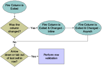
Row is Exited
-
Row Exit & Changed - Inline
This event fires after Row is Exited if the grid is an update grid and the row has been changed since the last time the row was exited.
The Trigger Parallel Event system function is available for the Row Is Exited and Changed and Row Is Exited and Changed In-Line events. This system function will enable a parallel event to run on a separate thread and will not interfere with existing Event Rules. (Release 9.1 Update 5)
-
Row is Exited & Changed - Asynch
This event fires after Row Exit & Changed - Inline if the grid is losing focus, or if another row is entered. Row is Exited & Changed - Asynch is equivalent to validating the contents of the row. It is often used for the Edit Line master business function.
-
Kill Focus on Grid
This event fires whether the user or runtime changes the focus.
20.4 Grid Control Runtime Processing
This section discusses runtime processing for the grid control.
20.4.1 How Runtime Processes the Grid Control
This subsection discusses how runtime processes the grid control.
Typically, runtime processes the grid control at these points in a standard workflow:
-
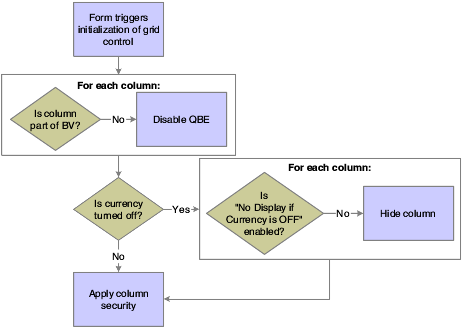
On control initialization (triggered by form initialization).
-
On grid population request (triggered conditionally by control initialization, Next, and Previous, and always by Find).
-
On row or control exit.
This flowchart illustrates the initialization process for a grid control:
Grid population occurs immediately after the initialization process if the option, Automatically Find On Entry is selected. The grid population process is also triggered when the user clicks the Find button or if you apply logic on an event to do so. If the fetch requires access to the form's BV only, then you can probably enable the engine to perform the fetch on its own. However, if you want to access other tables, you must set up and execute a custom fetch programmatically.
This flowchart illustrates the steps that occur when find is initiated:
Figure 20-2 Grid control find button processing
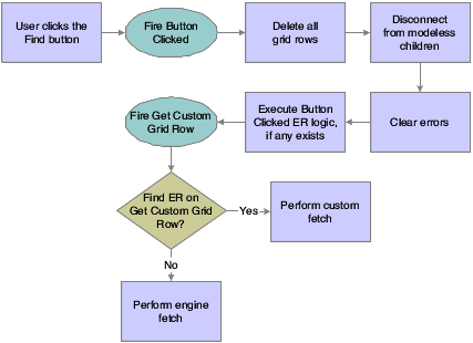
Description of "Figure 20-2 Grid control find button processing"
This flowchart illustrates how the system performs an engine fetch:
Figure 20-3 Grid control fetch processing
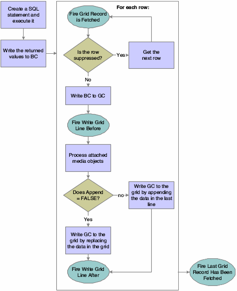
Description of "Figure 20-3 Grid control fetch processing"
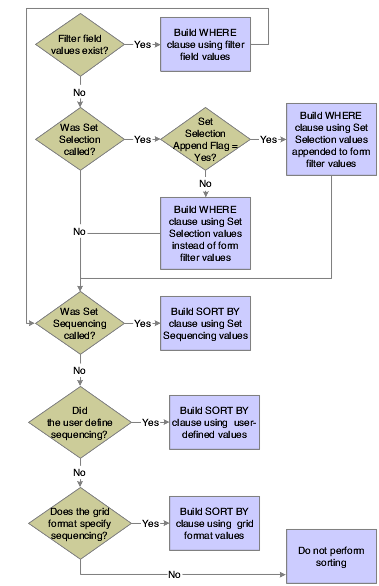
This flowchart illustrates how the system creates the SQL statement:
Custom fetches are executed based exclusively on the ER associated with the Get Custom Grid Row event. The ER provides instructions for how to load a row, and runtime repeats the ER until you tell it to stop or it reaches the end of a page if page-at-a-time processing is enabled. To tell the engine to continue looping or not, include a call to Continue Custom Fetch in the ER. Set Continue Custom Fetch to True to run another loop; set it to False to exit the custom fetch loop. (Not calling Continue Custom Fetch is equivalent to setting it to false.)
Grid controls are used to display information. In some instances, information display is all the grid does, in which case, no more grid control processing occurs.
Grids can also be used to enable users to delete, edit, and add data as well. To enable any of these functions, the grid (and therefore the form) must be in Add or Update mode (Update mode is the default mode; add mode occurs either when the user clicks Add or a fetch fails to retrieve data). Furthermore for add and update capabilities, the grid must not be disabled; that is, the Disable Input option was not set at design time. Finally, to add data, the user must have an entry row (that is, a blank row) as well. Runtime automatically adds an entry row to update grids in the add and update modes as long as the No Adds on Update Grid option was not set at design time.
When the user tabs out of an entry row, runtime performs these functions in this order:
-
Clear the GC hash table.
-
Fire Last Entry Row to Grid.
-
Get the value from the GC and copy the contents into a new entry row.
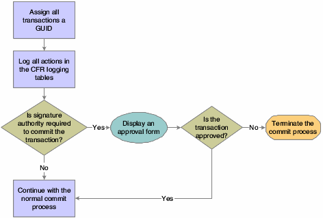
This three-part flowchart illustrates how runtime processes the act of writing data from the grid and committing the change to the database:
Figure 20-5 Grid control database commit, part 1 of 3
Description of "Figure 20-5 Grid control database commit, part 1 of 3"
Figure 20-6 Grid control database commit, part 2 of 3
Description of "Figure 20-6 Grid control database commit, part 2 of 3"
Figure 20-7 Grid control database commit, part 3 of 3
Description of "Figure 20-7 Grid control database commit, part 3 of 3"
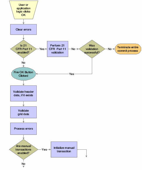
This flowchart illustrates 21 CFR 11 validation:
Figure 20-8 Grid control 21 CFR validation
Description of "Figure 20-8 Grid control 21 CFR validation"
This two-part flowchart illustrates grid data validation:
Figure 20-9 Grid control data validation, part 1 of 2
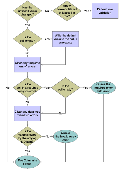
Description of "Figure 20-9 Grid control data validation, part 1 of 2"
Figure 20-10 Grid control data validation, part 2 of 2
Description of "Figure 20-10 Grid control data validation, part 2 of 2"
20.4.2 Impact of Interactivity Levels
This subsection discusses the effect of different runtime processing environments and modes: HTML (low or high interactivity) or Windows.
This table contrasts the differences:
| Grid Type | Interactivity | Effect |
|---|---|---|
| Non-editable | Low | Refresh the entire form (including grid control) on Find, Next, and Previous. Display only one page of data in the grid. |
| Non-editable | High | Refresh only the grid (not the entire form) on Find. Append additional rows and expand the page size on Next. The interface provides a vertical scroll bar. |
| Non-editable | Windows | Refresh only the grid (not the entire form) on Find. |
| Editable | Low | Display only one page of data in the grid. Post and refresh behavior depends on whether the Multi-Line Edit option is enabled:
|
| Editable | High | Expand the page and add a vertical scroll bar to display all rows. Post asynchronously and refresh the grid control at every user action (row exit, column exit, and so forth). Add a new entry row upon user keying into and exiting any cell in the entry row. |
| Editable | Windows | Expand the page and add a vertical scroll bar to display all rows. Process every user action immediately. Add a new entry row upon user keying into any cell in the entry row. |
For high interactive editable grid, post asynchronously for each cell change.
20.5 Grid Control System Functions
This section discusses the system functions you can use to affect how the grid control works during runtime.
Grid system functions enable you to manipulate the appearance of the grid and what goes into or comes out of it during runtime. In the latter case, the system applies the command either to the model version of the grid or to the display version. The model version of the grid contains all rows and columns, whereas the display version might have hidden rows or columns. This is an important distinction to make when you are performing actions based on row or column number. For example, assume a grid contains three rows, but the second one is hidden. If you insert a row beneath row number two in the model grid, the insert row becomes row three, and row three becomes row four. However, if you insert a row beneath row number two in the display grid, the row is inserted at the bottom of the grid, because the actual row number two is hidden.
Another distinction to make is whether the system function expects the first grid row number to be zero or one. All system function descriptions where these factors might be an issue include whether they affect the model or display version of the grid and whether they are zero- or one-based.
Some grid-related system functions enable you to alter the appearance of the grid. Use Set Grid Color to change the background color of a cell, row, column, or the entire control. Use Set Grid Font to change the type, style, size, effects, and color of the font in a cell, row, column, or the entire control. Alternatively you can use Set Grid Row Format to use HTML formatting commands to control the appearance of the grid, not only for color and font, but for other factors as well. Use Set Grid Cell Icon within a client-side, icon-setting NER to set an icon for a grid cell. Use Set Grid Cell Icon Visibility within normal form-based ER to control an icon's visibility dynamically.
To enable or prevent a user from customizing the grid, use Display Customize Grid Option.
Use Hide Grid Column and Show Grid Column to hide and display columns in the grid. Although a user cannot affect a hidden column, you can still work with and change values in it programmatically.
If the column is based on a DD item, use Set Data Dictionary Overrides to change the DD attributes of the column, or Set Data Dictionary Item to substitute another DD item altogether. To change the heading for the column, use Set Grid Column Heading.
Use Hide Grid Row and Show Grid Row to hide and display rows in the grid. As with columns, you can still affect hidden grid rows programmatically.
You can also control the bitmap icon that appears next to a given row with Set Grid Row Bitmap.
You can enable or prevent users from changing an existing cell, row, column, or the entire control. Use Enable Grid to enable user edits (assuming that the current mode permits such actions) and Disable Grid to prevent them. Although users cannot alter a disabled grid object, you can change it programmatically.
You can enable or prevent users from importing from Excel or from importing or exporting to Excel or Word with Display Import from Excel Option, Display Export to Excel Option, and Display Export to Word Option.
You can determine if a grid cell has been updated since the last check with Was Grid Cell Value Entered.
Use Get Max Grid Rows to count the number of rows currently loaded into the grid control. Use Get Selected Grid Row Count to count the number of rows in the current selection. The selected area need not consist of contiguous rows.
Use Set QBE Column Compare Style to set the comparison value (=, >, <=, and so forth) for a QBE column. Clear QBE Column clears an entry in a QBE column.
Runtime always fetches all records for all columns defined by the BV. However, you can impact how runtime builds the WHERE and ORDER BY clauses of the SQL SELECT statement it executes to perform a fetch. (Use the various Hide system functions to filter what the user sees even more, if necessary.) Use Set Selection to input the specific values you want to use in the WHERE clause. For example, assume that you want a list of accounts that are greater than 1000 USD. The SQL WHERE statement might look like this (literal values are used to simplify the examples):
WHERE F0902.GBAN01 > 1000
The Set Selection statement that builds this code would look like this:
Set Selection(FC Grid, F0902, GBAN01, <Greater Than>, '1000', <None>)
That is: (grid control, table, alias, comparison type, comparison value, and/or).
The values you input with Set Selection persist until form close. Consequently, subsequent calls to Set Selection enable you to build a complex WHERE clause. For example, say you wanted a list of document types for Foundation. In the F0005 table, system code and object type are in two different columns, so you must call Set Selection twice. First:
Set Selection(FC Grid, F0005, DRSY, <Equal To>, '00', <None>)
Then:
Set Selection(FC Grid, F0005, DRRT, <Equal To>, 'DT', <AND>)
By setting the and/or parameter to <AND>, the system knows to append the WHERE clause with the values from a subsequent call to Set Selection with an AND. Therefore, runtime will build this WHERE clause:
WHERE F0005.DRSY = '00' AND F0005.DRRT = 'DT'
Use Set Selection Append Flag to indicate whether the criteria from the Set Selection system function should replace the criteria from existing filter fields and QBE or be appended to it.
You can alter the sort order of the returned values by using Set Sequencing. Set Sequencing builds the ORDER BY clause of the SQL statement. The Set Sequencing parameters are: Set Sequencing (grid control, table, alias, sort order), so if we wanted to sort the preceding example by the document type code (DRKY) in ascending order, you would code:
Set Selection(FC Grid, F0005, DRKY, <ASCENDING>)
If you need to build a WHERE clause and do not want to use values that may already exist because of previous uses of Set Selection, use Clear Selection to delete all existing selection (but not sequencing) values from memory. To remove sequencing values, use Clear Sequencing.
When you fetch data, you can populate GB and then use system functions to write GB values to the grid control. You can also write from the grid control to the GB and manipulate the GB and grid data in other ways.
To write from the GB to the grid, use either Insert Grid Buffer Row or Update Grid Buffer Row, depending on whether you want to add a new row to the grid (insert) or overwrite an existing row (update). In either case, when you write a new row, you have a variety of configuration options. You can make the new row selectable, editable, updatable, and deletable, assuming that the current conditions permit such actions. You can also clear the GB automatically after insert so that you do not need to make repeated calls to Clear Grid Buffer, which is the system function that removes all values from the GB.
Insert Grid Buffer Row and Update Grid Buffer Row both require a row number that is based on the model grid as input so that runtime knows where to place the new row. One way to determine a grid row number is with the system function, Get Selected Grid Row Number.
To activate a specific grid row during an event, use Get Grid Row. After identifying a row with Get Grid Row, all subsequent ER that normally references GCs will reference the identified row instead. The alternate reference lasts for the duration of the event.
To prevent a row from being written to the grid during the runtime fetch, use Suppress Grid Line.
To copy or populate a grid row to the GB, use Copy Grid Row to Grid Buffer. To remove a grid row from the grid control, use Delete Grid Row.
You can set or clear an error on a cell, row, column, or the entire control. Use Set Grid Cell Error to set errors and Clear Grid Cell Error to clear them.
Change Row Selection
Use this system function to select or deselect grid rows programmatically.
- Grid
-
Input, required. The grid form control (FC) to affect.
- Row
-
Input, required. The row to affect. Set the parameter to <All Rows>, <Currently Selected Row>, or an applicable object from the object list.
- Select State
-
Input, required. The state (selected or deselected) in which to put the indicated row or rows. Set the parameter to <Selected (1)>, <Unselected (0)>, or an applicable object from the object list.
Clear Grid Cell Error
Use this system function to clear an error on a cell, a row, a column, or the entire control. Also, this system function does not take hidden rows into account; in other words, it affects the display grid instead of the model grid.
- Grid
-
Input, required. The grid FC to affect.
- Row
-
Input, required. The row in which to clear the error. Set the parameter to an alphanumeric constant (<Literal>), <All Rows>, or <Currently Selected Row>.
- Column
-
Input, required. The column in which to clear the error. Set the parameter to an applicable object (GC grid column) from the object list or <All Columns>.
Clear QBE Column
Use this system function to clear text from a single QBE column or from all columns.
- Grid
-
Input, required. The grid FC to affect.
- Column
-
Input, required. The QBE column to clear. Set the parameter to an applicable object (GC grid column) from the object list or <All Columns>.
Clear Selection
Use this system function to clear all system-function-defined selection information that was used to build previous SQL statements during the current session.
- Grid
-
Input, required. The grid FC to affect.
See Also:
Set Selection
Clear Sequencing
Use this system function to clear all system-function-defined sequencing information that was used to build previous SQL statements during the current session.
Copy Grid Row to Grid Buffer
Use this system function to write all of the GC fields to GB. Depending on the conditions when this function is initiated, the GC can be either in memory or in the grid. This system function affects the model version of the grid and is one-based.
Delete Grid Row
Use this function to delete a grid row from the model grid. That is, you can use this system function to affect hidden rows. This system function affects the model version of the grid and is one-based.
Disable Grid
Use this system function to protect a cell, a row, a column, or the entire control from being edited.
- Grid
-
Input, required. The grid FC to affect.
- Row
-
Input, required. The relative row to disable. The first row is 0. Set the parameter to an alphanumeric constant (<Literal>), <All Rows>, or <Currently Selected Row>.
- Column
-
Input, required. The column to disable. Set the parameter to an applicable object (GC grid column) from the object list or <All Columns>.
This function is useful when you need to complete more information in the header before you can add individual rows or when you want to use information in the header as default information in the grid. Also, this system function does not take hidden rows into account when deleting a row based on an absolute row number value.
See Also:
Enable GridDisplay Customized Grid Option
Use this function to hide or display the option that enables users to customize the grid. This includes the customize grid link on the grid header and the Grid Formats menu item under Tools menu.
Display Export to Excel Option
Use this function to hide or display the option that enables users to export the contents of the grid control to Excel. This includes the "Export to Excel" button on the grid header and the "Export To Excel" menu item under Tools menu.
- Grid
-
Input, required. The grid FC to affect.
- Enable
-
Input, required. A flag indicating whether to hide (Enable=<FALSE>) or display (Enable=<TRUE>) the option. Set the parameter to <TRUE> or <FALSE>.
Display Export to Word Option
Use this function to hide or display the option that enables users to export the contents of the grid control to Word. This includes the Export to Word button on the grid header and the Export To Word menu item under Tools menu.
- Grid
-
Input, required. The grid FC to affect.
- Enable
-
Input, required. A flag indicating whether to hide (Enable=<FALSE>) or display (Enable=<TRUE>) the option. Set the parameter to <TRUE> or <FALSE>.
Display Import from Excel Option
Use this function to hide or display the option that enables users to import the contents of an Excel file into a grid. This includes the "Import From Excel" button on the grid header and the "Import From Excel" menu item under Tools menu.
- Grid
-
Input, required. The grid FC to affect.
- Enable
-
Input, required. A flag indicating whether to hide (Enable=<FALSE>) or display (Enable=<TRUE>) the option. Set the parameter to <TRUE> or <FALSE>.
Enable Grid
Use this system function to enable a user to edit a cell, a row, a column, or the entire grid. Also, this system function does not take hidden rows into account when enabling a row based on an absolute row number value.
- Grid
-
Input, required. The grid FC to affect.
- Row
-
Input, required. The relative row to enable. The first row is 0. Set the parameter to an alphanumeric constant (<Literal>), <All Rows>, or <Currently Selected Row>.
- Column
-
Input, required. The column to enable. Set the parameter to an applicable object (GC grid column) from the object list or <All Columns>.
See Also:
Disable Grid
Get Grid Row
Use this function to target a grid row for use in an upcoming function in place of the grid row that would be used ordinarily. This system function affects the model version of the grid and is one-based.
- Grid
-
Input, required. The grid FC to affect.
- Row
-
Input, required. The relative row to acquire. Set the parameter to an alphanumeric constant (<Literal>), <Blank>, <Zero>, or applicable object from the object list.
Get Max Grid Rows
Use this system function to count the number of rows in the model grid; that is, it counts both hidden and visible rows.
- Grid
-
Input, required. The grid FC to affect.
- Row
-
Input, required. The object to which to assign the return value. Set the parameter to an applicable object from the object list.
This system function returns the number of rows in the model grid to the object identified by Row.
See Also:
Disable GridGet Next Selected Row
Use this system function to determine the next selected grid row after a given row.
- Grid
-
Input, required. The grid FC to affect.
- Start Row
-
Input, required. The row from which to start searching for a selected row. In other words, runtime will return the first row it finds, after this row, that has been selected. To include the first row of the grid in the search, select the special parameter, <Before First Row>. Set the parameter to <Before First Row> or an applicable object from the object list.
- Row
-
Output, required. The object to which to assign the return value. Set the parameter to an applicable object from the object list.
Get Selected Grid Row Count
Use this function to count the number of grid rows in the current selection. The rows to be counted need not be contiguous.
- Grid
-
Input, required. The grid FC to affect.
- Row
-
Output, required. The object to which to assign the return value. Set the parameter to an applicable object from the object list.
This system function returns the number of rows in the current selection to the object identified by Row.
See Also:
Get Max Grid RowsGet Selected Grid Row Number
Use this function to get the row number for a selected row. This system function affects the model version of the grid and is one-based.
- Grid
-
Input, required. The grid FC to affect.
- Row
-
Output, required. The object to which to assign the return value. Set the parameter to an applicable object from the object list.
If multiple rows are selected, the function returns the index value for the first row. Typically, you use this function only when you need to save the row as a variable for future processing.
Hide Grid Column
Use this function to prevent an entire column from appearing on the form.
- Grid
-
Input, required. The grid FC to affect.
- Column
-
Input, required. The column to hide. Set the parameter to an applicable object (GC grid column) from the object list or <All Columns>.
See Also:
Show Grid Column
Hide Grid Row
Use this system function to prevent an entire row from appearing on the form. This system function affects the model version of the grid and is one-based.
- Grid
-
Input, required. The grid FC to affect.
- Row
-
Input, required. The relative row to hide. Set the parameter to an alphanumeric constant (<Literal>), <All Rows>, <Currently Selected Row>, an applicable object from the object list.
This is an example of how to use this system function. If you create a form with a grid and you want to summarize rows, add together several rows to determine a total and show the total row. If you use this system function, you might include a check box for the detail information and then display the row instead of repopulating the grid.
If no row is selected when it is invoked, then the system function hides the last row.
See Also:
Show Grid RowInsert Grid Buffer Row
Use this system function to insert a row from the GB into the grid control. After the grid row is inserted, the row will receive focus when the grid is updated. This system function affects the model version of the grid and is one-based.
- Grid
-
Input, required. The grid FC to affect.
- Row
-
Input, required. The relative row to insert the row. Set the parameter to an alphanumeric constant (<Literal>), <After Current Row>, or <After Last Row>.
- Selectable?
-
Input, required. An indicator of whether the Select button processes for the inserted row. Set the parameter to <Yes> or <No>.
- Protected?
-
Input, required. An indicator of whether the user can edit the inserted row. Set the parameter to <Yes> or <No>.
- Updateable?
-
Input, required. An indicator of whether runtime will attempt to update or insert the underlying table if the user edits the data and clicks the OK button. Set the parameter to <Yes> or <No>.
- Deleteable?
-
Input, required. An indicator of whether the user can delete the inserted row. Set the parameter to <Yes> or <No>.
- Clear After?
-
Input, required. An indicator of whether runtime should clear the GB automatically immediately after the insert. Set the parameter to <Yes> or <No>.
See Also:
Update Grid Buffer Row
Insert Grid Row
This system function is deprecated. Use Insert Grid Buffer Row instead.
Set Data Dictionary Item
Use this system function to override form controls and grid columns that are DD items. This system function affects the model version of the grid, and it is one-based.
- Grid
-
Input, required. The grid FC to affect.
- Column
-
Input, required. The column to change. Set the parameter to an applicable object (GC grid column) from the object list or <All Columns>.
- DD Alias
-
Input, required. The alias of the DD item that you want to use. Set the parameter to a specific DD alias (<Pick DD Item>) or an applicable object from the object list.
- System Code
-
This parameter is reserved for future functionality.
This system function makes a complete change; you substitute a different DD item for the existing one. You can also create a new data item that is not the same type as the old item. The new DD item must be the same data type as the previous DD item or the system function call does not make any changes.
Set Data Dictionary Item Overrides
Use this system function to change a specific DD item property. This system function affects the model version of the grid, and it is one-based.
- Grid
-
Input, required. The grid FC to affect.
- Column
-
Input, required. The column to override. Set the parameter to an applicable object (GC grid column) from the object list or <All Columns>.
- Overrides
-
Input, required. The override to apply. Set the parameter to the specific type of override to apply.
Set Grid Cell Error
Use this system function to set an error on a cell, a row, a column, or the all columns in the grid. Also, this system function does not take hidden rows into account; in other words, it affects the display grid instead of the model grid.
- Grid
-
Input, required. The grid FC to affect.
- Row
-
Input, required. The relative row on which to set the error. Set the parameter to an alphanumeric constant (<Literal>), <All Rows>, <Currently Selected Row>, or applicable object from the object list.
- Column
-
Input, required. The column on which to set the error. Set the parameter to an applicable object (GC grid column) from the object list or <All Columns>.
- Error Code
-
Input, required. The alias of the error to be set on the row and column. Set the parameter to an alphanumeric constant (<Literal>), <Blank>, <Zero>, or applicable object from the object list.
See Also:
Clear Grid Cell Error
Set Grid Cell Icon
Use this system function to set the icon and the icon-specific tooltip text to display in the calling grid cell. This system function only processes when called from the Grid Cell Display Changed event of a grid column. The grid cell location information is calculated by runtime from the context of the event in which the function was called, and is therefore not explicitly defined in this function. This function has no effect when invoked from any other event, and is only available when defining a NER.
To ensure that translations are in effect for icon-specific tooltip text, you should use either the Define Message special value to implement text substitution on DD glossary text, or UDC text with locally-defined variables.
- Image File
-
Input, required. The name of the reference image to be rendered in the calling grid cell. Set the parameter to
None, or use the Image Picker to see and select the available icon reference images in the current H4A (or OH4A) installation. - Icon Tooltip
-
Input, required. The tooltip text associated with selection of this icon. Set the parameter to an applicable object (such as a NER variable), to
None, orDefine Messageusing the template Text Substitution mechanism.
Set Grid Cell Icon Visibility
Use this system function to show or hide an icon on a cell, a row, a column, or all columns in the grid. This system function does not take hidden rows into account. It affects the display grid instead of the model grid. This function has no effect on grid cells that are not rendered as icons.
Set Grid Color
Use this system function to set a color on a cell, a row, a column, or all columns in the grid. You can select a specific color to set, or you can reset the color which returns the color of the object to its default value. The system function affects the model version of the grid and it is one-based.
- Grid
-
Input, required. The grid FC to affect.
- Row
-
Input, required. The relative row on which to set the color. Set the parameter to an alphanumeric constant (<Literal>), <All Rows>, <Currently Selected Row>, or applicable object from the object list.
- Column
-
Input, required. The column on which to set the color. Set the parameter to an applicable object (GC grid column) from the object list or <All Columns>.
- Color
-
Input, required. The color to be set on the row and column. A color from the color palette (<Pick Color>) or the default color value (<Reset Color>).
Set Grid Column Heading
Use this system function to change the text in a grid column heading. This system function affects the model version of the grid, and it is one-based.
- Grid
-
Input, required. The grid FC to affect.
- Column
-
Input, required. The column for which to change the header. Set the parameter to an applicable object (GC grid column) from the object list or <All Columns>.
- Text
-
Input, required. The text to use for the column header. Set the parameter to an alphanumeric constant (<Literal>), <Blank>, <Zero>, or applicable object from the object list
See Also:
Set Data Dictionary Item Overrides
Set Grid Font
Use this system function to set a font for the text in a cell, a row, a column, or all columns in the grid. In this context, font includes typeface (such as Arial or Times New Roman), style (such as italic or bold), size, effects (strikeout or underline), and color. You can select a specific font to set, or you can reset the font which returns the font of the object to its default value. This system function affects the model version of the grid, and it is one-based.
- Grid
-
Input, required. The grid FC to affect.
- Row
-
Input, required. The relative row for which to set the font. Set the parameter to an alphanumeric constant (<Literal>), <All Rows>, <Currently Selected Row>, or applicable object from the object list.
- Column
-
Input, required. The column on which to set the font. Set the parameter to an applicable object (GC grid column) from the object list or <All Columns>.
- Font
-
Input, required. The font to be set on the row and column. Set the parameter to a font and related settings from the Font dialog (<Pick Font>) or the default font settings (<Reset Font>).
Set Grid Row Bitmap
Use this system function to manipulate the bitmap icon that appears next to the row. This function sets a specific system bitmap, such as a check mark or a trash can, to use as an icon on a specified row header. You cannot modify the icon list. This system function affects the model version of the grid, and it is one-based.
- Grid
-
Input, required. The grid FC to affect.
- Row
-
Input, required. The relative row for which to set the bitmap. Set the parameter to an alphanumeric constant (<Literal>), <All Rows>, <Currently Selected Row>, or applicable object from the object list.
- Bitmap
-
Input, required. The bitmap to be set on the row. Set the parameter to the specific bitmap that you want to apply (<Checkbox>, <X Mark>, and so forth).
Set Grid Row Format
This system function applies a system-defined HTML row format or returns to the default value.
- Grid
-
Input, required. The grid FC to affect.
- Format
-
Input, required. The format to apply. You can apply the default format, or you can use the alternate HTML formatting string you entered into the Alternate Grid Row Format String parameter for the gird at design-time. Set the parameter to <Default> or <Alternate>.
Set Lower Limit
Use this system function to create the WHERE clause of a SQL search statement for use in a succeeding fetch when you are searching against a table that employs a ragged hierarchy.
- Grid
-
Input, required. The grid FC to affect.
- Table
-
Input, required. The source from which to acquire comparison data. Set the parameter to an alphanumeric constant (<Literal>), <Null>, or an applicable object from the object list.
- Alias
-
Input, required. The column of the table from which to acquire comparison data. Set the parameter to an alphanumeric constant (<Literal>), <Null>, or an applicable object from the object list.
- Comparison Type
-
Input, required. The comparison operator to use. Set the parameter to the comparison operator to use (<Equal To>, <Not Equal To>, and so forth).
- Comparison Value
-
Input, required. The comparison value to use. Set the parameter to an alphanumeric constant (<Literal>), <Blank>, <Zero>, or applicable object from the object list.
- And/Or
-
Input, required. Indicates whether to append another
WHEREclause to the SQL statement and how the new statement relates to the one before it (ANDorOR). Set the parameter to <And>, <Or> or <None>.
In some cases, referencing an item just by table and column (as you do with Set Selection) is insufficient. For example, in JD Edwards EnterpriseOne, some tables, especially in Financials, are structured using ragged hierarchies. A ragged hierarchy is one in which the parent attribute of one or more child attributes is not at the level immediately above the child. In short, some attributes in the hierarchy effectively have an empty parent-level attribute and descend from a grandparent attribute instead.
This table illustrates how information might appear in a ragged hierarchy:
| Segment | Family | Class | Commodity |
|---|---|---|---|
| Mineral & Textile | |||
| Mineral & Textile | Mineral, Ores, & Metals | ||
| Mineral & Textile | Mineral, Ores, & Metals | Base Metals | |
| Mineral & Textile | Mineral, Ores, & Metals | Base Metals | Titanium |
| Mineral & Textile | Mineral, Ores, & Metals | Precious Metals | |
| Mineral & Textile | Mineral, Ores, & Metals | Precious Metals | Gold |
| Time, Jewelry, & Gem | |||
| Time, Jewelry, & Gem | Gemstone | ||
| Time, Jewelry, & Gem | Gemstone | Pearls | |
| Time, Jewelry, & Gem | Timepiece | ||
| Time, Jewelry, & Gem | Timepiece | Watches |
If you searched at the commodity level, the system would return only titanium and gold because at that level, watches and pearls are technically null values. To compensate, use the system function, Set Lower Limit, instead of Set Selection to build the WHERE clause of the SQL statement in this situation. With Set Lower Limit, you can have the grid display all records starting from the Titanium line down. With conventional filter fields it is impossible to display all the subsequent records because none of the other "class" fields are greater than or equal to Titanium. Set Lower Limit not only includes the most restrictive field (in this case Class - Titanium), but also includes each step in the hierarchy to determine if a record is actually "greater than" the lower limit record.
In general, this system function should not be used in cases where the user can affect the select. For example, QBE and filter fields are ways the user can affect the select. If the user can affect the select, then the user's select information should always be taken into consideration. This system function can be used in conjunction with Set Selection Append Flag to either append or replace the QBE or filter selection with the system function selection.
Set QBE Column Compare Style
When the application performs a QBE search, this system function enables the application to set which comparison operator to use. For example, if you want to set the QBE for a date column to be > January 1, 2005, you would use QC WorkDate = "010105" and Set QBE Column Compare Style(FC Grid, GC WorkDate, <Greater Than>).
- Grid
-
Input, required. The grid FC to affect.
- Column
-
Input, required. The column on which to set the QBE comparison operator. Set the parameter to an applicable object (GC grid column) from the object list or <All Columns>.
- Compare Style
-
Input, required. The comparison operator to use. Set the parameter to <Equal To>, <Not Equal To>, <Greater Than>, <Less Than>, <Greater Than or Equal To>, or <Less Than or Equal To>.
Set Selection
Use this system function to create the WHERE clause of a SQL search statement for use in a succeeding fetch.
- Grid
-
Input, required. The grid FC to affect.
- Table
-
Input, required. The source from which to acquire comparison data. Set the parameter to an alphanumeric constant (<Literal>), <Null>, or an applicable object from the object list.
- Alias
-
Input, required. The column of the table from which to acquire comparison data. Set the parameter to an alphanumeric constant (<Literal>), <Null>, or an applicable object from the object list.
- Comparison Type
-
Input, required. The comparison operator to use. Set the parameter to the comparison operator to use (<Equal To>, <Not Equal To>, and so forth).
- Comparison Value
-
Input, required. The comparison value to use. Set the parameter to an alphanumeric constant (<Literal>), <Blank>, <Zero>, or applicable object from the object list.
- And/Or
-
Input, required. Indicates whether to append another
WHEREclause to the SQL statement and how the new statement relates to the one before it (ANDorOR). Set the parameter to <And>, <Or> or <None>.
In general, this system function should not be used in cases where the user can affect the select. For example, QBE and filter fields are ways the user can affect the select. If the user can affect the select, then the user's select information should always be taken into consideration. This system function can be used in conjunction with Set Selection Append Flag to either append or replace the QBE or filter selection with the system function selection.
Set Selection Group
The Set Selection Group system function enables you to group together fetching criteria; this is the only characteristic of this system function that makes it different from the Set Selection system function. If you are not familiar with the Set Selection system function, please review the Grid Control System Functions section in the Form Design Aid guide.
The following three examples describe how Set Selection and Set Selection Group perform, and illustrate the differences in their functionality.
The result is that all employee records with the name ABC and all customer records are fetched.
- Example 1 Set Selection
-
A form has a filter field called Alpha Name (ALPH), which is associated with the Alpha Name column in the F0101 table. In addition, there are two Set Selection system functions under the Find Button Clicked event. These two system functions are as follows:
-
Set Selection (FC Grid,F0101,AT1,<equal>,'E',<AND>)
-
Set Selection (FC Grid,F0101,AT1,<equal>,'C',<OR>)
AT1 is the Search Type column in table F0101. Value 'E' is for Employee and value 'C' is for Customer.
When a user enters ABC in the filter field and then clicks the Find button, the following conceptual WHERE clause is created:
WHERE ALPH=ABC AND AT1=E OR AT1=C
-
- Example 2 Set Selection Group
-
A form has a filter field called Alpha Name (ALPH), which is associated with the Alpha Name column in the F0101 table. In addition, there are two Set Selection Group system functions under the Find Button Clicked event. These two system functions are as follows:
-
Set Selection Group (FC Grid,F0101,AT1,<equal>,'E',<AND>)
-
Set Selection Group (FC Grid, F0101,AT1,<equal>,'C',<OR>)
AT1 is the Search Type column in the F0101 table. Value 'E' is for Employee and value 'C' is for Customer.
When a user enters ABC in the filter field and then clicks the Find button, the following conceptual WHERE clause is created:
WHERE ALPH=ABC AND (AT1=E OR AT1=C)
The result is that all employee and all customer records with the name ABC are fetched.
-
- Example 3 Set Selection and Set Selection Group
-
A form has a filter field called Alpha Name (ALPH), which is associated with the Alpha Name column in the F0101 table. In addition, there are two Set Selection system functions and two Set Selection Group system functions under the Find Button Clicked event. These four system functions are as follows:
-
Set Selection (FC Grid,F0101,AN8,<greater than>,'100',<AND>)
-
Set Selection Group (FC Grid,F0101,AT1,<equal>,'E',<AND>)
-
Set Selection (FC Grid,F0101,AN8,<less than>,'200',<AND>)
-
Set Selection Group (FC Grid,F0101,AT1,<equal>,'C',<OR>)
AN8 is the Address Number column in the F0101 table; AT1 is the Search Type column in the F0101 table. Value 'E' is for Employee and value 'C' is for Customer.
When a user enters ABC in the filter field and then clicks the Find button, the following conceptual WHERE clause is created:
WHERE ALPH=ABC AND AN8>100 AND AN8<200 AND (AT1=E OR AT1=C)
The result is that all employee and all customer records with the name ABC and address number in the range of 100 to 200 are fetched.
Although shown in this example, the usage of mixed Set Selection and Set Selection Group is not a good practice. The purpose of this example is to show the runtime behavior - Set Selection Group system functions are grouped and appended to the WHERE clause at the end.
-
Set Selection Append Flag
When building a SQL statement programmatically, use this system function to indicate whether the returned value should replace the existing data or be appended to it.
- Grid
-
Input, required. The grid FC to affect.
- Append?
-
Input, required. Indicates whether to append or replace. Set the parameter to append (<Yes>) or replace (<No>).
See Also:
Set Selection
Set Sequencing
Use this system function to create the ORDER BY clause of a SQL search statement for use in a succeeding fetch.
Note:
Use of this system function implies that grid formats that include sequencing will not be used in the SQL.- Grid
-
Input, required. The grid FC to affect.
- Table
-
Input, required. The source from which to acquire comparison data. Set the parameter to an alphanumeric constant (<Literal>), <Null>, or an applicable object from the object list.
- Alias
-
Input, required. The column of the table from which to acquire comparison data. Set the parameter to an alphanumeric constant (<Literal>), <Null>, or an applicable object from the object list.
- Sort Order
-
Input, required. Whether to sort in ascending or descending order. Set the parameter to <Ascending> or <Descending>.
In general, this system function should not be used in cases where the user can affect the select. For example, QBE and filter fields are ways the user can affect the select. If the user can affect the select, then the user's select information should always be taken into consideration.
Show Grid Column
Use this function to make a hidden column visible. This system function affects the model version of the grid, and it is one-based.
- Grid
-
Input, required. The grid FC to affect.
- Column
-
Input, required. The column to show. Set the parameter to an applicable object (GC grid column) from the object list or <All Columns>.
See Also:
Hide Grid Column
Show Grid Row
Use this function to reveal and display a hidden row. This system function affects the model version of the grid, and it is one-based.
- Grid
-
Input, required. The grid FC to affect.
- Row
-
Input, required. The relative row to show. Set the parameter to an alphanumeric constant (<Literal>), <All Rows>, or applicable object from the object list.
See Also:
Hide Grid Row
Suppress Grid Line
Use this function to prevent a row from becoming part of the grid. This system function has an effect only when called from the Grid Record is Fetched event.
Update Grid Buffer Row
Use this system function to update a row from the grid buffer (GB) into the grid control. This system function affects the model version of the grid and is one-based.
- Grid
-
Input, required. The grid FC to affect.
- Row
-
Input, required. The relative row to affect. Set the parameter to an alphanumeric constant (<Literal>), <Currently Selected Row>, or applicable object from the object list.
- Selectable?
-
Input, required. An indicator of whether the Select button processes for the inserted row. Set the parameter to <Yes> or <No>.
- Protected?
-
Input, required. An indicator of whether the user can edit the inserted row. Set the parameter to <Yes> or <No>.
- Updateable?
-
Input, required. An indicator of whether runtime will attempt to update or insert the underlying table if the user edits the data and clicks the OK button. Set the parameter to <Yes> or <No>.
- Deleteable?
-
Input, required. An indicator of whether the user can delete the inserted row. Set the parameter to <Yes> or <No>.
- Clear After?
-
Input, required. An indicator of whether runtime should clear the GB automatically immediately after the insert. Set the parameter to <Yes> or <No>.
See Also:
Insert Grid Buffer Row - Grid
-
Input, required. The grid FC to affect.
- Row
-
Input, required. The relative row to affect. Set the parameter to an alphanumeric constant (<Literal>), <Currently Selected Row>, or applicable object from the object list.
- Selectable?
-
Input, required. An indicator of whether the Select button processes for the inserted row. Set the parameter to <Yes> or <No>.
- Protected?
-
Input, required. An indicator of whether the user can edit the inserted row. Set the parameter to <Yes> or <No>.
- Updateable?
-
Input, required. An indicator of whether runtime will attempt to update or insert the underlying table if the user edits the data and clicks the OK button. Set the parameter to <Yes> or <No>.
- Deleteable?
-
Input, required. An indicator of whether the user can delete the inserted row. Set the parameter to <Yes> or <No>.
- Clear After?
-
Input, required. An indicator of whether runtime should clear the GB automatically immediately after the insert. Set the parameter to <Yes> or <No>.
See Also:
Insert Grid Buffer Row
Was Grid Cell Value Entered
This system function returns a nonzero value if a specific grid cell has been changed since last time this system function is called. Row is taken from the current context.
- Grid
-
Input, required. The grid FC to affect.
- Column
-
Input, required. The column containing the grid cell to check. Set the parameter to an applicable object (GC grid column) from the object list or <All Columns>.
- Return To
-
Input, required. The object to which to assign the return value that designates whether the cell or node has changed. Set the parameter to an applicable object from the object list.
This system function returns one of these values to the object identified by Row:
- 0
-
The cell has not changed since the last check.
- 1
-
The cell has changed since the last check.