18 Using Output Components
This chapter describes how to display output text, images, and icons using ADF Faces components, and how to use components that allow users to play video and audio clips.
This chapter includes the following sections:
-
Section 18.1, "About Output Text, Image, Icon, and Media Components"
-
Section 18.2, "Displaying Output Text and Formatted Output Text"
18.1 About Output Text, Image, Icon, and Media Components
ADF Faces provides components for displaying text, icons, and images, and for playing audio and video clips on JSF pages.
18.1.1 Output Components Use Case and Examples
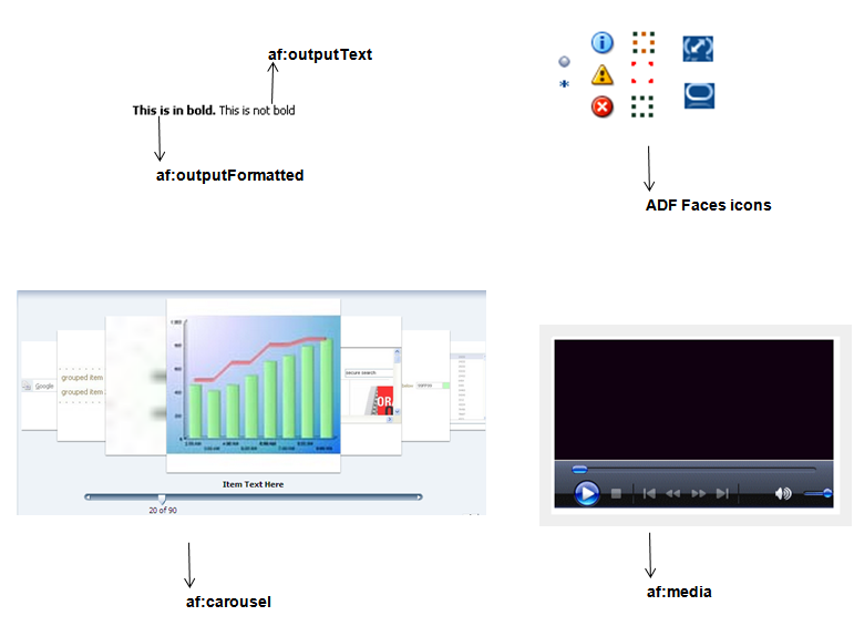
The outputText component can be used as child to many other components to display read-only text. When you need the text to be formatted, you can use the outputFormatted component. For example, you may want to use bold formatted text within instruction text, as shown in Figure 18-2.
Many ADF Faces components can have icons associated with them. For example, in a menu, each of the menu items can have an associated icon. You identify the image to use for each one as the value of an icon attribute for the menu item component itself. Information and instructions for adding icons to components that support them are covered in those components' chapters. In addition to providing icons within components, ADF Faces also provides icons used when displaying messages. You can use these icons outside of messages as well.
To display an image on a page, you use the image component. Images can also be used as links (including image maps) or used to depict the status of the server.
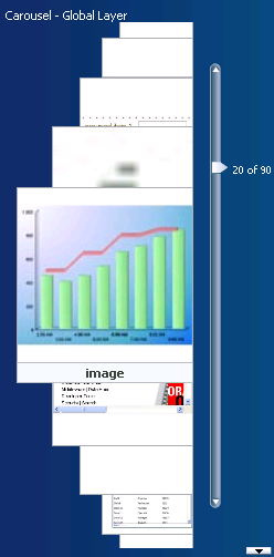
The carousel component manages a group of objects that users can scroll through. It can display objects that rotate in a circular, simulated 3D space, or it can display one object at a time. The objects can be displayed either horizontally or vertically. Users can browse through carousel objects using the slider or using the next and previous buttons. Some use cases for the carousel might include printed collateral, catalogues, and pictures.
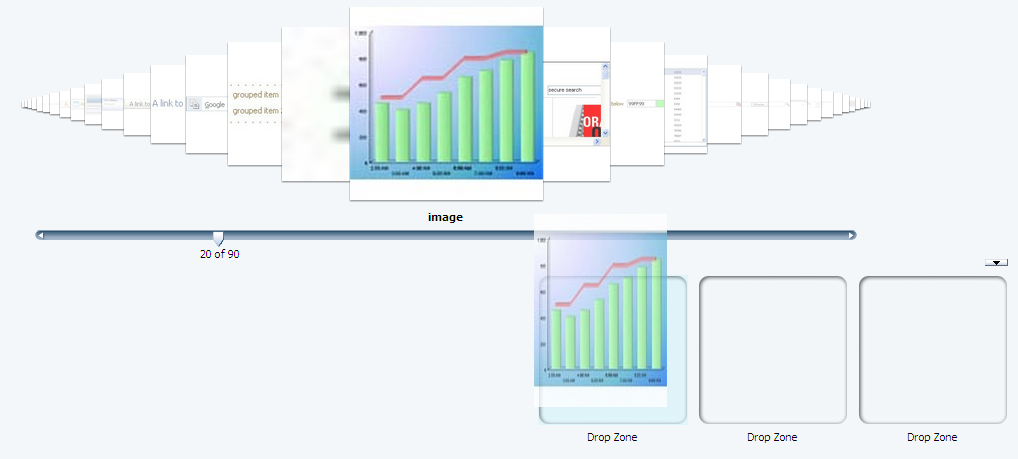
The carousel component may be used alone or may be used in conjunction with other components, which you can configure to control the image. For example, you might add components below the carousel that can be used as a drop zone for objects in the carousel; the user can drag an object from the carousel and drop it into a specific area, as shown in Figure 18-3. For more information about implementing drag and drop, see Chapter 33, "Adding Drag and Drop Functionality."
Another example might be adding a menu bar that allows users to perform some action on the current object, such as deleting it, adding it to a favorites list, or preview the image, as shown in Figure 18-4.
Best Practice:
Including more than one carousel per page may be visually confusing for the user by making it unclear which slider controls a given carousel, or which drop zone belongs to a given carousel.
The media component is used to display audio-visual content, such as advertisements or directions to complete a task. The media component can be configured to display all controls, typical controls, minimal controls, no visible controls (for example, controls are available only from a context menu), or no controls at all. Typically, you would not display controls when the clip is very short and control is not needed.
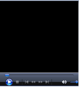
When the media component is the primary component on the page, then typically all controls are displayed, as shown in Figure 18-5.
18.1.2 Additional Functionality for Output Components
You may find it helpful to understand other ADF Faces features before you implement your output components. Additionally, once you have added these components to your page, you may find that you need to add functionality such as drag and drop and accessibility. Following are links to other functionality that output components can use.
-
Using parameters in text: You can use the ADF Faces EL format tags if you want text displayed in a component to contain parameters that will resolve at runtime. For more information, see Section 3.5.2, "How to Use the EL Format Tags."
-
Conversion: In some cases, a value may need to be converted to a string in order to display. For more information about conversion, see Chapter 7, "Validating and Converting Input."
-
Drag and drop: You can configure a page so that a user can drag and drop output components or values of output components, to another area on a page. For more information, see Chapter 33, "Adding Drag and Drop Functionality."
-
Localization: Instead of entering values for attributes that take strings as values, you can use property files. These files allow you to manage translation of these strings. For more information, see Chapter 29, "Internationalizing and Localizing Pages."
-
Skins: You can change the look and feel of output components by changing the skin. For more information, see Chapter 28, "Customizing the Appearance Using Styles and Skins."
18.2 Displaying Output Text and Formatted Output Text
There are two ADF Faces components specifically for displaying output text on pages: outputText, which displays unformatted text, and outputFormatted, which displays text and can include a limited range of formatting options.
To display simple text specified either explicitly or from a resource bundle or bean, you use the outputText component. You define the text to be displayed as the value of the value property. For example:
<af:outputText value="The submitted value was: "/>
Example 18-1 shows two outputText components: the first specifies the text to be displayed explicitly, and the second takes the text from a managed bean and converts the value to a text value ready to be displayed (for more information about conversion, see Section 7.3, "Adding Conversion").
<af:panelGroupLayout>
  <af:outputText value="The submitted value was: "/>
  <af:outputText value="#{demoInput.date}">
    <af:convertDateTime dateStyle="long"/>
  </af:outputText>
</af:panelGroupLayout>
You can use the escape attribute to specify whether or not special HTML and XML characters are escaped for the current markup language. By default, characters are escaped.
Example 18-2 illustrates two outputText components, the first of which uses the default value of true for the escape attribute, and the second of which has the attribute set to false.
Example 18-2 Output Text With and Without the escape Property Set
<af:outputText value="<h3>output & heading</h3>"/>
<af:outputText value="<h3>output & heading</h3>"
escape="false"/>
Figure 18-6 shows the different effects seen in a browser of the two different settings of the escape attribute.
You should avoid setting the escape attribute to false unless absolutely necessary. A better choice is to use the outputFormatted component, which allows a limited number of HTML tags.
As with the outputText component, the outputFormatted component also displays the text specified for the value property, but the value can contain HTML tags. Use the formatting features of the outputFormatted component specifically when you want to format only parts of the value in a certain way. If you want to use the same styling for the whole component value, instead of using HTML within the value, apply a style to the whole component. If you want all instances of a component to be formatted a certain way, then you should create a custom skin. For more information about using inline styles and creating skins, see Chapter 28, "Customizing the Appearance Using Styles and Skins."
Example 18-3 shows an outputFormatted component displaying only a few words of its value in bold (note that you need to use entities such as < on JSPX pages).
Example 18-3 Using outputFormatted to Bold Some Text for a JSPX file
<af:outputFormatted value="<b>This is in bold.</b> This is not bold"/>
Example 18-4 Using outputFormatted to Bold Some Text for a JSP file
<af:outputFormatted value="<b>This is in bold.</b> This is not bold"/>
Figure 18-7 shows how the component displays the text.
18.2.1 How to Display Output Text
Before displaying any output text, decide whether or not any parts of the value must be formatted in a special way. If they do, then use an outputFormatted component.
It may be helpful to have an understanding of how the attributes can affect functionality. For more information, see Section 18.2, "Displaying Output Text and Formatted Output Text."
You may also find it helpful to understand functionality that can be added using other ADF Faces features. For more information, see Section 18.1.2, "Additional Functionality for Output Components."
-
In the Component Palette, from the Text and Selection panel, drag and drop an Output Text onto the page. To create an
outputFormattedcomponent, drag and drop an Output Text (Formatted) from the Component Palette.Tip:
If parts of the value require special formatting, use an
outputFormattedcomponent.Tip:
If you plan to support changing the text of the component through active data (for example, data being pushed from the data source will determine the text that is displayed), then you should use the
activeOutputTextcomponent instead of theoutputTextcomponent. Create anactiveOutputTextcomponent by dragging an Output Text (Active) from the Component Palette. -
Expand the Common section of the Property Inspector and set the value attribute to the value to be displayed. If you are using the
outputFormattedcomponent, use HTML formatting codes to format the text as needed, as described in Table 18-1 and Table 18-2.The
outputFormattedcomponent also supports thestyleUsageattribute whose values are the following predefined styles for the text:-
inContextBranding -
instruction -
pageStamp
Figure 18-8 shows how the
styleUsagevalues apply styles to the component.Note:
If the
styleUsageandstyleClassattributes are both set, thestyleClassattribute takes precedence. -
18.2.2 What You May Need to Know About Allowed Format and Character Codes in the outputFormatted Component
Only certain formatting and character codes can be used. Table 18-1 lists the formatting codes allowed for formatting values in the outputFormatted component.
Table 18-1 Formatting Codes for Use in af:outputFormatted Values
| Formatting Code | Effect |
|---|---|
|
|
Line break |
|
|
Horizontal rule |
|
|
Lists: ordered list, unordered list, and list item |
|
|
Paragraph |
|
|
Bold |
|
|
Italic |
|
|
Teletype or monospaced |
|
|
Larger font |
|
|
Smaller font |
|
|
Preformatted: layout defined by whitespace and line break characters preserved |
|
|
Span the enclosed text |
|
|
Anchor |
Table 18-2 lists the character codes for displaying special characters in the values.
Table 18-2 Character Codes for Use in af:outputFormatted Values
| Character Code | Character |
|---|---|
|
|
Less than |
|
|
Greater than |
|
|
Ampersand |
|
|
Registered |
|
|
Copyright |
|
|
Nonbreaking space |
|
|
Double quotation marks |
The attributes class, style, and size can also be used in the value attribute of the outputFormatted component, as can href constructions. All other HTML tags are ignored.
Note:
For security reasons, JavaScript is not supported in output values.
18.3 Displaying Icons
ADF Faces provides a set of icons used with message components, shown in Figure 18-9.
If you want to display icons outside of a message component, you use the icon component and provide the name of the icon type you want to display.
Note:
The images used for the icons are determined by the skin the application uses. If you want to change the image, create a custom skin. For more information, see Chapter 28, "Customizing the Appearance Using Styles and Skins."
18.3.1 How to Display Icons
When you use messages in an ADF Faces application, the icons are automatically added for you. You do not have to add them to the message component. However, you can use the icons outside of a message component. To display one of the standard icons defined in the skin for your application, you use the icon component.
It may be helpful to have an understanding of how the attributes can affect functionality. For more information, see Section 18.3, "Displaying Icons."
You may also find it helpful to understand functionality that can be added using other ADF Faces features. For more information, see Section 18.1.2, "Additional Functionality for Output Components."
-
In the Component Palette, from the General Controls panel, drag and drop an Icon onto your page.
-
Expand the Common section and set Name to the name of one of the icon functions shown in Figure 18-9. For example, if you want to display a red circle with a white X, you would set Name to
error. -
Expand the Appearance section, and set ShortDesc to the text you want to be displayed as the alternate text for the icon.
18.4 Displaying Images
To display an image on a page, you use the image component and set the source attribute to the URI where the file is located. The image component also supports accessibility description text by providing a way to link to a long description of the image.
The image component can also be used as a link and can include an image map, however, it must be placed inside a goLink component. For more information, see Section 18.5, "Using Images as Links."
18.4.1 How to Display Images
You use the image component to display images.
You may also find it helpful to understand functionality that can be added using other ADF Faces features. For more information, see Section 18.1.2, "Additional Functionality for Output Components."
-
In the Component Palette, from the General Controls panel, drag and drop an Image onto your page.
Tip:
If you plan to support changing the
sourceattribute of the image through active data (for example, data being pushed from the data source will determine the image that is displayed), then you should use theactiveImagecomponent instead of theimagecomponent. Create anactiveImagecomponent by dragging an Image (Active) from the Component Palette. -
In the Insert Image dialog, set the following:
-
ShortDesc: Set to the text to be used as the alternate text for the image.
-
Source: Enter the URI to the image file.
-
-
If you want to include a longer description for the image, in the Property Inspector, set LongDescURL attribute to the URI where the information is located.
18.5 Using Images as Links
ADF Faces provides the commandImageLink component that renders an image as a link, along with optional text. You can set different icons for when the user hovers the mouse over the icon, and for when the icon is depressed or disabled. For more information about the commandImageLink component, see Section 20.3, "Using Buttons and Links for Navigation."
If you simply want an image to be used to navigate to a given URI, you can enclose an image in the goLink component and then, if needed, link to an image map.
You can use an image as a goLink component to one or more destinations. If you want to use an image as a simple link to a single destination, use a goLink component to enclose your image, and set the destination attribute of the goLink component to the URI of the destination for the link.
If your image is being used as a graphical navigation menu, with different areas of the graphic navigating to different URIs, enclose the image component in a goLink component and create a server-side image map for the image.
18.5.1 How to Use Images as Links
You use the commandImageLink component to render an image as a link.
It may be helpful to have an understanding of how the attributes can affect functionality. For more information, see Section 18.5, "Using Images as Links."
You may also find it helpful to understand functionality that can be added using other ADF Faces features. For more information, see Section 18.1.2, "Additional Functionality for Output Components."
To use an image as one or more goLink components:
-
In the Component Palette, from the General Controls panel, drag and drop a Link (Go) onto the page.
-
Drag and drop an Image as a child to the
goLinkcomponent. -
In the Insert Image dialog, set the following:
-
ShortDesc: Set to the text to be used as the alternate text for the image.
-
Source: Enter the URI to the image file.
-
-
If different areas of the image are to link to different destinations:
-
Create an image map for the image and save it to the server.
-
In the Property Inspector, set ImageMapType attribute to server.
-
Select the goLink component and in the Property Inspector, set Destination to the URI of the image map on the server.
-
-
If the whole image is to link to a single destination, select the goLink component and enter the URI of the destination as the value of Destination.
18.6 Displaying Images in a Carousel
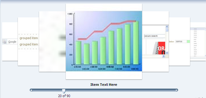
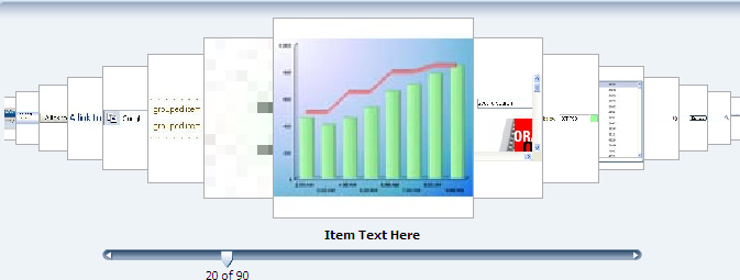
You can display images in a revolving carousel, as shown in Figure 18-10. Users can change the image at the front either by using the slider at the bottom or by clicking one of the auxiliary images to bring that specific image to the front.
By default, the carousel displays horizontally. The objects within the horizontal orientation of the carousel are vertically-aligned to the middle and the carousel itself is horizontally-aligned to the center of its container.
You can configure the carousel so that it can be displayed vertically, as you might want for a reference rolodex. By default, the objects within the vertical orientation of the carousel are horizontally-aligned to the center and the carousel itself is vertically aligned middle, as shown in Example 18-4. You can change the alignments using the carousel's alignment attributes.
Best Practice:
Generally the carousel should be placed in a parent component that stretches its children (such as a panelSplitter or panelStretchLayout). If you do not place the carousel in a component that stretches its children, your carousel will display at the default dimension of 500px wide and 300px tall. You can change these dimensions.
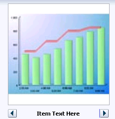
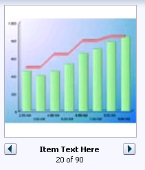
Instead of partially displaying the previous and next images, you can configure your carousel so that it only displays the current image, as shown in Figure 18-12.
You can also configure the controls used to browse through the images. You can display a slider with next and previous arrows that spans more than one image, as shown in Figure 18-10, display only next and previous buttons, as shown in Figure 18-12, or display next and previous buttons, along with the slide counter, as shown in Figure 18-12.
A child carouselItem component displays the objects in the carousel, along with a title for the object. Instead of creating a carouselItem component for each object to be displayed, and then binding these components to the individual object, you bind the carousel component to a complete collection. The component then repeatedly renders one carouselItem component by stamping the value for each item, similar to the way a tree stamps out each row of data. As each item is stamped, the data for the current item is copied into a property that can be addressed using an EL expression using the carousel component's var attribute. Once the carousel has completed rendering, this property is removed or reverted back to its previous value. Carousels contain a nodeStamp facet, which is both a holder for the carouselItem component used to display the text and short description for each item, and also the parent component to the image displayed for each item.
For example, the carouselItem JSF page in the ADF Faces demo shown in Figure 18-10 contains a carousel component that displays an image of each of the ADF Faces components. The demoCarouselItem (CarouselBean.java) managed bean contains a list of each of these components. The value attribute of the carousel component is bound to the items property on that bean, which represents that list. The carousel component's var attribute is used to hold the value for each item to display, and is used by both the carouselItem component and image component to retrieve the correct values for each item. Example 18-5 shows the JSF page code for the carousel. For more information about stamping behavior in a carousel, see Section 12.6, "Displaying Data in Trees."
Example 18-5 Carousel Component JSF Page Code
<af:carousel id="carousel" binding="#{editor.component}"
             var="item"
             value="#{demoCarousel.items}"
             carouselSpinListener="#{demoCarousel.handleCarouselSpin}">
  <f:facet name="nodeStamp">
    <af:carouselItem id="crslItem" text="#{item.title}" shortDesc="#{item.title}">
      <af:image id="img" source="#{item.url}" shortDesc="#{item.title}"/>
    </af:carouselItem>
  </f:facet>
</af:carousel>
A carouselItem component stretches its sole child component. If you place a single image component inside of the carouselItem, the image stretches to fit within the square allocated for the item (as the user spins the carousel, these dimensions shrink or grow).
Best Practice:
The image component does not provide any geometry management controls for altering how it behaves when stretched. You should use images that have equal width and height dimensions in order for the image to retain its proper aspect ratio when it is being stretched.
The carousel component uses a CollectionModel class to access the data in the underlying collection. This class extends the JSF DataModel class and adds on support for row keys. In the DataModel class, rows are identified entirely by index. However, to avoid issues if the underlying data changes, the CollectionModel class is based on row keys instead of indexes.
You may also use other model classes, such as java.util.List, array, and javax.faces.model.DataModel. If you use one of these other classes, the carousel component automatically converts the instance into a CollectionModel class, but without any additional functionality. For more information about the CollectionModel class, see the MyFaces Trinidad Javadoc at http://myfaces.apache.org/trinidad/trinidad-1_2/trinidad-api/apidocs/index.html.
Note:
If your application uses the Fusion technology stack, you can create ADF Business Components over your data source that represent the items, and the model will be created for you. You can then declaratively create the carousel, and it will automatically be bound to that model. For more information, see the "Using the ADF Faces Carousel Component" section of the Oracle Fusion Middleware Fusion Developer's Guide for Oracle Application Development Framework
The carousel components are virtualized, meaning not all the items that are there for the component on the server are delivered to and displayed on the client. You configure the carousel to fetch a certain number of rows at a time from your data source. The data can be delivered to the component either immediately upon rendering, or lazily fetched after the shell of the component has been rendered. By default, the carousel lazily fetches data for the initial request. When a page contains one or more of these components, the page initially goes through the standard lifecycle. However, instead of the carousel fetching the data during that initial request, a special separate partial page rendering (PPR) request is run on the component, and the number of items set as the value of the fetch size for the carousel is then returned. Because the page has just been rendered, only the Render Response phase executes for the carousel, allowing the corresponding data to be fetched and displayed. When a user does something to cause a subsequent data fetch (for example spinning the carousel for another set of images), another PPR request is executed.
Performance Tip:
You should use lazy delivery when the page contains a number of components other than a carousel. Using lazy delivery allows the initial page layout and other components to be rendered first before the data is available.
Use immediate delivery if the carousel is the only context on the page, or if the carousel is not expected to return a large set of items. In this case, response time will be faster than using lazy delivery (or in some cases, simply perceived as faster), as the second request will not go to the server, providing a faster user response time and better server CPU utilizations. Note however that only the number of items configured to be the fetch block will be initially returned. As with lazy delivery, when a user's actions cause a subsequent data fetch, the next set of items are delivered.
A slider control allows users to navigate through the collection. Normally the thumb on the slider displays the current object number out of the total number of objects, for example 6 of 20. When the total number of objects is too high to calculate, the thumb on the slider will show only the current object number. For example, say a carousel is used for a company' s employee directory. By default the directory might show faces for every employee, but it may not know without an expensive database call that there are exactly 94,409 employees in the system that day.
You can use other components in conjunction with the carousel. For example, you can add a toolbar or menu bar, and to that, add buttons or menu items that allow users to perform actions on the current object.
18.6.1 How to Create a Carousel
To create a carousel, you must first create the data model that contains the images to display. You then bind a carousel component to that model and insert a carouselItem component into the nodeStamp facet of the carousel. Lastly, you insert an image component (or other components that contain an image component) as a child to the carouselItem component.
It may be helpful to have an understanding of how the attributes can affect functionality. For more information, see Section 18.6, "Displaying Images in a Carousel."
You may also find it helpful to understand functionality that can be added using other ADF Faces features. For more information, see Section 18.1.2, "Additional Functionality for Output Components."
-
Create the data model that will provide the collection of images to display. The data model can be a
List,Array,DataModelorCollectionModel. If the collection is anything other than aCollectionModel, the framework will automatically convert it to aCollectionModel. For more information about theCollectionModelclass, see the MyFaces Trinidad Javadoc athttp://myfaces.apache.org/trinidad/trinidad-1_2/trinidad-api/apidocs/index.html.The data model should provide the following information for each of the images to be displayed in the carousel:
-
URL to the images
-
Title, which will be displayed below the image in the carousel
-
Short description used for text displayed when the user mouses over the image
For examples, see the
CarouselBean.javaand theCarouselMediaBean.javaclasses in the ADF Faces demo application. -
-
In the Component Palette, from the Data Views panel, drag and drop a Carousel onto the page.
Best Practice:
Place the carousel in a parent container that stretches its children.
-
In the Property Inspector, expand the Common section, and set the following:
-
Orientation: By default, the carousel displays horizontally. Select
verticalif you want it to display vertically, as shown in Figure 18-11. If you set it tohorizontal, you must configure how the items line up using thehalignattribute. If you set it tovertical, set how the items line up using thevalignattribute. -
Halign: Specify how you want items in a vertical carousel to display. Valid values are:
-
Center: Aligns the items so that they have the same centerpoint. This is the default.
-
End: Aligns the items so that the right edges line up (when the browser is displaying a left-to-right language).
-
Start: Aligns the items so that the left edges line up (when the browser is displaying a left-to-right language).
-
-
Valign: Specify how you want items in a horizontal carousel to display. Valid values are:
-
Bottom: Aligns the items so that the bottom edges line up.
-
Middle: Aligns the items so that they have the same middle point. This is the default.
-
Top: Aligns the items so that the top edges line up.
-
-
Value: Bind the carousel to the model.
-
-
Expand the Data section and set the following:
-
Var: Enter a variable that will be used in EL to access the individual item data.
-
VarStatus: Enter a variable that will be used in EL to access the status of the carousel. Common properties of
varStatusinclude:-
model: Returns theCollectionModelfor the component. -
index: Returns the zero-based item index.
-
-
-
Expand the Appearance section and set the following:
-
EmptyText: Enter text that should display if no items are returned. If using a resource bundle, use the dropdown menu to choose Select Text Resource.
-
DisplayItems: Select circular to have the carousel display multiple images. Select oneByOne to have the carousel display one image at a time.
-
ControlArea: Specify the controls used to browse through the carousel images. Valid values are:
-
full: A slider displays with built-in next and previous buttons, the current item text, and the image number.
-
small: Next and previous buttons are displayed, along with the current item text, and the image number.
-
compact: Only the next and previous buttons and item text are displayed.
-
-
-
If you do not place the carousel in a parent component that stretches its children, then the carousel will display at 500px wide by 300px tall. You can change these settings. To do so, expand the Style section, click the Layout tab, and set a height and width in pixels.
-
Expand the Behavior section, and set the following:
-
FetchSize: Set the size of the block that should be returned with each data fetch.
-
ContentDelivery: Specify when the data should be delivered. When the
contentDeliveryattribute is set toimmediate, items are fetched at the same time the carousel is rendered. If thecontentDeliveryattribute is set tolazy, items will be fetched and delivered to the client during a subsequent request. -
CarouselSpinListener: Bind to a handler method that handles the spinning of the carousel when you need logic to be executed when the carousel spin is executed. Example 18-6 shows the handler method on the
CarouselBeanwhich redraws the detail panel when the spin happens.Example 18-6 Handler for the CarouselSpinEvent
  public void handleCarouselSpin(CarouselSpinEvent event)
  {
    RichCarousel carousel = (RichCarousel)event.getComponent();
    carousel.setRowKey(event.getNewItemKey());
    ImageInfo itemData = (ImageInfo)carousel.getRowData();
    _currentImageInfo = itemData;

    // Redraw the detail panel so that we can update the selected details.
    RequestContext rc = RequestContext.getCurrentInstance();
    rc.addPartialTarget(_detailPanel);
  }
-
-
Expand the Advanced section and set CurrentItemKey. Specify which item is showing when the carousel is initially rendered. The value should be (or evaluate to) the item's primary key in the
CollectionModel: -
In the Component Palette, from the Data Views panel, drag a Carousel Item to the
nodeStampfacet of theCarouselcomponent.Bind the
CarouselItemcomponent's attributes to the properties in the data model using the variable value set on the carousel'svarattribute. For example, the carousel in Example 18-5 usesitemas the value for thevarattribute. So the value of thecarouselItem'stextattribute would beitem.title(given thattitleis the property used to access the text used for the carousel items on the data model). -
In the Component Palette, from the General Controls, drag an image and drop it as a child to the
carouselItem.Bind the
imagecomponent's attributes to the properties in the data model using the variable value set on the carousel'svarattribute. For example, the carousel in Example 18-5 usesitemas the value for thevarattribute. So the value of theimage'ssourceattribute would beitem.url(given thaturlis the property used to access the image).You can surround the image component with other components if you want more functionality. For example, Figure 18-14 shows a carousel whose images are surrounded by a
panelGroupLayoutcomponent and that also uses aclientListenerto call a JavaScript function to show a menu and a navigation bar.Example 18-7 shows the corresponding page code.
Example 18-7 A More Complex Layout for a Carousel
<af:carouselItem id="mainItem" text="#{item.title}" shortDesc="#{item.title}">
  <af:panelGroupLayout id="itemPgl" layout="vertical">
    <af:image id="mainImg" source="#{item.url}" shortDesc="#{item.title}"
                           styleClass="MyImage">
      <af:clientListener method="handleItemOver" type="mouseOver"/>
      <af:clientListener method="handleItemDown" type="mouseDown"/>
      <af:showPopupBehavior triggerType="contextMenu" popupId="::itemCtx"/>
    </af:image>
  <af:panelGroupLayout id="overHead" styleClass="MyOverlayHeader"
                       layout="vertical" clientComponent="true">
    <af:menuBar id="menuBar">
      <af:menu id="menu" text="Menu">
        <af:commandMenuItem id="menuItem1" text="Menu Item 1"/>
        <af:commandMenuItem id="menuItem2" text="Menu Item 2"/>
        <af:commandMenuItem id="menuItem3" text="Menu Item 3"/>
      </af:menu>
    </af:menuBar>
  </af:panelGroupLayout>
  <af:panelGroupLayout id="overFoot" styleClass="MyOverlayFooter"
                       layout="vertical" clientComponent="true"
                       halign="center">
    <af:panelGroupLayout id="footHorz" layout="horizontal">
      <f:facet name="separator">
        <af:spacer id="footSp" width="8"/>
      </f:facet>
      <af:commandImageLink . . .
                          />
      <af:outputText id="pageInfo" value="Page 1 of 1"/>
      <af:commandImageLink . . .
                         />
      </af:panelGroupLayout>
    </af:panelGroupLayout>
  </af:panelGroupLayout>
</af:carouselItem>
Example 18-8 shows the corresponding JavaScript.
Example 18-8 JavaScript Code to Handle Mouse Over and Mouse Down
function handleItemOver(uiInputEvent)
{
  var imageComponent = uiInputEvent.getCurrentTarget();
  var carousel = null;
  var componentParent = imageComponent.getParent();
  while (componentParent != null)
  {
    if (componentParent instanceof AdfRichCarousel)
    {
      carousel = componentParent;
    }
    componentParent = componentParent.getParent();
  }
  if (carousel == null)
  {
    AfLogger.LOGGER.severe("Unable to find the carousel component!");
    return;
  }
  var currentItemKeyPattern = ":"+ carousel.getCurrentItemKey() +":";

var overlayHeaderComponent = imageComponent.findComponent("overHead");
var overlyHeaderId = overlayHeaderComponent.getClientId();
// In IE we get mouseover for other items as well. This is inspite of having an
// overly div on top
if(overlyHeaderId.indexOf(currentItemKeyPattern) == -1)
return;
if (overlyHeaderId != window._myHeader)
{
  // ensure only one set of overlays are visible
  hideExistingOverlays();
}
var overlayFooterComponent = imageComponent.findComponent("overFoot");

window._myHeader = overlayHeaderComponent.getClientId();
window._myFooter = overlayFooterComponent.getClientId();

// do not propagate to the server otherwise all stamps will get this property on
// next data fetch
overlayHeaderComponent.setProperty("inlineStyle", "display:block", false, AdfUIComponent.PROPAGATE_LOCALLY);
          overlayFooterComponent.setProperty("inlineStyle", "display:block", false, AdfUIComponent.PROPAGATE_LOCALLY);
}

function handleItemDown(uiInputEvent)
  {
    if (uiInputEvent.isLeftButtonPressed())
    {
      // Only hide the overlays if the left button was pressed
      hideExistingOverlays();
    }
  }
Performance Tip:
The simpler the structure for the carousel is, the faster it will perform.
18.6.2 What You May Need to Know About the Carousel Component and Different Browsers
In some browsers, the visual decoration of the carousel's items will be richer. For example, Safari and Google Chrome display subtle shadows around the carousel's items, and the noncurrent items have a brightness overlay to help make clear that the auxiliary items are not the current item, as shown in Figure 18-15.
Figure 18-16 shows the same component in Internet Explorer.
18.7 Displaying Application Status Using Icons
ADF Faces provides the statusIndicator component that you can use to indicate server activity. What displays depends both on the skin your application uses and on how your server is configured. By default, the following are displayed:
-
When your application is configured to use the standard data transfer service, during data transfer an animated spinning icon is displayed:

When the server is not busy, a static icon is displayed:

-
When your application is configured to use the Active Data Service (ADS), what the status indicator displays depends on how ADS is configured.
Note:
ADS allows you to bind your application to an active data source. You must use the Fusion technology stack in order to use ADS. For more information, see Chapter 35, "Using the Active Data Service with an Asynchronous Backend."
ADS can be configured to either have data pushed to the model, or it can be configured to have the application poll for the data at specified intervals. Table 18-3 shows the icons that are used to display server states for push and poll modes (note that the icons are actually animated).
Table 18-3 Icons Used in Status Indicator for ADS
Icon Push Mode Pull Mode 
At the first attempt at connecting to the server.
At the first attempt at connecting to server.

When the first connection is successfully established.
When the first connection is successfully established and when a connection is reestablished.

When subsequent attempts are made to reconnect to the server.
Before every poll request.

When a connection cannot be established or reestablished.
When the configured number of poll attempts are unsuccessful.
After you drop a status indicator component onto the page, you can use skins to change the actual image files used in the component. For more information about using skins, see Chapter 28, "Customizing the Appearance Using Styles and Skins."
It may be helpful to have an understanding of how the attributes can affect functionality. For more information, see Section 18.7, "Displaying Application Status Using Icons."
You may also find it helpful to understand functionality that can be added using other ADF Faces features. For more information, see Section 18.1.2, "Additional Functionality for Output Components."
To use the status indicator icon:
-
In the Component Palette, from the General Controls panel, drag and drop a Status Indicator onto the page.
-
Use the Property Inspector to set any needed attributes.
Tip:
For help in setting attributes, use the field's dropdown menu to view a description of the attribute.
18.8 Playing Video and Audio Clips
The ADF Faces media component allows you to include video and audio clips on your application pages.
The media control handles two complex aspects of cross-platform media display: determining the best player to display the media, and sizing the media player.
You can specify which media player is preferred for each clip, along with the size of the player to be displayed for the user. By default, ADF Faces uses the MIME type of the media resource to determine the best media player and the default inner player size to use, although you can specify the type of content yourself, using the contentType attribute.
You can specify which controls are to be available to the user, and other player features such as whether or not the clip should play automatically, and whether or not it should play continuously or a specified number of times.
18.8.1 How to Allow Playing of Audio and Video Clips
Once you add a media component to your page, you can configure the media player to use by default, the size of the player and screen, the controls, and whether or not the clip should replay.
It may be helpful to have an understanding of how the attributes can affect functionality. For more information, see Section 18.8, "Playing Video and Audio Clips."
You may also find it helpful to understand functionality that can be added using other ADF Faces features. For more information, see Section 18.1.2, "Additional Functionality for Output Components."
To include an audio or video clip in your application page:
-
In the Component Palette, from the General Controls panel, drag and drop a Media onto the page.
-
In the Insert Media dialog, set the following attributes:
-
Source: Enter the URI to the media to be played.
-
StandbyText: Enter a message that will be displayed while the content is loading.
-
-
Expand the Common section of the Property Inspector and set the following:
-
Player: Select the media player that should be used by default to play the clip. You can choose from Real Player, Windows Media Player, or Apple Quick Time Player.
Alternatively, you can create a link in the page that starts the playing of the media resource based on the user agent's built-in content type mapping. The media control attempts to pick the appropriate media player using the following steps:
-
If the primary MIME type of the content is image, the built-in user-agent support is used.
-
If a media player has been specified by the
playerattribute, and that player is available on the user agent and can display the media resource, that player is used. -
If one player is especially good at playing the media resource and that player is available on the user agent, that player is used.
-
If one player is especially dominant on the user agent and that player can play the media resource, that player is used.
-
The player connected to the link provided on the page is used.
-
-
Autostart: Set to True if you want the clip to begin playing as soon as it loads.
-
ContentType: Enter the MIME type of the media to play. This will be used to determine which player to use, the configuration of the controls, and the size of the display.
-
-
Expand the Appearance section of the Property Inspector and set the following:
-
Controls: Select the amount and types of controls you want the player to display.
Because the set of controls available varies between players, you define what set of controls to display in a general way, rather than listing actual controls. For example, you can have the player display all controls available, the most commonly used controls, or no controls.
As an example, Example 18-9 uses the
allsetting for amediacomponent.Figure 18-17 shows how the player is displayed to the user.
Following values are valid:
-
All: Show all available controls for playing media on the media player.
Using this setting can cause a large amount of additional space to be required, depending on the media player used.
-
Minimal: Show a minimal set of controls for playing media on the media player.
This value gives users control over the most important media playing controls, while occupying the least amount of additional space on the user agent.
-
None: Do not show any controls for the media player and do not allow control access through other means, such as context menus.
You would typically use this setting only for kiosk-type applications, where no user control over the playing of the media is allowed. This setting is typically used in conjunction with settings that automatically start the playback, and to play back continuously.
-
NoneVisible: Do not show any controls for the media player, but allow control access through alternate means, such as context menus.
You would typically use this value only in applications where user control over the playing of the media is allowed, but not encouraged. As with the
nonesetting, this setting is typically used in conjunction with settings that automatically start the playback, and to play back continuously. -
Typical: Show the typical set of controls for playing media on the media player.
This value, the default, gives users control over the most common media playing controls, without occupying an inordinate amount of extra space on the user agent.
-
-
Width and Height: Define the size in pixels of the complete display, including the whole player area, which includes the media content area.
Tip:
Using the
widthandheightattributes can lead to unexpected results because it is difficult to define a suitable width and height to use across different players and different player control configurations. Instead of defining the size of the complete display, you can instead define just the size of the media content area using theinnerWidthandinnerHeightattributes. -
InnerWidth and InnerHeight: Define the size in pixels of only the media content area. This is the preferred scheme, because you control the amount of space allocated to the player area for your clip.
Tip:
If you do not specify a size for the media control, a default inner size, determined by the content type of the media resource, is used. While this works well for audio content, it can cause video content to be clipped or to occupy too much space.
If you specify dimensions from both schemes, such as a
heightand aninnerHeight, the overall size defined by theheightattribute is used. Similarly, if you specify both awidthand aninnerWidth, thewidthattribute is used.
-
-
Expand the Behavior section and set Autostart. By default, playback of a clip will not start until the user starts it using the displayed controls. You can specify that playback is to start as soon as the clip is loaded by setting the
autostartattribute totrue.Set PlayCount to the number of times you want the media to play. Once started, by default, the clip with play through once only. If the users have controls available, they can replay the clip. However, you can specify that the clip is to play back a fixed number of times, or loop continuously, by setting a value for the
playCountattribute. Setting theplayCountattribute to 0 replays the clip continuously. Setting the attribute to some other number plays the clip the specified number of times.
Example 18-10 shows an af:media component in the source of a page. The component will play a video clip starting as soon as it is loaded and will continue to play the clip until stopped by the user. The player will display all the available controls.
