20 Working with Layout Components on a Page
This chapter describes the types of layout components that support page infrastructure, but are not available through the Resource Catalog. Such components are exposed through Source view of page edit mode.
This chapter is intended for users granted the application-level permission Pages: Create, Edit, and Delete Pages or the space-level permission Basic Services: Edit Page Access, Structure, and Content.
Your application administrator has the authority to expose or hide application resources and revise default permissions. Tasks discussed in this chapter are not available to you if the relevant resource is hidden or you are not authorized to perform them.
20.1 What You Should Know About Layout Components
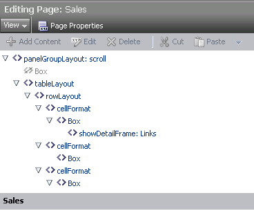
Some page layout components are not exposed for use in the Resource Catalog. They are associated with the components on a page, and are configurable when you edit a page in Source view (Figure 20-1).
Figure 20-1 Layout Components in Source View

Description of "Figure 20-1 Layout Components in Source View"
Table 20-1 lists and describes the layout components you are likely to encounter in Source view of page edit mode.
| Layout Component | Description |
|---|---|
|
Provides a means of arranging a series of child components vertically or horizontally (no wrapping), or consecutively (wrapping). The |
|
|
Provides a means of arranging content in defined areas on a page. Useful useful for enabling content to stretch when the browser is resized. For more information, see Section 20.3, "Setting panelStretchLayout Properties." |
|
|
The parent component of a tab set. For more information, see Section 20.4, "Setting panelTabbed Properties." |
|
|
Renders a border, or chrome, around its child component along with a header that contains icons to enable users to perform some operations. These include a menu icon with options for moving the component, along with its content, to new positions on the page. Users can drag and drop For more information, see Section 20.5, "Setting showDetailFrame Properties." |
|
|
A child component of a tab set ( |
|
|
Provides a means of incorporating some blank space in pages so that the page appears less cluttered than it would if all the components were presented immediately next to each other or immediately below each other. For more information, see Section 20.7, "Setting spacer/Separator Properties." |
20.2 Setting panelGroupLayout Properties
See Also:
For information about accessing and setting properties for any component on a page, see Section 18.6.2, "Setting Properties on a Component."
The panelGroupLayout component provides a means of arranging a series of child components vertically or horizontally (no wrapping), or consecutively (wrapping). The component's Layout property determines the arrangement of child components.
Properties for the panelGroupLayout component include a Child Components tab with options for hiding, showing, and rearranging component content. For more information, see Section 18.6.5, "Working with Child Components."
Table 20-2 lists and describes the panelGroupLayout properties that appear on the Display Options tab in the Component Properties dialog.
Table 20-2 panelGroupLayout Display Options
| Property | Description |
|---|---|
|
A means of expressing the horizontal alignment of component content Select one of:
|
|
|
A means of enhancing user accessibility as described by the Web Accessibility Initiative for Accessible Rich Internet Applications (WAI-ARIA). Each option describes the intended role of a content area to assist in using the area as a navigational landmark on the page. Screen readers and other assistive technologies can make use of these landmarks in page navigation. Select an option to clarify the role or purpose of a content area's content:
|
|
|
A means of specifying the orientation of component content. Choose from:
|
|
|
A field for entering
|
|
|
An option for hiding or showing the component on the page
Once you hide a component in this way, any child components are also hidden. You can show the component again in Composer Source view. In Source view, right-click the hidden component, and select Show Component from the resulting context menu. |
|
|
The component style theme to apply to the children of this component. Use this property to change the theme without causing associated skin changes. Application skins are the sources of the themes. Some skins may have no theme definitions. Enter one of:
No theme (none) is the default. |
|
|
A means of expressing the vertical alignment of component content. Select one of:
|
See Also:
Display Options properties additionally provide access to an Expression Language (EL) editor, which you can use to enter and test EL values. For more information, see Appendix B, "Expression Language (EL) Expressions."
20.3 Setting panelStretchLayout Properties
See Also:
For information about accessing and setting properties for any component on a page, see Section 18.6.2, "Setting Properties on a Component."
The panelStretchLayout component provides a means of arranging content in defined areas on a page. This component is useful for enabling content to stretch when the browser is resized.
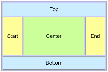
The panelStretchLayout component's defined areas are called facets (Figure 20-2).
Figure 20-2 Facets of a panelStretchLayout Component

Description of "Figure 20-2 Facets of a panelStretchLayout Component"
Note:
Figure 20-2 shows the facets when the language reading direction of the application is configured left-to-right. If instead the language direction is right-to-left, the start and end facets are switched.
Facets are controlled by the values you enter for its Display Options properties. When you set the height of the top and bottom facets, any contained components are stretched to fit the height. Similarly, when you set the width of the start and end facets, any components contained in those facets are stretched to that width. If no components are placed in a facet, then the facet does not take up any space.
Table 20-3 lists and describes the panelStretchLayout properties that appear on the Display Options tab in the Component Properties dialog.
Note:
All panelStretchLayout height and width facets take the value auto; however, using auto slows page performance.
Table 20-3 panelStretchLayout Display Options
| Property | Description |
|---|---|
|
The height of the bottom facet. Use any standard CSS unit of measure, such as pt, px, pc, li, and so on. Never express a Height value as a percentage. Because of differences between browsers and between layout containers, percentages do not work as you expect. If you want your component to take up 100% of a page, consider creating a page using the Stretch page style and adding the component to it. |
|
|
The width of the end facet. Use any standard CSS unit of measure, such as pt, px, pc, li, and so on. |
|
|
A field for entering tooltip text for the component The tooltip appears when users roll their mouse pointers over the component. |
|
|
An option for hiding or showing the component on the page
Once you hide a component in this way, any child components are also hidden. You can show the component again in Composer Source view. In Source view, right-click the hidden component, and select Show Component from the resulting context menu. |
|
|
The width of the start facet. Use any standard CSS unit of measure, such as pt, px, pc, li, and so on. |
|
|
The component style theme to apply to the children of this component. Use this property to change the theme without causing associated skin changes. Application skins are the sources of the themes. Some skins may have no themed definitions. Enter one of:
No theme (none) is the default. |
|
|
The height of the top facet. Use any standard CSS unit of measure, such as pt, px, pc, li, and so on. Never express a Height value as a percentage. Because of differences between browsers and between layout containers, percentages do not work as you expect. If you want your component to take up 100% of a page, consider creating a page using the Stretch page style and adding the component to it. |
See Also:
Display Options properties additionally provide access to an Expression Language (EL) editor, which you can use to enter and test EL values. For more information, see Appendix B, "Expression Language (EL) Expressions."
20.4 Setting panelTabbed Properties
See Also:
For information about accessing and setting properties for any component on a page, see Section 18.6.2, "Setting Properties on a Component."
The panelTabbed layout component is the parent component of a tab or tab set. Its unique set of Display Options controls the behind-the-scenes method of tab creation, the source for the tabs dimensions, the tab's position, and the like.
Table 20-4 lists and describes Display Options associated with the panelTabbed layout component.
Table 20-4 panelTabbed Display Options
| Property | Description |
|---|---|
|
Specifies when tab content is rendered
|
|
|
Specifies the source of the dimensions applied to the component
|
|
|
The position of the tab portion of the
In accessibility screen reader mode, the tab position is always |
|
|
A field for entering tooltip text for the component The tooltip appears when users roll their mouse pointers over the component. |
|
|
An option for hiding or showing the component on the page
Once you hide a component in this way, any child components are also hidden. You can show the component again in Composer Source view. In Source view, right-click the hidden component, and select Show Component from the resulting context menu. |
|
|
Specifies whether some, none, or all tabs can be removed
|
See Also:
For information about working with tabs, see Section 18.4.5, "Creating Layered Content Regions Using Tabs."
20.5 Setting showDetailFrame Properties
See Also:
For information about accessing and setting properties for any component on a page, see Section 18.6.2, "Setting Properties on a Component."
The showDetailFrame component renders a border, or chrome, around its child component along with a header that contains icons to enable users to perform some operations. These include a menu icon with options for moving the component, along with its content, to new positions on the page. Users can drag and drop showDetailFrame components from one panelCustomizable component to another on the page. Note that a showDetailFrame must be included inside a panelCustomizable component for it to be movable.
A showDetailFrame component enables the following actions:
-
Collapse and expand the component
-
Move content to different positions on the page
-
Rearrange task flows using options on the Actions menu
-
Edit and save text in a text editor.
The Display Options associated with showDetailFrame are common to many other types of components and are listed in Table 18-1, "Display Options Properties" with one exception: the showDetailFrame layout component does not expose the property Allow Child Selection.
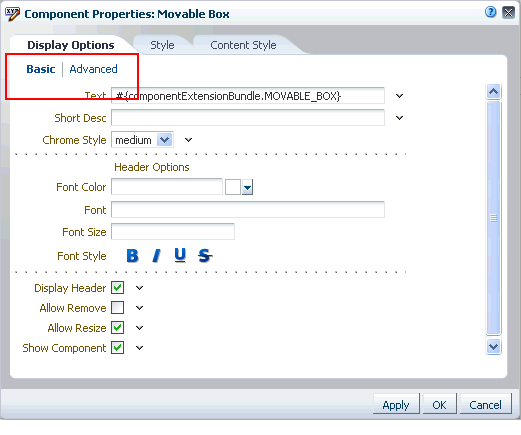
Display Options for showDetailFrame are presented on two subtabs: Basic and Advanced (Figure 20-3).
Figure 20-3 Basic and Advanced Display Options

Description of "Figure 20-3 Basic and Advanced Display Options"
20.6 Setting sidebarItem Properties
See Also:
For information about accessing and setting properties for any component on a page, see Section 18.6.2, "Setting Properties on a Component."
The sidebarItem component is a child component of panelTabbed (see Section 20.4). Unlike panelTabbed, which provides all of the properties associated with a tab set, sidebarItem provides all of the properties associated with a single tab.
Table 20-5 describes the sidebarItem properties that appear on the Display Options tab in the Component Properties dialog.
Table 20-5 sidebarItem Display Options
| Property | Description |
|---|---|
|
Indicates the current active tab, that is, the tab that is forward This value is set by default depending on whether the selected tab is forward. Changes you make to this value have no effect. |
|
|
The URL to an image Use any Web-compatible image from any accessible location. That is, do not put in a path to an image on an external server that requires authentication. Enter a full URL or a URL that is relative to the application root. Use CSS formatting. For example, enter: url(http://www.abc.com/image.jpg) |
|
|
The number of pixels the component will use when in a container that allocates size among multiple sibling items If the component requires more than the set limit, its sibling components are pushed to overflow menus. The default is 100 pixels. Note: This attribute is valid only when the parent container is a |
|
|
A field for entering tooltip text for the component The tooltip appears when users roll their mouse pointers over the component. |
|
|
An option for hiding or showing the component on the page
Once you hide a component in this way, any child components are also hidden. You can show the component again in Composer Source view. In Source view, right-click the hidden component, and select Show Component from the resulting context menu. |
|
|
The text to render on the tab The default value, an EL expression, evaluates to |
See Also:
Display Options properties additionally provide access to an Expression Language (EL) editor, which you can use to enter and test EL values. For more information, see Appendix B, "Expression Language (EL) Expressions."
20.7 Setting spacer/Separator Properties
See Also:
For information about accessing and setting properties for any component on a page, see Section 18.6.2, "Setting Properties on a Component."
The spacer component provides a means of incorporating some blank space in pages so that the page appears less cluttered than it would if all the components were presented immediately adjacent to each other.
Tip:
In the Resource Catalog, this component is called a Separator.
Table 20-6 lists and describes the spacer properties that appear on the Display Options tab in the Component Properties dialog.
Table 20-6 spacer Display Options
| Property | Description |
|---|---|
|
A field for specifying the spacer height Use any standard CSS unit of measure, such as pt, px, pc, li, and so on. Never express a Height value as a percentage. Because of differences between browsers and between layout containers, percentages do not work as you expect. |
|
|
A field for entering tooltip text for the component The tooltip appears when users roll their mouse pointers over the component. |
|
|
An option for hiding or showing the component on the page
Once you hide a component in this way, any child components are also hidden. You can show the component again in Composer Source view. In Source view, right-click the hidden component, and select Show Component from the resulting context menu. |
|
|
A field for specifying spacer width Use any standard CSS unit of measure, such as pt, px, pc, li, %, and so on. |
See Also:
Display Options properties additionally provide access to an Expression Language (EL) editor, which you can use to enter and test EL values. For more information, see Appendix B, "Expression Language (EL) Expressions."