27 Using ADF Pivot Table Components
This chapter describes how to use a databound ADF pivot table component to display data, and provides the options for pivot table customization.
This chapter includes the following sections:
-
Section 27.1, "Introduction to the ADF Pivot Table Component"
-
Section 27.2, "Understanding Data Requirements for a Pivot Table"
-
Section 27.8, "Updating Pivot Tables with Partial Page Rendering"
-
Section 27.11, "Customizing the Cell Content of a Pivot Table"
-
Section 27.13, "Using a Pivot Filter Bar with a Pivot Table"
For information about the data binding of ADF pivot tables, see the "Creating Databound Pivot Tables" section in the Oracle Fusion Middleware Fusion Developer's Guide for Oracle Application Development Framework.
27.1 Introduction to the ADF Pivot Table Component
The ADF pivot table component displays a grid of data with rows and columns. Similar to spreadsheets, this component provides the option of automatically generating subtotals and totals for grid data. The pivot table lets you pivot or move data labels and the associated data layer from one row or column edge to another to obtain different views of your data, supporting interactive analysis.
The power of the pivot table's interactive capability is based in its display of multiple nested attributes on row and column headers. You can dynamically change the layout of these attributes using drag-and-drop operations.
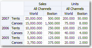
Figure 27-1 shows a pivot table with multiple attributes nested on its rows and columns.
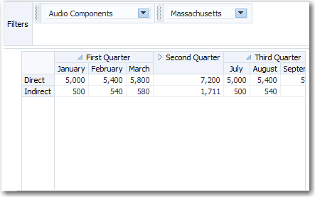
A pivot filter bar is a component that can be added to a pivot table to provide the user with a way to filter pivot table data in layers not displayed in one of the other edges of the pivot table. Users can also drag and drop these layers between the pivot filter bar and the associated pivot table to change the view of the data. Figure 27-2 shows a pivot filter bar for a pivot table.
27.1.1 Pivot Table Elements and Terminology
The following list of pivot table terms uses Figure 27-1 as a Sales Pivot Table sample in its descriptions of terms:
-
Edges: The axes in pivot tables, including:
-
Row edge: The vertical axis to the left of the body of the pivot table. In Figure 27-1, the row edge contains two layers, Year and Product, and each row in the pivot table represents the combination of a particular year and a particular product.
-
Column edge: The horizontal axis above the body of the pivot table. In Figure 27-1, the column edge contains three layers, Measure, Channel, and Geography, and each column in the pivot table represents the combination of a particular measure value (Sales or Units), a particular channel indicator (All Channels), and a particular geographic location (World or Boston).
-
Page edge: The edge represented by the pivot filter bar, whose layers can be filtered or pivoted with the layers in the row and column edges.
-
-
Layers: Nested attributes that appear in a single edge. In Figure 27-1, the following three layers appear in the column edge: Measure, Channel, and Geography. The following two layers appear in the row edge: Year and Product.
-
Header cell: The labels that identify the data displayed in a row or column. Row header cells appear on the row edge, and column header cells appear on the column edge.
-
Data cell: The cells within the pivot table that contain data values, not header information. In the sample, the first data cell contains a value of 20,000.000.
-
QDR (Qualified Data Reference): A fully qualified data reference to a row, a column, or an individual cell. For example, in Figure 27-1, the QDR for the first data cell in the pivot table must provide the following information:
-
Year=2007
-
Product=Tents
-
Measure=Sales
-
Channel=All Channels
-
Geography=World
-
27.2 Understanding Data Requirements for a Pivot Table
The pivot table component uses a model to display and interact with data. The specific model class used is oracle.adf.view.faces.bi.model.DataModel.
You can use any row set (flat file) data collection to supply data to a pivot table. During the data binding operation, you have the opportunity to drag each data element to the desired location on the row edge or column edge of the pivot table in the data binding dialog.
During data binding, you also have the option of specifying subtotals and totals for pivot table rows and columns, specifying drill operations at runtime, defining how to aggregate duplicate records, and setting up initial sort criteria.
For information about the data binding of ADF pivot tables, see the "Creating Databound Pivot Tables" section in the Oracle Fusion Middleware Fusion Developer's Guide for Oracle Application Development Framework.
27.3 Pivoting Layers
You can drag any layer in a pivot table to a different location on the same edge or to a different edge. This operation is called pivoting and is enabled by default.
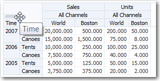
When you move the mouse over a layer, the layer's pivot handle and an optional pivot label are displayed. If you move the mouse over the pivot handle, the cursor changes to a four-point arrow drag cursor. You can then use the handle to drag the layer to the new location. If you move the mouse over a layer on the row edge, the pivot handle appears above the layer, as shown in Figure 27-3.
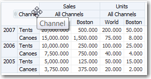
If you move the cursor over a layer in the column edge, the pivot handle appears to the left of the layer, as shown in Figure 27-4.
If, in Figure 27-3, you drag the pivot handle of the Time (Year) layer from the row edge to the column edge between the Measure (Sales) layer and the Channel layer, the pivot table will change shape as shown in Figure 27-5.
You can customize pivoting to disable pivot labels and pivoting.
To customize pivoting in a pivot table:
-
In the Structure window, right-click the dvt:pivotTable component and choose Go to Properties.
-
Optionally, in the Appearance category of the Property Inspector, in the
PivotLabelVisiblefield, select false from the dropdown list to disable the display of the label in the pivot handle. -
Optionally, in the Behavior category of the Property Inspector, in the
PivotEnabledfield, select false from the dropdown list to disable the pivoting.
27.4 Displaying Large Data Sets in Pivot Tables
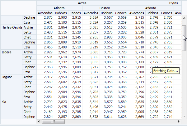
By default pivot tables support on-demand data scrolling for large data sets. Only the data being viewed in the pivot table is loaded. As the user scrolls vertically or horizontally, data is fetched or discarded to fill the new pivot table view. Figure 27-6 shows a pivot table with a large data set using on-demand data scrolling.
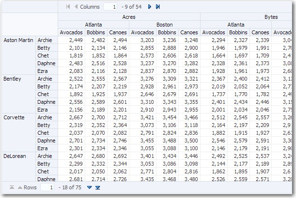
Instead of scroll bars, you can configure a page control to navigate large data sets in pivot tables for desktop applications and for mobile browsers on touch devices. This control is only available when there are more rows than the data fetch size, and the component is not being stretched by its containing layout component. For example, the page control for columns display at the top of the pivot table and the page control for rows display at the foot of the pivot table as shown in Figure 27-7.
When you are developing an ADF Faces web application, by default pivot tables use a vertical or horizontal scroll bar for displaying rows over the size of the data being fetched. To configure an alternative page control for the pivotTable component, set the scrollPolicy attribute to page. For example:
scrollPolicy="page"
While a standard ADF Faces web application will run in mobile browsers, because the user interaction is different and because screen size is limited, when your application needs to run in a mobile browser, you should create touch device-specific versions of the pages. For more information, see Appendix D, "Creating Web Applications for Touch Devices Using ADF Faces."
By default, when rendered on mobile devices, pivot tables display a page control that allows the user to jump to specific pages of rows. For pivot tables to display on a mobile device, you should:
-
Place the pivot table component within a flowing container (that is, a component that does not stretch its children). For more information about flowing container components, see Section 8.2.1, "Geometry Management and Component Stretching."
-
Set the
scrollPolicyattribute toauto(if the page may also run on a desktop device) orpage(if the page will only run on a mobile device.
If the pivot table is not in a flowing container, or if those attributes are not set correctly, the pivot table will display a scroll bar instead of pages.
When displaying large data sets using scroll bars or page controls, you can also improve readability by configuring the pivot table to always display the labels that appear above each row header layer and beside each column header layer. To configure consistent display of the row and column header labels for the pivotTable component, set the layerLabelMode attribute to rendered. The default value is hidden.
27.5 Using Selection in Pivot Tables
Selection in a pivot table allows a user to select one or more cells in a pivot table. Only one of the three areas including the row header, column header, or data cells can be selected at one time.
An application can implement features such as displaying customized content for a context menu, based on currently selected cells. Example 27-1 shows sample code for getting the currently selected header cells.
Example 27-1 Sample Code to Get Selected Header Cells
UIPivotTable pt = getPivotTable()
if (pt == null)
    return null;
HeaderCellSelectionSet headerCells = null;
if (pt.getSelection().getColumnHeaderCells().size() > 0) {
    headerCells = pt.getSelection().getColumnHeaderCells();
} else if (pt.getSelection().getRowHeaderCells().size() > 0) {
    headerCells = pt.getSelection().getRowHeaderCells();
}
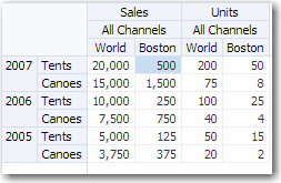
At runtime, selection in a data cell highlights the cell, as shown in Figure 27-8.
Editable data cells are opened for editing by double-clicking the cell or selecting the cell and pressing F2. Data cells selected for direct editing are displayed as shown in Figure 27-9.
Data cells selected for dropdown list editing are displayed as shown in Figure 27-10.
For more information about enabling data cell editing, see Section 27.12, "Pivot Table Data Cell Stamping and Editing."
27.6 Sorting in a Pivot Table
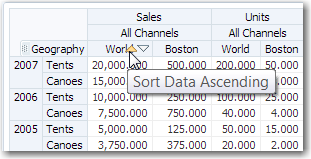
Pivot tables support sorting of data within the pivot table. When sorting is enabled, ascending and descending sort icons are displayed as the user hovers the cursor over the innermost layer of the column header. By default, the sortMode attribute of the dvt:pivotTable component is set to grouped, effectively sorting the data grouped by the row edge outermost layer. Figure 27-11 shows the sort icons in the World Sales column of the pivot table, where the data is grouped by the Year row edge outermost layers.
27.7 Sizing in a Pivot Table
When you create a pivot table, default settings determine the overall size of that pivot table. The pivot table also automatically sizes rows, columns, and layers within the space allowed for the overall size. You have the option of changing the overall size of the pivot table, resizing rows and columns, and resizing layers.
27.7.1 How to Set the Overall Size of a Pivot Table
The default size of a pivot table is a width of 300 pixels and a height of 300 pixels. Instead of entering pixels for width and height, you have the option of specifying a percentage value for width, height, or both. This percentage value refers to the portion of the page that you want the pivot table to use.
To customize the default settings of a pivot table:
-
In the visual editor, display the page that contains the pivot table.
-
Click Source to display the XML code on the JSPX page.
-
Enter the following code for the
inlineStyleattribute of thepivotTabletag, wherevalue1is an integer with the unit type for the width of the pivot table andvalue2is an integer with the unit type for the height of the pivot table:inlineStyle="width:value1;height:value2".
Example 27-2 shows the setting of the inlineStyle attribute that specifies the width of the table as 50 percent of the page size and the height of the table as 400 pixels.
27.7.2 How to Resize Rows, Columns, and Layers
The pivot table autosizes rows, columns, and layers when the pivot table is initially displayed. At runtime, you can change the size of rows, columns, or layers by dragging the row, column, or layer separator to a new location.
To resize rows, columns, and layers at runtime:
-
If you want to resize a row, do the following:
-
Position the cursor in the row header on the separator between the row you want to resize and the next row.
-
When the cursor changes to a double-sided arrow, click and drag the row separator to the desired location.
-
-
If you want to resize a column, do the following:
-
Position the cursor in the column header on the separator between the column you want to resize and the next column.
-
When the cursor changes to a double-sided arrow, click and drag the column separator to the desired location.
-
-
If you want to resize a layer, do the following:
-
Position the cursor in the row or column header on the separator between the layer you want to resize and the next layer.
-
When the cursor changes to a double-sided arrow, click and drag the layer separator to the desired location.
-
27.7.3 What You May Need to Know About Resizing Rows, Columns, and Layers
When you resize rows, columns, or layers, the new sizes remain until you perform a pivot operation. After a pivot operation, the new sizes are cleared and the pivot table rows, columns, and layers return to their original sizes.
If you do not perform a pivot operation, then the new sizes remain for the life of the session. However, you cannot save these sizes through MDS (Metadata Services) customization.
27.8 Updating Pivot Tables with Partial Page Rendering
You can update pivot tables, for example, to display the totals in a pivot table when triggered by a checkbox, by using partial page rendering (PPR). PPR allows only certain components on a page to be rerendered without the need to refresh the entire page. For more information about PPR, see Chapter 7, "Introduction to Partial Page Rendering."
For a component to be rerendered based on an event caused by another component, it must declare which other components are the triggers. Use the partialTriggers attribute to provide a list of IDs of the components that should trigger a partial update of the pivot table. The pivot table listens on the trigger components and if one of the trigger components receives an event that will cause it to update in some way, the pivot table is also updated.
Example 27-3 shows sample code for updating a pivot table by displaying the totals when a checkbox is triggered. The triggering component uses the ID as the partialTriggers value.
27.9 Exporting from a Pivot Table
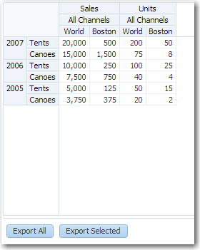
You can export the data from a pivot table to a Microsoft Excel spreadsheet. Create an action source, such as a command button or command link, and add a dvt:exportPivotTableData component and associate it with the data you wish to export. You can configure the dvt:exportPivotTableData component so that the entire pivot table will be exported, or so that only the rows selected by the user will be exported. For example, Figure 27-12 shows a pivot table that includes command button components that allow users to export the data to an Excel spreadsheet.
When the user clicks the command button, by default all the rows and columns are exported in an Excel format written to the file specified in the filename attribute of the tag. Alternatively, you can configure the dvt:exportPivotTableData component so that only the rows the user selects are exported, by setting the exportedData attribute to selected. Example 27-4 shows the sample code for the Export to Excel command button.
Example 27-4 Sample Code for Export to Excel Command Button
<af:commandButton text="Export To Excel" immediate="true">
  <dvt:exportPivotTableData type="excelHTML" exportedId="goodPT"
           filename="updated_export.xls" title="PivotTable export"/>
</af:commandButton>
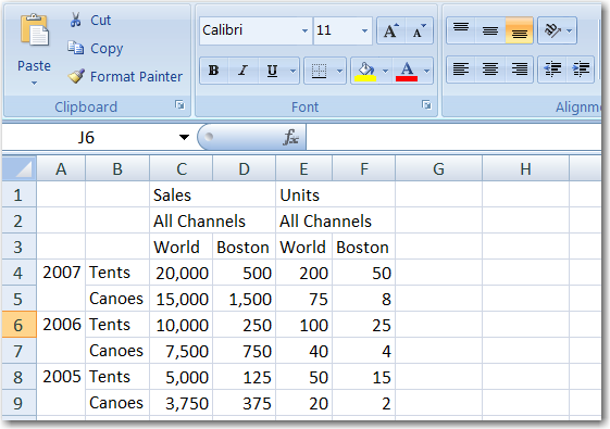
Figure 27-13 shows the resulting Excel spreadsheet.
Note:
You may receive a warning from Excel stating that the file is in a different format than specified by the file extension. This warning can be safely ignored.
27.10 Displaying Pivot Tables in Printable Mode
ADF Faces allows you to output your JSF page from an ADF Faces web application in a simplified mode for printing. For example, you may want users to be able to print a page (or a portion of a page), but instead of printing the page exactly as it is rendered in a web browser, you want to remove items that are not needed on a printed page, such as scrollbars and buttons. For information about creating simplified pages for these outputs, see Chapter 35, "Using Different Output Modes."
When a pivot table and pivot filter bar is displayed on a JSF page to be output in printable pages:
-
All data cells in the pivot table are displayed.
-
Limited client interactivity including cell select and row or column resizing is supported.
-
Pivoting, drilling, and sorting operations are not supported.
-
Context menus including the ability to resize rows or columns is not supported.
-
If configured, the pivot table data filter displayed in the pivot filter bar will be displayed, although the contents cannot be changed.
27.11 Customizing the Cell Content of a Pivot Table
All cells in a pivot table are either header cells or data cells. Before rendering a cell, the pivot table calls a method expression. You can customize the content of pivot table header cells and data cells by providing method expressions for the following attributes of the dvt:pivotTable tag:
-
For header cells, use one of the following attributes:
-
headerFormat: Use to create formatting rules to customize header cell content. -
headerFormatManager: Use only if you want to provide custom state saving for the formatting rules of the application's pivot table header cells.
-
-
For data cells, use one of the following attributes:
-
dataFormat: Use to create formatting rules to customize data cell content. -
dataFormatManager: Use only if you want to provide custom state saving for the formatting rules of the application's pivot table data cells.
-
27.11.1 How to Create a CellFormat Object for a Data Cell
To specify customization of the content of a data cell, you must code a method expression that returns an instance of oracle.dss.adf.view.faces.bi.component.pivotTable.CellFormat.
To create an instance of a CellFormat object for a data cell:
-
Construct an
oracle.adf.view.faces.bi.component.pivotTable.DataCellContextobject for the data cells that you want to format. TheDataCellContextmethod requires the following parameters in its constructor:-
model: The name of thedataModelused by the pivot table. -
row: An integer that specifies the zero-based row that contains the data cell on which you are operating. -
column: An integer that specifies the zero-based column that contains the data cell that you want to format. -
qdr: TheQDRthat is a fully qualified reference for the data cell that you want to format. -
value: Ajava.lang.Objectthat contains the value in the data cell that you want to format.
-
-
Pass the
DataCellContextto a method expression for thedataFormatattribute of the pivot table. -
In the method expression, write code that specifies the kind of formatting you want to apply to the data cells of the pivot table. This method expression must return a
CellFormatobject.
27.11.2 How to Construct a CellFormat Object
An instance of a CellFormat object lets you specify the following arguments:
-
Converter: An instance of
javax.faces.convert.Converter, which is used to perform number, date, or text formatting of a raw value in a cell. -
CSS style: Used to change the CSS style of a cell. For example, you might use this argument to change the background color of a cell.
-
CSS text style: Used to change the CSS style of the text in a cell. For example, you might use this argument to set text to bold.
-
New raw value: Used to change the cell's underlying value that was returned from the data model. For example, you might choose to change the abbreviated names of states to longer names. In this case, the abbreviation NY might be changed to New York.
27.11.3 How to Change Format and Text Styles
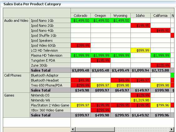
You can apply formatting and text styles to emphasize aspects of the data displayed in the pivot table. Figure 27-14 shows a pivot table with sales totals generated for products and for product categories. In the rows that contain totals, this pivot table displays bold text (a text style change) against a shaded background (a style change). These changes show in both the row header cells and the data cells for the pivot table. The row headers for totals contain the text "Sales Total."
The pivot table also shows stoplight and conditional formatting of data cells. For more information, see Section 27.11.4, "How to Create Stoplight and Conditional Formatting in a Pivot Table."
Example 27-5 shows sample code that produces the required custom formats for the sales totals, but not for the stoplight formatting. The example includes the code for method expressions for both the dataFormat attribute and the headerFormat attribute of the dvt:pivotTable tag. If you want to include stoplight formatting in the pivot table, you might want to include the code from Example 27-6.
Example 27-5 Sample Code to Change Style and Text Style in a Pivot Table
public CellFormat getDataFormat(DataCellContext cxt)
{
    CellFormat cellFormat = new CellFormat(null, null, null);
    QDR qdr = cxt.getQDR();
    //Obtain a reference to the product category column.
    Object productCateg = qdr.getDimMember("ProductCategory");
     //Obtain a reference to the product column.
    Object product = qdr.getDimMember("ProductId");

     if (productCateg != null && productCateg.toString().equals("Sales Total"))
      {
       cellFormat.setTextStyle("font-weight:bold")
       cellFormat.setStyle("background-color:#C0C0C0");
      }
     else if (product != null && product.toString().equals("Sales Total")
      {
       cellFormat.setTextStyle("font-weight:bold");
       cellFormat.setStyle("background-color:#C0C0C0");
      }
    return cellFormat;
}


public CellFormat getHeaderFormat(HeaderCellContext cxt)
{
  if (cxt.getValue() != null)
   {
    String header = cxt.getValue().toString();
    if (header.equals("Sales Total"))
     {
        return new CellFormat(null, "background-color:#C0C0C0",
                              "font-weight:bold");
      }
    }
    return null;
  }
27.11.4 How to Create Stoplight and Conditional Formatting in a Pivot Table
Stoplight and conditional formatting of the cells in a pivot table are examples of customizing the cell content. For this kind of customization, an application might prompt a user for a high value and a low value to be associated with the stoplight formatting. Generally three colors are used as follow:
-
Values equal to and above the high value are colored green to indicate they have no issues.
-
Values above the low value but below the high value are colored yellow to warn that they are below the high standard.
-
Values at or below the low value are colored red to indicate that they fall below the minimum acceptable level.
Figure 27-14 shows data cells with stoplight formatting for minimum, acceptable, and below standards sales for States.
Example 27-6 shows code that performs stoplight formatting in a pivot table that does not display totals. If you want to do stoplight formatting for a pivot table that displays totals, then you might want to combine the code from Example 27-5 (which addresses rows with totals) with the code for stoplight and conditional formatting.
Example 27-6 Sample Code for Stoplight and Conditional Formatting
public CellFormat getDataFormat(DataCellContext cxt)
{
   //Use low and high values provided by the application.
  double low = m_rangeValues.getMinimum().doubleValue() * 100;
  double high = m_rangeValues.getMaximum().doubleValue() * 100;

  CellFormat cellFormat = new CellFormat(null, null, null);

 // Create stoplight format
 if (isStoplightingEnabled())
 {
   String color = null;
   Object value = cxt.getValue();
   if (value != null && value instanceof Number)
   {
       double dVal = ((Number)value).doubleValue();
       if (dVal <= low)
       {
         color = "background-color:" + ColorUtils.colorToHTML(m_belowColor) + ";";
       }
       else if (dVal > low && dVal <= high)
       {
         color = "background-color:" + ColorUtils.colorToHTML(m_goodColor) + ";";
       }
       else if (dVal > high)
       {
         color = "background-color:" + ColorUtils.colorToHTML(m_aboveColor) + ";";
       }
    }
    cellFormat.setStyle(color);
  }
    return cellFormat;
}
27.12 Pivot Table Data Cell Stamping and Editing
The content in a pivot table data cell can be stamped using the dvt:dataCell child component to place a read-only or input component in each data cell. When you use stamping, child components are not created for every data cell in a pivot table. Rather, the content of the dvt:dataCell component is repeatedly rendered, or stamped, once per data attribute, such as the rows in a pivot table. Only certain types of components are supported, including all components with no activity and most components that implement the EditableValueHolder or ActionSource interfaces. You can also use stamping to specify custom CSS styles for the data cell.
Each time a child component is stamped, the data for the current cell is copied into a var property used by the data cell component in an EL Expression. Once the pivot table has completed rendering, the var property is removed, or reverted back to its previous value.
Data cell editing is enabled by using an input component as the child component of dvt:dataCell. At runtime you can open the cell for editing by double-clicking the cell in the pivot table, or by selecting the cell and pressing F2.
Example 27-7 shows sample code for data cell stamping.
Example 27-7 Data Cell Stamping Sample Code
<dvt:pivotTable var="cellData" varStatus="cellStatus">
  <dvt:dataCell>
    <af:switcher defaultFacet="default" facetName="#{cellStatus.members.MeasDim.value}">
      <f:facet name="Sales">
        <af:inputText value="#{cellData.dataValue}"   />
      </f:facet>
      <f:facet name="Weight">
        <af:outputText value="#{cellData.dataValue}" inlineStyle="#{cellStatus.cellFormat.textStyle}"/>
      </f:facet>
      <f:facet name="Available">
        <af:selectBooleanCheckbox id="idselectbooleancheckbox" label="Availability" text="Item Available" autoSubmit="true" value="#{cellData.dataValue}"/>
      </f:facet>
      <f:facet name="default">
        <af:outputText  value="#{cellData.dataValue}"   />
      </f:facet>
    </af:switcher>
  </dvt:dataCell>
</dvt:pivotTable>
Figure 27-15 shows the resulting pivot table.
Note:
In order to temporarily or permanently write values back to a set of cells within a cube, called a writeback, the pivot table must be bound to a data control or data model that supports writeback operations. A row set based data control is transformed into a cube and therefore cannot support writeback operations.
27.12.1 How to Specify Custom Images for Data Cells
With data cell stamping you can use the dvt:dataCell tag to specify a custom image for a data cell using af:image, af:icon, or af:commandImageLink as a child tag. Example 27-8 shows sample code for using an af:commandImageLink as a custom image in a pivot table data cell.
Example 27-8 Using a Custom Image for a Data Cell
<dvt:pivotTable var="cellData" varStatus="cellStatus">

  <!-- This is the default data cell that will be used for all data attributes-->
  <dvt:dataCell>
    <af:commandImageLink text="Go"
                     icon="/images/go.gif"
                     actionListener="#{pivotTableBean.imageLinkClick}"/>
    <af:outputText  value="#{cellData.dataValue}"   />
  </dvt:dataCell>
</dvt:pivotTable>
Actions associated with the image are handled through a registered listener, actionListener. In a bean class you specify the method to be called when the image link is clicked, for example:
public void imageLinkClick (javax.faces.event.ActionEvent.action)
27.12.2 How to Specify Images, Icons, Links, and Read-Only Content in Header Cells
In the same way that you use stamping in data cells, you can customize the content in header cells using the dvt:headerCell child component to place a read-only component in each header cell. Only read-only components or noneditable components are supported, including af:outputText, af:image, af:icon, af:commandImageLink, and af:commandLink.
By default, header cells do not support word wrapping for long text strings. You can use the dvt:headerCell component whiteSpace attribute to change the setting from the default noWrap to normal to specify header cell word wrapping.
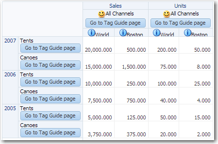
Example 27-9 shows sample code for using word wrapping for af:outputText, an af:commandImageLink as a custom image, and af:icon as a custom icon in pivot table header cells.
Example 27-9 Using Custom Components in Header Cells
<dvt:pivotTable id="goodPT"
                   binding="#{pivotTableHeaderCellDemo.pivotTable}"
                   contentDelivery="immediate"
                   value="#{pivotTableHeaderCellDemo.dataModel}"
                   var="cellData"
                   varStatus="cellStatus">
<!-- header cell components -->
<dvt:headerCell whiteSpace="normal">
   <af:switcher defaultFacet="default" facetName="#{cellData.layerName}">
     <f:facet name="Geography">
       <af:outputText value="#{cellData.label}"
          shortDesc="#{cellData.label}"/>
       <af:icon name="info" shortDesc="#{cellData.indent}" />
     </f:facet>
       <f:facet name="Channel">
       <af:outputText value="#{cellData.label}"  />
       <af:commandImageLink shortDesc="Sample commandImageLink"
         icon="/resources/images/pivotTableCSVDemo/smily-normal.gif"
         hoverIcon="/resources/images/pivotTableCSVDemo/smily-glasses.gif"
         />
       <af:commandButton text="Go to Tag Guide page" immediate="true"
         action="guide" />
      </f:facet>

      <f:facet name="Product">
        <af:outputText value="#{cellData.label}" />
        <af:commandButton text="Go to Tag Guide page" immediate="true"
         action="guide" />
      </f:facet>

      <f:facet name ="default">
        <af:commandLink text="#{cellData.label}"
         immediate="true" action="guide"/>
      </f:facet>
    </af:switcher>
  </dvt:headerCell>
...
</dvt:pivotTable>
Figure 27-16 shows the resulting pivot table.
27.13 Using a Pivot Filter Bar with a Pivot Table
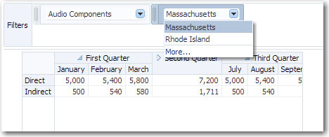
You can enhance the data filtering capacity in a pivot table by adding a pivot filter bar. Zero or more layers of data not already displayed in the pivot table row edge or column edge are displayed in the page edge. Figure 27-17 shows a pivot filter bar with Component and Geography layers that can be used to filter the data displayed in the pivot table.
You can also change the display of data in the pivot table by pivoting layers between the row, column, or page edges. Use the pivot handle to drag the layers between the edges as desired. Figure 27-18 shows the modified pivot table and pivot filter bar when the Channel data layer is pivoted to the page edge.
27.13.1 How to Associate a Pivot Filter Bar with a Pivot Table
You associate a pivot filter bar component, dvt:pivotFilterBar, to work with a pivot table component, dvt:pivotTable, by configuring the data model and associated properties to work with both components. Example 27-10 shows sample code for associating a pivot filter bar with a pivot table.
Example 27-10 Sample Code for Pivot Filter Bar
<dvt:pivotFilterBar id="pf1" value="#{binding.pt.pivotFilterBarModel}"
     modelName="pt1Model"/>
<dvt:pivotTable id="pt1" value="#{binding.pt.dataModel}"  modelName="pt1Model"
     partialTriggers="pf1"/>
You can associate a pivot filter bar with a pivot table in any of the following ways:
-
Create a pivot table using the Data Controls Panel.
When you drag a data collection from the Data Controls Panel to create a pivot table on your page, the Select Display Attributes page of the Create Pivot Table wizard provides the option to create a pivot filter bar to associate with the pivot table. You can choose to specify zero or more attributes representing data layers in the page edge. The data model and associated properties are automatically configured for you. For detailed information, see the "Creating Databound Pivot Tables" section in the Oracle Fusion Middleware Fusion Developer's Guide for Oracle Application Development Framework.
-
Add a pivot filter bar to a pivot table bound to data.
From the ADF Data Visualizations page of the Component Palette, Pivot Table panel, you can drag a
dvt:pivotFilterBarelement above advt:pivotTableelement that has been bound to a data collection. In this instance, you must configure the data model and associated properties in order for the pivot filter bar to work with the pivot table. -
Add a pivot filter bar to a pivot table not bound to data.
From ADF Data Visualizations page of the Component Palette, Pivot Table panel, you can drag a
dvt:pivotFilterBarelement above advt:pivotTableelement that has not been bound to a data collection. In this instance, you must configure the data model and associated properties in order for the pivot filter bar to work with the pivot table.
