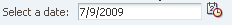
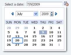
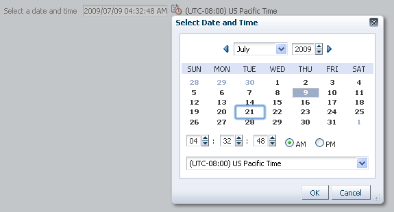
The inputDate component creates a text field for entering dates and (optionally) a glyph which opens a popup for picking dates from a calendar.
The appearance of the popup depends on the converter, if any, associated with the InputDate.
The inputDate will default its format to the "short" date format appropriate for the current locale; for example, in English, this is "mm/dd/yy". However, the format can be overridden by using a DateTimeConverter.
For this component, actionListener and returnListener attributes will only be fired on a PDA.
The value attribute accepts java.util.Date type, it does not accept java.lang.String nor java.util.Calendar. If no converter is specified, a default converter will be used to convert between Date and the display String. The String format comes from the default dateStyle of the DateTimeConverter, see javadoc for org.apache.trinidad.convert.DateTimeConverter. Developers should note that on the Javascript peer, the value returned is always in the user's timezone, even if the user has selected a different timezone in the picker. This is because Javascript does not provide information on timezone offsets of a different timezone.
Developers can programmatically attach a converter. That converter should be obtained by Application.createConverter(), rather than simply calling new DateTimeConverter(). Otherwise, some functionality will be missing, e.g. client conversion and validation, and the date picker will only display as an input field without the date-time popup (the popup relies on the client conversion and validation support)
Developers can supply their own custom converter, as long as it converts to a Date. To support time and timezone, the converter should be a subclass of the javax.faces.convert.DateTimeConverter. Otherwise, the date-picker popup will only display a calendar, since the Converter interface does not supply any information on handling time and timezone, and default values will be filled in for the time, timezone placeholders. For client-side conversion and validation, the converter should implement the org.apache.myfaces.trinidad.convert.ClientConverter interface. Otherwise, some functionality will be missing, e.g. client conversion and validation, and the date picker will only display as an input field without the date-time popup (the popup relies on the client conversion and validation support).
| Name |
Type |
Supports EL? |
Description |
| accessKey |
char |
Yes |
a character used to gain quick access to the form element specified by the for, if set (or this component itself, if it is a "non-simple" form element). If the same access key appears in multiple locations in the same page of output, the rendering user agent will cycle among the elements accessed by the similar keys.
This attribute is sometimes referred to as the "mnemonic".
Note that the accessKey is triggered by browser-specific and platform-specific modifier keys. It even has browser-specific meaning. For example, Internet Explorer will set focus when you press Alt+<accessKey>. Firefox sets focus on some operating systems when you press Alt+Shift+<accessKey>. Firefox on other operating systems sets focus when you press Control+<accessKey>. Refer to your browser's documentation for how it treats access keys.
|
| action |
javax.el.MethodExpression |
Yes |
a reference to an action method sent by the commandButton, or the static outcome of an action |
| actionListener |
javax.faces.el.MethodBinding |
Only EL |
a method reference to an action listener |
| attributeChangeListener |
javax.el.MethodExpression |
Only EL |
a method reference to an attribute change listener. Attribute change events are not delivered for any programmatic change to a property. They are only delivered when a renderer changes a property without the application's specific request. An example of an attribute change events might include the width of a column that supported client-side resizing. |
| autoComplete |
String |
Yes |
Valid Values: on, off
whether previous values of text fields in the form should be remembered and offered for auto completion. |
| autoSubmit |
boolean |
Yes |
an attribute which if set to TRUE on a form element, the component will automatically submit when an appropriate action takes place (a click, text change, etc.). Since autoSubmit is a partial submit, also submitted and re-rendered are any other components with partialTriggers pointing to this component. |
| binding |
oracle.adf.view.rich.component.rich.input.RichInputDate |
Only EL |
an EL reference that will store the component instance on a bean. This can be used to give programmatic access to a component from a backing bean, or to move creation of the component to a backing bean. |
| changed |
boolean |
Yes |
an attribute which if set to true, the changed indicator icon will be displayed on the component. |
| changedDesc |
String |
Yes |
the text commonly used by user agents to display tooltip text on the changed indicator icon. Default value is "Changed". The behavior of the tooltip is controlled by the user agent, e.g. Firefox 2 truncates long tooltips. |
| chooseId |
String |
Yes |
the id of the chooseDate component which can be used to pick the Date value for this inputDate. If set, attributes maxValue, minValue, disabledDays, disabledDaysOfWeek and disabledMonths are ignored. Identifiers are relative to the source component (this component), and must account for NamingContainers. If your component is already inside of a naming container, you can use a single colon to start the search from the root of the page, or multiple colons to move up through the NamingContainers - "::" will pop out of the component's naming container (or itself if the component is a naming container) and begin the search from there, ":::" will pop out of two naming containers (including itself if the component is a naming container) and begin the search from there, etc. |
| clientComponent |
boolean |
Yes |
whether a client-side component will be generated. A component may be generated whether or not this flag is set, but if client Javascript requires the component object, this must be set to true to guarantee the component's presence. Client component objects that are generated today by default may not be present in the future; setting this flag is the only way to guarantee a component's presence, and clients cannot rely on implicit behavior. However, there is a performance cost to setting this flag, so clients should avoid turning on client components unless absolutely necessary. |
| columns |
int |
Yes |
the number of columns to display in the text control. If no value is specified, a default value will be derived from the current converter, if one is attached. |
| contentStyle |
String |
Yes |
the style of the content piece of the component. You can style width by setting this attribute like this: width: 100px. Be aware that because of browser CSS precedence rules, CSS rendered on a DOM element takes precedence over external stylesheets like the skin file. Therefore skins will not be able to override what you set on this attribute. |
| converter |
javax.faces.convert.Converter |
Yes |
a converter object |
| customizationId |
String |
Yes |
This attribute is deprecated. The 'id' attribute should be used when applying persistent customizations. This attribute will be removed in the next release. |
| disabled |
boolean |
Yes |
whether the element is disabled. Unlike a readonly component, a disabled component is unable to receive focus. If the component has the potential to have a scrollbar, and you want the user to be able to scroll through the component's text or values, use the 'readOnly' attribute, not the 'disabled' attribute. |
| disabledDays |
org.apache.myfaces.trinidad.model.DateListProvider |
Yes |
a binding to an implementation of the org.apache.myfaces.trinidad.model.DateListProvider interface. The getDateList method should generate a List of individual java.util.Date objects which will be rendered as disabled. The Dates must be in the context of the given base Calendar. Note: this binding requires periodic roundtrips. If you just want to disable certain weekdays (e.g. Saturday and Sunday), use the disabledDaysOfWeek attribute! |
| disabledDaysOfWeek |
java.util.Set |
Yes |
a whitespace delimited list of weekdays that should be rendered as disabled in every week. The list should consist of one or more of the following abbreviations: sun, mon, tue, wed, thu, fri, sat. By default all days are enabled. |
| disabledMonths |
java.util.Set |
Yes |
a whitespace delimited list of months that should be rendered as disabled in every year. The list should consist of one or more of the following abbreviations: jan, feb, mar, apr, may, jun, jul, aug, sep, oct, nov, dec. By default all months are enabled. |
| editable |
String |
Yes |
Valid Values: inherit, always, onAccess
the editable look and feel to use for input components. 'always' indicates that the input component should always look editable. 'onAccess' indicates that the input will only look editable when accessed (hover, focus). 'inherit' indicates that we want to use the component parent's setting. None of the ancestor components define 'always' or 'onAccess', then 'always' will be used. |
| helpTopicId |
String |
Yes |
the id used to look up a topic in a helpProvider. |
| id |
String |
No |
the identifier for the component. The identifier must follow a subset of the syntax allowed in HTML:
- Must not be a zero-length String.
- First character must be an ASCII letter (A-Za-z) or an underscore ('_').
- Subsequent characters must be an ASCII letter or digit (A-Za-z0-9), an underscore ('_'), or a dash ('-').
|
| immediate |
boolean |
Yes |
whether the value is converted and validated immediately in the Apply Request Values phase, or is handled in the Process Validators phase, the default. By default, values are converted and validated together in the Process Validators phase. However, if you need access to the value of a component during Apply Request Values - for example, if you need to get the value from an actionListener on an immediate commandButton - then setting this to "immediate" makes that possible. |
| inlineStyle |
String |
Yes |
the CSS styles to use for this component. This is intended for basic style changes. The inlineStyle is a set of CSS styles that are applied to the root DOM element of the component. Be aware that because of browser CSS precedence rules, CSS rendered on a DOM element takes precedence over external stylesheets like the skin file. Therefore skins will not be able to override what you set on this attribute. If the inlineStyle's CSS properties do not affect the DOM element you want affected, then you will have to create a skin and use the skinning keys which are meant to target particular DOM elements, like ::label or ::icon-style. |
| label |
String |
Yes |
the label of the component. If you want the label to appear above the control, use a panelFormLayout. |
| labelAndAccessKey |
String |
Yes |
an attribute that will simultaneously set both the "label" and "accessKey" attributes from a single value, using conventional ampersand notation. For example, setting this attribute to "T&ext" will set the label to "Text" and the access key to 'e'. |
| labelStyle |
String |
Yes |
the CSS styles to use for the label of this component. The labelStyle is a set of CSS styles that are applied to the label DOM element of the component. This allows a label to be styled without requiring a new skin definition. |
| maxValue |
java.util.Date |
Yes |
the maximum value allowed for the Date value. When set to a fixed value on a tag, this will be parsed as an ISO 8601 date. ISO 8601 dates are of the form "yyyy-MM-dd" (for example: 2002-02-15) and the created Date object will be in the application's timezone, with the time components (hours, minutes, seconds, milliseconds) maximized. All other uses require java.util.Date objects.When binding to Date objects, it is advised to create the Date object with maximum value for any date-time components that aren't displayed (usually hours, minutes, seconds, milliseconds) to allow the largest range of values to be accepted. |
| minValue |
java.util.Date |
Yes |
the minimum value allowed for the Date value. When set to a fixed value on a tag, this will be parsed as an ISO 8601 date. ISO 8601 dates are of the form "yyyy-MM-dd" (for example: 2002-02-15) and the created Date object will be in the application's timezone, with the time components (hous, minutes, seconds, milliseconds) zeroed-out. All other uses require java.util.Date objects.When binding to Date objects, it is advised to create the Date object with zeroed-out values for any date-time components that aren't displayed (usually hours, minutes, seconds, milliseconds) to allow the largest range of values to be accepted. |
| partialTriggers |
String[] |
Yes |
the IDs of the components that should trigger a partial update. This component will listen on the trigger components. If one of the trigger components receives an event that will cause it to update in some way, this component will request to be updated too. Identifiers are relative to the source component (this component), and must account for NamingContainers. If your component is already inside of a naming container, you can use a single colon to start the search from the root of the page, or multiple colons to move up through the NamingContainers - "::" will pop out of the component's naming container (or itself if the component is a naming container) and begin the search from there, ":::" will pop out of two naming containers (including itself if the component is a naming container) and begin the search from there, etc. |
| readOnly |
boolean |
Yes |
whether the control is displayed as an editable field or as an output-style text control. Unlike a disabled component, a readonly component is able to receive focus. |
| rendered |
boolean |
Yes |
whether the component is rendered. When set to false, no output will be delivered for this component (the component will not in any way be rendered, and cannot be made visible on the client). If you want to change a component's rendered attribute from false to true using PPR, set the partialTrigger attribute of its parent component so the parent refreshes and in turn will render this component. |
| required |
boolean |
Yes |
whether a non-null, non-empty value must be entered. If false, validators will not be executed when the value is null or empty. |
| requiredMessageDetail |
String |
Yes |
the message to be displayed, if 'required' validation fails.
Parameters:
- {0} the label that identifies the component
|
| returnListener |
javax.el.MethodExpression |
Only EL |
a method reference to an return listener |
| shortDesc |
String |
Yes |
the short description of the component. This text is commonly used by user agents to display tooltip help text, in which case the behavior for the tooltip is controlled by the user agent, e.g. Firefox 2 truncates long tooltips. For form components, the shortDesc is displayed in a note window. For components that support the helpTopicId attribute it is recommended that helpTopicId is used as it is more flexible and is more accessibility-compliant. |
| showRequired |
boolean |
Yes |
whether the associated control displays a visual indication of required user input. If a "required" attribute is also present, both the "required" attribute and the "showRequired" attribute must be false for the visual indication not to be displayed. An example of when it can be desirable to use the showRequired property is if you have a field that is initially empty and is required only if some other field on the page is touched. |
| simple |
boolean |
Yes |
a boolean value that controls whether the component provides label support; when set to "true", the component will not display the label (these may be ignored: label, labelAndAccessKey, accessKey, showRequired, help facet) and may use simpler layout primitives. One of the usecases can be when the component is used in repeatable elements like in table, for-each etc., where label is not required. |
| styleClass |
String |
Yes |
a CSS style class to use for this component. The style class can be defined in your jspx page or in a skinning CSS file, for example, or you can use one of our public style classes, like 'AFInstructionText'. |
| unsecure |
java.util.Set |
Yes |
A whitespace separated list of attributes whose values ordinarily can be set only on the server, but need to be settable on the client. Currently, this is supported only for the "disabled" attribute. Note that when you are able to set a property on the client, you will be allowed to by using the the .setProperty('attribute', newValue) method, but not the .setXXXAttribute(newValue) method. For example, if you have unsecure="disabled", then on the client you can use the method .setProperty('disabled', false), while the method .setDisabled(false) will not work and will provide a javascript error that setDisabled is not a function. |
| validator |
javax.faces.el.MethodBinding |
Only EL |
a method reference to a validator method |
| value |
Object |
Yes |
the value of the component. If the EL binding for the "value" points to a bean property with a getter but no setter, and this is an editable component, the component will be rendered in read-only mode. |
| valueChangeListener |
javax.faces.el.MethodBinding |
Only EL |
a method reference to a value change listener |
| visible |
boolean |
Yes |
the visibility of the component. If it is "false", the component will be hidden on the client. Unlike "rendered", this does not affect the lifecycle on the server - the component may have its bindings executed, etc. - and the visibility of the component can be toggled on and off on the client, or toggled with PPR. When "rendered" is false, the component will not in any way be rendered, and cannot be made visible on the client. In most cases, use the "rendered" property instead of the "visible" property.
Not supported on the following renderkits: org.apache.myfaces.trinidad.core
|