11 Using Input Components and Defining Forms
This chapter describes the input components that are used to enter data, select values, edit text, and load files. If you want to create lists that may potentially be very large, or may represent relationships between objects (such as creating a list to represent an attribute that is a foreign key to another object), then you may want to use a list of values component. For more information about those components, see Chapter 13, "Using List-of-Values Components."
This chapter includes the following sections:
11.1 About Input Components and Forms
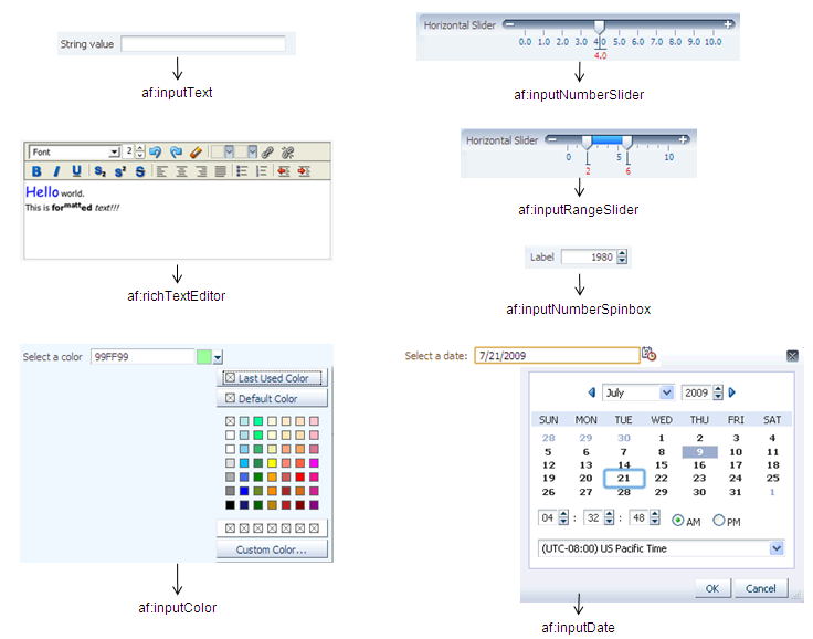
Input components accept user input in a variety of formats. The most common formats are text, numbers, date, and selection lists that appear inside a form and are submitted when the form is submitted. The entered values or selections may be validated and converted before they are processed further. Figure 11-1 shows ADF Faces standard input components.
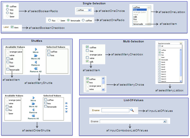
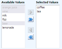
ADF Faces input components also include a number of components that allow users to select one or multiple values, as shown in Figure 11-2.
11.1.1 Input Component Use Cases and Examples
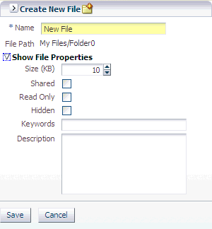
Input components are often used to build forms for user input. For example, the File Explorer application contains a form that allows users to create a new file. As shown in Figure 11-3, input components allow users to enter the name, the size, select permissions, and add keywords, and a description for a file. The Name field is required, as noted by the asterisk. If a user fails to enter a value, an error message is displayed. That validation and associated error message are configured on the component.
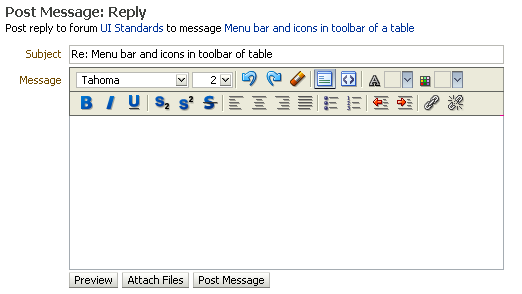
The richTextEditor component provides rich text input that can span many lines and can be formatted using different fonts, sizes, justification, and other editing features that may be required when you want users to enter more than simple text. For example, the richTextEditor might be used in a web-based discussion forum, allowing users to format the text that they need to publish, as shown in Figure 11-4.
The inputFile component allows users to browse for a local file to upload to the application server. For example, an email message might allow users to attach a file to a message, as shown in Figure 11-5.
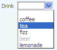
The ADF Faces selection components allows users to make selections from a list of items instead of typing in values. ADF Faces provides both single choice selection lists and multi-choice selection lists. Single-choice lists are used to select one value from a list, such as the desired drink in an online food order, as shown in Figure 11-6.
ADF single-selection components include a dropdown list (as shown in Figure 11-6), a list box, radio buttons, and checkboxes.
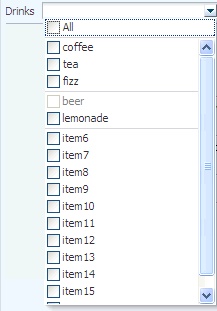
ADF multi-selection components allow users to select more than one value in a list. For example, instead of being able to select just one drink type, the selectManyChoice component allows a user to select more than one drink, as shown in Figure 11-7.
ADF multiple choice components include a dropdown list, checkboxes, and a shuttle.
Best Practice:
You can use either selection lists or list-of-values (LOV) components to display a list. LOV components should be used when the selection list is large. LOV components are model-driven using the ListOfValueModel class and may be configured programmatically using the API. They present their selection list inside a popup window that may also include a query panel. Selection lists simply display a static list of values. For more information about using LOV components, see Chapter 13, "Using List-of-Values Components."
The form components provide a container for other components. The form component represents a region where values from embedded input components can be submitted. Form components cannot be nested. ADF Faces also provides the subform component, which adds flexibility by defining subregions whose component values can be submitted separately within a form. The ADF Faces resetButton component provides an easy way for the user to reset input values within a form or subform to their previous state.
11.1.2 Additional Functionality for Input Components and Forms
You may find it helpful to understand other ADF Faces features before you implement your input components. Additionally, once you have added an input component or form to your page, you may find that you need to add functionality such as validation and accessibility. Following are links to other functionality that input components can use.
-
Using parameters in text: You can use the ADF Faces EL format tags if you want text displayed in a component to contain parameters that will resolve at runtime. For more information, see Section 3.5.2, "How to Use the EL Format Tags."
-
Client components: Input components can be client components. To work with the components on the client, see Chapter 4, "Using ADF Faces Client-Side Architecture."
-
JavaScript APIs: All input components have JavaScript client APIs that you can use to set or get property values. For more information, see the ADF Faces JavaScript API documentation.
-
Events: Input components fire both server-side and client-side events that you can have your application react to by executing some logic. For more information, see Chapter 6, "Handling Events."
-
You can add validation and conversion to input components. For more information, see Chapter 7, "Validating and Converting Input."
-
You can display tips and messages, as well as associate online help with input components. For more information, see Chapter 19, "Displaying Tips, Messages, and Help."
-
There may be times when you want the certain input components to be validated before other components on the page. For more information, see Section 5.2, "Using the Immediate Attribute."
-
You may want other components on the page to update based on selections you make from a selection component. For more information, see Section 5.3, "Using the Optimized Lifecycle."
-
You may want to use the
scrollComponentIntoViewBehaviortag with the richTextEditor component to allow users to jump to specific areas in the component. For more information, see Section 6.6.1, "How to Use the scrollComponentIntoViewBehavior Tag." -
You can change the icons used for required and changed notifications using skins. For more information, see Chapter 28, "Customizing the Appearance Using Styles and Skins."
-
You can make your input components accessible. For more information, see Chapter 30, "Developing Accessible ADF Faces Pages."
-
Instead of entering values for attributes that take strings as values, you can use property files. These files allow you to manage translation of these strings. For more information, see Chapter 29, "Internationalizing and Localizing Pages."
-
If your application uses the Fusion technology stack, then you can create automatically bound forms based on how your ADF Business components are configured. For more information, see the "Creating a Basic Databound Page" chapter of the Oracle Fusion Middleware Fusion Developer's Guide for Oracle Application Development Framework. If your application uses Enterprise JavaBeans, you can do the same. For more information, see the "Creating a Basic Databound Page" of the Oracle Fusion Middleware Java EE Developer's Guide for Oracle Application Development Framework.
11.2 Defining Forms
A form is a component that serves as a container for other components. When a submit action occurs within the form, any modified input values are submitted. For example, you can create an input form that consists of input and selection components, and a submit command button, all enclosed within a form. When the user enters values into the various input fields and clicks the Submit button, those new input values will be sent for processing.
By default, when you create a JSF page in JDeveloper, it automatically inserts a form component into the page. When you add components to the page, they will be inserted inside the form component.
Tip:
If you do not already have an af:form tag on the page, and you drag and drop an ADF Faces component onto the page, JDeveloper will prompt you to enclose the component within a form component.
Example 11-1 shows two input components and a Submit button that when clicked will submit both input values for processing.
Example 11-1 ADF Faces Form as a Container for Input Components
<af:form id="f1">
  <af:panelFormLayout id="pfl1">
    <af:inputText value="#{myBean.firstName}"
                  label="#{First Name}"
                  id="it1"
    </af:inputText>
    <af:inputText value="#{myBean.lastName}"
                  label="#{Last Name}"
                  id="it2"
    </af:inputText>
    <f:facet name="footer">
      <af:commandButton text="Submit"/>
                        id="cb1"
    </f:facet>
   </af:panelFormLayout>
</af:form>
Because there can be only one form component on a page, you can use subforms within a form to create separate regions whose input values can be submitted. Within a region, the values in the subform will be validated and processed only if a component inside the subform caused the values to be submitted. You can also nest a subform within another subform to create nested regions whose values can be submitted. For more information about subforms, see Section 5.5, "Using Subforms to Create Sections on a Page."
Example 11-2 shows a form with two subforms, each containing its own input components and Submit button. When a Submit button is clicked, only the input values within that subform will be submitted for processing.
Example 11-2 ADF Faces Subform Within a Form
<af:form>
  <af:subform>
    <af:panelFormLayout>
      <af:inputText value="#{myBean.firstName}"
      </af:inputText>
      <af:inputText value="#{myBean.lastName}"
      </af:inputText>
      <f:facet name="footer">
        <af:commandButton text="Submit"/>
      </f:facet>
    </af:panelFormLayout>
  </af:subform>
  <af:subform>
    <af:panelFormLayout>
      <af:inputText value="#{myBean.primaryPhone}"
      </af:inputText>
      <af:inputText value="#{myBean.cellPhone}"
      </af:inputText>
      <f:facet name="footer">
        <af:commandButton text="Submit"/>
      </f:facet>
    </af:panelFormLayout>
  </af:subform>
</af:form>
Aside from the basic Submit button, you can add any other command component within a form and have it operate on any field within the form. ADF Faces provides a specialized command component: the resetButton component, which when clicked, resets all the input and selection components within a form. That is, it updates all components whose values can be edited with the current values of the model. The resetButton component is different from HTML reset in that the resetButton component will reset the input components to their previous state which was partially or fully submitted successfully to the server without any validation or conversion error. For example, if a user enters value A and clicks the Submit button, and then changes the value from A to B and clicks the resetButton component, the value A will be restored.
11.2.1 How to Add a Form to a Page
In most cases, JDeveloper will add the form component for you. However, there may be cases where you must manually add a form, or configure the form with certain attribute values.
It may be helpful to have an understanding of form components. For more information, see Section 11.2, "Defining Forms."
You may also find it helpful to understand functionality that can be added using other ADF Faces features. For more information, see Section 11.1.2, "Additional Functionality for Input Components and Forms."
-
In the Component Palette, from the Layout panel, in the Core Structure group, drag and drop a Form onto the page.
-
In the Property Inspector expand the Common section, where you can optionally set the following:
-
DefaultCommand: Specify the ID attribute of the command component whose action should be invoked when the Enter key is pressed and the focus is inside the form.
-
UsesUpload: Specify whether or not the form supports uploading files. The default is
False. For more information about uploading files, see Section 11.9, "Using File Upload." -
TargetFrame: Specify where the new page should be displayed. Acceptable values are any of the valid values for the target attribute in HTML. The default is
_self.
-
11.2.2 How to Add a Subform to a Page
You should add subform components within a form component when you need a section of the page to be capable of independently submitting values.
It may be helpful to have an understanding of forms and subforms. For more information, see Section 11.2, "Defining Forms."
You may also find it helpful to understand functionality that can be added using other ADF Faces features. For more information, see Section 11.1.2, "Additional Functionality for Input Components and Forms."
You must add a form component to the page. For procedures, see Section 11.2.1, "How to Add a Form to a Page."
-
In the Component Palette, from the Layout panel, in the Core Structure group, drag and drop a Subform onto the page as a child to a
formcomponent. -
Use the Property Inspector to set the following:
-
Default: Specify whether or not the subform should assume it has submitted its values. When set to the default value of
false, thissubformcomponent will consider itself to be submitted only if no othersubformcomponent has been submitted. When set totrue, this subform component assumes it has submitted its values.Tip:
A
subformis considered submitted if an event is queued by one of its children or facets for a phase later than Apply Request Values (that is, for later than decode()). For more information about lifecycle phases, see Chapter 5, "Using the JSF Lifecycle with ADF Faces." -
Default Command: Specify the ID attribute of the command component whose action should be invoked when the Enter key is pressed and the focus is inside the subform.
-
11.2.3 How to Add a Reset Button to a Form
You can add the resetButton component inside a form or a subform. The reset button will act upon only those components within that form or subform.
It may be helpful to have an understanding of form components and the reset button. For more information, see Section 11.2, "Defining Forms."
You may also find it helpful to understand functionality that can be added using other ADF Faces features. For more information, see Section 11.1.2, "Additional Functionality for Input Components and Forms."
To add a reset button to a page:
-
In the Component Palette, from the General Controls panel, drag and drop a Button (Reset) onto the page.
-
Use the Property Inspector to set the following:
-
Text: Specify the textual label of the button.
-
Disabled: Specify whether or not the button should be disabled. For example, you could enter an EL expression that determines certain conditions under which the button should be disabled.
-
11.3 Using the inputText Component
Although input components include many variations, such as pickers, sliders, and a spinbox, the inputText component is the basic input component for entering values. You can define an inputText component as a single-row input field or as a text area by setting the rows attribute to more than 1. However, if you want to create a multiple row text input, consider using the richTextEditor component as described in Section 11.8, "Using the richTextEditor Component."
You can allow auto-completion for an inputText component using the autoComplete attribute. When set to true, the component remembers previous entries, and then displays those entries when the user types in values that begin to match those entries.
You can hide the input values from being displayed, such as for passwords, by setting the secret attribute to true. Like other ADF Faces components, the inputText component supports label, text, and messages. When you want this component to be displayed without a label, you set the simple attribute to true. Figure 11-8 shows a single-row inputText component.
You can make the inputText component display more than one row of text using the rows attribute. If you set the rows attribute to be greater than one, and you set the simple attribute to true, then the inputText component can be configured to stretch to fit its container using the dimensionsFrom attribute. For more information about how components stretch, see Section 9.2.1, "Geometry Management and Component Stretching." Figure 11-10 shows a multi-row inputText component.
You can add multiple inputText components to create an input form. Figure 11-9 shows an input form using three inputText components and a Submit command button.
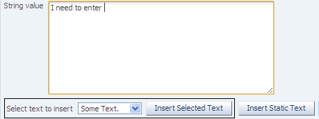
You can also configure an insertTextBehavior tag that works with command components to insert given text into an inputText component. The text to be entered can be a simple string, or it can be the value of another component, for example the selected list item in a selectOneChoice component. For example, Figure 11-10 shows an inputText component with some text already entered by a user.
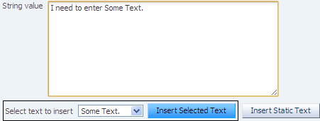
The user can then select additional text from a dropdown list, click the command button, and that text appears in the inputText component as shown in Figure 11-11.
11.3.1 How to Add an inputText Component
You can use an inputText component inside any of the layout components described in Chapter 9, "Organizing Content on Web Pages."
It may be helpful to have an understanding of how the attributes can affect functionality. For more information, see Section 11.3, "Using the inputText Component."
You may also find it helpful to understand functionality that can be added using other ADF Faces features. For more information, see Section 11.1.2, "Additional Functionality for Input Components and Forms."
To add an inputText component:
-
In the Component Palette, from the Text and Selection panel, drag and drop an Input Text onto the page.
-
In the Property Inspector, expand the Common section and set the following:
-
Label: Enter a value to specify the text to be used as the label.
If the text to be used is stored in a resource bundle, use the dropdown list to select Select Text Resource. Use the Select Text Resource dialog either to search for appropriate text in an existing bundle, or to create a new entry in an existing bundle. For more information about using resource bundles, see Chapter 29, "Internationalizing and Localizing Pages."
-
Value: Specify the value of the component. If the EL binding for a value points to a bean property with a
getmethod but nosetmethod, and this is a component whose value can be edited, then the component will be rendered in read-only mode.Note:
If you are using an
inputTextcomponent to display a Character Large Object (CLOB), then you will need to create a custom converter that converts the CLOB to a String. For more information about conversion, see Chapter 7, "Creating Custom JSF Converters."
-
-
Expand the Appearance section, and set the following:
-
Columns: Specify the size of the text control by entering the maximum number of characters that can be entered into the field.
-
Rows: Specify the height of the text control by entering the number of rows to be shown. The default value is 1, which generates a one-row input field. The number of rows is estimated based on the default font size of the browser. If set to more than 1, you must also set the
wrapattribute. -
DimensionsFrom: Determine how you want the
inputTextcomponent to handle geometry management. Set this attribute to one of the following:-
auto: If the parent component to theinputTextcomponent allows stretching of its child, then theinputTextcomponent will stretch to fill the parent component, as long as therowsattribute is set to a number greater than one and thesimpleattribute is set totrue. If the parent component does not allow stretching, then theinputTextcomponent gets its dimensions from the content. -
content: The
inputTextcomponent gets its dimensions from the component content. This is the default. -
parent: TheinputTextcomponent gets its dimensions from theinlineStyleattribute. If no value exists forinlineStyle, then the size is determined by the parent container.
-
-
Secret: Specify this boolean value that applies only to single-line text controls. When set to
true, thesecretattribute hides the actual value of the text from the user. -
Wrap: Specify the type of text wrapping to be used in a multiple-row text control. This attribute is ignored for a single-row component. By default, the attribute is set to
soft, which means multiple-row text wraps visually, but does not include carriage returns in the submitted value. Setting this attribute tooffwill disable wrapping: the multiple-row text will scroll horizontally. Setting it tohardspecifies that the value of the text should include any carriage returns needed to wrap the lines. -
ShowRequired: Specify whether or not to show a visual indication that the field is required. Note that setting the
requiredattribute totruewill also show the visual indication. You may want to use theshowRequiredattribute when a field is required only if another field's value is changed. -
Changed: Specify whether or not to show a blue circle whenever the value of the field has changed. If you set this to
true, you may also want to set thechangedDescattribute. -
ChangedDesc: Specify the text to be displayed in a tooltip on a mouseover of the changed icon. By default, the text is "Changed." You can override this by providing a different value.
-
Editable: Determine whether you want the component to always appear editable. If so, select
always. If you want the value to appear as read-only until the user hovers over it, selectonAccess. If you want the value to be inherited from an ancestor component, selectinherit.Note:
If you select
inherit, and no ancestor components define theeditablevalue, then the valuealwaysis used. -
AccessKey: Specify the key to press that will access the field.
-
LabelAndAccessKey: Instead of specifying a separate label and access key, you can combine the two, so that the access key is part of the label. Simply precede the letter to be used as an access key with an ampersand (&).
For example, if the label of a field is Description and you want the D to be the access key, you would enter
&Description.Note:
Because the value is being stored in the source of the page in XML, the ampersand (&) character must be escaped, so the value will actually be represented in the source of the page using the characters
&to represent the ampersand. -
Simple: Set to
trueif you do not want the label to be displayed.
-
-
If you want to style the label text, expand the Style section and set LabelStyle. Enter a CSS style property and value. For example, if you do not want the label text to wrap, you would enter
white-space:nowrap;for the value -
Expand the Behavior section and set the following:
-
Required: Specify whether or not a value is required. If set to
true, a visual indication is displayed to let the user know a value must be entered. If a value is not entered, an exception will occur and the component will fail validation. -
ReadOnly: Specify whether the control is displayed as a field whose value can be edited, or as an output-style text control.
-
AutoSubmit: Specify whether or not the component will automatically submit when the value changes. For more information about using the
autoSubmitattribute, see Section 5.3, "Using the Optimized Lifecycle." -
AutoComplete: Set to
onto allow the component to display previous values when the user begins to enter a matching value. Set tooffif no matches should be displayed. Default ison. -
AutoTab: Specify whether or not focus will automatically move to the next tab stop when the maximum length for the current component is reached.
-
MaximumLength: Specify the maximum number of characters per line that can be entered into the text control. This includes the characters representing the new line. If set to 0 or less, the
maximumLengthattribute is ignored. Note that in some browsers such as Internet Explorer, a new line is treated as two characters. -
Converter: Specify a converter object. For more information, see Section 7.3, "Adding Conversion."
-
Validator: Specify a method reference to a validator method using an EL expression. For more information, see Section 7.5, "Adding Validation."
-
11.3.2 How to Add the Ability to Insert Text into an inputText Component
The insertTextBehavior tag works with command components to insert given text into an inputText component. The text to be entered can be a simple string, or it can be the value of another component, for example the selected list item in a selectOneChoice component. To allow text to be inserted into an inputText component, add the insertTextBehavior tag as a child to a command component that will be used to insert the text.
Note:
The insertTextBehavior tag cancels server-side event delivery automatically; actionListener or action attributes on the parent command component will be ignored. If you need to also trigger server-side functionality, you must add an custom client listener to deliver the server-side event. For more information, see Section 6.4, "Sending Custom Events from the Client to the Server."
It may be helpful to have an understanding of how the attributes can affect functionality. For more information, see Section 11.3, "Using the inputText Component."
You may also find it helpful to understand functionality that can be added using other ADF Faces features. For more information, see Section 11.1.2, "Additional Functionality for Input Components and Forms."
Before you add an insertTextBehavior tag, you need to create an inputText component as described in Section 11.3.1, "How to Add an inputText Component." Set the clientComponent attribute to true.
-
Add a command component that the user will click to insert the text. For procedures, see Section 20.3.1, "How to Use Command Buttons and Command Links."
-
In the Component Palette, from the Operations panel, from the Behavior group, drag and drop an Insert Text Behavior as a child to the command component.
-
In the Insert Text Behavior dialog, enter the following:
-
For: Use the dropdown arrow to select Edit and then navigate to select the
inputTextcomponent into which the text will be inserted. -
Value: Enter the value for the text to be inserted. If you want to insert static text, then enter that text. If you want the user to be able to insert the value of another component (for example, the value of a
selectOneChoicecomponent), then enter an EL expression that resolves to that value. Example 11-3 shows page code for aninputTextcomponent into which either the value of a dropdown list or the value of static text can be inserted.Example 11-3 Using the insertTextBehavior Tag
<af:inputText clientComponent="true" id="idInputText" label="String value"
              value="#{demoInput.value}" rows="10" columns="60"/>
<af:selectOneChoice id="targetChoice" autoSubmit="true"
                    value="#{demoInput.choiceInsertText}"
                    label="Select text to insert">
  <af:selectItem label="Some Text." value="Some Text."/>
  <af:selectItem label="0123456789" value="0123456789"/>
  <af:selectItem label="~!@#$%^*" value="~!@#$%^*"/>
  <af:selectItem label="Two Lines" value="\\nLine 1\\nLine 2"/>
</af:selectOneChoice>
<af:commandButton text="Insert Selected Text" id="firstButton"
                  partialTriggers="targetChoice">
  <af:insertTextBehavior for="idInputText"
                         value="#{demoInput.choiceInsertText}"/>
</af:commandButton>
<af:commandButton text="Insert Static Text">
  <af:insertTextBehavior for="idInputText"
                         value="Some Static Text."/>
</commandButton>
-
-
By default, the text will be inserted when the action event is triggered by clicking the command component. However, you can change this to another client event by choosing that event from the dropdown menu for the
triggerTypeattribute of theinsertTextBehaviorcomponent in the Property Inspector.
11.4 Using the Input Number Components
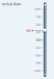
The slider components present the user with a slider with one or two markers whose position on the slider corresponds to a value. The slider values are displayed and include a minus icon at one end and a plus icon at the other. The user selects the marker and moves it along the slider to select a value. The inputNumberSlider component has one marker and allows the user to select one value from the slider, as shown in Figure 11-12 in horizontal layout, and in Figure 11-13 in vertical layout.
The inputRangeSlider component has two markers and allows the user to pick the end points of a range, as shown in Figure 11-14.
The inputNumberSpinbox is an input component that presents the user with an input field for numerical values and a set of up- and down-arrow keys to increment or decrement the current value in the input field, as shown in Figure 11-15.
11.4.1 How to Add an inputNumberSlider or an inputRangeSlider Component
When you add an inputNumberSlider or an inputRangeSlider component, you can determine the range of numbers shown and the increment of the displayed numbers.
It may be helpful to have an understanding of how the attributes can affect functionality. For more information, see Section 11.4, "Using the Input Number Components."
You may also find it helpful to understand functionality that can be added using other ADF Faces features. For more information, see Section 11.1.2, "Additional Functionality for Input Components and Forms."
To add an inputNumberSlider or inputRangeSlider component:
-
In the Component Palette, from the Text and Selection panel, drag and drop a Slider (Number) or Slider (Range) onto the page.
-
In the Property Inspector, expand the Common section (and for the
inputRangeSlidercomponent, also expand the Data section) and set the following attributes:-
Label: Specify a label for the component.
-
Minimum: Specify the minimum value that can be selected. This value is the begin value of the slider.
-
Maximum: Specify the maximum value that can be selected. This value is the end value of the slider.
-
MinimumIncrement: Specify the smallest possible increment. This is the increment that will be applied when the user clicks the plus or minus icon.
-
MajorIncrement: Specify the distance between two major marks. This value causes a labeled value to be displayed. For example, the
majorIncrementvalue of theinputRangeSlidercomponent in Figure 11-14 is5.0. If set to less than0, major increments will not be shown. -
MinorIncrement: Specify the distance between two minor marks. If less than 0, minor increments will not be shown.
-
Value: Specify the value of the component. If the EL binding for
valuepoints to a bean property with agetmethod but nosetmethod, the component will be rendered in read-only mode.
-
-
Expand the Appearance section and set the Orientation to specify whether the component will be in horizontal or vertical layout. For information about the other attributes in this section, see Section 11.3.1, "How to Add an inputText Component."
11.4.2 How to Add an inputNumberSpinbox Component
The inputNumberSpinbox component allows the user to scroll through a set of numbers to select a value.
It may be helpful to have an understanding of how the attributes can affect functionality. For more information, see Section 11.4, "Using the Input Number Components."
You may also find it helpful to understand functionality that can be added using other ADF Faces features. For more information, see Section 11.1.2, "Additional Functionality for Input Components and Forms."
To add an inputNumberSpinbox component:
-
In the Component Palette, from the Text and Selection panel, drag and drop an Input Number Spinbox onto the page.
-
Expand the Data section of the Property Inspector and set the following:
-
Value: Specify the value of the component. If the EL binding for
valuepoints to a bean property with agetmethod but nosetmethod, the component will be rendered in read-only mode. -
Minimum: Specify the minimum value allowed in the input field.
-
Maximum: Specify the maximum value allowed in the input field.
-
StepSize: Specify the increment by which the spinbox will increase or decrease the number in the input field.
-
-
Expand the Appearance and Behavior sections and set the attributes. For more information about setting these attributes, see Section 11.3.1, "How to Add an inputText Component."
11.5 Using Color and Date Choosers
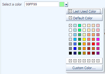
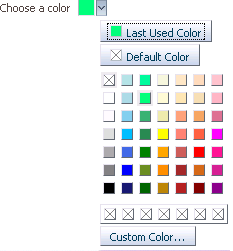
The inputColor component allows users to pick a color from a a palette. It presents a text input field for entering code for colors. It also displays a button for picking colors from a palette in a popup, as shown in Figure 11-16.
By default, the content delivery for the popup is lazy. When the user clicks the button, the inputColor component receives a PPR request, and rerenders, displaying a chooseColor component in a popup component.
Performance Tip:
If the clientComponent attribute on the inputColor component is set to true, then the popup and chooseColor component are delivered immediately. If the color palette is large, this could negatively affect initial page load performance.
The default color code format is the hexadecimal color format. However, you can override the format using a ColorConverter class.
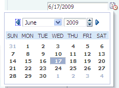
The inputDate component presents a text input field for entering dates and a button for picking dates from a popup calendar, as shown in Figure 11-17. The default date format is the short date format appropriate for the current locale. For example, the default format in American English (ENU) is mm/dd/yy. However, you can override the format using a date-time converter (for more information about using converters, see Section 7.3, "Adding Conversion").
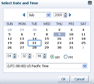
When you add a date-time converter and configure it to show both the date and the time, the date picker is displayed as a modal dialog with additional controls for the user to enter a time. Additionally, if the converter is configured to show a time zone, a timezone dropdown list is shown in the dialog, as shown in Figure 11-18.
11.5.1 How to Add an inputColor Component
The inputColor component allows users either to enter a value in an input text field, or to select a color from a color chooser.
It may be helpful to have an understanding of how the attributes can affect functionality. For more information, see Section 11.5, "Using Color and Date Choosers."
You may also find it helpful to understand functionality that can be added using other ADF Faces features. For more information, see Section 11.1.2, "Additional Functionality for Input Components and Forms."
To add an inputColor component:
-
In the Component Palette, from the Text and Selection panel, drag and drop an Input Color onto the page.
-
In Property Inspector, expand the Common section and set the following:
-
Label: Specify a label for the component.
-
Compact: Set to
trueif you do not want to display the input text field, as shown in Figure 11-19.
-
-
Expand the Data section and set the following attributes:
-
Value: Specify the value of the component. If the EL binding for
valuepoints to a bean property with agetmethod but nosetmethod, the component will be rendered in read-only mode. -
ColorData: Specify the list of colors to be displayed in the standard color palette. The number of provided colors can be 49 (7 colors x 7 colors), 64 (8 colors x 8 colors), or 121 (11 colors x 11 colors). The number set for this attribute will determine the valid value for the
widthattribute. For example, if you set thecolorDataattribute to 49, the width must be 7. If the number does not match the width, extra color elements in the list will be ignored and missing color elements will be displayed as no-color. The color list must be an array of typeTrColoron the client side. -
CustomColorData: Specify the list of custom-defined colors. The number of colors can be 7, 8, or 11. The color list must be an array of type
TrColoron the client side. On the server side, it must be aListofjava.awt.Colorobjects, or a list of hexadecimal color strings. -
DefaultColor: Specify the default color using hexadecimal color code, for example
#000000.
-
-
Expand the Appearance section and set the following attributes:
-
Width: Specify the width of the standard palette in cells. The valid values are 7, 8, and 11, which correspond to the values of the
colorDataandcustomColorDataattributes. -
CustomVisible: Specify whether or not the Custom Color button and custom color row are to be displayed. When set to
true, the Custom Color button and custom color row will be rendered. -
DefaultVisible: Specify whether or not the Default button is to be displayed. When set to
true, the Default button will be rendered. The Default button allows the user to easily select the color set as the value for thedefaultColorattribute. -
LastUsedVisible: Specify whether or not the Last Used button is to be displayed. When set to
truethe Last Used button will be rendered, which allows the user to select the color that was most recently used. -
Editable: Set to
onAccessif you want the value of the component to appear as read-only until the user hovers over it. If you want the component to always appear editable, selectalways. If you want the value to be inherited from an ancestor component, selectinherit.Note:
If you select
inherit, and no ancestor components define theeditablevalue, then the valuealwaysis used.
-
-
If you want to style the label, expand the Style section and set LabelStyle. Enter a CSS style property and value for the label. For example, if you do not want the label text to wrap, you would enter
white-space:nowrap;for the value. -
Expand the Behavior section and set the following attribute:
-
ChooseId: Specify the
idof thechooseColorcomponent which can be used to choose the color value. If not set, theinputColorcomponent has its own default popup dialog with achooseColorcomponent. -
AutoComplete: Set to
trueto allow the component to display previous values when the user begins to enter a matching value. Set tofalseif no matches should be displayed. Default istrue.
-
11.5.2 How to Add an InputDate Component
The inputDate component allows the user to either enter or select a date.
It may be helpful to have an understanding of how the attributes can affect functionality. For more information, see Section 11.5, "Using Color and Date Choosers."
You may also find it helpful to understand functionality that can be added using other ADF Faces features. For more information, see Section 11.1.2, "Additional Functionality for Input Components and Forms."
To add an inputDate component:
-
In the Component Palette, from the Text and Selection panel, drag and drop an Input Date onto the page.
-
In the Property Inspector, in the Common section, set the following:
-
Label: Specify a label for the component.
-
Value: Specify the value of the component. If the EL binding for
valuepoints to a bean property with agetmethod but nosetmethod, the component will be rendered in read-only mode.
-
-
Optionally expand the Style section and set the LabelStyle attribute to a CSS style property and value. For example, if you did not want the label text to wrap, you would enter
white-space:nowrap;as the value. -
Expand the Data section and set the following attributes:
-
MinValue: Specify the minimum value allowed for the date value. When set to a fixed value on a tag, this value will be parsed as an ISO 8601 date. ISO 8601 dates are of the form "yyyy-MM-dd" (for example: 2002-02-15). All other uses require
java.util.Dateobjects. -
MaxValue: Specify the maximum value allowed for the date value. When set to a fixed value on a tag, this value will be parsed as an ISO 8601 date. ISO 8601 dates are of the form "yyyy-MM-dd" (for example: 2002-02-15). All other uses require
java.util.Dateobjects. -
DisableDays: Specify a binding to an implementation of the
org.apache.myfaces.trinidad.model.DateListProviderinterface. ThegetDateListmethod should generate aListof individualjava.util.Dateobjects which will be rendered as disabled. The dates must be in the context of the given base calendar.Performance Tip:
This binding requires periodic roundtrips. If you just want to disable certain weekdays (for example, Saturday and Sunday), use the
disableDaysOfWeekattribute. -
DisableDaysOfWeek: Specify a whitespace-delimited list of weekdays that should be rendered as disabled in every week. The list should consist of one or more of the following abbreviations:
sun,mon,tue,wed,thu,fri,sat. By default, all days are enabled. -
DisableMonths: Specify a whitespace-delimited list of months that should be rendered as disabled in every year. The list should consist of one or more of the following abbreviations:
jan, feb, mar, apr, may, jun, jul, aug, sep, oct, nov, dec. By default, all months are enabled.
-
-
Expand the Behavior section and set the following:
-
ChooseId. Specify the
idof thechooseDatecomponent which can be used to choose the date value. If not set, theinputDatecomponent has its own default popup dialog with achooseDatecomponent. -
AutoComplete: Set to
trueto allow the component to display previous values when the user begins to enter a matching value. Set tofalseif no matches should be displayed. Default istrue.
-
-
If you want the value of the component to appear as read-only until the user hovers over it, expand the Appearance section and set Editable to
onAccess. If you want the component to always appear editable, selectalways. If you want the value to be inherited from an ancestor component, selectinherit.Note:
If you select
inherit, and no ancestor components define theeditablevalue, then the valuealwaysis used.
11.5.3 What You May Need to Know About Selecting Time Zones Without the inputDate Component
By default, the inputDate component displays a drop down list of time zones if the associated converter is configured to do so, for example, if you include the timezone placeholder z in the converter's pattern. The end user can only modify the timezone using this list. The list is configured to display the most common time zones.
However, there may be times when you need to display the list of time zones outside of the inputDate component. For example, on a Application Preferences page, you may want to use a selectOneChoice component that allows the user to select the time zone that will be used to display all inputDates in the application. A backing bean would handle the conversion between the time zone ID and the java.util.TimeZone object. Converters for the inputDate instances in the application would then bind the time zone to that time zone object.
You can access this list using either an API on the DateTimeUtils class, or using an EL expression on a component.
Following are the methods on DateTimeUtils class:
-
getCommonTimeZoneSelectItems (): Returns a list of commonly used time zones. -
getCommonTimeZoneSelectItems (String timeZoneId): Returns a list of commonly used time zones, including the given time zone if it is not part of the list.
To access this list using EL, use one of the following expressions:
-
af:getCommonTimeZoneSelectItemsFor example:
<f:selectItems value="#{af:getCommonTimeZoneSelectItems()}" id="tzones2" /> -
af:getMergedTimeZoneSelectItems (id)For example:
<f:selectItems value="#{af:getMergedTimeZoneSelectItems(demoInput.preferredTimeZoneId)}" id="tzones" />
If you will be using an inputDate component and a selection list for its time zone on the same page, you must clear out the local value for the inputDate's timezone to ensure that the value binding for the selection takes precedence. Otherwise, a non-null local value will take precedence, and the inputDate component will not appear to be updated.In Example 11-4, the backing bean has a reference using the binding attribute to the inputDate component. When the user picks a new time zone, the id is set and the code gets the converter for the inputDate and clears out its time zone. When the page is rendered, since the local value for the converter's time zone is null, it will evaluate #{demoInput.preferredTimeZone} and obtain the updated time zone.
Example 11-4 Using an inputDate and Time Zone Selection List Together
<af:selectOneChoice label="Select a new timezone"
                    value="#{demoInput.preferredTimeZoneId}" autoSubmit="true">
  <f:selectItems
         value="#{af:getMergedTimeZoneSelectItems(demoInput.preferredTimeZoneId)}"
         id="tzones" />
</af:selectOneChoice>
<af:inputDate  label="First inputDate with timezone bound" id="bound1"
               partialTriggers="tzpick"  binding="#{demoInput.boundDate1}">
  <af:convertDateTime type="both" timeStyle="full"
                      timeZone="#{demoInput.preferredTimeZone}"/>
</af:inputDate>

DemoInputBean.java
public void setPreferredTimeZoneId(String _preferredTimeZoneId)
{
  TimeZone tz = TimeZone.getTimeZone(_preferredTimeZoneId);
  setPreferredTimeZone (tz);
  this._preferredTimeZoneId = _preferredTimeZoneId;
}

public void setPreferredTimeZone(TimeZone _preferredTimeZone)
{
  this._preferredTimeZone = _preferredTimeZone;
     DateTimeConverter conv1 = (DateTimeConverter)
                              _boundDate1.getConverter();
  conv1.setTimeZone(null);
}
11.6 Using Selection Components
The selection components allow the user to select single and multiple values from a list or group of items. ADF Faces provides a number of different selection components, ranging from simple boolean radio buttons to list boxes that allow the user to select multiple items. The list of items within a selection component is made up of a number of selectItem components
All the selection components except the selectItem component delivers the ValueChangeEvent and AttributeChangeEvent events. The selectItem component only delivers the AttributeChangeEvent event. You must create a valueChangeListener handler or an attributeChangeListener handler, or both for them.
The selectBooleanCheckbox component value must always be set to a boolean and not an object. It toggles between selected and unselected states, as shown in Figure 11-20.
The selectBooleanRadio component displays a boolean choice, and must always be set to a boolean. Unlike the selectBooleanCheckbox component, the selectBooleanRadio component allows you to group selectBooleanRadio components together using the same group attribute.
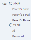
For example, say you have one boolean that determines whether or not a user is age 10 to 18 and another boolean that determines whether a user is age 19-100. As shown in Figure 11-21, the two selectBooleanRadio components can be placed anywhere on the page, they do not have to be next to each other. As long as they share the same group value, they will have mutually exclusive selection, regardless of their physical placement on the page.
Tip:
Each selectBooleanRadio component must be bound to a unique boolean.
You use the selectOneRadio component to create a list of radio buttons from which the user can select a single value from a list, as shown in Figure 11-22.
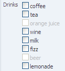
You use the selectManyCheckbox component to create a list of checkboxes from which the user can select one or more values, as shown in Figure 11-23.
The selectOneListbox component creates a component which allows the user to select a single value from a list of items displayed in a shaded box, as shown in Figure 11-24.
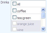
The selectManyListbox component creates a component which allows the user to select many values from a list of items. This component includes an All checkbox that is displayed at the beginning of the list of checkboxes, as shown in Figure 11-25.
The selectOneChoice component creates a menu-style component, which allows the user to select a single value from a dropdown list of items. The selectOneChoice component is intended for a relatively small number of items in the dropdown list.
Best Practice:
If a large number of items is desired, use an inputComboboxListOfValues component instead. For more information, see Chapter 13, "Using List-of-Values Components."
The selectOneChoice component is shown in Figure 11-26.
You can configure the selectOneChoice component to display in a compact mode, as shown in Figure 11-27. When in compact mode, the input field is replaced with a smaller icon.
When the user clicks the icon, the dropdown list is displayed, as shown in Figure 11-28.
The selectManyChoice component creates a menu-style dropdown component, which allows the user to select multiple values from a dropdown list of items. This component can be configured to include an All selection item that is displayed at the beginning of the list of selection items. If the number of choices is greater than 15, a scrollbar will be presented, as shown in Figure 11-29.
By default, all selectItem child components are built when the selectManyChoice component is built, as the page is rendered. However, if the way the list items are accessed is slow, then performance can be hampered. This delay can be especially troublesome when it is likely that the user will select the items once, and then not change them on subsequent visits.
For example, suppose you have a selectManyChoice component used to filter what a user sees on a page, and that the values for the child selectItem components are accessed from a web service. Suppose also that the user is not likely to change that selection each time they visit the page. By default, each time the page is rendered, all the selectItems must be built, regardless of whether or not the user will actually need to view them. Instead, you can change the contentDelivery attribute on the selectManyChoice component from immediate (the default) to lazy. The lazy setting causes the selectItem components to be built only when the user clicks the dropdown.
For both immediate and lazy, when the user then makes a selection, the values of the selected selectItem components are displayed in the field. However when lazy content delivery is used, on subsequent visits, instead of pulling the selected values from the selectItem components (which would necessitate building these components), the values are pulled from the lazySelectedLabel attribute. This attribute is normally bound to a method that returns an array of Strings representing the selected items. The selectItem components will not be built until the user goes to view or change them, using the dropdown.
Note that there are limitations when using the lazy delivery method on the selectManyChoice component. For more information about content delivery for the selectManyChoice component and its limitations, see Section 11.6.2, "What You May Need to Know About the contentDelivery Attribute on the SelectManyChoice Component."
For the following components, if you want the label to appear above the control, you can place them in a panelFormLayout component.
-
selectOneChoice -
selectOneRadio -
selectOneListbox -
selectManyChoice -
selectManyCheckbox -
selectManyListbox
For the following components, the attributes disabled, immediate, readOnly, required, requireMessageDetail, and value cannot be set from JavaScript on the client for security reasons (for more information, see Section 4.6.1, "How to Set Property Values on the Client"):
-
selectOneChoice -
selectOneRadio -
selectOneListbox -
selectBooleanRadio -
selectBooleanCheckbox -
selectManyChoice -
selectManyCheckbox -
selectManyListbox
11.6.1 How to Use Selection Components
The procedures for adding selection components are the same for each of the components. First, you add the selection component and configure its attributes. Then you add any number of selectItem components for the individual items in the list, and configure those.
It may be helpful to have an understanding of how the attributes can affect functionality. For more information, see Section 11.6, "Using Selection Components."
You may also find it helpful to understand functionality that can be added using other ADF Faces features. For more information, see Section 11.1.2, "Additional Functionality for Input Components and Forms."
-
In the Component Palette, from the Text and Selection panel, drag and drop the selection component onto the page.
-
For all selection components except the
selectBooleanCheckboxandselectBooleanRadiocomponents, a dialog opens where you choose either to bind to a value in a managed bean, or to create a static list. On the second page of the dialog, you can set the following properties:-
Label: Enter the label for the list.
-
RequiredMessageDetail: Enter the message that should be displayed if a selection is not made by the user. For more information about messages, see Section 19.3, "Displaying Hints and Error Messages for Validation and Conversion."
-
Validator: Enter an EL expression that resolves to a validation method on a managed bean (for more information, see Chapter 7, "Validating and Converting Input").
-
Value: Specify the value of the component. If the EL binding for the
valuepoints to a bean property with agetmethod but nosetmethod, the component will be rendered in read-only mode.Note:
If you are creating a
selectBooleanRadioorselectBooleanCheckboxcomponent, and you enter a value for thevalueattribute, you cannot also enter a value for theselectedattribute, as it is a typesafe alias for thevalueattribute. You cannot use both. -
ValueChangeListener: Enter an EL expression that resolves to a listener on a managed bean that handles value change events.
-
-
Expand the Appearance section of the Property Inspector and set the attributes, as described in Table 11-1. Note that only attributes specific to the selection components are discussed here. Many of the attributes are the same as for input text components. For more information, see Section 11.3.1, "How to Add an inputText Component."
Table 11-1 Appearance Attributes for Selection Components
Components Attribute selectOneRadio,selectManyCheckboxLayout: Set to
verticalto have the buttons or checkboxes displayed vertically. Set tohorizontalto have them displayed in a single horizontal line.selectManyListboxSize: Set to the number of items that should be displayed in the list. If the number of items in the list is larger than the
sizeattribute value, a scrollbar will be displayed.selectManyListbox,selectManyChoiceSelectAllVisible: Set to
trueto display an All selection that allows the user to select all items in the list.selectOneChoiceMode: Set to
compactto display the component only when the user clicks the dropdown icon.selectOneRadio,selectOneListbox,selectOneChoiceUnselectedLabel: Enter text for the option that represents a value of
null, meaning nothing is selected. IfunselectedLabelis not set and if the component does not have a selected value, then an option with an empty string as the label and value is rendered as the first option in the choice box (if there is not an empty option already defined). Note that you should set therequiredattribute totruewhen defining anunselectedLabelvalue. If you do not, two blank options will appear in the list. Once an option has been successfully selected, and ifunselectedLabelis not set, then the empty option will not be rendered. -
Expand the Behavior section of the Property Inspector and set the attributes, as described in Table 11-2. Note that only attributes specific to the selection components are discussed here. Many of the attributes are the same as for input text components. For more information, see Section 11.3.1, "How to Add an inputText Component."
Table 11-2 Behavior Attributes for Selection Components
Component Attribute All except the boolean selection components
ValuePassThru: Specify whether or not the values are passed through to the client. When
valuePassThruisfalse, the value and the options' values are converted to indexes before being sent to the client. Therefore, whenvaluePassThruisfalse, there is no need to write your own converter when you are using custom Objects as your values, options, or both. If you need to know the actual values on the client-side, then you can setvaluePassThrutotrue. This will pass the values through to the client, using your custom converter if it is available; a custom converter is needed if you are using custom objects. The default isfalse.Note that if your selection components uses ADF Model binding, this value will be ignored.
selectBooleanRadioGroup: Enter a group name that will enforce mutual exclusivity for all other
selectBooleanRadiocomponents with the samegroupvalue. -
If you want the value of a
selectOneChoiceorselectManyChoicecomponent to appear as read-only until the user hovers over it, expand the Appearance section and set Editable toonAccess. If you want the component to always appear editable, selectalways. If you want the value to be inherited from an ancestor component, selectinherit.Note:
If you select
inherit, and no ancestor components define theeditablevalue, then the valuealwaysis used. -
If you do not want the child
selectItemcomponents for theselectManyChoiceto be built each time the page is rendered, do the following:-
Create logic that can store the labels of the selected items and also return those labels as an array of strings.
-
Expand the Advanced section, and set ContentDelivery to lazy.
-
Bind LazySelectedLabel to the method that returns the array of the selected items.
Note that there are limitations to using lazy content delivery. For more information about content delivery for the
selectManyChoicecomponent, see Section 11.6.2, "What You May Need to Know About the contentDelivery Attribute on the SelectManyChoice Component." -
-
For the boolean components, drag and drop any number of
selectItemcomponents as children to the boolean component. These will represent the items in the list (for other selection components, the dialog in Step 2 automatically added these for you). -
With the
selectItemcomponent selected, in the Property Inspector, expand the Common section, and if not set, enter a value for thevalueattribute. This will be the value that will be submitted. -
Expand the Appearance section, and if not set, enter a value for Label. This will be the text that is displayed in the list.
-
Expand the Behavior section, and set Disabled to
trueif you want the item to appear disabled in the list.
11.6.2 What You May Need to Know About the contentDelivery Attribute on the SelectManyChoice Component
When the contentDelivery attribute on the selectManyChoice component is set to immediate (the default), the following happens:
-
First visit to the page:
-
The
selectManyChoiceand allselectItemcomponents are built as the page is rendered. This can cause performance issues if there are many items, or if the values for theselectItemcomponents are accessed for example, from a web service. -
When the
selectManyChoicecomponent renders, nothing displays in the field, as there has not yet been a selection. -
When user clicks drop down, all items are shown.
-
When user selects items, the corresponding labels for the selected
selectItemcomponents are shown in field. -
When page is submitted, values are posted back to the model.
-
-
Subsequent visit: The
selectManyChoiceand allselectItemcomponents are built again as the page is rendered. Labels for selectedselectItemcomponents are displayed in field. This will cause the same performance issues as on the first visit to the page.
When the contentDelivery attribute on the selectManyChoice component is set to lazy, the following happens:
-
First visit to the page:
-
The
selectManyChoiceis built as the page is rendered, but theselectItemcomponents are not. -
When the
selectManyChoicecomponent renders, nothing displays in the field, as there has not yet been a selection. -
When user clicks drop down, the
selectItemcomponents are built. While this is happening, the user sees a "busy" spinner. Once the components are built, all items are shown. -
When user selects items, the corresponding labels for the selected
selectItemcomponents are shown in field. -
When page is submitted, values are posted back to the model.
-
-
Subsequent visit:
-
When page is first rendered, only the
selectManyChoicecomponent is built. At this point, the value of thelazySelectedLabelattribute is used to display the selected items. -
If user clicks drop down, the
selectItemcomponents are built. While this is happening, the user sees a "busy" spinner. Once the components are built, all items are shown.Once the
selectItemcomponents are built, theselectManyChoicecomponent will act as though itscontentDeliveryattribute is set toimmediate, and use the actual value of theselectItemcomponents to display the selected items.
-
Following are limitations for using lazy content delivery for the selectManyChoice component:
-
You cannot store the value of the
selectManyChoicein Request scope. On postback, the value attribute is accessed from the model, rather than decoding what was returned from the client. If the value is stored in Request scope, that value will be empty. Do not store the value in Request scope. -
On postbacks, converters are not called. If you are relying on converters for postbacks, then you should not use lazy content delivery.
-
The
contentDeliveryattribute is ignored when in screen reader mode. TheselectItemcomponents will always be built when the page is rendered.
11.7 Using Shuttle Components
The selectManyShuttle and selectOrderShuttle components present the user with two list boxes and buttons to move or shuttle items from one list box to the other. The user can select a single item or multiple items to shuttle between the leading (Available values) list box and the trailing (Selected values) list box. For either component, if you want the label to appear above the control, place them in a panelFormLayout component.
The selectManyShuttle component is shown in Figure 11-30.
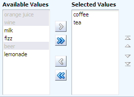
The selectOrderShuttle component additionally includes up and down arrow buttons that the user can use to reorder values in the Selected values list box, as shown in Figure 11-31. When the list is reordered, a ValueChangeEvent event is delivered. If you set the readOnly attribute to true, ensure the values to be reordered are selected values that will be displayed in the trailing list (Selected values).
The value attribute of these components, like any other selectMany component, must be a List or an Array of values that correspond to a value of one of the contained selectItem components. If a value of one of the selectItems is in the List or Array, that item will appear in the trailing list. You can convert a selectManyListbox component directly into a selectManyShuttle; instead of the value driving which items are selected in the listbox, it affects which items appear in the trailing list of the selectOrderShuttle component.
Similar to other select components, the List or Array of items are composed of selectItem components nested within the selectManyShuttle or selectOrderShuttle component. Example 11-5 shows a sample selectOrderShuttle component that allows the user to select the top five file types from a list of file types.
Example 11-5 selectOrderShuttle JSF Page Code
<af:selectOrderShuttle value="#{helpBean.topFive}"
    leadingHeader="#{explorerBundle['help.availableFileTypes']}"
    trailingHeader="#{explorerBundle['help.top5']}"
    simple="true">
  <af:selectItem label="XLS"/>
  <af:selectItem label="DOC"/>
  <af:selectItem label="PPT"/>
  <af:selectItem label="PDF"/>
  <af:selectItem label="Java"/>
  <af:selectItem label="JWS"/>
  <af:selectItem label="TXT"/>
  <af:selectItem label="HTML"/>
  <af:selectItem label="XML"/>
  <af:selectItem label="JS"/>
  <af:selectItem label="PNG"/>
  <af:selectItem label="BMP"/>
  <af:selectItem label="GIF"/>
  <af:selectItem label="CSS"/>
  <af:selectItem label="JPR"/>
  <af:selectItem label="JSPX"/>
  <f:validator validatorId="shuttle-validator"/>
</af:selectOrderShuttle>
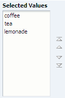
If you set the reorderOnly attribute of a selectOrdershuttle component to true, the shuttle function will be disabled, and only the Selected Values listbox appears. The user can only reorder the items in the listbox, as shown in Figure 11-32.
11.7.1 How to Add a selectManyShuttle or selectOrderShuttle Component
The procedures for adding shuttle components are the same for both components. First you add the selection component and configure its attributes. Then you add any number of selectItem components for the individual items in the list, and configure those.
It may be helpful to have an understanding of how the attributes can affect functionality. For more information, see Section 11.7, "Using Shuttle Components."
You may also find it helpful to understand functionality that can be added using other ADF Faces features. For more information, see Section 11.1.2, "Additional Functionality for Input Components and Forms."
To add a selectManyShuttle or selectOrderShuttle component:
-
In the Component Palette, from the Text and Selection panel, drag and drop a Shuttle or Shuttle (Ordered) onto the page.
-
A dialog appears where you choose either to bind to a value in a managed bean, or to create a static list. On the second page of the dialog, you can set the following:
-
Label: Enter the label for the list.
-
RequiredMessageDetail: Enter the message that should be displayed if a selection is not made by the user. For more information about messages, see Section 19.3, "Displaying Hints and Error Messages for Validation and Conversion."
-
Size: Specify the display size (number of items) of the lists. The size specified must be between 10 and 20 items. If the attribute is not set or has a value less than 10, the size would have a default or minimum value of 10. If the attribute value specified is more than 20 items, the size would have the maximum value of 20.
-
Validator: Enter an EL expression that resolves to a validation method on a managed bean.
-
Value: Specify the value of the component. If the EL binding for the
valuepoints to a bean property with agetmethod but nosetmethod, the component will be rendered in read-only mode. -
ValueChangeListener: Enter an EL expression that resolves to a listener on a managed bean that handles value change events.
-
-
In the Property Inspector, expand the Appearance section and set the following:
-
Layout: Specify whether the component will be in horizontal or vertical layout. The default is
horizontal, meaning the leading and trailing list boxes are displayed next to each other. When set tovertical, the leading list box is displayed above the trailing list box. -
LeadingHeader: Specify the header text of the leading list of the shuttle component.
-
LeadingDescShown: Set to
trueto display a description of the selected item at the bottom of the leading list box. -
TrailingHeader: Specify the header of the trailing list of the shuttle component.
-
TrailingDescShown: Set to
trueto display a description of the selected item at the bottom of the trailing list box.
-
-
Expand the Behavior section and optionally set the following attributes:
-
ValuePassThru: Specify whether or not the values are passed through to the client. When
valuePassThruisfalse, the value and the options' values are converted to indexes before being sent to the client. Therefore, whenvaluePassThruisfalse, there is no need to write your own converter when you are using custom objects as your values, options, or both. If you need to know the actual values on the client-side, then you can setvaluePassThrutotrue. This will pass the values through to the client, using your custom converter if it is available; a custom converter is needed if you are using custom objects. The default isfalse. -
ReorderOnly (
selectOrderShuttlecomponent only): Specify whether or not the shuttle component is in reorder-only mode, where the user can reorder the list of values, but cannot add or remove them.
-
-
In the Structure window, select one of the
selectItemcomponents, and in the Property Inspector, set any needed attributes.Tip:
If you elected to have the leading or trailing list box display a description, you must set a value for the
shortDescattribute for eachselectItemcomponent.
11.7.2 What You May Need to Know About Using a Client Listener for Selection Events
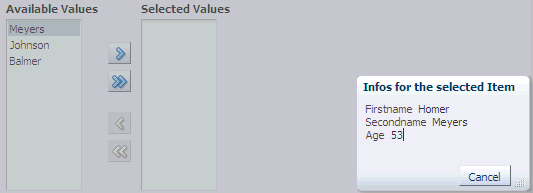
You can provide the user with information about each selected item before the user shuttles it from one list to another list by creating JavaScript code to perform processing in response to the event of selecting an item. For example, your code can obtain additional information about that item, then display it as a popup to help the user make the choice of whether to shuttle the item or not. Figure 11-33 shows a selectManyShuttle component in which the user selects Meyers and a popup provides additional information about this selection.
You implement this feature by adding a client listener to the selectManyShuttle or selectOrderShuttle component and then create a JavaScript method to process this event. The JavaScript code is executed when a user selects an item from the lists. For more information about using client listeners for events, see Section 4.2, "Listening for Client Events."
How to add a client listener to a shuttle component to handle a selection event:
-
In the Component Palette, from the Operations panel, in the Listeners group, drag a Client Listener and drop it as a child to the shuttle component.
-
In the Insert Client Listener dialog, enter a function name in the Method field (you will implement this function in the next step), and select
propertyChangefrom the Type dropdown.If for example, you entered showDetails as the function, JDeveloper would enter the code shown in bold in Example 11-6.
Example 11-6 Using a clientListener to Register a Selection
<af:selectManyShuttle value="#{demoInput.manyListValue1}"
     valuePassThru="true" ...>
     <af:clientListener type="propertyChange" method="showDetails"/>
     <af:selectItem label="coffee" value="bean" />
      ...
</af:selectManyShuttle>
This code causes the
showDetailsfunction to be called any time the property value changes. -
In your JavaScript, implement the function entered in the last step. This function should do the following:
-
Get the shuttle component by getting the source of the event.
-
Use the client JavaScript API calls to get information about the selected items.
-
In Example 11-7, AdfShuttleUtils.getLastSelectionChange is called to get the value of the last selected item
Example 11-7 Sample JavaScript methods showDetails used to process a selection
function showDetails(event)
{
  if(AdfRichSelectManyShuttle.SELECTION == event.getPropertyName())
  {
    var shuttleComponent = event.getSource();
    var lastChangedValue =    AdfShuttleUtils.getLastSelectionChange(shuttleComponent, event.getOldValue());
    var side = AdfShuttleUtils.getSide(shuttleComponent, lastChangedValue);
    if(AdfShuttleUtils.isSelected(shuttleComponent, lastChangedValue))
    {
      //do something...
    }
    else
    {
      //do something else
    }
    if(AdfShuttleUtils.isLeading(shuttleComponent, lastChangedValue))
    {
      //queue a custom event (see serverListener) to call a java method on the server
    }
  }
}
11.8 Using the richTextEditor Component
The richTextEditor component provides an input field that can accept text with formatting. It also supports label text, and messages. It allows the user to change font name, size, and style, create ordered lists, justify text, and use a variety of other features. The richTextEditor component also can be used to edit an HTML source file. Two command buttons are used to toggle back and forth between editing standard formatted text and editing the HTML source file. Figure 11-34 shows the rich text editor component in standard rich text editing Mode.
Figure 11-35 shows the editor in source code editing mode.
Other supported features include:
-
Font type
-
Font size
-
Link/unlink
-
Clear styling
-
Undo/redo
-
Bold/italics/underline
-
Subscript/superscript
-
Justify (left, middle, right, full)
-
Ordered/unordered lists
-
Indentation
-
Text color/background color
-
Rich text editing mode/source code editing mode
The value (entered text) of the rich text editor is a well-formed XHTML fragment. Parts of the value may be altered for browser-specific requirements to allow the value to be formatted. Also, for security reasons, some features such as script-related tags and attributes will be removed. There are no guarantees that this component records only the minimal changes made by the user. Because the editor is editing an XHTML document, the following elements may be changed:
-
Nonmeaningful whitespace
-
Element minimization
-
Element types
-
Order of attributes
-
Use of character entities
The editor supports only HTML 4 tags, with the exception of:
-
Script, noscript
-
Frame, frameset, noframes
-
Form-related elements (input, select, optgroup, option, textarea, form, button, label, isindex)
-
Document-related elements (html, head, body, meta, title, base, link)
The richTextEditor component also supports tags that pull in content (such as applet, iframe, object, img, and a). For the iframe tag, the content should not be able to interact with the rest of the page because browsers allow interactions only with content from the same domain. However, this portion of the page is not under the control of the application.
While the richTextEditor component does not support font units such as px and em, it does support font size from 1 to 7 as described in the HTML specification. It does not support embed or unknown tags (such as <foo>).
On the client, the richTextEditor component does not support getValue and setValue methods. There is no guarantee the component's value on the client is the same as the value on the server. Therefore, the richTextEditor does not support client-side converters and validators. Server-side converters and validators will still work.
The rich text editor delivers ValueChangeEvent and AttributeChangeEvent events. Create valueChangeListener and attributeChangeListener handlers for these events as required.
You can also configure the richTextEditorInsertBehavior tag, which works with command components to insert given text into the richTextEditor component. The text to be entered can be a simple string, or it can be preformatted text held, for example, in a managed bean.
By default, the toolbar in the richTextEditor component allows the user to change many aspects of the text, such as the font, font size and weight, text alignment, and view mode, as shown in Figure 11-36.
Figure 11-37 shows a toolbar that has been customized. Many of the toolbar buttons have been removed and a toolbar with a custom toolbar button and a menu have been added.
11.8.1 How to Add a richTextEditor Component
Once you add a richTextEditor component, you can configure it so that text can be inserted at a specific place, and you can also customize the toolbar. For more information, see Section 11.8.2, "How to Add the Ability to Insert Text into a richTextEditor Component," and Section 11.8.3, "How to Customize the Toolbar."
It may be helpful to have an understanding of how the attributes can affect functionality. For more information, see Section 11.8, "Using the richTextEditor Component."
You may also find it helpful to understand functionality that can be added using other ADF Faces features. For more information, see Section 11.1.2, "Additional Functionality for Input Components and Forms."
To add a richTextEditor component:
-
In the Component Palette, from the Text and Selection panel, drag and drop a Rich Text Editor onto the page.
-
Expand the Common section of the Property Inspector and set the
valueattribute. -
Expand the Appearance section and set the following:
-
Rows: Specify the height of the edit window as an approximate number of characters shown.
-
Columns: Specify the width of the edit window as an approximate number of characters shown.
-
Label: Specify a label for the component.
-
-
Expand the Behavior section and set the following:
-
EditMode: Select whether you want the editor to be displayed using the WYSIWYG or source mode.
-
ContentDelivery: Specify whether or not the data within the editor should be fetched when the component is rendered initially. When the
contentDeliveryattribute value isimmediate, data is fetched and displayed in the component when it is rendered. If the value is set tolazy, data will be fetched and delivered to the client during a subsequent request. For more information, see Section 12.2.2, "Content Delivery."
-
Tip:
You can set the width of a richTextEditor component to full width or 100%. However, this works reliably only if the editor is contained in a geometry-managing parent components. It may not work reliably if it is placed in flowing layout containers such as panelFormLayout or panelGroupLayout. For more information, see Section 9.2.1, "Geometry Management and Component Stretching."
11.8.2 How to Add the Ability to Insert Text into a richTextEditor Component
To allow text to be inserted into a richTextEditor component, add the richTextEditorInsertBehavior tag as a child to a command component that will be used to insert the text.
It may be helpful to have an understanding of the rich text editor component. For more information, see Section 11.8, "Using the richTextEditor Component."
You may also find it helpful to understand functionality that can be added using other ADF Faces features. For more information, see Section 11.1.2, "Additional Functionality for Input Components and Forms."
You need to create a richTextEditor component as described in Section 11.8.1, "How to Add a richTextEditor Component." Set the clientComponent attribute to true.
-
Add a command component that the user will click to insert the text. For procedures, see Section 20.3.1, "How to Use Command Buttons and Command Links."
-
In the Component Palette, from the Operations panel, in the Behavior group, drag and drop a Rich Text Editor Insert Behavior as a child to the command component.
-
In the Rich Text Editor Insert Behavior dialog, enter the following:
-
For: Use the dropdown arrow to select Edit and then navigate to select the
richTextEditorcomponent into which the text will be inserted. -
Value: Enter the value for the text to be inserted. If you want to insert static text, then enter that text. If you want the user to be able to insert the value of another component (for example, the value of a
selectOneChoicecomponent), then enter an EL expression that resolves to that value. If you want the user to enter preformatted text, enter an EL expression that resolves to that text. For example Example 11-8 shows preformatted text as the value for an attribute in thedemoInputmanaged bean.Example 11-8 Preformatted Text in a Managed Bean
private static final String _RICH_INSERT_VALUE = "<p align=\"center\" style=\"border: 1px solid gray; margin: 5px; padding: 5px;\">" + "<font size=\"4\"><span style=\"font-family: Comic Sans MS, Comic Sans,cursive;\">Store Hours</span></font><br/>\n" + "<font size=\"1\">Monday through Friday 'til 8:00 pm</font><br/>\n" + "<font size=\"1\">Saturday & Sunday 'til 5:00 pm</font>" + "</p>";Example 11-9 shows how the text is referenced from the
richTextEditorInsertBehaviortag.Example 11-9 Using the richTextEditorInsertBehavior Tag
<af:richTextEditor id="idRichTextEditor" label="Rich text value"
                   value="#{demoInput.richValue2}"/>
. . .
</af:richTextEditor>
<af:commandButton text="Insert Template Text">
  <af:richTextEditorInsertBehavior for="idRichTextEditor"
                                   value="#{demoInput.richInsertValue}"/>
</af:commandButton>
-
-
By default, the text will be inserted when the action event is triggered by clicking the command component. However, you can change this to another client event by choosing that event from the dropdown menu for the
triggerTypeattribute.
11.8.3 How to Customize the Toolbar
Place the toolbar and toolbar buttons you want to add in custom facets that you create. Then, reference the facet (or facets) from an attribute on the toolbar, along with keywords that determine how or where the contained items should be displayed.
To allow text to be inserted into a richTextEditor component, add the richTextEditorInsertBehavior tag as a child to a command component that will be used to insert the text.
It may be helpful to have an understanding of the rich text editor component. For more information, see Section 11.8, "Using the richTextEditor Component."
You may also find it helpful to understand functionality that can be added using other ADF Faces features. For more information, see Section 11.1.2, "Additional Functionality for Input Components and Forms."
-
In the JSF page of the Component Palette, from the Core panel, drag and drop a Facet for each section of the toolbar you want to add. For example, to add the custom buttons shown in Figure 11-37, you would add two
<f:facet>tags. Ensure that each facet has a unique name for the page.Tip:
To ensure that there will be no conflicts with future releases of ADF Faces, start all your facet names with
customToolbar. -
In the ADF Faces page of the Component Palette, from the Menus and Toolbars panel, drag and drop a Toolbar into each facet and add toolbar buttons or other components and configure as needed. For more information about toolbars and toolbar buttons, see Section 16.3, "Using Toolbars."
-
With the
richTextEditorcomponent selected, in the Property Inspector, in the Appearance section, click the dropdown icon for thetoolboxLayoutattribute and select Edit to open the Edit Property: ToolboxLayout dialog. The value for this attribute should be a list of the custom facet names, in the order in which you want the contents in the custom facets to appear. In addition to those facets, you can also include all, or portions, of the default toolbar, using the following keywords:-
all: All the toolbar buttons and text in the default toolbar. Ifallis entered, then any keyword for noncustom buttons will be ignored. -
font: The font selection and font size buttons. -
history: Undo and redo buttons. -
mode: Rich text mode and source code mode buttons. -
color: Foreground and background color buttons. -
formatAll: Bold, italic, underline, superscript, subscript, strikethrough buttons. IfformatAllis specified,formatCommonandformatUncommonwill be ignored. -
formatCommon: Bold, italic, and underline buttons. -
formatUncommon: Superscript, subscript, and strikethrough buttons. -
justify: Left, center, right and full justify buttons. -
list: Bullet and numbered list buttons. -
indent: Outdent and indent buttons. -
link: Add and remove Link buttons.
For example, if you created two facets named
customToolbar1andcustomToolbar2, and you wanted the complete default toolbar to appear in between your custom toolbars, you would enter the following list:-
customToolbar1 -
all -
customToolbar2
You can also determine the layout of the toolbars using the following keywords:
-
newline: Places the toolbar in the next named facet (or the next keyword from the list in thetoolboxLayoutattribute) on a new line. For example, if you wanted the toolbar in thecustomToolbar2facet to appear on a new line, you would enter the following list:-
customToolbar1 -
all -
newline -
customToolbar2
If instead, you did not want to use all of the default toolbar, but only the font, color, and common formatting buttons, and you wanted those buttons to appear on a new line, you would enter the following list:
-
customToolbar1 -
customToolbar2 -
newline -
font -
color -
formatCommon
-
-
stretch: Adds a spacer component that stretches to fill all available space so that the next named facet (or next keyword from the default toolbar) is displayed as right-aligned in the toolbar.
-
11.9 Using File Upload
The inputFile component provides users with file uploading and updating capabilities. This component allows the user to select a local file and upload it to a selectable location on the server (to download a file from the server to the user, see Section 20.5.1, "How to Use a Command Component to Download Files").
The inputFile component delivers the standard ValueChangeEvent event as files are being uploaded, and it manages the loading process transparently. The value property of an inputFile component is set to an instance of the org.apache.myfaces.trinidad.model.UploadedFile class when the file is uploaded.
To initiate the upload process you first must configure the page's form to allow uploads. You then create an action component such as a command button, as shown in Figure 11-38, that can be used to upload a file.
Once a file has been uploaded, and so the value of the inputFile is not null (either after the initial load is successful or it has been specified as an initial value), you can create an Update button that will be displayed instead of the Browse button, as shown in Figure 11-39. This will allow the user to modify the value of the inputFile component.
Note:
When the file is uploaded, the value of the inputFile component becomes the instance of the org.apache.myfaces.trinidad.model.UploadedFile class. Therefore, if you need to access the value (that is, the file itself), you need to access this class. Accessing the component itself through the binding attribute only accesses the component and not the uploaded file.
You can also specify that the component be able to load only a specific file by setting the readOnly property to true, In this mode, only the specified file can be loaded, as shown in Figure 11-40.
The inputFile component can be placed in either an h:form tag or an af:form tag, but in either case, you have to set the form tag to support file upload. If you use the JSF basic HTML h:form, set the enctype to multipart/form-data. This would make the request into a multipart request to support file uploading to the server. If you are using the ADF Faces af:form tag, set usesUpload to true, which performs the same function as setting enctype to multipart/form-data to support file upload.
The ADF Faces framework performs a generic upload of the file. You should create an actionListener or action method to process the file after it has been uploaded (for example, processing xml files, pdf files, and so on).
The value of an inputFile component is an instance of the org.apache.myfaces.trinidad.model.UploadedFile interface. The API lets you get at the actual byte stream of the file, as well as the file's name, its MIME type, and its size.
Note:
The API does not allow you to get path information from the client about from where the file was uploaded.
The uploaded file may be stored as a file in the file system, but may also be stored in memory; the API hides that difference. The filter ensures that the UploadedFile content is cleaned up after the request is complete. Because of this, you cannot usefully cache UploadedFile objects across requests. If you need to keep the file, you must copy it into persistent storage before the request finishes.
For example, instead of storing the file, add a message stating the file upload was successful using a managed bean as a response to the ValueChangeEvent event, as shown in Example 11-10.
Example 11-10 Using valueChangeListener to Display Upload Message
JSF Page Code ----->
<af:form usesUpload="true">
  <af:inputFile label="Upload:"
                valueChangeListener="#{managedBean.fileUploaded}"/>
  <af:commandButton text="Begin"/>
</af:form>

Managed Bean Code ---->
import javax.faces.application.FacesMessage;
import javax.faces.context.FacesContext;
import javax.faces.event.ValueChangeEvent;
import org.apache.myfaces.trinidad.model.UploadedFile;

public class ABackingBean
{
  ...
  public void fileUploaded(ValueChangeEvent event)
  {
    UploadedFile file = (UploadedFile) event.getNewValue();
    if (file != null)
    {
      FacesContext context = FacesContext.getCurrentInstance();
      FacesMessage message = new FacesMessage(
         "Successfully uploaded file " + file.getFilename() +
         " (" + file.getLength() + " bytes)");
      context.addMessage(event.getComponent().getClientId(context), message);
      // Here's where we could call file.getInputStream()
    }
  }
}
You can also handle the upload by binding the value directly to a managed bean, as shown in Example 11-11.
Example 11-11 Binding the Value to a Managed Bean
JSF Page Code ---->
<af:form usesUpload="true">
  <af:inputFile label="Upload:" value="#{managedBean.file}"/>
  <af:commandButton text="Begin" action="#{managedBean.doUpload}"/>
</af:form>

Managed Bean Code ---->
import org.apache.myfaces.trinidad.model.UploadedFile;public class AManagedBean
{
  public UploadedFile getFile()
  {
    return _file;
  }
  public void setFile(UploadedFile file)
  {
    _file = file;
  }

  public String doUpload()
  {
    UploadedFile file = getFile();
    // ... and process it in some way
  }
  private UploadedFile _file;

}
11.9.1 How to Use the inputFile Component
A Java class must be bound to the inputFile component. This class will be responsible for containing the value of the uploaded file.
It may be helpful to have an understanding of how the attributes can affect functionality. For more information, see Section 11.9, "Using File Upload."
You may also find it helpful to understand functionality that can be added using other ADF Faces features. For more information, see Section 11.1.2, "Additional Functionality for Input Components and Forms."
To add an inputFile component:
-
Create a Java class that will hold the value of the input file. It must be an instance of the
org.apache.myfaces.trinidad.model.UploadedFileinterface. -
Select the
af:formcomponent and set UsesUpload to true. -
In the Component Palette, from the Text and Selection panel, drag and drop an Input File onto the page.
-
Set value to be the class created in Step 1.
-
If you want the value of the component to appear as read-only until the user hovers over it, expand the Appearance section and set Editable to
onAccess. If you want the component to always appear editable, selectalways. If you want the value to be inherited from an ancestor component, selectinherit.Note:
If you select
inherit, and no ancestor components define theeditablevalue, then the valuealwaysis used. -
In the Component Palette, from the General Controls panel, drag and drop any command component onto the page. This will be used to initiate the upload process.
-
With the command component selected, set the
actionListenerattribute to a listener that will process the file after it has been uploaded.
11.9.2 What You May Need to Know About Temporary File Storage
Because ADF Faces will temporarily store files being uploaded (either on disk or in memory), by default it limits the size of acceptable incoming upload requests to avoid denial-of-service attacks that might attempt to fill a hard drive or flood memory with uploaded files. By default, only the first 100 kilobytes in any one request will be stored in memory. Once that has been filled, disk space will be used. Again, by default, that is limited to 2,000 kilobytes of disk storage for any one request for all files combined. Once these limits are exceeded, the filter will throw an EOFException.
Files are, by default, stored in the temporary directory used by the java.io.File.createTempFile() method, which is usually defined by the system property java.io.tmpdir. Obviously, this will be insufficient for some applications, so you can configure these values using three servlet context initialization parameters, as shown in Example 11-12.
Example 11-12 Parameters That Define File Upload Size and Directory
  <context-param>
    <!-- Maximum memory per request (in bytes) -->
    <param-name>org.apache.myfaces.trinidad.UPLOAD_MAX_MEMORY</param-name>
    <!-- Use 500K -->
    <param-value>512000</param-value>
  </context-param>
  <context-param>
    <!-- Maximum disk space per request (in bytes) -->
    <param-name>org.apache.myfaces.trinidad.UPLOAD_MAX_DISK_SPACE</param-name>
    <!-- Use 5,000K -->
    <param-value>5120000</param-value>
  </context-param>
  <context-param>
    <!-- directory to store temporary files -->
    <param-name>org.apache.myfaces.trinidad.UPLOAD_TEMP_DIR</param-name>
    <!-- Use a TrinidadUploads subdirectory of /tmp -->
    <param-value>/tmp/TrinidadUploads/</param-value>
  </context-param>
  <!-- This filter is always required;  one of its functions is
          file upload. -->
  <filter>
    <filter-name>trinidad</filter-name>
    <filter-class>org.apache.myfaces.trinidad.webapp.TrinidadFilter</filter-class>
  </filter>
You can customize the file upload process by replacing the entire org.apache.myfaces.trinidad.webapp.UploadedFileProcessor class with the <uploaded-file-processor> element in the trinidad-config.xml configuration file. Replacing the UploadedFileProcessor class makes the parameters listed in Example 11-12 irrelevant, they are processed only by the default UploadedFileProcessor class.
The <uploaded-file-processor> element must be the name of a class that implements the oracle.adf.view.rich.webapp.UploadedFileProcessor interface. This API is responsible for processing each individual uploaded file as it comes from the incoming request, and then making its contents available for the rest of the request. For most applications, the default UploadedFileProcessor class is sufficient, but applications that need to support uploading very large files may improve their performance by immediately storing files in their final destination, instead of requiring ADF Faces to handle temporary storage during the request.
