

 Read more...
In this tutorial, you open and use a starter application containing four features. Each feature has an image associated with it. The goal of the tutorial is to design and develop a custom springboard to be used when the application starts.
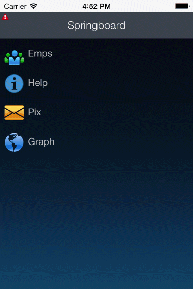
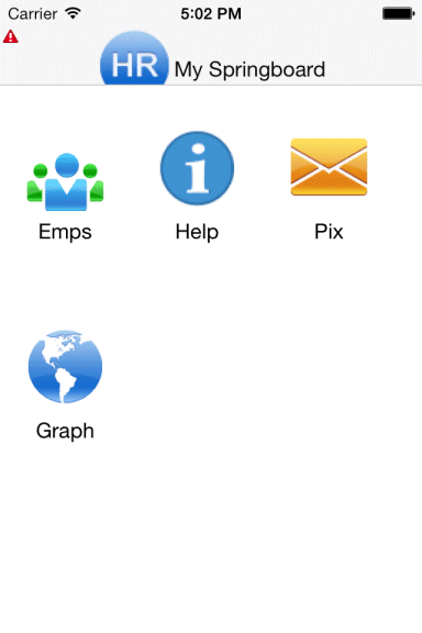
The image on the left is the default springboard with only one feature per row and the one on the right is the customized one you'll build in this tutorial, containing multiple features per row.
| Assumptions: |
|---|
To complete this tutorial you must have installed JDeveloper 12.1.3 and have installed the MAF Extension. You may deploy to either an Android emulator (SDK version 5.0.x API level 21) or iOS simulator (Xcode 6.1.x). If you decide, you can deploy the application to a connected Android device. The tutorial demonstrates deploying the application to an Android emulator. You launch the emulator using the Android Virtual Device (AVD) Manager, which is part of Android SDK Tools. If you are using an iOS environment, you can use the following tutorial to set up the development environment: Set Up and Configure an iOS Environment. If you are using an Android environment, you can use the following tutorial: Set Up and Configure an Android Environment. |
| Purpose | Duration | Application |
|---|---|---|
This tutorial shows you how to develop a custom springboard with Mobile Application Framework. To see the completed application for this tutorial, click the Download button to download a zip of the the solution application, and unzip it to your JDeveloper mywork folder. |
2 hours |  |
In this first section,you open the tutorial starter application and explore it's features.
-
Download and unzip the springboard.zip application and extract it to a directory of your choosing.
-
Open JDeveloper 12.1.3.
-
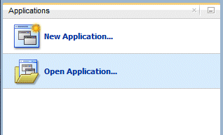
In the Application Navigator, click Open Application.
-
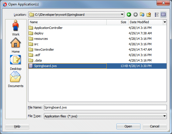
Navigate to the directory where you unzipped the downloaded file and select the Springboard.jws file. Then click OK.
-
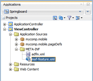
Expand the ViewController > Application Sources > META-INF nodes, double-click the maf-feature.xml file to open it in the editor and examine the application features.
-
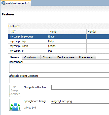
Notice there are four features: Emps, Help, Graph and Pix. Click on each feature id to see it's Springboard image. Take note that the name of the image matches the name of the feature. This will become important later when we want to display the feature name and image.
-
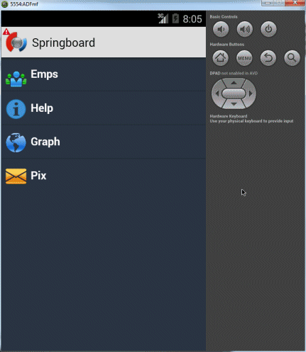
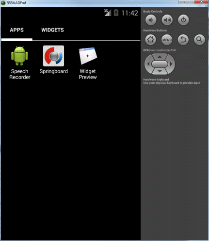
If you were to deploy and run the application you'd see it has a default Springboard that looks like the image below.
This is ok, but has some weaknesses.
What if you have more features than can display on one page? Users will have to use the "More" button to access them.
What if you want to make the header more interesting like add an image? Unfortunately, you are not able to modify this default page or layout. -
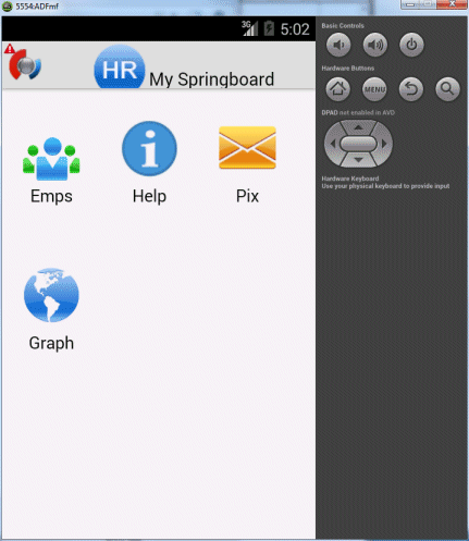
What we'd like is something more flexible, like the image below where there are multiple rows of features with multiple features in a row and an logo in the header.
In this section, you'll create a new feature for the Springboard and add an AMX page to hold it's content. Then you can add that AMX page as the custom springboard the application should use when it starts.
-
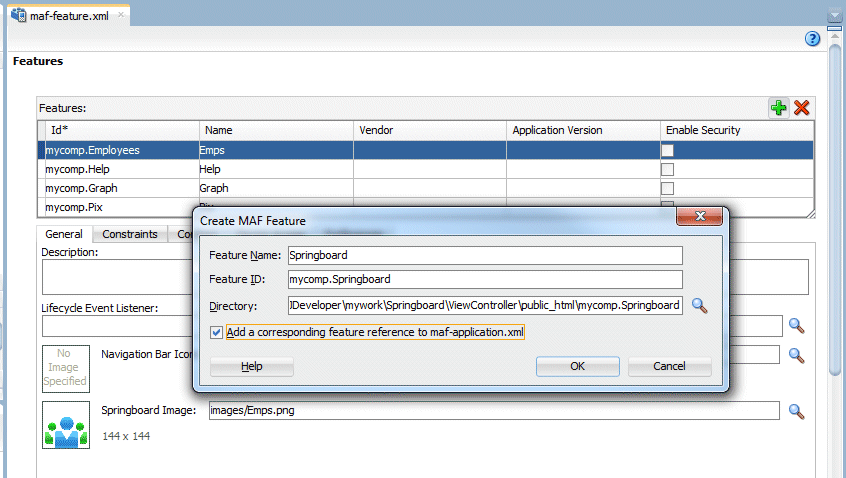
In the maf-feature.xml file, click the green plus sign
 to add a new feature. Name it Springboard, accept the default values and click OK.
 -
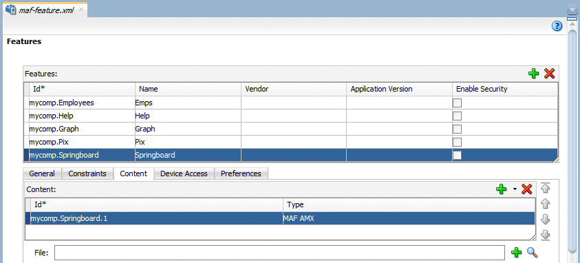
With the Springboard feature highlighted, click the Content tab and ensure the Type property is set to MAF AMX.
-
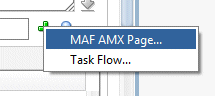
Below the Content, click the green plus sign
by the File property and select MAF AMX Page... -
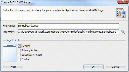
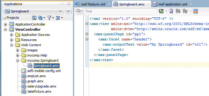
Name the page Springboard.amx and select only the Header facet.
-
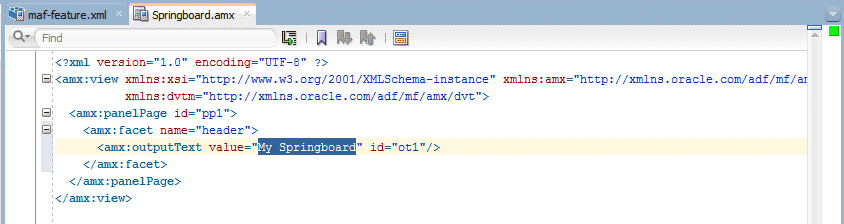
The page will be displayed in the editor. Find the outputText in the header facet and set the value to My Springboard.
Save all your work. -
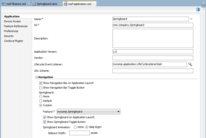
Next specify that this Springboard page is to be used as the application springboard when the application loads.
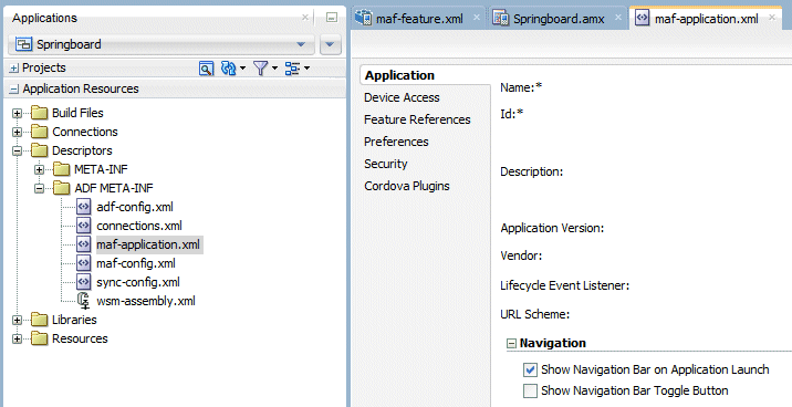
Find the Application Resources window, expand the Descriptors > ADF META-INF nodes and double-click the maf-application.xml file. -
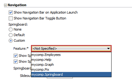
In the Navigation area, click the Custom button and then set the Feature property to mycomp.Springboard.
-
There will be a red outline around the property value. THis is because you can not have a feature be both the source of the springboard and also be an item in the springboard.
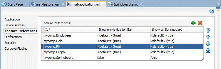
Click the Feature References tab and set the Show on Navigation Bar and Show on Springboard properties to false for mycomp.Springboard. feature.
The display sequence of the features is determined by the order listed here. Move the Pix feature above the Graph. -
Click back on the Application tab to see the red outline has been removed.
Save all your work.

In this section you refine the Springboard page to show the each of the features in the maf-feature.xml, both the name and image.
-
If it is not already open, double-click Springboard.amx in the Application Navigator to open it in the editor. If it is already open, you can click the tab named Springboard.amx.
-
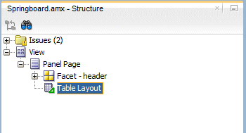
In the Components window, expand the Layout node. Drag a Table Layout component onto the Structure Window and drop it on the Panel Page. THis component will allow the features to be displayed in a table format.
-
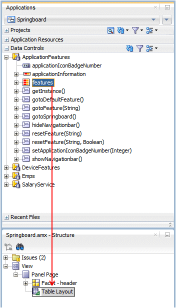
Next, add a component to read all the feature records so they can be displayed on the page.
Expand the Data Controls window and then the ApplicationFeatures node. Drag the features collection onto the Structure window and drop it on the Table Layout component. -
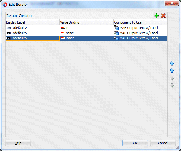
In the popup pane, remove all of the iterator content, except the id, name, and image. Then click OK.
-
Click the Source tab for the Springboard to continue working.
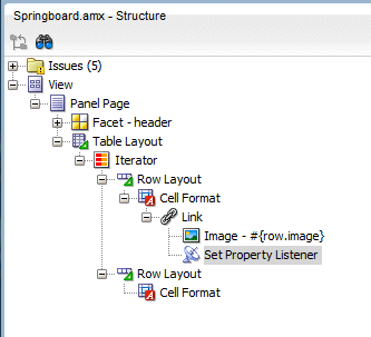
From the Component window, find and add two Row Layout components inside the Iterator.
Inside each Row Layout add a Cell Format. -
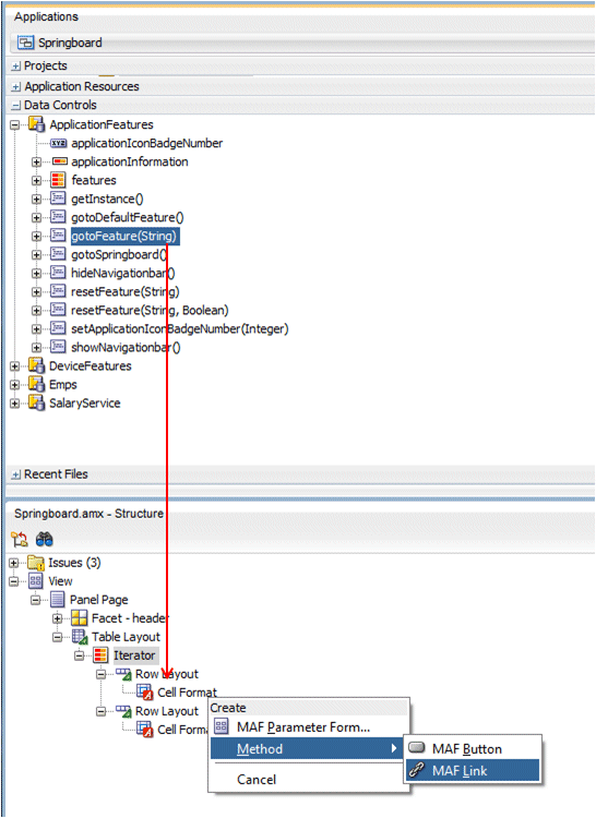
Now add a link to call the feature.
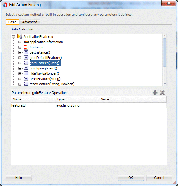
Form the Data Control window, drag a gotoFeature() operation onto the first Cell Format in the Structure window and drop it as a MAF Link. -
Nothing needs to be modified in the Edit Action Binding pane, so click OK.
-
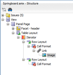
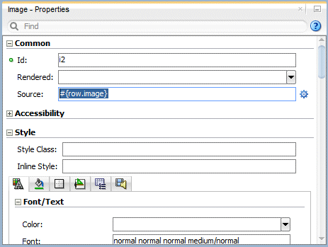
In the Component window, expand the General Controls node and drag an Image component onto the Structure window and drop it on the Link component.
Set the Source property to use the feature name from the iterator #{row.image}. -
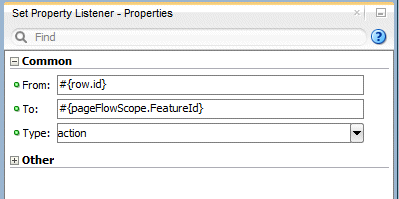
In the Component window, expand the Operations node and drag a Set Property Listener component onto the Structure window and drop it on the Link component.
Set the following properties:
From = #{row.id}
To = #{pageFlowScope.FeatureId}
Type = action -
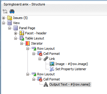
Now display the feature name.
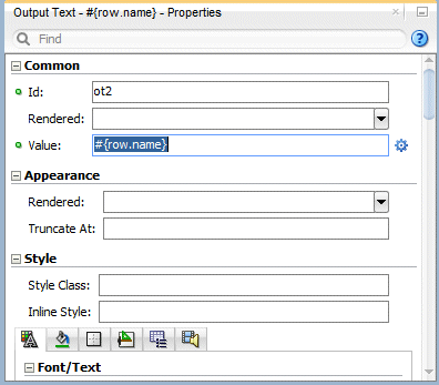
In the Component window, expand the Text and Selection node and drag an Output Text component onto the Structure window and drop it on the second Cell Format component.
Set the the Value property to #{row.name} to display the feature name -
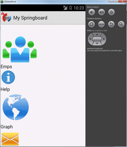
If you were to deploy and run the application, the springboard would look like the following image. Notice how name is displayed below the image.
Now lets make it look nicer.
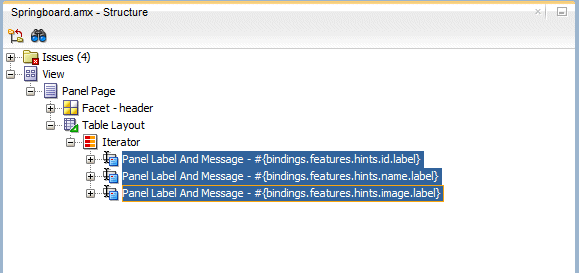
We only need the bindings for these items and will create our own display of them. In the Structure pane, expand the iterator and delete the three Panel Label and Message components.
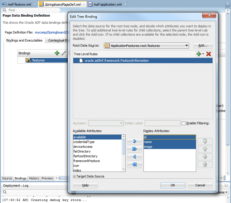
If you click the Bindings tab on the Springboard page, you can see the features collection is added as a binding. If you select the features binding and then click the pencil icon, you can see the bindings for the three attributes from the iterator. We will access these bindings when we display content on the springboard page.
Once you've examined the bindings, close the edit pane.
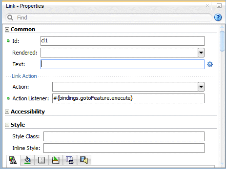
Select the Link and remove the value for the Text property.
Save all your work.
The Springboard page is now being used and displays all the features, including the name and Springboard image. Now lets make some changes to the UI to make it more useable and flexible.
-
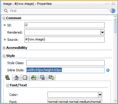
Display all images on the springboard page at a specific size.
Select the Image component and set the Inline Style class to width:65px;height:65px. -
In the Structure window add a second Table Layout to the Panel Pane. Then inside of it, add a Row Layout, then Cell Format and finally a Panel Group Layout. These components will allow the images to be display in a more uniform manner
-
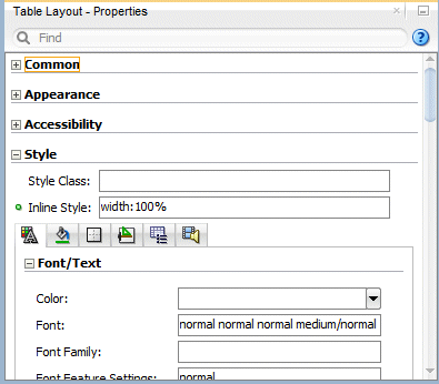
Select the Table Layout component you just added and in the Style node, set the Inline Style property to width:100%.
-
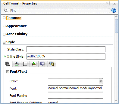
Select the Cell Format component you just added and in the Style node, set the Inline Style property to width:100%.
-
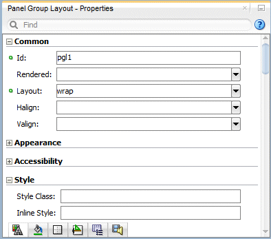
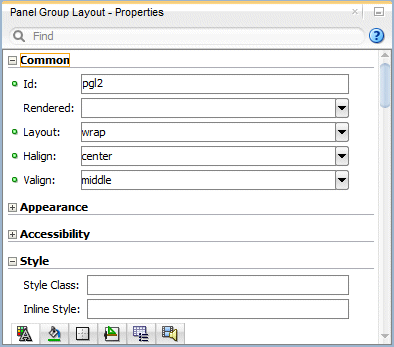
Select the Panel Group Layout component you just added and in the Common node, set the Layout property to wrap.
-
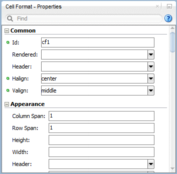
Select both the Cell Format components and set the Halign property to center and the Valign to middle.
-
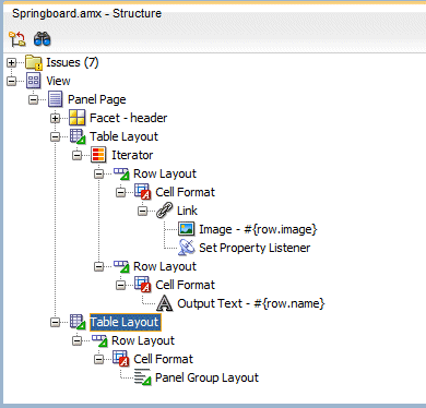
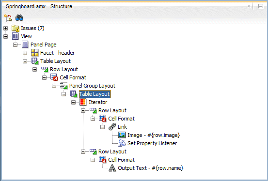
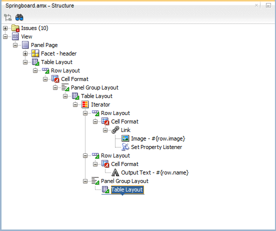
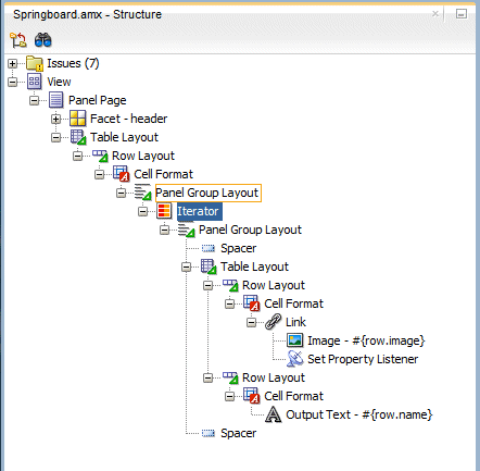
Next, in the Structure window, drag the Table Layout containing the Iterator and drop it on the Panel Group Layout you just created.
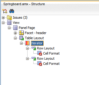
THe expanded layout should now look like the following image. -
Next, to give the features a little room on the page, add a Panel Group Layout, inside the Iterator. Set the Layout property to wrap, the Halign property to center and the Valign to middle.
-
Inside the new Panel Group Layout, add another Table Layout component.
-
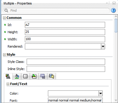
Next, to add some room between features, add a Spacer before and after the Table Layout you just moved. You can find the Spacer component in the Layout node of the Component window.
Set the Height and Width properties in both to 25 and 100, respectively.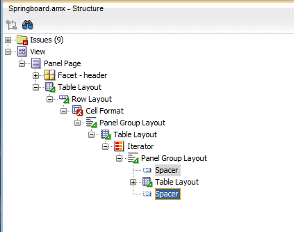
Save all your work.
-
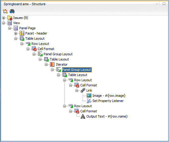
Finally move the Iterator to be a child of the Panel Group Layout (at the same level as the Table Layout).
Then delete the Table Layout. -
Click Save All on the Toolbar to save your work.
-
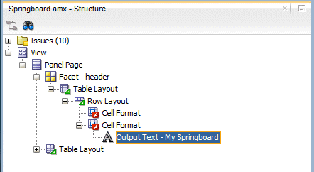
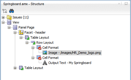
In the header facet, add a Table Layout > Row Layout and a Cell Format in each like the image below
-
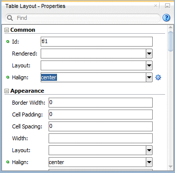
Select the Table Layout component ans set the Halign property to center.
-
Move the Output Text item into the second Cell Format.
-
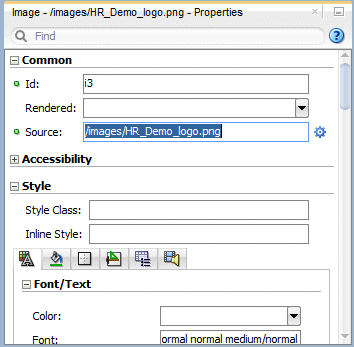
Drag an Image onto the first Cell Format and set the Source property to use another logo (/images/HR_Demo_logo.png).
-
Save all your work.
Then move the two Row Layout components into the Table Layout.
Save all your work.
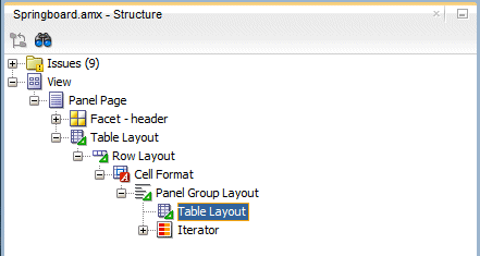
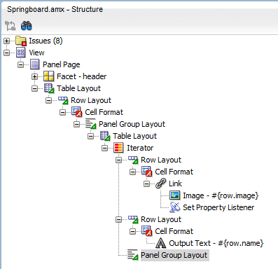
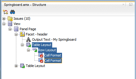
The final Structure window should look like the image below.
In this section of the tutorial, create a Deployment Profile and then deploy the application to an emulator. In this case it's an Android emulator, but it could be deployed to an iOS simulator.
-
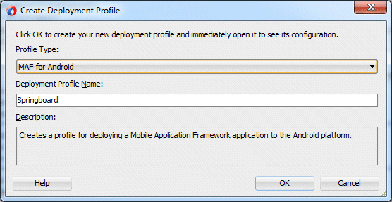
From the Application menu, select Deploy > New Deployment Profile.
In the Create Deployment Profile, select the MAF Android profile type and change the name to Springboard.
Then click OK, twice to complete the process. -
If the emulator is not running, start it.
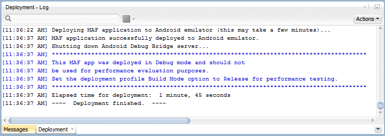
Then back in JDeveloper, from the Application menu, select Deploy > Springboard...
Monitor the Deployment window until the deployment is complete. -
In the emulator, find the Springboard application and click it.
-
When the application starts, you should see the custom springboard.
Two things to notice:
1: The images are the same size
2: There is some room between each feature icon and they wrap across two lines. -
Congratulations, the tutorial is now complete.

 Expand all | Hide all