")
Overview
This document provides standards and guidance related to the use of buttons on Fluid User Interface Self-Service transactions.
Note that the usage of buttons in certain specific contexts, such as grids, will be tracked in the separate guidelines for those contexts. This documentation will provide a cross-reference to any such other guidelines where appropriate.
The guidelines in this section apply to all form factors.
Common Guidelines
Field Order
When designing pages, ensure that the tab order is correct for the expected flow and user interaction for that page; do not set tab order to select a Save button before required data entry fields for a page are selected.
For example, if a Save or Submit button is placed last on the page (in Application Designer) to ensure it will be last in tab order, then developers must apply a style to set the location of that Save or Submit button if they want to force it to appear in the upper right corner when displayed to users.
Button Text
Assign button text (as a field label or a message catalog entry) so that it is translatable.
Never apply button text by style because that will cause a translation problem.
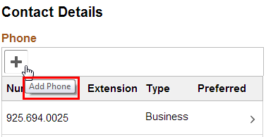
Alternate Text (Mouse-Over Text)
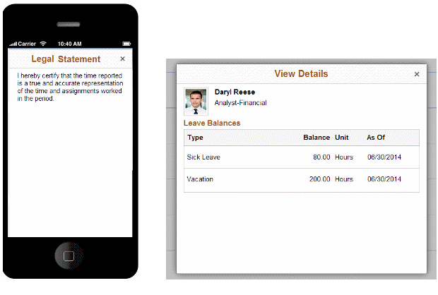
Alternate text for a button in standard (non-accessible) mode is needed when more information, in addition to the label shown on the button, is needed. You should not enable alternate text that only duplicates the button label; for example, for a button whose label is Save, do not provide alternate text that says “Save.” Only show alternate text when an additional description is needed, for example when an icon or button label needs more clarification.
 ...
... 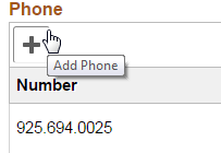
Figure 1: Examples of alternate text
Button Size
The default style for a button will dynamically allow the size of the button to grow to accommodate the label text.
This is an example of buttons with dynamic sizing (no fixed width):
Be aware that dynamic sizing might result in undesired horizontal scrolling to see the button text if the button size exceeds the visible area of the view layout, especially in portrait mode on a smartphone. This is an example of the button size exceeding the size of the view layout:
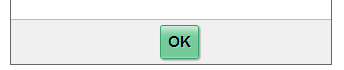
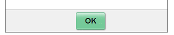
Developers can override the default style and specify a minimum width for a button. This may be appropriate for buttons that normally have short label text, such as OK (where a dynamic-width button might look too narrow or compressed).
This example shows a button with dynamic sizing:
This example shows a button with minimum width defined to provide extra space around the button text:
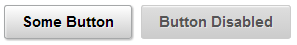
Disabled Button
Avoid displaying a disabled button on a page if there is no condition under which it becomes enabled or available to the end user. For example, do not show self-service users an action that they cannot perform.
In general, it is acceptable and preferable to show a button in a disabled state if the user must first select or enter values in some other fields before the process/action associated with the button can be run. In some cases, particularly in grids, it may be preferable to hide/show such buttons to reduce clutter, rather than always showing them in a disabled or enabled state.
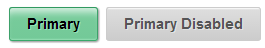
Primary Button
Style: psc_primary
Primary refers to the main or most frequent action that is taken on a page. If there is a single action that logically can be considered the one that a user would typically want to run on a page, that button should be styled as the primary action button.
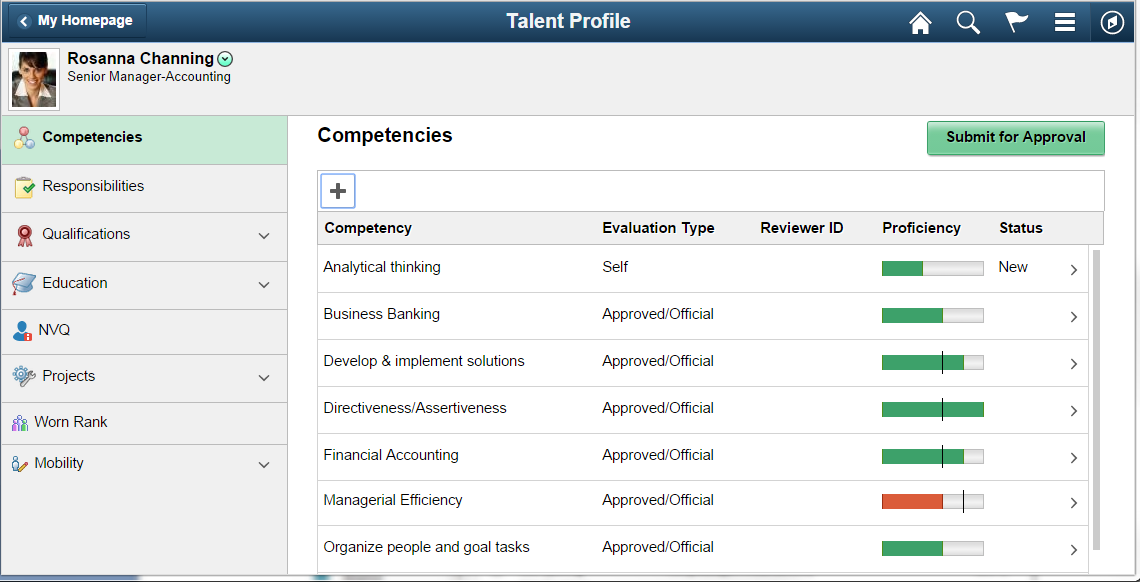
Designers and developers should ensure that there is only one primary button on a page. The primary button color is green when enabled and gray when disabled:
The following example shows a page designed for a medium or large form factor in which a primary button (Submit for Approval) appears in the upper right portion of the page:
The following example shows a modal page where the primary button is in the upper right corner (see Buttons in Modal Windows topic below for more details). Note that because the Done button is designated as the primary, no other action button on that page should be presented with that styling.
Note that in the Figure 3, the secondary action buttons shown centered at the bottom of the page use the psc_button-simple style; they can never use the primary style.
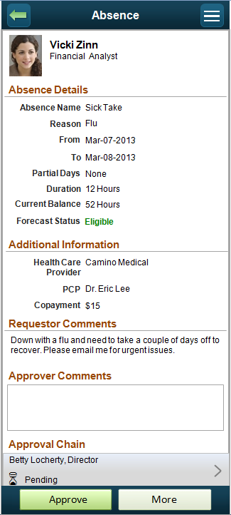
The following example shows a page in the small form factor with a primary button in the footer (see Small Form Factor Guidelines topic below for more details).
Standard Text Button
A standard text button is any button with a text label on a page that is not designated as a primary button. If enabled, it is a white/gray gradient; if disabled, it is gray.
Button with Image
Buttons can display an image without any text if the meaning is immediately obvious. Note that a meaningful button label is still required for use in Accessibility mode.
In this example, the plus sign icon on the button is a clear indicator of the function of the button, which is to add a row to the grid:
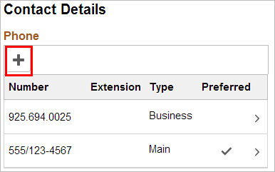
Note that the alternate text still provides confirmation/clarification of the button action:
Buttons can include an icon along with text if this aids the user. You might include an icon along with text when the text does not succinctly describe the intended meaning and if the icon provides additional or clarifying information.

Note: Directional buttons with arrows are a special use case and do not require that an image be specified for the arrows. The developer must specify the text in these buttons.
Directional Button
Style: psc_button-next and psc_button-previous
Use directional buttons to indicate sequenced steps. Use the style name shown so that the arrow images are automatically added to the button (do not add your own image).
Note that the following example uses the primary style for the Next button:
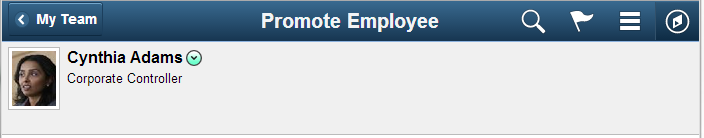
Back Button in Banner
Style: ps_button_backnav
The Back button in the banner should provide the user with a way to navigate to the previous component. This example shows the banner after the user has navigated from My Team to the Promote Employee page:
The text of the Back button should display the page the user will return to after selecting the button. If clicking the Back button returns the user to the Employee Homepage, the text of the Back button should be “Employee Home” rather than “Back.”
Note that in a small form factor, because of the limited available space, the Back button displays only the left arrow with no text, as shown in this example:
Never use the ps_button_backnav style except for the Back button in a banner. Do not use it for application buttons in the main body of a page.
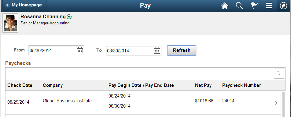
Refresh Results/Grid/Display
Use a button with the label Refresh if the user can refresh the results shown for a set of data, for example, after selecting a date range or as-of date that is different from the default setting, as shown in these examples:
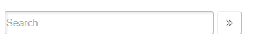
Invoke Search
Use image PT_NUI_EXECUTE in an image button for search:
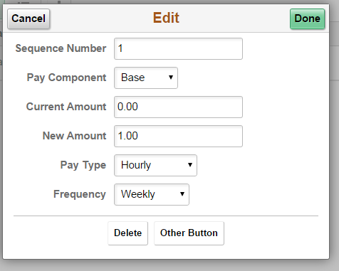
Buttons in Modal Windows
In general, when using a modal window, place the Cancel and Primary Action buttons in the header and place any secondary action buttons (including Delete) centered at the bottom of the page.
Style secondary actions as a simple button; that is, similar to buttons used in grids.
Single, Primary Action Button
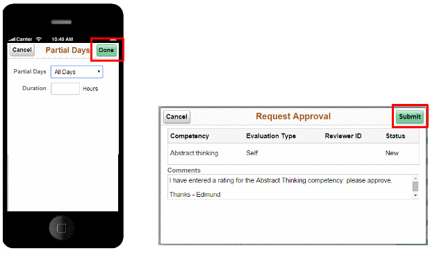
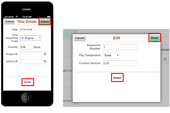
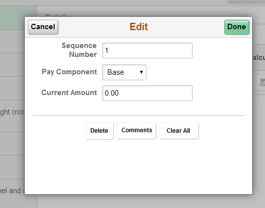
When there is a single action (other than Cancel) and it is the primary action (for example, Save, Done, Submit), then put the primary button in the modal window header on the right and put a Cancel button on the left. Center other, secondary, actions such as Delete at the bottom of the modal window and use “light” style for the buttons themselves (psc_button-simple).
Use a group box (type layout) containing the buttons and use the following styles (if you need to scroll more work is needed):
ps_collection psc_halign-center psc_border-standard psc_border-toponly psc_padding-top05em psc_margin-top1em
This results in a set of secondary action buttons that looks like this (note the horizontal rule above the collection of buttons):
Note: If there are so many actions that the secondary buttons do not fit without horizontal scrolling, refer to the Small Form Factor Guidelines later in this documentation. They describe the use of the More button for information on how to make the buttons fit in the available space.
When a modal is invoked from another modal, label the second modal’s primary button “Continue” to indicate that the user will continue the transaction by returning to the first modal to complete the transaction by clicking that modal’s primary button (Submit, Done, and so on).
The following example illustrates this design.
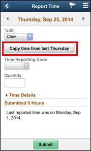
1. From a regular page, the user taps the Copy button to access the first modal window:
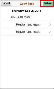
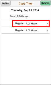
2. From the first modal window, the user drills into the detail row and invokes a second modal window:
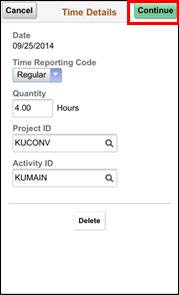
3. On the second modal window, the user makes desired changes and taps the Continue button to return to the first modal window:
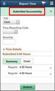
4. From the first modal window, the user clicks the primary button (Submit) to complete the transaction:
5. The system indicates that the transaction completed successfully:
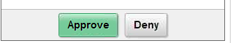
When multiple equivalent level actions are available (that is, a grouping of alternatives such as Approve, Deny, and Pushback), center these buttons at the bottom of the content. If possible, make them be visible (for example, by putting other page content in a scrollable area, using collapsible group boxes, or using tap outs). Use a Cancel button in the upper left corner.
For a read-only modal, place an X in the upper right corner to dismiss the modal.
Note: Modal windows on a smartphone will be full screen and will not have a footer.
These examples show a single, primary action button in a small form factor and a larger form factor: /
These examples show a single, primary action with a secondary action button at the bottom of the page in a small form factor and a larger form factor:
This example shows multiple secondary buttons centered in a larger form factor:
These examples show read-only, information modal windows (no action required) in a small form factor and a larger form factor. An X icon in the top right corner replaces specific action buttons:
Buttons for Specific Sections/Objects Within a Page
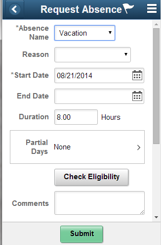
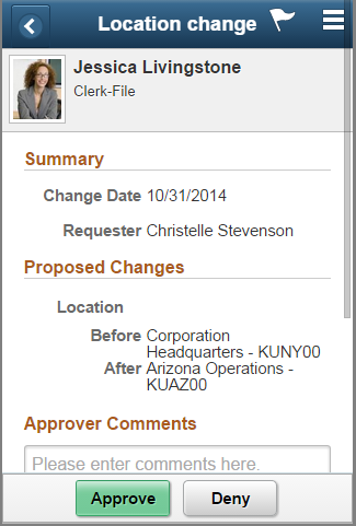
Place buttons that pertain to specific sections of a page or to specific page objects, such as a grid or group box, adjacent to the related section or object, not in the header or footer.
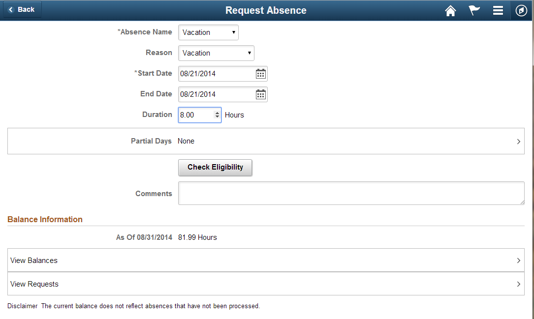
In this example, the Check Eligibility button is placed after the absence information fields so that the user may see if the proposed absence is allowed before submitting the request:
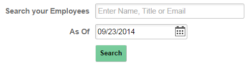
The following Search example illustrates the placement of a button below the content to which it applies:
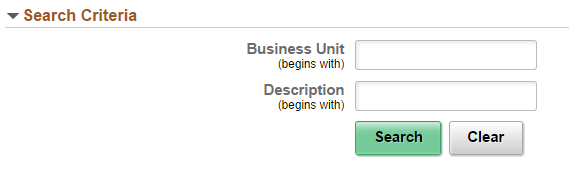
The following Search example illustrates the placement of multiple buttons below the content to which they apply:
Place buttons that apply to a specific section of a page according to the following guidelines and based on the discretion of the designer and the User Experience team:
- Aligned with the page content (that is, other fields)
- Adjacent (side by side) to the specific field to which that button applies
- Left aligned
- Centered
Special Use Cases (Grid, Banner, Search, and Confirmation Messages)
Separate guidelines are provided for the use of buttons for the following:
- Grids, see Fluid Grid Standards
- Banners, see Fluid Banner Standards
- Search, see Fluid Search Standards
- Confirmation Messages, see Fluid Messages Standards
Refer to the appropriate standards documentation for details about button usage in these situations.
Small Form Factor Guidelines
The guidelines in this section apply to buttons that appear in a small form factor device (smartphone).
Footer Buttons
The use of the footer area is restricted to the small form factor. Use this footer area to present buttons as described below.
- Place only as many buttons as will fit while being able to display the full label text, including an allowance for translation. Center buttons in the footer area.
- If there are more actions than would fit if each had its own button, then use a More button to allow access to actions that do not have their own button. When clicked, the More button will display other available actions.
For example, if there are three main actions but they do not all fit in the footer, then add one button for the first action and a second button labeled More (do not include an ellipsis) that provides access to the other two actions. For example:
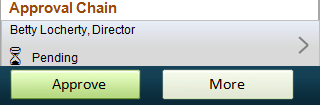
When the user selects the More button, an action sheet appears with the additional available actions. If the user does not want to select one of the actions shown on the action sheet, then they should click outside the action sheet to dismiss it. Therefore, do not add any additional button or action on the action sheet (such as Cancel, Dismiss, or an X in the upper right corner) to dismiss the action sheet.
The default style for a button is dynamic width (no fixed size), meaning that the size of the button will grow to accommodate the label text. This can result in large button sizes that could force horizontal scrolling. It is preferable to choose labels that will fit within the available display without scrolling. Avoid using fixed width buttons, especially when the label (including translated value) may not fit within the button. Users will be frustrated if they see a truncated label and no clear way to see the rest of the text.
Example of two short labels (dynamic sizing):
Example of one long label and one short label (dynamic sizing):
If possible, avoid long labels when there are space constraints that could interfere with label text being fully visible, such as portrait view on a smartphone.
The following example shows two labels in dynamic-sized (non-fixed width) buttons. Note that a scrollbar appears, which impairs the user’s ability to see the full text of both buttons:
This example shows two buttons, centered, on a smartphone. The designer used minimum width to achieve a balanced look for both buttons:
This example shows three buttons, centered, on a smartphone. The designer used minimum width to achieve a balanced look for all buttons:
When there are more button actions in the footer than will fit without horizontal scrolling, show the primary button and use a More button with an action sheet to access additional buttons. When the More button is selected, the action sheet opens from the bottom, displaying the additional actions as an overlay.
Only use an action sheet in the small form factor. For larger form factors, code to display all the buttons correctly on the page. See the Responsive Design section in this documentation for more information about the use of the More button in larger form factors.
The following example shows a primary button and a More button. Do not include an ellipsis in the More button label.
Medium, Large, and Extra Large Form Factor Guidelines
These guidelines apply to all form factors larger than small (smartphone), which includes tablet, laptop, and desktop.
Page Level Buttons
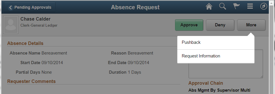
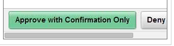
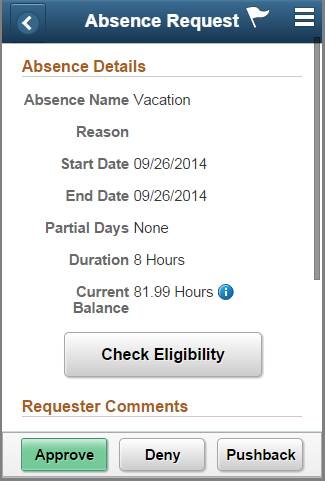
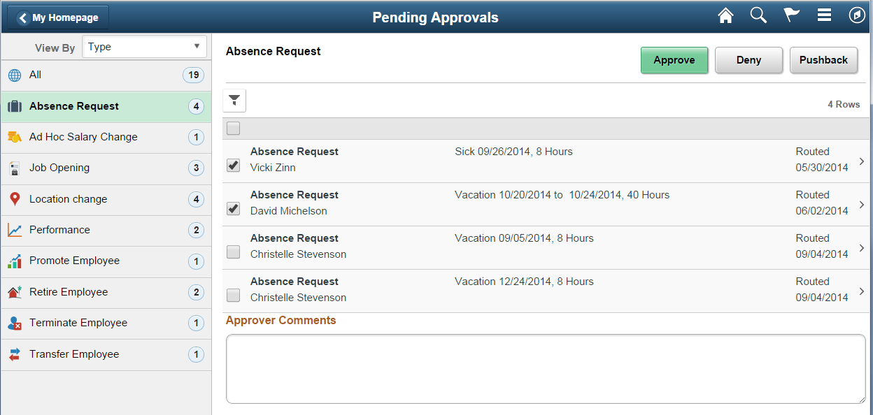
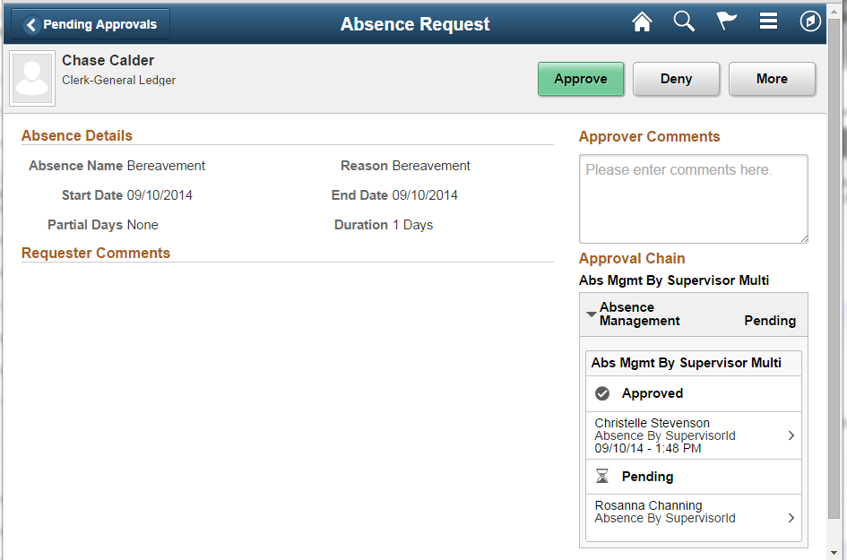
Put page level buttons at the top right area of the page. As a guideline, place the primary button at either end of a collection of buttons. In general, place the primary action at the right of the set of buttons unless the natural (logical) order of the actions in the collection puts the primary action at the beginning (left) of the set of actions. For example, retain the natural order of actions in the group “Approve, Deny, Pushback” (in this example the primary action is Approve and since it sounds natural to maintain the list of actions in the order Approve, Deny, and Pushback, the primary button is kept at the beginning of the list.
This example shows a three-panel layout with the page level button at the top right of the page:
This example shows a three-panel layout with page-level buttons (multiple possible actions) at top right:
Responsive Design
This section illustrates some of the advantages of using responsive design to ensure that content looks good in all form factors.
Page Level Action Buttons
In general, page level action buttons (for example, Save and Submit) should be styled so that they appear in the footer of the page in a small form factor and in the upper right portion of a page for all other form factors.
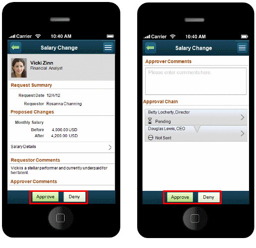
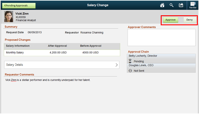
Note the placement of the Approve and Deny buttons for a transaction on the small form factor examples that follow compared to their placement on the medium, large, and extra large form factors:
Note: Depending on the transaction, the buttons in the larger form factors may be placed either in the content area or in the header.
If there are more button actions than will properly fit in one line in the upper right portion of the page, add as many buttons as will fit while reserving the last one as a More button that will display the other remaining actions.
For example, if there is only room for three buttons but there are four separate actions that may be performed, then use separate buttons for the first two actions and display the remaining two actions from a third button labeled More, as shown in this example:
Here is an example of how the extra options associated with the More button appear when it is clicked: