")
Overview
The Fluid Panel Layout standards provide guidance for using these layouts:
- 2-panel layout
- Page with application header
- 3-panel layout (2-panel with application header)
2-Panel Layout
A 2-panel layout has a panel on the left that drives the content on the right.
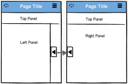
In medium and large form factors, the left panel may be fixed, collapsible, or overlaid in landscape mode. It will always be overlaid in portrait mode.
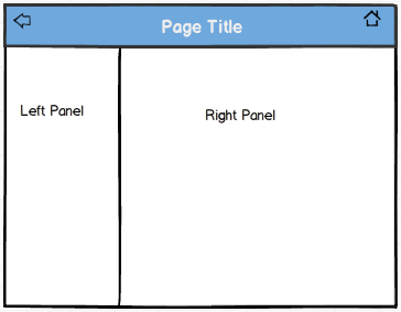
In the small form factor, the left panel will be partially overlaid on the content panel. To overlay the left panel fully, you can apply a style, psc_panel_fullsize, which when used with psc_open overlays the left panel in the entire content area. When the user selects an item in the left panel, the content panel will be brought to the forefront. The tab to expand and collapse the left panel will appear to the left. This tab has a standard label that can be overridden.

When to Use
Use the 2-panel layout when you need to select items on the left and show details for those selections in the content panel (the content on the left drives the content on the right). Note that the left panel and the content panel scroll independently.
Use the 2-panel layout for responsive design of the phone, where the application start page is not a component but is the left panel of the 2-panel layout.
Type of Content
The left panel should contain a list of tabs that may be:
- Used for navigation, for example, a Menu structure:
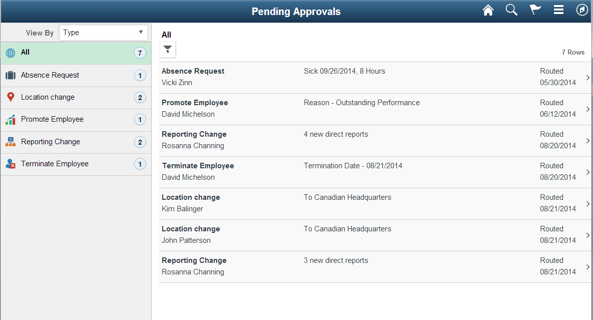
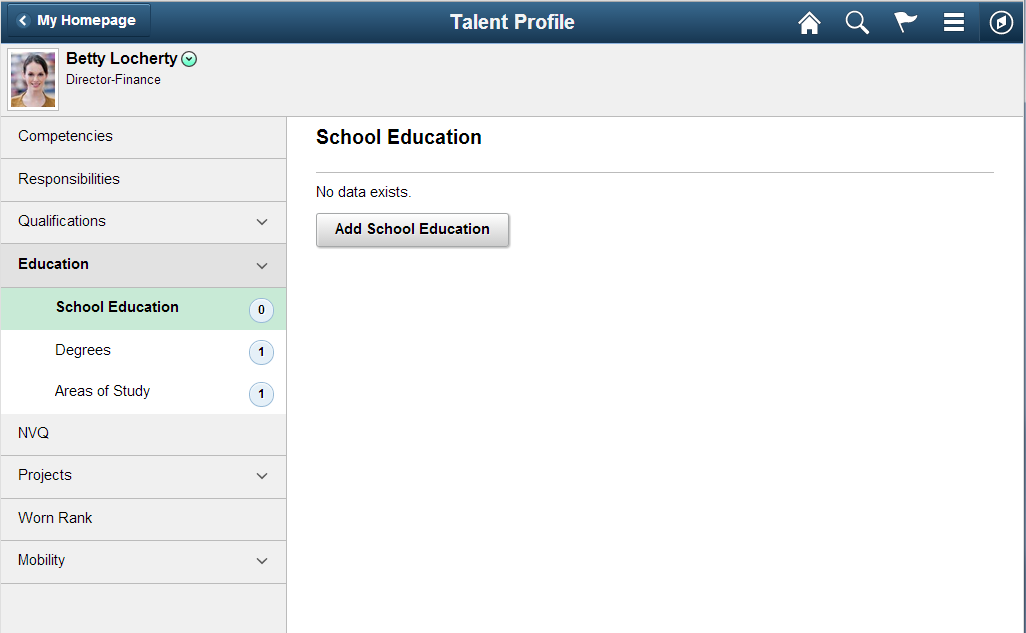
- A list of categories and subcategories, for example, Transaction Types in Mobile Approvals or Attributes in Talent Profile. If a category has subcategories, then you can use subtabs to denote the subcategories. (Note that when a tab with subtabs is selected, the first subtab is selected by default and content pertaining to the first subtab appears to the right. You can only have two levels.)
- A transaction summary:


The left panel might also contain action buttons, as shown in the previous example.
The content panel may contain content that would appear in any regular page, such as fields, grids, group boxes, graphics, and so on. These may be read-only or editable.
In medium and large form factors, when the page first appears, the first tab (or first subtab of the first tab) will be selected by default, and the content corresponding to it will appear on the right. You could display a different tab or subtab instead if your use case calls for it, for example, if you are navigating back to that page.
Note: The following Pivot Grid examples (Procurement Spend Analysis and Team Performance Status) look similar to a 2-panel layout, but they are not:


Margins and Layout
Use ps_apps_content styling to the interior of the content panel to get the default padding. This styling also affects scrolling, so it must be used.
Maximum Width
Use the default size for the left panel that is provided by the style. Set the interior of the content panel to 1024 pixels.
Do not override the size of the left panel as that is provided for you. As a guideline for medium and large form factors, the interior of the content panel should be set to 1024 pixels. If it does not look good beyond a certain width, you should not let your content grow past it. Do not set it on ps_apps_content; only set it on your interior content.>
Panel Title
For most use cases, the left panel does not need a title. Instead, use an Aria label.
For most use cases, the content panel should have an appropriate panel title and should match the selected category in the left panel. Use page title group box for the content panel title.

The content panel may not need a visible title as long as there is a way to identify (in the summary area) where the user is if the left panel is collapsed, as shown in Supplier Watch list below. However, it should have a title in accessible mode.

Left Panel Modes
The left panel can have these three modes:
- Fixed
- Collapsible
- Overlayed
Fixed Left Panel
In fixed mode, the left panel will not have the expand/collapse tab. This mode is applicable only to landscape for medium and larger form factors. Keep the left panel fixed when there is no need for more space to display content in the content panel (that is, content in the right panel can be displayed without horizontal scrolling).
Collapsible Left Panel
In collapsible mode, the expand/collapse tab for the left panel is visible. When the left panel is collapsed in medium and larger form factors, the content panel will shift to the left.
This mode is applicable only to landscape for medium and larger form factors. Use a collapsible left panel when the content in the content panel is large enough that it induces horizontal scrolling in the medium and larger form factors.
Overlaid Left Panel
In this mode, when the left panel appears, it will overlay the content panel. When it is not visible, the expand/collapse tab will be visible. This mode is available for both landscape and portrait mode. In portrait mode, the left panel will always be an overlay because the other modes are not applicable.
Use the overlaid left panel mode in landscape mode when viewing the left panel content alongside the content panel is not relevant or not important.
Considerations for Portrait Orientation
For all form factors, the left panel will always be an overlay in portrait orientation. If the user invokes the application while in portrait layout, the left panel should be hidden by default. The default can be overridden if the use case calls for it.
For medium and larger form factors, if a fixed left panel is used, it should hide the left panel when the user switches from landscape to portrait, which is the default behavior for the left panel. If a collapsible or overlaid left panel is used in landscape layout, the default behavior is to maintain the state of the left panel in portrait layout before the user switched from landscape: if the left panel was not hidden in landscape layout, it will be displayed (overlaid) when switched to portrait layout, and if it was hidden in landscape layout, then it will be hidden in portrait layout.
For all form factors, the left panel can be automatically collapsed when the user selects a tab that points to a specific page. However, if the user selects a tab with subtabs, then the left panel does not automatically collapse. It will collapse only when the user selects a specific subtab or the left panel arrow.
For the content panel, different styles may need to be used for some of the content to avoid horizontal scrolling in portrait orientation. For example, 2-column layouts in landscape may need to use a one-column layout. Nonstacked grids in landscape may be converted to stacked grids in portrait. Refer to Fluid Grid Standards for more details.
The following examples show the transition of a 2-panel layout from medium (or larger) form factors in landscape mode to medium (or larger) form factors in portrait mode to small form factor portrait mode. Note that small form factor landscape mode and portrait mode are the same.
Note for Desktop: There is no official concept of portrait on a desktop. Different browsers work differently, so the breakpoint is not officially guaranteed on a desktop. The breakpoint for overlay mode (if running fixed or default [collapsible] mode) is defined as follows: where maximum window size is less than or equal to 900 pixels or when the device is in portrait mode.
This example shows a 2-panel layout in medium (or larger) form factors in landscape mode. The left panel is fixed
This example shows a 2-panel layout in medium (or larger) form factors in portrait mode. The left panel is collapsed.

This example shows a 2-panel layout in medium (or larger) form factors in portrait mode. The content panel is overlaid with the left panel.

This example shows a 2-panel layout in portrait mode for a small form factor device:

Left Panel Icons and Counts
Icons may be used for items in the left panel when there are not too many categories. If all categories cannot have meaningful icons, then do not use any icons to avoid a combination of some categories with icons and some without. Icons used in the left panel should be colored. Follow these guidelines for icons:
- Avoid using icons if the category labels are too long, as the labels will wrap.
- Do not use icons for subtabs.
- For the small form factor, make the icons 24 pixels; for medium and larger form factors, make the icons 20 pixels.
Counts for tabs or subtabs may be used to denote the number of items for that tab. It is acceptable to have some tabs with counts and some without. Follow these guidelines for counts:
- On the small form factor, when no counts or icons appear for a tab, you must display a chevron instead.
- If a tab or subtab has no items, the designer or developer must decide whether or not to display a 0.
This example shows a left panel with icons for the tabs but no icons for the subtabs:

This example shows a left panel with no icons for either tabs or subtabs. The subtabs have counts, including 0. (This is a 3-panel layout, which is discussed elsewhere in this documentation.)
This example shows a left panel with one tab having a count and one not having a count:

Action Buttons
The left panel may have action buttons that act on the content in the left panel.
In the following example for Supplier Watch, clicking the Add button in the left panel adds suppliers to the watch list, and the Edit button enables users to delete suppliers from the watch list:

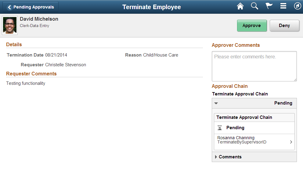
For actions that pertain only to the content panel, locate buttons at the top right, as shown in this example:

If the actions pertain to both left and content panels, use a 3-panel layout and locate the buttons in the top panel (see 3-Panel Layout section):

Page with Application Header
On medium and larger form factors, the header is fixed and the content area scrolls separately. The color of the header should be gray.

On the small form factor, the header should scroll off the page when the user scrolls the page; however, designers must apply special styling. The color of the header in the small form factor should be gray when it does not scroll off the page, and white when it does scroll off the page.

When to Use
Use this layout when you need to display header information or provide context information separate from the content. Also use this layout when you need a Search field at the top of the page.
Type of Content
The header can contain information such as employee photo and name or any other information that needs to be called out on the page. It may also contain a search field and buttons when these elements are needed to not scroll off the page.
Keep the height of the header as short as possible. Also, the header should never have to scroll horizontally.
The content area may contain content that appears on any regular page, such as fields, grids, group boxes, graphics, and so on. It may be read-only or editable.
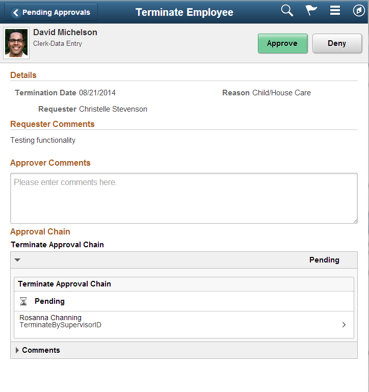
The following example shows an application header that displays an employee photo, employee information, and two action buttons:

Margins and Layout
Apply ps_apps_content styling to the interior of the page to get the default padding. This styling also affects scrolling.
Maximum Width
For medium and larger form factors, the maximum width of the content should be set to 1440 pixels. There is no width limitation for the application header: it spans the entire width.
Landscape Orientation
On all form factors, the content of the page should be laid out so that horizontal scrolling can be avoided.
Portrait Orientation
Application header content may need to be laid out differently from landscape orientation to avoid horizontal scrolling.
For medium and larger form factors, if the buttons that appear in landscape mode do not fit in portrait mode, the designer will need to add a More button to display the buttons that do not fit. Refer to Fluid Button Standards for more details.
Note: Page-level buttons in the application header for medium and larger form factors must be moved to the footer in the small form factor.
For the content section, designers may need to use different styles for some of the content to avoid horizontal scrolling in portrait mode. For example, 2 column layouts in landscape mode may need to use a one-column layout. Also, nonstacked grids in landscape mode may need to be converted to stacked grids in portrait mode. Refer to Fluid Grid Standards for more details.
The following examples show the same page in landscape and portrait modes, respectively, on a medium form factor. The bottom panel is formatted differently for each mode
Action Buttons
For medium and larger form factors, action buttons included in the application header should be aligned to the right and center of the header.
For the small form factor, buttons should not be part of the application header; instead, they should be part of the footer.
3-Panel Layout
The 3-panel layout is a combination of the 2-panel layout and a page with an application header.
The application header spans the entire width of the page. The left panel may be collapsible or fixed in landscape mode, and it will always be overlaid in portrait mode. The application header remains fixed, and the left and content panels scroll independently.

On the small form factor, left and content panel behavior will be similar to that of the 2-panel layout. The application header, however, will always persist.
Note that on the small form factor, the application header does not scroll off the page. It is important to keep it as short as possible (approximately 2.5-em height) or eliminate the application header to avoid only a small section of the content area appearing when the device keyboard is visible.
When to Use
Use the 3-panel layout when you need a combination of content on the left driving the content on the right plus header information. Use this layout when the selection in the left panel does not change the data that appears in the application header. If the selection in the left panel changes the header information, then a 2-panel layout with the header information in the content panel is appropriate rather than a 3-panel layout.
Note that the left and content panels will scroll independently. The top panel will always remain fixed and will not have scrolling within it.
Type of Content
Refer to corresponding section for 2-panel layout and page with application header.
Margins and Layout
Refer to corresponding section for 2-panel layout and page with application header.
Maximum Width
Refer to corresponding section for 2-panel layout and page with application header.
Panel Title
Refer to corresponding section for 2-panel layout and page with application header.
Left Panel Modes
See the 2-Panel Layout section.
Note: The top panel remains fixed, even when the left panel is collapsed or overlaid.

Considerations for Portrait Orientation
Refer to corresponding section for 2-panel layout and page with application header.
The following example shows the left panel collapsed in portrait orientation in a medium form factor:

The following example shows the left panel overlaid in portrait orientation in a medium form factor:

The following example shows the left panel collapsed in a small form factor:

The following example shows the left panel overlaid in a small form factor:

Left Panel Icons and Counts
Refer to corresponding section for 2-panel layout and page with application header.
Action Buttons
If an action affects both the left and content panels, then the designer should locate the action button on the right side of the application header for medium and larger form factors. In a small form factor, this button would be part of the footer.
The left panel may have action buttons that act on the content in the left panel. See Figure 15 in the 2-Panel Layout Action Buttons section.
For any actions that pertain only to the content panel, the designer can locate buttons in the top right. See Figure 16 in the 2-Panel Layout Action Buttons section.

