Administrators can design composite forms to display the data in sections as charts. Planners can also drill down to the next level by clicking the underlined links or chart areas.
Design suggestions:
Display the top section as a chart and the bottom section as a grid, so that planners can see the effect of data they enter in the bottom grid (when saved) as a chart on the top.
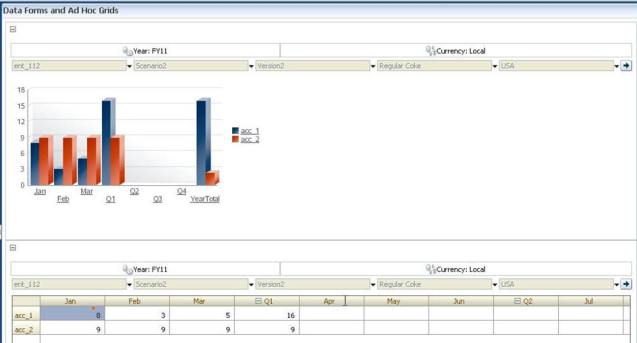
Include the same ad hoc grid twice, one to display as a grid and the other to display as a chart. Users can then perform ad hoc operations (such as Zoom In, Pivot To, and Keep Only) on the grid and view the changes in the chart.
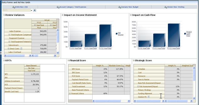
Create dashboards. For example:
Watch this video to learn about displaying forms as charts in Planning.
![]() To embed charts in composite forms:
To embed charts in composite forms:
Click a composite form section, and then right-click on a form.
Display as Chart toggles with Display as Grid, allowing you to switch between them.
On Chart Properties, select a chart type:
Chart Type Description Bar The length of each bar proportionally represents a value over an independent variable (for example, time). Horizontal Bar Like the regular bar chart, but turned on its side so that the dependent variable is displayed on the horizontal axis. Line Displays data points (for example, sales of various product lines) over time, connected by lines. Area Like the Line chart, but the area between the axis and the line is emphasized with color. Pie Each slice of the pie chart proportionally represents a class of data in relation to the whole. Scatter Each point represents the distribution of data for two variables. Read the onscreen text for advice on selecting a chart type.
Optional: To set where the chart displays the values that the chart represents (called the Legend), click Options, then click Legend, select one of the following, and then click OK:
Right: To display the legend to the right of the chart (the default).
Bottom: To display the legend at the bottom of the chart.
Left: To display the legend to the left of the chart.
Top: To display the legend at the top of the chart.
Optional: To set where the chart labels (that is, the member names or aliases) are displayed, on Options, click Label, select one of the following, and then click OK.
Outside Max: To display the label above bar charts or, for non-bar charts, display the label above the data point for positive values and below the data point for negative values. Outside Max is the default.
Center: To display the label centered on bar charts, or for non-bar charts, display the label above the data point for positive values and below the data point for negative values.
Inside Max: To display the label on the bar, near the top, or for non-bar charts, display the label below the data point for positive numbers and above the data point for negative numbers.
Inside Min: To display the label inside on the bar, near the bottom, or for non-bar charts, display the label above the data point for positive values and below the data point for negative values.
Max Edge: To display the label on the bar, or for non-bar charts, display the label at the data point.