Information Displayed in Analyze Chart
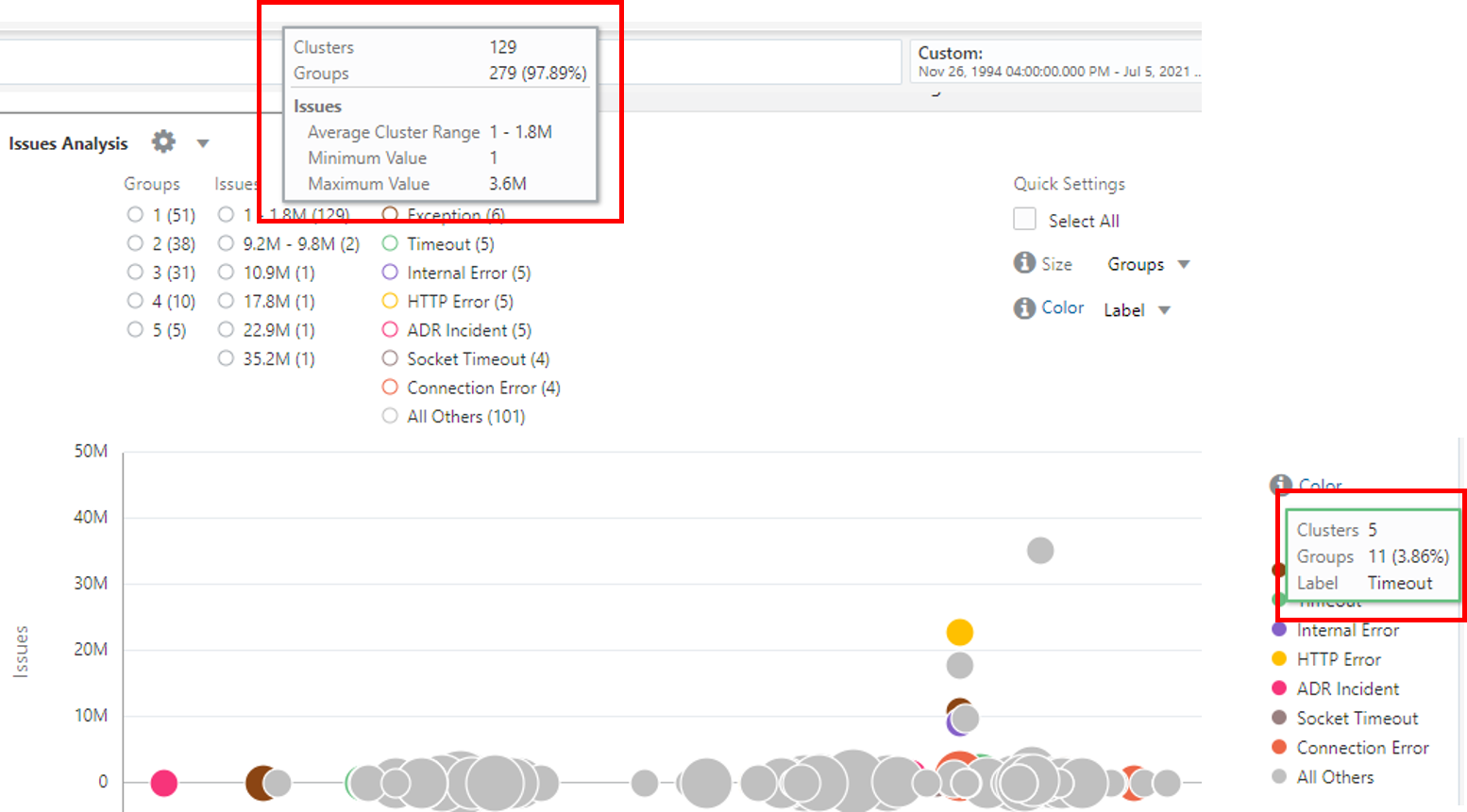
Analyze chart for Link visualization is a bubble chart that shows the anomalies in the patterns.
Each row in the Link table represents a unique group. The size of the bubble represents the number of such groups that are contained in the bubble. The position of the bubble is determined by the values of the fields that are plotted along the x and y axes. Hover the cursor over a filter legend to view the following information:
-
Clusters: Number of bubbles in the chart for this legend value
-
Groups: Total number and percentage of groups across all the clusters
-
Average Cluster Range: Each bubble (cluster) represents a range of values. An average is computed for each bubble which shows the minimum and maximum averages across all the bubbles for this value. This is applicable only for numeric values.
-
Minimum Value: Lowest absolute value across all the bubbles for this legend range.
-
Maximum Value: Largest absolute value across all the bubbles for this legend range.
