| Lightweight UI Toolkit Developer's Guide Release 1.5 E23376-03 |
|
 Previous |
 Next |
LWUIT permits the following resource elements:
Localization (L10N) bundles
GUI / UI Builder
Resources can be delivered as a bundle (a binary file that can be loaded and used on the device). A bundle can combine several different resource types within a single file, thereby easing distribution and improving compression. LWUIT supports two methods for creating a resource bundle: a set of Ant tasks, or the graphical Resource Editor utility (see The LWUIT Resource Editor).
The following sections detail the five resource types and the ways in which they relate to the resource bundle mechanism.
A resource bundle can be built using Ant during the standard application build process. Resource files convert existing files into bundles as necessary. An application can have any number of resource files.
A resource file it is loaded fully into memory (due to Java ME IO constraints), so you should group resources based on the needs of the application flow. This allows the application to load only the necessary resources for a given form or use case and leaves memory free for additional resources needed by other forms or use cases.
To create a resource, use code similar to the following example in your build file:
<taskdef
  classpath="editor.jar"
  classname="com.sun.lwuit.tools.resourcebuilder.LWUITTask"
  name="build" />
<build dest="src/myresourceFile .res">
  <image file="images/myImage.png" name=”imageName” />
</build>
You can add several additional types of resources to the build tag. These optional resource tags are explained in the remainder of this chapter.
There are several types of images in LWUIT, most of which can be stored either individually in the Java archive (JAR™) or packaged as part of a resource bundle.
To load an image stored in the JAR file, use the following code:
Image image = Image.createImage("/images/duke.png");
The Image tag supports the following attributes:
|
|
The name of the resource (defaults to the name of the file name). |
|
|
The file that would be used for the image (required) |
Once loaded, the image is ready to be used as a background image of a component or even as an icon for a component that can contain an image.
The LWUIT library supports bitmap fonts, system fonts, and loadable fonts. System fonts use basic native fonts and are based on the common MIDP fonts. For more detailed information please see the Font API in the API documentation located in install-dir/docs/api/lwuit.
Bitmap fonts generate fonts on the desktop as image files. These image can be used to draw desktop quality fonts on a device without requiring specific support from the device.
Loadable fonts support specifying a font as a name or even as a TrueType font file, if the underlying operating system supports such fonts, the font object would be created.
All fonts can be used in a theme file and are represented using the Font class in LWUIT.
Three basic parameters define a system font:
|
|
Valid values are |
|
|
Valid values are |
|
|
Valid values are |
To create a system font, use the following code:
Font.createSystemFont(Font.FACE_SYSTEM,
                      Font.STYLE_BOLD,
                      Font.SIZE_MEDIUM);
To create a bold italic font style use code similar to the following:
Font.createSystemFont(Font.FACE_SYSTEM,
                      Font.STYLE_BOLD | Font.STYLE_ITALIC,
                      Font.SIZE_MEDIUM);
Different platforms have different font support. For example, phones usually only support system and bitmap fonts while TVs usually support TrueType fonts but don't work well with bitmap fonts. LWUIT has support for defining fonts in resources that allow a resource to adapt for different devices. To support portability LWUIT allows specifying a loadable font if such a font is supported by the underlying system and allows bundling bitmaps for increased portability. As a fallback a system font is always defined, thus if the native font isn't supported or a developer isn't interested in using a bitmap font the system font fallback can always be used. It is possible to define such a font using the Ant task with the following syntax:
<build dest="src/myresourceFile.res">
     <font logicalName=”SansSerif” name=”myFont” size=”20” />
</build>
The following attributes are supported for the font Ant task:
|
|
Name of the font to load from the resource file (optional: defaults to logical name or file name). |
|
|
Defaults to the English alphabet, numbers and common signs. Should contain a list of all characters that are supported by a font. For example, if a font is always used for uppercase letters then it would save space to define the charset as: "ABCDEFGHIJKLMNOPQRSTUVWXYZ" |
|
|
Font file in the case of using a file. Defaults to TrueType font. size floating point size of the font. |
|
|
Defaults to False. Indicates whether the font should be bold. |
|
|
Defaults to True, relevant only when src is used. If set to False, type 1 fonts are assumed. |
|
|
Defaults to True. If false, fonts are aliased. |
|
|
The logical name of the font as specified by java.awt.Font in Java SE: Dialog, DialogInput, Monospaced, Serif, or SansSerif. |
|
|
Defaults to True. If false no bitmap version of the font is created. |
Resource bundles support localization resources, allowing the developer to store key-value pairs within the resource file. The localization bundles use the format of Java property files, which only support USASCII characters. To enter characters in a different script, either use a special editor (such as NetBeans) or use the native2ascii JDK tool with the Ant task to convert the file.
To create a resource bundle use the following code
<build dest="src/myresourceFile.res">
   <l10n name="localize">
      <locale name="en" file="l10n/localize.properties" />
       <locale name="iw" file="l10n/localize_iw_IL.properties" />
   </l10n>
</build>
To load the localization resource use the following syntax:
Hashtable h = bundle.getL10N("localize", "en");
The hashtable contains the key value pairs of the resources within the bundle allowing for easy localization. LWUIT supports automatic localization through the UIManager.setResourceBundle(Hashtable) method. This installs a global resource bundle which is “checked” whenever a localizable resource is created, thus allowing for the replacement of the entire UI language without querying the resource bundle manually.
This section discusses how themes work as resources. See Chapter 7 and Chapter 8 to both of these chapters in-depth discussions of styles and theming in LWUIT.
A theme can be defined using a key value properties file containing selectors and values. A selector can be defined as an attribute value, optionally with a component name prepended to it for narrowing the selection further.
The value of an entry in the theme depends on the type of the entry, some entries such as bgImage expect an image object and some entries such as Font expect a font definition. Most entries just expect numbers. For example, this is a typical snippet from a theme:
sel#fgColor= 0017ff
font= systemSmall
Form.bgImage=myBackground
Form.font=Serif
SoftButton.bgColor= ff
SoftButton.fgColor= ffffff
To add this theme into a resource, add the following:
<build dest="src/myresourceFile .res">
   <font logicalName="Serif" bold="true" />
   <font createBitmap="false" name="systemSmall"
         system="FACE_SYSTEM ; STYLE_PLAIN; SIZE_SMALL" />
   <image file="images/background.png" name="myBackground" />
   <theme file="themes/myTheme.conf" name="myTheme" />
</build>
This theme can then be installed as follows:
UIManager.getInstance().setThemeProps(res.getTheme(myTheme));
The Resource Editor is a standalone GUI tool that allows UI experts, developers, and translators to open, create, and edit resource packages for LWUIT. The Resource Editor was designed for visual work and provides “live” preview of all UI changes, enabling rapid UI customization.
The resource editor and the Ant tasks accomplish similar things, with some limitations in the Ant task feature set. The Ant task is designed for features that make more sense as developer tasks, while the Resource Editor is a tool aimed at designers doing visual work.
The Resource Editor supports the resource types described in Resource Elements.
Figure 9-1 Editing the Default LWUIT Look and Feel
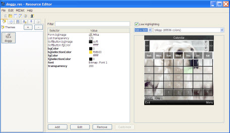
To use the tool, launch the Resource Editor application from your LWUIT distribution.
Use File > Open to load an existing resource (.res) file.
To add a resource, click the + button in the tab representing the element type you wish to add and specify a name for the resource. Specify a name for the resource. The new resource is added under the appropriate tab.
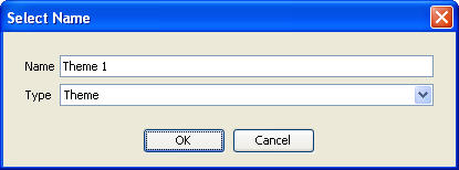
To create a new theme, select the Theme node, then click the + button. Note that a resource bundle can contain more than one theme.
|
Note: The live preview is displayed for themes only and represents the behavior of the theme alone. It doesn't contain the other resources in the file that do not relate to the theme. |
The LWUIT Resource Editor supports the following image types:
RGB: Standard JPG/PNG formats. Indexed PNGs also work very well (and are highly recommended) with this image type.
SVG: SVG Tiny images are supported. LWUIT can optionally seamlessly generate PNG images for the SVG files when a device doesn't support SVG.
Multi-Image: One can add several images based on the DPI of the device (one of several predefined family ranges). Irrelevant images are skipped when loading the resource file .
Multi-images are ideal for icons or small artifacts that are hard to scale properly. They are not meant to replace things such as 9-image borders and so forth since adapting them to every resolution or to device rotation isn't practical.
Timeline: A timeline is a set of images that can be moved rotated, scaled, and blended to provide interesting animation effects.Timelines allow rudimentary animation and enable GIF importing using the resource editor.
The Resource Editor can use device specific fonts or create bitmap fonts for the devices from any font installed in your desktop operating system. Figure 9-2 shows the font editing dialog that appears when adding a new font to the resource file.
|
Note: Using the Resource Editor does not grant you permission to use the fonts commercially in any way. Licensing the right to use a particular font within a mobile application is strictly your responsibility! |
Make sure to specify the characters you need from the font (defaults to upper and lower case English with numbers and symbols). Notice that the more characters you pick in the character set, the more RAM the font will consume on the device. Anti-aliasing is built in to the bitmap font. When running under Java 5 the Resource Editor has two anti-aliasing options: Off indicates no anti-aliasing in the bitmap font, and Simple indicates standard anti-aliasing.
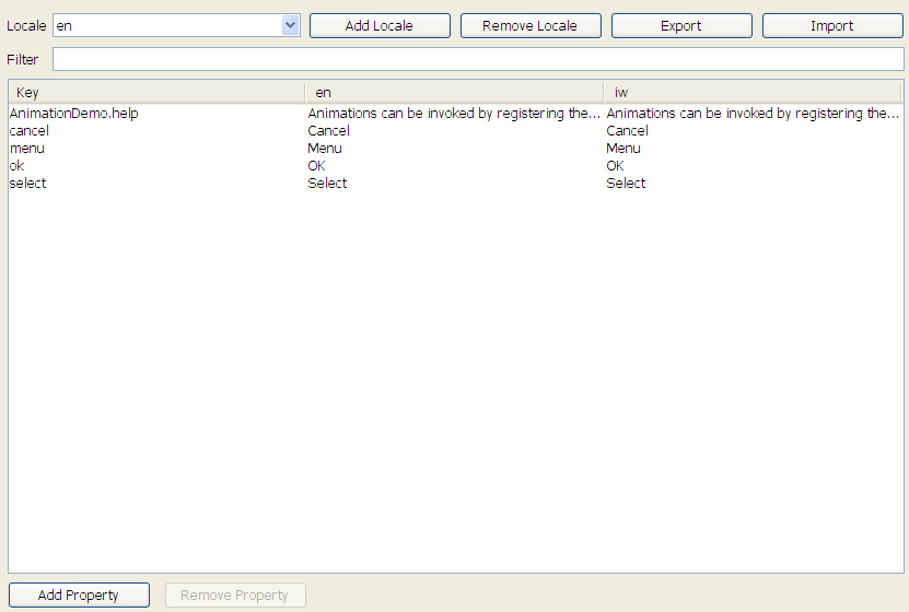
A localization resource can be edited by assigning key/value pairs to use within the application. A key can be mapped to a resource name in any locale.
The editor allows you to add or remove locales listed in the combo box above and appropriately edit the locale entries in the table below. To add or remove a locale property use the buttons on the bottom of the screen.
Figure 9-3 Localization and Internationalization View
To modify a theme resource, set the selectors and the theme resources to appropriate values to produce an attractive UI. When creating a new theme you see a UI containing the table of selectors and resources (for more in depth details of themes for developers, see Chapter 8).
Figure 9-4 Blank Theme View Without Any Styles
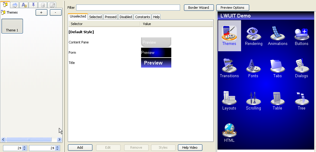
To modify the theme, choose a selector on the left side and click the Edit button. You can add new selectors using the Add button in the theme. To modify an existing selector, select it in the table and double click or press the Edit button.
This section describes how to add a new theme using the Resource Editor.
Select the theme tab on the left, and click the + button to open the New Theme window. From the Template combo box, select Blank.
The UI area on the right shows the Unselected tab by default. Click the Add button at the bottom of the UI area. 
Description of the illustration add.jpg
The Add window opens.
Select Form from the Component combo box at the top of the Add window.
In the Background tab uncheck Derive. From the Type dropdown, choose GRADIENT_RADIAL.
Type ff into the left gradient color (to select a blue to black radial gradient).
Type 2 into the gradient Size spinner to double the size of the gradient.
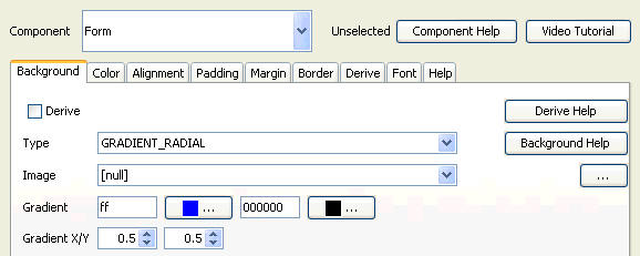
Click OK to save your changes.
Click the Add button again and select Title from the Component combo box.
Select the Background tab.
Uncheck Derive.
In the Type combo box select GRADIENT_LINEAR_VERTICAL.
In the Gradient input field on the right, type 6363ff to select a light blue color.
Select the Color Tab.
Uncheck the Derive Foreground checkbox
Type ffffff into theForeground field.
Select the Alignment tab.
Uncheck the Derive checkbox and make sure Left is selected in the Alignment combo box.
Select the Padding tab.
Uncheck the Derive checkbox
Type 10 in the Left and Right fields, and type 5 in the Top and Bottom fields.
Select the Font tab.
Uncheck the Derive Font check box.
Select BOLD in the center combo box and LARGE in the combo box on the right.
These steps will create a left-aligned spaced large title that uses white bold text on a vertical gradient background.
In the UI area Unselected tab, double-click the [Default Style] selector to open the Edit window.
Select the Color tab.
Uncheck Derive Foreground and type in ffffff to make the default text color white.
Uncheck Derive Transparency and type in 0 to make components transparent by default.
In the UI area choose the Selected tab and double-click the [Default Style] entry.
Select the Color tab.
Uncheck Derive Foreground.
Type in ff to make the foreground blue
Uncheck Derive Transparency
Type in 200 to make the selection color blend nicely. Click OK.
Click the Border Wizard button on the top of the UI area.
Make these changed on the Create Image tab:
In the Width and Height spinners, type 200.
In the Thickness spinner, type 4.
In the Arc Width and Arc Height fields, type 30.
In Color A and Color D fields, type in ffffff.
In Color B and Color C fields, type in 9f9f9f.
This creates a reverse border gradient which strengthens a sense of depth.
In the opacity spinner type 130 to make the image translucent.
Select the Cut Image tab.
Type 100 in the Top spinner, 90 in the Bottom spinner.
Type 25 in the Left and Right spinners.
Select the Apply To tab.
In the Component field, type Content Pane.
In the Style combo box, choose Unselected.
Click the Add button on the Right. This populates the Applies To area.
Click the Generate button at the bottom, and close the wizard.
Click the Unselected tab.
Double-click the ContentPane style entry.
Select the Padding tab.
Uncheck Derive.
Input 5 in Top, Bottom, Left and Right spinners.
Select the Margin tab.
Uncheck Derive.
Input 14 in Top, Bottom, Left and Right spinners.
This will provide some spacing around the border to accentuate its effect.
Figure 9-5 shows the final result.
To gain a deeper understanding of themes add a theme from a template and review its settings. In the Themes tab on the left, click + to add a new theme. From the template combo box, choose Wood and click OK. For example, view the Transitions.
You can gain deeper understanding of the selector concepts from Chapter 7 and Chapter 8.
A theme entry is comprised of a UIID and the attributes modified for the specific UIID. The hardest part in building a theme is understanding the component names for the entries within the UI.
When pointing at the UI preview on the right, a tooltip pops up indicating the UIID of the component you are pointing at, however, this might not work as expected for list renderers (who are no longer there) or for components that are underneath other components (for example. a container that has components on top of it).
When adding a new entry (using the Add button at the bottom of the screen) the combo box at the top highlights in bold the UIIDs that are present in the current screen. This allows discovery via trial and error.
Notice that every attribute within this dialog has a Derive check box associated with it. The default behavior of adding a new theme entry is to derive from the base style. You need to explicitly indicate that you are interested in modifying a specific attribute. This allows the theme to remain efficient by reducing the amount of "noise" within the theme and also allows inheritance to work properly.
LWUIT style inheritance is built in stages:
LWUIT has constant "sensible defaults" for some component behaviors (for example, Buttons have a border style by default).
Every style type has the [Default Style] global scope where you can define your own defaults for components (although this won't replace LWUIT's builtin defaults such as the button borders).
Individual styles can use the Derive tab to define explicit inheritance hierarchy from a specific style UIID to reuse definitions made for one component. This is very useful when you have multiple style types because the Selected, Pressed and Disabled component styles can derive from the Unselected style of a component.
Data is generally designed for developers and shouldn't be used by designers.
An arbitrary file can be placed within this section and it can be accessed by developers in runtime. This section has no effect on the rest of the functionality even if the data file is an image or font.
The preview showing the LWUIT Demo allows for easy customization of a MIDlet. This capability is not limited to the LWUIT Demo. The Resource Editor supports plugging in your own MIDlet so you can test your theme on the fly.You can install your own MIDlet into the Resource Editor preview panel. In the Resource Editor menu bar, select Application > Pick Application MIDlet and select your MIDlet's JAR file.
There are, however, several restrictions and limitations in this feature:
Since the MIDlet is executed in Java SE it can't leverage javax.microedition APIs. While the APIs are present they are implemented in stub form. For example, if you use RMS, GCF, and so forth, they will return null for all queries and do nothing in all operations. Additionally, invoking features such as theming won't work.
If there is a failure in the MIDlet the Resource Editor will silently load the LWUIT Demo in the preview and use it instead. To debug the failure, execute the Resource Editor from command line using java -jar ResourceEditor.jar. When entering the theme option you can see the stack trace of the exception that caused the failure.
It is critical that you DO NOT obfuscate the MIDlet meant for the Resource Editor's preview feature since the Resource Editor must replace the LWUIT instance used within the MIDlet with its own!
Some developers use a preprocessor to create a custom version of their MIDlet for use within this feature. This allows them to avoid functionality that won't work properly in the tool and still give designers the ability to view the entire application for customization.
There is currently a known issue in some operating systems which causes the Resource Editor to fail in some cases when using the Aero theme. This issue stems from Java SE's look and feel implementation and the only workaround is to change the application look and feel using the Look And Feel menu option.