2 Working with ADF Skin Selectors
This chapter describes the ADF skin selectors. These selectors along with pseudo-elements, pseudo-classes, ADF skin properties and ADF skinning framework rules allow you to customize the appearance of ADF Faces and ADF Data Visualization components.
This chapter includes the following sections:
2.1 About ADF Skin Selectors
The ADF skinning framework provides a range of selectors that you can specify in an ADF skin to customize the appearance of ADF Faces and ADF Data Visualization components. There are two types of selectors: global selectors and component-specific selectors. A global selector defines style properties that you apply to one or more selectors. A component-specific selector defines style properties that apply to one component.
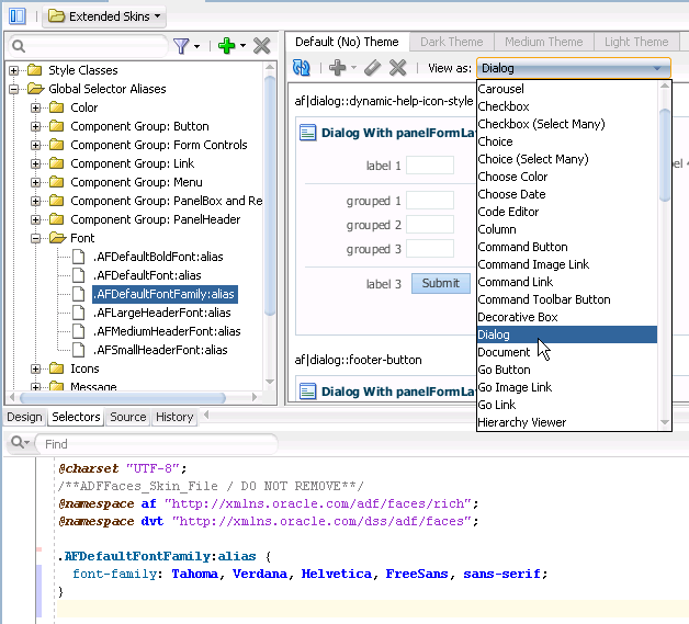
The ADF skins provided by Oracle ADF define many global selectors (Global Selector Aliases in the user interface of the selectors editor) that many ADF Faces components inherit. For example, many ADF Faces components use the .AFDefaultFontFamily:alias selector to specify the font family. If you create an ADF skin that overrides this selector by specifying a different font family, that change affects all the components that have included the .AFDefaultFontFamily:alias selector in their selector definition. Figure 2-1 shows the .AFDefaultFontFamily:alias selector in the source view and the design view. The View as list displays the current list of ADF Faces components that use the value defined in the .AFDefaultFontFamily:alias global selector alias to determine what font family to use.
An ADF skin that you create inherits the global selector aliases defined in the ADF skin that it extends from. You can also create new global selector aliases in your ADF skin files. For more information, see Chapter 8, "Working With Global Selector Aliases."
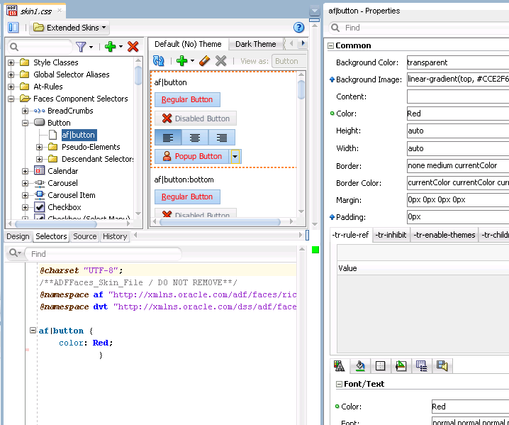
Component-specific selectors are selectors that the ADF skinning framework exposes that allow you to identify the corresponding ADF Faces and ADF Data Visualization components for which you can define style properties. For example, Figure 2-2 shows the selector for the ADF Faces button component in the source editor and selectors editor. The value of the property that determines the color of the font to appear in the button has been changed to Red in the Properties window.
For more information about the component-specific selectors, see Chapter 5, "Working with Component-Specific Selectors." For more information about global selector aliases, see Chapter 8, "Working With Global Selector Aliases."
2.1.1 ADF Skin Selectors and Pseudo-Elements
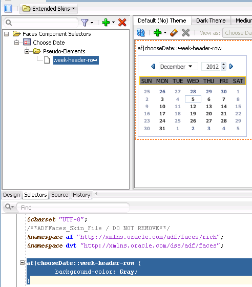
Many ADF skin selectors expose pseudo-elements. A pseudo-element denotes a specific area of a component for which you can define style properties. Pseudo-elements are denoted by a double colon followed by the portion of the component the selector represents. For example, Figure 2-3 shows how the week-header-row pseudo-element exposed by the af|chooseDate selector allows you to configure style properties for the appearance of the calendar grid.
2.1.2 ADF Skin Selectors and Icon Images
ADF Faces components that render icons do so using a set of base icon images. No CSS code entries appear in the source file of the ADF skin for these icon images in contrast to, for example, the CSS code entries that appear in a source file when you specify an image as a value for the CSS background-image property. Instead, the ADF skinning framework registers the icon image for use with the renderer. For more information about the renderer and supported render kits, see Section 12.2, "ADF Skinning Framework and Supported Render Kits."
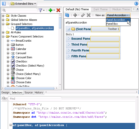
ADF skin selectors use two naming conventions for pseudo-elements that identify icon images that render in a component. The names of these pseudo-elements end in -icon or in -icon-style. Figure 2-4 shows the example of the Panel Accordion selector's pseudo-elements. Pseudo-elements that end in -icon-style specify a background image, as shown in Figure 2-4. In contrast, pseudo-elements that end in -icon do not specify a background image, but can reference IMG elements or text, as in the following examples:
af|panelAccordion::undisclosed-icon {content "X"}
af|panelAccordion::undisclosed-icon {content: url("http:server:port/img/img.png")}
In Figure 2-4, the undisclosed-icon-style pseudo-element styles the icon used for the undisclosed icon in the panelAccordion component. This pseudo-element specifies the icon as a background image. Use the :hover and :active pseudo-classes to customize the appearance. For example, write the following syntax to make the background red if the end user hovers the mouse over the icon:
af|panelAccordion::undisclosed-icon-style:hover {
    background-color: Red;
}
Tip:
Many browsers do not render background images when in accessibility mode. The following example demonstrates how you can work around this behavior if you want your application to display an image when in accessibility mode.
If you want to use your own image rather than the icon specified as a background image, you need to first prevent the background image from rendering. Do this by specifying the -tr-inhibit ADF skin property for the component's selector pseudo-element as follows:
af|panelAccordion::undisclosed-icon-style
{
  -tr-inhibit: background-image;
}
Next you specify the text or image that you want to render as a value for the content property of the undisclosed-icon selector. For example, write syntax similar to the following to specify an alternative image:
af|panelAccordion::undisclosed-icon
{
        content:url("images/undisclosed.png");
        width: 10px;
        height: 10px;
}
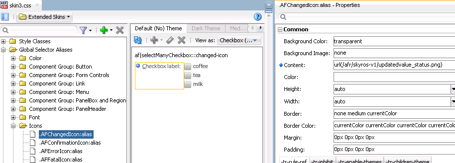
The ADF skinning framework also defines a number of global selector aliases that specific icon images to use in different scenarios. These global selector aliases appear under the Icons node in the Selector Tree of the selectors editor, as shown in Figure 2-5. The .AFChangedIcon:alias shown in Figure 2-5 enables you to globally set the changed icon for all components using that icon.
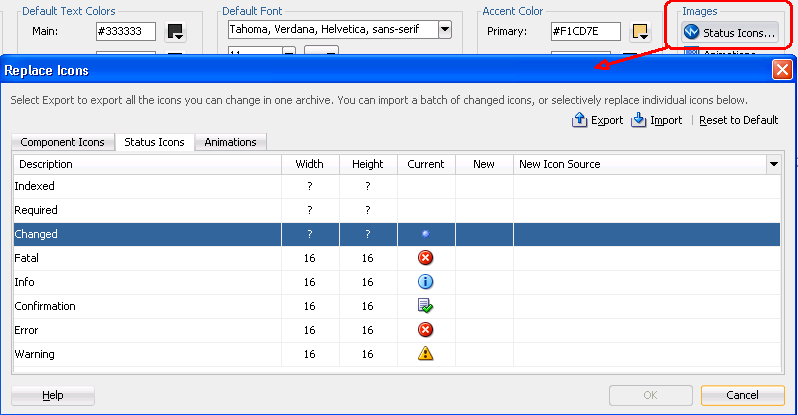
These icons can also be viewed and changed using the Replace Icons dialog that you invoke from the design editor, as described in Section 6.2, "Changing Images and Colors in the ADF Skin Design Editor," if your ADF skin extends from the Skyros or Fusion Simple families of ADF skin. Figure 2-6 shows the dialog that appears for an ADF skin that extends from the Skyros family of ADF skins.
For more information, see Chapter 6, "Working with Images and Color in Your ADF Skin."
2.1.3 Grouped ADF Skin Selectors
You can group ADF skin selectors and global selector aliases to minimize the number of entries in the source file of the ADF skin. The selectors that you group render under the Grouped Selectors node in the Selector Tree, as shown in Figure 2-7. The View as list in the Preview Pane displays all the selectors that you grouped.
As the selectors editor does not provide a way to specify grouped selectors, you use the source editor to specify the selectors and/or global selector aliases that you want to put in a grouped selector. Separate each selector by a comma (,) to include in the grouped selector.
2.1.4 Descendant ADF Skin Selectors
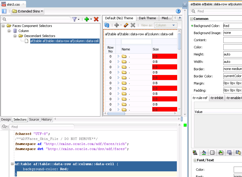
A descendant selector is made up of two or more selectors separated by white space. You can configure descendant selectors for ADF skin selectors. These allows you to configure style properties for specific selectors when they render within another selector. When you configure a descendant selector, the selectors editor displays a Descendant Selectors node under the selector included in the descendant selector, as shown in Figure 2-8.
As the selectors editor does not provide a way to specify descendant selectors, you use the source editor to specify the selectors and/or global selector aliases that you want to specify in a descendant selector. Separate each selector by a white space.
2.2 Pseudo-Classes in the ADF Skinning Framework
The CSS specification defines pseudo-classes, such as :hover and :active, which are used to define style properties for when a selector is in a particular state. You can apply these pseudo-classes to almost every ADF Faces component. In addition, the ADF skinning framework provides additional pseudo-classes for specialized functions. Examples include pseudo-classes to apply when a browser's locale is a right-left language (:rtl) or for drag and drop operations (:drag-target and :drag-source). The syntax that appears in the source file of an ADF skin to denote a pseudo-class uses the following format(s):
adfskinselector:pseudo-class
adfskinselector::pseudo-element:pseudo-class
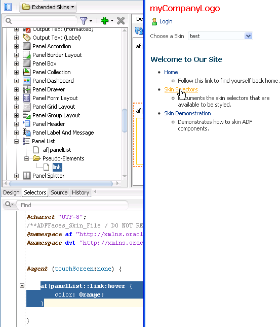
Figure 2-9 shows the syntax that you write in the source file of an ADF skin for the :hover pseudo-class so that a panelList component's link renders orange when the end user hovers a cursor over the link in Figure 2-9.
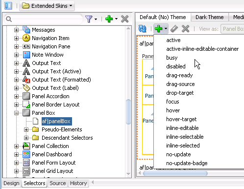
Some components make more use of pseudo-classes than other components. The panelBox component's selector, for example, makes extensive use of pseudo-classes to define its appearance when it is in various states (for example, active, disabled, or busy). Figure 2-10 shows the list of available pseudo-classes that renders when you select the panelBox component's selector in the Selector Tree and click the Add Pseudo-Class icon to display the list of available pseudo-classes in an ADF skin that extends from the Skyros family of ADF skins.
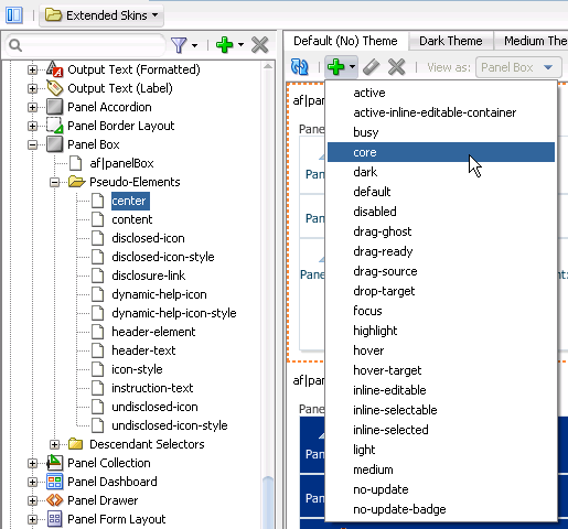
Pseudo-classes can also be applied to pseudo-elements that selectors expose. The panelBox component selector's pseudo elements are a good example. Figure 2-11 shows the list of pseudo-classes that the center pseudo-element exposed by the panelBox component selector accepts. Many of these pseudo-classes allow you to define the appearance for the panelBox component depending on the value that the application developer sets for its attributes. For example, the core and highlight pseudo-classes define the corresponding appearance when the application developer sets the panelBox component's ramp attribute to core or highlight.
The following are common pseudo-classes used by ADF Faces selectors.
-
Drag and drop: The two pseudo-classes available are
:drag-sourceapplied to the component initiating the drag and removed once the drag is over, and:drop-targetapplied to a component willing to accept the drop of the current drag. -
Standard: In CSS, pseudo-classes like
:hover,:active, and:focusare considered states of the component. This same concept is used in applying skins to components. Components can have states likeread-onlyordisabled. When states are combined in the same selector, the selector applies only when all states are satisfied. -
Right-to-left: Use this pseudo-class to set a style or icon definition when the browser is in a right-to-left language. Another typical use case is asymmetrical images. You will want the image to be flipped when setting skin selectors that use the image in a right-to-left reading direction. Be sure to append the
:rtlpseudo-class to the very end of the selector and point it to a flipped image file. The skin editor's preview pane does not render changes that you make to a flipped image file. The following example from the Skyros skin shows the image that thecalendarcomponent'stoolbar-day-hover-iconpseudo-element references when it renders in a browser that uses a right-to-left language:af|calendar::toolbar-day-hover-icon:rtl { content: url(/afr/cal_day_ovr_rtl.png); width: 16px; height: 16px; }You can also use
:rtlto apply to skin icons. For more information, see Chapter 6, "Working with Images and Color in Your ADF Skin." -
Inline editing: This pseudo-class is applied when the application activates a component subtree for editing in the browser. For example,
:inline-selectedis a pseudo-class applied to currently selected components in the active inline-editable subtree. -
Message: This pseudo-class is used to set component-level message styles using CSS pseudo-classes of
:fatal,:error,:warning,:confirmation, and:info. For more information, see Section 5.5, "Configuring ADF Skin Properties to Apply to Messages."
Note:
The global selector aliases that appear in the Selector Tree are a special type of pseudo-class (:alias). For more information, see Chapter 8, "Working With Global Selector Aliases."
2.3 Properties in the ADF Skinning Framework
The ADF skinning framework defines a number of ADF skin properties. The Fusion web application, rather than the user's browser, interprets ADF skin properties. When configured, ADF skin properties enable you to do the following:
-
Reference styles from other selectors with the
-tr-rule-refproperty.Create your own global selector alias and combine it with other selectors using the
-tr-rule-refproperty. For more information, see Section 8.2, "Creating a Global Selector Alias," Section 8.3, "Modifying a Global Selector Alias," and Section 8.4, "Applying a Global Selector Alias." -
Suppress styles defined in an ADF skin with the
-tr-inhibitskin property.Suppress or reset CSS properties inherited from a base skin with the
-tr-inhibitskin property. For example, the-tr-inhibit:paddingproperty removes any inherited padding. Remove (clear) all inherited properties with the-tr-inhibit:allproperty. The suppressed property name must be matched exactly with the property name in the base skin. -
Reference the value of a property defined in another selector using the
-tr-property-refproperty.For more information, see Section 8.5, "Referencing a Property Value from Another Selector."
-
Configure the themes for child components with the
-tr-children-themeproperty.For more information, see Section 5.6, "Applying Themes to ADF Faces Components."
-
ADF skin selectors with style properties.
Skin style properties allow you to customize the rendering of a component throughout the application. A CSS property is stored with a value in the
Skinobject and is available when the component is being rendered. For example, inaf|breadCrumbs{-tr-show-last-item: false}, the skin property-tr-show-last-itemis set to hide the last item in thebreadCrumbscomponent's navigation path.
The ADF skinning framework also provides the + and - operators that allow you to set a selector's color or font properties relative to the value that you specify for the color or font properties of another selector. This is useful if you want to apply a range of colors to selectors or maintain a relative size between fonts.
Example 2-1 demonstrates the syntax that you write to make use of this feature for a color property. A global selector alias defines the background color that two additional global selector aliases (.fooColorTestPlus and .fooColorTestMinus) apply using the + and - operators.
Example 2-1 Using the + and - Operators to Apply Color
.BaseBackgroundColor:alias { background-color: #0099ff; }
.fooColorTestPlus {
    -tr-rule-ref: selector(".BaseBackgroundColor:alias");
    background-color: +#333333;
    }
.fooColorTestMinus {
    -tr-rule-ref: selector(".BaseBackgroundColor:alias");
    background-color: -#333333;
}
Example 2-2 demonstrates the syntax that you write to make use of this feature for a font property. A global selector alias defines the font size and an additional global selector alias (.fooFont Test) increases this font size by 1pt using the + operator.
2.4 Accessing Selector Information from Within the ADF Skin Editor
You can access reference information for the ADF skin selectors and CSS properties that you configure in your ADF skin in a number of ways within the ADF Skin Editor. The reference information that you can access includes the following reference documents for ADF skin selectors:
-
Tag Reference for Oracle ADF Faces Skin Selectors
-
Oracle Fusion Middleware Data Visualization Tools Tag Reference for Oracle ADF Skin Selectors
(for the release that pertains to the application you are skinning)
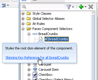
You can access these reference documents in the Oracle ADF Skin Editor Documentation Library or in a Help Center window if you click the link in the information text that appears when you hover over a selector in the Selector Tree, as shown in Figure 2-12.
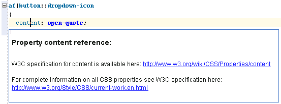
In addition to referencing information for the ADF skin selectors, you can access information for CSS selectors. You do this from the Source tab of the editor by selecting the CSS property and pressing Control + D or choosing Show Quick Reference, as illustrated in Figure 2-13.
