| Oracle Fusion Middleware Data Visualization Tools Tag Reference for Oracle ADF Faces 12c (12.2.1) E52773-01 |
Short name: dvt
Namespace: http://xmlns.oracle.com/adf/faces/rich/dvt
Links
- Components
- Shared Child Tags
- Type-Specific Child Tags
- Deprecated Components
- Miscellaneous Child Tags
- Deprecated Child Tags
Name
| Description | Sample image | |
|---|---|---|
| dvt:areaChart | Defines properties for an area chart. |  |
| dvt:barChart | Defines properties for a bar chart. | 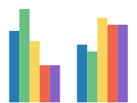 |
| dvt:bubbleChart | Defines properties for a bubble chart. | 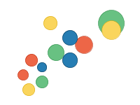 |
| dvt:comboChart | Defines properties for a combo chart. | 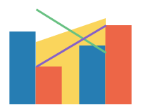 |
| dvt:funnelChart | Defines properties for a funnel chart. | 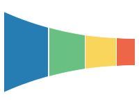 |
| dvt:lineChart | Defines properties for a line chart. | 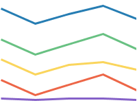 |
| dvt:pieChart | Defines properties for a pie chart. | 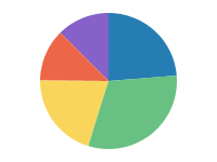 |
| dvt:scatterChart | Defines properties for a scatter chart. |  |
| dvt:stockGraph | Use the stockGraph tag to create an ADF stock candle graph. This tag has a minimal set of properties to support common functionality for this graph type. | |
| dvt:sparkChart | Use the sparkChart tag to create an ADF spark chart. |
Name
| Description | Sample image | |
|---|---|---|
| dvt:dialGauge | Defines properties for a dial gauge. The dial gauge is used to display a metric value plotted on a circular axis. | 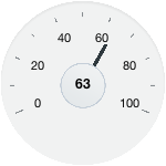 |
| dvt:ledGauge | Defines properties for a LED gauge. The LED gauge is used to display a metric value using a shape and color. | 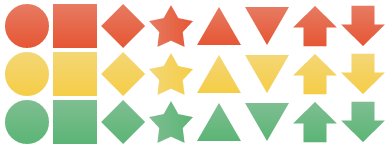 |
| dvt:ratingGauge | Defines properties for a rating gauge. The rating gauge is used to display or edit a rating value for some product or service. |  |
| dvt:statusMeterGauge | Defines properties for a status meter gauge. The status meter gauge is used to display a metric value, optionally plotted against a set of thresholds. | 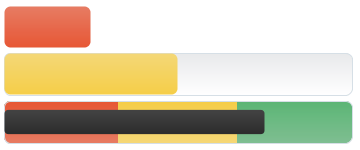 |
Name
| Description | Sample image | |
|---|---|---|
| dvt:projectGantt | The ProjectGantt is used to illustrate a list of tasks in a project schedule. | |
| dvt:schedulingGantt | A Scheduling Gantt is used to illustrate the scheduling of resources. | |
| dvt:resourceUtilizationGantt | The ResourceUtilizationGantt is used to illustrate available and utilization level of a resource in a time period. | |
| dvt:timeline | The Timeline component is used to display a series of events in chronlogical order. It supports zoom operation, expanding and collapsing a group of related events, and rendering of simple ADF components within each event. The Timeline component is capable of displaying two series of events side-by-side each other to allow comparison of events between two timelines. |
Name
| Description | Sample image | |
|---|---|---|
| dvt:map | This component represents business data on a geographic map with multiple layers of information. | |
| dvt:thematicMap | This component is a type of map that shows the spatial patterns of data related to a particular topic | 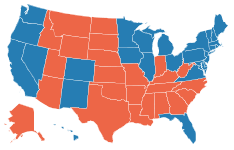 |
Name
| Description | Sample image | |
|---|---|---|
| dvt:majorTick | Defines properties for the major tick marks of a data visualization component. | |
| dvt:minorTick | Defines properties for the minor tick marks of a data visualization component. | |
| dvt:referenceArea | Defines properties for a reference area of a data visualization component. | |
| dvt:referenceAreaItem | Defines properties for a reference area item of a data visualization component. | |
| dvt:referenceLine | Defines properties for a reference line of a data visualization component. | |
| dvt:referenceLineItem | Defines properties for a reference line item of a data visualization component. | |
| dvt:legendArea | Determines characteristics and display properties of the graph legend area. | |
| dvt:legendText | Identifies data in a graph legend. Use the legendText tag to set properties on the text is associated with each marker in the legend. | |
| dvt:legendTitle | Specifies the characteristics and text of the title used in the graph's legend. | |
| dvt:numberFormat | Specifies formatting for numeric values. | |
| dvt:panelCard | The panel card component is a container that shows one of multiple showDetailItems at a time, and provides navigation between its showDetailItems with an optional transition effect. | |
| dvt:legend | The legend displays a panel which contains descriptive text for style information from its source components. | |
| dvt:legendSection | The legendSection displays a list of marker and label pairs which are grouped as a unit within the legend. | |
| dvt:showLegendGroup | The showLegendGroup creates a disclosable (expandable/collapsible) region within the legend. | |
| dvt:attributeGroups | The attributeGroups tag can produce values for different attribute types (color, shape, etc) based on discrete categories or continuous values in a data set. | |
| dvt:attributeMatchRule | The attributeMatchRule tag is a child of attributeGroups and is used to override an attribute when the category matches a certain value. | |
| dvt:attributeExceptionRule | The attributeExceptionRule tag is a child of attributeGroups and is used to override an attribute when a particular boolean condition is met. | |
| dvt:pointLocation | A pointLocation is a child of a pointDataLayer. It is used to define the data column that specifies the names of the points from the built-in point layer, or the x and y coordinates, for which data is being displayed | |
| dvt:marker | A marker is used to stamp out built-in or custom marker shapes associated with data points on the map |
Name
| Description | Sample image | |
|---|---|---|
| dvt:chartAxisLine | Defines properties for a chart axis line. | |
| dvt:chartDataItem | Defines properties for a data item of an area, bar, bubble, combo, line, or scatter chart. | |
| dvt:chartLegend | Defines properties for the chart legend. | |
| dvt:chartSeriesStyle | Defines properties for a series of a chart. | |
| dvt:chartTickLabel | Defines properties for the tick labels of a chart axis. | |
| dvt:chartValueFormat | Defines formatting properties for the values of a chart. | |
| dvt:chartXAxis | Defines properties for the x-axis of a chart. | |
| dvt:chartYAxis | Defines properties for the y-axis of a chart. | |
| dvt:chartY2Axis | Defines properties for the y2-axis of a chart. | |
| dvt:funnelDataItem | Defines properties for a data item of a funnel chart. | |
| dvt:pieDataItem | Defines properties for a data item of a pie chart. | |
| dvt:sparkItem | Use the sparkItem tag to represent and provide data for a bar or marker in an ADF spark chart. |
Name
| Description | Sample image | |
|---|---|---|
| dvt:gaugeMetricLabel | Defines properties for the gauge metric label. | |
| dvt:gaugeThreshold | Defines properties for a gauge threshold. | |
| dvt:gaugeTickLabel | Defines properties for the gauge tick labels. |
Name
| Description | Sample image | |
|---|---|---|
| dvt:node | The node component is used to stamp out nodes in the hierarchy. | |
| dvt:link | The link component is used to stamp out links between nodes in the hierarchy. |
Name
| Description | Sample image | |
|---|---|---|
| dvt:pivotFilterBar | The PivotFilterBar component is used to filter data based on the selected criterion belonging to the PivotableQueryDescriptor as specified by the value property. The PivotFilterBar component is usually used along with the PivotTable component, in which case the PivotFilterBar is used to display the attributes of the page edge. When the PivotFilterBar component is associated with the PivotTable component, users will also be able to change the layout of the PivotTable by drag and drop pivoting between the PivotFilterBar and the PivotTable. | |
| dvt:exportPivotTableData | The exportPivotTableData is a declarative way to allow an action source (<commandButton>, <commandLink>, etc.) to export data from a pivotTable component into an external format. | |
| dvt:headerCell | Header cell tag is used to specify custom pivot table header cell content. | |
| dvt:dataCell | Data cell tag is used to specify custom pivot table data cell content. |
Name
| Description | Sample image | |
|---|---|---|
| dvt:timeAxis | This is used to specify the time axis for the Gantt and Timeline components. When it is specified inside the Gantt, the time axis component is used for the major and minor axis of the Gantt component. When it is specified inside the Timeline, the time axis component is used for the time scale in the timeline and timeline overview components. | |
| dvt:ganttLegend | The Legend must be used as a child of the Project Gantt, Scheduling Gantt, or Resource Utilization Gantt components | |
| dvt:timelineItem | The Timeline. | |
| dvt:timelineOverview | A TimelineOverview provides a bird's-eye view of all the events in the timeline. The TimelineOverview is an optional component. An application associates a TimelineOverview component with the Timeline component by adding it as a child of the Timeline component. | |
| dvt:timelineSeries | The TimelineSeries displays a series of events along a specified period of time. A Timeline must have at least one TimelineSeries. |
Name
| Description | Sample image | |
|---|---|---|
| dvt:mapToolbar | This component contains tools for turning on/off themes, selecting theme elements, zooming, calculating distance and area for the selected regions, displaying legend, and showing the spatial coordinates of the mouse location. Insert the mapToolbar tag on a page that contains a map. This tag is a separate component from the map so that developers can position it separately on the page. | |
| dvt:mapOverview | mapOverview is a child tag of the map that lets developer customize different aspects of the overview Map. The overview map appears in the lower right corner of the map. Each map should have at most one mapOverview tag. | |
| dvt:mapLegend | mapLegend is a child tag of the map that lets developer customize different aspects of the legend. To view the legend, the user has to use the mapToolbar to show/hide the legend. |
Name
| Description | Sample image | |
|---|---|---|
| dvt:predefinedTheme | predefinedTheme is a child tag of the map that let developers create a predefined theme | |
| dvt:mapColorTheme | mapColorTheme is a child tag of the map that lets developer create a color theme on a map. ADF map uses the value from the GeoMapModel to color regions on the map. | |
| dvt:mapPieGraphTheme | mapPieGraphTheme is a child tag of the map that lets developers create a pie Graph theme. ADF map uses the value from the GeoMapModel to draw a pie chart on a location on the map. | |
| dvt:mapBarGraphTheme | mapBarGraphTheme is a child tag of the map that lets developer create a bar Graph theme. mapBarSeriesSet is the child tag of this tag. | |
| dvt:mapPointTheme | mapPointTheme is a child tag of the map that let developers create a point theme. |
Name
| Description | Sample image | |
|---|---|---|
| dvt:mapPieSliceSet | mapPieSliceSet is a child tag of the mapPieGraphTheme. The mapSliceSet tag wraps all the mapPieSliceItem tags for one mapPieGraphTheme. | |
| dvt:mapPieSliceItem | mapPieSliceItem is a child tag of the mapPieSliceSet | |
| dvt:mapBarSeriesSet | mapBarSeriesSet is a child tag of the mapBarGraphTheme. A mapBarSeriesSet tag wraps all the mapBarSeriesItem tag. | |
| dvt:mapBarSeriesItem | mapBarSeriesItem is a child tag of the mapBarSeriesSet. The mapBarSeriesItem tag gives developers the option of customizing the color of the bars. | |
| dvt:mapPointStyleItem | mapPointStyleItem is a child tag of the mapPointTheme and let developers customize the image used for points in a mapPointTheme. |
Name
| Description | Sample image | |
|---|---|---|
| dvt:nBoxCell | Defines properties for an NBox cell. | |
| dvt:nBoxColumn | Defines properties for an NBox column. | |
| dvt:nBoxNode | Defines properties for an NBox node. | |
| dvt:nBoxRow | Defines properties for an NBox row. |
Name
| Description | Sample image | |
|---|---|---|
| dvt:areaLayer | The areaLayer is a child of the thematicMap and is used to customize which layers from the built-in basemap get displayed | |
| dvt:areaDataLayer | The areaDatLayer allows developers to display data associated with geographical regions of the map using styles (such as colors or patterns), markers, or other adornments | |
| dvt:areaLocation | An areaLocation is a child of an areaDataLayer. It is used to define the data column that specifies the names of the areas from the built-in layer for which data is being displayed | |
| dvt:area | An area is used to stamp out stylistic attributes (such as colors and patterns) onto the geographical areas of the map | |
| dvt:pointDataLayer | The pointDataLayer allows developers to display data associated with coordinate locations or pregeocoded points of a point base layer using markers or other adornments | |
| dvt:customAreaLayer | The custom area layer is used to create a new area layer from region data and insert it into the hierarchy | |
| dvt:customArea | A custom area is a child of the customAreaLayer and is used to specify the lower level regions from the built-in basemap that will be aggregated to form the new area |
Name
| Description | Sample image | |
|---|---|---|
| dvt:sunburstNode | A child of the Sunburst component. The sunburst node displays two dimensions of data through its size and color. | |
| dvt:treemapNode | A child of the Treemap component. The treemap node displays two dimensions of data through its size and color. | |
| dvt:treemapNodeHeader | A child of the Treemap Node component. The treemap node header defines the properties of the header that may appear on the node. |
Name
| Description | Sample image | |
|---|---|---|
| dvt:clientLayout | ClientLayouts are used to register a javascript method that can be invoked to perform layout for a Digram | |
| dvt:nodeAttributes | NodeAttributes are used to declare node-level attributes for ClientLayouts | |
| dvt:linkAttributes | LinkAttributes are used to declare link-level attributes for ClientLayouts | |
| dvt:diagramNodes | DiagramNodes is used to define the collection of Nodes to be displayed in a Diagram | |
| dvt:diagramNode | The diagram node component is used to stamp out nodes in a diagram. | |
| dvt:diagramLinks | DiagramLinks is used to define the collection of Links to be displayed in a Diagram | |
| dvt:diagramLink | The diagram link component is used to stamp out links between nodes in the diagram. | |
| dvt:overviewWindow | The legend displays a panel which contains descriptive text for style information from its source components. |
Name
| Description | Sample image | |
|---|---|---|
| <dvt:areaGraph> | The areaGraph tag is deprecated. Use the areaChart tag instead. | |
| <dvt:barGraph> | The barGraph tag is deprecated. Use the barChart tag instead. | |
| <dvt:bubbleGraph> | The barGraph tag is deprecated. Use the barChart tag instead. | |
| <dvt:comboGraph> | The comboGraph tag is deprecated. Use the comboChart tag instead. | |
| <dvt:funnelGraph> | The funnelGraph tag is deprecated. Use the funnelChart tag instead. | |
| <dvt:gauge> | The gauge tag is deprecated. Use the dialGauge, ledGauge, or statusMeterGauge tag instead. | |
| <dvt:horizontalBarChart> | The horizontalBarChart tag is deprecated. Use the barChart tag with horizontal orientation instead. | |
| <dvt:horizontalBarGraph> | The horizontalBarGraph tag is deprecated. Use the barChart tag with horizontal orientation instead. | |
| <dvt:lineGraph> | The lineGraph tag is deprecated. Use the lineChart tag instead. | |
| <dvt:paretoGraph> | The paretoGraph tag is deprecated. Use the comboChart tag instead. | |
| <dvt:pieGraph> | The pieGraph tag is deprecated. Use the pieChart tag instead. | |
| <dvt:radarGraph> | The radarGraph tag is deprecated. Use the lineChart tag instead. | |
| <dvt:scatterGraph> | The scatterGraph tag is deprecated. Use the scatterChart tag instead. | |
| <dvt:search> | The Search tag usage within HierarchyViewer has been deprecated. The Search tag is used to perform a search and display result. It is added as a child of the hierarchyViewer tag to enable searching. The searchResults tag must be added as a child of the search tag to specify how to handle results. When enabled, a collapsible search panel is displayed in the top, right corner of the hierarchyViewer. | |
| <dvt:searchResults> | The SearchResults tag usage has been deprecated. The SearchResults tag is used to perform a searchResults and display result. It is added as a child of the hierarchyViewer tag to enable searchResultsing. The searchResults tag must be added as a child of the searchResults tag to specify how to handle results. When enabled, a collapsible searchResults panel is displayed in the top, right corner of the hierarchyViewer. |
Name
| Description | |
|---|---|
| <dvt:activeDataProperties> | This tag is deprecated. Use animationDownColor, animationDuration, animationIndicators, animationOnDataChange, animationOnDisplay and animationUpColor in the graph or gauge tag to specifies animation properties for active data enabled graph or gauge. |
| <dvt:alert> | Defines an additional data point that needs to be highlighted with a separate symbol, such as an error or warning. |
| <dvt:alertSet> | Wraps an infinite number of alert tags for a graph. |
| <dvt:annotation> | Defines an annotation on a graph. An annotation is associated with a specific data point on a graph. |
| <dvt:annotationSet> | Wraps an infinite number of annotation tags for a graph. |
| <dvt:attributeFormat> | Specifies formatting for an attribute matching the name property. |
| <dvt:background> | Defines the characteristics of the graph background. |
| <dvt:drillBehavior> | Adds a client-side behavior to drill on a row. |
| <dvt:exportPivotTableData> | The exportPivotTableData is a declarative way to allow an action source (<commandButton>, <commandLink>, etc.) to export data from a pivotTable component into an external format. |
| <dvt:gaugeSetBackground> | This tag is deprecated since the parent tag, "gauge", is deprecated. Use dialGauge, ledGauge, ratingGauge, or statusMeterGauge instead. Use the gaugeSetBackground tag to specify the background colors of a gauge set. |
| <dvt:gradientStopStyle> | Use the gradientStopStyle tag to control the color and rate of change of a gradient fill. This tag must be wrapped by the SpecialEffects tag. |
| <dvt:graphFont> | Formats fonts in graph components that display text. |
| <dvt:graphFootnote> | Specifies the characteristics and text of the footnote for the graph. |
| <dvt:graphPlotArea> | Determines characteristics of the graph plot area. |
| <dvt:graphSubtitle> | Specifies the characteristics and text of the subtitle for the graph. |
| <dvt:graphTitle> | Specifies the characteristics and text of the title for the graph. |
| <dvt:isolateLevelsBehavior> | Adds a client-side behavior to isolate on a row. |
| <dvt:legendArea> | Determines characteristics and display properties of the graph legend area. |
| <dvt:legendText> | Identifies data in a graph legend. Use the legendText tag to set properties on the text is associated with each marker in the legend. |
| <dvt:legendTitle> | Specifies the characteristics and text of the title used in the graph's legend. |
| <dvt:mapBarGraphTheme> | mapBarGraphTheme is a child tag of the map that lets developer create a bar Graph theme. mapBarSeriesSet is the child tag of this tag. |
| <dvt:mapBarSeriesItem> | mapBarSeriesItem is a child tag of the mapBarSeriesSet. The mapBarSeriesItem tag gives developers the option of customizing the color of the bars. |
| <dvt:mapBarSeriesSet> | mapBarSeriesSet is a child tag of the mapBarGraphTheme. A mapBarSeriesSet tag wraps all the mapBarSeriesItem tag. |
| <dvt:mapColorTheme> | mapColorTheme is a child tag of the map that lets developer create a color theme on a map. ADF map uses the value from the GeoMapModel to color regions on the map. |
| <dvt:mapLegend> | mapLegend is a child tag of the map that lets developer customize different aspects of the legend. To view the legend, the user has to use the mapToolbar to show/hide the legend. |
| <dvt:mapOverview> | mapOverview is a child tag of the map that lets developer customize different aspects of the overview Map. The overview map appears in the lower right corner of the map. Each map should have at most one mapOverview tag. |
| <dvt:mapPieGraphTheme> | mapPieGraphTheme is a child tag of the map that lets developers create a pie Graph theme. ADF map uses the value from the GeoMapModel to draw a pie chart on a location on the map. |
| <dvt:mapPieSliceItem> | mapPieSliceItem is a child tag of the mapPieSliceSet |
| <dvt:mapPieSliceSet> | mapPieSliceSet is a child tag of the mapPieGraphTheme. The mapSliceSet tag wraps all the mapPieSliceItem tags for one mapPieGraphTheme. |
| <dvt:mapPointStyleItem> | mapPointStyleItem is a child tag of the mapPointTheme and let developers customize the image used for points in a mapPointTheme. |
| <dvt:mapPointTheme> | mapPointTheme is a child tag of the map that let developers create a point theme. |
| <dvt:markerText> | Defines the characteristics of marker text in a graph. |
| <dvt:numberFormat> | Specifies formatting for numeric values. |
| <dvt:o1Axis> | Controls the color and visibility of the ordinal (or category) axis. |
| <dvt:o1MajorTick> | Controls the appearance of major tick marks on the ordinal axis. |
| <dvt:o1TickLabel> | Controls the appearance of the ordinal axis tick label, including the rotation and presence of tick labels. |
| <dvt:o1Title> | Specifies the text and alignment of the title for the ordinal axis of the graph. |
| <dvt:paretoLine> | Defines characteristics of the line that shows cumulative percentages in a pareto graph. |
| <dvt:paretoMarker> | Defines characteristics of markers of the pareto line in a pareto graph. |
| <dvt:predefinedTheme> | predefinedTheme is a child tag of the map that let developers create a predefined theme |
| <dvt:referenceObject> | Defines a reference line or a reference area for a graph. You can define an unlimited number of reference objects for a given graph. |
| <dvt:referenceObjectSet> | Wraps an unlimited number of reference objects for a given graph. |
| <dvt:restoreBehavior> | Adds a client-side behavior to remove isolation. |
| <dvt:rowDisclosureBehavior> | Adds a client-side behavior to disclose a row within the parent component. |
| <dvt:series> | Defines a series in a graph. |
| <dvt:seriesSet> | Wraps the definitions of up to 128 series for a graph |
| <dvt:shapeAttributes> | Specifies interactivity properties on subcomponents of a ADF Data Visualization component. |
| <dvt:shapeAttributesSet> | Wraps shapeAttributes tags for a graph or for a gauge. |
| <dvt:sliceLabel> | Specifies the characteristics of the labels that describes slices of a pie or ring graph. Each slice represents a data value. |
| <dvt:specialEffects> | Use the specialEffects tag to set gradient properties of a subcomponent of a graph or gauge. This tag wraps gradientStopStyle tags for a graph or for a gauge. |
| <dvt:stockMarker> | Defines the characteristics of markers in a stock graph. |
| <dvt:stockVolumeFormat> | Wraps the definition of the number format for the volume markers in a stock graph. |
| <dvt:timeAxisDateFormat> | Specifies the format for the time axis of the graph. |
| <dvt:volumeMarker> | Defines the characteristics of volume markers in a stock graph. |
| <dvt:x1Format> | Wraps the number format for markers on the x-axis. |
| <dvt:y1Axis> | Controls characteristics and scaling of the y1-axis. |
| <dvt:y1BaseLine> | Specifies the start of the y1-axis line from which bars and area markers originate. |
| <dvt:y1Format> | Wraps the number format for the markers on the y1-axis. |
| <dvt:y1MajorTick> | Controls the appearance of major tick marks on the y1-axis. |
| <dvt:y1MinorTick> | Controls the appearance of minor tick marks on the y1-axis. |
| <dvt:y1TickLabel> | Controls the appearance of the y1-axis tick labels. |
| <dvt:y1Title> | Specifies the characteristics and text of the title on the y1-axis. |
| <dvt:y2Axis> | Controls the characteristics and scaling of the y2-axis. |
| <dvt:y2BaseLine> | Specifies the start of the y2-axis line from which bars and area markers originate. |
| <dvt:y2Format> | Wraps the number format for the markers on the y2-axis. |
| <dvt:y2MajorTick> | Controls the appearance of major tick marks on the y2-axis. |
| <dvt:y2MinorTick> | Controls the appearance of minor tick marks on the y2-axis. |
| <dvt:y2TickLabel> | Controls the appearance of the y2-axis tick labels. |
| <dvt:y2Title> | Specifies the characteristics and text of the title on the y2-axis. |
| <dvt:zFormat> | Wraps the number format for the markers on the z-edge of a 3-D graph. |
Name
| Description | |
|---|---|
| <dvt:bottomLabel> | This tag is deprecated since the parent tag, "gauge", is deprecated. Use dialGauge, ledGauge, or statusMeterGauge instead. Use the bottomLabel tag to specify the text and location of a bottom label, if any, for the gauge. |
| <dvt:gaugeBackground> | This tag is deprecated since the parent tag, "gauge", is deprecated. Use dialGauge, ledGauge, ratingGauge, or statusMeterGauge instead. Use the gaugeBackground tag to specify the background colors of a gauge. |
| <dvt:gaugeFont> | This tag is deprecated since the parent tag, "gauge", is deprecated. Use dialGauge, ledGauge, ratingGauge, or statusMeterGauge instead. Use the gaugeFont tag to format fonts in gauge components that display text. |
| <dvt:gaugeFrame> | This tag is deprecated since the parent tag, "gauge", is deprecated. Use dialGauge, ledGauge, ratingGauge, or statusMeterGauge instead. Use the gaugeFrame tag to specify the characteristics of the raised frame behind the dial gauge or the shadow behind the status meter and LED gauges. |
| <dvt:gaugeLegendArea> | This tag is deprecated since the parent tag, "gauge", is deprecated. Use dialGauge, ledGauge, ratingGauge, or statusMeterGauge instead. Use the gaugeLegendArea tag to determine the characteristics and display properties of the legend area of a gauge. |
| <dvt:gaugeLegendText> | This tag is deprecated since the parent tag, "gauge", is deprecated. Use dialGauge, ledGauge, ratingGauge, or statusMeterGauge instead. Use the gaugeLegendText tag to identify the number type to appear in the gauge legend. |
| <dvt:gaugeLegendTitle> | This tag is deprecated since the parent tag, "gauge", is deprecated. Use dialGauge, ledGauge, ratingGauge, or statusMeterGauge instead. Use the gaugeLegendTitle tag to specify the title for the gauge legend. |
| <dvt:gaugePlotArea> | This tag is deprecated since the parent tag, "gauge", is deprecated. Use dialGauge, ledGauge, ratingGauge, or statusMeterGauge instead. Use the gaugePlotArea tag to specify the characteristics of the plot area of a gauge. |
| <dvt:graphPieFrame> | Use the graphPieFrame tag to specify the characteristics of a pie frame. Pie frame is a decorative frame encloses a pie or ring graph. Its area includes pie slices, pie slice labels, feelers and the pie label in a pie graph. This area is similar to the graph plot area in other graph types except it has no axes. |
| <dvt:indicator> | This tag is deprecated since the parent tag, "gauge", is deprecated. Use dialGauge, ledGauge, or statusMeterGauge instead. Use the indicator tag to specify the visual properties of the Dial Gauge Needle or the Status Meter Bar. Note: The fill color, border color and type attributes do not apply to Status Meters. |
| <dvt:indicatorBar> | This tag is deprecated since the parent tag, "gauge", is deprecated. Use dialGauge, ledGauge, or statusMeterGauge instead. Use the indicatorBar tag to set the fill properties of the inner rectangle (bar) of a status meter gauge. |
| <dvt:indicatorBase> | This tag is deprecated since the parent tag, "gauge", is deprecated. Use dialGauge, ledGauge, or statusMeterGauge instead. Use the indicatorBase tag to set the fill properties of the circular base of the indicator of a dial gauge. |
| <dvt:lowerLabelFrame> | This tag is deprecated since the parent tag, "gauge", is deprecated. Use dialGauge, ledGauge, or statusMeterGauge instead. <br/> Use the lowerLabelFrame tag to specify the colors for the frame behind the bottom label. This lowerLabelFrame tag also controls the visibility of this frame. |
| <dvt:metricLabel> | This tag is deprecated since the parent tag, "gauge", is deprecated. Use dialGauge, ledGauge, or statusMeterGauge instead. Use the metricLabel tag to position the label for the gauge metric. |
| <dvt:pieFeeler> | Sets the color of the optional line between a pie slice and the slice label. |
| <dvt:pieLabel> | Specifies the characteristics of the label that describes a pie or ring graph. |
| <dvt:slice> | Specifies the characteristics of all slices of a pie or ring graph |
| <dvt:threshold> | Use the threshold tag to specify a threshold section for a gauge or spark chart. You can create an infinite number of thresholds for a gauge. |
| <dvt:thresholdSet> | Use the thresholdSet tag to wrap all the threshold tags for a gauge or spark chart. An infinite number of thresholds can be included in a thresholdSet tag. |
| <dvt:tickLabel> | This tag is deprecated since the parent tag, "gauge", is deprecated. Use dialGauge, ledGauge, or statusMeterGauge instead. Use the tickLabel tag to specify which tick marks in a gauge have labels. |
| <dvt:tickMark> | This tag is deprecated since the parent tag, "gauge", is deprecated. Use dialGauge, ledGauge, or statusMeterGauge instead. Use the tickMark tag to specify where tick marks are displayed in a gauge. |
| <dvt:timeSelector> | Specifies the time range and characteristics for time selector on time axis. |
| <dvt:topLabel> | This tag is deprecated since the parent tag, "gauge", is deprecated. Use dialGauge, ledGauge, or statusMeterGauge instead. Use the topLabel tag to specify the text and location of a top label, if any, for the gauge. |
| <dvt:upperLabelFrame> | Use the upperLabelFrame tag to specify the colors for the frame behind the top label. |
| <dvt:x1Axis> | Controls characteristics and scaling of the x1-axis.. |
| <dvt:x1MajorTick> | Controls the appearance of major tick marks on the x-axis. |
| <dvt:x1MinorTick> | Controls the appearance of minor tick marks on the x-axis. |
| <dvt:x1TickLabel> | Controls the appearance of the x-axis tick labels. |
| <dvt:x1Title> | Specifies the characteristics and text of the title on the x-axis. |