13 Using List-of-Values Components
inputListOfValues and inputComboboxListOfValues components to a page.This chapter includes the following sections:
13.1 About List-of-Values Components
The ADF List-of-Values (LOV) input component can fetch and display data from one list item to another.
ADF Faces provides two list-of-values (LOV) input components that can display multiple attributes of each list item and can optionally allow the user to search for the needed item. These LOV components are useful when a field used to populate an attribute for one object might actually be contained in a list of other objects, as with a foreign key relationship in a database. For example, suppose you have a form that allows the user to edit employee information. Instead of having a separate page where the user first has to find the employee record to edit, that search and select functionality can be built into the form, as shown in Figure 13-1.
Figure 13-1 List-of-Values Input Field
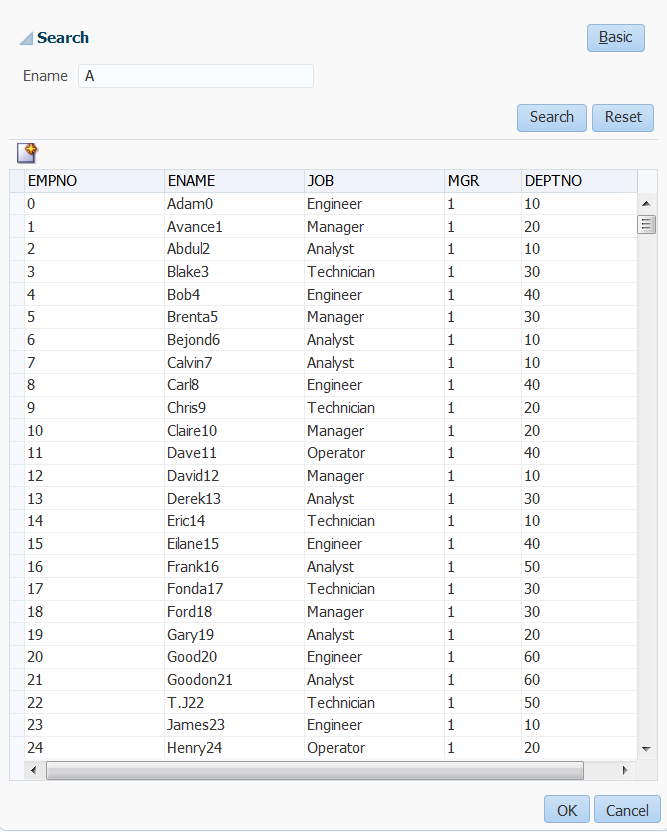
In this form, the employee name field is an LOV that contains a list of employees. When the user clicks the search icon of the inputListOfValues component, a Search and Select popup dialog displays all employees, along with a search field that allows the user to search for the employee, as shown in Figure 13-2. If the results table is empty, you can display a custom message via the resultTable facet.
Figure 13-2 The Search Popup Dialog for a List-of-Values Component

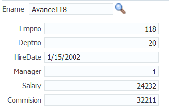
When the user returns to the page, the current information for that employee is displayed in the form, as shown in Figure 13-3. The user can then edit and save the data.
Figure 13-3 Form Populated Using LOV Component

As shown in the preceding figures, the inputListOfValues component provides a popup dialog from which the user can search for and select an item. The list is displayed in a table. In contrast, the inputComboboxListOfValues component allows the user two different ways to select an item to input: from a simple dropdown list, or by searching as you can in the inputListOfValues component.
You can also create custom content to be rendered in the Search and Select dialog by using the searchContent facet. You define the returnPopupDataValue attribute and programmatically set it with a value when the user selects an item from the Search and Select dialog and then closes the dialog. This value will be the return value from the ReturnPopupEvent to the returnPopupListener. When you implement the returnPopupListener, you can perform functions such as setting the value of the LOV component and its dependent components, and displaying the custom content. In the searchContent facet you can add components such as tables, trees, and input text to display your custom content.
If you implement both the searchContent facet and the ListOfValues model, the searchContent facet implementation will take precedence in rendering the Search and Select dialog. The following example shows the code to display custom content using a table component.
<af:inputListOfValues model="#{bean.listOfValuesModel}"
...
              returnPopupDataValue="#{bean.returnPopupDataValue}"
              returnPopupListener="#{bean.returnPopupListener}">
   <f:facet name="searchContent">
      <af:table id="t1" value="#{bean.listModel}" var="row"
      selectionListener="#{bean.selected}"
      ...
   </f:facet>
</af:inputListOfValues>
Both components support the auto-complete feature, which allows the user to enter a partial value in the input field, tab out (or click out), and have the dialog populated with one or more rows that match the partial criteria. For auto-complete to work, you must implement logic so that when the user tabs or clicks out after a partial entry, the entered value is posted back to the server. On the server, your model implementation filters the list using the partially entered value and performs a query to retrieve the list of values. ADF Faces provides APIs for this functionality. To configure the LOV input component to auto-complete using only the Search and Select dialog when no unique matching row is available, you need to add the following element to the adf-config.xml file:
If you want to add the auto-complete feature when the user tabs or clicks out after entering a partial entry, you will need to disable the custom popup. In your LaunchPopupListener() code, add launchPopupEvent.setLaunchPopup(false) to prevent the custom popup from launching when the user tabs or clicks out. Clicking on the Search link will still launch the Search and Select dialog. The following example shows the listener code in a managed bean that is used to disable the custom popup.
public void LaunchPopupListener(LaunchPopupEvent launchPopupEvent) {
    if (launchPopupEvent.getPopupType().equals
       (LaunchPopupEvent.PopupType.SEARCH_DIALOG)
    {
      ...

      launchPopupEvent.setLaunchPopup(false);
    }
}
In the situation where the user tabs out and no unique row match is available to auto-complete a partial input criteria (because duplicate values exist), the Search and Select dialog is displayed. When the user clicks out with a partial value and no unique row match is available, the user gets a validation error notifying them of duplicate values. In this case, you can optionally configure the Search and Select dialog to launch so the behavior for tab out and click out on duplicate values is the same (by default the dialog does not display for the click out action). To configure auto-complete to always use the Search and Select dialog when no unique matching row is available, you can add the following element to the adf-config.xml file
<adf-faces-config xmlns="http://xmlns.oracle.com/adf/faces/config">
    <lov-show-searchdialog-onerror>true</lov-show-searchdialog-onerror>
</adf-faces-config>
If the readOnly attribute is set to true, the input field is disabled. If readOnly is set to false, then the editMode attribute determines which type of input is allowed. If editMode is set to select, the value can be entered only by selecting from the list. If editMode is set to input, then the value can also be entered by typing.
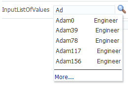
You can also implement the LOV component to automatically display a list of suggested items when the user types in a partial value. For example, when the user enters Ad, then a suggested list which partially matches Ad is displayed as a suggested items list, as shown in Figure 13-4. If there are no matches, a "No results found." message will be displayed.
Figure 13-4 Suggested Items List for an LOV

The user can select an item from this list to enter it into the input field, as shown in Figure 13-5.
Figure 13-5 Suggested Items Selected
You add the auto-suggest behavior by adding the af:autoSuggestBehavior tag inside the LOV component with the tag's suggestItems values set to a method that retrieves and displays the list. You can create this method in a managed bean. If you are using ADF Model, the method is implemented by default.
In your LOV model implementation, you can implement a smart list that filters the list further. You can implement a smart list for both LOV components. If you are using ADF Model, the inputComboboxListOfValues allows you declaratively select a smart list filter defined as a view criteria for that LOV. If the smart list is implemented, and auto-suggest behavior is also used, auto-suggest will search from the smart list first. If the user waits for two seconds without a gesture, auto-suggest will also search from the full list and append the results. The maxSuggestedItems attribute specifies the number of items to return (-1 indicates a complete list). If maxSuggestedItems > 0, a More link is rendered for the user to click to launch the LOV's Search and Select dialog. The following example shows the code for an LOV component with both auto-suggest behavior and a smart list.
af:autoSuggestBehavior
    suggestItems="#{bean.suggestItems}"
    smartList="#{bean.smartList}"/>
    maxSuggestedItems="7"/>
Figure 13-6 shows how a list can be displayed by an inputComboboxListOfValues component. If the popup dialog includes a query panel or smart list is not being used a Search link is displayed at the bottom of the dropdown list. If a query panel is not used or if smart list is enable, a More link is displayed.
Figure 13-6 InputComboboxListOfValues Displays a List of Employee Names

You can control when the contents of the dropdown list are sent and rendered to the client using the contentDelivery attribute. When set to immediate delivery, the contents of the list are fetched during the initial request. With lazy delivery, the page initially goes through the standard lifecycle. However, instead of fetching the list content during that initial request, a special separate partial page rendering (PPR) request is run, and the list content is then returned. You can configure the list so that its contents are not rendered to the client until the first request to disclose the content and the contents then remain in the cache (lazy), or so that the contents are rendered each time there is a request to disclose them (lazyUncached), which is the default.
How you set the contentDelivery attribute effects when the LaunchPopupEvent is queued. When contentDelivery is set to lazyUncached, this event is queued while displaying the dropdown panel. When contentDelivery is lazy, the event is queued only the first time the dropdown displays. When set to immediate, the LaunchPopupEvent is not queued at all.
The dropdown list of the inputComboboxListOfValues component can display the following:
-
Full list: As shown in Figure 13-6, a complete list of items returned by the
ListOfValuesModel.getItems()method. -
Favorites list: A list of recently selected items returned by the
ListOfValuesModel.getRecentItems()method. -
Search link: A link that opens a popup Search and Select dialog. The link is not on the scrollable region on the dropdown list.
-
customActionsfacet: A facet for adding additional content. Typically, this contains one or morelinkcomponents. You are responsible for implementing any logic for thelinkto perform its intended action, for example, launching a popup dialog.
The number of columns to be displayed for each row can be retrieved from the model using the getItemDescriptors() method. The default is to show all the columns.
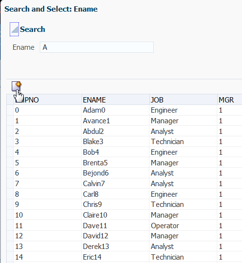
The popup dialog from within an inputListOfValues component or the optional search popup dialog in the inputComboboxListOfValues component also provides the ability to create a new record. For the inputListOfValues component, when the createPopupId attribute is set on the component, a toolbar component with a button is displayed with a create icon. At runtime, a button component appears in the LOV popup dialog, as shown in Figure 13-7.
Figure 13-7 Create Icon in Toolbar of Popup Dialog

When the user clicks the Create button, a popup dialog is displayed that can be used to create a new record. For the inputComboboxListOfValues, instead of a toolbar, a link with the label Create is displayed in the customActions facet, at the bottom of the dialog. This link launches a popup where the user can create a new record. In both cases, you must provide the code to actually create the new record.
Both the inputListOfValues and the inputComboboxListOfValues components support the context facet. This facet allows you to add the af:contextInfo control, which can be used to show contextual information. When the user clicks in this area, it launches a popup window displaying contextual information.
Tip:
Instead of having to build your own create functionality, you can use ADF Business Components and ADF data binding. For more information, see the "Creating an Input Table" section in Developing Fusion Web Applications with Oracle Application Development Framework.
Like the query components, the LOV components rely on a data model to provide the functionality. This data model is the ListOfValuesModel class. This model uses a table model to display the list of values, and can also access a query model to perform a search against the list. You must implement the provided interfaces for the ListOfValuesModel in order to use the LOV components.
Tip:
Instead of having to build your own ListOfValuesModel class, you can use ADF Business Components to provide the needed functionality. For more information, see the "Creating Databound Selection Lists and Shuttles" chapter of Developing Fusion Web Applications with Oracle Application Development Framework.
When the user selects an item in the list, the data is returned as a list of objects for the selected row, where each object is the rowData for a selected row. The list of objects is available on the ReturnPopupEvent event, which is queued after a selection is made.
If you choose to also implement a QueryModel class, then the popup dialog will include a Query component that the user can use to perform a search and to filter the list. Note the following about using the Query component in an LOV popup dialog:
-
The saved search functionality is not supported.
-
The
Querycomponent in the popup dialog and its functionality is based on the correspondingQueryDescriptorclass. -
The only components that can be included in the LOV popup dialog are
query,toolbar, andtable.
When the user clicks the Search button to start a search, the ListOfValuesModel.performQuery() method is invoked and the search is performed. For more information about the query model, see Using Query Components.
You should use the list-of-values components when you have a more complex selection process that cannot be handled by the simpler select components. With list-of-values components, you can filter the selection list using accessors, smart list, auto-suggest, and other features to fine-tune the list criteria. You can create custom content in the popup window. You can add code to the returnPopupListener to perform functions when the popup window closes. A customActions facet can be used to add additional content. A create feature allows the user to create a new record. The list-of-values components offer a rich set of data input features for easier data entry.
13.1.1 Additional Functionality for List-of-Values Components
You may find it helpful to understand other ADF Faces features before you implement your list-of-values components. Additionally, once you have added a list-of-value component to your page, you may find that you need to add functionality such as validation and accessibility. Following are links to other functionality that input components can use.
-
Client components: Components can be client components. To work with the components on the client, see Using ADF Faces Client-Side Architecture .
-
JavaScript APIs: All list-of-value components have JavaScript client APIs that you can use to set or get property values. For more information, see the JavaScript API Reference for Oracle ADF Faces.
-
Events: List-of-value components fire both server-side and client-side events that you can have your application react to by executing some logic. For more information, see Handling Events.
-
You can add validation and conversion to list-of-values components. For more information, see Validating and Converting Input.
-
You can display tips and messages, as well as associate online help with list-of-values components. For more information, see Displaying Tips, Messages, and Help.
-
There may be times when you want the certain list-of-values components to be validated before other components on the page. For more information, see Using the Immediate Attribute.
-
You may want other components on the page to update based on selections you make from a list-of-values component. For more information, see Using the Optimized Lifecycle.
-
You can change the appearance of the components using skins. For more information, see Customizing the Appearance Using Styles and Skins.
-
You can make your list-of-values components accessible. For more information, see Developing Accessible ADF Faces Pages.
-
Instead of entering values for attributes that take strings as values, you can use property files. These files allow you to manage translation of these strings. For more information, see Internationalizing and Localizing Pages.
-
The LOV components use the query component to populate the search list. For more information on the query component, see Using Query Components.
-
Other list components, such as
selectOneChoice, also allow users to select from a list, but they do not include a popup dialog and they are intended for smaller lists. For more information about select choice components, list box components, and radio buttons, see Using Input Components and Defining Forms . -
If your application uses ADF Model, then you can create automatically bound forms using data controls (whether based on ADF Business Components or other business services). For more information, see the "Creating a Basic Databound Page" chapter of Developing Fusion Web Applications with Oracle Application Development Framework.
13.2 Creating the ListOfValues Data Model
A ListofValues data model is a collection of interface classes. The ListofValues data model uses the ADF Faces API to access the LOV functionality.
Before you can use the LOV components, you must have a data model that uses the ADF Faces API to access the LOV functionality. For more information on the LOV data model, see the Java API Reference for Oracle ADF Faces.
13.2.1 How to Create the ListOfValues Data Model
Before you begin:
It may be helpful to have an understanding of the list-of-values data model. For more information, see Creating the ListOfValues Data Model.
You may also find it helpful to understand functionality that can be added using other ADF Faces features. For more information, see Additional Functionality for List-of-Values Components.
To create a ListOfValues model and associated events:
13.3 Using the inputListOfValues Component
Using the inputListOfValues component you can select from list of values to help populate the LOV field on a page. You can use this component when the list of values to display is too large.
The inputListOfValues component uses the ListOfValues model you implemented to access the list of items, as documented in Creating the ListOfValues Data Model.
13.3.1 How to Use the InputListOfValues Component
Before you begin:
It may be helpful to have an understanding of the inputListOfValues component. For more information, see Using the inputListOfValues Component.
You may also find it helpful to understand functionality that can be added using other ADF Faces features. For more information, see Additional Functionality for List-of-Values Components.
You will need to complete this task:
- Create a page or page fragment. If you also implemented the search API in the model, the component would also allows the user to search through the list for the value.
To add an inputListOfValues component:
13.3.2 What You May Need to Know About Skinning the Search and Select Dialogs in the LOV Components
By default, the search and select dialogs that the InputComboboxListOfValues and InputListOfValues components can be resized by end users when they render. You can disable the end user's ability to resize these dialogs by setting the value of the -tr-stretch-search-dialog selector key to false in your application's skin file, as shown in the following example. The default value of the -tr-stretch-search-dialog selector key is true. For more information about skinning, see the skinning chapter.
af|inputComboboxListOfValues{
  -tr-stretch-search-dialog: false;
}
af|inputListOfValues{
  -tr-stretch-search-dialog: false;
}
13.4 Using the InputComboboxListOfValues Component
Using the inputComboboxListOfValues component you can select from a list of values to populate the LOV field on a page. The component also allows you to add a search link at the bottom of the populated list dropdown panel to launch the Search and Select dialog.
The inputComboboxListOfValues component allows a user to select a value from a dropdown list and populate the LOV field, and possibly other fields, on a page, similar to the inputListOfValues component. However, it also allows users to view the values in the list either as a complete list, or by most recently viewed. You can also configure the component to perform a search in a popup dialog, as long as you have implemented the query APIs, as documented in Creating the ListOfValues Data Model.
For more information about skinning and the Search and Select dialog sizing, see What You May Need to Know About Skinning the Search and Select Dialogs in the LOV Components.
13.4.1 How to Use the InputComboboxListOfValues Component
Before you begin:
It may be helpful to have an understanding of the inputComboboxListOfValues component. For more information, see Using the InputComboboxListOfValues Component.
You may also find it helpful to understand functionality that can be added using other ADF Faces features. For more information, see Additional Functionality for List-of-Values Components.
To add an inputComboboxListOfValues component: