2 ADF Faces Components Demo Application
This chapter contains the following sections:
2.1 About the ADF Faces Components Demo Application
The ADF Faces Components demo application showcases the various components and framework capabilities and allows users to try different property settings on the selected component. The components demo is provided with full source code.
ADF Faces includes the ADF Faces Components Demo application that allows you both to experiment with running samples of the components and architecture features and to view the source code.
The ADF Faces Components Demo application contains the following:
-
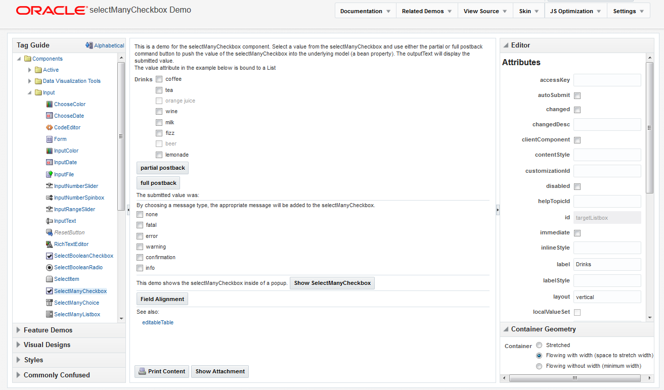
Tag guide: Demonstrations of ADF Faces components, validators, converters, and miscellaneous tags, along with a property editor to see how changing attribute values affects the component. Figure 2-1 shows the demonstration of the
selectManyCheckboxcomponent. Each demo provides a link to the associated tag documentation. -
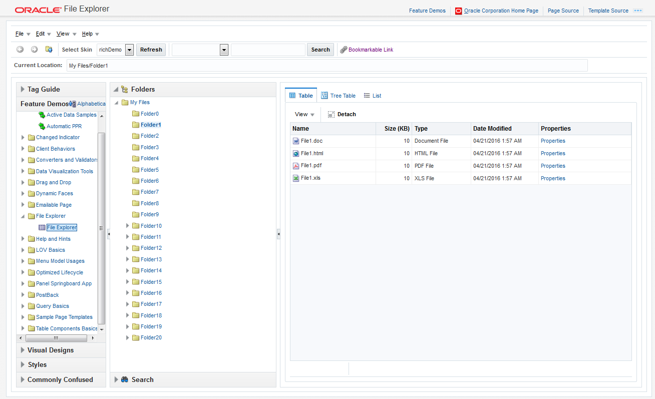
Feature demos: Various pages that demonstrate different ways you can use ADF components. For example, the File Explorer is an application with a live data model that displays a directory structure and allows you to create, save, and move directories and files. This application is meant to showcase the components and features of ADF Faces in a working application, as shown in Figure 2-2.
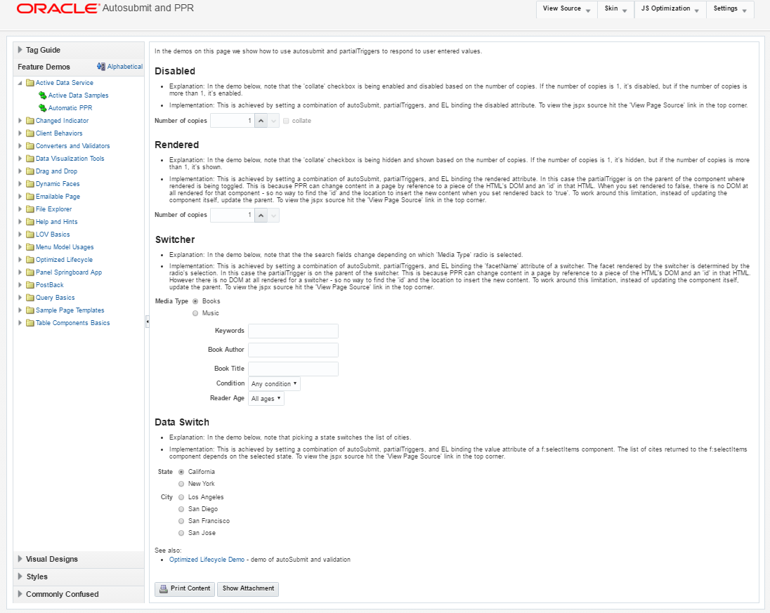
Other pages demonstrate the main architectural features of ADF Faces, such as layout components, Ajax postback functionality, and drag and drop. Figure 2-3 shows the demonstration on using the
AutoSubmitattribute and partial page rendering. -
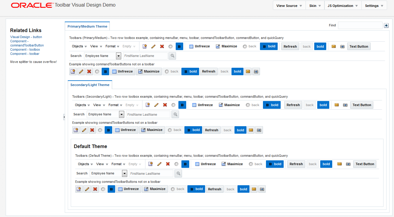
Visual designs: Demonstrations of how you can use types of components in different ways to achieve different UI designs. Figure 2-4 shows how you can achieve different looks for a toolbar.
-
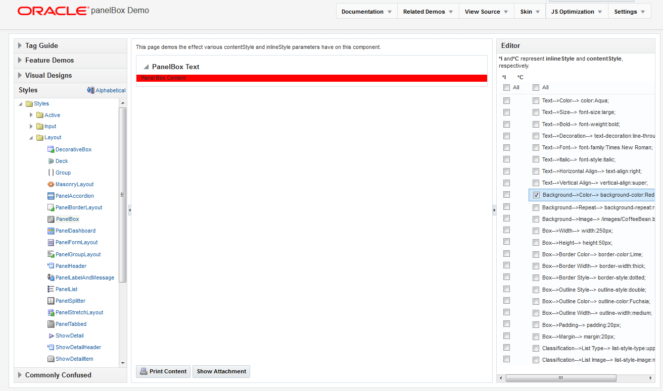
Styles: Demonstration of how setting inline styles and content styles affects components. Figure 2-5 shows different styles applied to the
panelBoxcomponent. -
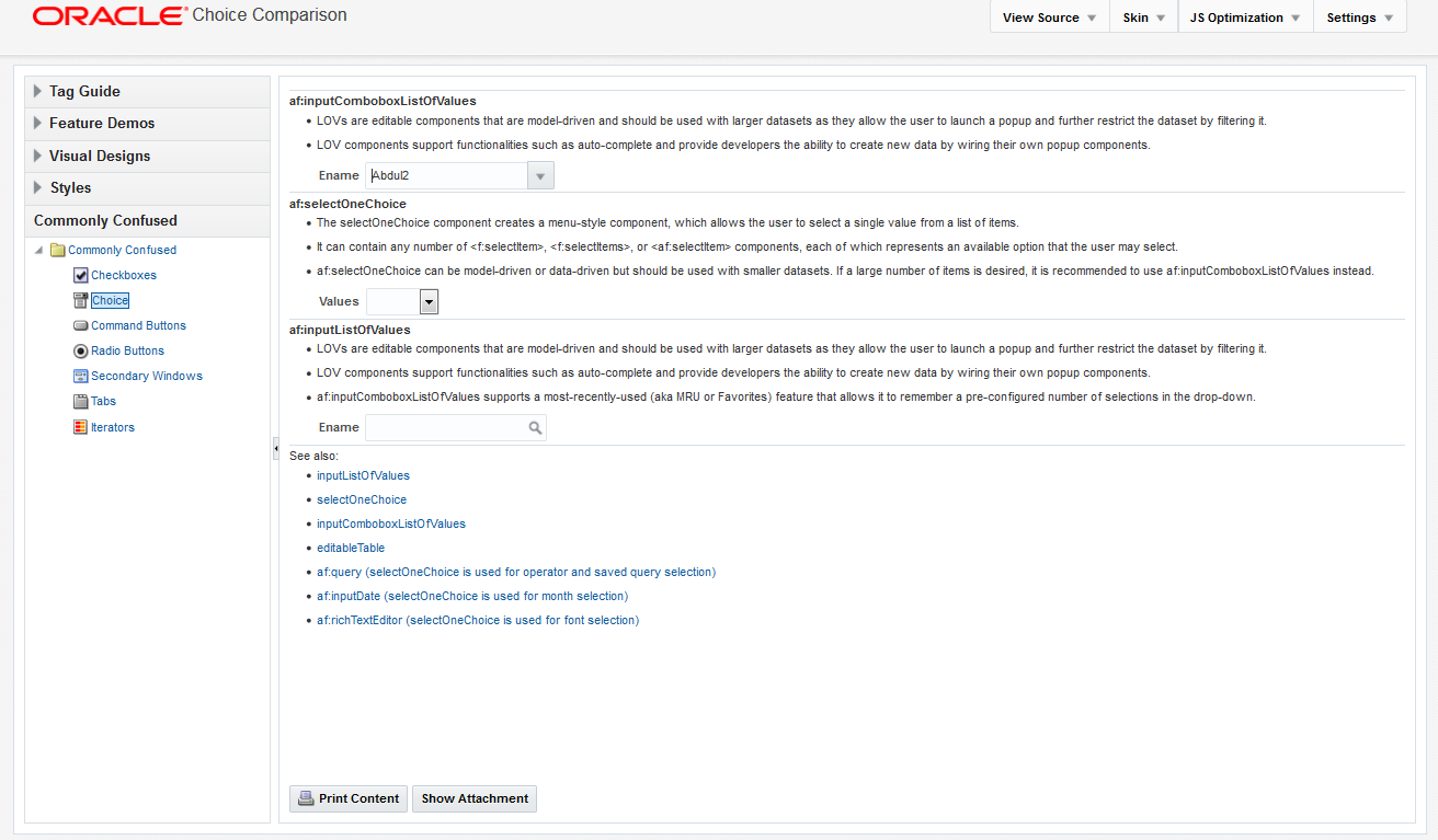
Commonly confused components: A comparison of components that provide similar functionality. Figure 2-6 shows the differences between the various components that display selection lists.
Additional Components of the File Explorer in the Demo Application
Because the File Explorer is a complete working application, many sections in this guide use that application to illustrate key points, or to provide code samples. The source for the File Explorer application can be found in the fileExplorer directory.
The File Explorer application uses the fileExplorerTemplate page template. This template contains a number of layout components that provide the basic look and feel for the application. For information about layout components, see Organizing Content on Web Pages. For information about using templates, see Creating and Reusing Fragments, Page Templates, and Components.
The left-hand side of the application contains a panelAccordion component that holds two areas: the directory structure and a search field with a results table, as shown in Figure 2-7.
Figure 2-7 Directory Structure Panel and Search Panel
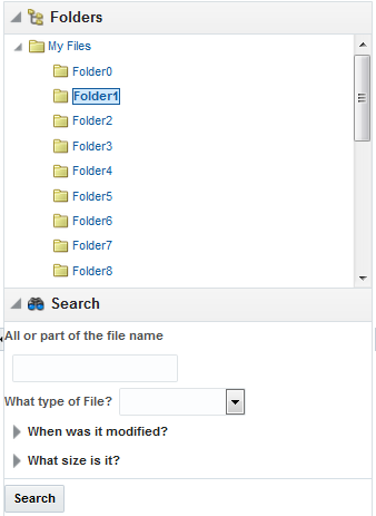
Description of "Figure 2-7 Directory Structure Panel and Search Panel"
You can expand and collapse both these areas. The directory structure is created using a tree component. The search area is created using input components, a button, and a table component. For information about using panelAccordion components, see Displaying or Hiding Contents in Panels. For information about using input components, see Using Input Components and Defining Forms . For information about using buttons, see Working with Navigation Components. For information about using tables and trees, see Using Tables, Trees, and Other Collection-Based Components.
The right-hand side of the File Explorer application uses tabbed panes to display the contents of a directory in either a table, a tree table or a list, as shown in Figure 2-8.
Figure 2-8 Directory Contents in Tabbed Panels
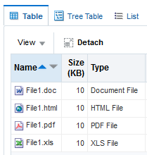
Description of "Figure 2-8 Directory Contents in Tabbed Panels"
The table and tree table have built-in toolbars that allow you to manipulate how the contents are displayed. In the table an list, you can drag a file or subdirectory from one directory and drop it into another. In all tabs, you can right-click a file, and from the context menu, you can view the properties of the file in a popup window. For information about using tabbed panes, see Displaying or Hiding Contents in Panels. For information about table and tree table toolbars, see Displaying Table Menus, Toolbars, and Status Bars. For information about using context menus and popup windows, see Using Popup Dialogs, Menus, and Windows.
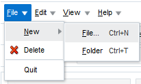
The top of the File Explorer application contains a menu and a toolbar, as shown in Figure 2-9.
The menu options allow you to create and delete files and directories and change how the contents are displayed. The Help menu opens a help system that allows users to provide feedback in dialogs, as shown in Figure 2-10.
Figure 2-10 Help System
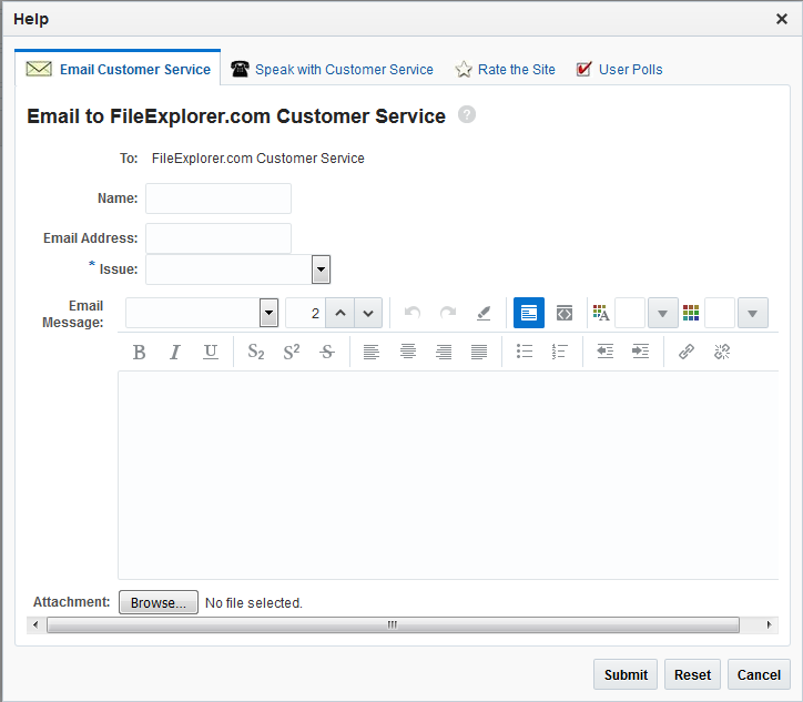
The help system consists of a number of forms created with various input components, including a rich text editor. For information about menus, see Using Menus in a Menu Bar. For information about creating help systems, see Displaying Help for Components. For information about input components, see Using Input Components and Defining Forms .
Within the toolbar of the File Explorer are controls that allow you navigate within the directory structure, as well as controls that allow you to change the look and feel of the application by changing its skin. Figure 2-11 shows the File Explorer application using the simple skin.
Figure 2-11 File Explorer Application with the Simple Skin
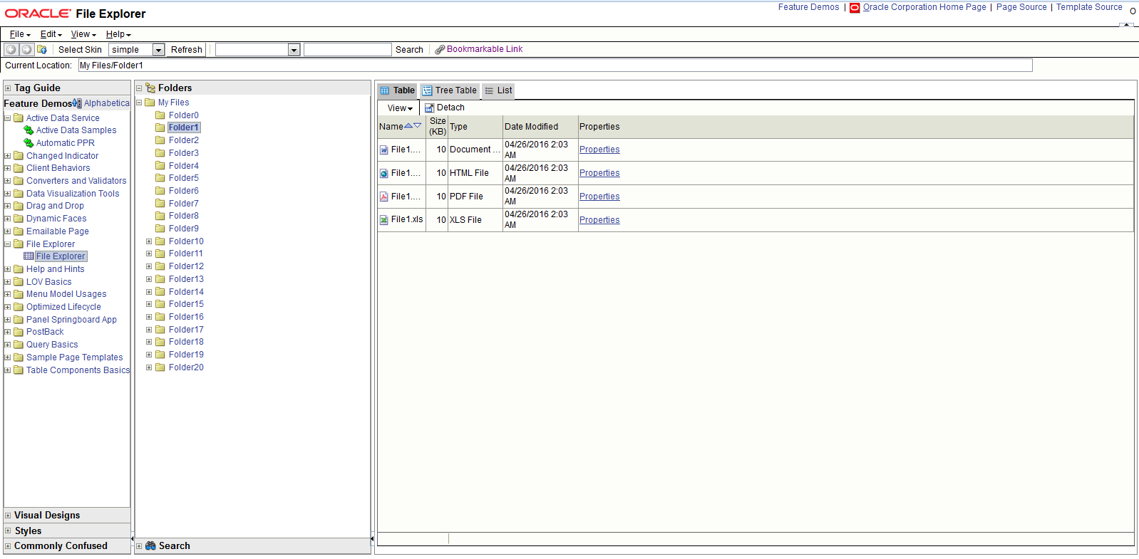
Description of "Figure 2-11 File Explorer Application with the Simple Skin"
For information about toolbars, see Using Toolbars. For information about using skins, see Customizing the Appearance Using Styles and Skins.
2.2 Downloading and Installing the ADF Faces Components Demo Application
You can download and install the ADF Faces Components Demo application from Oracle Technology Network (OTN) web site; you can open and view the demo using JDeveloper when you want to view samples of ADF Faces components and to understand features.
In order to view the demo application (both the code and at runtime), install JDeveloper, and then download and open the application within JDeveloper.
You can download the ADF Faces Components Demo application from the Oracle Technology Network (OTN) web site. Navigate to http://www.oracle.com/technetwork/developer-tools/adf/overview/ index-092391.html and click the ADF Faces Components Demo link in the Download section of the page. The resulting page provides detailed instructions for downloading the WAR file that contains the application, along with instructions for deploying the application to a standalone server, or for running the application using the Integrated WebLogic Server included with JDeveloper.
If you do not want to install the application, you can run the application directly from OTN by clicking the ADF Faces Rich Client Components Hosted Demo link.
