| Oracle® HTML DB User's Guide Release 1.5 Part Number B10992-01 |
|


|
View PDF |
| Oracle® HTML DB User's Guide Release 1.5 Part Number B10992-01 |
|
|
View PDF |
This section provides information on how to use Application Builder. Application Builder is the tool you use to build the pages that comprise an application.
This section contains the following topics:
|
See Also: |
You use Application Builder to build dynamically rendered applications in Oracle HTML DB. An application is a collection of database-driven Web pages linked together using tabs, buttons, or hypertext links.
A page is the basic building block of an application. Each page can have buttons and fields (called items) and can include application logic (or processes). You can branch from one page to the next using conditional navigation, perform calculations (called computations), validations (such as edit checks), and display reports, calendars, and charts.
Topics in this section include:
An application is a collection of pages that share a common session state definition and authentication method. Application Builder is the tool you use to build the pages that comprise an application.
To access the Application Builder home page, navigate to the Development tab and click Application Builder. The Application Builder home page appears. The sections that follow describe the Application Builder home page.
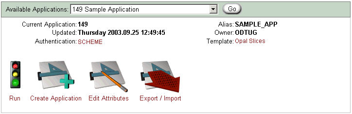
Use the Available Applications list (see Figure 7-1) to select an existing application and then click Go.
The current application ID, last update date, application authentication scheme, the application alias, the application owner, and selected template display directly beneath the list. You can run an existing application, create a new application, edit application attributes, or export information by clicking the following icons:
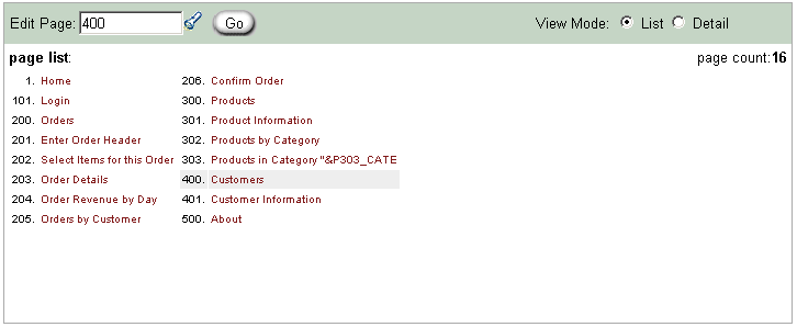
As shown in Figure 7-2, a page list displays at the bottom of the page. To access a specific page, enter a page ID in the Edit Page field and click Go. To change the view mode, select List or Detail.
List view displays only the page ID and page name. To edit a page, drill down on the page name. Detail view displays a report of all pages that comprise your application. To sort, click the column headings. The report displays the page ID, name, and counts of all components on the page.
The Application Navigation pane displays on the left side of the page. Click Navigate to expand or collapse the list.
As shown in Figure 7-3, the available links include:
Application list displays all applications in your workspace to which you have edit access. Change the view by selecting List or Detail at the top of the page. To edit an application in Detail view, click the edit icon. To edit an application in List view, select the application name.
Page grid edit displays an editable table of all pages in the currently selected application. To apply your edits, click Apply Changes. To create a new page using the Create Page Wizard, click Create New. To edit a page, click the edit icon.
History displays counts of changes to applications aggregated by user by day.
Reports displays links to summary application reports. Summary Reports offer interesting summary information such as details about customized regions, component counts, and related pages in the current application. Utilization Reports offer information specific to how components are utilized on each page.
Application Utilities offers quick access utilities that enable you to manage translations, cascading style sheets, images, and export and import applications.
You can view, create, and edit the components that define a page by accessing a Page Definition.
To view the Page Definition for an existing page:
Click the Build icon.
From the Available Applications list, select an application and click Go.
The list of pages for the selected application appears at the bottom of the page.
To edit a specific page, you can either:
Enter the page ID in the Edit Page field and click Go
Click the page name
As shown in Figure 7-4, the Page Definition appears.
Every Page Definition is divided into four sections as described in Table 7-1.
Table 7-1 Page Definition Page
| Section | Description |
|---|---|
| Navigation Pane | Enables you to link to another page, run the current page, edit item help as well as display navigation links and page reports.
See Also: "Using the Page Navigation Pane" for more information |
| Page Rendering | Defines all attributes for the page, regions, buttons, items, page rendering computations and page level processes.
See Also: "Viewing Page Attributes" and "Managing Page Rendering Components" for more information |
| Page Processing | Specifies page level application logic such as computations, validations, processes, and branching.
See Also: "About Page Processing Components" for more information |
| Shared Components | Displays application components that can be shared among multiple pages.
See Also: "Creating Tab Sets", "Creating a Navigation Bar", "Creating Menus", "Creating Lists", and "Editing Templates" |
The Page Navigation pane displays on the left side of the page. Available options include:
Page. Use this field to link to other pages. To access a page directly, enter a page ID and click Go. To access the previous or next page ID, click the arrow buttons.
Run Page. Submits the pages in the current application to the HTML DB engine. The HTML DB engine then renders the pages into viewable HTML.
Edit Item Help. Enables you to edit help text associated with all items on the current page. Item help text serves as context sensitive help for users of an application.
Navigate. Expandable list offering quick access to wizards for creating lists, lists of values, menus, security, tabs, and templates. Click Navigate to expand or collapse the list.
Page Reports. Expandable list offering access to page reports. Click Page Reports to expand or collapse the list.
|
See Also:
|
Every Page Definition includes a Page Reports list in the left navigation pane. Each report offers a different presentation of the components that define the page.
To access the Page Reports link:
Click the Build icon.
From the Available Applications list, select an application and click Go.
The list of pages for the selected application appears at the bottom of the page.
To access the Page Definition for a specific page, you can either:
Enter the page ID in the Edit Page field and click Go
Click the page name
Click Page Reports in the left navigation pane to expand the list.
Click the appropriate page report link.
The sections that follow describe available page reports.
Clicking All Conditions displays the Conditions Report. This report describes all currently defined conditions on the current page for regions, buttons, items, computations, validations, processes, and branches.
A condition is a small unit of logic that enables you to control the display of regions, items, buttons, and tabs and the execution of processes, computations, and validations. When you apply a condition to a component, the condition is evaluated. Whether the condition passes or fails determines whether the component displays, or whether a logic control (process, computation, validation) is executed.
Clicking Event View displays the Page Event View report. This report details all currently defined page components and processes. It provides a chronological view of how and in what order the HTML DB engine renders the page, invokes logic, and runs processes. A graphical legend in the left navigation pane identifies the component type. You can choose from two view options:
Show All displays all possible page components and processes, including those not currently defined.
Show Used displays currently used page components and processes (Default).
To view details about a specific page component or process, click the appropriate hypertext link.
To run the current page, click Run. To create a new page, click Create.
History displays the Recent Changes report. Recent Changes displays recent edits for the current page by developer, application, page ID, modification date, attribute, and action. History lists a history of edited pages by page ID, page name, developer, and edit date.
Page Detail displays the detailed report describing all currently defined page components and processes. Select the following options at the top of the page to display or hide information:
All. Enabled by default. Displays detailed information about the current page including defined regions, items, buttons, processes, validations, branches, and computations.
Regions, Items, and Buttons. Displays detailed information of all items and button defined in each region of the page.
Processes. Displays details about defined processes including source code.
Validations. Displays any defined validations performed on the current page.
Branches. Displays information about branching performed on the current page.
Computations. Displays details about computations on the current page defined at the page or application level.
Related Pages displays the Related Pages and Components report. This report displays all components that point to the current page, including menus, branches, tabs, navigation bar icons, and list entries. To edit a component, click the component name.
Summary of All Pages displays the Page Component Counts report. This report lists all defined components by page.
Clicking Tree View displays the Page Tree report. Use this page to view and edit page attributes using the following hierarchy:
. Page
. . . Regions
. . . . . Items
. . . . . Buttons
. . . Process
. . . Computations
. . . Validations
. . . Branches
To edit an attribute, simply select it.
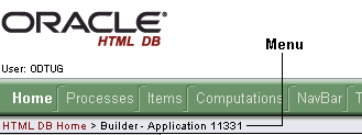
Users who log in to Oracle HTML DB having developer privileges have access to the Developer toolbar. The Developer toolbar offers a quick way to edit the currently selected page, create a new page, control, or component, view session state, or turn edit links on an off.
As shown in Figure 7-5, the Developer toolbar displays at the bottom of every page in a running application. It offers a quick way to edit the currently selected page, create a new page, control, or component, view session state, or toggle edit links on or off.
The Developer toolbar consists of the following links:
Edit Application links you to the Application Builder home page. (See "Viewing a Page Definition".)
Edit Page.accesses the Page Definition for the currently running page. (See "Editing Page Attributes".)
New links to a wizard that enables you to create a new blank page, component (report, chart, or form), page control (region, button, or item), or a shared component (menu, list, or tab).
Session links you to session state information for the current page. (See "Viewing Session State".)
Debug runs the current page in debug mode. (See "Accessing Debug Mode".)
Show edit links toggles between Show edit links and Hide edit links. Clicking Show edit links displays an edit link (resembling four gray dots) to the right of most page components or controls. By clicking an edit link you can edit the selected component or control.
You create a new application in Oracle HTML DB using the Create Application Wizard. You delete an application from the Application Builder home page.
Topics in this section include:
|
See Also: "Viewing Application Attributes" and "Editing Application Attributes" for more information on application attributes |
You can use the Create Application Wizard to create a new application having up to nine pages.
To create an application using the Create Application Wizard:
Click the Build icon.
Application Builder appears.
Click the Create Application icon.
Choose the method by which you want to create your application:
From Scratch. Enables you to define tabs, select a user interface (UI), and many other options.
Based on an Existing Application. Creates a copy of another application, including any authentication settings, but without any the pages. Select this option to create an application using the same user interface templates as the application you are copying.
Based on Existing Tables. Creates a complete application based on existing tables you specify. Includes a menu, breadcrumb menus, report page, form page, and a chart page. Select this option if you have a single table from which you would like to create a report and insert, update and delete rows.
Follow the on-screen instructions.
You can delete an application from the Application Builder home page, or while editing application attributes. If you delete an application you also delete all defined attributes including templates, processes, buttons, and pages.
To delete an application from Application Builder home page:
Click the Build icon.
From the Available Applications list, select an application and click Go.
The list of pages for the selected application appears at the bottom of the page.
From the Tasks list, select Delete this Application.
Follow the on-screen instructions.
To delete an application while editing application attributes:
Click the Build icon.
From the Available Applications list, select an application and click Go.
The list of pages for the selected application appears at the bottom of the page.
Select the Edit Attributes icon.
The Edit Application Attributes page appears.
Verify the application ID.
To delete the current application, click Delete.
You can create a new page in your application by clicking Create on the Page Definition page, selecting the New... link on the Developer toolbar, or by using a page wizard.
Topics in this section include:
Oracle HTML DB supports two types of graphical charts:
HTML
SVG
SVG (Scalable Vector Graphics) is an XML-based language for Web graphics from the World Wide Web Consortium (W3C). SVG charts are defined using an embed tag.
When evaluating whether an SVG chart is appropriate chart type for your application remember that:
Some Web browsers do not support SVG charts
Most Web browsers that support SVG charts require users download an SVG plug-in
You define charts in Oracle HTML DB using a wizard in which you define a SQL query using the following syntax:
SELECT LINK, LABEL, VALUE
FROM   ...
LINK is an URL, LABEL is the text that displays in the bar, and VALUE is the numeric column that defines the bar size.
For example:
SELECT null, ename, sal
FROM   scott.emp
WHERE  deptno = :P101_DEPTNO
To create a new page while viewing a Page Definition:
Click the Build icon.
From the Available Applications list, select an application and click Go.
The list of pages for the selected application appears at the bottom of the page.
Navigate to a specific page, by either:
Entering the page ID in the Edit Page field and click Go
Clicking the page name
Under Page in Page Rendering, click Create.
Follow the on-screen instructions.
Users who log in to Oracle HTML DB having developer privileges have access to the Developer toolbar. The Developer toolbar displays at the bottom every page and offers a quick way create a new page.
To create a new page from the Developer toolbar:
Oracle HTML DB includes the following types of wizards for creating pages:
Wizards that add discrete controls such as regions, items, and validations to an existing page
Wizards that add an entire component (such as a report or chart) to an existing page
Wizards that create one or more new pages with components on them
To create a new page using a page wizard:
Click the Build icon.
From the Available Applications list, select an application and click Go.
The list of pages for the selected application appears at the bottom of the page.
Select the Wizards tab.
The Create Page(s) Wizards page appears.
Select the type of page or pages you would like to create.
Follow the on-screen instructions.
You can delete a page while editing page attributes.
To delete a page:
Click the Build icon.
From the Available Applications list, select an application and click Go.
The list of pages for the selected application appears at the bottom of the page.
Navigate to a specific page, by either:
Entering the page ID in the Edit Page field and click Go
Clicking the page name
Under Page, click Edit.
Under Primary Page Attributes, verify the page and application ID.
To delete the page, click Delete at the top of the page.
Follow the on-screen instructions.
Templates control the look and feel of the pages in your application. Oracle HTML DB includes a number of templates each of which has a distinctive theme.
Topics in this section include:
|
See Also: |
You view and edit templates on the Templates page.
To view a template from the Templates tab:
Click the Build icon.
Select the Templates tab.
The Templates page appears.
To view an existing template, click the template name.
You can also access the Templates page from the Shared Components section of Page Definition.
A cascading style sheet (CSS) provides a way to control the style of a Web page without changing its structure. When used properly, a CSS separates visual attributes such as color, margins, and fonts from the structure of the HTML document. Oracle HTML DB includes page templates with built-in UI themes which reference their own CSS. The style rules defined in each CSS for a particular theme also determine the way reports and regions look. When you copy templates from the Oracle HTML DB gallery, make sure you select templates that match the UI theme you are currently using.
If you need to create a custom template, it is generally simplest to start with an existing template and then modify it. Once you have created one or more default templates, you can modify those templates to fit your specific needs. The Templates page is grouped by UI themes.
To create a custom template:
Click the Build icon.
Select the Templates tab.
At the top of the Templates page, click Create.
Select the type of template you would like to create.
Select a creation method:
Start with a default template
From scratch
As a copy of an existing template
Follow the on-screen instructions.
You can also make a copy of an existing template by scrolling down to the appropriate template type and click Create/copy.
Once you create a custom template, you can quickly edit it by clicking the edit icon.
To edit an existing template:
Click the Build icon.
Select the Templates tab.
Locate the template you wish to edit and click the edit icon.
Follow the on-screen instructions.
As you edit templates, you can make changes in one window and run your application in another by selecting Return to page. Selecting this check box, keeps the page you are editing current after you click Apply Changes.
Topics in this section include:
Templates define the appearance of a page. Each template consists of a header template, a body template, a footer template, and a number of subtemplate definitions. If you do not specify a page template as a page level attribute, then the HTML DB engine uses the default page template defined on the Edit Application Attributes page.
Page templates combine static HTML with substitution strings which are replaced at runtime. You use substitution strings to indicate the existence and placement of a component within a page template. You can further specify how a component should display using subtemplates.
Table 7-2 describes the available page template substitution strings. Note that all template substitution strings must be in upper case and begin and end with a pound sign (#).
Table 7-2 Page Template Substitution Strings
| Substitution String | Description |
|---|---|
#ONLOAD# |
May be used in the Header and Footer section of the page template and should be placed inside the <body> html tag. For example:
<body #ONLOAD#> Use this string as substitute in a JavaScript call to be executed when a page is loaded by the Web browser. The JavaScript to be called can vary for each page. |
#TITLE# |
Defines the page title. Typically included within HTML title tags. |
#NAVIGATION_BAR# |
Defines the existence of navigation bar icons. A navigation bar will appear on every page in your application that uses a template which includes this substitution string.You can expand this substitution string using the Navigation bar subtemplate. |
#FORM_OPEN# |
Specifies where the HTML open form tag <form> is placed. You must include this substitution string in order to submit a form.
You do not need to code your own form open, the HTML DB engine does it for you. |
#NOTIFICATION_MESSAGE# |
Enables developers to communicate messages to the user. Defines where a summary of inline error messages is displayed. Inline error message that can be displayed next to a field, or inline in the notification area or both. |
#SUCCESS_MESSAGE# |
Defines where in the page success and error message appear. If the page process runs without raising an error, then this text displays.
You can customize the display of the success message for each template by adding HTML to be displayed before and after the success message. |
#BOX_BODY# |
Identifies where the Body displays. If the Body is null, then #BOX_BODY# will be used instead. |
#TAB_CELLS# |
Identifies the display of standard tabs.
See Also: "About Standard Tab Attributes" for more information on defining Standard Tab Attributes |
#PARENT_TAB_CELLS# |
Identifies the display of parent tabs. Parent tabs require standard tabs. If your application only has one level tabs, you do not need this substitution string.
See Also: "About Standard Tab Attributes" for more information on defining Parent Tab Attributes |
#NAVIGATION_BAR# |
Identifies the display of navigation bar icons. Does not require an HTML table or row to be opened. The navigation bar is intended to display icons for use in meta navigation such as a help or log out icon. You can expand #NAVIGATION_BAR# using the Navigation Bar subtemplate.
See Also: "About Subtemplate Definitions" for more information on Navigation Bar subtemplate |
#FORM_CLOSE# |
If a #FORM_OPEN# is included, then you must include a #FORM_CLOSE# in the header, body, or footer template. #FORM_OPEN# must appear before the #BOX_BODY# and #FORM_CLOSE# must appear after the #BOX_BODY# substitution string. |
#REGION_POSITION_NN# |
Identifies the exact placement of regions within a page. If no region is specified (for example, #REGION_POSITION_01#) then #REGION_POSITION_01# will be replaced with nothing. |
#GLOBAL_NOTIFICATION# |
Displays the Global Notification attribute. Global notifications are intended to communicate system status, such as a pending system downtime. You can also use HTMLDB_APPLICATION.G_GLOBAL_NOTIFICATION to set this value if you wish to set it programmatically
See Also: "About Global Notifications" for more information on the Global Notification attribute |
#HEAD# |
Used after the <head> open tag, but before the </head> close tag. You can optionally define the contents of #HEAD# for each page (for example, to reference additional style sheets or JavaScript libraries). |
The sections that follow describe specific sections of the Edit Page Template page.
Application ID identifies the application to which this template corresponds. Name identifies the template name used by application developers to identify the template.
Enables you to apply an existing template to the current application. When you select an existing template, you become a subscriber to that template.
To load a new copy of a master template, click Refresh.
Each template consists of a header, a body, a footer, and subtemplate definitions. Use substitution strings to indicate the existence of a component on a page template. All template substitution strings must be in upper case and begin and end with a pound sign (#). You can include the substitution strings listed.
Header is the first section of the page template. When displaying regions or executing processes or computations AFTER HEADER, they will display or execute immediately after this section in the template is rendered.
Body is the second section in the page template and is rendered after the header and before the footer section. At a minimum, you must include the #BOX_BODY# substitution string.
Footer is the third section.
Use Subtemplate Definitions to specify how a component should display. Available subtemplate definitions include:
Success Message. Expands the #SUCCESS_MESSAGE# substitution string. You can define a success message either programmatically, or as an attribute of a process. If a success message exists and if the page template includes the #SUCCESS_MESSAGE# substitution string, then this subtemplate is used to render the message.
Navigation Bar. Controls the display of navigation bar icons. This subtemplate is only relevant if the #NAVIGATION_BAR# substitution string is identified in your page template. Use the #BAR_BODY# substitution string to identify where each navigation bar icon should display.
Notification. Alerts the user that validation errors have occurred. This subtemplate expands the #NOTIFICATION _MESSAGE# substitution string. Notification messages will not be display unless the #NOTIFICATION_MESSAGE# substitution string is included in the page template.
You MUST populate this attribute if your application includes standard tabs. Standard tabs may be placed in the header, body, or footer sections of the page template using the #TAB_CELLS# substitution string. The page template Header/Body/Footer defines the HTML table and rows. This subtemplate defines how these tabs display by defining the specific cell. Available attributes include:
Current Tab. Defines the subtemplate to use for standard tabs that are selected (or current) Whether or not a tab is current is determined by standard tab attributes and the page displays. Use #TAB_TEXT# to position a tab's label and link within the template.
Non Current Standard Tab. Defines the subtemplate to use for standard tabs that are not current. Use #TAB_TEXT# to position a tab's label and link within the template.
You MUST populate this attribute if your application includes two levels of tabs. Parent tabs may be placed in the header, body, or footer section of the page template using the #PARENT_TAB_CELLS# substitution string. Parent tabs only display in conjunction with standard tabs. Available attributes include:
Current Parent Tab. Defines the subtemplate to use for parent tabs that are selected (or current). Whether or not a tab is current is determined by the page that displays and the standard tab set the page uses. Use #TAB_TEXT# to position a tab's label and link within the template.
Non Current Parent Tab. Defines the subtemplate to use for parent tabs that are not current. Use #TAB_TEXT# to position a tab's label and link within the template.
Each region is assigned a column and a display sequence within that column. When regions are placed in more than one column, Oracle HTML DB renders the regions using an HTML table. This attribute will be used in the <table> tag used for the layout.
Use this attribute only when a page template will be designated as an error template. Use #MESSAGE# to place the error message and #BACK_LINK# to display a link back to the previous page. A template can be designated as an error template by editing the application attributes. For example:
#MESSAGE#

<br>

<a href="#BACK_LINK#">back</a>
You can use build options to enable or disable functionality. Most application attributes have a build option attribute.
Build Options have two possible values: INCLUDE and EXCLUDE. A component that is excluded is not considered part of the application definition at runtime.
Regions templates control the appearance and placement of region attributes. Region templates frequently use HTML tables to arrange content.
Region templates apply style elements to regions. Region templates display substitution strings. #BODY# (the only required substitution string) identifies where the source of the region should be placed. All other substitution strings are optional. You can use these substitution strings to indicate the existence and placement of a component (such as a button) within the region.
The topics that follow describe specific sections of the Edit Region Template page.
Application ID Identifies the application to which this template corresponds. Name identifies the template name used by developers to identify the template.
Applies an existing template to the current application. When you select an existing template, you become a subscriber to that template.
To load a new copy of a master template, click Refresh.
#BODY# (the only required substitution string) identifies where the source of the region should be placed. All other substitution strings are optional.
When you create a button in a region position, the positions you have defined will appear in a select list. Use the following substitution strings to define positions for placement of buttons in a region:
#EDIT#
#CLOSE#
#CREATE#
#EXPAND#
#HELP#
#DELETE#
#COPY#
#NEXT#
#PREVIOUS#
Report templates are used to apply formatting and style elements to reports. Each report template identifies column names using the syntax #1#, #2#, #3# and so on. You can also name columns using column name substitution syntax such as #ENAME# or #EMPNO#. You can reference any item from your application within your template. For example, to reference an item called ABC. in your template, you could include the exact substitution string&ABC.. The actual value of ABC. would be provided by an end user editing an item in your application named ABC.
Oracle HTML DB includes two types of report templates:
The sections that follow describe generic column templates, named column templates, as well as how to use report templates conditionally, incorporate Oracle tags, and add JavaScript to row templates.
|
See Also: Online help for more information on using specific sections of the Edit Report Template page |
You can use generic column templates for most queries. This template defines the look of each column. You can conditionally display one-column templates for rows that meet a specific condition and use another column template for other rows. You cannot use this type of template to display multiple columns on the same row differently. If you want each column to use a specific style, you could define the column template similar to the following:
<td class="tabledata" align="#ALIGN#">#COLUMN_VALUE#</td>
This example assumes your page template includes a CSS containing the class tabledata. This example also demonstrates the use the substitution strings #ALIGN# and #COLUMN_VALUE#. If you actually ran this report, these substitution strings would be replaced with values generated by the results of a SQL query.
If your query uses an expression in the select list, it is a good idea to create an alias for the columns to avoid runtime errors. For example, suppose your query was as follows:
SELECT ename, (sal + comm) * 12 FROM emp
You could rewrite the query to alias the columns as follows:
SELECT ename, (sal + comm) * 12 yearly_comp FROM emp
Although named column templates offer a great deal of flexibility, you may need to create a new template for each query. When you use a named column template, you specify the column name in the template. For example:
<tr><td>#ENAME#</td><td><font color=red>#SAL#</td></tr>
You can also include a position notation. The following example demonstrates how to use following HTML and substitution strings:
<tr><td>#ENAME#</td><td><font color=red>#SAL#</td></tr>

<tr><td>#1#</td><td><font color=red>#2#</td></tr>
By creating conditions, you can create a report that displays rows differently depending upon who runs the report. You can conditionally use up to four report templates for each query and can refer to specific rows using the syntax #1#, #2#, #3#. For example, to display a row in bold if the salary was greater then 2000 you could include the following row template condition:
#5# > 2000
You can conditionally display HTML depending upon values in the database using JavaScript. The following example displays an HTML row only if the GROUP_DESC query column is not null.
<script language="javascript">
IF ( "#GROUP_DESC#" != "" )
document.writeln( "<TR>;
<TD BGCOLOR=#336699>;<FONT SIZE=2 COLOR=#FFFFFF FACE=Arial, Helvetica>Group Description</FONT></TD>
</TR>
</TR>
<TD>#GROUP_DESC#</TD>
                </TR>" );
        </TR>" );
|
See Also:
|
A list is a shared collection of links. You control the appearance of a list through list templates. Using template attributes, you can also define a list element to be either current or non current for a specific page.
|
See Also:
|
Label templates are designed to centrally manage HTML markup of page item labels. Each item can have an optional label. You can control how these labels display using label templates. For example, you could create a label template called "Required Field" which references an image (such as an asterisk) to indicate to the user that the field is required.
Label templates enable you to define a before and after text string that gets prepended and appended to the item.
|
See Also: Online help for more information on using specific sections of the Edit Label Template page |
A menu template controls the display of menus. You select a menu template when you create a region.
Breadcrumb style menus usually indicate where the current page is relative to other pages in the application. In addition, users can click a specific page to instantly view it. Oracle HTML DB includes breadcrumb paths beneath the standard tabs (or second level navigation tabs) at the top of each page as shown in the following example:
|
See Also:
|
Button templates enable application developers to customize the look and feel of a button. To build a button, you can use multiple images or HTML tags. Using button templates is optional.
Application attributes are not specific to one page, but apply to all pages in an application. Once you create an application the next step is to specify application attributes.
To view application attributes:
Click the Build icon.
From the Available Applications list, select an application and click Go.
The list of pages for the selected application appears at the bottom of the page.
Click the Edit Attributes icon. (See Figure 7-7.)
The Edit Application Attributes page appears.
Application attributes apply to all pages in an application. Once you create an application the next step is to specify application attributes.
To edit application attributes:
Click the Build icon.
From the Available Applications list, select an application and click Go.
The list of pages for the selected application appears at the bottom of the page.
Select the Edit Attributes icon.
The Edit Application Attributes page appears.
Oracle HTML DB creates a unique application ID when you create a new application. The application ID displays at the top of the page. Beneath the application ID are links to various sections of the page. Required values are marked with a red asterisk (*).
The topics that follow describe the specific sections of the Edit Application Attributes page.
Topics in this section include:
Use this section to define basic characteristics of your application, including the application name, an optional alphanumeric alias, a version number, and the application owner. Table 7-3 describes all Application Definition attributes.
Table 7-3 Application Definition Attributes
| Attribute | Description |
|---|---|
| Name | Provides a short descriptive name for the application to distinguish it from other applications in select lists and reports. |
| Application Alias | Assigns an alternate alphanumeric application identifier. You can use this identifier in place of the application ID.For example, suppose you create an alias of myapp for application 105. Using f?p syntax, you could call application 105 as either:
|
| Version | Enables application versioning. You can also automatically tie the version to the date of last modification using the following format masks:
If your application version uses YYYY.MM.DD then Oracle HTML DB replaces this format mask with the date of last modification of any application attribute. |
| Image Prefix | Enter virtual directory set up during installation that points to the actual path to the file system that contains images for your application. Ask your administrator if you are unsure. By default, it is configured as '/i/', your administrator may have customized this option after installation. Do not include a full image path only the virtual directory name.
When embedding an image in static text (for example, in page or region headers or footers) you can reference an image using the substitution string <img src="#IMAGE_PREFIX#go.gif"> |
| Proxy Server | Use this field when you specify a proxy server. You can reference a proxy server using the PL/SQL package variable HTMLDB_APPLICATION.G_PROXY_SERVER. For example:
www-proxy.us.oracle.com Application Builder may require a proxy server when using a region source type of URL. The URL region source embeds the results of the URL (that is, the page returned by navigating to the URL) as the region source. If you use a firewall and the target of a URL is on the opposite side of the firewall from where Oracle HTML DB is installed, you may need this proxy setting. |
| Default Parsing Schema | Specifies the schema that all SQL and PL/SQL in the application will be parsed as. You may use #OWNER# to reference this value in SQL queries and PL/SQL (for example, in a region or a process). |
| Logging | Determines whether user activity is recorded in the Oracle HTML DB activity log. When set to Yes, every page view will be logged, allowing a Workspace administrator to monitor user activity for each application. |
| Exact Substitutions | Select whether or not to use exact substitutions. For optimal runtime performance, it is recommended you use exact substitutions.
Exact substitutions use the following sytnax: &ITEM. Non-exact substitutions use the following sytnax. &ITEM |
Use the Authorization field to specify an authorization scheme for your application. You may assign only one authorization to a given application.When you use an authorization scheme, users can only view those pages that pass the specified authorization scheme. An authorization scheme is a binary operation that either succeeds (equals true) or fails (equals false). If it succeeds then the component can be viewed, if it fails then the component cannot be viewed or processed. If you have attached an authorization scheme to a page and it fails then an error message displays. When you attach an authorization scheme to any other component (such regions, button, or items) and it fails, no error page displays. Instead, the component either does not display or is not processed or executed.
Use these attributes when establishing your authentication and session management infrastructure. Table 7-4 describes all session management attributes.
Table 7-4 Session Management Attributes
| Attribute | Description |
|---|---|
| Home Link | This is the relative URL used to display the home page of your application. For example, f?p=6000:600 could be for application 6000 with a home page ID of 600.
The value you enter here replaces You can also use this attribute to name a procedure. For example, you could create a procedure such as |
| Login URL | Specifies the location of the application login page.
See Also: "Using Substitution Strings" and "Creating an Authorization Scheme" for more information |
| Public User | Identifies the Oracle schema (that is, the user) used to connect to the database when generating unprotected pages.
When a user logs in as this user then the HTML DB engine considers this to be a "public user" session. The HTML DB engine supports the following built -in display conditions:
If the current application user (or See Also: "Establishing User Identity Through Authentication" for more information For example you can show a login button if the user is a public user and a logout link if the user is not the public user. The public user (if null) defaults to " |
To view details about a selected authentication scheme, click mange next to Authentication: SCHEME.
Use these attributes to control the look and feel of the pages in your application. An application can have any number of page templates. You can specify a unique template for each page, or if you do not specify a template the HTML DB engine uses the template specified here. Table 7-5 describes the available user interface templates attributes.
Table 7-5 User Interface Templates Attributes
| Attribute | Description |
|---|---|
| Default Page Template | Specifies the default page template for displaying pages. If a page developer does not explicitly choose a template then the HTML DB engine uses the template specified here. |
| Print Mode Page Template | Identifies the template to be used when the HTML DB engine is in printer friendly mode.
When calling the HTML DB engine to render a page, you have the option to identify a printer friendly attribute with values of YES and NO. If you specify YES, then the page displays using a printer friendly template. The HTML DB engine displays all text within HTML Form Fields as text. The printer friendly template does not need to have the |
| Error Page Template | Optional. Specifies a page template to use for errors that display on a separate page as opposed to those that display inline. |
| Body Width | When Application Builder creates a table to display the body of the application, this attribute specifies the width it should it use. The default is 98 percent (98%).
Typically the developer controls all table creations using region templates. In the event that such templates are unavailable, Oracle HTML DB uses this value. |
Use the following attributes to specify the default template when you create new regions, labels, reports, lists, menus, and buttons. You can override these settings on the edit page for each component.
|
See Also:
|
The attributes described in Table 7-6 enable you to specify globalization options such as the primary application language.
Table 7-6 Globalization Attributes
| Attribute | Description |
|---|---|
| Application Primary Language | Identifies the language in which an application is developed. This language is the base language from which all translations are made. For example, suppose application 100 was authored in English and then translated it into French and published as application 101. The application ID would be transparent to the end user.
All modifications to the application should be made to the primary language specified here. |
| Application Language Derived From | When running an application, the HTML DB engine needs to know the user's language preference so it can set the database language and run the translated application. The database language setting determines date display and sorting characteristics.
This option enables you to disable browser derived language support. You also have the option of having the application language derived from an application preference. |
|
See Also: "About Translating an Application and Globalization Support" for more information on translating an application and globalization support |
Use these attributes to manage your application by defining an application status and build status. For example, if you select the status Restricted Access, you can specify which users who have access and can run this application.
|
See Also: Online help for more information on each Application Availability attribute |
You can use a global notification to communicate system status. If your page template contains a #GLOBAL_NOTIFICATION# substitution string, then the text entered here displays on each page.
VPD provides an application programmatic interface (API) which enables developers to assign security policies to database tables and views. Using PL/SQL, developers can create security policies with stored procedures and bind the procedures to a table or view by means of a call to an RDBMS package. Such policies are based on the content of application data stored within the database, or based on context variables provided by Oracle database. In this way, VPD permits access security mechanisms to be removed from applications, and centralized.
The PL/SQL you enter in this field is executed immediately after the user is authenticated. v('USER') is accessible from this function. Session state for the current call is not yet initialized when this call is made. If your application does not need to employ VPD to support multiple customers in the same database then leave this attribute null.
Static substitution string are strings that are defined centrally. They are typically used for phrases or labels that occur in many places within an application. Defining Static substitution strings centrally enables you to affect multiple changes to labels by making a single change to a substitution string.
|
See Also: "Using Substitution Strings" for more information on the built-in substitution strings available in Oracle HTML DB |
Use build options to enable or disable functionality. Most application attributes have a build option attribute. Do not specify a build option unless you plan on excluding that object from specific installations. Build Options have two possible values: INCLUDE and EXCLUDE. An attribute that is excluded is treated as if it does not exist.
Page attributes only apply to a specific page. Once you have defined application attributes the next step is to specify page attributes. You access page attributes from the Page Definition page.
To view page attributes:
Click the Build icon.
From the Available Applications list, select an application and click Go.
The list of pages for the selected application appears at the bottom of the page.
Navigate to a specific page, by either:
Entering the page ID in the Edit Page field and click Go
Clicking the page name
The Page Definition appears.
By default, each page is divided into three sections.
Page Rendering. Includes all attributes for the page, regions, buttons, items, as well as page rendering computations and processing.
Page Processing. Enables you to specify page level application logic such as computations, validations, processes, and branching.
Shared Components. Displays common components that display on every page within an application. Parent tabs, standard tabs, navigation bars, list of values, menus, lists, and templates are examples of shared components. You can hide shared components by disabling the Shared Components customization option.
Attributes found under the section Page are the actual attributes of the page. Page Rendering contains attributes that are subordinate to the page (such Regions, Buttons, Items, Computations and Processes). You define these attributes on their own respective pages.
A page is the basic building block of an application. You create a new application using the Create Application Wizard. Once created, each page has page ID, a name, and typically some text attributes such as a header, title and footer. You add content to your page by creating regions, items and buttons. Page templates and page region templates control the exact look and feel of each page.
You can view the details about a specific component by selecting the component name. You can view, edit, and create new page components by clicking the following buttons:
View. Click this button to view and edit details about currently defined components.
Copy. Click this button to make a copy of current component.
Create. Click this button to create a new component.
Topics in this section include:
|
See Also: |
Under Page Rendering, you specify all page attributes as well as attributes for defined regions, buttons, items, page rendering computation, and page processes.
Topics in this section include:
Use Page to edit high-level page attributes such as the page name, an optional name alias, and view information about defined tab sets, specified templates, and authorization schemes.
A region is a section of a page that contains content. The content of a region is determined by the region source. For example, a region may contain a report based on a SQL query you define, or it may contain static HTML.
For more information on specific region attributes, see the on-screen instructions.
Each region has a region source type. The HTML DB engine interprets a region differently based the type you select. Table 7-7 describes available region types.
Table 7-7 Region Types
| Region Type | Description |
|---|---|
| HTML | HTML regions contain HTML you provide. They are also used as containers for items. Any HTML you type may contain substitution strings. |
| Report | Report regions can be defined by a SQL query you write, or by using a wizard to guide you through the steps needed to write a query.
See Also: "Creating Reports" |
| Chart | Chart regions contain line, bar, or pie charts based on SQL queries.
See Also: "Creating Charts" |
| List | List regions are used for navigation and may consist of links or images. Individual list entries can be conditionally displayed.
See Also: "Creating Lists" |
| Menu | Menu regions are navigational controls consisting of predefined, hierarchically organized links.
See Also: "Creating Menus" |
| PL/SQL Dynamic Content | Regions based on PL/SQL enable you to render any HTML or text using the PL/SQL Web Toolkit. |
| Other, HTML Text (escape special characters). | Same as HTML region, but the HTML DB engine escapes special characters before they are rendered. |
| Other, HTML Text (with shortcuts) | Same as HTML region, but with support for shortcuts.
See Also: "Utilizing Shortcuts" |
| Other, Help Text | Help regions enable you to provide page level help.
See Also: "Creating a Help Page" |
| Other, URL | URL based regions obtain their content by calling a Web server using a predefined URL.
See Also: "About Regions Based on an URL" |
| Other, Web Service Result | Web service based regions call a predefined Web service to obtain an XML document. An optional XSLT style sheet may be applied.
See Also: "Implementing Web Services" |
| Other, Tree | Trees are a hierarchical navigational control based on a SQL query executed at runtime. It enables the user to expand and collapse nodes.
See Also: "Creating Trees" |
|
See Also:
|
When you create a region, you must specify its position or Display Point on the page. Regions are rendered in order of sequence number within a Display Point. You can choose either a default position (such as Page Template Body) or a user defined position in the template (such as Page Template Region Position 1.) In addition to Display Point, you can specify which column the region will be placed in. When you place regions in multiple columns, Oracle HTML DB automatically renders the necessary HTML to produce a multi column layout.
Whether a region is displayed can be based on conditions defined at the region level. Conditions may reference session state, the currently logged in user, or HTML DB engine settings (such as whether or not a page is in Print View mode).
In addition to the body content of a region (which can be a report, a chart, or HTML with form elements), you can specify additional HTML to be placed above and below a region or in its header and footer. The region footer supports the following substitution strings:
#TIMING# shows the elapsed time in seconds used when rendering a region. You may use this for debugging purposes.
#ROWS_FETCHED# shows the number of rows fetched by the Oracle HTML DB reporting engine. You may use these substitution strings to display customized messages to the user. For example:
Fetched #ROWS_FETCHED# rows in #TIMING# seconds.
#TOTAL_ROWS# displays the total number of rows that satisfy a SQL query used for a report.
#FIRST_ROW_NUMBER# and #LAST_ROW_NUMBER# displays the range of rows displayed. For example:
Row(s) #FIRST_ROW_NUMBER# through #LAST_ROW_NUMBER# of #ROWS_FETCHED# displayed
As you design your application you can use buttons to direct users to a specific page or URL, or to post or process information. Buttons can be placed in predefined region template positions or among items in a form.
For more information on specific button attributes, see the on-screen instructions.
Each page can include any number of branches. A branch links to another page in your application or to an URL. The HTML DB engine considers branching at different times during page processing. You can choose to branch before processing, before computation, before validation, and after processing. Like any other component in Application Builder, branching can be conditional. For example, you can branch when a user clicks a button. When you create a branch, you associate it with a specific button. The branch will only be considered if a user clicks the button.
The name you give a button determines the value of the built-in attribute REQUEST. You can reference the value of REQUEST from within PL/SQL using the bind variable :REQUEST. By using this bind variable, you can conditionally process, validate, or branch based on which button the user clicks. You can also create processes that execute when the user clicks a button. You can also use a more complex condition as demonstrated in the following examples:
If :REQUEST in ('EDIT','DELETE') then ...
If :REQUEST != 'DELETE' then ...
These examples assume the existence of buttons named EDIT and DELETE. You can also use this syntax in PL/SQL Expression conditions. Be aware, however, that the button name case is preserved. In other words, if you name a button "LOGIN" then a request looking for the name "Login" will fail. For example:
<input type="BUTTON" value="Finish" onClick="javascript:doSubmit('Finish');">
Note that Finish is the name of the REQUEST and in this example is case sensitive.
An item is part of an HTML form and can be a text field, text area, password, combobox, checkbox, and so on. There are two types of items, page items and application items. Page items are placed on a page and have associated user interface properties, such as Display As, Label and Label Template. Application items are not associated with a page and therefore have no user interface properties. An application item can be used as a global variable.
For more information on specific item attributes, see the on-screen instructions.
For each item, you specify a type by making a selection from the Display As list. Table 7-8 describes many available Display As options.
Table 7-8 Item Display As Options
| Display As Option | Description |
|---|---|
| Button | Used to build forms in Oracle HTML DB. Use an Item Button when you want to place a button among other fields (or items) in a form. When clicked, this type of button will automatically switch the HTML DB engine to processing mode, enabling you to perform validations, execute processes, or branch the user to another page.
See Also: "About Buttons" |
| Check box | Displayed using a list of values. A list of values is required for items displayed as check boxes. The value corresponding to a checked box is returned in a single colon (:) delimited string.
The following example demonstrates how to create a single check box that returns SELECT NULL display_text, 'YES' return_value FROM DUAL; This example includes the additional text "Click to select." SELECT 'Click to select' display_text, 'YES' return_value FROM DUAL; See Also: "HTMLDB_UTIL" for more information on breaking up returned values |
| Date Picker | Displays a text field with a calendar icon next to it. When clicked, this icon displays a small calendar from which the user can select a date and a time (optional).
If the format you need is not included in the Display As list, select Date Picker (use applications format mask). When using a format mask, your application looks for the format in an item called |
| Display as Text (based on LOV, does not save state) | Displays a read-only version of a display value from a list of values by using the item's value in session state to look up the corresponding display value in the associated list of values. The value displayed on the screen is not saved in session state upon submit. |
| Display as Text (based on LOV, saves state) | Displays a read-only version of a display value from a list of values by using the item's value in session state to look up the corresponding display value in the associated list of values. |
| Display as Text (escape special characters, does not save state) | Displays a read-only version of the value in session state, escaping special characters. Session state is not saved. |
| Display as Text (saves text) | Displays a read-only version of the value in session state. Upon submit, the value displayed is saved in session state. |
| File | Displays a text field with a "Browse..." button. This enables the user to locate a file on a local file system and upload it. Oracle HTML DB provides a table for these files to be uploaded to as well as an API to retrieve the files. |
| Hidden | Renders an HTML hidden form element. Session state can be assigned and referenced just like a text field. |
| List Managers | Based on a list of values. This item enables you to manage a list of items by selecting and adding to a list. The list of values display as a popup. |
| Multiselect List | Renders as a multiselect HTML form element. When submitted, selected values are returned in a single colon delimited string. You can break up the values using the HTMLDB_UTIL API.
See Also: "HTMLDB_UTIL" |
| Password | Renders as an HTML password form element. |
| Popup LOV | Renders as a text field with an icon next to it from which a user can select a value from a popup window. The list in the popup window is driven by a list of values. There are two types of Popup LOVs, one that fetches a set of rows when the window pops up and one that does not.
Popup LOV values must select two columns. For example: SELECT ename, empno FROM emp If one of the columns is an expression, remember to use an alias. For example: SELECT ename||' '||job display_value, empno FROM emp |
| Radio Group | Renders as an HTML radio group form element, based on a list of values. Choose Radiogroup with Submit to have the page submitted when the radio button is selected.
The following example displays employee names ( SELECT ename, empno FROM emp |
| Select List | Displays using a list of values. A list of values is required for items displayed as a select list. Select lists are rendered using the HTML form element <select>. The values in a select list are determined using a shared list of values or a list of values defined at the item level. You may specify the NULL display value and NULL return value.
The following example would return employee names ( SELECT ename display_text, empno return_value FROM emp Oracle HTML DB provides additional enhancements to a standard HTML select list:
|
| Stop and Start HTML Table (Displays label only) | Oracle HTML DB uses HTML tables to render items. This item may be used to control the layout of items in forms by closing a table and starting a new one. |
| Text | Displays as an HTML text field containing a maximum of 30,000 bytes of text. You control the maximum length and display width by editing the Height and Width item attribute. |
| Text Area | Renders as an HTML text area. This is no maximum length for an item displayed as a text area. You control the height and width by editing the Height and Width item attribute. Additional available Text Area Display As options include:
|
| Text with Calculator | Renders as a text field with an icon next to. When clicked, the icon displays a small window containing a calculator. Calculations are placed back in the text field. |
You can reference item values stored in session state in regions, computations, processes, validation, and branches. Table 7-9 describes the supported syntax for referencing item values.
Table 7-9 Syntax for Referencing Item Values
| Type | Syntax | Description |
|---|---|---|
| SQL | :MY_ITEM |
Standard bind variable syntax for items no longer than 30 bytes. Use this syntax for references within a SQL query and within PL/SQL. |
| PL/SQL | v('MY_ITEM') |
PL/SQL syntax referencing the item value using the v function.
See Also: "Oracle HTML DB APIs" |
| PL/SQL | nv('MY_NUMERIC_ITEM') |
Standard PL/SQL syntax referencing the numeric item value using the nv function.
See Also: "Oracle HTML DB APIs" |
| Static Text | &MY_IITEM |
Static text. |
| Static Text (exact) | &MY_IITEM. |
Static text. Exact Substitution. |
You can set the value of an item in your application using any of the following methods:
For page items, use the Source Attribute to set the item value.
From the Page Definition, select the item name to view the item attributes (called Edit Page Item). Scroll down to the Source attribute and edit the appropriate fields.
You can also set the value of an item in any region based on PL/SQL or a process using the following syntax:
BEGIN
 :MY_ITEM :=  'new value';
END;
Pass the value on an URL reference using f?p syntax. For example:
f?p=100:101:10636547268728380919::NO::MY_ITEM:ABC
Set the value using a computation. Computations are designed to set item values. For example:
TO_CHAR(SYSDATE,'Day DD Month, YYYY');
Use the PL/SQL API to set an item value within a PL/SQL context. For example:
HTMLDB_UTIL.SET_SESSION_STATE('MY_ITEM',SYSDATE);
You can use page computations to assign a value to an identified item when a page is submitted or displayed. Application level computations can also be used to assign values to items. Most application level computations are performed for every page in an application. In contrast, computations created at the page level only execute when that page is rendered or processed.
For each computation, specify the item for which you are creating the computation as well as a computation type.
You control when a computation executes under Computation Points attributes by specifying a sequence number and a computation point. The computation point On New Instance executes the computation when a new session (or instance) is generated.
Under Computation Source, enter an expression or query to compute an item's value. In the event a computation fails, you can optionally define an error message in Computation Error Message field.
You create a page process to execute some type of code (such as SQL or PL/SQL) or to make a call to the rendering engine. You would typically create a page process to alter data in some way (for example, to perform an UPDATE, INSERT, or DELETE).
A page process is a unit of logic that runs when a specific event occurs, such as loading or submitting page, resetting session state, and automatic row processing. From a functional perspective, there is no difference between page level and application level processes. The difference lies in the point at which the process occurs.
For more information on specific page processing attributes, see the online help.
You create a process by running the Create Page Process Wizard. During the page creation process, you define a process name, specify a sequence, the point at which process will execute, and a process type. You can change nearly all of these attributes on the Edit Page Process page.
You control when a process executes under Process Firing Point attributes by specifying a sequence number and a process point. You can prevent a process from running during subsequent visits to a page by selecting one of the following options under Run Process:
Once for each page visit
Once for each session or when reset
Under Source, enter the appropriate code for SQL or PL/SQL process types. In the event a process fails, you can optionally define an error message in the Process Error Message field.
Under Page Processing, you specify application logic such as computations, validations, processes, and branching. The HTML DB engine runs this logic in the order it appears on the Page Definition.
For more information on specific page processing attributes, see the online help. Topics in this section include:
You can define a validation declaratively by selecting a built-in validation type or by entering custom SQL or PL/SQL. You enter the actual validation edit check in the Validation Messages field. Keep in mind that the validation you enter must be consistent with validation type you selected. For more information on validation types, see online help.
You can choose to have validation error messages display inline (that is, on the page where the validation is performed) or on a separate error page.
To define how a validation error message displays:
In the Error Message field, enter your error message text.
From the Error message display location list, select a display location.
If you selected either Inline with Field or Inline with Field and in Notification in step 2, select the item associated with the error message from the Associated Item list.
You can control when and if a validation is performed under Conditional Validation Processing. To have a validation performed when a user clicks a button, make a selection from the When Button Pressed list.
You can add other conditions by making a selection from the Conditional Type list and entering text in the expression fields.
A branch is an instruction to link to a specific page, procedure, or URL. For example you can branch from page 1 to page 2 after page 1 is submitted.
You create a new branch by running the Create Page Branch Wizard and specifying Branch Point and Branch Type. The Branch Type defines the type of branch you are creating. For more information on Branch Types, see online help.
You specify when to create a branch by making a selection from the Branch Point list. Valid options include:
On Submit: Before Computation - Occurs before computations, validations, or processing. Use this option for buttons that do not need to invoke any processing, for example, a "Cancel" button.
On Submit: Before Validation - Occurs after computations, but before validations or processing. If a validation fails, page processing stops, a rollback is issued, and the page displays the error. Because of this default behavior, you do not need to create branches to accommodate validations. However, you might want to branch based on the result of a computation (for example, to the previous branch point).
On Submit: Before Processing - Occurs after computations and validations, but before processing. Use this option to branch based on a validated session state, but before performing any page processing.
On Submit: After Processing - Occurs after computations, validations, and processing. This option branches to an URL or page after performing computations, validations, and processing. When using this option, remember to sequence your branches if you have multiple branches for a given branch point.
On Load: Before Header - Occurs before a page is rendered. This option displays another page instead of the current page or redirects the user to another URL or procedure.
Depending upon the Branch Type you select, you can specify the following additional information in Branch Action attributes:
The page ID of the page you wish to branch to
PL/SQL code
An URL address
Page attributes only apply to a specific page. You access page attributes from the Page Definition page.
To edit page attributes:
Click the Build icon.
From the Available Applications list, select an application and click Go.
The list of pages for the selected application appears at the bottom of the page.
Navigate to a specific page, by either:
Entering the page ID in the Edit Page field and clicking Go
Clicking the page name
Under Page, click Edit to modify existing page attributes.
Required values are marked with a red asterisk (*). For more information on specific page attributes, see the online help.
Topics in this section include:
Use these attributes to define general attributes for the current page such as a page name, an optional alphanumeric alias, and a browser title. Table 7-10 describes editable Primary Page attributes.
Table 7-10 Primary Page Attributes
Use this attributes to replace the #HEAD# substitution string in the page template header. The values entered here are inserted after the HTML <HEAD> tag. You can use attribute to:
Use these attributes to define page header, body header, body footer, and page footer text. Table 7-11 describes editable primary page attributes.
Table 7-11 Page Header, Footer and Text Attributes
| Attribute | Description |
|---|---|
| Header Text | Displays after the page template header and before page template body. |
| Body Header | Displays before showing regions. Displays before the page template #BOX_BODY# substitution string. |
| Body Footer | Displays after showing regions. Displays after page template #BOX_BODY# substitution string. |
| Footer | Displays after page template body and before page template footer. |
Use this attribute to add onload events such as calls to JavaScript. To use this feature, your page template must include #ONLOAD#.
You can use the Page HTML Body Attribute to exercise exact control over generated HTML. Use this feature to write into the contents of the BODY tag. For example, your page template could define the following:
<html.
<head>
...
</head.
<body #ONLOAD# >
Use this attribute to specify an authorization scheme and an authentication method for the current page.
Select the authorization scheme to be applied to the page from the Authorization Scheme list. Authorization schemes are defined at the application level and can be applied to many elements within the application. A given authorization scheme is set up to be evaluated either once for each application session (at session creation) or once for each page view. If the selected authorization scheme evaluates to true, then the page displays (that is, subject to other defined conditions). If it evaluates to false, then the page will not display and an error message appears.
From the Authentication list, specify whether this page has been defined as public or requires authentication. If a page is identified as public, the page can be viewed before authentication. This attribute only applies if the application uses SCHEME authentication. The application's page sentry function may access this page attribute to identify pages that do not require prior authentication to view. The implementation of the authentication scheme's page sentry function determines whether this PAGE_IS_PUBLIC page attribute has any effect.
Use the Allow duplicate page submissions list to specify whether Oracle HTML DB allows users to process a page multiple times. This can happen when a user clicks the browser's back button and then submits the page again, or if the user clicks the browser's reload button.
Setting this attribute to No, prevents duplicate page submissions.
Build options allow you to enable or disable functionality. Most application attributes have a build option attribute. Do not specify a build option unless you plan on excluding that object from specific installations. Build Options have two possible values: INCLUDE and EXCLUDE. An attribute that is excluded is treated as if it does not exist.
Use this attribute to specify the error text that displays in the #NOTIFICATION_MESSAGE# substitution string included in the page template.
Use this attribute to enter help text for the current page. Page level help supports shortcuts using the following syntax:
"SHORTCUT_NAME"
Help text is displayed using a help system that you must develop. To show the help for a specific page, call the WWV_APPLICATION.HELP procedure from a page that you create for displaying help text. For example, you could use a navigation bar icon similar to:
f?p=4000:4600:&SESSION::&DEBUG::LAST_STEP:&APP_PAGE_ID
In the previous example, page 4600 calls the HTMLDB_APPLICATION.HELP procedure and passes the page ID for which help will be displayed.
The HTML DB engine dynamically renders and process pages based on data stored in database tables. To view a rendered version of your application, you run or submit it to the HTML DB engine. As you create new pages you can run them individually, or run an entire application.
To run page from the Page Definition:
Click the Build icon.
From the Available Applications list, select an application and click Go.
The list of pages for the selected application appears at the bottom of the page.
Navigate to a specific page.
The Page Definition appears.
In the left navigate pane, click Run Page.
To run an entire application:
Click the Build icon.
From the Available Applications list, select the application and click Go.
Click the Run icon.
|
 Copyright © 2003 Oracle Corporation All Rights Reserved. |
|