|
Oracle® Application Server Portal User’s Guide
10g (9.0.4) Part No. B10358-01 |
|
|
|
|
Oracle® Application Server Portal User’s Guide
10g (9.0.4) Part No. B10358-01 |
|
|
|
|
This chapter discusses how to use templates and styles to control the appearance of pages in a page group. A template concerns itself with page layout; a style concerns itself with fonts and colors. You can apply a style to a template, and that style will be enforced on all pages that use the template.

You’ll find additional information about creating a look and feel in the paper "Design Your Portal for Visual Impact," on Portal Center, http://portalcenter.oracle.com. Click the Search icon in the upper right corner of any Portal Center page.
This chapter includes the following main sections:
The content of this chapter is intended for users who will work with templates, styles, and site navigation. Different types of privileges are required for different types of tasks:
To work with templates, you need at least the Manage Template privilege on the page group where you will create templates.
To work with styles, you need at least the Manage Style privilege on a page for which you will create, edit, or delete a style. And Allow Privileged Users to Manage Page Styles must be selected for the relevant page group. This will allow you to work with the styles that you create. To work with other styles, you must have at least the Manage Styles privilege on the relevant page group.
Navigation pages, sub-page links regions, and navigation item types require different access privileges for different types of objects:
To work with navigation pages, you need at least Manage All privileges on the page group where you will create the navigation page.
To delete a navigation page, you need at least the Manage privilege on the navigation page.
To work with sub-page links regions, you need at least Manage privileges on the page where you will add the region.
To work with navigation item types, you need at least the Manage Content or Manage Items With Approval privilege on the page.
If a particular task requires different privileges than those listed here, those privileges will be listed before the steps of that task.
A page template provides a way of enforcing a particular look and feel and establishing a common security model for multiple pages. As with any page, you can divide a template page into regions and tabs, apply a style, grant access privileges to pages based on the template, and add items and portlets.
|
Note: If item level security will be part of your security model, you should know that it can be applied to items placed on pages that are based on a page template; though it cannot be applied (successfully) to items intrinsic to the template—that is, to items that are part of the template itself—even if item level security is turned on for the template and the user has privileges on the item.For more information on item level security, see Section 7.8.9, "Enabling Item Level Security". |
This section offers information on working with templates in OracleAS Portal. It includes the following subsections:
Another type of template used in OracleAS Portal is the User Interface Template. UI templates are good for standardizing the overall look and feel of data-driven portlets. By applying a UI template, you can automatically specify a page title, a title background, links to home and help pages, and background colors and images.
|
Note: This chapter provides information on creating a template in OracleAS Portal. Templates are very much like regular pages; therefore, for information on designing the layout of the template, applying a template to a page, or changing the template selection, see Chapter 7, " Creating and Designing Pages".For information on selecting a default template for a page group, see Chapter 4, " Working with Page Groups". |
You’ll find additional information about using templates in the technical note "OracleAS Portal Best Practices: Templates." You’ll this reference on Portal Center, http://portalcenter.oracle.com. Click the Search icon in the upper right corner of any Portal Center page.
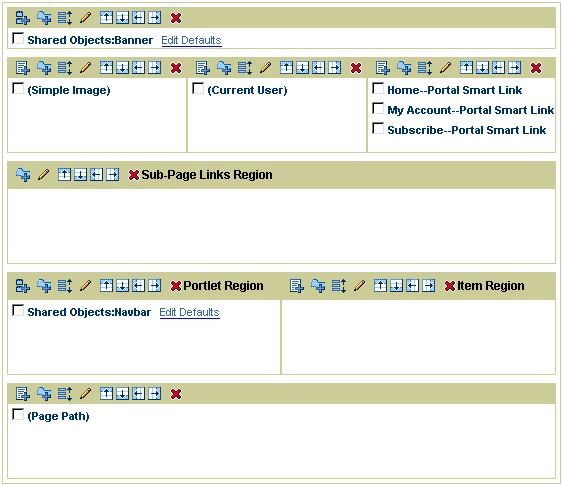
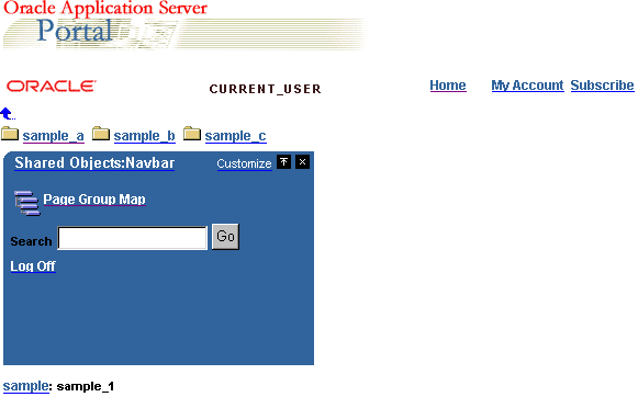
Figure 6-1 and Figure 6-2 show how you might set up a page template, and what a page would look like with the template applied. The template contains a banner, a corporate logo, the current user, and some commonly used links at the top; a sub-page links region below the common links; a navigation page to the left of the main content region; and a footer at the bottom that shows the location of the current page within the page group.
When page designers create pages, they can choose to base those pages on a particular page template. If a page is based on a template, any changes made to the template are automatically cascaded to all pages that use it.
Keep in mind that if a page is based on a template, page designers will not be able to add any new regions to the page. The page template must contain all regions that will be required. One way to work within this restriction is to create a portlet region in your template for the display of pages that are published as portlets. Or you can provide many different regions, both item and portlet. Users may not use them all; they can choose what they need.
|
Note: For information on creating a portlet region, see Section 7.5, "Designing the Layout of a Page". For information on publishing a page as a portlet, see Section 7.3.4, "Publishing a Page as a Portlet". |
Page templates offer some flexibility. You can set up a template so that page designers can apply a different style or set up different access privileges on pages they base on the template. You can also identify regions within the page template where content can be added. For example, in the template depicted in Figure 6-1, you could set up the main content region so that page designers can add whatever content they want there, without being able to affect any other regions on the page.
Some of the tasks you perform on existing page templates require that you locate them through the Portal Navigator. You locate pages in the Portal Navigator first through the page’s parent page group, then through one of the nodes under that page group, either the Pages, Templates, or Navigation Pages node. This section describes how to get to the Templates node in the Portal Navigator.
To locate a page template through the Portal Navigator:
In the Portal Builder, click the Navigator link at the top of the page.
In the Portal Navigator, click the Page Groups tab to bring it forward.
At this point, you can enter the name of the page template in the Find field at the top of the tab, click Go, and select the page template from the list of returned results. If you’re unsure of the page template name, or prefer to drill to a specific page template, continue with Step 3.
Click the page group that owns the page template you want to locate.
If the page template you’re locating is shared across page groups, click the Shared Objects page group.
On the resulting page, click the Templates node.
The page templates specific to the selected page group are listed on the resulting page.
Page templates enable you to enforce a standard layout and appearance for multiple pages.
To create a page template:
In the Portal Navigator, click the page group where you will create a page template.
|
Tip: If you want to use this template in more than one page group, create it in the Shared Objects page group. |
On the resulting page, click the Templates node.
Click Template next to Create New ….
In the Name field, enter a name for the page template. The name can be used in a URL to directly access the template. Direct access URLs take the following format:
http://<hostname>:<portnumber>/pls/<dad>/url/page/<pagegroupname>/<templatename>
For example:
http://mymachine.mycompany.com:5000/pls/portal/url/page/myportal/mytemplate
The name must be unique within the page group and the Shared Objects page group, is limited to 40 characters, and can contain only alphanumeric characters (A-Z, a-z, 0-9) and the underscore (_) character. Do not use spaces or other special characters
In the Display Name field, enter a descriptive name for the page template.
This is the name by which users will identify this template (e.g., how it will be listed in the Portal Navigator). Enter up to 40 characters.
(Optional) In the Description field, enter a description for the page template.
The description, which is optional, is displayed only when you edit the page template. It does not appear to the user.
Select Make available for use in this page group to make this template available to authorized users.
This will enable other users to apply this template to the pages they create in this page group.
In the Navigation Page For Banner list, choose a navigation page to use as a banner for the page template.
The navigation page is added to a region across the top of the page. Be sure to choose a navigation page that fits appropriately. If you do not want to include a banner across the top, choose <None> in this list.
This list includes all the navigation pages associated with this page group and the Shared Objects page group that have been published as portlets.
Click Next.
Select Enable Pages To Use Different Style to enable page designers to use a different style in pages that are based on this template.
Conversely, to enforce a particular style on all pages based on this template, do not select this check box.
In the Style list, choose a style to apply to pages based on this template.
The Preview section provides examples of the chosen style. Select the Portlets, Items, Tabs, or Other radio button to preview how these elements will appear within the selected style.
Click Next.
Select Enable Pages To Have Different Access to enable page designers to specify different access privileges on pages that are based on this template.
Conversely, to enforce a particular set of access privileges on all pages based on this template, do not select this check box.
(Optional) Select Display Page To Public Users to enable everyone, including users who are not logged into the portal, to view pages based on this template.
(Optional) Select Enable Item Level Security to enable content contributors to set access privileges on individual items in pages that are based on this template.
If you do not select this check box, item privileges are inherited from the pages on which the items appear. For more information on item-level security, see Section 2.3, "Protecting Your Content" and Section 7.8.9, "Enabling Item Level Security".
To explicitly grant privileges to specific users or groups:
|
Note: When you set privileges on a template, those privileges apply to pages based on the template, but not on the template itself. To have privileges on a template, a user must have the Manage Templates page group privilege. |
In the Grantee field, enter the name of the user or group that should have access to pages based on this template.
Optionally, click the Users or Groups icon for lists of users or groups.
In the list next to the Grantee field, choose a privilege level.
|
Note: Just because one privilege appears before another in the list does not mean that the privilege implies all other privileges below it. For more information, see Section 7.12.4, "Page Privileges". |
Click Add.
(Optionally) if you are revising this template, rather than creating it, click the Clear Cache link to remove all earlier versions of this template from the mid-tier cache.
This includes the removal of cached versions of the template for pages that are based on this template.
Click Finish to create the page template and return to the Navigator.
The new template is added under the Templates node In the Portal Navigator. The next step is to design the layout of the template page. For information on how to do this, see Chapter 7, " Creating and Designing Pages".
A page template page definition is always cached; however, pages based on the page template can use a different caching option. For more information, see Section 7.10.1, "Changing How a Page Is Cached".
When constructing your template, you may want to prevent users from changing what appears in one or more region. To do this, go to each relevant region and clear the Enable Users To Include Content In This Region check box. For example, your page might be divided into a main content region and one or more regions containing navigational elements. You want to enable users to edit or customize the content in the main content region, but disable them from editing or customizing the other regions. Disabling access to regions that contain navigational elements or fixed company branding, such as the company logo, prevents users from adversely affecting the look, feel, and content of those regions.
If there is an existing page that you want to use as the starting point for a new page template, you can convert the page to a template, rather than create a completely new page template.
Note, however, that only pages that are not based on a template can be converted to templates.
When you convert a page to a template, a copy of the page is created. The copy becomes the new page template. The original page still exists, and is not affected by the conversion.
When you create a template from a page, not everything in the original page is included in the template, including:
Caching options
Contact E-Mail
Category
Keywords
Custom page attributes
Page Images
Approval routing
Sub-pages
To create a page template from an existing page:
In the Portal Navigator, click the page group that hosts the page you want to convert to a template.
On the resulting page, click the Pages node.
Click Convert to Template next to the page you want to convert.
|
Tip: If you want to create a template from the page group's home page, click Convert Root Page to Template next to the page group. |
In the confirmation screen, click Yes to create a copy of the page and convert that copy to a page template.
When you delete a page template, any pages that were based on the template are automatically detached from the template. Note, however, that deleting a template is not the only way, nor the best way to detach a page from its template. For more information on detaching from a page template, see Section 7.4.3, "Detaching a Page from Its Template".
| To delete a page template, you must have at least the privileges outlined in the Intended Audience section of this chapter, or Manage privileges on the page template. |
To delete a page template:
In the Portal Navigator, click the page group that hosts the template you will delete.
On the resulting page, click the Templates node.
Click the Delete link next to the template you want to delete.
|
Tip: If the page template is used by more than one page group, it will be under the Shared Objects page group. |
A style controls the colors and fonts used by pages and item regions and all the tabs, portlets, and items displayed within them. If you want a page or group of pages to use the same colors and fonts, apply a style. On the other hand, if you want to apply a consistent layout to a group of pages, use a page template.
Because you can apply a style to a template, you can use a template to provide a standard approach to layout, fonts, and colors.
This section discusses how to create, delete, and apply styles. It contains the following subsections:
|
Note: For information about choosing a default style for a page group, see Chapter 4, " Working with Page Groups". |
You can give all your pages a uniform appearance by applying a single style. This means that you can change the look of all your pages just by changing the style the pages use (assuming that you have the appropriate privileges to do so). If you prefer, you can apply different styles to give each page a distinct look. You can even apply different styles to the item regions within a page.
Be careful when editing a style: the changes you make affect the appearance of all pages and item regions that use the style. Also, if you delete a style, all pages that use the style revert to the page group default style, or the system default style if the page group default style is <None>.
The amount of control you have over the style of a page depends on your privileges:
If you have the Manage or Manage Style privilege on a page and the Allow Privileged Users To Manage Page Style check box is selected for the parent page group, you can apply a different style to the page, edit existing styles to change the colors and fonts used, or create new styles. If this check box is not selected, only portal administrators or users with the Manage All privilege on the page group can apply a different style to pages in the page group.
If you have the Manage Style privilege on a page group and the Allow Privileged Users To Manage Page Style check box is selected for the page group, you can perform any action on any style in the page group.
The portal administrator can perform any action on any style in any page group.
If you have the Customize (Style) privilege or above on a page and the Allow Privileged Users To Customize Page Style check box is selected for the parent page group, you can apply a different style to your version of the page. If this check box is not selected, no user can apply a different style when customizing a member page.
This section explains how to create a style; subsequent sections explain how to define it.
To create a style:
In the Portal Navigator, click the page group where you will create a style.
|
Tip: If you plan to use this style in more than one page group, create it in the Shared Objects page group. |
On the resulting page, click the Styles node.
Click the Style link next to Create New ….
On the Create Style page, enter a name for the style in the Name field.
The name is used internally and must be unique within the page group and the Shared Objects page group. The name can contain only alphanumeric characters (A-Z, a-z, 0-9) and the underscore (_) character. Do not use spaces or other special characters.
In the Display Name field, enter a descriptive name for the style.
In the Copy From list, choose the style that most closely matches the colors and fonts that you want to use in your new style.
This list includes only those styles that you have access to, including public styles and any styles that you created previously.
(Optionally) Select Make available for use in this page group to make this style available for other users to apply to their own pages, or to use as a starting point for their own styles.
|
Note: If you do not see this check box, you do not have style publishing privileges. Contact your portal administrator to request these privileges. |
Click Create.
Section 6.2.3, "Style Element Properties" provides tables that briefly describe the style element properties available for items, tabs, portlets, and common components.
See the following subsections for specifics on designing a style:
The tables in the following subsections list and describe the types of user interface elements you can affect with a style. It is divided into the following subsections:
Table 6-1 lists and describes style element properties that apply to items.
Table 6-1 Style element properties that apply to items
Table 6-2 lists and describes style element properties that apply to tabs.
Table 6-2 Style element properties that apply to tabs
Table 6-3 lists and describes style element properties that apply to portlets.
Table 6-3 Style element properties that apply to portlets
Table 6-4 lists and describes style element properties that apply to item regions and pages.
Table 6-4 Style element properties common to item regions and pages
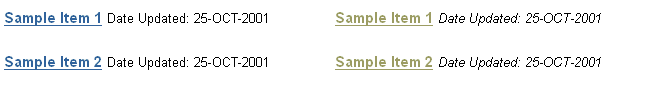
You can change the colors and fonts used for item attributes (for example, Display Name, Create Date, and any custom attributes) by editing the style used by the page or item region that contains them. You can have different color and font settings for each attribute.
Figure 6-3 shows the same item region with different item attribute color and font settings.
Figure 6-3 Same item region with different item attribute color and font settings
To change which attributes are displayed in a region, see Section 7.5.2.10, "Changing the Attributes Displayed in a Region".
Be careful when changing a style: the changes you make affect the appearance of all pages and item regions that use the style.
To change item attribute colors and fonts:
In the Portal Navigator, click the page group that owns the style you will change.
|
Tip: If the style is used by more than one page group, it will be under the Shared Objects page group.If you do not know the name of the style you want to change, edit a page or region that uses the style. When editing a page or region, if you have the appropriate privileges, you can also edit the style used by that page or region. |
On the resulting page, click the Styles node.
Click the Edit link next to the style you want to change.
In the Style Element Type section, choose Items.
In the Style Element Properties section, choose the style element you want to change.
For a list and description of the style element properties relevant to items, see Section 6.2.3, "Style Element Properties".
|
Tip: You can also select the style element by clicking it in the Preview section. |
To select a new color, click a color in the color palette, or enter the color’s hexadecimal value in the Color field.
Clicking in the palette automatically populates the Color field with the color’s hexadecimal value.
Choose a Font Face, Font Size, Font Style, and Font Decoration.
The <Default> font face renders the text in the default font specified by the user's browser.
Click Apply.
The Preview section is refreshed to show your color and font selections.
Edit each style element as desired.
Click Apply after changing each element.
Click Close to return to the Navigator.
|
Note: If you edit a style by editing a region that uses the style, you can change only the colors and fonts of attributes that are displayed in the region. |
The following subsections explain how to change the colors and fonts that define the look and feel of portlets:
You can change the color of the main body of a portlet by editing the style used by the page that hosts the portlet.
Figure 6-4 shows the same portlet with different body color settings.
Figure 6-4 Same portlet with different body color settings
Be careful when changing a style: the changes you make affect the appearance of all pages and item regions that use the style.
Portlets created in OracleAS Portal may use their own style instead of the style of the page on which they are placed. In such cases, these portlets will use the style specified when they were created rather than any style you apply.
To change the portlet body color:
In the Portal Navigator, click the page group that owns the style you will change.
|
Tip: If the style is used by more than one page group, it will be under the Shared Objects page group.If you do not know the name of the style you want to change, edit a page or region that uses the style. When editing a page or region, if you have the appropriate privileges, you can also edit the style used by that page or region. |
On the resulting page, click the Styles node.
Click the Edit link next to the style you will change.
In the Style Element Type section, choose Portlets.
In the Style Element Properties section, choose Portlet Body Color.
For a list and description of style element properties relevant to portlets, see Section 6.2.3, "Style Element Properties".
Click a color in the color palette, or enter the color’s hexadecimal value in the Background Color field, for example #CCFFFF.
Clicking in the palette automatically populates the Background Color field with the color’s hexadecimal value. For the portlet to inherit the color from its host page background, clear the Background Color field.
Click Apply.
The Preview section is refreshed to show your color selection.
Click Close to return to the Navigator.
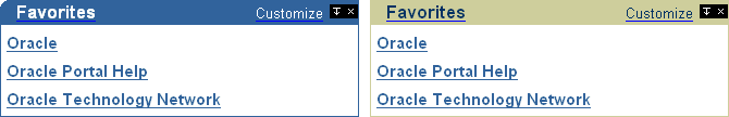
You can change the colors and fonts used in a portlet header by editing the style that is applied to the page that hosts the portlet. You can also change the appearance of the edges of the portlet header.
Figure 6-5 shows the same portlet with different header color and edge settings.
Figure 6-5 The same portlet with different settings for header color and edges
Be careful when changing a style: the changes you make affect the appearance of all pages and item regions that use the style.
To change the portlet header or subheader:
In the Portal Navigator click the page group that owns the style you will change.
|
Tip: If the style is used by more than one page group, it will be under the Shared Objects page group.If you do not know the name of the style you want to change, edit a page or region that uses the style. When editing a page or region, if you have the appropriate privileges, you can also edit the style used by that page or region. |
On the resulting page, click the Styles node.
Click the Edit link next to the style you will change.
In the Style Element Type section, choose Portlets.
To change the colors and fonts of the portlet headers:
In the Style Element Properties section, choose one of the following:
Portlet Header Color
Portlet Header Text
Portlet Header Link
Portlet SubHeader Color
Portlet SubHeader Text
Portlet SubHeader Link
You can also select a style element by clicking it in the Preview section.
For a list and description of style element properties relevant to portlets, see Section 6.2.3, "Style Element Properties".
Click a color in the color palette, or enter the color’s hexadecimal value in the Color field, for example #CCFFFF.
Clicking in the palette automatically populates the Color field with the color’s hexadecimal value.
Choose a Font Face, Font Size, Font Style, and Font Decoration.
The <Default> font face renders text in the default font specified by the user's browser.
Click Apply.
The Preview section is refreshed to show your color and font selections.
To change the edges of the portlet header:
In the Style Element Properties section, choose Portlet Header Style.
Click the appropriate radio button for the edges you want:
Figure 6-6 Portlet header element with square edges (normal)

Figure 6-8 Portlet header element with rounded left edge

Figure 6-9 Portlet header element with rounded right edge

Click Apply.
The Preview section is refreshed to show your selection.
Edit each of the portlet header style elements as desired.
Click Apply after changing each element.
Click Close to return to the Navigator.
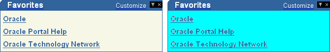
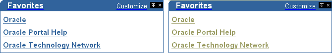
OracleAS Portal provides four levels of heading and text attributes for use in developing your own portlets. If you view the source of any OracleAS Portal page, you'll see that the portlets were written using Portlet Heading1 and Portlet Text1. For example, the Favorites portlet uses the Portlet Heading1 style element for favorite links.
You can change the colors and fonts of portlet headings and text by editing the style that is applied to the page that hosts the portlet.
Figure 6-10 shows the Favorites portlet with different Portlet Heading1 color settings.
Figure 6-10 Favorites portlet with different Portlet Heading1 color settings
For information about how to use these style elements in your own portlets, see the Portal Developer Kit on the Portal Center, http://portalcenter.oracle.com. Click the Search icon in the upper right corner of any Portal Center page.
Be careful when changing a style: the changes you make affect the appearance of all pages and item regions that use the style.
To change the portlet heading and text colors and fonts:
In the Portal Navigator, click the page group that owns the style you will change.
|
Tip: If the style is used by more than one page group, it will be under the Shared Objects page group.If you do not know the name of the style you want to change, edit a page or region that uses the style. When editing a page or region, if you have the appropriate privileges, you can also edit the style used by that page or region. |
On the resulting page, click the Styles node.
Click the Edit link next to the style you will change.
In the Style Element Type section, choose Portlets.
In the Style Element Properties section, choose PortletHeadingn or PortletTextn, where n is the desired level.
You can also select the portlet heading or text style element by clicking it in the Preview section.
For a list and description of style element properties relevant to portlets, see Section 6.2.3, "Style Element Properties".
Click a color in the palette, or enter a hexadecimal value in the Color field, for example #FFCC00.
Clicking in the palette automatically populates the Color field with the color’s hexadecimal value.
Choose a Font Face, Font Size, Font Style, and Font Decoration.
The <Default> font face renders the text in the default font specified by the user's browser.
Click Apply.
The Preview section is refreshed to show your color and font selections.
Edit the style elements as desired.
Click Apply after changing each element.
Click Close to return to the Navigator.
You have a number of options for using styles to change the overall appearance of a page. These include:
You can select a background color or image for a page or an item region by editing the style it uses.
Figure 6-11 shows the same item region with different background color settings.
Figure 6-11 Same item region with different background color settings

If your background image is smaller than the page or item region, it will be repeated as a pattern to cover the whole page or region.
Be careful when changing a style, because any changes you make affect the appearance of all pages and item regions that use the style.
To change the page or item region background:
In the Portal Navigator, click the page group that owns the style you will change.
|
Tip: If the style is used by more than one page group, it will be under the Shared Objects page group.If you do not know the name of the style you want to change, edit a page or region that uses the style. When editing a page or region, if you have the appropriate privileges, you can also edit the style used by that page or region. |
On the resulting page, click the Styles node.
Click the Edit link next to the style you will change.
In the Style Element Type section, choose Common.
In the Style Element Properties section, choose Background.
For a list and description of style element properties relevant to pages and regions, see Section 6.2.3, "Style Element Properties".
Click a color in the color palette, or enter a hexadecimal value in the Background Color field, for example #CC9999.
Clicking in the palette automatically populates the Background Color field with a hexadecimal value.
To apply an image to the background of the page or region, enter the name and location of the image you want use in the Background Image field, for example:
c:\webimages\pagebg.gif
If you do not know the name and location of the image, click Browse to locate it on your file system. The image file must be of type JPEG, GIF, or PNG.
|
Tip: To delete a background image, click the Delete icon next to the image. |
Click Apply.
The Preview section is refreshed to show your color and image selections.
Click Close to return to the Navigator.
You can change the height and text alignment of the banners in an item region by editing the style the region uses.
Figure 6-12 shows the same item region with different height and text alignment settings on the banner.
Figure 6-12 Same item region with different settings for banner height and alignment

Be careful when changing a style, because any changes you make affect the appearance of every object that uses the style.
To change the height and text alignment of item region banners:
In the Portal Navigator, click the page group that hosts the style you will change.
|
Tip: If the style is used by more than one page group, it will be under the Shared Objects page group.If you do not know the name of the style you want to change, edit a page or region that uses the style. When editing a page or region, if you have the appropriate privileges, you can also edit the style used by that page or region. |
On the resulting page, click the Styles node.
Click the Edit link next to the style you will change.
To change banner height and text alignment for the item region:
In the Style Element Type section, choose Common.
In the Style Element Properties section, choose Region Banner.
For a list and description of style element properties relevant to pages and regions, see Section 6.2.3, "Style Element Properties".
To change the banner height and text alignment for groups of items:
In the Style Element Type section, choose Items.
In the Style Element Properties section, choose Group By Banner.
You can also select the banner style element by clicking it in the Preview section.
In the Height field, enter the height of the banner in pixels.
Set the banner height approximately 20-25% greater than the selected text size. For example, if text size is 8, set banner height to 10.
In the Text Alignment list, choose where you want text to appear in the banner (Left, Center, Right).
Click Apply.
The Preview section is refreshed to show your height and alignment selections.
Edit each of the banner style elements as desired.
Click Apply after changing each element.
Click Close to return to the Navigator.
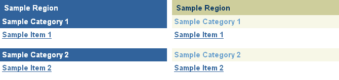
You can change the colors and fonts used by the banners in an item region by editing the style used by the region.
Figure 6-13 shows the same item region with different banner and font color settings.
Figure 6-13 Same item region with different settings for banner and font color
Be careful when changing a style: the changes you make affect the appearance of every object that uses the style.
To change banner and font settings:
In the Portal Navigator, click the page group that hosts the style you will change.
|
Tip: If the style is used by more than one page group, it will be under the Shared Objects page group.If you do not know the name of the style you want to change, edit a page or region that uses the style. When editing a page or region, if you have the appropriate privileges, you can also edit the style used by that page or region. |
On the resulting page, click the Styles node.
Click the Edit link next to the style you will change.
To change the colors and fonts of the item region banner:
In the Style Element Type section, choose Common.
In the Style Element Properties section, choose either Region Banner or Region Banner Text.
For a list and description of style element properties relevant to pages and regions, see Section 6.2.3, "Style Element Properties".
To change the colors and fonts of the Group By banner:
In the Style Element Type section, choose Items.
In the Style Element Properties section, choose either Group By Banner, Group By Banner Text, or Group By Banner Link.
For a list and description of style element properties relevant to pages and regions, see Section 6.2.3, "Style Element Properties".
You can also select the banner style element by clicking it in the Preview section.
Click a color in the color palette, or enter a hexadecimal value in the Color field, for example #66FF66.
Clicking in the palette automatically populates the Color field with a hexidecimal value.
Choose a Font Face, Font Size, Font Style, and Font Decoration.
The <Default> font face renders text in the default font specified by the user's browser.
Click Apply.
The Preview section is refreshed to show your color and font selections.
Edit each of the banner style elements as desired.
Click Apply after changing the color or font of each element.
|
Note: If you are editing a style by editing a region to which the style is applied, you can only change the banner colors and fonts if the appropriate banner is displayed in the region. |
Click Close to return to the Navigator.
You can change tab colors and fonts by editing the style used in a region that contains the tabs.
Figure 6-14 shows the same tabs with different color and font settings.
Figure 6-14 Same tabs with different color and font settings

Be careful when changing a style: the changes you make affect the appearance of all pages and item regions that use the style.
To change tab color and fonts:
In the Portal Navigator, click the page group that owns the style you will change.
|
Tip: If the style is used by more than one page group, it will be under the Shared Objects page group.If you do not know the name of the style you want to change, edit a page or region that uses the style. When editing a page or region, if you have the appropriate privileges, you can also edit the style used by that page or region. |
On the resulting page, click the Styles node.
Click the Edit link next to the style you will change.
In the Style Element Type section, choose Tabs.
In the Style Element Properties section, choose a tab style element to define.
For a list and description of style elements that are relevant to tabs, see Section 6.2.3, "Style Element Properties".
Click a color in the color palette, or enter a hexadecimal value in the Color field.
Clicking in the palette automatically populates the Color field with a hexidecimal value.
Choose a Font Face, Font Size, Font Style, and Font Decoration.
The <Default> font face renders text in the default font specified by the user's browser.
Click Apply.
The Preview section is refreshed to show your color and font selections.
Edit the tab style elements as desired.
Click Apply after changing each element.
Click Close to return to the Navigator.
You can make any style you create available for use within the page group that owns it.
To make a style available within a page group:
In the Portal Navigator, click the page group that owns the style you want to make available.
|
Tip: If the style is used by more than one page group, you will find it under the Shared Objects page group.If you do not know the name of the style you want to change, edit a page or region that uses the style. Click the Style link in the page toolbar at the top of the page. Then click the link to the style under the Style Properties section. |
On the resulting page, click the Styles node.
Click the Edit link next to the style you want to make available.
Click the Main tab to bring it forward.
Under Style Usage, select Make available for use in this page group.
Click OK to return to the Navigator.
When you delete a style, all pages and item regions that used the style revert to the page group default style. If the page group default style is <None>, all pages and regions revert to the system default style.
You cannot delete the system default style.
To delete a style:
In the Portal Navigator, click the page group that owns the style you will delete.
|
Tip: If the style is used by more than one page group, it will be under the Shared Objects page group. |
On the resulting page, click the Styles node.
Click the Delete link next to the style that you want to delete.
In the confirmation page, click Yes.
A navigation page is a special type of page that can be included on other pages to provide a consistent set of navigational elements. A typical navigation page might contain a logo, the page title, a login link, and a link to the home page. Typically, navigation pages are used for navigation bars, page banners, and page footers.
Navigation pages are excluded from searches, preventing their useless inclusion in search result sets.
Although you can add any item or portlet to a navigation page, and even divide your navigation page into several regions, you should bear in mind that the idea is to add navigation pages to other pages. You should design your navigation pages to take up as little space as possible, so that when they are added to other pages, there is still plenty of room for the rest of the page content.
Once you create a navigation page and add all the navigational elements that you want, you can publish it as a portlet. This way other users can add it to their pages. Navigation pages that are published as portlets can be added to any portlet region on a page. For information on publishing a navigation page as a portlet, see Section 7.3.4, "Publishing a Page as a Portlet". For information on selecting a default navigation page for a page group, see Chapter 4, " Working with Page Groups".
For more information about navigation, see the technical note, "OracleAS Portal Best Practices: Navigation," on Portal Center, http://portalcenter.oracle.com. Click the Search icon in the upper right corner of any Portal Center page.
The following sections explain how to create, add, and remove a navigation page:
Some of the tasks you perform on existing navigation pages require that you locate them through the Portal Navigator. You locate pages in the Portal Navigator first through the page’s parent page group, then through one of the nodes under that page group, either the Pages, Templates, or Navigation Pages node. This section describes how to get to the Navigation Pages node in the Portal Navigator.
To locate a navigation page through the Portal Navigator:
In the Portal Builder, click the Navigator link at the top of the page.
In the Portal Navigator, click the Page Groups tab to bring it forward.
At this point, you can enter the name of the navigation page in the Find field at the top of the tab, click Go, and select the navigation page from the list of returned results. If you’re unsure of the navigation page name, or prefer to drill to a specific navigation page, continue with Step 3.
Click the page group that owns the navigation page you want to locate.
If the navigation page you’re locating is shared across page groups, click the Shared Objects page group.
On the resulting page, click the Navigation Pages node.
The navigation pages specific to the selected page group are listed on the resulting page.
Navigation pages enable you to provide a standard set of navigational elements that can be included on the pages in a page group.
To create a navigation page:
In the Portal Navigator, click the page group where you will create a navigation page.
|
Tip: If you want to be able to use this navigation page in more than one page group, create it in the Shared Objects page group. |
On the resulting page, click the Navigation Pages node.
Click Navigation Page next to Create New ….
In the Name field, enter a name for the navigation page. The name can be used in a URL to directly access the navigation page. Direct access URLs take the following format:
http://<hostname>:<portnumber>/pls/<dad>/url/page/<pagegroupname>/<navigationpagename>
For example:
http://mymachine.mycompany.com:5000/pls/portal/url/page/myportal/mynavigationpage
The name must be unique within the page group and the Shared Objects page group, is limited to 40 characters, and can contain only alphanumeric characters (A-Z, a-z, 0-9) and the underscore (_) character. Do not use spaces or other special characters
In the Display Name field, enter a descriptive name for the navigation page.
This is the name that will appear in the Portal Navigator. It’s limited to 40 characters.
In the Copy From list, choose a navigation page to use as a starting point for your new navigation page.
This list includes all the navigation pages in this page group on which you have at least View privileges.
If you want to start with a blank navigation page, choose <None>.
Select Publish As Portlet to make this navigation page available to other users.
Eventually you will need to publish the navigation page as a portlet so that other users can add it to their pages. However, while the navigation page is under development, you might prefer to keep this check box cleared.
|
Note: If you do not see this check box, you do not have portlet publishing privileges. Contact your portal administrator to request these privileges. |
Click Create.
Click the link in the confirmation message at the top of the page to edit the properties of your new navigation page.
Alternatively, you can create another navigation page, or click Close to return to the Navigator.
After creating your navigation page, you can add items, portlets, and regions to it. See Chapter 7, " Creating and Designing Pages". See also, Section 6.3.4, "Creating Navigation With Built-In Navigation Item Types" for information on adding built-in navigation item types.
When you create a new navigation page, you can base it on an existing navigation page. You can do this through a creation process (see Section 6.3.2, "Creating a Navigation Page") or through a copy process. Copy navigation pages directly in the Portal Navigator. Note that the copy you create falls under the same Navigation Pages node in the Portal Navigator that the original navigation page falls under.
To copy a navigation page:
In the Portal Navigator, click the page group that owns the navigation page you will copy.
On the resulting page, click the Navigation Pages node.
Click the Copy link next to the navigation page you want to copy.
In the Name field, enter an internal name for the new navigation page.
The name is used internally and for direct access URLs. The name is limited to 40 characters and can contain only alphanumeric characters (A-Z, a-z, 0-9) and the underscore (_) character. Do not use spaces or other special characters.
In the Display Name field, enter a descriptive name for the new navigation page.
This name will appear in the Portal Navigator. It is limited to 40 characters.
Select Copy Access Control if you want the new navigation page to have the same privilege settings as the original navigation page.
Click OK to create the new navigation page.
OracleAS Portal comes with a number of pre-built navigation item types that simplify and speed the task of constructing site navigation. Navigation-type items are the types of items you are most likely to add to your navigation pages; however, you can include other types of items on your navigation pages, including images, text, page links, and URLs. Additionally navigation-type items can be added to page types other than navigation pages. The next sections discuss how to add built-in navigation item types to a page, including:
You’ll find examples of these built-in navigation item types in the technical note "OracleAS Portal Best Practices: Navigation," on Portal Center, http://portalcenter.oracle.com. Click the Search icon in the upper right corner of any Portal Center page.
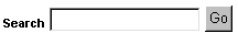
Use the following steps to add a basic search box to a page (Figure 6-15). You can specify whether users of the search box can search all page groups or only the selected page group.
To add a Basic Search Box item to a page:
Go to the page where you will add the item.
For information on locating a page, see Section 7.2, "Navigating to Pages".
Switch to Edit mode.
Click the Add Item icon in the region in which you want to add the item.
If the Add Item icon does not display next to the region, the region may be a portlet region (and may contain portlets). In this case, you cannot add items to this region.
From the Built-In Navigation Item Types list, choose Basic Search Box.
|
Note: If this item type does not appear in the list, contact your page group administrator. Your administrator selects which item types to display here. |
Click Next.
In the Search Box Width field, enter the width of the search box.
In the Search in Page Group field, select the page group that is searched by default.
Select All Page Groups for the search to include all page groups.
In the Search Icon field, enter the location of the image.
Use the first field to enter or browse for the image on your file system. Alternatively, use the second field to enter the URL of an image or to reuse an image that has already been uploaded to the portal. To reuse an image, enter its internal name (the name OracleAS Portal assigns to it) without a path into the second field, for example, 1645.GIF.
To obtain the internal name OracleAS Portal has assigned to an image, go to a place within your portal where the image is already in use; right click it; and select Properties from the right-click menu.
In the Search Label field, either:
Enter a label for the search box.
This field is not translated. The exact text in this field is used for all languages.
Or, select Use the Default Search Label to use the portal default search label.
This option is translated into each installed language.
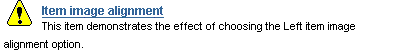
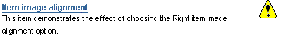
In the Image Alignment field, select an image alignment, if you specified an image for the search box.
Table 6-5 lists and describes image alignment options.
Table 6-5 Item image alignment options
| Alignment | Description | Example |
|---|---|---|
| Left | Aligns the image on the left side of the page. |
|
| Right | Aligns the image on the right side of the page. |
|
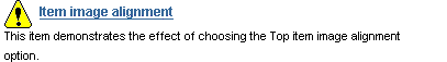
| Top | Aligns the top of the image with the top of the display name. |
|
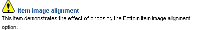
| Bottom | Aligns the bottom of the image with the baseline of the display name. Same as Baseline. |
|
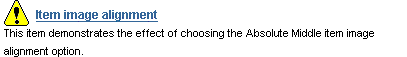
| Absolute Middle | Aligns the middle of the image with the absolute middle of the display name. |
|
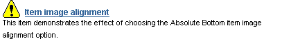
| Absolute Bottom | Aligns the bottom of the image with the absolute bottom of the display name. |
|
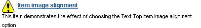
| Text Top | Aligns the top of the image with the top (tallest text) of the display name. |
|
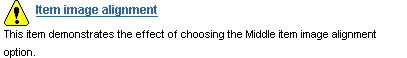
| Middle | Aligns the middle of the image with the baseline of the display name. |
|
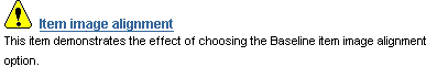
| Baseline | Aligns the bottom of the image with the baseline of the display name. Same as Bottom. |
|
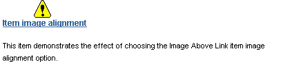
| Image Above Link | Aligns the image above the display name. |
|
Click Finish.
You can use lists of objects to provide a quick way for users to jump to a page of interest or to a list of all objects classified under a particular category or perspective. You can choose which pages, categories, or perspectives appear on the list, making it an easy way to provide access to some objects while hindering access to others.
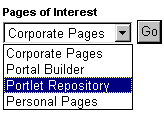
You can choose whether to display this list as a drop-down list (Figure 6-16) or as a list of links (with or without associated images).
To add a List of Objects item to a page:
Go to the page where you will add the item.
For information on locating a page, see Section 7.2, "Navigating to Pages".
Switch to Edit mode.
Go to the region where you will add the item, and click the Add Item icon.
If the Add Item icon does not display with the region, the region may be a portlet region (and may contain portlets). In this case, you cannot add items to this region.
From the Built-In Navigation Item Types list, choose List of Objects.
|
Note: If this item type does not appear in the list, contact your page group administrator. Your administrator selects which item types to display here. |
Click Next.
In the Display Name field, enter the display name for the item.
Users click the display name to view the item. Make the name as descriptive as possible.
In the Display Type field, select the display type for the list of objects item, such as drop-down list, links, and links/images.
Select Display Objects Alphabetically to display the objects in the list alphabetically.
In the Select objects to add to your list section, click the Browse icon next to an object type you will add to your list.
In the resulting window, click the Return Object link next to an object you want to add to your list.
Click the Plus icon to the left of an object to expand the list of available objects.
Repeat steps 9 and 10 until you complete your list.
Click the Delete icon to remove an object from the list of objects item. Click the Rearrange icon to rearrange objects in the list of objects item.
|
Note: When an object that is included in a list of objects item is moved or promoted in OracleAS Portal, the object's reference in the list of objects is lost. |
Click Finish.
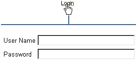
Take the following steps to add login/logout links and/or icons to a page. Users can use these links/icons to log in or log out of the portal.
To add a Login/Logout Link item to a page:
Go to the page where you want to add the item.
For information on locating a page, see Section 7.2, "Navigating to Pages".
Switch to Edit mode.
Go to the region where you will add the item, and click the Add Item icon.
If the Add Item icon does not display next to the region, the region may be a portlet region (and may contain portlets). In this case, you cannot add items to this region.
From the Built-In Navigation Item Types list, choose Login/Logout Link.
|
Note: If this item type does not appear in the list, contact your page group administrator. Your administrator selects which item types to display here. |
Click Next.
In the Login Link field, either:
Enter text that users click to log in to the portal. This text is not translated.
Select Use The Default Login Link. This text is translated into each installed language.
(Optional) In the Login Icon field, enter the path and file name of an image to associate with the login link, or click Browse to locate the image.
Example: c:\webart\login.gif
The file is uploaded to the page when you click Finish.
In the Logout Link field, either:
Enter text that users click to log in to the portal. This text is not translated.
Select Use The Default Logout Link. This option is translated into each installed language.
(Optional) In the Logout Icon field, enter the path and file name of the image to associate with the logout link, or click Browse to locate the image.
Example: c:\webart\logout.gif
The file is uploaded to the page when you click Finish.
Next to Select a page, choose a page to display to users after they log in.
Choose either the page where you are adding the login/logout link, or the default home page for the portal.
If you have selected an image for the login/logout link, select an image alignment.
For descriptions and examples of image alignment options, see Table 6-5.
Click Finish.
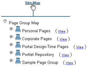
An Object Map Link item is a link to a page that lists all page groups and sub-pages in your portal (the Object Map or site map). You can use the Object Map for rapid navigation to other locations within your portal.
To add an Object Map Link item to a page:
Go to the page where you will add the item.
For information on locating a page, see Section 7.2, "Navigating to Pages".
Switch to Edit mode.
Go to the region where you will add the Object Map Link, and click the Add Item icon.
If the Add Item icon does not display next to the region, the region may be a portlet region (and may contain portlets). In this case, you cannot add items to this region.
From the Built-In Navigation Item Types list, choose Object Map Link.
|
Note: If this item type does not appear in the list, contact your page group administrator. Your administrator selects which item types to display here. |
Click Next.
Select an Object Map Type.
Enter a Display Name for the item.
Users click the display name to view the item. Make it as descriptive as possible.
Enter the location of an image icon.
Use the first field to enter or browse for the image on your file system. This uploads the image into the portal. Alternatively, use the second field to enter the URL of an image or to reuse an image that has already been uploaded to the portal. To reuse an image, enter its internal name (not file name) without a path into the second field, for example 1645.GIF.
To obtain the internal name OracleAS Portal has assigned to an image, go to a place within your portal where the image is already in use; right click it; and select Properties from the right-click menu.
In the Image Alignment field, select an image alignment, if you specified an image for the item.
For descriptions and examples of image alignment options, see Table 6-5.
Click Finish.
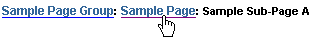
The Page Path item provides a linked trail (or breadcrumbs) returning up the hierarchy of pages that lead to the current sub-page. You can choose the number of levels for the path and the character that separates the path levels.
To add a Page Path item to a page:
Go to the page where you will add the item.
For information on locating a page, see Section 7.2, "Navigating to Pages".
Switch to Edit mode.
Go to the region where you want to add the item, and click the Add Item icon.
If the Add Item icon does not display next to the region, the region may be a portlet region (and may contain portlets). In this case, you cannot add items to this region.
From the Built-In Navigation Item Types list, choose Page Path.
|
Note: If this item type does not appear in the list, contact your page group administrator. Your administrator selects which item types to display here. |
Click Next.
Enter the number of Path Levels to display for the page path item.
Enter 0 to show all levels; enter 1 to show the current level plus one level up; enter 2 to show the current level plus two levels up; and so on. If you were to create the following:
A Marketing page group with a sub-page named Global Marketing
A sub-page under Global Marketing named European Marketing
A sub-page under European Marketing named Events
Then, if you added a page path item to the Events page and entered 1 for the page level, the page path item appears as:
European Marketing: Events
If you enter 2 for the page level, the page path item appears as:
Global Marketing: European Marketing: Events
In the Path Element Separator field, enter a character to separate page levels.
If you enter an asterisk (*), the page path item appears as:
Marketing* Global Marketing* European Marketing* Events
Click Finish.
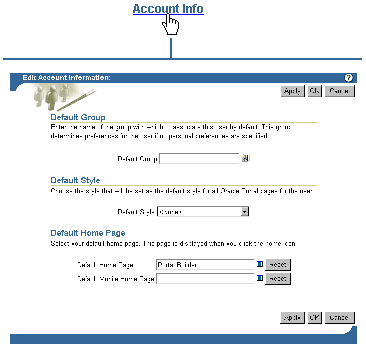
Portal Smart Links provide rapid access to Account Information, Advanced Search, Contact Information, help topics, your portal home page, and the like. They’re smart because they save you having to provide an address to the targeted information. You select the type of smart link you want, and Portal Smart Link dynamically constructs the URL to the targeted information.
To add a Portal Smart Link item to a page:
Go to the page where you will add the item.
For information on locating a page, see Section 7.2, "Navigating to Pages".
Switch to Edit mode.
Go to the region where you want to add the item, and click the Add Item icon.
If the Add Item icon does not display next to the region, the region may be a portlet region (and may contain portlets). In this case, you cannot add items to this region.
From the Built-In Navigation Item Types list, choose Portal Smart Link.
Make sure the Built-In Navigation Item Types radio button is selected.
|
Note: If this item type does not appear in the list, contact your page group administrator. Your administrator selects which item types to display here. |
Click Next.
In the Portal Smart Link field, select a smart link type.
When users click the link, they’ll get the following result:
Account Information displays the Edit Account Information page.
Community displays the Portal Community main page. The community is part of the Oracle Technology Network (OTN) and includes the Portal Studio and Portal Developer Kit (PDK).
Contact displays an e-mail link of the contact for the current page or page group. If there is no contact information available, this link does not display.
Customize allows the user to customize the current page. This only displays if the user has the appropriate privileges.
Edit allows the user to edit the current page. This only displays if the user has the appropriate privileges on the page or any of its tabs, or if item level security is enabled on the page or any of its tabs.
Favorites allows the user to add the current page to the Favorites portlet.
Mobile displays the current user's mobile customization page. Adding this link allows users to customize their mobile portals. This link should only be added when there is a distinct mobile portal with mobile pages.
Navigator displays the Portal Navigator. This only displays if the user has the appropriate privileges to view the Navigator.
Personal Page displays the personal page of the currently logged in user.
Portlet Repository Refresh Status displays the refresh status of the Portlet Repository for the administrator. This link should only be used on pages in the Portlet Repository page group.
Refresh refreshes the page. If caching is not set to "on" for the page definition and page content, this link does not display.
Refresh Portlet Repository allows the administrator to refresh the Portlet Repository. This link should only be used on pages in the Portlet Repository page group.
Subscribe allows users to subscribe to the page on which this smart link is displayed.
Enter a Display Name for the item, or select Use the Default Display Name.
Users click the display name to view the item. Be as descriptive as possible. This field is not translated. Whatever you enter here will be used for all languages.
Portal Smart Text enables you to place useful information on your pages without requiring that you construct the underlying code to make that information work. For example, use the Current Date Smart Text item to include the current date on a page.
To add a Portal Smart Text item to a page:
Go to the page where you will add the item.
For information on locating a page, see Section 7.2, "Navigating to Pages".
Switch to Edit mode.
Go to the region where you will add the item, and click the Add Item icon.
If the Add Item icon does not display next to the region, the region may be a portlet region (and may contain portlets). In this case, you cannot add items to this region.
From the Built-In Navigation Item Types list, choose Portal Smart Text.
|
Note: If this item type does not appear in the list, contact your page group administrator. Your administrator selects which item types to display here. |
Click Next.
Select a Text Type.
Standard types include:
Current Date, which lists today’s date and dynamically updates each day
Current User, which lists the user who logged in to this portal instance
Current Page, which lists the display name of the current page
Click Finish.
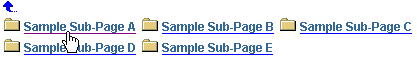
OracleAS Portal offers a fast way to include a list of links to a current page’s sub-pages through Sub-Page Links regions. Add one of these regions to a standard or navigation page, and it automatically populates with links to the current page’s sub-pages. You can configure the region to show links to one or two levels of sub-pages. For example, if you place the region on a navigation page, configure it to show one level of sub-pages, publish the navigation page as a portlet, then place the navigation page portlet on a standard page in your page group, the Sub-Page Links region in the navigation page portlet will display links to the first level of sub-pages of the standard page on which it is placed.
This section describes how to add a Sub-Page Links region to a page. For information on configuring a Sub-Page Links region, see Section 7.5.2, "Configuring Region Display Options". You can use page properties to specify which sub-pages are available for display and which are not. For more information, see Section 7.8.1, "Defining the Display of Sub-Page Links".
To add a Sub-Page Links region to a page:
Go to the page where you will add a Sub-Page Links region.
For information on locating a page, see Section 7.2, "Navigating to Pages".
Switch to Edit mode.
Add a region where you will display sub-page links, or go to the existing region you will use for this purpose.
For information on how to add a region, see Section 7.5.1.1, "Adding a Region to a Page".
Click the region’s Edit icon.
Select the Sub-Page Links radio button under the Region Type section.
Click OK to save your changes and return to the page.
Some of the seeded banners provided with OracleAS Portal contain sub-page links. These banners are navigation pages that have been published as portlets. If you prefer to have a sub-page links region on a page in lieu of displaying such links in your banner, you must edit the navigation page to remove its sub-page links region.
Delete a navigation page when it is no longer useful. If one or more pages are using a deleted navigation page, the navigation page will no longer appear on the pages.
To delete a navigation page:
In the Portal Navigator, click the page group that owns the navigation page you will delete.
If the navigation page is used by more than one page group, it will be under the Shared Objects page group.
On the resulting page, click the Navigation Pages node.
Click the Delete link next to the relevant navigation page.
On the confirmation page, click Yes.
|
 Copyright © 2003 Oracle Corporation All rights reserved |
|