29 Using ADF Hierarchy Viewer Components
This chapter describes how to use an ADF hierarchy viewer component to display data, and provides the options for hierarchy view customization.
This chapter includes the following sections:
-
Section 29.5, "Adding Interactivity to a Hierarchy Viewer Component"
-
Section 29.7, "Customizing the Appearance of a Hierarchy Viewer"
For information about the data binding of ADF hierarchy viewers, see the "Creating Databound Hierarchy Viewers" section in the Oracle Fusion Middleware Fusion Developer's Guide for Oracle Application Development Framework.
29.1 Introduction to Hierarchy Viewers
A hierarchy viewer component can be used to visually display hierarchical data. Hierarchical data contains master-detail relationships within the data. For example, you could create a hierarchy viewer component that renders an organization chart from a data collection that contains information about the relationships between employees in an organization.
29.1.1 Understanding the Hierarchy Viewer Component
JDeveloper generates the following elements in JSF pages when you drag and drop components from the Component Gallery onto a JSF page or when you use the Create Hierarchy Viewer dialog to create a hierarchy viewer component as described in the "Creating Databound Hierarchy Viewers" section in the Oracle Fusion Middleware Fusion Developer's Guide for Oracle Application Development Framework.
-
dvt:hierarchyViewerThis element wraps the
dvt:nodeand thedvt:linkelements. -
dvt:nodeA node is a shape that references the data in a hierarchy, for example, employees in an organization or computers in a network. You configure the child elements of the
dvt:nodeelement to reference whatever data you want to display. Thedvt:nodeelement supports the use of one or moref:facetelements that display content at different zoom levels (100%, 75%, 50%, and 25%). Thef:facetelement supports the use of many ADF Faces components, such asaf:outputText,af:image, andaf:panelGroupLayout, in addition to the ADF Data Visualizationdvt:panelCardcomponent.At runtime, the node contains controls that allow users to navigate between nodes and to show or hide other nodes by default. For information about specifying node content and defining zoom levels, see Section 29.3.1, "How to Specify Node Content."
-
dvt:linkYou set values for the attributes of the
dvt:linkelement to connect one node with another node. For information about how to customize the appearance of the link and add labels, see Section 29.7.4, "How to Configure the Display of Links and Labels." -
dvt:panelCardThe panel card element provides a method to dynamically switch between multiple sets of content referenced by a node element using animation by, for example, horizontally sliding the content or flipping a node over.
The
f:facettag for each zoom level supports the use of advt:panelCardelement that contains one or moreaf:showDetailItemelements defining the content to be displayed at the specified zoom level. At runtime, the end user uses the controls on the node to dynamically switch between the content that theaf:showDetailItemelements reference. For more information, see Section 29.6, "Using Panel Cards."Note:
Unlike the other elements, thedvt:panelCardelement is not generated if you choose the default quick layout option when using the Component Gallery to create a hierarchy viewer. For more information see, Section 29.1.3, "Available Hierarchy Viewer Layout Options."
The hierarchy viewer component uses elements such as af:panelGroupLayout, af:spacer, and af:separator to define how content is displayed in the nodes. Example 29-1 shows the code generated when the component is created by insertion from the Component Palette. Code related to the hierarchy viewer elements is highlighted in the example.
Example 29-1 Hierarchy Viewer Sample Code
<dvt:hierarchyViewer id="hierarchyViewer1" layout="hier_vert_top"
                             inlineStyle="width:100%;height:600px;">
  <dvt:link linkType="orthogonalRounded" id="l1"/>
    <dvt:node width="233" height="330" id="n1">
      <f:facet name="zoom100">
        <af:panelGroupLayout layout="vertical"
                             inlineStyle="width:100%;height:100%;padding:5px"
                             id="pgl2">
         <af:panelGroupLayout layout="horizontal" id="pgl3">
         <af:panelGroupLayout inlineStyle="width:85px;height:120px"
                             id="pgl4">
           <af:image id="i1"/>
        </af:panelGroupLayout>
        <af:spacer width="5" height="5" id="s2"/>
        <af:panelGroupLayout layout="vertical" id="pgl1">
          <af:outputText value=" attribute value1 "
                      inlineStyle="font-weight:bold;font-size:20px;color:#383A47"
                      id="ot5"/>
          <af:outputText value=" attribute value2"
                      inlineStyle="font-size:20px;color:#383A47"
                      id="ot9"/>
          <af:outputText value=" attribute value3"
                      inlineStyle="font-size:11px;font-style:italic;color:#383A47"
                      id="ot2"/>
        </af:panelGroupLayout>
        </af:panelGroupLayout>
        <af:spacer height="5" id="s1"/>
        <af:separator id="s4"/>
        <af:spacer height="5" id="s3"/>
          <dvt:panelCard effect="slide_horz"
                      inlineStyle="border-width:1px;border-color:#CCCCCC;
                      font-size:16px;font-weight:bold;color:#5a6a7a"
                      id="pc1">
            <af:showDetailItem text="first group title "
                      inlineStyle="font-weight:bold;font-size:16px;color:#5a6a7a"
                      id="sdi1">
            <af:panelFormLayout inlineStyle="width:100%;height:100%;padding:5px"
                      id="pfl1">
            <af:panelLabelAndMessage label="attribute label4"
                       labelStyle="font-size:14px;color:#5A6A7A" id="plam2">
            <af:outputText value="attribute value4"
                        inlineStyle="font-size:14px;color:#383A47" id="ot3">
            </af:panelLabelAndMessage>
            <af:panelLabelAndMessage label="attribute label5"
                         labelStyle="font-size:14px;color:#5A6A7A" id="plam6">
            <af:outputText value="attribute value5"
                         inlineStyle="font-size:14px;color:#383A47" id="ot8">
            </af:panelLabelAndMessage>
            <af:panelLabelAndMessage label="attribute label6"
                         labelStyle="font-size:14px;color:#5A6A7A" id="plam5">
            <af:outputText value="attribute value6"
                         inlineStyle="font-size:14px;color:#383A47" id="ot6">
            </af:panelLabelAndMessage>
            </af:panelFormLayout>
          </af:showDetailItem>
          <af:showDetailItem text="second group title "
                         inlineStyle="font-weight:bold;
                         font-size:16px;color:#5a6a7a" id=sd12">
            <af:panelFormLayout inlineStyle="width:100%;height:100%;padding:5px"
                         id="pfl2">
            <af:panelLabelAndMessage label="attribute label7"
                         labelStyle="font-size:14px;color:#5A6A7A" id="plam3">
            <af:outputText value="attribute value7"
                         inlineStyle="font-size:14px;color:#383A47" id="ot7"/>
            </af:panelLabelAndMessage>
            <af:panelLabelAndMessage label="attribute label8"
                         labelStyle="font-size:14px;color:#5A6A7A"id="plam4">
            <af:outputText value="attribute value8"
                         inlineStyle="font-size:14px;color:#383A47" id="ot1"/>
            </af:panelLabelAndMessage>
          <af:panelLabelAndMessage label="attribute label9"
                         labelStyle="font-size:14px;color:#5A6A7A" id="plam1">
          <af:outputText value="attribute value9"
                          inlineStyle="font-size:14px;color:#383A47" id="ot4"/>
          </af:panelLabelAndMessage>
          </af:panelFormLayout>
          </af:showDetailItem>
        </dvt:panelCard>
      </af:panelGroupLayout>
    </f:facet>
  </dvt:node>
</dvt:hierarchyViewer>
29.1.2 Hierarchy Viewer Elements and Terminology
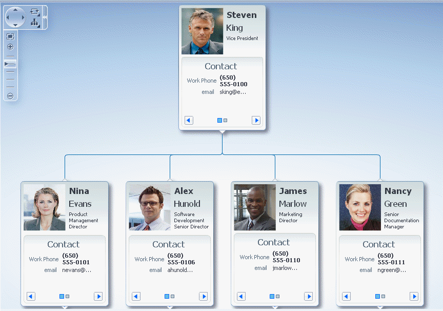
A hierarchy viewer visually displays hiearchical data and the master-detail relationships. Figure 29-1 shows a segment of a hierarchy viewer component at runtime that includes a control panel, a number of nodes, and links that connect the nodes.
The Control Panel provides controls so that a user can manipulate the position and appearance of a hierarchy viewer component at runtime. By default, it appears in a hidden state in the upper left-hand corner of the hierarchy viewer component, as illustrated by Figure 29-2.
You cannot configure the Control Panel to appear in another location. Users click the Hide or Show Control Panel button shown in Figure 29-2 to hide or expand the Control Panel. Figure 29-3 shows the expanded Control Panel.
You can configure the hierarchy viewer component so that the Control Panel does not appear to the user at runtime. For information about the procedure, see Section 29.7.3, "How to Configure the Display of the Control Panel."
Table 29-1 describes the functionality that the controls in the Control Panel provide to users. The Panel Selector is automatically enabled if a node in your hierarchy viewer component contains a dvt:panelCard element with one or more af:showDetailItem elements. The Layout Selector appears automatically if the hierarchy viewer component uses one of the following layouts:
-
Vertical top down
-
Horizontal left to right
-
Tree
-
Radial
-
Circle
For more information about layouts for a hierarchy viewer component, see Section 29.1.3, "Available Hierarchy Viewer Layout Options."
Table 29-1 Elements in the Control Panel
| Control | Name | Description |
|---|---|---|
|
Pan Control |
Allows user to reposition the hierarchy viewer component within the viewport. |
|
 |
Zoom to Fit |
Allows user to zoom a hierarchy viewer component so that all nodes are visible within the viewport. |
|
Zoom Control |
Allows user to zoom the hierarchy viewer component. |
|
|
Hide or Show |
Hides or shows the Control Panel. |
|
 |
Panel Selector |
Displays a list of node panels that you have defined. Users can use the panel selector to show the same panel on all nodes at once. |
|
Layout Selector |
Allows a choice of layouts. Users can change the layout of the hierarchy viewer component from the layout you defined to one of the layout options presented by the component. For more information, see Section 29.1.3, "Available Hierarchy Viewer Layout Options." |
29.1.3 Available Hierarchy Viewer Layout Options
The hierarchy viewer can use any of the following layouts, specified by the component's type attribute:
-
hier_vert_top- Vertical top down -
hier_vert_bottom- Vertical bottom up -
hier_horz_left- Horizontal left to right -
hier_horz_right- Horizontal right to left -
hier_horz_start- Horizontal, direction depends on the locale -
hier_horz_end- Horizontal, direction depends on the locale -
tree- Tree, indented tree -
radial- Radial, root node in center and successive child levels radiating outward from their parent nodes -
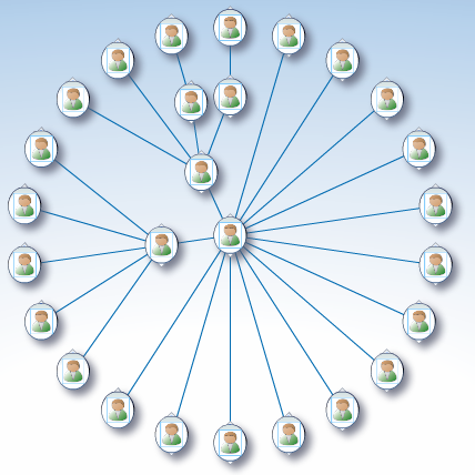
circle- Circle, root node in center and all leaf nodes arranged in concentric circle, with parent nodes arranged within the circleFigure 29-4 shows an example of a circle layout for a hierarchy viewer component.
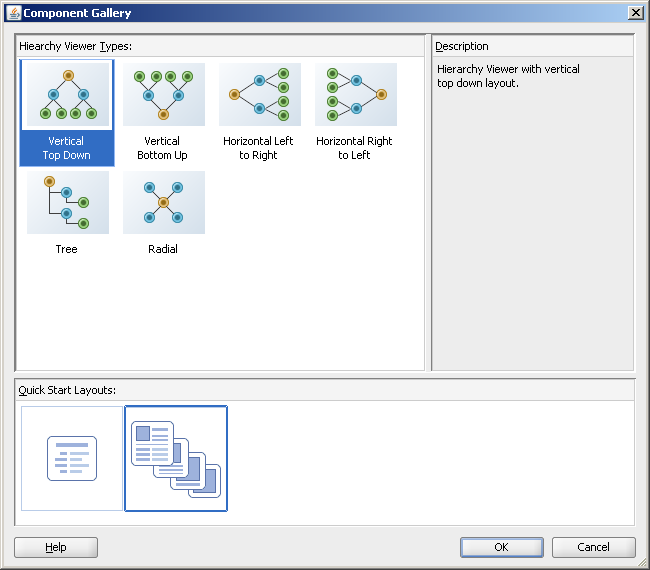
You can define the initial layout of the hierarchy viewer when you insert the component on the page from either the Data Controls panel to bind a data collection to the hierarchy viewer component, or from the Component Palette to insert the component and bind to data later. The available layouts are displayed in the Hierarchy Viewer Types area of the Component Gallery, shown in Figure 29-5.
Note:
The circle layout is not available in the Component Gallery. In order to create a hierarchy viewer with a circle layout, you must specify acircle value in the dvt:hierarchyViewer tag type attribute in the Property Inspector.In the Quick Start Layouts area of the Component Gallery you can also choose to generate the dvt:panelCard element to support multiple sets of content for a node, the selection shown in Figure 29-5.
29.2 Data Requirements for Hierarchy Viewers
A hierarchy viewer component requires data collections where a master-detail relationship exists between one or more detail collections and a master detail collection. The hierarchy viewer component uses the same data model as the ADF Faces tree component. You can test whether it is possible to bind a data collection to a hierarchy viewer component by first binding it to an ADF Faces tree component. If you can navigate the data collection using the ADF Faces tree component, it should be possible to bind it to a hierarchy viewer component.
When you add a hierarchy viewer component to a JSF page, JDeveloper adds a tree binding to the page definition file for the JSF page. For information about how to populate nodes in a tree binding with data, see the "Using Trees to Display Master-Detail Objects" section in the Oracle Fusion Middleware Fusion Developer's Guide for Oracle Application Development Framework.
The data collections that you bind to nodes in a hierarchy viewer component must contain a recursive accessor if you want users to be able to navigate downward from the root node of the hierarchy viewer component. For more information about navigating a hierarchy viewer component, see Section 29.4, "Navigating in a Hierarchy Viewer."
29.3 Managing Nodes in a Hierarchy Viewer
A node is a shape that represents the individual elements in a hierarchy viewer component at runtime. Examples of individual elements in a hierarchy viewer component include an employee in an organization chart or a computer in a network diagram. By default, each node in a hierarchy viewer component includes controls that allows users to do the following:
-
Navigate to other nodes in a hierarchy viewer component
The top of each node contains a single Restore or Isolate button to either display the parent node or single out the node as the anchor node in the hierarchy viewer. One exception is the node at the very top of the hierarchy viewer component, because this node has no parent nodes and may not be isolated.
-
Show or hide child nodes of the currently selected node in a hierarchy viewer component
The single Show or Hide button appears on the bottom of every node that is a not a leaf node.
If you use a panel card to display different sets of information for the node that the hierarchy viewer component references, controls at the bottom of the node allow the user to change the information set in the active node. For more information, see Section 29.6, "Using Panel Cards."
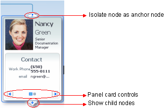
Figure 29-6 shows an example of a node with controls that allow an end user to isolate the node as the anchor node, show the child nodes, and change the node to show different sets of information in the active node. For information about how to configure the controls on a node, see Section 29.3.2, "How to Configure the Controls on a Node."
There are four basic types of nodes:
-
Root nodes are the uppermost visible nodes in a hierarchy viewer component. A root node is always the root of the hierarchy returned from the tree component. Typically, only one root node is visible at a time. However, there could be more than one root node depending on the use case that you implement (for example, in a family tree).
-
An anchor node is the node that has focus whenever the hierarchy viewer component is rendered. There is always just one anchor node visible.
The anchor node may be the same as the root node if child nodes are defined for the tree node and if the value of the hierarchy viewer component's
displayLevelsAncestorproperty is equal to0. At runtime, if a user double-clicks another node that has a value specified for itssetAnchorListenerproperty, that node becomes the anchor node. An anchor node may also be an inner or leaf node, depending on whether or not it has child nodes. For information about how to specify an anchor node, see Section 29.3.4, "How to Associate a Node Definition with a Particular Set of Data Rows."You can specify one or more ancestor levels above the anchor node. For more information, see Section 29.3.5, "How to Specify Ancestor Levels for an Anchor Node."
Figure 29-7 illustrates how a node can be a different type depending on the layout of the hierarchy viewer component.
29.3.1 How to Specify Node Content
Although a node contains controls by default that allow you to navigate to a node and show or hide nodes, nodes do not by default include content unless you used a quick start layout when creating the hierarchy viewer component. You must define what content a node renders at runtime. You can specify node content when you associate data bindings with the hierarchy viewer component as described in the "Creating Databound Hierarchy Viewers" section in the Oracle Fusion Middleware Fusion Developer's Guide for Oracle Application Development Framework.
By default, a hierarchy viewer component that you create contains one node with one facet element that has a zoom level of 100%:
<f:facet name="zoom100"/>
You can insert three more instances of the facet element into the hierarchy viewer component with the following zoom levels:
-
25%:
zoom25 -
50%:
zoom50 -
75%:
zoom75
Use these zoom level definitions to improve readability of node content when the hierarchy viewer is zoomed out to display more nodes and less display room is available in each node. You can define a subset of the available data collection within one or more of the facet elements. For example, if you have a data collection with node attributes that references data about a company department such as its name, location, and number, you can specify a facet element with a zoom level of 50% that references the node attribute for the department's name and number.
At runtime, when a user moves the mouse over a node at any zoom level, a hover window displaying node content at zoom level 100% is automatically displayed, allowing the user to see the full information regardless of zoom level. The controls on the hover window are active when the node has been selected in the hierarchy viewer.
Each of the facet elements that you insert can be used to reference other components. You can use one or more of the following components when you define content for a node in a hierarchy viewer component. The node component facet's support the following components:
-
af:commandButton -
af:commandImageLink -
af:commandLink -
af:commandMenuItem -
af:goButton -
af:goLink -
af:imageFor information about how to use the
af:imagecomponent, see Section 29.7.2, "How to Include Images in a Hierarchy Viewer." -
af:menu -
af:outputFormatted -
af:outputText -
af:panelFormLayout -
af:panelGroupLayoutFor information about how to use the
panelGroupLayoutcomponent, see Section 8.12.1, "How to Use the panelGroupLayout Component." -
af:panelLabelAndMessage -
af:separator -
af:showDetailItem -
af:showPopupBehaviorFor information about how to use the
af:showPopupBehaviorcomponent, see Section 29.5.3, "How to Configure a Hierarchy Viewer to Invoke a Popup Window." -
af:spacer -
dvt:panelCardFor more information about how to use the
dvt:panelCardcomponent, see Section 29.6, "Using Panel Cards."
Note:
Unsupported components are flagged at design time.The hierarchy viewer component renders in a Flash Player only. For this reason, certain properties of ADF Faces components that you specify as node content may not be supported and the component will not render as you expect.
To add a node to a hierarchy viewer component:
-
In the Structure window, right-click the dvt:hierarchyViewer node and choose Insert inside dvt:hierarchyViewer > Node.
The following entry appears in the JSF page:
<dvt:node>
<f:facet name="zoom100"/>
</dvt:node>
-
In the Structure window, right-click the dvt:node and choose Go to Properties.
-
Configure the appropriate properties in the Property Inspector.
For example, set a value for the
typeproperty to associate a node component with an accessor:<dvt:node type="model.rootEmp model.HvtestView"/>
For more information, see Section 29.3.3, "How to Specify a Node Definition for an Accessor."
29.3.2 How to Configure the Controls on a Node
The node component (dvt:node) exposes a number of properties that allow you to determine if controls such as Restore, Isolate, Show or Hide appear at runtime. It also exposes properties that determine the size and shape of the node at runtime.
To configure the controls on a node:
-
In the Structure window, right-click the
dvt:nodecomponent and choose Go to Properties. -
Configure properties in the Appearance section of the Property Inspector for the
dvt:nodecomponent, as described in Table 29-2.Table 29-2 Node Configuration Properties
To do this: Set the following value for this property: Configure the Hide or Show controls to appear or not on a node.
Set
showExpandChildrentoFalseto hide the controls. By default the property is set toTrue.Configure the Restore or Isolate controls to appear or not on the node.
Set the
showNavigateUpandshowIsolateproperties toFalseto hide these controls on the node. By default the property is set totrue.If the
showNavigateUpproperty is set totrue, you must also set a value for the hierarchy viewer component'snavigateUpListenerproperty, as described in Section 29.4.1, "How to Configure Upward Navigation in a Hierarchy Viewer."Configure the height and width of a node.
Set values for the
widthandheightproperties.Select the shape of the node.
Select a value from the Shape dropdown list. Available values are:
-
ellipse -
rect -
roundedRect(default)
-
-
For information about configuring the properties in the Style section of the Property Inspector for the node component, see Section 20.4, "Changing the Style Properties of a Component."
The hover window is automatically displayed when the user moves the mouse over the node, reflecting the shape attribute set for the node. A node with the shape attribute roundedRect, for example, will have a hover window with the same attribute, as shown in Figure 29-8.
29.3.3 How to Specify a Node Definition for an Accessor
By default, you associate a node component with an accessor when you use the Create Hierarchy Viewer dialog to create a hierarchy viewer component, as described in the "Creating Databound Hierarchy Viewers" section in the Oracle Fusion Middleware Fusion Developer's Guide for Oracle Application Development Framework. The Create Hierarchy Viewer dialog sets the node component's type property to a specific accessor.
You can configure a node component's type property to use one or more specified accessors. Alternatively, you can configure a node component's rendered property to use a node definition across accessors, as described in Section 29.3.4, "How to Associate a Node Definition with a Particular Set of Data Rows." When the hierarchy viewer component determines which node definition to use for a particular data row, it first checks for a match on the type property:
-
If the
typeproperty matches and therenderedproperty value istrue(default), the hierarchy viewer component uses the node definition. -
If the
typeproperty does not match, the hierarchy viewer component checks for a value of therenderedproperty that evaluates totrue. The result of evaluating therenderedproperty does not affect thetypeproperty.
29.3.4 How to Associate a Node Definition with a Particular Set of Data Rows
You can use a node component's rendered property to associate the node with a particular set of data rows or with a single data row. The rendered property accepts a boolean value so you can write an EL expression that evaluates to true or false to determine what data rows you associate with a node definition. For example, assume that you want a node to display data based on job title. You write an EL expression for the node component's rendered property similar to the following pseudo EL expression that evaluates to true when a job title matches the value you specify (in this example, CEO):
rendered="#{node.title == 'CEO'}"
When you use the node component's rendered property in this way, you do not define a value for the node component's type property.
29.3.5 How to Specify Ancestor Levels for an Anchor Node
The anchor node of a hierarchy viewer component is the root of the hierarchy returned by the tree binding. Depending on the use case, there can be multiple root nodes, for example, a hierarchy viewer component that renders an organization chart with one or more managers. When a hierarchy viewer component renders at runtime, the node that has focus is the anchor node. If a user double-clicks another node at runtime that has a value specified for its setAnchorListener property, that node becomes the anchor node.
You can configure the hierarchy viewer to display one or more levels above the anchor node, the ancestor levels. For example, if you search for an employee in a company, you may wish to display the chain of management above the employee. Specify ancestor levels using the displayLevelsAncestor property.
To specify the number of ancestor levels for an anchor node:
-
In the Structure window, right-click the dvt:hierarchyViewer node and choose Go to Properties.
-
Expand the Common section of the Property Inspector.
-
Specify the number of levels of ancestor nodes that you want to appear at runtime above the anchor node in the
displayLevelsAncestorproperty.For example, the following entry appears in the JSF page if you entered
2as the number of ancestor levels for the anchor node.displayLevelsAncestor="2" -
Save changes to the JSF page.
29.4 Navigating in a Hierarchy Viewer
By default, a hierarchy viewer component has downward navigation configured for root and inner nodes. You can configure the hierarchy viewer component to enable upward navigation and to determine the number of nodes to appear when a user navigates between nodes on the same level.
For more information about node types, see Section 29.3, "Managing Nodes in a Hierarchy Viewer."
29.4.1 How to Configure Upward Navigation in a Hierarchy Viewer
If you want to configure upward navigation for a hierarchy view component, you configure a value for the hierarchy viewer component's navigateUpListener property.
To configure upward navigation for a hierarchy viewer component:
-
In the Structure window, select dvt:hierarchyViewer and choose Go to Properties.
-
In the Property Inspector, expand the Behavior section of the Property Inspector and write a value for the hierarchy viewer component's
navigateUpListenerproperty that specifies a method to update the data model so that it references the new anchor node when the user navigates up to a new anchor node. -
Click OK.
29.4.2 How to Configure Same-Level Navigation in a Hierarchy Viewer
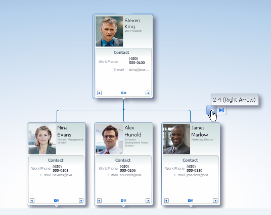
Same-level navigation between the nodes in a hierarchy viewer component is enabled by default. You can configure the hierarchy viewer component to determine how many nodes to display at a time. When you do this, controls appear that enable users to navigate to the following:
-
Left or right to view the next set of nodes
-
First or last set of nodes in the collection of available nodes
To configure same-level navigation in a hierarchy viewer component:
-
In the Structure window, right-click the dvt:hierarchyViewer node and select Go to Properties.
-
Expand the Common section of the Property Inspector and specify the number of nodes that you want to appear at runtime in the Nodes Per Level field (
levelFetchSize).For example, the following entry appears in the JSF page if you entered
3as the number of nodes:levelFetchSize="3" -
Click OK.
29.4.3 What Happens When You Configure Same-Level Navigation in a Hierarchy Viewer
At runtime, the hierarchy viewer component renders the number of nodes that you specified as a value for the hierarchy viewer component's levelFetchSize property. It also renders controls that allow users to do the following:
-
Navigate to the left or right to view the next set of nodes
-
Navigate to the first or last set of nodes in the collection of available nodes
Figure 29-9 shows a runtime example where levelFetchSize="3". When a user moves the mouse over the control, as shown in the circled area in Figure 29-9, the control that allows users to navigate to the last set of nodes appears.
29.5 Adding Interactivity to a Hierarchy Viewer Component
You can configure a hierarchy viewer component to invoke popup windows and display menus with functionality and data from other pages in your Oracle Fusion web application.
29.5.1 How to Configure 3D Tilt Panning
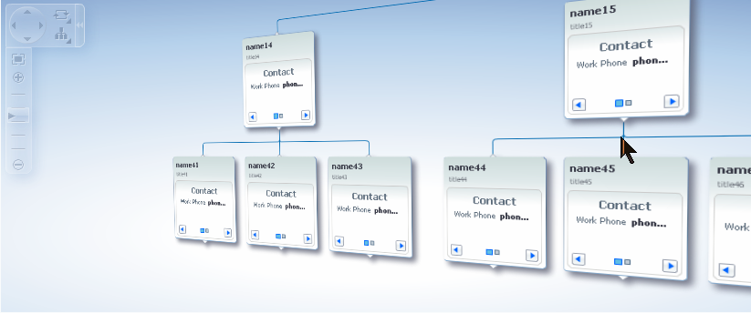
By default, panning in a hierarchy viewer is accomplished by clicking and dragging the component to reposition the view, or by using the panning control in the Control Panel. In a hierarchy viewer with a large quantity of nodes, instead of browsing through a hierarchy viewer one page at a time, users can initiate a 3D tilt panning effect that animates the hierarchy viewer to visually fly through the hierarchy viewer nodes. Once set in motion toward the edge of a view, the effect continues automatically until it reaches the end of the nodes on an edge. Figure 29-10 shows the tilt panning effect as it reaches the edge of the view.
To use the tilt panning effect you should first adjust the zoom level on the hierarchy view for an acceptable view of the content of the nodes. You can initiate the effect in any of these ways:
-
Click and drag using the pan control in the control panel to initiate tilt panning after a short period of regular panning.
-
Click and drag the view one-third of the way across the viewport.
-
Click and hold the cursor near the edge of the view to initiate tilt panning in that direction.
Once the tilt panning effect is initiated, you can move the cursor within the view to change the direction of the pan through the view. Exit tilt panning by selecting any node in the view.
You configure 3D tilt panning effect for the hierarchy viewer by setting the panning property to tilt.
29.5.2 How to Configure Node Selection Action
By default, clicking a hierarchy viewer node at runtime selects the node. You can customize this interaction by setting the clickBehavior attribute on the dvt:node component. Valid values for this property include:
-
focus- The node receives focus and is selected when clicked (default). -
expandCollapse- Child node elements are either expanded or collapsed, depending on their current expansion state. -
isolateRestore- The node is either isolated or restored, depending on its current state. -
none- Clicking the node does nothing.
29.5.3 How to Configure a Hierarchy Viewer to Invoke a Popup Window
You can invoke a popup window from a hierarchy viewer node by specifying values for the af:showPopupBehavior tag and invoking it from a command component, for example, af:commandButton. You must nest the command component that invokes the popup inside an f:facet element in a node of the hierarchy viewer component. The triggerType property of an af:showPopupBehavior tag used in this scenario supports only the following values:
-
action -
mouseHover
For example, Figure 29-11 shows a modal popup invoked from an HR Detail link in the node. Example 29-2 shows sample code for creating the popup. Example 29-3 shows sample code for the invoking the popup from a command component. For brevity, elements such as <af:panelGroupLayout>, <af:spacer>, and <af:separator> are not included in the sample code.
Example 29-2 Sample Code to Create the Popup
<af:popup id="popupDialog" contentDelivery="lazyUncached" eventContext="launcher"
       launcherVar="source">
  <af:setPropertyListener from="#{source.currentRowData}"
        to="#{myBean.selectedEmployee}" type="popupFetch"/>
    <af:dialog title="Employee HR Detail">

    <af:panelFormLayout>

    <af:panelLabelAndMessage label="Name" >
    <af:outputText  value="#{myBean.selectedEmployee.firstName}
          #{myBean.selectedEmployee.lastName}"/>
    </af:panelLabelAndMessage>

    <af:panelLabelAndMessage label="Offical Title" >
    <af:outputText  value="#{myBean.selectedEmployee.officalTitle}"/>
    </af:panelLabelAndMessage>

    <af:panelLabelAndMessage label="HR Manager Id" >
    <af:outputText  value="#{myBean.selectedEmployee.hrMgrPersonId}"/>
    </af:panelLabelAndMessage>

    <af:panelLabelAndMessage label="HR Rep Id" >
    <af:outputText  value="#{myBean.selectedEmployee.hrRepPersonId}"/>
    </af:panelLabelAndMessage>


    </af:panelFormLayout>
  </af:dialog>
</af:popup>
Example 29-3 Sample Code to Invoke Popup from Command Component
<f:facet name="zoom100">
...
<dvt:panelCard effect="slide_horz"
...
<af:showDetailItem text="Contact "
...
<af:commandLink text="Show HR Detail" inlineStyle="font-size:14px;color:#383A47" >
  <af:showPopupBehavior popupId="::popupDialog" triggerType="action"
              align="endAfter" alignId="pg1" />
</af:commandLink>
</showDetailItem>
</dvt:panelCard>
</f:facet>
For more information about using the af:showPopupBehavior tag, see Section 13.4, "Invoking Popup Elements."
29.5.4 How to Configure a Hierarchy View Node to Invoke a Menu
You can configure a node component (dvt:node) within a hierarchy viewer to invoke a menu by using the af:menu component. You can configure one or more af:commandMenuItem elements for the af:menu component. Nodes within a hierarchy viewer component do not support the nesting of af:menu components. Figure 29-12 shows a context menu associated with a node.
Example 29-4 shows sample code for creating the context menu
Example 29-4 Context Menu Sample Code
<af:popup id="popupDialog" contentDelivery="lazyUncached" >
 <af:menu>
    <af:commandMenuItem text="Send an IM"/>
    <af:commandMenuItem text="Look at details"/>

  </af:menu>
</af:popup>
For more information about using the af:menu component, see Chapter 13, "Using Popup Dialogs, Menus, and Windows."
29.6 Using Panel Cards
You can use the panel card component in conjunction with the hierarchy viewer component to hold different sets of information for the nodes that the hierarchy viewer component references. The panel card component is an area inside the node element that can include one or more af:showDetailItem elements.
Each of the af:showDetailItem elements references a set of content. For example, a hierarchy viewer component that renders an organization chart would include a node for employees in the organization. This node could include a panel card component that references contact information using an af:showDetailItem element and another af:showDetailItem element that references salary information.
A panel card component displays the content referenced by one af:showDetailItem element at runtime. The panel card component renders navigation buttons and other controls that allow the user to switch between the sets of data referenced by af:showDetailItem elements. The controls that allow users to switch between different sets of data can be configured with optional transitional effects. For example, you can configure a panel card to horizontally slide between one set of data referenced by an af:showDetailItem element to another set of data referenced by another af:showDetailItem element.
29.6.1 How to Create a Panel Card
You can insert a panel card component into the JSF page that renders the hierarchy viewer component by using the context menu that appears when you select the Facet zoom element in the Structure window for the JSF page.
-
In the Structure window, right-click the zoom level within the node where you want to create a panel card.
For example, select f:facet - zoom100.
-
Select Insert inside f:facet -zoom100 > Panel Card.
-
Use the Property Inspector to configure the properties of the panel card component.
For example, set a value for the Effect property in the Advanced properties for the panel card component. Valid values are:
-
Horizontal Slide (default) -
Panel Flip -
Node Flip -
No Animation
-
-
In the Structure window, right-click dvt:panelCard and choose Insert inside dvt:panelCard > Show Detail Item.
-
Repeat Step 4 as necessary.
-
Use the Property Inspector to configure the properties of the
af:showDetailItemelements that you insert.
29.6.2 What Happens at Runtime When a Panel Card Component Is Rendered
At runtime, a node appears and displays one panel card component. Users can click the navigation buttons at the bottom of the panel card to navigate to the next set of content referenced by one of the panel card's af:showDetailItem child elements.
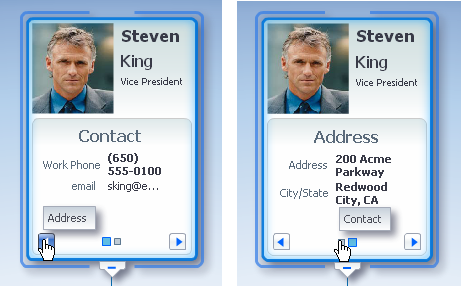
Figure 29-13 shows a node with a panel card component where two different af:showDetailItem child elements reference different sets of information (Contact and Address). The controls in the example include arrows to slide through the panel cards as well as buttons to directly select the panel card to display. Tooltips display for both control options.
29.7 Customizing the Appearance of a Hierarchy Viewer
You can customize the hierarchy viewer component size and appearance including adding images, configuring the display of the control panel, and customizing links and labels.
You can change the appearance of your hierarchy viewer component by changing skins and component style attributes, as described in Chapter 20, "Customizing the Appearance Using Styles and Skins."
29.7.1 How to Adjust the Size of a Hierarchy Viewer
You can adjust the size of the hierarchy viewer component by setting values for a number of the hierarchy viewer component's attributes using the Property Inspector.
To adjust the size of a hierarchy viewer:
-
In the Structure window for the JSF page that contains the hierarchy viewer component, select the dvt:hierarchyViewer node.
-
In the Property Inspector, write the following values for the
InlineStyleproperty:-
widthWrite a value in percent (
%) or pixels (px). The default value for width is100%. -
heightWrite a value in percent (
%) or pixels (px). The default value for height is600px.
The final value that you enter for the
InlineStyleproperty must use this syntax:width:100%;height:600px; -
-
Save changes to the JSF page.
29.7.2 How to Include Images in a Hierarchy Viewer
You can configure a hierarchy viewer component to display images in the nodes of a hierarchy viewer component at runtime. This can be useful where, for example, you want pictures to appear in an organization chart. Insert an af:image component with the source attribute bound to the URL of the desired image. The following code example renders an image.
<af:panelGroupLayout>
<af:image source="/person_id=#{node.PersonId}"
inlineStyle="width:64px;height:90px;"/>
</af:panelGroupLayout>
For more information about the af:panelGroupLayout component, see Section 8.12.1, "How to Use the panelGroupLayout Component."
29.7.3 How to Configure the Display of the Control Panel
You can configure the hierarchy viewer component so that the Control Panel described in Section 29.1.2, "Hierarchy Viewer Elements and Terminology," acts as follows when the hierarchy viewer component renders at runtime:
-
Appears in an expanded or show state
-
Appears in a collapsed or hidden state
-
Does not appear to users
To configure the display of the Control Panel:
-
In the Structure window, right-click the dvt:hierarchyViewer node and choose Go to Properties.
-
Expand the Appearance section and select one of the following values from the ControlPanelBehavior dropdown list:
-
hiddenSelect this value if you do not want the Control Panel to appear at runtime.
-
initCollapsedThis is the default value. The Control Panel appears in a collapsed or hidden state at runtime.
-
initExpandedSelect this value if you want the Control Panel to appear in an expanded or show state at runtime.
-
-
Save changes to the JSF page.
29.7.4 How to Configure the Display of Links and Labels
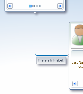
In a hierarchy viewer the relationships between nodes are represented by lines that link the nodes. The links can be configured to include labels. Figure 29-14 illustrates links and labels in a hierarchy viewer.
You can customize the appearance of links and labels by setting properties of the dvt:link element in a hierarchy viewer. Figure 29-15 illustrates links with a dashDot value set for the linkStype attribute.
To customize the display of links and labels:
-
In the Structure window, right-click the dvt:link node and choose Go to Properties.
-
In the Property Inspector, set the following attributes to customize the appearance of links between nodes in a hierarchy viewer as desired:
-
linkStyle- Sets the style of the link, for example, dotted or dashed line. -
linkColor- Sets the color of the link. -
linkWidth- Sets the width of the link, in pixels. -
linkType- Sets the type of link, for example, direct line or smooth curved line fitted to what would have been a single right angle. -
endConnectorType- Sets the style of the link connection end tonone(default) orarrowOpen.
-
-
Also in the Property Inspector, enter text for the label associated with the link in the
labelproperty.Alternatively, specify an EL expression to stamp out the link label based on the child node. For example, write an EL expression similar to the following where the node
varattribute refers to the child node associated with the link.label="{node.relationship}" -
Optionally, also in the Property Inspector, use the
renderedproperty to stamp the link for a particular relationship between nodes. The property accepts a boolean value so you can write an EL expression that evaluates totrueorfalseto determine if the link represents the relationship. For example, assume that you want a link to display based on reporting relationship. You write an EL expression for the link component'srenderedproperty similar to the following EL expression that evaluates totruewhen the relationship matches the value you specify (in this example,CONSULTANT):rendered="#{node.relationship == "CEO"}
29.8 Adding Search to a Hierarchy Viewer
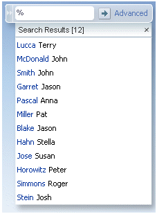
The hierarchy viewer search functionality looks through the data structure of the hierarchy viewer and presents matches in a scrollable list. Users can double-click a search result to display the matching node as the anchor node in the hierarchy viewer. When enabled, a search panel is displayed in the upper right-hand corner of the hierarchy viewer, and results are displayed below the search panel. Figure 29-16 shows a sample search panel.
Figure 29-17 shows sample search results.
29.8.1 How to Configure Searching in a Hierarchy Viewer
Add the dvt:search tag as a child of the dvt:hierarchyViewer tag to enable searching, and dvt:searchResults as a child of dvt:search to specify how to handle the results.
To configure search in a hierarchy viewer:
-
In the Structure window, right-click the dvt:hierarchyViewer node and choose insert inside dvt:hierarchyViewer > dvt:search.
-
In the Property Inspector, set the following attributes to configure the search functionality:
-
value: Specify the variable to hold the search text. -
actionListener: Enter the listener called to perform the search. -
initialBehavior: Specify how the search panel is initially displayed. Valid values areinitCollapsedfor initially collapsed,initExpandedfor initially expanded, orhiddenfor completely hidden from view.
-
-
Optionally, add a
f:facetwith a value ofname="end"to specify a component that will launch an advanced search outside of the hierarchy viewer component. This facet should contain only a single component, for exampleaf:commandLink, to launch a comprehensive search of a data set. For more information, see Section 12.4, "Using the query Component." -
In the Structure window, right-click the dvt:search node and choose insert inside dvt:search > dvt:searchResults.
-
In the Property Inspector, set the following attributes to configure the display of the search results:
-
value: Specify the search results data model. This must be an instance oforacle.adf.view.faces.bi.model.DataModel. -
var: Enter the name of the EL variable used to reference each element of the hierarchy viewer collection. Once this component has completed rendering, this variable is removed, or reverted back, to its previous value. -
varStatus: Enter the name of the EL variable used to reference thevarStatusinformation. Once this component has completed rendering, this variable is removed, or reverted back, to its previous value. -
resultListener: Specify a reference to an action listener that will be called after a row in the search results is selected. -
emptyText: Specify the text to display when no results are returned. -
fetchSize: Specify the number of result rows to fetch at a time.
-
-
In the Structure window, right-click the dvt:searchResults node and select insert inside dvt:searchResults, then select ADF Faces, then select af:setPropertyListener.
-
In the Property Inspector, set the following attributes to map the search results node from the results model to the corresponding hierarchy viewer model:
-
from: Specify the source of the value, a constant or an EL expression. -
to: Specify the target of the value. -
type: Chooseactionas the value.
-
-
In the Structure window, right-click the dvt:searchResults node and choose insert inside dvt:searchResults > f:facet with a value of
name="content". -
In the Structure window, right-click the f:facet
contentnode and do the following to specify the components to stamp out the search results:-
Insert an ADF Faces
af:panelGroupLayoutelement to wrap the output of the search results. -
Insert the ADF Faces output components to display the search results. For example:
<af:outputText value="#{resultRow.Lastname} " id="ot1"
           inlineStyle="color:blue;"/>
<af:outputText value="#{resultRow.Firstname}" id="ot2"/>
Each stamped row references the current row using the
varattribute of thedvt:searchResultstag.
-
Example 29-5 shows sample code for configuring search in a hierarchy viewer.
Example 29-5 Sample Hierarchy Viewer Search Code
<dvt:hierarchyViewer>
  <dvt:search id="searchId" value="#{bindings.lastNameParam.inputValue}"
                      actionListener="#{bindings.ExecuteWithParams1.execute}">
    <f:facet name="end">
      <af:commandLink text="Advanced">
        <af:showPopupBehavior popupId="::mypop" triggerType="action"/>
      </af:commandLink>
    </f:facet>
      <dvt:searchResults id="searchResultId"
          emptyText="#{bindings.searchResult1.viewable ? 'No match.' : 'Access
          Denied.'}"
          fetchSize="25"
          value="#{bindings.searchResult1.collectionModel}"
          resultListener="#{bindings.ExecuteWithParams.execute}"
                               var="resultRow">
        <af:setPropertyListener from="#{resultRow.Id}"
                               to="#{bindings.employeeId.inputValue}"
                               type="action"/>
    <f:facet name="content">
      <af:panelGroupLayout inlineStyle="width:110px;height:20px;">
        <af:outputText value="#{resultRow.Lastname} " id="ot1"
           inlineStyle="color:blue;"/>
        <af:outputText value="#{resultRow.Firstname}" id="ot2"/>
      </af:panelGroupLayout>
    </f:facet>
      </dvt:searchResults>
  </dvt:search>
</dvt:hierarchyViewer>
29.8.2 What You May Need to Know About Configuring Search in a Hierarchy Viewer
Search in a hierarchy viewer is based on the searchable attributes or columns of the data collection that is the basis of the hierarchy viewer data model. Using a query results collection defined in data controls in Oracle ADF, JDeveloper makes this a declarative task. For more information, see the "How to Create a Databound Search in a Hierarchy Viewer" section in the Oracle Fusion Middleware Fusion Developer's Guide for Oracle Application Development Framework.
