3. Design Views
In this step, we will create views for the application.
3.1. Import the CSS file
To customize the appearance of HTML components we will use a CSS file.
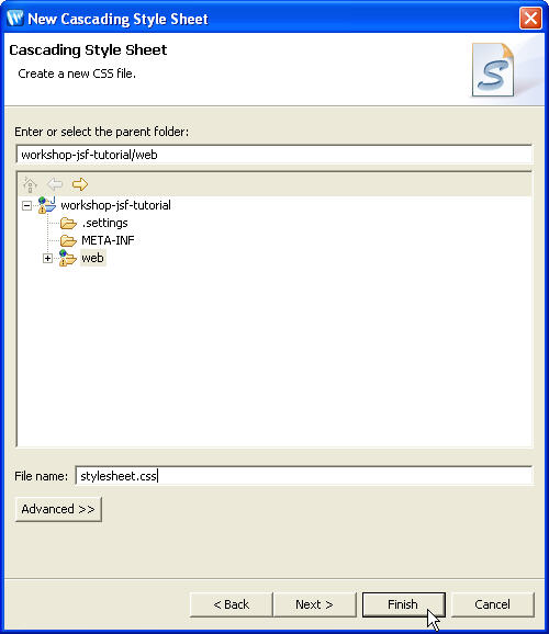
- Select File > New > Other
- Expand Web and select CSS. Click Next
- Select the web folder and type stylesheet.css
for file name and click Finish .
This creates a new file stylesheet.css under the web application root folder i.e. web (Web App Root). - Copy all the code from workshop-jsf-tutorial/web/Resources/stylesheet.css file to web/stylesheet.css file.
- Save the stylesheet.css file.
3.2. Create images folder
In this application, we will place image files under the images folder.
- Select File > New > Folder
- In New Folder wizard select the parent folder workshop-jsf-tutorial/web and type folder name images
- Click Finish.
This creates new folder called images under the web application root folder i.e. web (Web App Root) - Copy the image file banner.gif from the folder workshop-jsf-tutorial/web/Resources/images to the workshop-jsf-tutorial/web/images folder.
3.3. Create a view
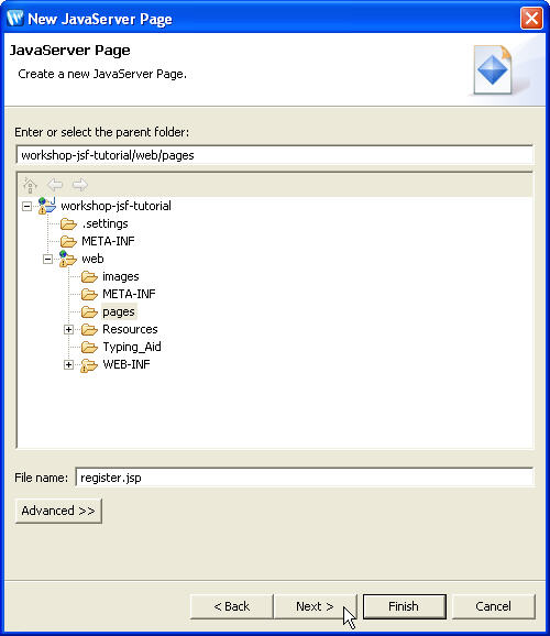
In this step, we will create a JSP page named register.jsp that shows the user registration form.
- Select File > New > Other. Expand Web and click JSP. Click Next .
- Select the folder workshop-jsf-tutorial/web/pages for the file location and in the File name field enter register.jsp.
- Click Next
- Ensure that the template New JSP File (html) is selected and click Next.
- Choose a resource bundle base name resources > application.
This base name is used by the page register.jsp .
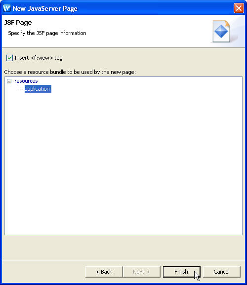
- Click Finish
- This creates an empty JSP file named register.jsp with the JSF tags <f:view> and <f:loadBundle> from JSF Core tag library. Open and review the code.
- By default, the taglib lines:
<%@ taglib uri="http://java.sun.com/jsf/html" prefix="h" %>
is not added to new JSP files.
Copy the line to your register.jsp file.
| <!DOCTYPE HTML PUBLIC "-//W3C//DTD HTML 4.01 Transitional//EN"> <%@ page language="java" contentType="text/html; charset=iso-8859-1" %> <%@ taglib uri="http://java.sun.com/jsf/core" prefix="f" %> <f:loadBundle basename="resources.application" var="bundle"/> <f:view> <html> <head> <meta http-equiv="Content-Type" content="text/html; charset=iso-8859-1" /> <title>Untitled Document</title> </head> <body> </body> </html> </f:view> |
The basename attribute of the loadBundle tag refers to the ResourceBundle located in the resources package of the application. The basename attribute must specify the fully qualified class name of the file.
3.4. Design the register.jsp view
In this step, we will add UI components to design the JSF page register.jsp.
To design the JSF page, you will use JSF tags which are readily available and displayed in Design Palette view.
The JSP Variables section of the Design Palette displays lists of variables available to the JSP page and facilitates insertion of those variables onto the page. The different icons indicate the variables scope.
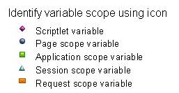
Note that information about the variable will be displayed on mouse-over for each variable.
Right-click the Session scope variable user and observe the options in the pop-up menu.
The pop-up menu shows the options to
- Navigate to the source file associated with the Java class of a variable
- Navigate to the variable definition in faces-config.xml file
- Insert the variable or its fields into a page
3.4.1. Specify the page title and stylesheet
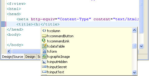
- Remove the text Insert Title Here from the <title> tag in register.jsp; type <h: and press Ctrl+Space
- From the list of tags select h:outputText tag and press Enter. This adds the empty tag <h:outputText/>.
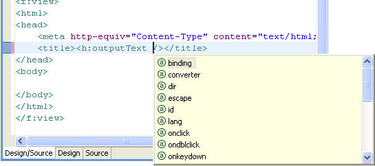
- Press the Space key before the closing bracket of the outputText tag. It displays the outputText attributes list.
- Choose the attribute value for the <h:outputText> tag.
- Select the Properties tab.
In the Smart Editor tab click the icon for the Value attribute.
 - In this Choose Binding dialog click the Resources tab and click on the New Resource Key link.
- In the New Resource Key dialog, in the Resource Key field, enter registerPageTitle; in the Resource Value field enter Register to Workshop.
- Click OK on the New Resource Key editor. It adds new key/value pair in the resource bundle application.properties file.
- Click OK on Choose Binding dialog.
- On the Design Palette view, from the HTML tags
list, drag the
 Import CSS File tag to the Design
Editor (= the blank upper pane) of the register.jsp
page.
Import CSS File tag to the Design
Editor (= the blank upper pane) of the register.jsp
page. 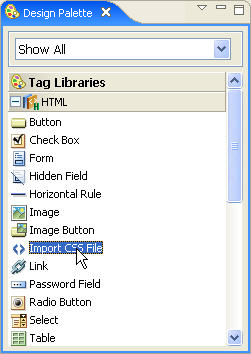
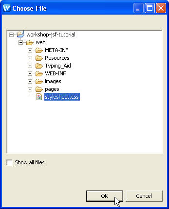
- It opens the Choose File dialog. Choose the file workshop-jsf-tutorial/web/stylesheet.css
- This will add a <link> tag referencing the CSS file before the </head> tag.
- Save the register.jsp file.
This displays a list of tags from the JSF HTML tags libraries. This is
one of the most powerful features called Code Completion offered
by the Workshop AppXRay technology.
| <link rel="stylesheet" type="text/css" href="../stylesheet.css"> |
3.4.2. Add an HTML table
The WYSIWYG JSF Editor supports drag and drop of any tags from any tag library listed in the Design Palette view.
- On the Design Palette view, from the HTML tags
list, drag the
 Table tag
to the Design Editor of register.jsp page.
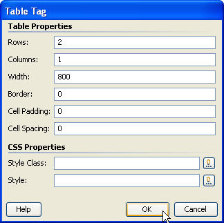
It opens a Table Tag dialog.
Table tag
to the Design Editor of register.jsp page.
It opens a Table Tag dialog. - In the Table Tag dialog enter the parameters as shown below:
- Click OK
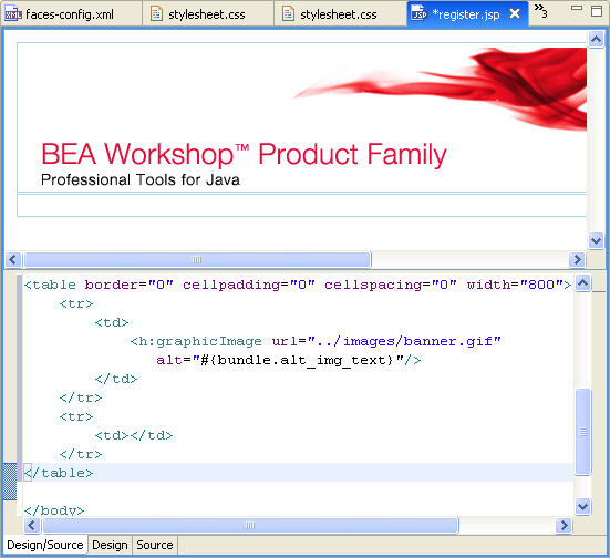
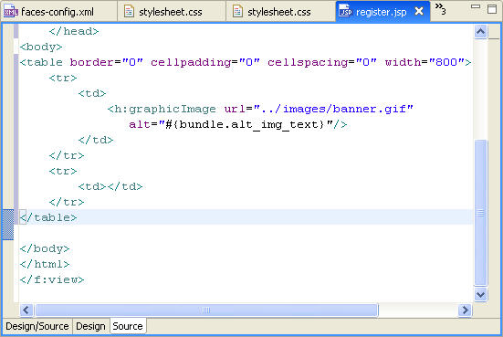
- This will add an HTML table tag in the body tag of register.jsp page.
3.4.3. Add an Image to the page
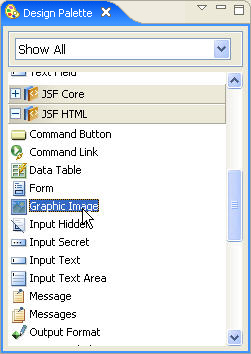
- On the Design Palette view, from the JSF
HTML tags
list, drag the
 Graphic
Image tag to the first row of the HTML
table.
Graphic
Image tag to the first row of the HTML
table.
- Click the icon
 for URL and choose the image file banner.gif and click OK .
 - Click the icon
 for
Alt (alternative text for image). In the Choosing
Binding dialog click the Resources tab and
click on the New Resource Key link.
for
Alt (alternative text for image). In the Choosing
Binding dialog click the Resources tab and
click on the New Resource Key link.
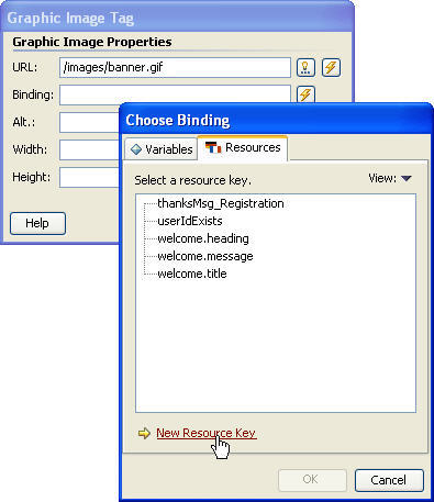
- In the New Resource Key editor type alt_img_text for the resource key and JSF Editor for the resource value.
- Click OK on the New Resource Key editor. It adds a new key/value pair in the resource bundle application.properties file.
- Click OK on the Choose Binding dialog.
- Click OK in the Graphic Image Tag dialog.
- This will add a <h:graphicImage> tag with attribute values in the first row of the HTML table.
- Save the register.jsp page.
From the split-pane view, you can switch to a pure WYSIWYG (or Design) Editor by clicking on the Design tab.
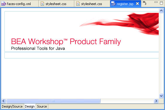
You also have flexibility of a professional Source Editor to work with.
3.4.4. Add application messages
During user registration the application should prompt the user to re-enter userId, if the userId entered already exists. The registerUser( ) method of UserBean appends FacesMessage to FacesContext if the userId already exists.
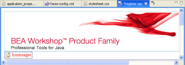
In the register.jsp page we will add a <h:messages> tag to display error messages being added to FacesContext during the request process.
- Using the drag and drop feature of the editor, add the
 Messages tag
from the JSF HTML tag library to the second row of the HTML table.
Messages tag
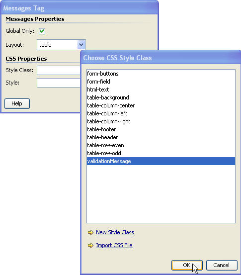
from the JSF HTML tag library to the second row of the HTML table. - In the Messages Tag dialog,
select the checkbox Global Only
Confirm that the Layout field has the value table.
To set the CSS stylesheet class, click the icon for Style Class.
In the Choose CSS Style Class
dialog select validationMessage and click OK.
for Style Class.
In the Choose CSS Style Class
dialog select validationMessage and click OK. - Click OK in the Messages Tag dialog.
- This will add a <h:messages> tag with attribute values in the second row of the HTML table.
- In the Design Editor press Enter after
the h:messages UI component.
- Save the register.jsp page.
3.4.5. Add HTML Form, Form Fields and Validation Error Messages
Now we will add tags for an HTML form and form fields. We will also define validators for various form fields. In the process we will learn different features of Workshop.
- Using the drag and drop feature, add the
 Form tag from the JSF HTML tag library
to the second row of the HTML table after the h:messages placeholder.
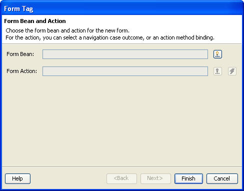
Form tag from the JSF HTML tag library
to the second row of the HTML table after the h:messages placeholder. - Click the icon
 next to the Form Bean field. In the Choose
Bean/Property dialog
select JSF Managed Bean user and click OK .
next to the Form Bean field. In the Choose
Bean/Property dialog
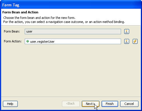
select JSF Managed Bean user and click OK . - Click the icon
 next
to the Form
Action field. In the Choose Method dialog
select registerUser method of the user Managed
Bean.
next
to the Form
Action field. In the Choose Method dialog
select registerUser method of the user Managed
Bean.
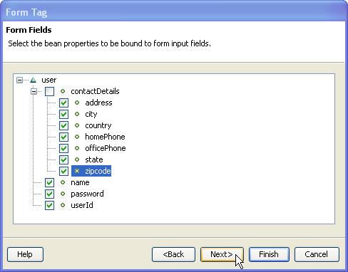
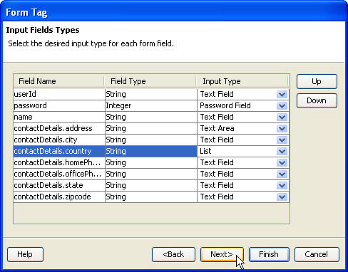
Click Next. - Select all the properties of the user bean to be bound to form input fields and click Next.
- In Form Tag dialog, using the Up and Down buttons,
set the order of the fields as shown below.
Set the Input Type of the contactDetails.address field to Text Area .
Set the Input Type of the contactDetails.country field to List.
- Click Next.
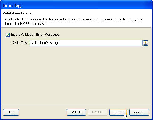
- Our application is required to display validation error messages. To
accomplish this, ensure that the Insert Validation Error Messages
check box is checked.
Click the icon
next to the Style Class field.
In the Choose CSS Style Class dialog select the class validationMessage and click OK. - Click Finish
This action will insert tags from the JSF HTML tag library. Specifically, a <h:form> tag containing a <h:panelGrid> tag for the HTML table; <h:outputText> tags for form field labels; <h:inputText>, <h:selectOneListbox> and <h:inputTextarea> tags for form fields and <h:message> tags for validation error messages.
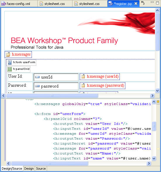
Also note the tag <h:commandButton>
with action attribute (which refers to the UserBean.registerUser() method)
has been added.
The for attribute value of <h:message>
tag refers to the id attribute value of
the respective form field.
3.4.6. Using the Property sheet and Smart Editor
The selectOneListbox field shows a list of countries. We will use the Property Sheet and Smart Editor tabs to add items to the list and specify its properties. In this process we will understand the difference between the Property Sheet and Smart Editor facilities.
- In the Design Editor select the country list box. The
Property Sheet tab on the Properties
view displays a list of attributes defined for the <h:selectOneListbox>
tag and the source window shifts to the corresponding tag.
The Property Sheet tab lists all the tag attributes and their values. Depending on the attribute type, an attribute value picker is displayed to help with editing the attribute value.
The Smart Editor tab provides UI for efficient editing. - In the Smart Editor tab click the icon next
to the Static Items attribute.
- In the Edit Select Item List, click Add.
- In the Select Item Tag dialog, in the Label field, add "United States of America" and in the Value field add "USA".
- Repeat until the Edit
Select Item List dialog
appears as shown below:
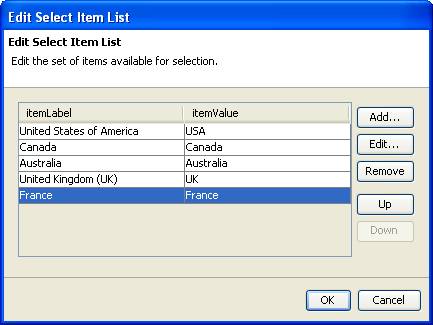
- When the list is complete, click OK.
3.4.7. Synchronized Editing
- The WYSIWYG JSF (Design) editor view, Source Editor view, Properties view and Outline view are synchronized with each other. This means any real-time changes being made in one view are immediately reflected in other views.
- In the Smart Editor tab, in the Rendering Properties section, for the field Type choose the option Menu. This will change the Country list tag from <h:selectOneListbox> tag to <h:selectOneMenu> tag.
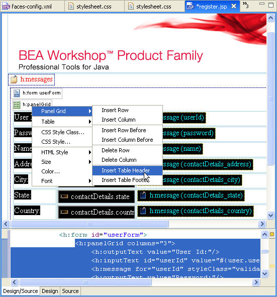
3.4.8. Insert table header and footer
- In the Design Editor, right-click the h:panelGrid component to open the pop-up menu and select Panel Grid > Insert Table Header.
- Drag the Output Text tag from the JSF HTML tag library and drop it in the table header row.
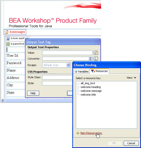
- In the Output Text Tag dialog click the icon next
to the Value field.
In the Choosing Binding dialog
click the Resources tab and click on the New
Resource Key link.
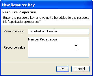
- In the New Resource Key editor, in the Resource Key field, enter registerFormHeader; in the Resource Value field, enter Member Registration.
- Click OK on the New Resource Key dialog. This adds a new key/value pair in the resource bundle application.properties file.
- Click OK on the Choose Binding dialog.
- Click OK on the Output Text Tag dialog.
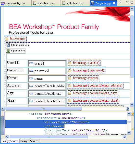
- In the Design Editor, right-click the h:panelGrid component to open the pop-up menu and select Panel Grid > Insert Table Footer.
- In Source View, move the Submit button (<h:commandButton action="#{user.registerUser}" value="Submit"/>) into the table footer.
- Save register.jsp page.
This will add a table header row using the <f:facet>
tag from the JSF Core tags library.
3.4.9. Specify style class for table
- In the Design Editor select the h:panelGrid component.
- In the Smart Editor click the icon
next to the Table Class field and in the Choose
CSS Style Class
dialog select the option table-background and
click OK
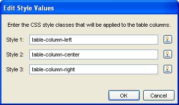
- Next to the Column Classes field, click
the icon
and in the Edit
Style Values dialog select the styles for three columns as shown
below and click OK
- We have specified CSS style classes for the table and table columns. Now set the CSS style classes for the table header and footers.
- In the Properties view select the Property
Sheet
tab view and click the Value column of the headerClass attribute.
Note that the icon appears.
Click the icon and
from the Choose CSS Style Class dialog
select the style-class table-header and click OK
- Similarly select the style-class table-footer for the footerClass Style Sheet attribute.
- Select each form field one at time (except for the Address field). For each field, using the Smart Editor tab, in the Style Class field enter form-field.
- Save the register.jsp page.
3.4.10. Define validators for form-fields
Next we will identify validation rules for the HTML form fields. The table shown below describes validation rules / criteria for some of the form fields.
 |
 |
 |
||||||||||||||||||||||||
|
|
|
||||||||||||||||||||||||
 |
|
 |
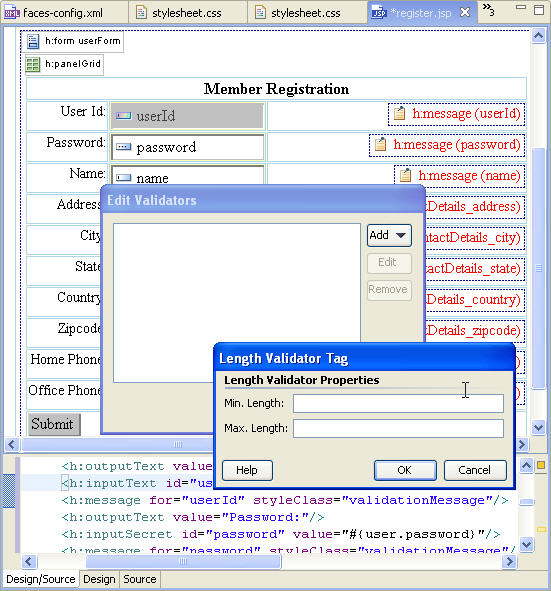
- In the Design Editor select the userId text field. The Smart Editor tab displays the attributes of the <h:inputText> tag for the userId text field. Check the Required checkbox under the Validation section. This will add an attribute required="true" to the userId text field tag.
- Click the icon next
to the
Validators field . In the Edit Validators dialog
click the Add button and select the option Length
Validator
- In the Length Validator Tag dialog type 4 for Min. Length field and 8 for Max. Length field and click OK. This will add a JSF standard Length Validator to the validators list for the userId text field.
- In the Edit Validators dialog. Click OK.
The <f:validateLength> tag from the JSF Core tag library will be added to the userId input text field. - In the Design Editor select the password text field. The Smart Editor tab displays attributes of the <h:inputText> tag for the password text field. Check the Required checkbox under the Validation section. This will add an attribute required="true" to the password text field tag.
- Click the icon next
to the Validators field. In
the Edit Validators dialog
click the Add button and select the option Long
Validator.
- In the Long Validator Tag dialog type 1000 for Min. Value field and 9999 for Max. Value field and click OK.
- This will add a JSF standard Long Validator to the validators
list for the password text field. Click
OK.
The <f:validateLongRange> tag from the JSF Core tag library will be added to password input text field. - For each form field (i.e. name, city, zipcode, and country) check the
Required validation attribute.
We need to specify the symbol ( * ) for each form field that requires input value.
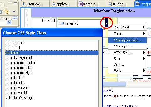
- In the Design Editor type the symbol * after the userId input text field. This will insert the symbol * in the <f:verbatim> tag from the JSF Core tag library.
- Select the symbol * to specify the CSS style-class. Right-click to open pop-up menu and select CSS Style Class > html-text
- This will apply the style-class html-text to the symbol * using the <span> tag.
- For each form field (i.e. password, name, address, city, zipcode, and country) add the symbol * and apply the style-class html-text
- Save the register.jsp page.
3.4.11. Localize UI Component labels
In an internationalized application the GUI component labels should be localized. Hence, we will bind the UI component labels to the dynamic values from the application resource bundle.
- In the workshop-jsf-tutorial/web/WEB-INF/src/java/resources/application.properties file add key-value pairs for form field labels and save the file. You can copy from workshop-jsf-tutorial/web/Typing_Aid/application_properties_1.txt
- In the Design Editor select the label User Id: for the userId text field. The Smart Editor view displays attributes of the <h:outputText> tag for the User Id: text label.
- In the Smart Editor click the icon
next to the Value field. In the Choose
Binding
dialog choose the resource key userId under the Resources
view and click OK
- This will dynamically bind the value attribute of <h:outputText> tag to the userId key value from the application resource bundle.
- Similarly bind the labels of other UI components (i.e. password, name, address, city, state, zipcode, country, office phone and home phone, submit) to the respective key value from the application resource bundle.
- Save the register.jsp page.
| userId=User ID\: password=Password\: name=Name\: address=Address\: city=City\: state=State\: country=Country\: zipcode=Zipcode\: officePhone=Phone (Off.)\: homePhone=Phone (Home)\: submit=Submit reset=Reset |
3.4.12. Observe the variables available to a JSP page
Workshop automatically detects the variables available to be used in a JSP page and provides a list to select from. This reduces development time and minimizes errors.
- In the Design Editor select the userId text field. The Source Editor view displays the selected <h:inputText> tag for the userId text field.
- Remove the userId text from the value
attribute of <h:inputText> tag for
the userId text field and press Ctrl+Space
Workshop shows a list of variables available to be used in JSF page. - Reset the value attribute of <h:inputText> tag for the userId text field to #{user.userId}
3.4.13. Code completion and error checking for the JSF Managed beans
Workshop has a deep understanding of the application and builds a database to store that understanding. It provides code completion for the variables and methods of JSF Managed Beans.
- In the Design Editor select the Submit button. The Source Editor view displays the selected <h:commandButton> tag for the Submit button.
- Remove registerUser text from the action attribute of the <h:commandButton>
tag for the Submit button and press Ctrl+Space
Workshop provides code completion by showing methods of Managed Bean UserBean. - Reset the action attribute of <h:commandButton> tag to #{user.registerUser}
3.4.14. Real-time Error Checking
With its analysis of the application, Workshop immediately sees potential errors and provides real-time error checking.
Workshop will create a warnings/errors manifest of all the affected files. The manifest will go beyond affected Java files and will include files at all levels including the JSP pages and XML configuration files.
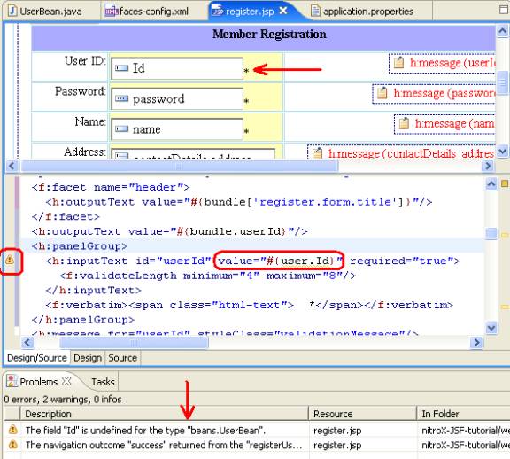
- If you edit the value attribute of the <h:inputText> tag for the userId text field with the value #{user.Id} then the Source Editor shows the warning icon.
- If you save the register.jsp page then the Problems view shows warning message saying that the Id field is undefined for the Managed Bean beans.UserBean.
- Reset the value attribute to #{user.userId}.
- In the UserBean class edit the getPassword( ) method name to getPass( ) and save UserBean class.
- The Problems view shows warning message for the register.jsp resource saying that the field password is undefined for the Managed Bean beans.UserBean.
- In the UserBean class reset the method name getPass( ) to getPassword( ) and save UserBean class.
Click one of the following arrows to navigate through the tutorial:
|
|