6 Formatting Views
This chapter provides detailed information about the formatting options available for each of the views in Oracle BAM Active Studio.
This chapter contains the following topics:
Introduction to Formatting Views
Formatting changes the way parts of the view look. A report can contain several views of different types. You apply formatting to each view in a report.
Formatting includes tasks such as adding display titles, formatting text and colors, and changing value formats. Several formatting features apply to specific view types only. Because each of the view types has different characteristics and structures, formatting options change depending on the view type.
When you create or edit a view, select the Properties button to display the formatting options.
Configuring General Formatting Properties
General formatting properties are those properties that are common to all views of a particular type. However there are a few properties described in this section that are general to all view types.
To specify general properties:
-
Click the Properties button in the View Editor. To open the View Editor, double-click the view you are editing, or click Edit view in the View Tasks/Options list.
-
Select the General tab.

Description of the illustration bam_ve_general.gif
The following general properties are available in all views:
-
View Title displays a title and title bar for this view in the report. Every view in a report can have its own title. The view title bar is also used to display surface prompts, menus, and the additional information button.
-
Display additional info button creates an icon in the view title with additional information that you enter in the field.
-
Allow view to be detached from report creates an icon in the view title that when clicked opens the view in a separate browser window. You can edit the browser window settings by clicking the link.
Depending on the view you select there might be more options. See the related sections in this chapter for information about general options for each view.
-
-
Click Apply or OK.
Configuring Axis Properties
For chart views (except Pie Chart), you can format the axes or accept the automatic axis formatting. Auto formatting adjusts the axes for active data. Other view types do not contain axes.
-
Click the Properties button in the View Editor. To open the View Editor, double-click the view you are editing, or click Edit view in the View Tasks/Options list.
-
Select the Axis tab.
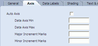
Description of the illustration bam_ve_axis.gif
-
To use the automatic axis formatting, select the Auto Axis check box. If you turn off Auto Axis, you must specify numbers for the following settings:
-
Data Axis Min
-
Data Axis Max
-
Major Increment Marks
-
Minor Increment Marks
-
-
If your view type is a Combo Chart, you can choose to display a secondary axis by selecting the Display Secondary Axis check box and specifying the secondary axis settings.
-
Click Apply or OK.
Configuring View Borders, Shading, and Background Color
You can change the background color and borders of the view, the view title bar, column headers and any column in a list view, the report prompt input dialog box, the report prompt selected option, import a background image, and format the Go prompt button.
To change the color of view element:
-
Click the Properties button in the View Editor. To open the View Editor, double-click the view you are editing, or click Edit view in the View Tasks/Options list.
-
Select the Shading tab.

Description of the illustration bam_ve_shading.gif
-
Select a target from the Apply To list.
-
Click the color swatch next to the Color field to change the background color.
A color palette is displayed.
-
Select a color from the palette.
The color and the color hexadecimal number display. You can also specify the color by typing or pasting a hexadecimal number in the Color field.
-
Click Apply or OK.
-
Click the Properties button in the View Editor.
-
Select the Shading tab.
-
Select a target from the Apply To list.
-
In the Background section check the Image check box, and click Browse to locate the image file.
The file must be a GIF, JPG, or PNG file type.
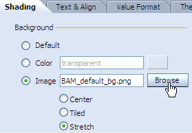
Description of the illustration bam_ve_shading_image.gif
-
Select whether the image is to be centered, tiled, or stretched over the target location.
-
Click Apply or OK.
-
Click the Properties button in the View Editor.
-
Select the Shading tab.
-
Select a target from the Apply To list.
-
Next to a border type, select a line style from the list, such as solid or double.
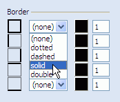
Description of the illustration bam_ve_shading_border.gif
-
Click the color swatch next the list you selected.
A color palette is displayed.
-
Select a color from the palette.
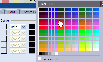
Description of the illustration bam_ve_shading_border_color.gif
The color is displayed in the swatch.
-
Enter a number next to the color swatch to indicate the line thickness.

Description of the illustration bam_ve_shading_border_thick.gif
-
In the Margin group (View target only) you can adjust the amount of white space between the view borders and the data displayed in the view.
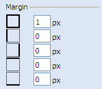
Description of the illustration bam_ve_shading_margin.gif
-
Click Apply or OK.
Configuring Text Alignment
The Text & Align tab in the View Editor lets you adjust the alignment of labels in the view including the view title, column headers, and column text.

Description of the illustration bam_ve_textalign.gif
You can configure text wrapping properties and edit column headers. You can configure with of columns in list views.
-
Click the Properties button in the View Editor. To open the View Editor, double-click the view you are editing, or click Edit view in the View Tasks/Options list.
-
Select the Text & Align tab.
-
Select a target from the Apply To list.
-
Edit the column heading name by entering a name in the Column Heading text field. This name is displayed in the view but does not change the column name in the data object.
-
Select an option for horizontal text alignment, and where applicable, for vertical text alignment.
-
Choose from the following properties:
-
None applies no formatting. Text longer than the column is wide is truncated.
-
Wrap text causes data to start on a new line if the column is not wide enough to display all information.
-
Wrap text (break words) breaks long words to wrap them. No hyphen is used.
-
Ellipses truncates data after a set width and displays ellipses as an indicator in list view types only.
-
Width is the set width for the column measured in pixels, inches, or percentage.
You can change the width of the column by choosing the column name in the Text and Align properties tab, and set the pixel value for width, for example, 150. By default, all of the columns have variable width in the report, so if you configure it to be a fixed width, as mentioned, you can increase or decrease the width. If you configure a fixed width for only one column, space is taken away from the remaining columns, but if you configure a fixed width for all of the columns, a scroll bar appears at the bottom of the view to help the user navigate the width of the view.
-
Height is the set height for the row measured in pixels.
-
-
Click Apply or OK.
Displaying Data Labels
In chart view types, you can choose to display data labels that show values, percentages, or data series names.
-
Click the Properties button in the View Editor. To open the View Editor, double-click the view you are editing, or click Edit view in the View Tasks/Options list.
-
Select the Data Labels tab.
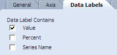
Description of the illustration bam_ve_label.gif
-
Select the check boxes to display data labels.
You can select any combination of label types to display.
-
Click Apply or OK.
Configuring Font Formats
The Fonts tab in the View Editor lets you select and format the fonts used in the view.
-
Click the Properties button in the View Editor. To open the View Editor, double-click the view you are editing, or click Edit view in the View Tasks/Options list.
-
Select the Font tab.

Description of the illustration bam_ve_font.gif
-
Select a target from the Apply To list.
-
Select a font name from the Font list.
-
Select a font style from the Style list.
-
Select a font size from the Size list.
-
Click the color swatch to change the font color.
A color palette is displayed.
-
Select a color from the palette.
The color swatch changes color and the color hexadecimal number is displayed in the Color field. You can also specify the color by typing or pasting a hexadecimal number in this field.
-
Choose effects to apply to the text by selecting the check boxes and radio buttons.
-
Click Apply or OK.
Configuring Themes
You can select color themes for chart views and the Crosstab and Matrix views, but not Summary Crosstab view.
-
Click the Properties button in the View Editor. To open the View Editor, double-click the view you are editing, or click Edit view in the View Tasks/Options list.
-
Select the Themes tab.

Description of the illustration bam_ve_theme.gif
-
Select an option to choose a preconfigured color scheme.
If your chart only includes two colors, the colors are applied in the order listed in the color scheme. If your chart requires more than seven colors, the colors are repeated with patterns applied to represent more values.
-
Click Apply or OK.
Adding and Changing Themes
You can change the theme colors and add more themes using Oracle BAM Architect.
-
Open Oracle BAM Architect and select Data Objects from the list.
-
Select the Chart Themes or Matrix Themes data object located in the Data Objects/System/Views folder.
-
Click Contents.
-
Click Edit Contents.
-
Click Add.
-
Enter an Name and unique Number.
-
Enter a hexadecimal number corresponding to each color choice in each of the color fields. Chart Themes can have up to 16 colors. Matrix Themes let you specify a Border Color, Heading Border Color, and Cell Border Color. In addition you can add up to 10 colors and 10 font colors.
-
Click Save.
Configuring Value Formats
Use value formatting to apply currency or decimal formatting to a field containing numeric values, or to apply date formatting to datetime fields. You can specify value formatting when you create or edit a report from the View Editor.
-
Click the Properties button in the View Editor. To open the View Editor, double-click the view you are editing, or click Edit view in the View Tasks/Options list.
-
Select the Value Format tab.
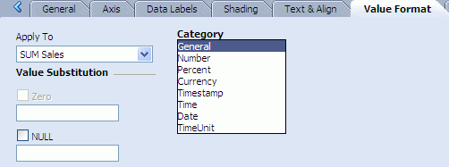
Description of the illustration bam_ve_valueformat.gif
-
Select a field from the Apply To list.
-
Select the category describing the value format, and select from the following options:
-
If you select General, no other formatting selections must be made.
-
If you select Number, specify a negative number format, the number of decimal places to include, and click the Digits Grouping Symbol check box to apply the comma as a thousands separator. Select the Round to the nearest check box to display numbers in shorter form such a 20K for 20,000.
-
If you select Percent, specify the number of decimal places to include.
-
If you select Currency, specify a negative number format, the number of decimal places to include, and a currency symbol. Select the Round to the nearest check box to display numbers in shorter form such a 20K for 20,000.
-
If you select Timestamp, specify a timestamp format. You can select Adjust time zone from GMT to check box to make time zone adjustments.
-
If you select Time or Date, choose a type of time or date format in the Type list. You can select Adjust time zone from GMT to check box to make time zone adjustments.
-
If you select TimeUnit, choose the unit of time to represent from the Type list.
-
If you select HTML, no other formatting selections must be made. HTML only applies to calculated fields containing HTML to ensure that the HTML is displayed correctly in the view.
-
-
Select the Zero check box and enter a value to substitute for zero values. This option is only enabled for Number, Currency, and Percent formats.
-
Select the NULL check box and enter a value to substitute for null values.
-
Click Apply or OK.
Configuring the Display of Active Data
You can format the look of the active data as it is added to the view. You can specify a color and a time interval to indicate how recently the information arrived.
To format the display of active data:
-
Click the Properties button in the View Editor. To open the View Editor, double-click the view you are editing, or click Edit view in the View Tasks/Options list.
-
Select the Active Data tab.
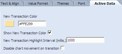
Description of the illustration bam_ve_activedata.gif
-
Click the New Transaction Color color swatch.
A color palette is displayed.
-
Select a color.
The color and the color hexadecimal number display for the transaction color. You can also specify the color by typing or pasting a hexadecimal number in this field.
-
Enter a number in the New Transaction Highlight Interval field to indicate the length of time to highlight active data.
-
Click Apply or OK.
For the Updating Ordered List view you can select Show Rank Colors.
In the Action List view you can select Show Rank Colors and Does not support active data.
For Chart views you can select Disable chart movement on transition to improve performance, and you can uncheck Show New Transaction Color to disable the color change that highlights active data.
For Columnar Reports only, you can also click the Use the fade transition effect for Active Data check box. If you have large amounts of active data, this setting is not recommended. The New Transaction Highlight Area property lets you select Entire Row or Cell Only to indicate where active data is.
Configuring Patterns
If your Chart view contains two or more chart values (for example in a Stacked Bar Chart or Combo Chart), you can control the colors and borders used to define each value using the controls on the Patterns tab in the Oracle BAM Active Studio View Editor.
-
Click the Properties button in the View Editor. To open the View Editor, double-click the view you are editing, or click Edit view in the View Tasks/Options list.
-
Select the Patterns tab.

Description of the illustration bam_ve_pattern.gif
-
Select a data group to apply a pattern to in the Apply To list.
For example, assume you selected the Samples/Product Sales data object, grouped by the Region column, and charted the sum of Sales and the sum of Num Sold.

Description of the illustration bam_patterns_groups.gif
In the Apply To list the chart values would be represented as SUM_Sales(/Samples/Product Sales) and SUM_Num_Sold(/Samples/Product Sales).

Description of the illustration bam_patterns_applyto.gif
-
To customize the area color for the selected chart value, select the Custom option under Area, then choose a color by clicking the color block, or enter its hexadecimal value in the field.
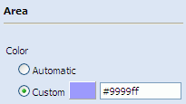
Description of the illustration bam_patterns_area_hex.gif
-
To customize the border color for the selected chart value, select the Custom option under Border, then choose a color by clicking the color block, or enter its hexadecimal value in the field.
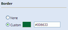
Description of the illustration bam_patterns_border.gif
-
Click Apply to save your changes and see them in the view.