4 Pivoting, Drilling, and Sorting Data
This chapter explains how to find and arrange the data that you want to analyze.
The topics include:
4.1 Pivoting Data
Laying out data on a table or crosstab organizes it so you can easily compare results side by side, spot trends when you see progressions, track progress over weeks, months and years, and so on. In other words, how the data is arranged is an important aid to analysis because it reveals data relationships that may not be apparent.
Pivoting data is how you move the data from one axis to another to arrange it for efficient analysis. For example, you can pivot data from the body of the table or crosstab to the page axis and back again to see new data relationships.
One way to think about pivoting data is to visualize the data plotted on a graph, and then switching data from the x-axis to the y-axis.
4.1.1 Pivoting for Comparison and Analysis
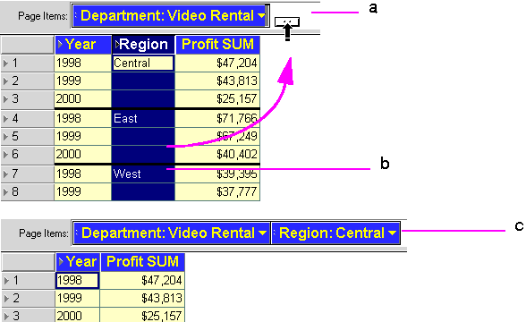
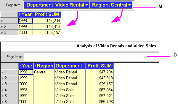
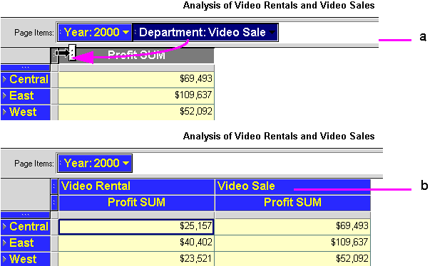
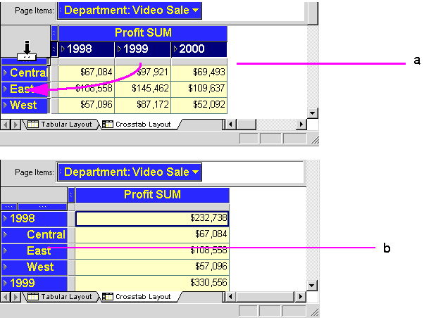
Pivoting a column on a table from the body to the page axis or from the page axis to the body rearranges the order of the data as it is presented and helps you organize the data. On a crosstab, however, pivoting a column has a much different meaning because the positions of data columns determine the data interrelationships of the items on the crosstab. Therefore, pivoting a column on a crosstab not only changes the positions of the data—you may see different numerical values as the data relationships vary. Figures 4-1 and 4-2 provide examples of pivoting on tables and crosstabs.
Key to Figure 4-1:
a. The Page Items axis.
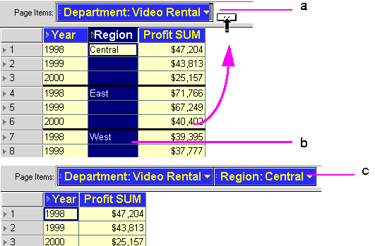
b. The Region Item is selected, then dragged to the Page Items axis.
c. Region is now a pivoted Item on the Page Items axis. The value 'Central' is selected, which means that only Central's profits are displayed in the table.
Key to Figure 4-2:
a. The Items Department and Video Sales are dragged from the Page Items axis to the table.
b. The Page Items axis is now empty, and the table now displays all four Items. You can now see all dimensions of the data, which is useful for an overview of the data, but not as useful for detailed analysis.
Key to Figure 4-3:
a. The Department Item is dragged from the Page Items axis to the table.
b. The table now displays profits for Departments Video Rentals and Video Sales.
Key to Figure 4-4:
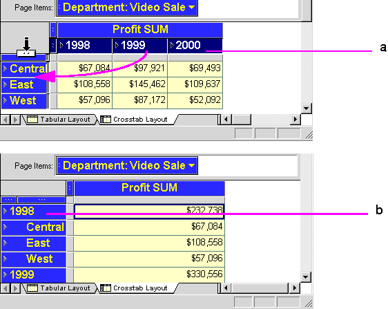
a. The Calendar Date Year Item is dragged from the top axis to the left axis.
b. The table now displays profits in a single column, and includes sub-totals for each Calendar Date Year. You can see a new data relationship at the new intersection of a column and a row; in this case, the Profit SUM for the year.
4.1.2 Pivoting Data on a Table
To pivot an Item from a table to the Page Items axis:
-
Select the column heading and drag it up to the page axis area.
As you drag the pointer into the page axis area, it changes to an arrow with a horizontal column marker indicating you're moving a vertical column (in the table body) to a horizontal position (the page axis item).
-
Release the mouse button. The column moves to the page axis.
Key to Figure 4-5:
a. The Page Items axis.
b. The Region Item is selected, then dragged to the Page Items axis.
c. Region is now a pivoted Item on the Page Items axis. The value 'Central' is selected, which means that only Central's profits are displayed in the table.
To pivot an Item from the Page Items axis to a table:
-
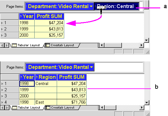
Click the item marker on the page axis item. The item marker is the two dots at the front of the item name.
The pointer changes to a vertical arrow indicating that you can move the item down to the table body:
Key to Figure 4-6:
a. The Region Item is dragged from the Page Items axis to the table.
b. The table now displays profits for all three Regions. -
Drag the pointer down onto the table where you want the page axis item to go.
The pointer changes to a left-right arrow indicating you can put the page axis item into the table body.
-
Release the mouse button. The page axis item becomes a column in the table.
You can insert the page axis item into a table at three locations:
Left-most column—drag the pointer onto the first column in the table. The page axis item is inserted to become the first column.
Middle columns—drag the pointer onto a column head. The page axis item is inserted to the left of that column.
Right-most column—drag the pointer onto the blank space after the last column. The page axis item is added as the right most column of the table.
Key to Figure 4-7:
a. The left-most column.
b. The middle columns.
c. The right-most colum.
4.1.3 Pivoting Data on a Crosstab
Because the data relationships on a crosstab depend on the intersection of the rows and columns, pivoting data from one axis to another creates a new set of data relationships. In addition, the new arrangement can add levels of data to an axis. For example, if the data on the side axis is organized into three levels such as Region, City, and Store Name, pivoting the Year item to the side axis adds a fourth level of data to that axis, (see Figure 4-8 for an example).
-
Click the axis item marker of the item to pivot.
-
Drag the pointer to its position on the new axis. You can drag the pointer onto the axis marker or onto one of the rows at that level.
The direction of the pointer indicates how the item will pivot from horizontal to vertical, or vice versa.
-
Let go of the mouse button. The item moves to the new axis.
Key to Figure 4-8:
a. The Calendar Date Year Item is dragged to a new position on the left axis.
b. The table now displays profits in a single column, and includes sub-totals for each Calendar Date Year.
Notice that the new crosstab now has only one column for the Profit SUM. The Calendar Date Year 2000 data is further down on the side axis. Scroll down the page to see it.
4.1.3.1 Producing erroneous results when pivoting
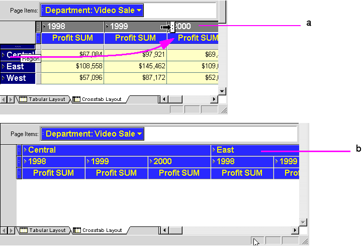
As you can see, it is easy to pivot data in Discoverer Desktop. However, sometimes this ease of use also makes it easy to produce erroneous results. For example, in a Crosstab layout, if you remove everything from your left axis or your top axis, you can produce a meaningless table, see example Figure 4-9.
Key to Figure 4-9:
a. The Region Item is dragged from the left axis to the top axis.
b. Because there is now no cross-tabulation, no profits data is displayed on the table.
4.1.4 Duplicating Tables and Crosstabs
When you have a Worksheet, you can duplicate it as another Worksheet of the same type, or you can convert the Worksheet to a different type, for example, into a Table or Crosstab. For example, if your data is currently displayed as a table, but you want to analyze it using the pivoting features of a crosstab, you can duplicate the table as a crosstab.
To convert a Worksheet table to another Worksheet type:
-
Choose Sheet | Duplicate a Table or Sheet | Duplicate as Crosstab.
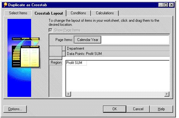
The dialog box for duplicating the table or crosstab appears, with the Crosstab Layout tab visible.
Figure 4-10 shows the Duplicate as Crosstab dialog box. The dialog box for duplicating tables is similar.
-
Click OK now if you want to accept the default table or crosstab configuration.
-
If you want to change the default table or crosstab configuration, choose from the four tabs and configure your duplicate table.
The tabs across the top of the dialog are used as follows:
-
Select Items—adds new items to the new table or crosstab (see Section 7.1.2, "Selecting the Data" for details).
-
Conditions—adds conditions to the new table or crosstab (see Section 5.5, "Finding Data that Meets Conditions" for details).
-
Sort—(available for tables only) sorts the data on the new table (see "Key to Figure 4-27:" for details).
-
Calculations—defines calculations on the new table or crosstab (see Section 8.3, "Creating Calculations" for details).
-
-
Click OK to create your duplicate table.
A new Worksheet is created in your Workbook containing the duplicate table or crosstab.
4.2 Drilling Into and Out of Data
Drilling into data shows more details about the data. Drilling out of data (or collapsing) consolidates the data for a broader overview. Typically, you drill into data to analyze it at a finer level of detail, and drill out to get the “bigger picture.”
In addition to drilling into and out of data on the current table or crosstab, you can also drill to another worksheet, or to a related item that is not on the worksheets. See Section 4.2.5, "Drilling with the Drill Dialog Box" for details.
Discoverer Desktop provides two ways to drill into and out of data:
-
Drilling directly from a table or crosstab - clicking a Drill Point to display a Drill Icon is the quickest way to drill, and covers many types of drilling typical in routine data analysis, (see Figure 4-11).
-
Drilling from the Drill dialog box - using this menu option provides even more options for drilling. Select an Item or cell and choose Sheet ¦ Drill from the main Discoverer Desktop menu. You can also choose the Drill option from the Discoverer Desktop tool bar.
Key to Figure 4-11:
a. Drill Points are Items that you can drill down into to look at more detail.
b. Drill Icons are displayed when you click a Drill Point, and allow you choose drill options.
4.2.1 Drilling down using the Drill icon
This section explains how to use the Drill icon to drill down into data.
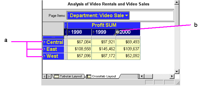
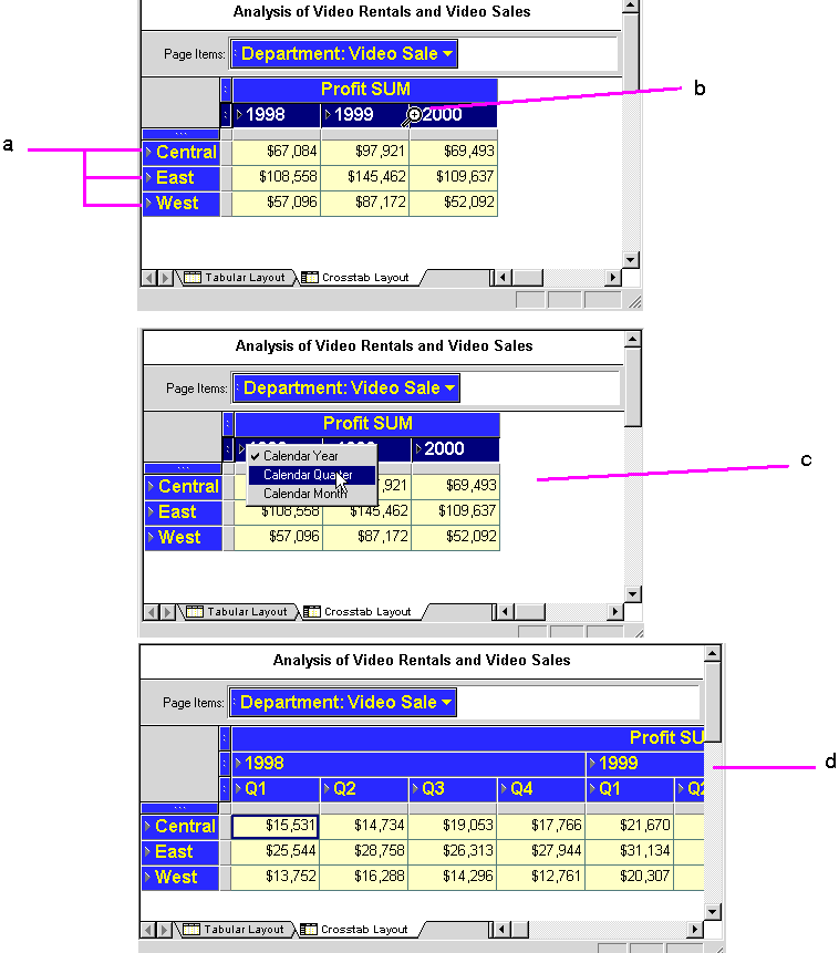
Key to Figure 4-12:
a. Right-pointing arrows on Items indicate Drill-points, which are data points at which you can drill down to further levels of detail.
b. When you move your cursor over a Drill-point, the icon changes to a magnifying-class with a cross at its center, (the Drill-icon).
c. Click the Drill-icon to see the drilling options available, and select an option. Notice that all Years are selected.
d. The Worksheet displays the drilled data for all Years selecte.
4.2.2 Drilling out using the Drill icon
This section explains how to use the Drill icon to drill out of data.
Key to Figure 4-13:
a. Click the Drill-icon for the data that you want to collapse.
b. From the list of drill options, choose a higher level to which to collapse.
c. The drilled data is collapsed and the original Worksheet is displayed.
4.2.3 Drill examples
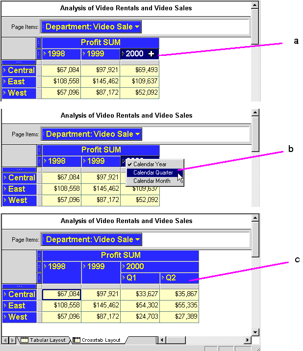
Key to Figure 4-14:
a. The Worksheet displays data for three years, 1998, 1999, and 2000. In this example we want to only drill down to quarter level data for the year 2000.
b. The Drill-icon for the year 2000 is clicked and Calendar Quarter is selected.
c. The Worksheet displays quarter level profits for the year 2000, (named Q1 and Q2), but not the years 1998 and 1999.
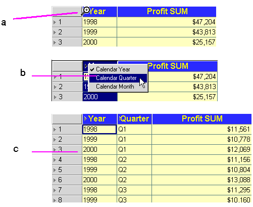
Key to Figure 4-15:
a. Put the pointer on the icon next to the data that you want to drill. In this example, the pointer is on the drill icon for Calendar Year, which means you want to drill into or out of data at this level.
b. Click the mouse button to see the drop-down menu for the selected item. The menu options apply only to the data the you want to drill. In this example, the options for Calendar Year are Calendar Quarter and Calendar Month. Select the level of data that you want to see.
c. When you release the mouse button, the new data details appear in a new column in the table; in this case, the Quarter column.
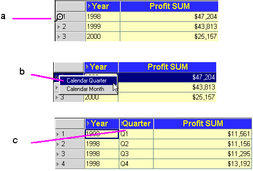
Key to Figure 4-16:
a. Move the cursor over the row icon for the data that you want to drill. In this example, the pointer is on the icon for 1998, which means that you want to drill to data only for that row (not for all rows).
b. From the pull down list, select the level of data that you want to see. Notice that the menu only includes Calendar Quarter and Calendar Month because you are starting from a single Calendar Year row, not the Calendar Year column.
c. When you release the mouse button, the new data details appear in a new column in the table; in this case, the Quarter column. Quarter names appear for only the Calendar Date Quarter 1998 because the drilling started there.
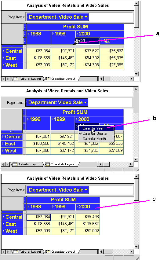
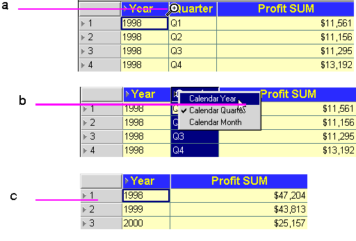
Key to Figure 4-17:
a. Put the pointer on the icon next to the data from where you want to drill up. In this example, the pointer is on the drill icon for Quarter, which means you want to start the drill at that level.
b. Select the level of data that you want to see. As the menu shows, you could drill up from Calendar Quarter (ticked to indicate that it is the current drill level), down to Calendar Month, or up to Calendar Year. This example shows drilling up to Calendar Year.
c. When you release the mouse button, the data drills back up the Calendar Year level, and the Quarter column is removed.
To drill into or out of data from the table or crosstab:
-
Click the drill icon in the column or row with the data that you want to drill. Drill icons are arrowheads that point to the right.
You can also double-click on a crosstab data item's heading to drill quickly. See Section 4.2.4, "Quick Drilling by Double-Clicking" for details.
To simultaneously drill all the columns or rows at the same level (Figure 4-18), select them first by clicking the selection box for that level of data. Then put the pointer on the drill icon in any one of the selected columns or rows and click.
-
From the drop-down menu, choose the level of data that you want to analyze.
Key to Figure 4-18:
a. The current drill level is ticked.
b. To drill back up, select one of the levels above the current drill level.
c. To drill down, select one of the levels below the current drill level.
If you select a level that has already been drilled down, you can collapse the levels back to their previous state.
Key to Figure 4-19:
a. The current drill level is ticked.
b. To drill back up, select Collapse.
Note that the Quarter level does not appear on the sample menu because the data is already drilled to that level and you cannot collapse a level into itself.
Hint: Use Collapse after you drill data down several levels and want to get back to the original level in one step.
You can also collapse drilled data by selecting the level to collapse to and then choosing Sheet | Collapse.
Key to Figure 4-20:
a. Select the Region level by clicking on the selection box for the Region data item. All the rows of Regions in the entire worksheet are selected.
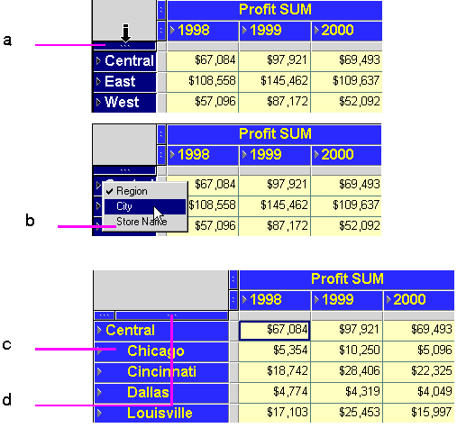
b. Now click on any drill icon on any one of the selected Region rows. Then choose a drill level from the options displayed, in this case drill down to City. Alternatively, you could drill further down to Store Name level.
c. When City is selected, City data is displayed for all Regions.
d. Note that a selection box has been added on the side axis for the City data item.
Key to Figure 4-21:
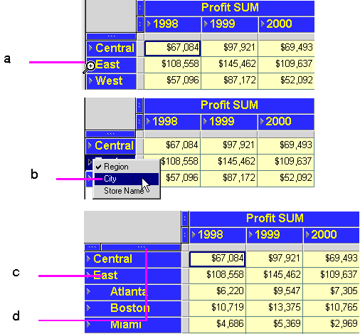
a. Put the pointer on the drill icon of the row from which you want to drill, in this case the East Region.
b. Select the level to drill to, in this case, drill down to City.
c. The resulting drill shows Cities for the East Region only.
d. Note that a selection box has been added on the side axis for the City data item.
The data on the side axis in the Discoverer Desktop sample data is organized in the hierarchical sequence of Region, City, and Store Name. Typically, you would drill from Region to City and then from City to Store Name. However, in some instances, you may want to drill from Region directly to Store Name.
The following figure shows how to drill to a sub-level on the side axis. This can also be thought of as skipping a hierarchical level.
Key to Figure 4-22:
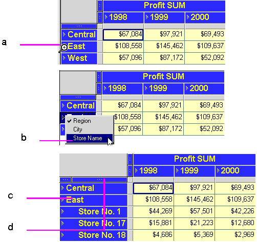
a. Put the pointer on the drill icon of the row from which you want to drill, in this case the East Region.
b. Select the level to drill to, in this drill straight down to Store Name.
c. The resulting drill shows Store Names for the East Region only.
d. Note that a selection box has been added on the side axis for the Store Name data item because now that data is visible.
4.2.4 Quick Drilling by Double-Clicking
You can quickly drill down from one level to the next on a crosstab by clicking in a data item's column heading. The drill automatically drills to the next level in the data hierarchy. For example, clicking on the column heading Region automatically drills to City because that's the next level in the hierarchy—Region, City, Store Name.
Key to Figure 4-23:
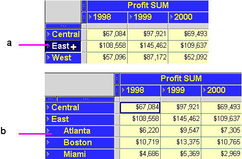
a. Put the pointer in the row from which you want to drill, but don't put the pointer on the drill icon. A white cross is displayed. Double-click the white cross to drill down.
b. Quick drilling drills to the next level of the data. In this example, Region is drilled to City for only the selected row, (the Eastern Region). Double-click on the East Region once more to drill down to the next level of data - Store Name.
Note: Double-clicking on a column head on a table does not drill down. Instead, it displays the data item's properties.
4.2.5 Drilling with the Drill Dialog Box
Double-clicking on an individual cell displays the Drill dialog box.
Use the Drill dialog box to drill up and down from columns and rows on the tables and crosstabs and additionally, to related items on the worksheet or to related items on another worksheet.
To drill with dialog box:
-
Display the table or crosstab with the data you want to drill.
-
On the table or crosstab, click the data item where you want to begin drilling.
-
Choose Sheet | Drill, or double-click on the data item.
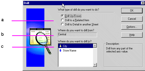
Key to Figure 4-24:
a. Drill options.
b. Where to drill from.
c. Where to drill to. The arrow indicates the direction of the drill. A down-arrow indicates a drill-down. An up-arrow indicates a drill-up (or collapse). -
Up/Down—drills down to details or up to an aggregate level in the data's predefined hierarchy, such as Year to Quarter to Month.
Drill to a Related Item—drills down to details or up to an aggregate level to data that is related but that is not in the data's predefined hierarchy, such as City to Quarter or Region to Product.
Drill to Detail in another Sheet—drills to data that is in the workbook, but that isn't in the data's hierarchy; another sheet is created to show the details.
-
Select where to drill from.
The row or column you selected appears here. You can also drill from another starting point by clicking the drop-down arrow and selecting from the list that appears. The choices in the list pertain to the data item to start the drilling and the type of drill option you selected.
For example, if you selected a column heading and Drill Up/Down, the other options are in the column's data hierarchy. The drop-down arrow is not available if you selected a data item that does not have other levels for drilling.
-
Select where to drill to.
The choices in the list show where you can drill to. The choices depend on the other selections on the dialog box.
-
Click OK. The data on the table or crosstab is then drilled to the level you specified on the dialog box.
The following figures show examples of drilling from the Drill dialog box.
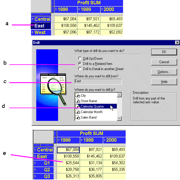
In this example, the drilling starts at the City data, which is in the hierarchy of data—Region, City, Store Name. However, Quarterly data is related to City, so you can drill from City to Quarter.
Key to Figure 4-25:
a. The East Region item is selected from the left axis.
b. 'Drill to a Related Item' is selected.
c. The 'Where do you want to drill from?' box confirms the drill-point.
d. Calendar Quarter is selected from the list of related drill options.
e. Click OK to view the East Region data broken down into Quarters.
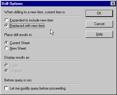
The Drill Options dialog box offers additional ways to customize the drilling results.
Click the Options button on the Drill dialog box to open the Drill Options dialog. Choose from the following options:
Expand to include new item—the table or crosstab is enlarged to fit in the new level of data (see Figure 4-27 for an example).
Replaced with new item—the data level where the drill started is replaced with the new level of data (see Figure 4-27 for an example).
Current Sheet—adds the new level of data on the current worksheet.
New Sheet—creates a new worksheet to display the drilled data.
Table—display the results in a table.
Crosstab—display the results in a crosstab.
Let me modify query before proceeding—displays the New Sheet dialog box so you can format the new layout, add conditions and calculations before the drilling takes place. See Section 7.1, "Building a New Workbook or Worksheet" for a description of the options.
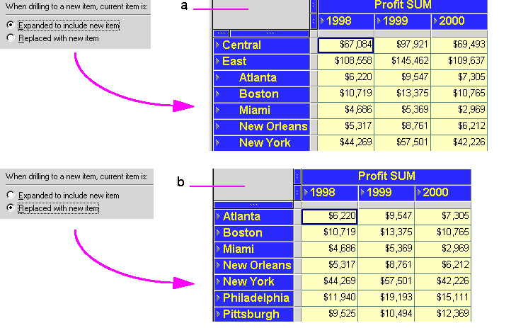
Figure 4-27 shows the difference between expanding and replacing data.
Key to Figure 4-27:
a. In this example, the City data is included with the Region dat.
b. In this example, the City data replaces the Region data.
4.3 Sorting Data
Sorting arranges text data in alphabetical order and numeric data in numerical order. Creating an ordered list of customers, or employees, or product part numbers are typical uses of sorting. However, sorting is also helpful for analyzing data. For example, sorting sales data from most profitable sales to least profitable sales shows the relative standing of your company's best selling products or the most effective salespeople.
You can also group data and then sort within the group. For display and reporting purposes, each group of data can start on a new page. See Section 4.3.1.2, "Group Sorting" for details.
4.3.1 Sorting Data on Tables
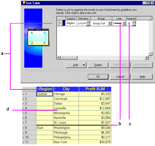
Figure 4-28 shows an example of sorting data on a table and the results.
Key to Figure 4-28:
a. A sort is selected on Region, which sorts the Region column alphabetically from A - Z, (East - West).
b. A line of size 3 separates the sort groups, (Regions).
c. The Spaces option is left blank, so that there are no spaces between the sort groups (Regions).
d. Because Group Sort is also selected under the Group option, the Cities are also sorted alphabetically within Region.
-
Display the table with the data you want to sort.
-
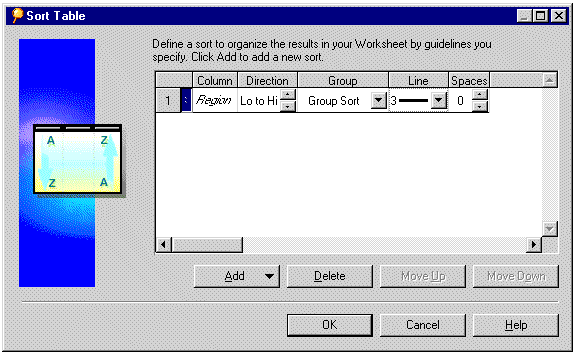
The Sort Table dialog box appears. It shows the sorting options currently selected for the table.
-
Select the sorting options and click OK.
You can choose from these options in the Sort Table dialog box:
Column—The name of the column containing the data you want to sort. You can add additional columns to sort at several levels on the table. See the next section for details.
Direction—The sort order of the data in the column. Click the up and down buttons in the Direction box to choose the sort order:
-
Lo to Hi—A to Z for text; increasing for numbers (e.g., 1 to 10).
-
Hi to Lo—Z to A for text; decreasing for numbers (e.g., 10 to 1).
Group—The manner of grouping and displaying sorted data. Click the drop-down button in the Group box and choose one of the options:
-
Group Sort—Data is sorted within each group. The group name appears once at the beginning of the grouped data.
-
Page Break—Mainly for printing reports, this option starts a new page at the start of each new group. The group name appears at the top of the page.
-
Hidden - Sub-group the data at the next hierarchical level, but do not display the sub-grouped item. For example, if the hierarchy is Year, Quarter, Month, sorting on Year with the Hidden option selected sorts on Quarter within Year but does not display the Quarter Item, or line separators for each Quarter. To display sub-grouped Items, change this option to Group.
-
None—The data in the column is not grouped and is all sorted as a unit.
Line—The thickness of the line separating the data groups. Click the drop-down button in the Line box and choose a line thickness. The figures in this section show a line for subtotals; you can also use a line when displaying totals.
Spaces—The number of cell spaces between groups. Click the up and down buttons in the Spaces box to choose the spacing.
4.3.1.1 Sorting Data Within Data
By adding more sort columns, you can sort data within data.
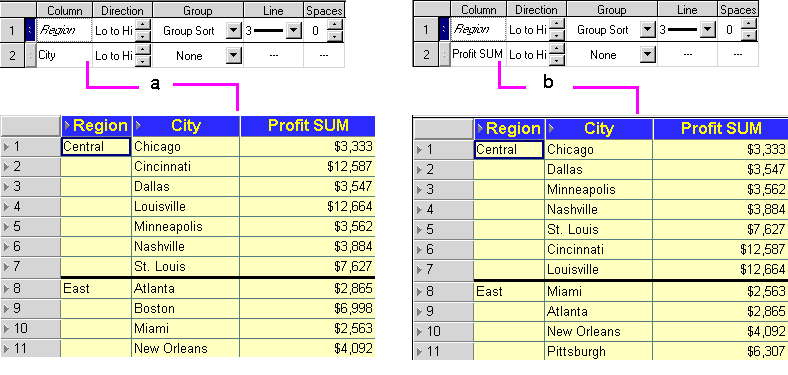
For example, if you sort data first by Region and then by City, data is sorted alphabetically by Region (Central, East, West) and then within the Regions alphabetically by City (Atlanta, Boston, Miami, and so on). However, if you sort first by Region and then by a numeric column, such as Profit SUM, the data is sorted alphabetically by Region and then numerically by the Profit.
Here is an example showing sorting applied to two columns:
Key to Figure 4-30:
a. A table sorted on City within Region.
b. A table sorted on Profit SUM within Region.
To add and rearrange columns to sort:
-
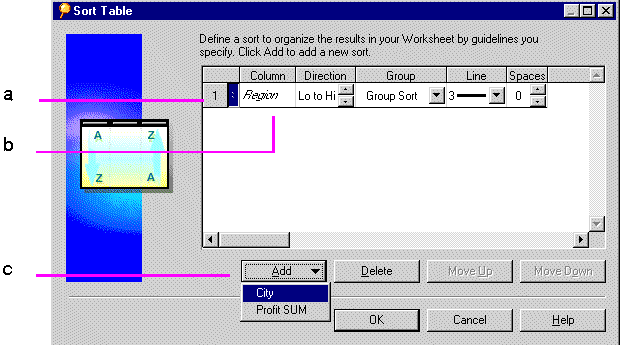
On the Sort Table dialog box, click the Add button to see additional columns for sorting.
For example, in the following figure you can add the Department or Profit SUM columns for sorting.
Key to Figure 4-31:
a. Column Number.
b. Column Name.
c. Add button, used to display other Items on which data can be sorted. -
Choose the additional column.
The column is added to the list of sorting columns.
Note: The order of the columns on the Sort Table dialog box is important. The order of the columns determines which data is sorted first, second, third, and so on. You can move the columns up and down to put them in the proper order on the dialog box.
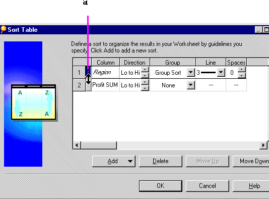
If you want to move a column up or down on the list, click the column's handle (just to the right of the column number) to select it. The pointer becomes an up/down arrow indicating you can move the selected column up or down in the order.
Key to Figure 4-32:
a. The arrow indicates that you can move the selected sort column (Region, in this example) down, changing the sort order to Region within Profit SUM. -
Drag the column up or down or click the move up or move down buttons.
-
When the order of the columns is correct, select options for Direction, Group, Line, and Spaces for each column (Figure 4-29), then click OK.
To remove the selected column for sorting, click the Delete button. Delete removes the column only from the list of sort columns. It does not remove it from the table.
4.3.1.2 Group Sorting
Data in tables is often organized into groups. For example, listings by address are often grouped according to City or Zip Code; tables listing business products might group them by type, such as Office Furniture, Computers, and Supplies. One key reason to group sort data is to find subtotals for groups of numbers.
Note: You can group sort on tables, but not on crosstab displays.
Columns with Group Sort selected always precede those with no group sorting (None) to assure that the sorting is done correctly on the table. You cannot move a column without group sorting above a column with group sorting.
The names of group sorted columns appear in italics on the dialog box.
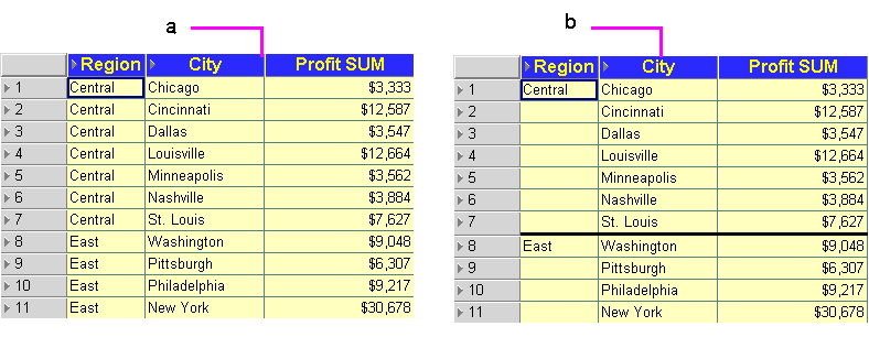
Here is an example of two tables, one group sorted, the other not:
Key to Figure 4-33:
a. A table sorted on Region with group-sorting turned on
b. A table sorted on Region group-sorting turned off.
The table without group sorting does not include a subtotal for groups. Ungrouped data cannot have subtotal rows because the data to total can appear anywhere in the table. See Section 5.3, "Totaling Numeric Data" for steps to add subtotals and totals to data sorted by groups.
Group sorting is also pertinent when finding percentages. When you specify percentages for numbers (for example, the percentage of each region's profits of the total profits), the data is automatically group sorted for that section of data (e.g., the regions) so the percentages can be displayed properly. See Section 5.4, "Using Percentages" for more information.
The actual grouping of data is based on the design of the business area and workbook developed by your database administrator. In the previous examples, the grouping is Region and City, but it could also have been State and City or Country and City. See your database administrator if you want to group data in some other way.
4.3.1.3 Sorting from the Tool Bar
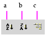
Three buttons on the tool bar apply the sort direction and grouping to selected columns on the table:
Key to Figure 4-34:
a. Set the sort order from High to Low.
b. Set the sort order from Low to High.
c. Apply Group-sort.
-
Select the table column(s) to sort.
-
Click the tool to sort the column.
If a column is already sorted or group sorted, clicking the tool returns the data to its previous unsorted state.
4.3.2 Sorting Data on Crosstabs
Because the location of data on a crosstab determines the relationship of one data item to another, sorting crosstab data is different to sorting tabular data. In particular, you normally want to maintain those data relationships while rearranging the data.
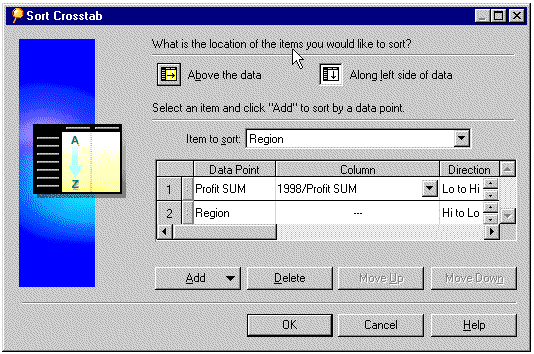
The way to maintain the data relationships is to sort data on the left axis relative to a specific column on the top axis, or sort data on the top axis relative to a specific row on the left axis. The sorting tools and Sort Crosstab dialog box (Figure 4-37) automatically sort the data in that manner and maintain the data relationships.
Note: Some data on a crosstab layout is already sorted by default. For example, text items automatically sort alphabetically.
4.3.2.1 Sorting Crosstabs Data from the Tool Bar
Most typical crosstab data sorts can be handled with the sorting tools on the tool bar (Figure 4-34). Sorting a crosstab with the tools on the tool bar automatically sorts all of the items on an axis.
To sort crosstab data from the tool bar:
-
Select either the column on the top axis or the row on the left axis to use for sorting.
-
Click the A-Z tool or the Z-A tool. The data on the crosstab is sorted relative to the selected column or row.
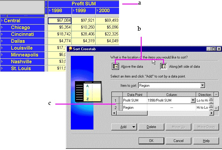
Key to Figure 4-35:
a. A Crosstab Table.
b. Options for choosing which axis to sort. Choose Above the data to sort on Items on the top axis. Choose Along left side of data to sort on Items on the side axis, (see note C below).
c. The sort-options for the left axis are Profit SUM and Region.
Note: You can also sort on the left axis by clicking the selection handle of the item on that axis and then click one of the sorting tools on the tool bar.
Returning a Crosstab to its Previous State
After sorting a crosstab, the data on the top axis or left axis is reordered relative to the column or row you used for sorting. To return the crosstab to it previous “unsorted” state, you must manually resort it.
In the example above (Figure 4-35), you would resort the data by the items in the left axis, Region and City. Click on the Region item's selection box and then click the sorting tool on the tool bar to resort. Repeat with the City item. The crosstab reverts to its previous state.
4.3.2.2 Sorting Across an Axis
Data on each axis is sorted by default:
You can reverse the sort order by selecting the item on the axis and clicking the Sort Order tool on the tool bar.
For example, in the following figure, Regions are sorted from high to low (Z-A). To reverse this order, select the item handle as shown in the figure, then click the A-Z tool on the tool bar.
4.3.2.3 Sorting Crosstabs Data from the Sort Crosstab Dialog Box
Although the sorting tools on the tool bar provide most of the types of sorting that you will want to do on a crosstab, the Sort Crosstab dialog box offers additional features and more control over the precise aspects of the sorting.
For example, in Figure 4-35, the Region and Cities are both sorted according to the Profit SUM amounts. By using the Sort Crosstab dialog box, you could sort only the Regions or only the Cities and thus display sort results that are more “finely tuned.”
To sort data on a crosstab with the dialog box:
-
Display the crosstab with the data you want to sort.
-
Select the options (described below) from the dialog box and click OK to sort the data according to the selections on the dialog box.
-
Repeat the process to add other sorting to the data.
For example, after Cities are sorted in the example shown in Figure 4-37, you could repeat the process and sort by Region. Being able to successively sort lets you create a crosstab that orders the data in precisely the way you want.
The Sort Crosstab dialog box includes the following options:
Above the data—Sorts the crosstab based on data from items on the top axis.
Along left side of data—Sorts the crosstab based on data from items on the left axis.
Item to sort—Lists the items for either the top axis or side axis depending on the selected sort location (above the data or along the left side). Click the drop-down arrow and select the item that you want to use to sort the data.
Data Point—The name of the item that will be rearranged as the data is sorted.
Column/Row—Identifies the column that contains the data for sorting when sorting based on data from the left side of the crosstab, or identifies the row that contains the data for sorting when sorting based on data from the top of the crosstab. Click the down arrow to select the specific column or row.
Direction—Click the up or down arrows to select the sort direction.
Add—Click to add a data point for sorting. (See below for more information.)
Delete—Select an item in the dialog box and click to remove it. You cannot delete all of the items on the left axis on a crosstab.
When you click the Add button in the Sort Crosstab dialog box, a drop-down list shows you the data points on the crosstab that can be used for sorting. For example, in the figure above, the added data point is Profit SUM. Without adding that data point to the sorting, the crosstab in the example would simply be sorted alphabetically by City down the left side of the crosstab. With the added data point, however, the cities are sorted by Profit SUM from lowest to highest. In other words, the City entry on the dialog box identifies which data you want to sort, and the added data point (Profit SUM) identifies how you want to sort the cities (by profit from lowest to highest).
Added data points must always be the first item for sorting. (City cannot be above Profit SUM in the example.) This is because sorting items by data points makes logical sense, but sorting data points by items does not.
To illustrate this concept, it makes sense to sort Cities by Profit because each City has a Profit amount associated with it. However, it does not make sense to sort Profit by City because each profit has only one city associated with it. It would be like trying to sort the profit amounts by “New Yorks” or “Phoenixes” which doesn't make logical sense.
You can add the data point two or more times. This is useful with duplicate data points. In the example, if two cities had exactly the same amount of profit, you could specify how to sort those two duplicated pieces of data (low to high or high to low). This type of “sorting within sorting” on a crosstab is helpful for text or other data likely to have duplicate values. For financial data or other variable numeric items, however, sorting within sorting is usually not necessary.
