2 Working with ADF Skin Selectors
This chapter describes the ADF skin selectors, pseudo-elements, pseudo-classes, ADF skin properties and ADF skinning framework rules that allow you to customize the appearance of ADF Faces and ADF Data Visualization components.
This chapter includes the following sections:
2.1 About ADF Skin Selectors
The ADF skinning framework provides a range of selectors that you can specify in an ADF skin to customize the appearance of ADF Faces and ADF Data Visualization components. There are two types of selectors: global selectors and component-specific selectors. A global selector defines style properties that you apply to one or more selectors. A component-specific selector defines style properties that apply to one selector.
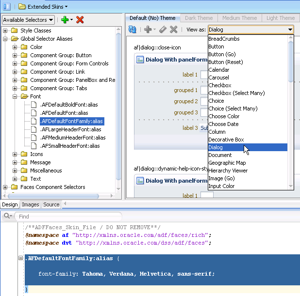
The ADF skins provided by Oracle ADF define many global selectors (Global Selector Aliases in the user interface of the visual editor) that many ADF Faces components inherit. These ADF skins do not define global selectors inherited by the ADF Data Visualization components. For example, many ADF Faces components use the .AFDefaultFontFamily:alias selector to specify the font family. If you create an ADF skin that overrides this selector by specifying a different font family, that change affects all the components that have included the .AFDefaultFontFamily:alias selector in their selector definition. Figure 2-1 shows the .AFDefaultFontFamily:alias selector in the source view and the design view. The View as list displays the current list of ADF Faces components that use the value defined in the .AFDefaultFontFamily:alias global selector alias to determine what font family to use.
An ADF skin that you create inherits the global selector aliases defined in the ADF skin that it extends from. You can also create new global selector aliases in your ADF skin files. For more information, see Chapter 8, "Working With Global Selector Aliases."
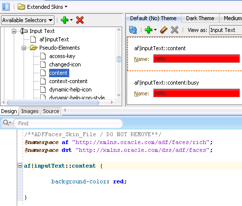
Component-specific selectors are selectors that the ADF skinning framework exposes that allow you to identify the corresponding ADF Faces and ADF Data Visualization components for which you can define style properties. For example, Figure 2-2 shows the selector for the ADF Faces inputText component in the source editor and visual editor. A value of red has been set for the CSS background-color property in the content pseudo-element exposed by this component's selector (af|inputText).
For more information about the component-specific selectors, see Chapter 5, "Working with Component-Specific Selectors." For more information about global selector aliases, see Chapter 8, "Working With Global Selector Aliases."
2.1.1 ADF Skin Selectors and Pseudo-Elements
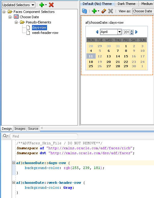
Many ADF skin selectors expose pseudo-elements. A pseudo-element denotes a specific area of a component for which you can define style properties. Pseudo-elements are denoted by a double colon followed by the portion of the component the selector represents. For example, Figure 2-3 shows how the days-row pseudo-element exposed by the af|chooseDate selector allows you to configure style properties for the appearance of the calendar grid.
2.1.2 ADF Skin Selectors and Icon Images
ADF Faces components that render icons do so using a set of base icon images. No CSS code entries appear in the source file of the ADF skin for these icon images in contrast to, for example, the CSS code entries that appear in a source file when you specify an image as a value for the CSS background-image property. Instead, the ADF skinning framework registers the icon image for use with the renderer. For more information about the renderer and supported render kits, see Section 11.2, "ADF Skinning Framework and Supported Render Kits."
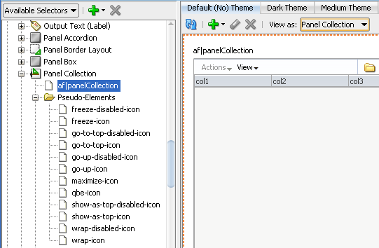
ADF skin selectors use two naming conventions for pseudo-elements that identify icon images that render in a component. The names of these pseudo-elements end in -icon or in icon-style. For example, the Panel Collection selector's pseudo-elements end in -icon, as shown in Figure 2-4.
In contrast, the Column selector (af|column) defines pseudo-elements that end in both -icon and -icon-style, as shown in Figure 2-5.
In Figure 2-5, the sort-ascending-icon-style pseudo-element styles the icon used for the sort ascending indicator in the column selector. This pseudo-element specifies the icon as a background image. Use the :hover and :active pseudo-classes to customize the appearance. For example, write the following syntax to make the background red if the end user hovers the mouse over the sort ascending indicator:
af|column::sort-ascending-icon-style:hover
{
   background-color: Red;
}
Tip:
Many browsers do not render background images when in accessibility mode. The following example demonstrates how you can work around this behavior if you want your application to display an image when in accessibility mode.If you want to use your own image rather than the icon specified as a background image, you need to first prevent the background image from rendering. You do this by specifying the -tr-inhibit ADF skin property for the sort-ascending-icon-style pseudo-element as follows:
af|column::sort-ascending-icon-style
{
  -tr-inhibit: background-image;
}
Next you specify the text or image that you want to render as a value for the content property of the sort-ascending-icon selector. For example, write syntax similar to the following to specify an alternative image:
af|column::sort-ascending-icon
{
        content:url("images/arrow-up.jpg");
        width: 10px;
        height: 10px;
}
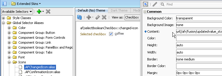
The ADF skinning framework also defines a number of global selector aliases that specific icon images to use in different scenarios. These global selector aliases appear under the Icons node in the Selector Tree, as shown in Figure 2-6. The .AFChangedIcon:alias shown in Figure 2-6 enables you to globally set the changed icon for all components using that icon.
For more information, see Chapter 6, "Working with Images in Your ADF Skin."
2.1.3 Grouped ADF Skin Selectors
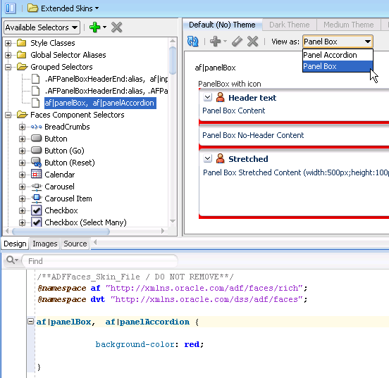
You can group ADF skin selectors and global selector aliases to minimize the number of entries in the source file of the ADF skin. The selectors that you group render under the Grouped Selectors node in the Selector Tree, as shown in Figure 2-7. The View as list in the Preview Pane displays all the selectors that you grouped.
As the visual editor does not provide a way to specify grouped selectors, you use the source editor to specify the selectors and/or global selector aliases that you want to put in a grouped selector. Separate each selector by a comma (,) to include in the grouped selector.
2.1.4 Descendant ADF Skin Selectors
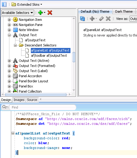
A descendant selector is made up of two or more selectors separated by white space. You can configure descendant selectors for ADF skin selectors. These allows you to configure style properties for specific selectors when they render within another selector. When you configure a descendant selector, the visual editor displays a Descendant Selectors node under the selector included in the descendant selector, as shown in Figure 2-8.
As the visual editor does not provide a way to specify descendant selectors, you use the source editor to specify the selectors and/or global selector aliases that you want to specify in a descendant selector. Separate each selector by a white space.
2.2 Pseudo-Classes in the ADF Skinning Framework
The CSS specification defines pseudo-classes, such as :hover and :active, which are used to define style properties for when a selector is in a particular state. You can apply these pseudo-classes to almost every ADF Faces component. In addition, the ADF skinning framework provides additional pseudo-classes for specialized functions. Examples include pseudo-classes to apply when a browser's locale is a right-left language (:rtl) or for drag and drop operations (:drag-target and :drag-source). The syntax that appears in the source file of an ADF skin to denote a pseudo-class uses the following format(s):
adfskinselector:pseudo-class
adfskinselector::pseudo-element:pseudo-class
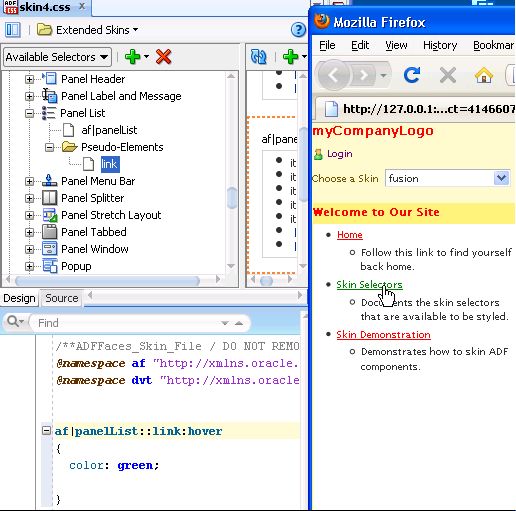
Figure 2-9 shows the syntax that you write in the source file of an ADF skin for the :hover pseudo-class so that a panelList component's link renders green when an end user hovers a mouse over the link in Figure 2-9.
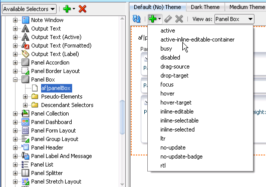
Some components make more use of pseudo-classes than other components. The panelBox component's selector, for example, makes extensive use of pseudo-classes to define its appearance when it is in various states (for example, active, disabled, rendering right to left). Figure 2-10 shows the list of available pseudo-classes that renders when you select the panelBox component's selector in the Selector Tree and click the Add Pseudo-Class icon to display the list of available pseudo-classes.
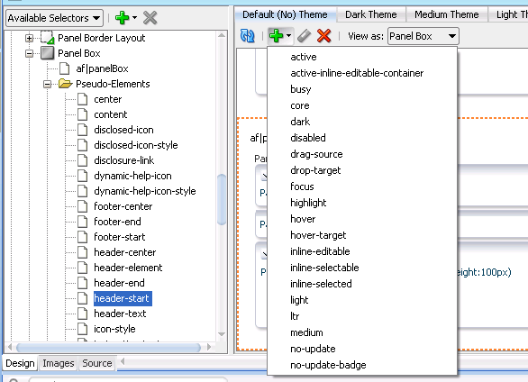
Pseudo-classes can also be applied to pseudo-elements that selectors expose. The panelBox component selector's pseudo elements are a good example. Figure 2-11 shows the list of pseudo-classes that the header-start pseudo-element exposed by the panelBox component selector accepts. Many of these pseudo-classes allow you to define the appearance for the panelBox component depending on the value that the application developer sets for its attributes. For example, the core and highlight pseudo-classes define the corresponding appearance when the application developer sets the panelBox component's ramp attribute to core or highlight.
The following are common pseudo-classes used by ADF Faces selectors.
-
Drag and drop: The two pseudo-classes available are
:drag-sourceapplied to the component initiating the drag and removed once the drag is over, and:drop-targetapplied to a component willing to accept the drop of the current drag. -
Standard: In CSS, pseudo-classes like
:hover,:active, and:focusare considered states of the component. This same concept is used in applying skins to components. Components can have states likeread-onlyordisabled. When states are combined in the same selector, the selector applies only when all states are satisfied. -
Right-to-left: Use this pseudo-class to set a style or icon definition when the browser is in a right-to-left language. Another typical use case is asymmetrical images. You will want the image to be flipped when setting skin selectors that use the image in a right-to-left reading direction. Be sure to append the
:rtlpseudo-class to the very end of the selector and point it to a flipped image file. For example, the end image of thepanelBoxcomponent will be thepanelBoxStart.pngfile when the browser is set to right-to-left. ThepanelBoxend image in right-to-left is the same as the flipped left-to-rightpanelBoxstart image.af|panelBox::medium af|panelBox::top-end:rtl { background-image: url(/skins/purple/images/panelBoxStart.png); width:8px; height:8px }You can also use
:rtlto apply to skin icons. For more information, see Chapter 6, "Working with Images in Your ADF Skin." -
Inline editing: This pseudo-class is applied when the application activates a component subtree for editing in the browser. For example,
:inline-selectedis a pseudo-class applied to currently selected components in the active inline-editable subtree. -
Message: This pseudo-class is used to set component-level message styles using CSS pseudo-classes of
:fatal,:error,:warning,:confirmation, and:info. For more information, see Section 5.5, "Configuring ADF Skin Properties to Apply to Messages."
Note:
The global selector aliases that appear in the Selector Tree are a special type of pseudo-class (:alias). For more information, see Chapter 8, "Working With Global Selector Aliases."2.3 Properties in the ADF Skinning Framework
The ADF skinning framework defines a number of ADF skin properties. The Fusion web application, rather than the user's browser, interprets ADF skin properties. When configured, ADF skin properties enable you to do the following:
-
Suppress styles defined in an ADF skin with the
-tr-inhibitskin property.Suppress or reset CSS properties inherited from a base skin with the
-tr-inhibitskin property. For example, the-tr-inhibit:paddingproperty will remove any inherited padding. Remove (clear) all inherited properties with the-tr-inhibit:allproperty. The suppressed property name must be matched exactly with the property name in the base skin -
Reference styles from other selectors with the
-tr-rule-refproperty.Create your own global selector alias and combine it with other selectors using the
-tr-rule-refproperty. For more information, see Section 8.2, "Creating a Global Selector Alias." -
Reference the value of a property defined in another selector using the
-tr-property-refproperty.For more information, see Section 8.5, "Referencing a Property Value from Another Selector."
-
Configure the themes for child components with the
-tr-children-themeproperty.For more information, see Section 5.6, "Applying Themes to ADF Faces Components."
-
ADF skin selectors with style properties.
Skin style properties allow you to customize the rendering of a component throughout the application. A CSS property is stored with a value in the
Skinobject and is available when the component is being rendered. For example, inaf|breadCrumbs{-tr-show-last-item: false}, the skin property-tr-show-last-itemis set to hide the last item in thebreadCrumbscomponent's navigation path.
The ADF skinning framework also provides the + and - operators that allow you to set a selector's color or font properties relative to the value that you specify for the color or font properties of another selector. This is useful if you want to apply a range of colors to selectors or maintain a relative size between fonts.
Example 2-1 demonstrates the syntax that you write to make use of this feature for a color property. A global selector alias defines the background color that two additional global selector aliases (.fooColorTestPlus and .fooColorTestMinus) apply using the + and - operators.
Example 2-1 Using the + and - Operators to Apply Color
.BaseBackgroundColor:alias { background-color: #0099ff; }
.fooColorTestPlus {
-tr-rule-ref: selector(".BaseBackgroundColor:alias");
background-color: +#333333;
}
.fooColorTestMinus {
-tr-rule-ref: selector(".BaseBackgroundColor:alias");
background-color: -#333333;
}
Example 2-2 demonstrates the syntax that you write to make use of this feature for a font property. A global selector alias defines the font size and an additional global selector alias (.fooFont Test) increases this font size by 1pt using the + operator.
2.4 Rules in the ADF Skinning Framework
The ADF skinning framework defines a number CSS at-rules that allow you to define properties for selectors that you do not want to apply to all browsers, platforms, locales, or reading directions.
For example, you may need to add some padding in Internet Explorer that you do not need on any other browser or maybe you want a font style to be different on Windows than it is on other platforms. To style a selector for a particular user environment, put that skinning information inside an ADF skinning framework rule. The ADF skinning framework picks the styles based on the HTTP request information, such as agent and platform, and merges them with the styles without rules. Those CSS properties that match the rules get merged with those outside of any rules. The most specific rules that match a user's environment take precedence.
Note:
The visual editor does not currently support the creation of the following rules in an ADF skin. Use the source editor to create and modify the supported rules.The ADF skinning framework currently supports these rules:
-
Define platform styles using
@platformThe supported values to set a platform-specific style are
windows,macos,linux,solaris, andppc. -
Define browser styles using
@agentThe supported values to set a browser agent-specific style are
ie,mozilla,gecko,webkit(maps to safari),ice, andemail.-
Specify styles for any version of Internet Explorer:
@agent ie -
Optionally, specify a specific version of the agent using the
andkeyword. For example, to specify version 7 of Internet Explorer:@agent ie and (version: 7) -
Use comma-separated rules to specify styles for a number of agents. For example, use the following rule to specify styles for Internet Explorer 6.x, Internet Explorer 7.x, or Gecko 1.9:
@agent ie and (version: 6), ie and (version: 7), gecko and (version: 1.9) -
Note that the following two syntax examples specify the same rule:
@agent ie and (version: 7.*)@agent ie and (version: 7)To specify a rule for styles to apply only to Internet Explorer 7.0.x, write the following:
@agent ie and (version: 7.0.x) -
Use the
max-versionandmin-versionkeywords to specify a range of versions. For example, you can rewrite the following rule:@agent ie and (version: 6), ie and (version: 7)as:
@agent ie and (min-version: 6) and (max-version: 7)to apply styles that you define to all versions of Internet Explorer 6 and 7.
The following example demonstrates how you set the content area of the
inputTextcomponent to the color pink for versions 7 and 8 of Internet Explorer, and version 1.9 ofgeckoon the Windows and Linux platforms.@platform window, linux { @agent ie and (version: 7) and (version: 8), gecko and (version: 1.9) { af|inputText::content {background-color:pink } } } -
-
@importSpecify another ADF skin that defines styles which you can import into your ADF skin. The following example demonstrates valid syntax to import an ADF skin (
skinA) into the current ADF skin:@import "skinA.css"; @import url("skinA.css");The
@importstatement(s) must be the first entry in your ADF skin file, as shown in the following example that imports two ADF skins into the current ADF skin:@import url("skinA.css"); @import url("skinB.css"); /**ADFFaces_Skin_File / DO NOT REMOVE**/ @namespace af "http://xmlns.oracle.com/adf/faces/rich"; @namespace dvt "http://xmlns.oracle.com/dss/adf/faces"; af|inputText{ background-color: Green; } ... -
@accessibility-profile
Define
@accessibility-profile,which defines styles for high-contrast and large-fonts accessibility profile settings when enabled in thetrinidad-config.xmlfile.The high-contrast value is for cases where background and foreground colors need to contrast highly with each other. The large-fonts value is for cases where the user must be allowed to increase or decrease the text scaling setting in the web browser. Defining large-fonts does not mean that the fonts are large, but rather that they are scalable fonts or dimensions instead of fixed pixel sizes.
<!-- Enable both high-contrast and large-fonts content --> <accessibility-profile>high-contrast large-fonts</accessibility-profile>
For more information about the
@accessibility-profilerule, see Section 5.7, "Configuring an ADF Skin for Accessibility." -
@localeA certain locale must be specified, either only the language or both the language and the country. This defines styles only for a particular language and country. Example 2-3 demonstrates how you can set the color of text rendered by the
af:commandMenuItemcomponent on a menu bar when the locale is German (de).Note:
The ADF skinning framework does not support the:langpseudo class.
Example 2-3 shows several selectors in the CSS file that will be merged together to provide the final style.
Example 2-3 Merging of Style Selectors
/** For IE and Gecko on Windows, Linux and Solaris, make the color pink. **/
@platform windows, linux, solaris
{
@agent ie, gecko
{
af|inputText::content {background-color:pink}
}
}
af|someComponent {color: red; width: 10px; padding: 4px}
/* For IE, we need to increase the width, so we override the width.
We still want the color and padding; this gets merged in. We want to add
height in IE. */
@agent ie { af|someComponent {width: 25px; height: 10px} }
/* For IE 7 and 8, we also need some margins.*/
@agent ie (version: 7) and (version: 8)
{
af|someComponent {margin: 5px;}
}
/* For Firefox 3 (Gecko 1.9) use a smaller margin.*/
@agent gecko (version: 1.9)\
{
af|someComponent {margin: 4px;}
}
/* The following selectors are for all platforms and all browsers. */
/* rounded corners on the top-start and top-end */
/* shows how to use :rtl mode pseudo-class. The start image in ltr mode is the */
/* same as the end image in the right-to-left mode. */
af|panelBox::medium af|panelBox::top-start,
af|panelBox::medium af|panelBox::top-end:rtl {
          background-image: url(/skins/purple/images/panelBoxStart.png);
          width:8px;
          height:8px
}
/* The following example sets the text color to red when the locale is German (de)*/
@locale de {
af|commandMenuItem::bar-item-text
{
color: Red;
}
}
af|panelBox::medium af|panelBox::top-end,
af|panelBox::medium af|panelBox::top-start:rtl {
background-image: url(/skins/purple/images/panelBoxEnd.png);
height: 8px;
width: 8px;
}
