6 Design Guidelines for BlackBerry 4.2 to 4.5
This chapter describes how to accommodate the behavior of BlackBerry browsers 4.2 to 4.5.
This chapter includes the following sections:
6.1 About BlackBerry Browser Display Behavior
The BlackBerry browser behaves differently than many other browsers in that it does not display pages using horizontal scrolling. Instead, it fits a page to the width of the screen. This chapter presents guidelines to help you format pages to display properly on BlackBerry smartphones.
6.2 Formatting Tables to Prevent Wrapping
Because browsers wrap long words between fields, avoid long words on lines that contain multiple fields when formatting tables.
Note:
Within this chapter, a word refers to a series of characters. In this context, a word does not include white space.Because the default mode of the BlackBerry browser limits the browser width to that of the physical screen, any field that does not fit in a line is displayed on the next line. If the intent of an application is to display multiple elements in one line, then you must ensure that the total width of the fields are within the width of the browser. Like other browsers, the BlackBerry browser wraps multiple lines when needed. The column width cannot be reduced beyond the size of the longest word in the field.
6.2.1 How to Prevent Fields from Wrapping in Tables
To prevent fields from wrapping, ensure that the total of the size attribute values in a table's row satisfies the following formula when all of the fields in a row are input fields.
3*Number of columns + the Sum of the size attributes in all columns <=X, when X=48
In general, field sizes in table columns should satisfy the following formula:
3 * Number of Columns +
Sum of size attributes in all input field columns +
Sum of number of characters in longest words in all output field columns <=  X, when X=48
If the fields still wraps, decrease the value of X until it fits.
6.3 Formatting Label and Message Panels
To preserve the intended programming flexibility, nowrap attributes are supported and inserted when they are explicitly programmed for the Trinidad component. You may encounter problems if you add nowrap to a component definition when you program pages.
6.4 Formatting Column Width
When formatting columns, set the percentage width specification for both the label and the field in the tr:panelFormLayout component so that the total width is at 100%.
6.5 What You May Need to Know About Display Variations on BlackBerry Smartphones
This section describes how the same application can display differently on different devices. This section includes the following topics:
6.5.1 Changing the Minimum Font Size
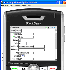
Changing the minimum font size through user preferences affects the formatting ability of the ADF Mobile browser renderer. For example, input fields and their corresponding labels align properly when the font is set to its default size of 6 pt., as shown in Figure 6-1.
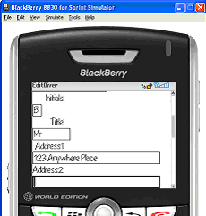
However, increasing the font size to 10 pt. disrupts the display by shifting the input fields beneath their corresponding labels. As a result, the page is difficult to read.
Figure 6-2 shows a page that is too large for the display screen.
6.5.2 Form Factor Variations
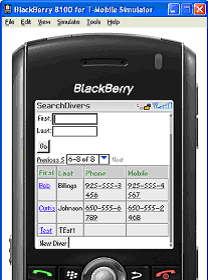
Differing screen sizes can affect display. Even if the font size is at the default of 6 pt. (illustrated in Figure 6-1), the same application appears differently on different devices. In Figure 6-3, the input fields barely fit the device's screen, even though they are easily accommodated on other devices running the same application as shown in Figure 6-1.
In addition, input fields may display properly on the screen of one device, but may appear crowded on the screen of another type of device.
Figure 6-4 shows an application whose table cells are not wide enough to accommodate the text, causing it to wrap.


