30 Creating Databound Selection Lists and Shuttles
This chapter describes how to add selection lists and shuttle components to pages.
This chapter includes the following sections:
30.1 About Selection Lists and Shuttles
Selection list components present the user with a list of choices as input values. The selection list may be model-driven, obtained from a fixed list, or dynamically created at runtime. Selection list components can be rendered as lists, radio buttons, checkboxes, and list boxes. Some selection types can also be singular (select one) or multiple (select many).
Selection lists and shuttles work the same way as do standard JSF list components. ADF Faces list components, however, provide extra functionality such as support for label and message display, automatic form submission, and partial page rendering. When you present users with a list, they can readily see the available choices and make a selection. Picking from a list also eliminates typing errors that may occur.
List of values (LOV) components are UI components that allow the user to enter values by picking from a list that is generated by a query. The LOV displays inside a modal popup dialog that typically includes search capabilities. The af:inputListOfValues and af:inputComboboxListOfValues components, for example, offer additional features that are not available in selection lists, such as search fields inside the LOV modal dialog and queries based on multiple table columns. For more information, see Section G.2.6, "How to Create a Popup List of Values" and the Oracle Fusion Middleware Web User Interface Developer's Guide for Oracle Application Development Framework.
List of values components offer more complex search and input capabilities by using the query component to create a popup search panel with a results table. The query component also has features such as auto-suggestion, smart list filtering, and custom facets for additional functionality.
When the user selects an item from a navigation list, a corresponding component bound to the list also changes its value in response to the selection. For example, when the user selects a product from a shopping list, the table that is bound to the products list updates to display the details of the selected product.
A shuttle allows the user to easily see the available items on an available list and the selected items in the selected list and to quickly move those items back and forth between the lists.
Shuttles provide a visual way to select items from an available list and at the same time see those selected items. ADF Faces provides the selectManyShuttle component and the selectOrderShuttle component, which allow reordering of the selected list. Both components can be implemented by adding code in a managed bean to populate the lists.
30.1.1 Selection Lists and Shuttles Use Cases and Examples
You can use a selection list component such as selectOneChoice for a single value input selection situation in which the list is relatively small. For example, you can use a selectOneChoice to select from a list of product colors or the type of credit card being used.
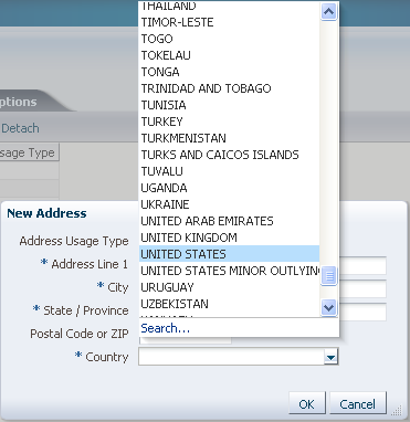
For larger lists and with more complex filtering, use an af:inputListOfValues or af:inputComboboxListOfValues component. These components use the query component to perform a transactional search to populate the list. For instance, you can use the af:inputComboboxListOfValues to select from a list of countries in an address input page.
Use the selectShuttle components when you want the user to be able to assemble a list of items and be able to select and unselect them. You should use the shuttle components when the number of items is large but not overwhelming to display. The user can review the selection and be able to iteratively select and unselect the items until the user is satisfied with the final selection. For instance, the available list could be the options available for a particular automobile and the user can shuttle the options he like to the selected list.
30.1.2 Additional Functionality for Selection Lists and Shuttles
You may find it helpful to understand other ADF features before you configure or use the ADF Model layer. Additionally, you may want to read about what you can do with your model layer configurations. Following are links to other functionality that may be of interest.
-
For more information about using LOV components with search forms and the
af:querycomponent, see Section 31.1.2, "List of Values (LOV) Input Fields." -
You can use the LOV in a task flow that uses an isolated data control. For more information about shared and isolated data controls, see Section 20.4, "Sharing Data Controls Between Task Flows."
-
LOVs are associated with a named view criteria. For more information about setting view criteria options, see Section 5.11.1, "How to Create Named View Criteria Declaratively."
-
LOV components uses the
af:querycomponent to populate the selection list. For more information about theaf:querycomponent, see Chapter 31, "Creating ADF Databound Search Forms."
30.2 Creating List of Values (LOV) Components
List of values (LOV) components are input components that allow the user to enter values by picking from a list that is generated by a query. ADF Faces provides the af:inputListOfValues and af:inputComboboxListOfValues components. If you are creating a fully-featured LOV component, you must define the LOV in the view object as described in Section 5.12, "Working with List of Values (LOV) in View Object Attributes."
If you are using dependent LOVs as part of your search form, you must use them with the af:query component. For more information about using LOV components with search forms, see Section 31.1.2, "List of Values (LOV) Input Fields."
The af:inputListOfValues component has a search icon next to the search criteria field, as shown in Figure 30-1.
The af:inputComboboxListOfValues component has a dropdown icon next to the field, as shown in Figure 30-2 for the PaymentOptionId attribute.
For af:inputComboboxListOfValues, clicking the dropdown icon displays the LOV dropdown list and either a More or a Search command link, as shown in Figure 30-3. A Search link appears when the LOV Search and Select popup dialog contains a search panel to refine the search. A More link appears when the popup dialog contains only the list-of-values table.
The user can select any of the items in the dropdown list to populate the input field. The dropdown list includes a filtered list of values and an optional list of most recently used items. The width of each attribute in the dropdown list can be configured using the DisplayWidth UI hint for that attribute in the view object definition. The width of the dropdown list will be the sum of the widths of all the attributes in the dropdown list.
You can create custom content to be rendered in the Search and Select dialog using the searchContent facet. You can add components such as input text, tables, and trees to display the custom content. You will need to define the returnPopupDataValue attribute and implement a returnPopupListener. When you want to add the auto-complete feature with your custom popup, you can disable the popup by adding launchPopupEvent.setLaunchPopup(false) to your LaunchPopupListener() code. However, clicking on the Search link will still launch the Search and Select dialog. For more information about adding custom content, see the "Using List-of-Values Components" chapter of the Oracle Fusion Middleware Web User Interface Developer's Guide for Oracle Application Development Framework.
If the component's readOnly attribute is set to true, then the input field will not be rendered and the value cannot be changed. By default, the readOnly attribute is set to false, which also enables the editMode attribute to determine whether the user is permitted only to select a value from the list (editMode set to select) or whether the user can also enter a value into the input field (editMode set to input).
You can also set up the LOV component to display a list of selectable suggested items when the user types in a partial value. For example, when the user types in Ca, then a suggested list which partially matches Ca is displayed as a suggested items list. The user can select an item from the list to be entered into the input field. If there are no matches, a "No results found" message will be displayed. You add the af:autoSuggestBehavior tag from the Component Palette into the LOV and set the selectedItem attribute to the suggestedItems method implemented in ADF Model.
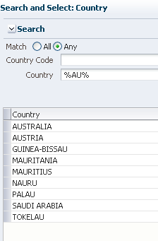
When the user clicks the Search or More link (or for af:inputListOfValues, the search icon), the LOV Search and Select dialog displays with the full list of values in a table format. The LOV Search and Select dialog launched from a More link is shown in Figure 30-4.
The Search and Select popup dialog also presents a create function that allows the user to add a new row. Be aware that if you are creating a new record using the LOV Search and Select dialog, the new row will appear as an empty row in the table if the LOV has the Query Automatically control hint set to false. The content of the row will appear when you perform a query using the Search button. Example 30-1 shows a code sample that uses a commandLink to invoke the create function.
Example 30-1 Create Function Sample Code
<f:facet name="customActions">
      <af:commandLink id="createLink" text="Create..."
         partialSubmit="true">
                 <af:showPopupBehavior popupId="createSLPopup"
                 alignId="createLink"/>
      </af:commandLink>
</f:facet>
If the LOV is part of a task flow that is using an isolated data control, and you use the create function to add a new record, the newly added record will not be displayed in the parent page. This is because the search region is also using an isolated data control scope, so the underlying view object updates are not displayed. For more information about shared and isolated data controls, see Section 20.4, "Sharing Data Controls Between Task Flows."
To programmatically refresh the LOV and display the view object updates, add a returnListener to the Create link with code similar to that shown in Example 30-2.
Example 30-2 Code to Refresh the LOV
public void refreshLOV() {
     BindingContainer bindings = this.getBindings();
     oracle.jbo.uicli.binding.JUCtrlListBinding lovBinding =
         (oracle.jbo.uicli.binding.JUCtrlListBinding)
          bindings.get("Description1");
     JUIteratorBinding lovIter = lovBinding.getIteratorBinding();
     RowSet rs = lovIter.getRowSetIterator().getRowSet();
     rs.executeQuery();

    //Add LOV as the partialTrigger

    AdfFacesContext.getCurrentInstance().addPartialTarget(this.getPlatformDesc());
An LOV is associated with a data source via the view accessor. You can apply one or more view criteria to the view accessor associated with the LOV. The view accessor provides permanent filtering to the LOV data source. In addition to this permanent filtering, you may be able to apply other filters.
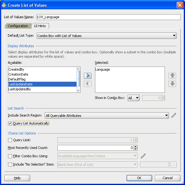
The LOV dialog may include a query panel to allow the user to enter criteria to search for the list of values, or it may contain only a table of results. When you define the LOV in the view object, you can use the UI hints to specify whether a search region should be displayed, which view criteria should be used as the search to populate the list of values, and which LOV component to use. Figure 30-5 shows the Create List of Values dialog and some of its options. In this example, the search region will be made available with the AvailableLanguages1ViewCriteria view criteria used for the query, and af:inputComboboxListOfValues as the component. Another useful option for the af:inputComboboxListOfValues is the Show in Combo Box option, which allows you to select the number of attributes to display in the dropdown list and in the Search and Select dialog. For more information on LOV UI hints, see Section 5.12.5, "How to Set User Interface Hints on a View Object LOV-Enabled Attribute."
For both af:inputListOfValues and af:inputComboboxListOfValues, if the user enters a partial match in the input search field and presses the Tab or Enter key, the LOV automatically launches the LOV Search and Select dialog and executes the query after applying an auto-generated view criteria with a single item representing the partial match value entered by the user. If there are matches, the Search and Select dialog displays all the entries matching the partially entered criteria. If there are no entries that match the entered partial match, then the dialog displays all the entries.
By default, in the af:inputComboboxListOfValues component auto-complete feature, the search is case-sensitive. If you want the search to be case-insensitive, create a view criteria to be associated with that LOV attribute. In the Create View Criteria dialog, deselect the Ignore Case checkbox for that view criteria item before you apply that view criteria to the LOV definition. For more information about setting view criteria options, see Section 5.11.1, "How to Create Named View Criteria Declaratively."
You can also set up the LOV component to display a list of selectable suggested items when the user types in a partial value. For example, when the user types in Ca, then a suggested list which partially matches Ca is displayed as a suggested items list. The user can select an item from the list to be entered into the input field. You add this auto-suggest behavior feature by including an af:autoSuggestBehavior tag from the Component Palette in the LOV and set the selectedItem attribute to the suggestedItems method implemented in ADF Model.
If the LOV is an af:inputComboboxListOfValues, you can apply an additional view criteria to further filter the values in the dropdown list to create a smart list. If the Filter Combo Box Using UI hint is not applied, the dropdown list is filtered by the view criteria applied to the view accessor. Note that this smart list filter applies only to the dropdown list. The full list is still used for validation and for searching from the LOV Search and Select popup dialog.
If both the auto-suggest behavior and smart list filter are enabled for an LOV, auto-suggest will search from the smart list first. If the user waits for two seconds without clicking, then auto-suggest will also search from the full list and append the results. You can also specify the number of suggested items returned by setting the maxSuggestedItems attribute (-1 indicates a complete list). If maxSuggestedItems > 0, a More link is rendered for the user to click on to launch the LOV's Search and Select dialog. Example 30-3 shows the code from an LOV with both auto-suggest behavior and a smart list.
Example 30-3 Auto-Suggest Behavior and Smart List
af:autoSuggestBehavior
    suggestItems="#{bindings.CountryName.suggestItems}"
    smartList="#{bindings.CountryName.smartList}"/>
    maxSuggestedItems="5"
You can define an attribute in the view object to be one or more LOVs. If multiple LOVs are defined on an attribute, each LOV has its own name, view accessor, data mappings, validator, and UI hints (except for the Default List Type hint, which is defined once for the attribute). To switch between LOVs to be used at runtime, an LOV switcher is used. The LOV switcher can be based on an existing attribute of type String, or created as a new String attribute solely for switching between LOVs. The LOV switcher returns the name of the LOV to use at runtime. For instance, you can create three LOVs for the price attribute, and designate the CountryCode attribute as the LOV switcher. At runtime, the value of CountryCode will switch the price attribute to use the LOV that reflects the country's price and currency.
If an attribute is defined as an LOV, you can set the Support Multiple Value Selection control hint in its view criteria to enable users to make multiple selections in the search criteria field. If multiple selection is enabled on an LOV attribute, and the Equal to or Not equal to operator is chosen, a selectManyChoice component will render in the query panel. The user can select multiple items as the search criteria.
If the value of an LOV depends on the value of another LOV, then the two LOVs are called cascading LOVs. For instance, the list of values for the City LOV depends on the value of the Country LOV that was selected. If the LOV is defined as a named bind variable, or if validation is enabled, the LOV query may behave differently depending on such conditions as whether null values for the named bind variable are acceptable. If the bind variable is null, you may want the LOV query to return an empty list. The view criteria's Ignore Null Values and Validation options can be used to define LOV query behavior.
If the view object has an LOV with a bind variable, you should set that view object bind variable's control hint to Hide. Otherwise, the bind variable will be displayed in the LOV Search and Select popup dialog. In the view object overview editor's Query tab, double-click the bind variable, click the Control Hints tab and select Hide from the Display Hint dropdown list.
Best Practice:
An attribute that has been enabled as an LOV should not be used as search criteria in a manually created search form using the "Find Mode" iterator. Creating a search form in this way could result in SQL exception:java.sql.SQLException: Attempt to set a parameter name that does not occur in the SQL. It is best practice to use the query and quick query components for creating search forms. For more information, see Chapter 31, "Creating ADF Databound Search Forms."Displaying an LOV list for a name attribute when the view object's key attribute is a numerical value requires mapping supplemental attributes on the LOV-enabled attribute. For example, to display a list of credit cards by name instead of by their payment option ID value, you can create an LOV on the name reference attribute and define the primary key attribute as a supplemental attribute to the LOV. For details about creating an LOV-enabled reference attribute, see Section 5.12.4, "How to Define an LOV to Display a Reference Attribute."
For more information about different usage scenarios and other view criteria options, see Section 5.11.1, "How to Create Named View Criteria Declaratively," and Section 5.11.3, "What You May Need to Know About Bind Variable Options."
30.2.1 How to Create an LOV
You can create the LOV using either the af:inputListOfValues or the af:inputComboboxListOfValues component. You can add auto-suggest behavior to the component to display a list of possible matches from user input.
It may be helpful to have an understanding of the options that are available to you when you create an LOV. For more information, see Section 30.2, "Creating List of Values (LOV) Components."
You may also find it helpful to understand functionality that can be used with LOVs. For more information, see Section 30.1.2, "Additional Functionality for Selection Lists and Shuttles."
You will need to complete this task:
- Define the attribute to be an LOV in the view object by following the procedure described in Section 5.12, "Working with List of Values (LOV) in View Object Attributes."
-
From the Data Controls panel, drag and drop the attribute onto the JSF page and choose Create > List of Values > ADF LOV Input or Create > List of Values > ADF LOV Choice List.
-
In the Operations page of the Component Palette, from the ADF Faces panel, drag and drop Auto Suggest Behavior as a child to the LOV component.
-
In the Property Inspector, for each of the auto-suggest attributes, enter the:
-
EL expression that resolves to the
suggestItemsmethod.
-
EL expression that resolves to the
smartListmethod. -
Number of items to be displayed in the auto-suggest list. Enter -1 to display the complete list.
Example 30-4 shows an
inputListOfValuescomponent with the auto-suggest behavior and smart list features.Example 30-4 LOV Component with Auto-Suggest Behavior
<af:inputListOfValues id="ProductsId" popupTitle="Search and Select: #{bindings.Products.hints.label}" value="#{bindings.Products.inputValue}" label="#{bindings.Products.hints.label}" model="#{bindings.Products.listOfValuesModel}" required="#{bindings.Products.hints.mandatory}" columns="#{bindings.Products.hints.displayWidth}" shortDesc="#{bindings.Products.hints.tooltip}"> <f:validator binding="#{bindings.Products.validator}"/> <af:autoSuggestBehavior suggestItems="#{bindings.Products.suggestedItems}" smartList="#{bindings.Products.smartList}" maxSuggestedItems="5"/> </af:inputListOfValues> -
-
If you added the auto-suggest behavior, you must set the component's
autoSubmitproperty totrue.
30.2.2 What Happens When You Create an LOV
When you drag and drop an attribute from the Data Controls panel, JDeveloper does many things for you. For a full description of what happens and what is created when you use the Data Controls panel, see Section 26.2.2, "What Happens When You Create a Text Field."
When you drag and drop an attribute defined as an LOV from the Data Controls panel onto a JSF page as an inputListOfValues or inputComboboxListOfValues component, JDeveloper adds code to the page similar to that shown in Example 30-5. The language attribute in the CountryCodes view object has been defined as an LOV and its default component is set to be an inputComboboxListOfValues. The component gets its properties from the control hints defined declaratively in the view object. If you want to include the auto-suggest behavior, you must manually add that tag from the Component Palette.
Example 30-5 inputComboboxListOfValues Component Code in a JSF Page
<af:inputComboboxListOfValues id="languageId"
            popupTitle="Search and Select: #{bindings.Language.hints.label}"
            value="#{bindings.Language.inputValue}"
            label="#{bindings.Language.hints.label}"
            model="#{bindings.Language.listOfValuesModel}"
            required="#{bindings.Language.hints.mandatory}"
            columns="#{bindings.Language.hints.displayWidth}"
            shortDesc="#{bindings.Language.hints.tooltip}"
            readOnly="false">
       <f:validator binding="#{bindings.Language.validator}"/>
</af:inputComboboxListOfValues>
In the page definition file, JDeveloper adds code as shown in Example 30-6. The bindings section of the page definition specifies that the LOV is for the language attribute and the name of the LOV is LOV_language. JDeveloper adds the definitions for the iterator binding objects into the executables element, and the list of values binding object into the bindings element.
Example 30-6 inputComboboxListOfValues Component Code in Page Definition
<executables>
    <variableIterator id="variables"/>
    <iterator Binds="CountryCodesView1" RangeSize="25"
              DataControl="AppModuleDataControl"
              id="CountryCodesView1Iterator"/>
</executables>
<bindings>
    <listOfValues StaticList="false" IterBinding="CountryCodesView1Iterator"
                  Uses="LOV_Language" id="Language"/>
</bindings>
For more information about the page definition file and ADF data binding expressions, see Section 13.7, "Working with Page Definition Files,"and Section 13.8, "Creating ADF Data Binding EL Expressions."
30.3 Creating a Selection List
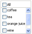
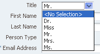
ADF Faces Core includes components for selecting a single value and multiple values from a list. For example, selectOneChoice allows the user to select an item from a dropdown list, and selectManyChoice allow the user to select several items from a list of checkboxes. Selection lists are described in Table 30-1.
Table 30-1 ADF Faces Single and Multiple List Components
| ADF Faces component | Description | Example |
|---|---|---|
|
|
Select a single value from a list of items. |
 |
|
|
Select a single value from a set of radio buttons. |
|
|
|
Select a single value from a scrollable list of items. |
|
|
|
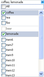
Select multiple values from a scrollable list of checkboxes. Each selection displays at the top of the list. |
 |
|
|
Select multiple values from a group of checkboxes. |
|
|
|
Select multiple values from a scrollable list of checkboxes, |
|
You can create selection lists using the SelectOneChoice ADF Faces component. The steps are similar for creating other single-value selection lists, such as SelectOneRadio and SelectOneListbox.
A databound selection list displays values from a data control collection or a static list and updates an attribute in another collection or a method parameter based on the user's selection. When adding a binding to a list, you use an attribute from the data control that will be populated by the selected value in the list.
Note:
By default, ADF Model list binding passes the index to the component. If you setvaluePassThru=true, then you should set the list binding entry in the corresponding page definition file Mode attribute to Object. When Mode=Object, the list binding will pass an object instead of an index to the component. For more information, see Section 30.3.5, "What Happens When You Create a Fixed Selection List."To create a selection list, you choose a base data source and a list data source in the Edit List Binding dialog:
-
Base data source: Select the data collection that you want to bind to your control and that contains the attributes to be updated from user selections.
-
List data source: Select the data collection that contains the attributes to display.
The data collection is based on the view object. For more information about creating a view object, see Section 5.2.1, "How to Create an Entity-Based View Object."
You can create three types of selection lists in the Edit List Binding dialog:
-
Model-driven list: List selections are based on a list of values bound to a data collection. This type of selection list offers significant advantages over the other two, as described in Section 30.3.1, "How to Create a Model-Driven List."
-
Static list: List selections are based on a fixed list that you create a manually by entering values one at a time into the editor. For more information, see Section 30.3.2, "How to Create a Selection List Containing Fixed Values."
-
Dynamic list: List selections are generated dynamically based on one or more databound attribute values. For more information, see Section 30.3.3, "How to Create a Selection List Containing Dynamically Generated Values."
30.3.1 How to Create a Model-Driven List
A model-driven list is based on a list of values that is bound to a view data object. Lists of Values are typically used in forms to enable an end user to select an attribute value from a dropdown list instead of having to enter it manually. When the user submits the form with the selected values, ADF data bindings in the ADF Model layer update the value on the view object attributes corresponding to the databound fields.
Note:
One way to create a model-driven list is to drag a collection from the Data Controls panel onto a JSF page, choose one of the ADF Forms in the popup menu, and accept the defaults. The advantage is that if there are LOVs defined on the underlying view object attributes, all the LOVs on the entire form will be configured automatically. For more information, see Section 5.12.1, "How to Define a Single LOV-Enabled View Object Attribute."You can also use the list of values as the basis for creating a selection list. The advantages of creating a model-driven list based on a list of values are:
-
Reuse: The list of values is bound to a view data collection. Any selection list that you create based on the data collection can use the same list of values. Because you define the LOV on the individual attributes of view objects in a data model project with ADF Business Components, you can customize the LOV usage for an attribute once and expect to see the changes anywhere that the business component is used in the user interface.
-
Translation: Values in the list of values can be included in resource bundles used for translation.
It may be helpful to have an understanding of the options that are available to you when you create an selection list component. For more information, see Section 30.3, "Creating a Selection List."
You may also find it helpful to understand functionality that can be used with selection lists. For more information, see Section 30.1.2, "Additional Functionality for Selection Lists and Shuttles."
You will need to complete these tasks:
-
Create a view object.
-
Create a view accessor on the object.
-
Create a list of values that is bound to an attribute on the base data source for the selection list. For example, you can create a list of values bound to the
CountryIdattribute of theAddressesview data object.For more information, see Section 5.12.1, "How to Define a Single LOV-Enabled View Object Attribute."
To create a model-driven selection list:
-
From the Data Controls panel, drag and drop the attribute onto the JSF page and choose Create > Single Selections > ADF Select One Choice.
The Edit List Binding dialog displays. The view object collection containing the attribute you dropped on the JSF page is selected by default in the Base Data Source list.
To select a different view data collection, click the Add icon next to the list.
-
Click the Model Driven List radio button.
-
In the Base Data Source Attribute list, select an attribute on which you based a list of values, for example,
CountryId.The list contains all the attributes for the view data collection selected in the Base Data Source list.
-
If a list of values was created for the attribute you selected, it will be listed in the Server List Binding Name list.
For example, you could select
LOV_CountryIdin the Server List Binding Name list because a list of values was created for theCountryIdattribute. -
Click OK.
30.3.2 How to Create a Selection List Containing Fixed Values
You can create a selection list containing selections that you code yourself, rather than retrieving the values from another data source. See Section 30.3.3, "How to Create a Selection List Containing Dynamically Generated Values," for information about populating selection lists with values that are dynamically generated from another data source.
It may be helpful to have an understanding of the options that are available to you when you create a selection list component. For more information, see Section 30.3, "Creating a Selection List."
You may also find it helpful to understand functionality that can be used with selection lists. For more information, see Section 30.1.2, "Additional Functionality for Selection Lists and Shuttles."
You will need to complete this task:
- Prepare a list of values that you will enter into the component as a fixed list.
To create a list bound to a fixed list of values:
-
From the Data Controls panel, drag and drop the attribute onto the JSF page and choose Create > Single Selections > ADF Select One Choice.
The Edit List Binding dialog displays. The view object collection containing the attribute you dropped on the JSF page is selected by default in the Base Data Source list.
To select a different view data collection, click the Add icon next to the list.
-
Click the Fixed List radio button.
The Fixed List option lets end users choose a value from a static list that you define.
-
In the Base Data Source Attribute list, choose an attribute.
The Base Data Source Attribute list contains all of the attributes in the view data collection you selected in the Base Data Source list. For example, if you selected
CountryCodesas the base data source, you can chooseCountryNamein the list. -
In the Set of Values box, enter each value you want to appear in the list. Press the Enter key to set a value before typing the next value. For example, you could add the country codes
India,Japan, andRussia.The order in which you enter the values is the order in which the list items are displayed in the
SelectOneRadiocontrol at runtime.The
SelectOneRadiocomponent supports anullvalue. If the user has not selected an item, the label of the item is shown as blank, and the value of the component defaults to an empty string. Instead of using blank or an empty string, you can specify a string to represent thenullvalue. By default, the new string appears at the top of the list. -
Click OK.
30.3.3 How to Create a Selection List Containing Dynamically Generated Values
You can populate a selection list component with values dynamically at runtime.
Tip:
Another option is to create a static view object or a database view object within a shared application module. Then use a model- driven LOV to create the list. This provides caching and translatability.It may be helpful to have an understanding of the options that are available to you when you create a selection list component. For more information, see Section 30.3, "Creating a Selection List."
You may also find it helpful to understand functionality that can be used with selection lists. For more information, see Section 30.1.2, "Additional Functionality for Selection Lists and Shuttles."
You will need to complete these tasks:
-
Define a data source for the list data source that provides the dynamic list of values.
-
Define a data source for the base data source that is to be updated based on the user's selection.
To create a selection list bound containing dynamically generated values:
-
From the Data Controls panel, drag and drop the attribute onto the JSF page and choose Create > Single Selections > ADF Select One Choice.
The Edit List Binding dialog displays. The view object collection containing the attribute you dropped on the JSF page is selected by default in the Base Data Source list.
To select a different view data collection, click the Add icon next to the list.
-
Click the Dynamic List radio button.
The Dynamic List option lets you specify one or more base data source attributes that will be updated from another set of bound values.
-
Click the Add button next to List Data Source.
-
In the Add Data Source dialog, select the view data collection that will populate the values in the selection list.
In the Fusion Order Demo application, for example, you could select
ProductQuantities.Note:
The list and base collections do not have to form a master-detail relationship, but the attribute in the list collection must have the same type as the base collection attributes. -
Accept the default iterator name and click OK.
The Data Mapping section of the Edit List Binding dialog updates with a default data value and list attribute. The Data Value control contains the attribute on the data collection that is updated when the user selects an item in the selection list. The List Attribute control contains the attribute that populates the values in the selection list.
-
You can accept the default mapping or select different attributes items from the Data Value and List Attribute lists to update the mapping.
To add a second mapping, click Add.
-
Click OK.
30.3.4 What Happens When You Create a Model-Driven Selection List
When you drag and drop an attribute from the Data Controls panel, JDeveloper does many things for you. For a full description of what happens and what is created when you use the Data Controls panel, see Section 26.2.2, "What Happens When You Create a Text Field."
Example 30-7 shows the page source code after you add a model-driven SelectOneChoice component to it.
Example 30-7 Model-Driven SelectOneChoice List in JSF Page Source Code
<af:selectOneChoice value="#{bindings.CountryId1.inputValue}"
                            label="#{bindings.CountryId1.label}">
          <f:selectItems value="#{bindings.CountryId1.items}"/>
</af:selectOneChoice>
The f:selectItems tag, which provides the list of items for selection, is bound to the items property on the CountryId1 list binding object in the binding container. For more information about ADF data binding expressions, see Section 13.6, "Configuring the ADF Binding Filter."
In the page definition file, JDeveloper adds the list binding object definitions in the bindings element, as shown in Example 30-8.
Example 30-8 List Binding Object for the Model-Driven List in the Page Definition File
 <bindings>
    <list IterBinding="AddressesView1Iterator" id="CountryId"
          Uses="LOV_AddressId" StaticList="false" ListOperMode="0">
      <AttrNames>
        <Item Value="AddressId"/>
      </AttrNames>
    </list>
    <list IterBinding="AddressesView1Iterator" id="CountryId1"
          Uses="LOV_CountryId" StaticList="false" ListOperMode="0">
      <AttrNames>
        <Item Value="CountryId"/>
      </AttrNames>
    </list>
  </bindings>
In the list element, the id attribute specifies the name of the list binding object. The IterBinding attribute references the variable iterator, whose current row is a row of attributes representing each variable in the binding container. The variable iterator exposes the variable values to the bindings in the same way as do other collections of data. The AttrNames element specifies the attribute value returned by the iterator.
For more information about the page definition file and ADF data binding expressions, see Section 13.7, "Working with Page Definition Files,"and Section 13.8, "Creating ADF Data Binding EL Expressions."
30.3.5 What Happens When You Create a Fixed Selection List
When you add a fixed selection list, JDeveloper adds source code to the JSF page and list and iterator binding objects to the page definition file.
Example 30-9 shows the page source code after you add a fixed SelectOneChoice component to it.
Example 30-9 Fixed SelectOneChoice List in JSF Page Source Code
<af:selectOneChoice value="#{bindings.CountryIdStatic.inputValue}"
                            label="#{bindings.CountryIdStatic.label}">
          <f:selectItems value="#{bindings.CountryIdStatic.items}"/>
        </af:selectOneChoice>
The f:selectItems tag, which provides the list of items for selection, is bound to the items property on the CountryId list binding object in the binding container. For more information about ADF data binding expressions, see Section 13.8, "Creating ADF Data Binding EL Expressions."
In the page definition file, JDeveloper adds the definitions for the iterator binding objects into the executables element, and the list binding object into the bindings element, as shown in Example 30-10.
Example 30-10 List Binding Object for the Fixed Selection List in the Page Definition File
<executables>
    <iterator Binds="Addresses1" RangeSize="10"
              DataControl="StoreFrontModuleDataControl"
              id="Addresses1Iterator"/>
  </executables>
  <bindings>
    <list IterBinding="Addresses1Iterator" id="CountryIdStatic" ListOperMode="0"
          StaticList="true">
      <AttrNames>
        <Item Value="CountryIdStatic"/>
      </AttrNames>
      <ValueList>
        <Item Value="India"/>
        <Item Value="Japan"/>
        <Item Value="Russia"/>
      </ValueList>
    </list>
  </bindings>
For complete information about page definition files, see Section 13.7, "Working with Page Definition Files."
30.3.6 What You May Need to Know About Values in a Selection List
Once you have created a list binding, you may want to access a value in the list. You can set the component's valuePassThru attribute to true either in the visual editor or in the Property Inspector. Example 30-11 shows the code for a selectOneChoice component.
Example 30-11 valuePassThru Attribute Set to true in selectOneChoice
 <af:selectOneChoice value="#{bindings.Language.inputValue}"
                     label="#{bindings.Language.label}"
                     required="#{bindings.Language.hints.mandatory}"
                     shortDesc="#{bindings.Language.hints.tooltip}"
                     valueChangeListener="#{myBean.valueChanged}"
                     id="soc1" valuePassThru="true">
      <f:selectItems value="#{bindings.Language.items}" id="si1"/>
</af:selectOneChoice>
Only when the valuePassThru attribute is set to true and the Mode attribute in the corresponding page definition file is set to Object can the value passed to the valueChangeListener be of type Object (which is the actual value). By default, Mode is set to Index. Example 30-12 shows the Mode attribute in the page definition file.
30.3.7 What Happens When You Create a Dynamic Selection List
When you add a dynamic selection list to a page, JDeveloper adds source code to the JSF page and list and iterator binding objects to the page definition file.
Example 30-13 shows the page source code after you add a dynamic SelectOneChoice component to it.
Example 30-13 Dynamic SelectOneChoice List in JSF Page Source Code
 <af:selectOneChoice value="#{bindings.Quantity.inputValue}"
                            label="#{bindings.Quantity.label}">
          <f:selectItems value="#{bindings.Quantity.items}"/>
        </af:selectOneChoice>
The f:selectItems tag, which provides the list of items for selection, is bound to the items property on the Quantity list binding object in the binding container. For more information about ADF data binding expressions, see Section 13.8, "Creating ADF Data Binding EL Expressions."
In the page definition file, JDeveloper adds the definitions for the iterator binding objects into the executables element, and the list binding object into the bindings element, as shown in Figure 30-6.
Example 30-14 List Binding Object for the Dynamic Selection List in the Page Definition File
<executables>
    <iterator Binds="OrderItems" RangeSize="-1"
              DataControl="StoreFrontModuleDataControl1"
              id="OrderItemsIterator"/>
    <iterator Binds="ProductQuantities" RangeSize="10"
              DataControl="StoreFrontModuleDataControl1"
              id="ProductQuantitiesIterator"/>
  </executables>
  <bindings>
    <list IterBinding="AddressesView1Iterator" id="CountryId"
          Uses="LOV_AddressId" StaticList="false" ListOperMode="0">
      <AttrNames>
        <Item Value="AddressId"/>
      </AttrNames>
    </list>
    <list IterBinding="ProductQuantities1Iterator" id="Quantity"
          StaticList="false" ListOperMode="0" ListIter="OrderItems1Iterator">
      <AttrNames>
        <Item Value="Quantity"/>
      </AttrNames>
      <ListAttrNames>
        <Item Value="Quantity"/>
      </ListAttrNames>
      <ListDisplayAttrNames>
        <Item Value="OrderId"/>
      </ListDisplayAttrNames>
    </list>
  </bindings>
By default, JDeveloper sets the RangeSize attribute on the iterator element for the OrderItems iterator binding to a value of -1 thus allowing the iterator to furnish the full list of valid products for selection. In the list element, the id attribute specifies the name of the list binding object. The IterBinding attribute references the iterator that iterates over the ProductQuantities collection. The ListIter attribute references the iterator that iterates over the ProductList collection. The AttrNames element specifies the base data source attributes returned by the base iterator. The ListAttrNames element defines the list data source attributes that are mapped to the base data source attributes. The ListDisplayAttrNames element specifies the list data source attribute that populates the values users see in the list at runtime.
For complete information about page definition files, see Section 13.7, "Working with Page Definition Files."
30.4 Creating a List with Navigation List Binding
Navigation list binding lets users navigate through the objects in a collection. As the user changes the current object selection using the navigation list component, any other component that is also bound to the same collection through its attributes will display from the newly selected object. In addition, if the collection whose current row you change is the master view object instance in a data model master-detail relationship, the row set in the detail view object instance is automatically updated to show the appropriate data for the new current master row.
It may be helpful to have an understanding of the options that are available to you when you create a navigation list. For more information, see Section 30.4, "Creating a List with Navigation List Binding."
You may also find it helpful to understand functionality that can be used with navigation lists. For more information, see Section 30.1.2, "Additional Functionality for Selection Lists and Shuttles."
To create a list that uses navigation list binding:
-
From the Data Controls panel, drag and drop a collection to the page and choose Create > Navigation > ADF Navigation Lists.
-
In the Edit List Binding dialog, from the Base Data Source dropdown list, select the collection whose members will be used to create the list.
This should be the collection you dragged from the Data Controls panel. If the collection does not appear in the dropdown menu, click the Add button to select the collection you want.
-
From the Display Attribute dropdown list, select the attribute that will display in the list. You can choose the selection that includes all the attributes, and you can choose Select Multiple to launch a selection dialog.
In the Select Multiple Display Attributes dialog, shuttle the attributes you want to display from the Available Attributes list to the Attributes to Display list. Click OK to close the dialog.
-
Click OK.
30.5 Creating a Databound Shuttle
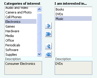
The selectManyShuttle and selectOrderShuttle components render two list boxes and buttons that allow the user to select multiple items from the leading (or available) list box and to move or shuttle those items over to the trailing (or selected) list box, and vice versa. You can also double-click an item to move it to the other list box. Figure 30-6 shows an example of a rendered selectManyShuttle component. You can specify any text you want for the headers that display above the list boxes.
The only difference between selectManyShuttle and selectOrderShuttle is that in the selectOrderShuttle component, the user can reorder the items in the trailing list box by using the up and down arrow buttons on the side.
The Fusion Order Demo application uses a selectManyShuttle component to select customer interest categories from a Categories of Interest list box to an I am interested in list box. The leading list box on the left displays all the categories. The trailing list box on the right displays the categories the customer has selected.
Like other ADF Faces selection list components, the selectManyShuttle component can use the f:selectItems tag to provide the list of items available for display and selection in the leading list.
Before you can bind the f:selectItems tag, create a generic class that can be used by any page that requires a shuttle. In the class, declare and include getter and setter methods for the properties that describe the view object instance names that should be used for the list of all available choices (leading list or available product categories) and the list of selected choices (trailing list or assigned product categories). Example 30-15 shows the CustRegBasicInformationBean class that is created to manage the population and selection state of the shuttle component on the basicInformation.jsff page.
Example 30-15 CustRegBasicInformationBean Class
package oracle.fodemo.storefront.account.view.managed;
import java.io.Serializable;
import java.util.List;
import javax.faces.application.FacesMessage;
import javax.faces.context.FacesContext;
import oracle.binding.OperationBinding;
import oracle.binding.BindingContainer;
import oracle.fodemo.storefront.adf.util.ADFUtils;
import javax.faces.event.ValueChangeEvent;
import oracle.fodemo.storefront.jsf.util.JSFUtils;
public class CustRegBasicInformationBean implements Serializable {
    String allItemsIteratorName;
    String allItemsValueAttrName;
    String allItemsDisplayAttrName;
    String allItemsDescriptionAttrName;
    String selectedValuesIteratorName;
    String selectedValuesValueAttrName;
    List selectedValues;
    List allItems;
    private boolean refreshSelectedList = false;
    public CustRegBasicInformationBean() {
    }

    public void setAllItemsIteratorName(String allItemsIteratorName) {
        this.allItemsIteratorName = allItemsIteratorName;
    }
    public String getAllItemsIteratorName() {
        return allItemsIteratorName;
    }

// other getter and setter methods are omitted
    public void setSelectedValues(List selectedValues) {
        this.selectedValues = selectedValues;
    }
    public void refreshSelectedList(ValueChangeEvent event) {
        refreshSelectedList = true;
    }
    public List getSelectedValues() {
        if (selectedValues == null || refreshSelectedList) {
            selectedValues =
                    ADFUtils.attributeListForIterator(selectedValuesIteratorName,
                                                     selectedValuesValueAttrName);
        }
        return selectedValues;
    }
    public void setAllItems(List allItems) {
        this.allItems = allItems;
    }

    public List getAllItems() {
        if (allItems == null) {
            allItems =
                    ADFUtils.selectItemsForIterator(allItemsIteratorName,
                    allItemsValueAttrName,
                    allItemsDisplayAttrName,
                    allItemsDescriptionAttrName);
        }
        return allItems;
    }
}
The getAllItems() method populates the shuttle's leading list. The getSelectedValues() method also returns a List, but the list defines the items in the shuttle's trailing list. The values returned by getSelectedValues() are a subset of the values returned by getAllItems(). Values that are in getAllItems() but not in getSelectedValues() will be ignored (and will generate an error in the server log). Note that the CustRegBasicInformationBean class calls several utility methods in the ADFUtils class. Also note that this class uses values for several properties of the base bean. Example 30-16 shows the managed bean and managed properties configured in customer-registration-task-flow.xml for working with the shuttle component.
Example 30-16 Managed Bean for the Shuttle Component in the customer-registration-task-flow File
<managed-bean>
      <managed-bean-name>
        custRegBasicInformationBean</managed-bean-name>
      <managed-bean-class>
        oracle.fodemo.storefront.account.view.managed.CustRegBasicInformationBean
      </managed-bean-class>
      <managed-bean-scope>view</managed-bean-scope>
      <managed-property>
        <property-name>allItemsIteratorName</property-name>
        <value>AvailableCategoriesShuttleListIterator</value>
      </managed-property>
      <managed-property>
        <property-name>allItemsValueAttrName</property-name>
        <value>CategoryId</value>
      </managed-property>
      <managed-property>
        <property-name>allItemsDisplayAttrName</property-name>
        <value>CategoryName</value>
      </managed-property>
      <managed-property>
        <property-name>allItemsDescriptionAttrName</property-name>
        <value>CategoryDescription</value>
      </managed-property>
      <managed-property>
        <property-name>selectedValuesIteratorName</property-name>
        <value>SelectedCategoriesShuttleListIterator</value>
      </managed-property>
      <managed-property>
        <property-name>selectedValuesValueAttrName</property-name>
        <value>CategoryId</value>
      </managed-property>
</managed-bean>
The basicInformation.jsff page uses the following iterator objects:
-
CustomerRegistrationIterator: Iterates over theCustomerRegistrationcollection, which provides the context for the form above the shuttle. -
SelectedCategoriesShuttleListIterator: Iterates over theSelectedCategoriesShuttleListcollection, which provides the list of categories assigned to the current customer. -
AvailableCategoriesShuttleListIterator: Iterates over theAvailableCategoriesShuttleListcollection, which provides the list of product categories.
All the bindings of the basicInformation.jsff page are defined in the file account_basicInformationPageDef.xml. Example 30-17 shows part of the page definition file for the basicInformation.jsff page.
Example 30-17 Page Definition File for the basicInformation Page
<?xml version="1.0" encoding="UTF-8" ?>
<pageDefinition xmlns="http://xmlns.oracle.com/adfm/uimodel"
                version="11.1.1.48.68" id="account_basicInformationPageDef"
                Package="oracle.fodemo.storefront.pageDefs">
  <parameters/>
  <executables>
    <page path="oracle.fodemo.storefront.pageDefs.
          templates_StoreFrontTemplatePageDef"
          id="pageTemplateBinding"/>
    <iterator Binds="CustomerRegistration" RangeSize="25"
              DataControl="StoreServiceAMDataControl"
              id="CustomerRegistrationIterator" Refresh="ifNeeded"/>
    <iterator id="SelectedCategoriesShuttleListIterator"
              Binds="SelectedCategoriesShuttleList" RangeSize="-1"
              DataControl="StoreServiceAMDataControl"/>
    <iterator id="AvailableCategoriesShuttleListIterator"
              Binds="AvailableCategoriesShuttleList" RangeSize="-1"
              DataControl="StoreServiceAMDataControl"/>
    <invokeAction Binds="setHelpId" id="invokeSetHelpId" Refresh="ifNeeded"/>
  </executables>
It may be helpful to have an understanding of the options that are available to you when you create a shuttle. For more information, see Section 30.5, "Creating a Databound Shuttle."
You may also find it helpful to understand functionality that can be used with selection lists. For more information, see Section 30.1.2, "Additional Functionality for Selection Lists and Shuttles."
You will need to complete these tasks:
-
Create the relevant iterator bindings in the page definition file. Use Example 30-17 as a guide.
-
Create a class similar to the CustRegBasicInformationBean class. Use Example 30-15 as a guide.
-
Configure the required managed bean and managed properties in the task flow definition or, in the case of an unbounded task flow, the
adfc-config.xmlfile. Use Example 30-16 as a guide.
To create a shuttle component:
-
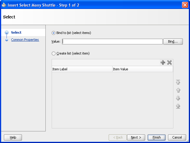
In the Common Components page of the Component Palette, from the Common panel, drag and drop SelectManyShuttle onto the page. JDeveloper displays the Insert SelectManyShuttle wizard, as illustrated in Figure 30-8.
-
Select Bind to list (select items) and click Bind to open the Expression Builder.
-
In the Expression Builder, expand ADF Managed Beans > pageFlowScope > CustRegBasicInformationBean > allItems to build the expression
#{pageFlowScope.custRegBasicInformationBean.allItems}and click Next.This binds the
f:selectItemstag to thegetAllItems()method that populates the shuttle's leading list. -
In the Common Properties page, click Bind next to the Value field to open the Expression Builder again.
-
In the Expression Builder, expand ADF Managed Beans > pageFlowScope > CustRegBasicInformationBean > selectedValues to build the expression
#{pageFlowScope.custRegBasicInformationBean.selectedValues}and click Finish.This binds the
valueattribute of theselectManyShuttlecomponent to thegetSelectedValues()method that populates the shuttle's trailing list.
Example 30-18 shows the code for the selectManyShuttle component after you complete the Insert SelectManyShuttle dialog.
Example 30-18 SelectManyShuttle Component in basicInformation.jsff File
<af:selectManyShuttle
       value="#{pageFlowScope.custRegBasicInformationBean.selectedValues}"
               leadingHeader="#{res['basicinfo.leadingHeader']}"
               trailingHeader="#{res['basicinfo.trailingHeader']}"
               leadingDescShown="true" size="8"
               trailingDescShown="true"
               inlineStyle="background-color:transparent;"
               id="sms1">
       <f:selectItems
               value="#{pageFlowScope.custRegBasicInformationBean.allItems}"/>
</af:selectManyShuttle>
