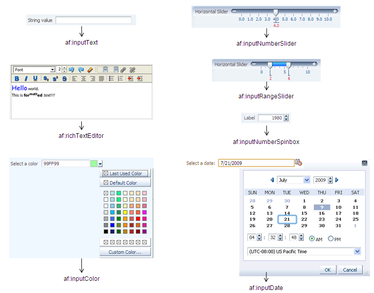
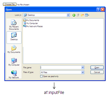
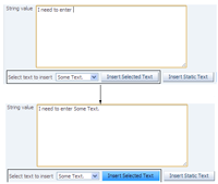
- The af:inputText component allows users to enter simple strings.
- The af:inputNumberSlider component allows users to select a number using a slider. You can configure the range of numbers shown on the slider. The af:inputRangeSlider component has two thumbs and allows users to select two numbers to create a range. The af:inputNumberSpinbox component has up and down arrow keys that increment or decrement the number in the box.
- The af:inputColor component has a text field where a user can enter a color code and also a button that launches a color picker (the af:chooseColor comonent) from which a user can select a color, including a custom color.
- The af:inputDate component has a text field where a user can enter a date and also an icon that launches a date picker (the af:chooseDate comonent) from which a user can select a date, time, and timezone.
- The af:richTextEditor component provides a text editor that accepts text with formatting. The text can be shown in WYSIWYG mode or in HTML source mode.


Documentation
Web User Interface Developer's Guide for Oracle ADF: Using Input Components and Defining Forms
Demos and code examples:
You can download the ADF Faces Rich Client component demo, where you can explore the components at runtime and view sample code.

