
Description
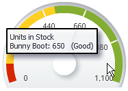
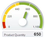
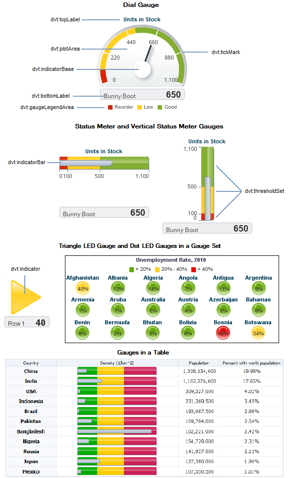
Gauges are measuring instruments for indicating a quantity such as sales, stock levels, temperature, or speed. Gauges typically display a single data value, often more effectively than a graph. Gauges can show state information such as acceptable or unacceptable ranges using color. When you need to compare many data values at a glance, multiple gauges can be shown inside table cells, or in a vertical, horizontal, or grid layout as a gauge set. The gauge component supports four categories of gauge types: dial, status meter, vertical status meter, and LED. All gauge types can display a title, bottom label, data label, and legend.
The properties for the gauge component are sufficient to produce a gauge, but you can also add and configure child components or supported facets to further customize the display and behavior of the gauge or gauge set.
The gauge component supports these child tags and facets:
- Use dvt:gaugeFrame to customize the decorative frame that encloses the plot area on dial gauges, and dvt:gaugePlotArea to customize the frame that encloses the indicator.
- The dvt:indicator component points to the value that is plotted in a dial gauge, typically in the form of a line or an arrow, dvt:indicatorBar refers to the inner rectangle in a status meter gauge, and dvt:indicatorBase refers to the circular base of a line or needle style indicator in a dial gauge.
- Use the dvt:topLabel component to show the gauge title appearing at the top or inside of a gauge. Use dvt:bottomLabel component for an optional label that appears below or inside the gauge. By default, displays the label for the data row. You can configure a dvt:lowerLabelFrame for this label to specify border color and fill color. Use dvt:metricLabel to show the value of the metric that the gauge is plotting in text.
- The dvt:thresholdSet component specifies the dvt:threshold sections for the metrics of a gauge. You can create an unlimited number of thresholds for a gauge. A legend displays a description of the threshold set with the color and the name or range of each threshold. Legend elements include dvt:gaugeLegendArea, dvt:gaugeLegendText, and dvt:gaugeLegendTitle.
- The dvt:tickMark component refers to the markings along the value axis of the gauge. These can identify regular intervals, from minimum value to maximum value, and can also indicate threshold values. Tick marks can specify major increments that may include dvt:tickLabel components or minor increments.
- You can use a dvt:shapeAttributesSet component to configure behavior properties for gauge child elements. For example, a gauge indicator could be associated with a hyperlink to additional information when the user moves the mouse over the indicator at runtime.
- Use the bodyContextMenu facet to support a single af:popup component containing the context menu that will be shown on right click on any non-selectable object within the component. The af:popup must contain an af:menu to display the context menu.
Documentation
Web User Interface Developer's Guide for Oracle ADF: Using Gauge Components
Fusion Developers Guide for Oracle ADF: Creating Databound ADF Data Visualization Components
Demos and code examples:
You can download the ADF Faces Rich Client component demo, where you can explore data visualization components at runtime and view sample code.