Dashboards and Scorecards
Category Sales Analysis Dashboard
The Category Sales Analysis dashboard measures:
-
Category profitability, across time, channel, customer and at the brand and item levels.
-
Average price, which compares the price of the product at retail against the competitive products at an item level by channel, time and market.
Supported Category Sales Analysis measures include:
| Measure | Explanation |
| Retailer Net Cost and Gross Margin | Displays the next cost and gross margin for each product category, by Retailer. |
| Category Coverage | Displays the sales of a single product as a percentage of total category sales - by $ value. |
| Product Mix | This pie chart displays the breakdown of categories, brands or items. Click on a category within the pie chart to drill-down to its members. For example, clicking on Tea drills-down to a pie chart displaying all products belonging to the category. |
| Product Contribution to Gross Margin | Display the percentage that each product category contributes towards gross margin. |
| Category Sales By Type | Category sales value by type of promotion – either promotion or regular pricing. This measure helps category managers see how much his sales organization depends upon promotion to sell, and how it affects the overall sales and volume at retail. |
| Sales Growth % Change to Previous Period | Percentage change in sales growth for the category over the previous period. For example, selecting the Month filter displays the percent change from the previous month to the current month. |
Manufacturer Promotions Dashboard
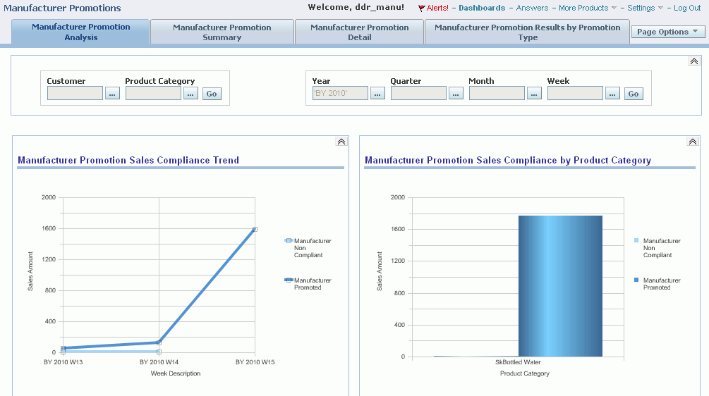
Use the Manufacturer Promotions dashboard to display pre-seeded reports and graphs to facilitate reporting and analysis. This dashboard displays:
-
Weekly sales compliance trend by promoted and non-compliant sales
-
Manufacturer promotion compliance by promotion type
-
Manufacturer promotion compliance by product category for promoted and non-promoted sales by product category
-
Expected vs. Actual promotion sales
-
Expected vs. Actual ACV % by manufacturer promotion
-
Expected vs. Actual sales by promotion type (for example, display, feature, and so on.)
As well, context sensitive drill-downs are available from the manufacturer promotion dashboard to display:
-
Manufacturer Promotion Summary Results at the promotion/customer level
-
Manufacturer Promotion Detail Results at the promotion/customer/SKU level
The Manufacturer Promotions Analysis tab displays a variety of charts for compliance analysis including:
-
Mfr Promotion Sales Compliance Trend
-
Mfr Promotion Sales Compliance by Product Category
-
Mfr Promotion Sales (Expected vs. Actual)
-
Mfr Promotion ACV % (Expected vs. Actual)
-
Mfr Promotion Sales by Promotion Type (Expected vs. Actual)
-
Mfr Promotion Sales Compliance by Promotion Type
The Manufacturer Promotions Summary tab displays a high level overview of promotions:
-
Mfr Promoted Sales Quantity
-
Mfr Non-Compliant Sales Quantity
-
Total Sales Quantity
-
Expected Sales Quantity
-
% of Expected Sales Qty
-
Expected Customer ACV%
-
Actual Customer ACV%
-
Number of Stores Running Promotion
-
Number of Retail Stores
-
Store Participation
The Manufacturer Promotions Detail tab displays detailed promotions data by promotion name and type:
-
Promoted Price
-
Actual Promoted Price
-
Actual Mfr Non-Compliant Price
-
Mfr Promoted Sales Quantity
-
Mfr Non-Compliant Sales Quantity
-
Total Sales Quantity
-
Expected Sales Quantity
-
% of Expected Sales Qty
-
Expected Customer ACV%
-
Actual Customer ACV%
-
Number of Stores Running Promotion
-
Number of Retail Stores
-
Store Participation %
Sales Performance by Account Dashboard
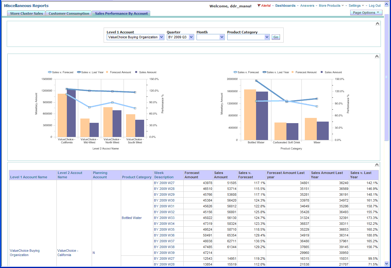
Demand Signal Repository has provided a sample out of the box dashboard which utilizes the Alternate Organization Hierarchy. Existing dashboards and reports can be easily modified to use the alternate organization hierarchy instead of the Customer Organization Hierarchy.
The Sales Performance by Account dashboard page can be found on the Miscellaneous Reports dashboard. This dashboard displays sales and forecast facts associated with the ValueChoice Buying Organization (a level one account). The chart on the left shows a breakdown by level two account and the chart on the right shows a breakdown by product category.
The Sales Performance by Account dashboard page is made up of:
-
The Sales Performance by Account Prompt
-
The Sales Performance by Account query which has several views that are displayed on the dashboard page.
Scorecards
Demand Signal Repository uses color-coded scorecards which provide a graphical interface for monitoring results versus goals over time. The scorecard indicates how well you are meeting your goals and thresholds, and display both latest (weekly) results as well as overall Year To Date (YTD) results. The following example illustrates how color-coding indicates results:
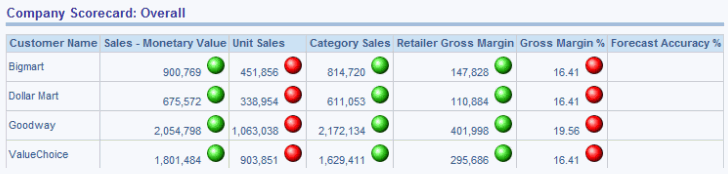
Demand planning involves establishing performance targets that measure many aspects of a single customer relationship. Then, on a weekly, monthly, or quarterly basis, the scorecard evaluates whether the company has met the goal or has fallen below its objectives.
When drilling down on a measure (either latest results or overall results) from the scorecard, the underlying reports only display weekly results for the specified year. All available weeks are displayed, regardless of the week selected in the scorecard. The results are displayed starting with the first week in which data is loaded through the latest week.
Upper and Lower Bound Measures
How DSR color-codes Scorecard measures depends on whether or not a measure is upper bound (in which lower values are better), or lower bound (in which higher values are better). The following table lists all upper and lower bound measures:
| Lower Bound Measures | Upper Bound Measures |
| Monetary Sales | On-Hand Inventory |
| Unit Sales | % Returns |
| Category Sales | Inventory Cover |
| Retailer Gross Margin | Order Cycle Time (OCT) |
| Gross Margin % | Order Change % |
| Forecast Accuracy % | Deduction Balance |
| On-Time Delivery % | Payment Days |
| Perfect Order % | |
| Invoice Accuracy % | |
| Item Data Synchronization % | |
| Item Data Accuracy % |
Formatting Rules for Lower Bound Measures
Each measure has an associated icon, that is colored to represent a different condition:
| Measure (Icon) Appearance | Explanation |
| No Icon | No goal has been defined for the measure. |
| Green Circle | Sales are equal to (or above) the goal. |
| Yellow Circle | The measure is below the specified goal, but above the lower-bound threshold. |
| Red Circle | Either:
|
Formatting Rules for Upper Bound Measures
Each measure has an associated icon, that is colored to represent a different condition:
| Measure (Icon) Appearance | Explanation |
| No Icon | No goal has been defined for the measure. |
| Green Circle | The measure is below or equal to the goal. |
| Yellow Circle | The measure is above the goal, but below |
| Red Circle | Either:
|
Sales Scorecard
The Sales scorecard displays the following sales-related measures.
-
Monetary sales: Sales amount for all of the manufacturer’s products in terms of the manufacturer’s reporting currency rolled up to chain level versus the goal set for the most recent week or month.
-
Unit sales: Sales quantity for all of the manufacturer’s products rolled up to chain level versus the goal set for the most recent week or month.
-
Category sales: Sales amount for all products (including competitor products) in terms of the manufacturer’s reporting currency rolled up to chain level versus the goal set for the most recent week or month.
-
Category share: Ratio of monetary sales to category sales as a percentage compared to the goal set for the most recent week or month.
-
Retailer gross margin: Retailer gross margin for all of the manufacturer’s products in terms of the manufacturer’s reporting currency rolled up to chain level versus the goal set for the most recent week or month.
-
Gross margin %: Ratio of retailer gross margin to monetary sales as a percentage compared to the goal set for the most recent week or month.
-
Forecast accuracy %: Mean absolute percentage deviation of the forecast from actual monetary sales for all manufacturer products across the retail chain.
Supply Chain Scorecard
Supply Chain scorecard displays the results of measures versus goals comparisons for seven supply-chain-oriented measures:
-
Service Level: The percentage of product that a buyer received, as compared to the original ordered quantity.
-
Order Cycle Time: The average time between placing an order and when the order was received at the customer location.
-
Inventory Cover: How many days of demand that can be filled by the current inventory.
-
On-Time Delivery: The percentage of customer orders that are received on-time.
-
On-Hand Inventory: The quantity of current inventory.
-
In-Stock %: The percentage of items that are currently on-hand (in stock).
-
% Returns: The percentage of customer orders that are returned.
Operations Scorecard
The Operations Scorecard displays the results of measures versus goals comparisons for the following operations-related measures:
-
Perfect order %: The percentage of customer orders that do not require changes in items or item quantities.
-
Order change %: The percentage of customer orders that require changes in items or item quantities.
-
Invoice accuracy %: The percentage of seller invoices that are accurate.
-
Payment days: The average number of days that pass between a customer receiving an invoice and paying it.
-
Deduction Balance: The monetary value of products removed from distribution because of damage, seasonality, discontinuation, and so on.
-
Item data synchronization %: The percentage of items sold that are synchronized by the buyer using the Global Data Synchronization Network (GDSN).
-
Item data accuracy %: The percentage of items with accurate (that is, measured) dimensions and weight attributes out of all items.
Reports
Use Demand Signal Repository’s prebuilt Category Management reports to view filterable demand data. Each report is built to display a different aspect of your organization’s performance.
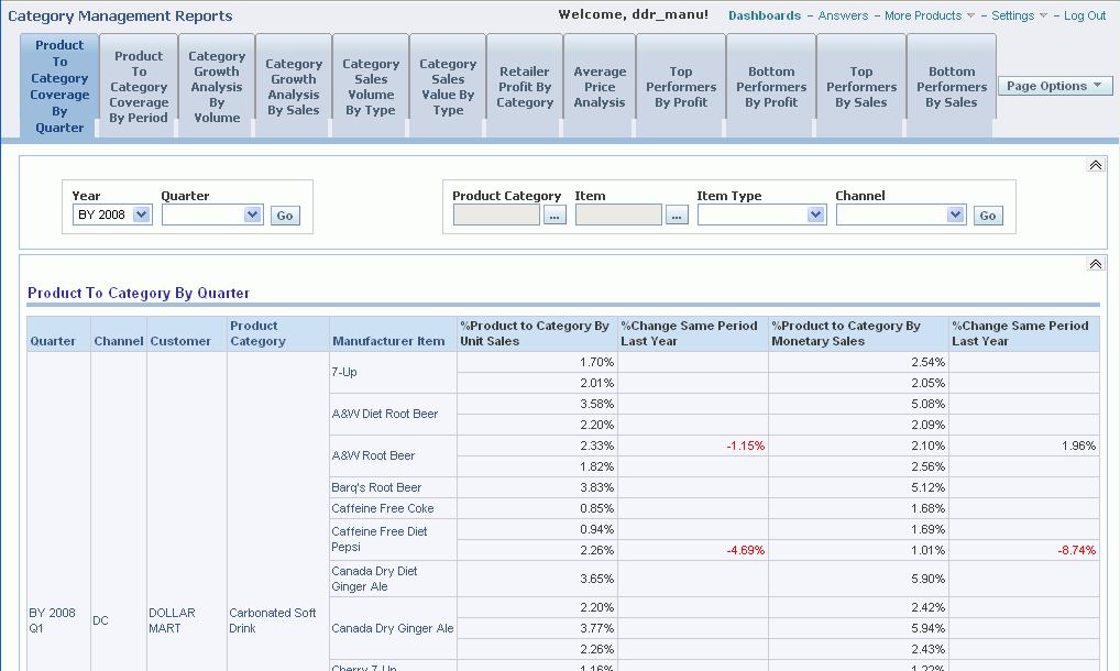
You can filter reports by time (Year, Quarter, and Month) or product (Product Category, Channel, Item Type). Click a report element (for example, the Bottled Water category or Dollar Mart customer) to drill down to a detailed display of that particular element. Where appropriate, the user can also choose to see demand data related to the manufacturers items only, competitors’ items only or all items.
The following table describes the prebuilt reports that are available in Demand Signal Repository:
| Report Name | Description |
| Product to Category Coverage by Quarter | This report displays, by customer, the individual items and their subtotals by customer within category. Data is subtotaled by item within customer, customer within channel type, and grand total for all channels. You can filter this report by:
|
| Product to Category Coverage by Period | This report displays, by customer, category coverage by quarter, month and week. You can filter this report by:
|
| Category to Market Coverage by Quarter | This report displays the category activity on a market basis, sorted first by the category within the market, and the customers as a subset of the category. This report shows both value (money) and volume (units sold). You can filter this report by:
|
| Category Growth Analysis by Volume | This report displays sales growth based on overall volume by product category. This report includes the percentage change in sales versus the same period last year, and the total year-to-date percentage change. The color-coded threshold is user-defined and enables you to quickly identify under performing categories. Click the color bar to drill down to the report details. For example, clicking the color threshold KPI indicator drills down to the brand report:
|
| Brand Growth Analysis by Volume | This report displays sales growth based on overall volume by brand. This report includes the percentage change in sales versus the same period last year, and the total year-to-date percentage change. Access this report by clicking the threshold indicator in the Category Growth Analysis by Volume report. |
| Item Growth Analysis by Volume | This report displays sales growth based on overall volume by item. This report includes the percentage change in sales versus the same period last year, and the total year-to-date percentage change. Access this report by clicking the threshold indicator in the Category Growth Analysis by Volume report. |
| Category Growth Analysis by Sales | This report displays sales growth based on overall sales by product category. The report also enables a view by channel within time (Quarter and Month) and Item/Brand. Click the KPI threshold button to drill down to lower levels of detail: brand and item.
|
| Brand Growth Analysis by Sales | This report displays sales growth based on overall sales by brand. The report also enables a view by channel within time (Quarter and Month) and Item/Brand. Click the KPI threshold button to drill down to view growth analysis by item.
|
| Item Growth Analysis by Sales | This report displays sales growth based on overall sales by brand. The report also enables a view by channel within time (Quarter and Month) and Item/Brand.
|
| Category Sales Volume by Type | This report displays category sales and volume data by type. Type is defined as two different formats of sales value and volume:
|
| Brand Sales Volume by Type | This report displays brand sales and volume data by type. Type is defined as two different formats of sales value and volume:
|
| Item Volume by Type | This report displays item sales and volume data by type:
|
| Category Sales Value by Type | This report displays product category sales value by type:
|
| Brand Sales Value by Type | This report displays brand sales value, by type:
|
| Item Sales Value by Type | This report displays item sales value by type:
|
| Retailer Profit by Category | This report displays the specific profit estimated for the retailer, based on the data received, or through direct data received from the retailer. Gross Margin is calculated as the difference between the POS price multiplied by the quantity sold and the actual item cost. |
| Retailer Profit by Brand | This report displays the specific profit estimated for the retailer by brand. This report is based on the data received, or through direct POS data received from the retailer. Gross Margin is calculated as the difference between the point of sale price multiplied by the quantity sold and the actual item cost. |
| Retailer Profit by Item | This report displays the specific profit estimated for the retailer, by item. This report is based on the data received either externally or through direct POS data received from the retailer. Gross Margin is calculated as the difference between the point of sale price multiplied by the quantity sold and the actual item cost. |
| Average Price Analysis | This report displays average prices. You can filter the report by Market or Product Category. |
| Top Performers by Profit | This report displays the top performers based on retailer profit. |
| Bottom Performers by Profit | This report displays the bottom performers based on retailer profit. |
| Top Performers by Sales | This report displays the top performers based on overall sales volume at retail. |
| Bottom Performers by Sales | This report displays the bottom performers based on overall sales volume at retail. |
| Syndicated Data | This report displays the results of imported syndicated data. |