Tool Bars
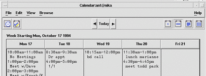
Tool bars are a method used to provide quick access to things that are already user-accessible in an application by other methods. For example, an application can provide access to frequently used features from its menus through its tool bar. Some common usages of tool bars are navigation, changing data views, accessing frequently used tools or editors, simplifying the number of steps to complete a common operation, and providing a fast path to frequently used menu items.
Figure 6-1 Example from Common Desktop Environment Calendar.

Tool Bar Guidelines
|
Required |
fd: |
If you use a tool bar, it should be used only in windows with a menu bar. |
|
Required |
fe: |
Tool bars should contain only operations that are already available to the user in your application menus. All items in a tool bar should be redundant. Items in a toolbar are meant to provide quick access to operations that are already accessible to the user by other methods. |
|
Required |
ff: |
When an action represented by a tool bar icon is unavailable to the user, that icon should be made insensitive, with the associated stippled appearance. Whenever a menu item is made insensitive, the corresponding tool bar item must be made insensitive as well. |
|
Recommended |
fg: |
Give users the option to hide the tool bar. |
Design Issues for Tool Bars
When designing your application and an associated tool bar, consider the following issues.
-
Would the usability of the application be improved by placing these items on the tool bar?
Tool bars should only be used when they improve or enhance user access to common operations, such as in an application with several large menus.
-
What kinds of operations are being placed on a tool bar? How are they grouped?
Tool bars should present a natural organization of actions. Grouping items that are dissimilar can confuse users because they do not expect to find the item they are looking for in that context.
-
Is the tool bar too crowded?
Placing too many items in the tool bar can cause the user to have to search for the item they are looking for, rather then being able to quickly find it and use it. Keep the number of buttons to a minimum so that you don't increase the difficulty of your application when using a tool bar.
-
Are the icons clearly representative of their associated action?
Cryptic icons add to user confusion. Keep the pixmaps as simple as possible. Remember that all graphics must be international in scope. When designing a graphic to represent a command, such as Save, remember that the icon has to represent a verb, as opposed to a noun like most other icons. This can make the icon more confusing to users.
Tool Bar Components
A tool bar is typically constructed using the following Motif components.
Tool Bar Container
The tool bar uses a container component to provide a layout mechanism for the drawn buttons that make up a tool bar. You may choose most any container for the tool bar, as long as it allows for the specified behavior.
|
Required |
fh: |
The tool bar container is placed directly under the menu bar and should be the same width as the window, as well as similar height to the menu bar. |
|
Recommended |
fi: |
If you use a tool bar in your application, then you should provide a status line in the same primary window as the tool bar. This status line should provide immediate feedback to the user as to the purpose of the button that the mouse is currently over or that has the keyboard focus. When the arrow is over a tool bar icon, the status line should display a brief definition of what the icon represents or what will happen when the user clicks the icon. |
|
Recommended |
fj: |
You may provide labels under tool bar icons. These labels should serve to explain the purpose of the icon. |
Tool Bar Button
The Motif DrawnButton provides an appropriate medium for the graphic buttons in tool bars.
|
Recommended |
fk: |
Drawn buttons in the tool bar should be the same width and height. Similar or related items should be grouped, and groups should be evenly spaced across the tool bar. |
Pixmap
The pixmap for the drawn button is the graphic that conveys the functionality to be expected by pushing a particular button.
|
Recommended |
fl: |
All pixmaps in the tool bar should be the same size. This ensures that all the buttons will be the same size. |
|
Recommended |
fm: |
The recommended size of the pixmap is 24x24. The default for the drawn button is to resize itself according to the size of its label type, which, in this case, would be a pixmap. |
- © 2010, Oracle Corporation and/or its affiliates
