Part VI Sample Portal
Chapter 36 Understanding the Developer Sample
This chapter describes the developer sample that you can choose to install on your system during the Sun Java System Portal Server installation. See the Installation Guide for more information on installing the developer sample. This chapter contains the following sections:
Overview
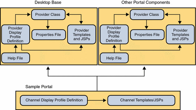
Conceptually, the Desktop is split into the three well-defined components as shown in Figure 37–1.
Base Desktop
This includes Provider Java classes (based on the Provider API), provider display profile definitions and resource bundles (also referred to as properties files), display profile definitions of channels referenced by base Desktop XML or base Desktop JSPs and templates, default templates and JSPs (installed in /var/opt/SUNWportal/portals/<portal_id>/desktop/default directory), and help files.
Developer Sample
This includes organization level display profile definitions (such as themes and channel display profile definitions), templates and JSPs for the example Desktops in the developer sample (installed in /var/opt/SUNWportal/portals/<portal_id>/desktop/developer_sample directory), and user definition, Desktop display profile definitions, and templates and JSPs for the Authless user.
Other components
This includes the Provider Java classes for their component specific providers, provider display profile definitions for their component specific providers and provider resource bundles (properties files), display profile definition for channels referenced by component display profile XML or component templates and JSPs, default templates and JSPs, and help files.
The developer sample has a dependency on the base Desktop and other components and cannot be installed if the base Desktop and other components are not installed. The base Desktop and other components are installed as part of the Portal Server 7.1 software.
Figure 36–1 Desktop Components
When you install the Portal Server 7.1 software, you can choose to install the developer sample. The developer sample is an authentication-less (authless) desktop that consists of containers, channels, portlets, services, and templates which can be used to demonstrate what the Portal Server 7.1 software is capable of. It includes five example Desktops that show the possibilities of the Portal Server 7.1 software. In this way you can quickly get a feel for the kinds of containers that are possible to design.
Developer Sample Installation Directories
If you choose to install the developer sample, the installer locates the appropriate files in the following directories:
PortalServer-base/samples/desktop
This directory contains the following display profile documents:
- dp-org.xml
-
Contains the display profile definitions for channels and containers.
- dp-anon.xml
-
Contains the display profile definitions for channels and containers for the authlessanonymous and anonymous users in the default organization.
The /var/opt/SUNWportal/portals/<portal_id>/desktop/developer_sample directory contains the JSP, template, and other support files for the Portal Server 7.1 software developer sample.
The /var/opt/SUNWportal/portals/<portal_id>/desktop/developer_anonymous_sample contains the JSP, template, and other support files for the Portal Server 7.1 software Desktop anonymous user.
Note –
The developer sample has a dependency on the base Desktop and other components and cannot be installed if the base Desktop and other components are not installed. The base Desktop and other components are installed in the /var/opt/SUNWportal/portals/<portal_id>/desktop/default directory.
Sample Desktops
The table below shows the three sample Desktops, which make up the developer sample.
Table 36–1 Sun Java System Portal Server Sample Desktop Containers|
Container (Desktop) Type |
Description |
|---|---|
|
Generates a JSP-based tab Desktop.Creates a Desktop that contains multiple containers selected using different tabs. Normally, each tab is constructed by using the corresponding PredefinedTabPanelContainer. This container is JSP-based. Its provider is JSPTabContainerProvider. |
|
|
Generates a JSP-based table Desktop. Creates a Desktop that arranges a maximum of five sub-containers into the channel arrangement. This container is JSP-based. Its provider is JSPTableContainerProvider. |
|
|
Generates a frame-based Desktop. Creates a Desktop using frames. The left-hand frame enables you to navigate, and the right-hand frame displays the channels. This container is JSP-based. Its provider is JSPTabContainerProvider. |
The developer sample can also serve as a place to start when building your own site’s portal. You can customize the containers and use the building-block providers, such as XMLProvider and JSPProvider, to add customized content. The developer sample also includes content providers, such as BookmarkProvider, that cannot be extended but that can be used to provide content.
If the existing building-block and content providers do not meet your needs, you can either extend an existing building-block provider (content providers are not public and hence not extendible), or develop custom building-block providers. If either of these methods do not suit your needs, you can develop a custom provider.
Note –
The Portal Server 7.1 software distinguishes between building-block providers, which you can extend using the Portal Server 7.1 software APIs, and content providers, which you cannot extend. See the Sun Java System Portal Server 7.1 Developer's Guide for more information on extending the providers.
Chapter 37 JSP-Based Desktop
This chapter contains the following sections:
JSPTabContainer
The JSPTabContainer provides a JSP-based tabbed Desktop.
Sample Desktop
Default Layout
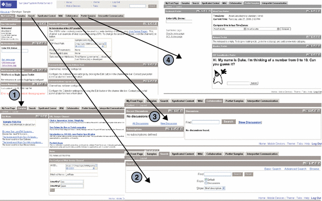
By default, the sample portal Desktop based on the JSPTabContainer includes five tabs, My Front Page, Samples, Search, Collaboration, and Sample Portlet. In the figure below, the channels are shown in numbers.
-
My Front Page tab (default) — Login or User Information, Bookmark, Sample JSP, and XML Test channels
-
1 — Samples tab: Sun Information, URL Scraper, and Notes channels
-
2 — Search tab: Search channel
-
3 — Collaboration tab: Discussions Lite and Discussions channels
-
4 — Portlet Samples tab: Bookmark, Showtime, and Weather portlet channels
Figure 37–1 Sample Desktop Based on JSPTabContainer
Default Actions
The sample JSPTabContainer channel, by default, includes:
-
Banner links to return Home, tabs to allow the user to remove, rename or select the start tab, and also create a new tab (the URL for this page is action=edit&provider=JSPTabContainer), theme to allow the user to set the color scheme and font type for the Desktop (the URL for the preset theme page is action=edit&provider=JSPPresetThemeContainer), help that displays the Desktop sample online help (the URL is ../docs/locale/desktop/helppage.htm), Log Out link to log the user out of the Desktop (the URL is action=logout), and Search to allow the user to search.
When you click the Tabs link in the Desktop, the Current Tabs Settings Edit page, where you can make changes, is displayed. Start Tab lets you set the starting tab; Tab Name specifies the name of the tabs in the container; and Action lets you rename or delete a tab from the Desktop. (JavaScript handles the action.)
When you click Make a New Tab, the corresponding Edit page is shown. You decide what to name the tab and what the tab topics are. Content Page is displayed only when making a new tab from scratch. When other Tab Topics are selected, a new tab which looks similar to the TabTopic selected, is created and displayed.
-
Links specific to the contained containers. The channels in each tab depend on the contained container of the JSPTabContainer. In the Sample Portal, these contained containers are JSPTableContainer and the channels are dependant on this container; but this does not have to be the case, they can be any container. The Content and Layout links provide the ability to customize the current selected contained container.
-
Content and layout links. The top-most JSP in the table container defines the Content and Layout links. JSPContentContainer is the container that displays the Content page, and JSPLayoutContainer is the container that displays the Layout page.
Default Display Profile Settings
The provider responsible for generating the JSPTabContainer channel is JSPTabContainerProvider. The provider profile is the template which decides the properties for a container channel, but the container channel profile will ultimately decide the values for the container channel attributes.
The properties that make up JSPTabContainer work as follows by default.
- contentPage
-
Set to tab.jsp. This draws the Content Page for the tab container.
- editPage
-
Set to tabedit.jsp. This displays the Edit page for the tab container where new tabs can be added, and existing tabs removed or renamed.
- startTab
-
Sets the tab that opens first on the Desktop as MyFrontPageTabPanelContainer.
- maxTabs
-
Allows six tabs to be created. As there are currently five tabs, one more can be added.
- makeTabProvider
-
Used when creating a new tab from scratch.
- channelNumber
-
Specifies that a number is appended to a newly created tab as the channel name. This number is increased each time a new tab is created, so that the new tab will have unique name. For example, to create a new tab based on MyFrontPageTabPanelContainer in JSPTabContainer, the new tab channel name would be JSPTabContainer/MyFrontPageTabPanelContainer1. (The new tab name is actually the channelName property in the display profile plus the value of the channelNumber property. The channelNumber is incremented by one each time a new tab is created.)
- contentChannel
-
Specifies JSPContentContainer as the content channel that provides the Content page displaying channels to add to a user-created tab.
- presetThemeChannel
-
Specifies JSPPresetThemeContainer as the channel that is displayed in the Theme - Preset Theme page.
- customThemeChannel
-
Specifies JSPCustomThemeContainer as the channel that is displayed in the Theme - Custom Theme page.
- TabProperties
-
This collection has <Collection name=> entries for each of the available tab defined in JSPTabContainer.
- Available
-
This list describes all available channels for this container. The available channels are displayed in the Content Preference page for users to select from.
- Selected
-
This list describes selected channels for this container. Only selected channels are displayed on the Desktop.
JSPTabContainer Architecture
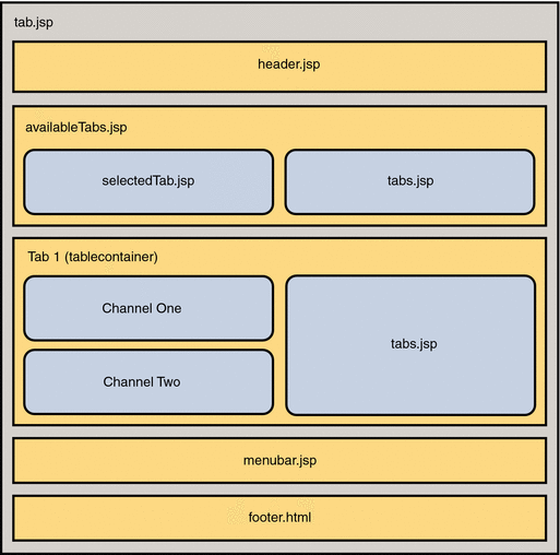
Figure 38–2 shows the JSPTabContainer architecture. In this figure, tab.jsp is the top-level JSP file. The tab.jsp file makes include calls to the header.jsp, availableTabs.jsp, menubar.jsp, and footer.html files. The availableTabs.jsp file makes an include call to the selectedTab.jsp and tabs.jsp files.
Figure 37–2 JSPTabContainer Architecture
JSP Files Used by JSPTabContainer
The Portal Server 7.1 software uses JSP files for a channel’s presentation layer. JSPTabContainer references two main JSPs, tab.jsp and tabedit.jsp, through the contentPage and editPage properties.
Content template is responsible for the front page of the container channel and the file name for the tab container channel is tab.jsp. The tab.jsp file extensively uses the Desktop taglibs.
The Edit page is where you can add, remove, and rename tabs. The tabedit.jsp is used to display this page.
JSPTableContainer
The JSPTableContainer provides a JSP-based table Desktop.
Sample Desktop
Default Layout
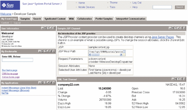
By default, the sample portal Desktop based on the JSPTableContainer (see Figure 38–3) contains the following channels:
-
Thin channels: User Information, Sun Information, My Bookmarks, Mailcheck Provider, and My Applications
-
Wide channels: Sample JSP, XML Test, Notes, Personal Notes, and Preconfigured Web Service
Figure 37–3 Sample Desktop Based on JSPTableContainer
Default Actions
The sample JSPTableContainer channel, by default, includes:
-
Banner links to return to the Desktop Home page, Desktop theme to allow the user to set the color scheme and font type for the Desktop (the URL for this page is action=edit&provider=JSPPresetThemeContainer), Log Out to allow the user to log out of the Desktop (the URL for this page is action=logout), Help to display the Desktop sample online help (the URL for this page is ../docs/locale/desktop/helppage.htm), and Search to allow the user to search.
-
Leaf channel. JSPTableContainer does not contain any contained containers, it only has leaf channels. This container uses JSPContentContainer and JSPLayoutContainer to edit the content and layout, respectively.
-
Content and layout links. The toptable.jsp file defines the Content and Layout links. JSPContentContainer is the container that displays the Content page, and JSPLayoutContainer is the container that displays the Layout page.
The Content link (action=edit&provider=JSPContentContainer&container=JSPTableContainer) allows the user to edit the content on the Content page and the Layout link (action=edit&provider=JSPLayoutContainer&container=JSPTableContainer) allows the user to edit the layout of the channels on the Layout page.
Default Display Profile Settings
The provider responsible for generating the JSPTableContainer channel is JSPTableContainerProvider. The provider profile is the template which decides the properties for a container channel, but the container channel profile will ultimately decide the values for the container channel attributes. The default properties that make up JSPTableContainer work as follows:
- contentPage
-
Set to toptable.jsp. This draws the Content Page for the table container.
- categories
-
This collection defines the categories under which the available channels in the JSPTabContainer will be grouped in the Content page. Here there are three categories: Personal Channels, Sample Channels, and News Channels.
- channelsRow
-
This collection and values that appear in this collection, contain the row number value for channels in this container. For example, the mail check channel is defined as row 4.
- channelsIsRemovable
-
This collection defines a collection to contain the isRemovable value for channels in this container. Only one channel, user information, is defined, with a value of false, so that it cannot be removed.
- Available
-
This list describes all available channels for this container. The available channels are displayed in the content preference page for users to select from.
- Selected
-
This list describes selected channels for this container. Only selected channels shows up in the Desktop.
JSPTableContainer Architecture
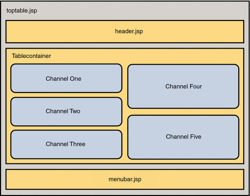
Figure 38–4 shows the JSPTableContainer architecture. In this figure, toptable.jsp is the top-level JSP file. The toptable.jsp file makes include calls to the header.jsp, launchPopup.jsp, leafWrapper.jsp, and menubar.jsp files.
Figure 37–4 JSPTableContainer Architecture
JSP Files Used by JSPTableContainer
The Portal Server 7.1 uses JSP files for a channel’s presentation layer. JSPTableContainer references one main JSP, toptable.jsp, through the contentPage property.
Content template is responsible for the front page of the container channel and the file name for the tab container channel is toptable.jsp. The toptable.jsp file extensively uses the Desktop taglibs.
Chapter 38 Frame-Based Desktop
This chapter contains the following sections:
The FrameTabContainer provides a frame-based table Desktop.
Sample Desktop
Default Layout
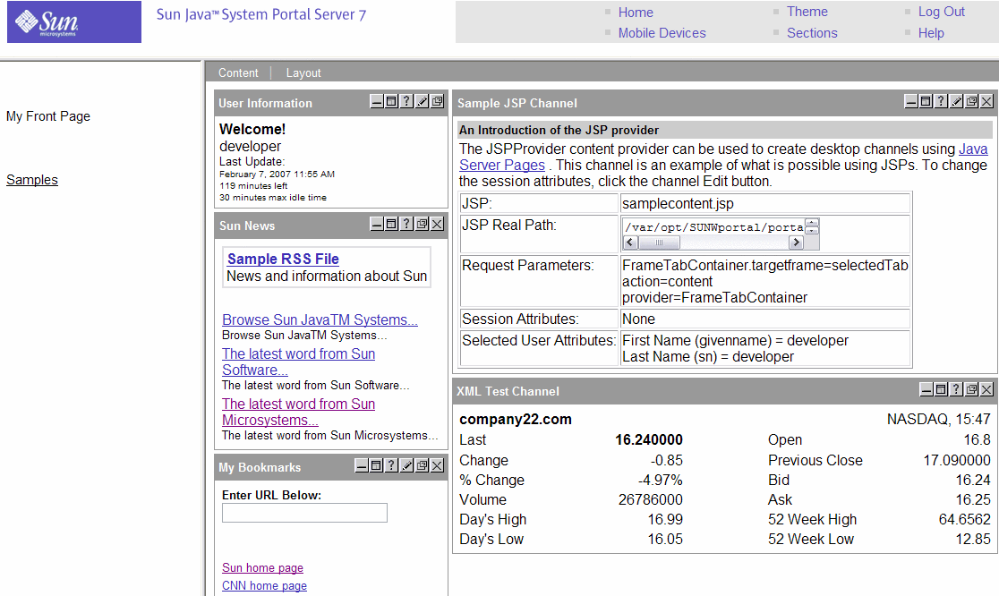
By default, the sample portal Desktop based on the FrameTabContainer provides a frame-based table Desktop consisting of two frames (see Figure 39–1), My Front Page and Samples, with the following channels:
-
In the My Front Page frame: My Bookmarks, My Applications, Sample JSP, and XML Test
-
In the Samples frame: URL Scraper, Notes, and Preconfigured Web Service
Figure 38–1 Sample Desktop Based on FrameTabContainer
Default Actions
The sample FrameTabContainer channel, by default, includes:
-
Banner links to return to the Desktop Home page, Sections (action=edit&provider=FrameTabContainer) that allow users to rename or select the start page, delete a page, and also create a new page, theme (action=edit&provider=JSPPresetThemeContainer) that allows users to set the color scheme and font type for the Desktop, Help (../docs/locale/desktop/helppage.htm) to display the Desktop sample online help, and Log Out (action=logout) that logs the user out from the Desktop.
The Sections link on the Content page displays the Current Page Settings Edit page where you can make changes. Here, Start page allows the user to set the starting page, Rename allows the user to rename the page, and Delete allows the user to delete a page from the Desktop.
-
Content and layout links. The top-most JSP in the table container defines the Content and Layout links. JSPContentContainer is the container that displays the Content page, and JSPLayoutContainer is the container that displays the Layout page.
The Content link (action=edit&provider=JSPContentContainer&container=MyFrontPageFramePanelContainer) allows the user to edit the content for this particular page on the Content page and the Layout link (action=edit&provider=JSPLayoutContainer&container=MyFrontPageTabPanelContainer&selected=MyFrontPageFramePanelContainer) allows the user to edit the layout of the channels for this particular page on the Layout page.
Default Display Profile Settings
The provider responsible for generating FrameTabContainer channel is JSPTabContainerProvider. The provider profile is the template which decides the properties for a container channel, but the container channel profile will ultimately decide the values for the container channel attributes. The properties that make up FrameTabContainer work as follows:
- contentPage
-
Set to frametab.jsp. This draws the Content Page for the frame container.
- editPage
-
Set to frametabedit.jsp. This displays the Edit page for the frame container where new pages can be added, or existing pages removed or renamed.
- startTab
-
Sets the page that opens first on the Desktop as MyFrontPageFramePanelContainer.
- maxTabs
-
Allows four pages to be created. As, by default, there are two pages, two more can be added.
- makeTabProvider
-
Specifies JSPFrameCustomTableContainerProvider as the provider to create a new page on the Desktop.
- channelNumber
-
Specifies that a number is appended to a newly created page as the channel name. This number is increased each time a new page is created, so that the new page will have unique name. For example, to create a new page based on MyFrontPageFramePanelContainer in FrameTabContainer, the new page channel name would be FrameTabContainer/MyFrontPageFramePanelContainer1. (The new page name is actually the channelName property in the display profile plus the value of channelNumber property. The channelNumber property value is incremented by one each time a new page is created.)
- contentChannel
-
Specifies JSPContentContainer as the content channel that provides the Content page displaying channels to add to a user-created page.
- TabProperties
-
This collection has entries for each of the four containers that are available in the FrameTabContainer.
- Available
-
This list describes all available channels for this container. The available channels are displayed in the content preference page for users to select from.
- Selected
-
This list describes selected channels for this container. Only selected channels shows up in the Desktop.
FrameTabContainer Architecture
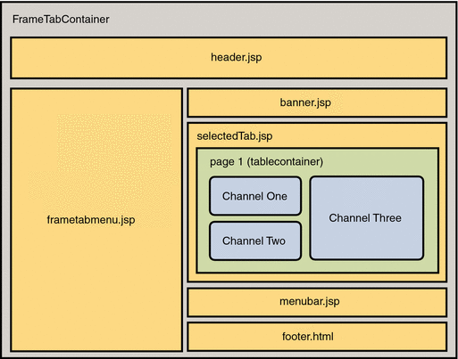
Figure 39–2 shows the FrameTabContainer architecture. In this figure, frametab.jsp is the top-level JSP file. The frametab.jsp file makes include calls to the frametabmenu.jsp, header.jsp, banner.jsp, selectedTab.jsp, menubar.jsp, frameset.jsp, and footer.html files.
FrameTabContainer is made up of two sub-containers, MyFrontPageFramePanelContainer and SamplesFramePanelContainer, as represented by Page 1 (tablecontainer) in the figure.
Figure 38–2 FrameTabContainer Architecture
JSP Files Used by FrameTabContainer
The Portal Server 7.1 uses JSP files for a channel’s presentation layer. FrameTabContainer references two main JSPs, frametab.jsp and frametabedit.jsp, through the contentPage and editPage properties.
Content template is responsible for the front page of the container channel and the file name for the tab container channel is frametab.jsp. The frametab.jsp file extensively uses the Desktop taglibs.
The Edit page is where you can add, remove, and rename pages. The frametabedit.jsp is used to display this page.
Chapter 39 Internally Used Containers
Often, when working with the sample portal, you need to modify the appropriate “contained” container, which is part of the top-level container. The contained containers are:
Sun Java System Portal Server 7.1 software uses other container providers internally to perform such tasks as creating new tabs and edit containers.
Internally Used Containers
This section lists the internally used containers in Portal Server 7.1 and provides their description.
Table 39–1 Internally Used Containers|
Container Name |
Description |
|---|---|
|
JSPTabCustomTableContainerProvider is used when a new tab is created in the user’s JSP tab-based Desktop, and is specified in the makeTabProvider property of JSPTabContainer. JSPTabCustomTableContainerProvider is based on the JSP table container provider. |
|
|
JSPFrameCustomTableContainerProvider is used when a new frame is created in the user’s JSP frameset-based Desktop, and is specified in the makeTabProvider property. JSPFrameCustomTableContainerProvider is based on the table container provider. |
|
|
PredefinedFrontPageFramePanelContainerProvider is the provider for the predefined tab for MyFrontPage tab when the user creates a new page based on an existing page from the make NewPage page on FrameTabContainer. |
|
|
PredefinedSamplesFramePanelContainerProvider is the provider for the predefined tab for Samples tab when the user creates a new page based on an existing page from the make NewPage page on FrameTabContainer. |
|
|
PredefinedToolsTemplatePanelContainerProvider is the provider for the Tools tab on TemplateTabContainer. |
|
|
PredefinedFrontPageTemplatePanelContainerProvider is the provider for the predefined tab for MyFrontPage tab when the user creates a new tab based on an existing tab from the make New Tab page on TemplateTabContainer. |
|
|
PredefinedSamplesTemplatePanelContainerProvider is the provider for the predefined tab for Samples tab when the user creates a new tab based on an existing tab from the make New Tab page on TemplateTabContainer. |
|
|
PredefinedSamplesTabPanelContainerProvider is the provider for the predefined tab for Samples tab when the user creates a new tab based on an existing tab from the make New Tab page on JSPTabContainer. |
|
|
PredefinedFrontPageTabPanelContainerProvider is the provider for the predefined tab for MyFrontPage tab used when the user creates a new tab based on an existing tab from the make New Tab page on JSPTabContainer. |
Chapter 40 Global Themes
This chapter contains the following sections:
What is a Theme?
The Desktop theme provides the capability of creating a customizable user interface that allows the end users to select different look and feel for their Desktop.
The definition of a theme in Sun Java System Portal Server software Desktop is a collection of user interface attributes that are used in the markup output from the Desktop. The attributes can be colors, fonts, and images. Out of the box, there are eight themes that come with the sample portal and each theme contains thirty eight (38) attributes.
GlobalThemes Display Profile Definition
The display profile document, PortalServer-base/samples/desktop/dp-org.xml file, contains the XML fragment for the eight default themes. See this file for the definition of these themes. See the Sun Java System Portal Server 7.1 Developer Sample Guide for more information on customizing the Global Themes.
Theme Properties
The following is a list of theme properties that can be defined, modified, and/or customized in the display profile document. Please referthe Glossary of Terms for more detailed description for the theme properties.
- activeBulletImage
-
activeBulletGraphics
- inactiveBulletImage
-
inactiveBulletGraphics
- brandImage
-
logo image
- brandImage2
-
Product name image
- brandImageBgColor
-
header logo bg color
- brandImage2BgColor
-
header product name bg color
- brandBgColor
-
header link box bg color
- headerBgColor
-
header bg color and footer bg color
- headerFontColor
-
header font color
footer font color
- headerText
-
header font size
footer font size
header font face
footer font face
- tabNotchImage
-
tabNotch image
- titleText
-
selected tab font face
selected tab font size
unselected tab font face
unselected tab font size
channel title font face
channel title font size
- titleFontColor
-
selected tab font color
channel title font color
- fontSize
-
channel font size
channel link font size
- fontFace
-
channel font face
channel link font face
- titleBarColor
-
selected tab bg color
channel title bar bg color
content/layout bar color
channel border color
page piping color (bottom)
button bg color
- borderColor
-
border color
- tabColor
-
unselected tab bg color
secondary channel title bar color
- tabFontColor
-
unselected tab font color
- bgColor
-
channel bg color
- fontColor
-
channel font color
- borderWidth
-
channel border width
- tableBgColor
-
table bg color
page piping, top
- channelHightlightColor
-
highlight color for channel content (as seen in the Placida theme JSP channel)
- linkSeparatorColor
-
link separator color (in the toolbar, between Content and Layout)
footer link separator color
- channelLinkColor
-
channel link color
- contentLayoutLinkColor
-
content/layout link color
- contentLayoutText
-
content/layout link font size
content/layout link font face
- brandImageWidth
-
brand image width
- previewImage
-
preview image (on preset themes page)
- removeImage
-
remove image (for the channel title bar)
- detachImage
-
detach image (for the channel title bar)
- helpImage
-
help image (for the channel title bar)
- editImage
-
edit image (for the channel title bar)
- minimizeImage
-
minimize image (for the channel title bar)
- maximizeImage
-
maximize image (for the channel title bar)
- normalizeImage
-
normalize image (in the maximized channel)
- attachImage
Glossary of Terms
The following table provides description of where the theme attributes are actually used in the desktop.
Table 40–1 Glossary of Terms|
Term |
Description |
|---|---|
|
Header |
The banner area at the top of the portal page. Contains the branding and the global links. |
|
Bullet graphics |
The “dot” graphics that go next to the global links in the header |
|
Logo, product name, link |
The three areas in the header for the Sun theme |
|
Footer |
The narrow banner at the bottom of the portal page. Contains the global links |
|
Tab notch |
The graphic that goes in the upper left corner of the tab table cells |
|
Selected tab |
The tab whose contents are displayed |
|
Unselected tab |
The other tabs whose contents are not seen |
|
Content/layout bar |
The tool bar underneath the tabs that contains the content and layout links |
|
Channel |
The data containers displayed inside each tab |
|
Page piping |
The narrow bands of color at the top and bottom of the portal page |
|
Table background |
The areas the channels sit in |
|
Highlight color for channel content |
A contrasting color for tables inside channels |
|
Secondary channel title bar |
An extra color bar beneath the standard channel title bar |
|
Link separator |
- © 2010, Oracle Corporation and/or its affiliates
