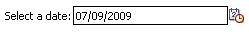
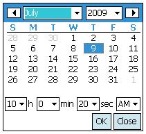
inputDate component running on Windows Mobile as shown when rendered in a simple form
Tag name: <amc:inputDate>
On Windows Mobile, the inputDate component creates a text field for
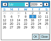
entering dates and a glyph which opens a popup for picking dates from a calendar. On Blackberry,
the inputDate component creates a collection of dropdown combo boxes in which the individual
parts of the date (year, month, etc.) can be specified.
The appearance of the component depends on the converter, if any, associated with the InputDate.
The inputDate will default its format to the "short" date format appropriate for the current locale; for example, in English, this is "mm/dd/yy". However, the format can be overridden by using a DateTimeConverter.
The value attribute accepts java.util.Date type, it does not accept java.lang.String nor java.util.Calendar. If no converter is specified, a default converter will be used to convert between Date and the display String. The String format comes from the default dateStyle of the DateTimeConverter.
inputDate component running on Windows Mobile as shown when rendered in a simple form
<amc:inputDate label="Select a date:"
              id="iDate"
              value="#{demoInput.date}" />
| Name | Type | Supports EL? | Description |
|---|---|---|---|
| align | String | Yes |
Specifies the horizontal alignment of an element with respect to the surrounding context. Valid values:
Note: On BlackBerry smartphones, if the attribute value is assigned by an EL expression, any changes to the value will not affect the visual appearance of the element once it is rendered. |
| backgroundColor | String | Yes | Sets the color of a background to an RGB value (rgb(255,0,0)) or a hexadecimal number (#ff0000 or #f00). The default value is device-dependent. |
| disabled | boolean | Yes | Specifies whether or not the component is disabled. Unlike a read-only component, a disabled component cannot receive focus. |
| focusable | boolean | Yes | Specifies whether or not this component can acquire focus set to it by the user. Unlike disabled, clicking on a focusable component will cause the component to receive focus. |
| fontFamily | String | Yes |
Defines a prioritized list of font family names and/or generic family names for an element. The client will use the first value it recognizes. Valid values:
|
| fontSize | int | Yes | Specifies the size of a font in points. |
| fontStyle | String | Yes |
Specifies how the characters in text should be displayed. Valid values:
fontStyle="bold underline". |
| foregroundColor | String | Yes | Specifies the color of the foreground of an element. The color value can be an RGB value (rgb(255,0,0)) or a hexadecimal number (#ff0000 or #f00). The default value is device-dependent. |
| height | int | Yes |
Specifies the height of the component. Can be entered in pixels or as a percentage of its parent's height. A percentage value should be entered as a number followed by the "%" symbol. A number will be interpreted as a pixel value (as will a number followed by the text "px"). Note: This component does not support the height attribute on Windows Mobile and BlackBerry smartphones. Any value assigned to it is ignored. |
| id | String | No |
Specifies the identifier for the component. The identifier must follow the following rules:
|
| label | String | Yes | Defines the label of the component. In order for the label to appear above the component, a Panel Form Layout should be used. |
| readOnly | boolean | Yes | Specifies whether or not the component is displayed as an editable field or as an output-style text component. Unlike a disabled component, a read-only component is able to receive focus. |
| rendered | boolean | Yes | Specifies whether or not the component is rendered. When set to false, no output will be delivered for this component (the component will not in any way be rendered, and cannot be made visible). |
| required | boolean | Yes | Specifies whether or not a non-null, non-empty value must be entered. If set to false, validators will not be executed when the value is null or empty. If set to true, a visual indication is displayed to notify the end user that a value must be entered; otherwise, an exception will occur and the component will fail validation. |
| showRequired | boolean | Yes | Defines whether or not the associated component displays a visual indication of the required user input. Both the "required" attribute and the "showRequired" attribute must be false for the visual indication not to be displayed. For example, this attribute could be used when there is a field that is initially empty and is required only if some other field on the page is modified. |
| simple | boolean | Yes | Represents a boolean value that components whether or not the component provides the label support; when set to "true", the component will not display the label (label and showRequired properties are ignored) and may use simpler layout primitives. For example, this attribute could be defined when a component is used in a table where label is not required. |
| value | Object | Yes | Specifies the value of the component. |
| valueChangeListener | oracle.adfnmc.el.MethodExpression | Only EL | Defines a method reference to a value change listener. |
| verticalAlign | String | Yes |
Specifies the vertical alignment of a component with respect to the surrounding context. Valid values:
Note: On BlackBerry smartphones, if the attribute value is assigned by an EL expression, any changes to the value will not affect the visual appearance of the element once it is rendered. |
| width | int | Yes | Specifies the width of this component. Can be entered in pixels or as a percentage of its parent's width. A percentage value should be entered as a number followed by the "%" symbol. A number will be interpreted as a pixel value (as will a number followed by the text "px"). |