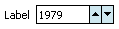
An InputNumberSpinbox component running on Windows Mobile in a simple form. The user clicks the up arrow to increment the value and the down arrow to decrement the value.
Tag name: <amc:inputNumberSpinbox>
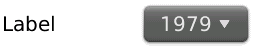
On Windows Mobile, the InputNumberSpinbox component creates an input component and up/down arrows. On Blackberry, the component appears as a dropdown combobox. It is used to enter numbers and quickly step through the numbers using the up/down arrows or scrolling on Blackberry. The number needs to be within the minimum and maximum. It also supports displaying a label.
An InputNumberSpinbox component running on Windows Mobile in a simple form. The user clicks the up arrow to increment the value and the down arrow to decrement the value.
<amc:form>
  <amc:inputNumberSpinbox label="Year:"
                         value="2006"
                         minimum="1900"
                         maximum="2100"/>
</amc:form>
| Name | Type | Supports EL? | Description |
|---|---|---|---|
| align | String | Yes |
Specifies the horizontal alignment of an element with respect to the surrounding context. Valid values:
Note: On BlackBerry smartphones, if the attribute value is assigned by an EL expression, any changes to the value will not affect the visual appearance of the element once it is rendered. |
| backgroundColor | String | Yes | Sets the color of a background to an RGB value (rgb(255,0,0)) or a hexadecimal number (#ff0000 or #f00). The default value is device-dependent. |
| disabled | boolean | Yes | Specifies whether or not the component is disabled. Unlike a read-only component, a disabled component cannot receive focus. |
| focusable | boolean | Yes | Specifies whether or not this component can acquire focus set to it by the user. Unlike disabled, clicking on a focusable component will cause the component to receive focus. |
| fontFamily | String | Yes |
Defines a prioritized list of font family names and/or generic family names for an element. The client will use the first value it recognizes. Valid values:
|
| fontSize | int | Yes | Specifies the size of a font in points. |
| fontStyle | String | Yes |
Specifies how the characters in text should be displayed. Valid values:
fontStyle="bold underline". |
| foregroundColor | String | Yes | Specifies the color of the foreground of an element. The color value can be an RGB value (rgb(255,0,0)) or a hexadecimal number (#ff0000 or #f00). The default value is device-dependent. |
| height | int | Yes |
Specifies the height of the component. Can be entered in pixels or as a percentage of its parent's height. A percentage value should be entered as a number followed by the "%" symbol. A number will be interpreted as a pixel value (as will a number followed by the text "px"). Note: This component does not support the height attribute on Windows Mobile and BlackBerry smartphones. Any value assigned to it is ignored. |
| id | String | No |
Specifies the identifier for the component. The identifier must follow the following rules:
|
| label | String | Yes | Defines the label of the component. In order for the label to appear above the component, a Panel Form Layout should be used. |
| maximum | int | Yes | Specifies the maximum number allowed in the input field. |
| minimum | int | Yes | Specifies the minimum number allowed in the input field. |
| readOnly | boolean | Yes | Specifies whether or not the component is displayed as an editable field or as an output-style text component. Unlike a disabled component, a read-only component is able to receive focus. |
| rendered | boolean | Yes | Specifies whether or not the component is rendered. When set to false, no output will be delivered for this component (the component will not in any way be rendered, and cannot be made visible). |
| required | boolean | Yes | Specifies whether or not a non-null, non-empty value must be entered. If set to false, validators will not be executed when the value is null or empty. If set to true, a visual indication is displayed to notify the end user that a value must be entered; otherwise, an exception will occur and the component will fail validation. |
| showRequired | boolean | Yes | Defines whether or not the associated component displays a visual indication of the required user input. Both the "required" attribute and the "showRequired" attribute must be false for the visual indication not to be displayed. For example, this attribute could be used when there is a field that is initially empty and is required only if some other field on the page is modified. |
| simple | boolean | Yes | Represents a boolean value that components whether or not the component provides the label support; when set to "true", the component will not display the label (label and showRequired properties are ignored) and may use simpler layout primitives. For example, this attribute could be defined when a component is used in a table where label is not required. |
| stepSize | int | Yes | Specifies the step size by which the spinbox will increase or decrease the number in the input. This is an integer value. |
| value | Object | Yes | Specifies the value of the component. The value will be converted to an Integer internally. When the value is retrieved, it will be an Integer type. |
| valueChangeListener | oracle.adfnmc.el.MethodExpression | Only EL | Defines a method reference to a value change listener. |
| verticalAlign | String | Yes |
Specifies the vertical alignment of a component with respect to the surrounding context. Valid values:
Note: On BlackBerry smartphones, if the attribute value is assigned by an EL expression, any changes to the value will not affect the visual appearance of the element once it is rendered. |
| width | int | Yes |
Specifies the width of this component. Can be entered in pixels or as a percentage of its parent's width. A percentage value should be entered as a number followed by the "%" symbol. A number will be interpreted as a pixel value (as will a number followed by the text "px"). Note: On BlackBerry smartphones, if the Input Number Spinbox's width is set to a value that is too small to show all the numeric text, an IndexOutOfBoundsException or IllegalArgumentException may be thrown. There is no work-around other than to leave the width and height attributes blank, so that the component determines the appropriate size, or to give the width and height attributes values that are large enough. |