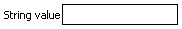
An inputText component running on Windows Mobile in a simple form.
Tag name: <amc:inputText>
The inputText component creates a browser input text widget. Depending on the value of "rows", this component either maps to a single-row text field or a multi-row text area. It also supports displaying a label, text, and messages.
If the input should be hidden from the user while displayed, such as for passwords, the secret property should be set to "true".
If the input has readOnly=true, it will display like an outputText, i.e. no borders.
An inputText component running on Windows Mobile in a simple form.

Simple text input box with some default text and a label.
<amc:form>
  <amc:inputText label="Input:"
                value="Some text"/>
</amc:form>
A slightly more interesting example showing a text box twenty five characters in length with hidden input text.
<amc:inputText label="Password:"
              columns="25"
              required="no"
              secret="true"/>
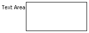
A text input box which will display three rows of wrapped input text, with a vertical scrollbar.
<amc:inputText label="Alert:"
              rows="3"
              wrap="soft"/>
| Name | Type | Supports EL? | Description |
|---|---|---|---|
| align | String | Yes |
Specifies the horizontal alignment of an element with respect to the surrounding context. Valid values:
Note: On BlackBerry smartphones, if the attribute value is assigned by an EL expression, any changes to the value will not affect the visual appearance of the element once it is rendered. |
| backgroundColor | String | Yes | Sets the color of a background to an RGB value (rgb(255,0,0)) or a hexadecimal number (#ff0000 or #f00). The default value is device-dependent. |
| disabled | boolean | Yes | Specifies whether or not the component is disabled. Unlike a read-only component, a disabled component cannot receive focus. |
| focusable | boolean | Yes | Specifies whether or not this component can acquire focus set to it by the user. Unlike disabled, clicking on a focusable component will cause the component to receive focus. |
| fontFamily | String | Yes |
Defines a prioritized list of font family names and/or generic family names for an element. The client will use the first value it recognizes. Valid values:
|
| fontSize | int | Yes | Specifies the size of a font in points. |
| fontStyle | String | Yes |
Specifies how the characters in text should be displayed. Valid values:
fontStyle="bold underline". |
| foregroundColor | String | Yes | Specifies the color of the foreground of an element. The color value can be an RGB value (rgb(255,0,0)) or a hexadecimal number (#ff0000 or #f00). The default value is device-dependent. |
| height | int | Yes |
Specifies the height of the component. Can be entered in pixels or as a percentage of its parent's height. A percentage value should be entered as a number followed by the "%" symbol. A number will be interpreted as a pixel value (as will a number followed by the text "px"). Note: This component does not support the height attribute on Windows Mobile and BlackBerry smartphones. Any value assigned to it is ignored. You may use the rows attribute to increase the height of this component. |
| id | String | No |
Specifies the identifier for the component. The identifier must follow the following rules:
|
| label | String | Yes | Defines the label of the component. In order for the label to appear above the component, a Panel Form Layout should be used. |
| maximumLength | int | Yes | Specifies the maximum number of characters that can be entered into the text component. This includes the characters representing the new line. If set to 0 or less, the maximumLength is ignored. |
| readOnly | boolean | Yes | Specifies whether or not the component is displayed as an editable field or as an output-style text component. Unlike a disabled component, a read-only component is able to receive focus. |
| rendered | boolean | Yes | Specifies whether or not the component is rendered. When set to false, no output will be delivered for this component (the component will not in any way be rendered, and cannot be made visible). |
| required | boolean | Yes | Specifies whether or not a non-null, non-empty value must be entered. If set to false, validators will not be executed when the value is null or empty. If set to true, a visual indication is displayed to notify the end user that a value must be entered; otherwise, an exception will occur and the component will fail validation. |
| rows | int | Yes | Defines the height of the text component specified by the number of characters shown. The default value is 1, which generates a one-row input field. The number of rows is estimated based on the default font size of the device. |
| secret | boolean | Yes | Defines a boolean value that only applies to single line text components. When set to "true", it hides the actual value of the text from the end user, and will prevent the actual "value" from being shown to the end user. When the end user manually enters a value, each character will appear as an asterisk ( * ). If secret is set to true, be sure to not use a converter or validator tag with this Input Text, which would expose the value the user entered via its messages. |
| showRequired | boolean | Yes | Defines whether or not the associated component displays a visual indication of the required user input. Both the "required" attribute and the "showRequired" attribute must be false for the visual indication not to be displayed. For example, this attribute could be used when there is a field that is initially empty and is required only if some other field on the page is modified. |
| simple | boolean | Yes | Represents a boolean value that components whether or not the component provides the label support; when set to "true", the component will not display the label (label and showRequired properties are ignored) and may use simpler layout primitives. For example, this attribute could be defined when a component is used in a table where label is not required. |
| value | Object | Yes | Specifies the value of the component. |
| valueChangeListener | oracle.adfnmc.el.MethodExpression | Only EL | Defines a method reference to a value change listener. |
| verticalAlign | String | Yes |
Specifies the vertical alignment of a component with respect to the surrounding context. Valid values:
Note: On BlackBerry smartphones, if the attribute value is assigned by an EL expression, any changes to the value will not affect the visual appearance of the element once it is rendered. |
| width | int | Yes | Specifies the width of this component. Can be entered in pixels or as a percentage of its parent's width. A percentage value should be entered as a number followed by the "%" symbol. A number will be interpreted as a pixel value (as will a number followed by the text "px"). |