A Menu is designed to only hold MenuGroups.
Besides MenuGroup, other types of children are not allowed.
If you use <amc:menuGroup> to group items inside a Menu, the Menu will
include separators around the group.
The number of items displayed in a Menu is limited by the target device's screen size. When there are more items than the display limit, scroll up and scroll down icons are displayed for the Menu, allowing the user to scroll through the Menu contents.
There are two different types of Menus, determined by the "type" attribute of the Menu.
Main
Main Menus are shown on the main system menu on each platform. Brining up this Menu is device dependent.
Alt
Alt Menus are shown on the left menu button on Windows Mobile and will act as a main menu on BlackBerry.

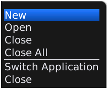
Main menu component running on Windows Mobile.
Main Menu component running on BlackBerry.

Alt Menu component running on Windows Mobile.

Alt Menu component running on BlackBerry.
<amc:menu type="main" id="m1">
    <amc:menuGroup id="g1">
      <amc:subMenu label="Edit" id="sm1">
        <amc:menuGroup id="g2">
          <amc:commandMenuItem label="Copy" id="cm1" />
          <amc:commandMenuItem label="Paste" id="cm2" />
        </amc:menuGroup>
      </amc:subMenu>
    </amc:menuGroup>
    <amc:menuGroup id="g3">
      <amc:commandMenuItem label="Open" id="cm3"/>
    </amc:menuGroup>
  </amc:menu>
Attributes
| Name | Type | Supports EL? | Description |
|---|---|---|---|
| id | String | No |
Specifies the identifier for the component. The identifier must follow the following rules:
|
| label | String | Yes | Defines the label of the component. |
| platform | String | Yes |
Specifies the client platform on which this component will appear. Valid values:
Note: because Sub Menu is not supported on BlackBerry smartphones, this attribute will be ignored even if it is set to "BlackBerry". |
| rendered | boolean | Yes | Specifies whether or not the component is rendered. When set to false, no output will be delivered for this component (the component will not in any way be rendered, and cannot be made visible). |
| type | String | Yes |
Specifies the type of the menu. Valid values:
|