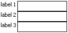
A panelFormLayout component running on Windows Mobile containing three input fields.
Tag name: <amc:panelFormLayout>
The panelFormLayout positions components such that their labels and fields line up vertically.
Usually, this component will simply contain labeled ADF Faces input components in its main content. This includes components whose names start with 'input' (like inputText and inputDate) and components that start with 'select' (like selectOneChoice, selectBooleanRadio, and selectManyChoice).
When more complex field content is needed, use a panelLabelAndMessage around the content.
Other components can be added to panelFormLayout, but they will not line up with labels and fields automatically, and each will appear on its own row. You can use other panel components, like a horizontal layout panelGroupLayout, to layout a row of buttons or fields. To align content with other labels and fields, use panelLabelAndMessage.
A panelFormLayout component running on Windows Mobile containing three input fields.
<amc:panelFormLayout rows="6" labelWidth="40%" id="pfl1">
  <!-- A bunch of form components -->
  <amc:inputText label="Text" id="it1"/>
  <amc:inputFile label="File" id="if1"/>
  <amc:inputDate label="Date" id="id1"/>
  <amc:inputText label="Attribute2" id="it2"/>
  <amc:inputText label="Attribute3" id="it3"/>

  <!-- Now, an example of panelLabelAndMessage for more complex content -->
  <amc:panelLabelAndMessage label="Date Range" id="plm1">
    <amc:panelGroupLayout id="pgl1">
      <amc:inputDate simple="true" shortDesc="Start date" id="id2"/>
      <amc:inputDate simple="true" shortDesc="End date" id="id3"/>
    </amc:panelGroupLayout>
  </amc:panelLabelAndMessage>
</amc:panelFormLayout>
| Name | Type | Supports EL? | Description |
|---|---|---|---|
| backgroundColor | String | Yes | Sets the color of a background to an RGB value (rgb(255,0,0)) or a hexadecimal number (#ff0000 or #f00). The default value is device-dependent. |
| columnMargin | int | Yes | Sets the size of the margin between the label and field in pixels. This attribute is ignored when the labelAlignment attribute is set to top. |
| disabled | boolean | Yes | Specifies whether or not the component is disabled. Unlike a read-only component, a disabled component cannot receive focus. |
| fieldWidth | String | Yes |
Specifies the width of the field. The framework enforces this dimension unless it cannot fit in the space allocated by the parent. You may define the fieldWidth in pixels or as a percentage. The units used for this value must be identical to the units used in the labelWidth value. If a fieldWidth is provided as a percentage, the labelWidth and the fieldWidth should total up to 100%. If the fieldWidth is not specified, but a labelWidth is specified as a percentage, the fieldWidth will be derived as the appropriate percentage value for you. Note: The labelWidth has precedence when allocating available space. In a case where both field and label width are specified in pixels and the total is greater than the available width, the field width is cropped to the remaining available width after labelWidth is allocated. |
| height | int | Yes | Specifies the height of the component. Can be entered in pixels or as a percentage of its parent's height. A percentage value should be entered as a number followed by the "%" symbol. A number will be interpreted as a pixel value (as will a number followed by the text "px"). |
| id | String | No |
Specifies the identifier for the component. The identifier must follow the following rules:
|
| labelAlignment | String | Yes |
Specifies the alignment of labels for the Panel Form Layout items. Valid values:
|
| labelFontColor | String | Yes | Specifies the text color of the label. The color value can be an RGB value (rgb(255,0,0)) or a hexadecimal number (#ff0000 or #f00). The default value is device-dependent. |
| labelFontFamily | String | Yes |
Defines a prioritized list of font family names and/or generic family names for the Panel Form Layout's label. The client will use the first value it recognizes. Valid values:
|
| labelFontSize | int | Yes | Specifies the size of a font in points for the Panel Form Layout's label. |
| labelFontStyle | String | Yes |
Specifies how the characters in text should be displayed in the Panel Form Layout's label. Valid values:
labelFontStyle="bold underline". |
| labelWidth | int | Yes |
Specifies the width of the labels. The framework enforces this dimension unless it cannot fit in the space allocated by the parent. You may define the labelWidth in pixels or as a percentage. The units used for this value must be identical to the units used in the fieldWidth value. If a labelWidth is provided as a percentage, the labelWidth and the fieldWidth should total up to 100%. If the labelWidth is not specified, but a fieldWidth is specified as a percentage, the labelWidth will be derived as the appropriate percentage value for you. Note: The labelWidth has precedence when allocating available space. In a case where both field and label width are specified in pixels and the total is greater than the available width, the field width is cropped to the remaining available width after labelWidth is allocated. |
| rendered | boolean | Yes | Specifies whether or not the component is rendered. When set to false, no output will be delivered for this component (the component will not in any way be rendered, and cannot be made visible). |
| width | int | Yes | Specifies the width of this component. Can be entered in pixels or as a percentage of its parent's width. A percentage value should be entered as a number followed by the "%" symbol. A number will be interpreted as a pixel value (as will a number followed by the text "px"). |